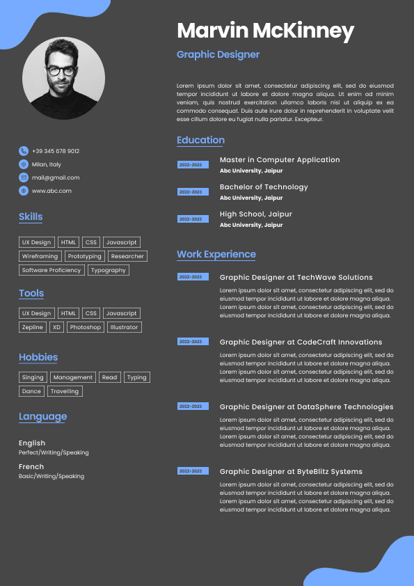
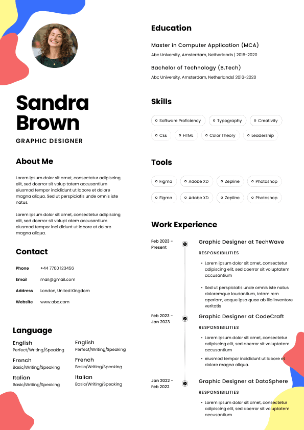
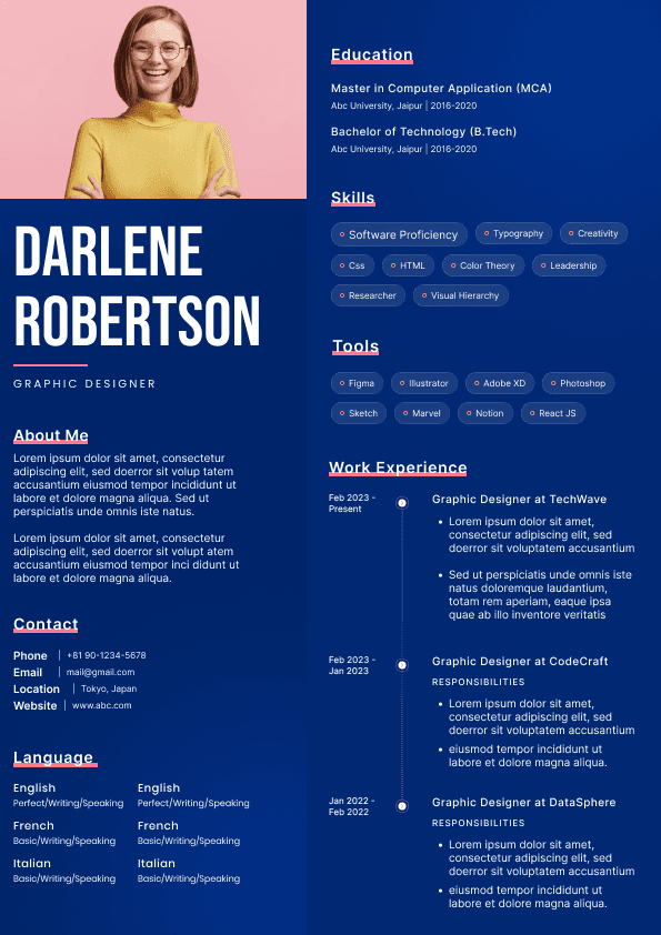
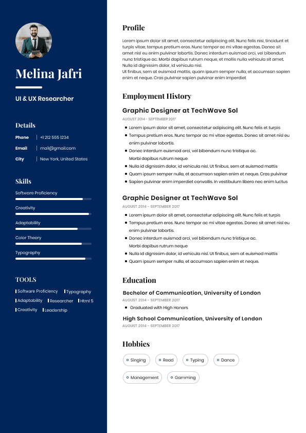
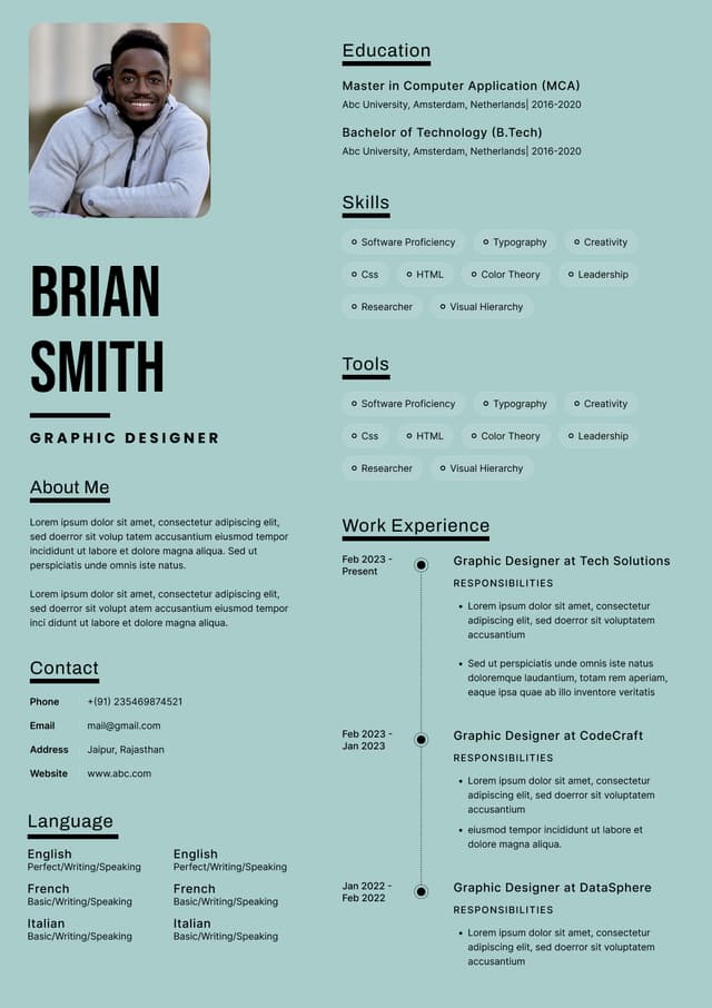
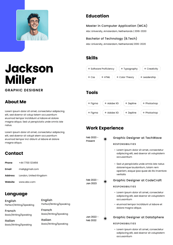
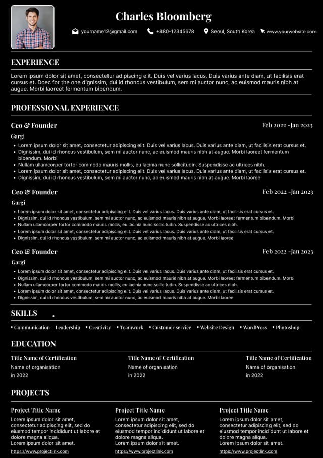
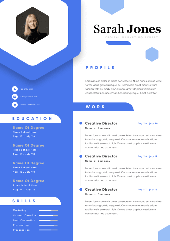
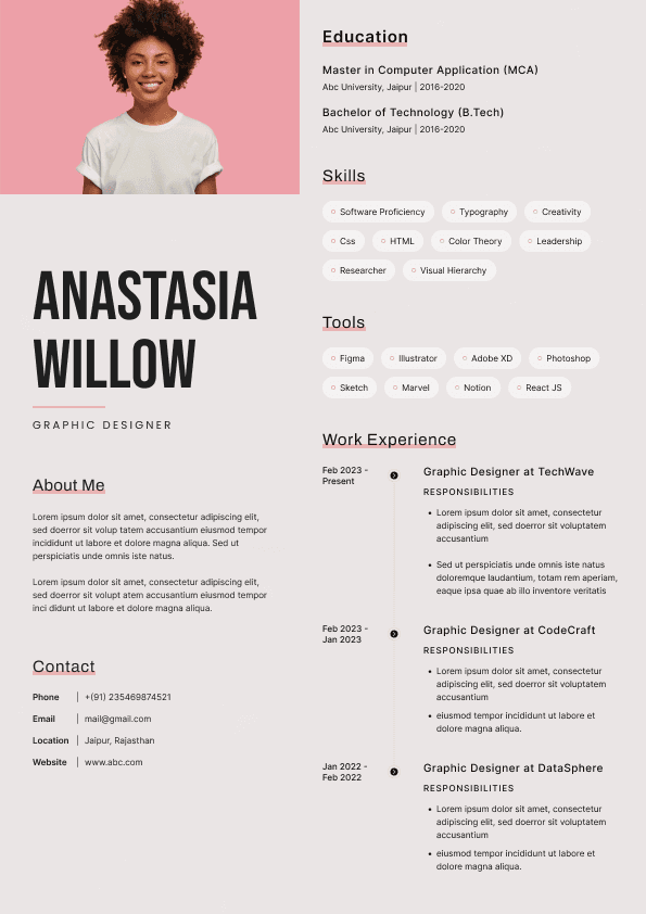
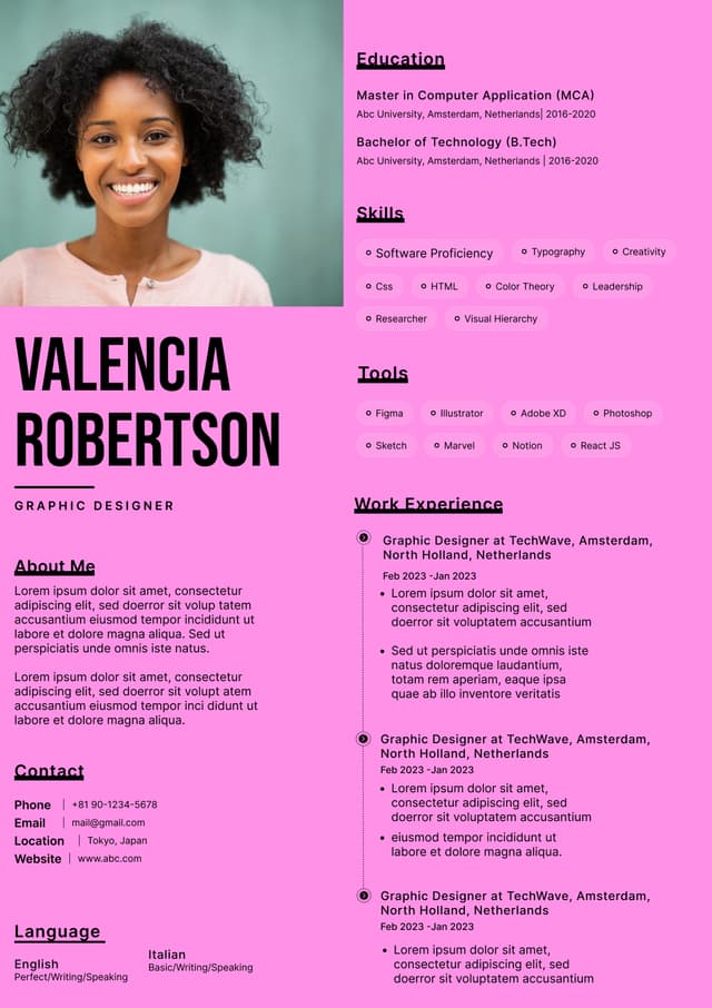
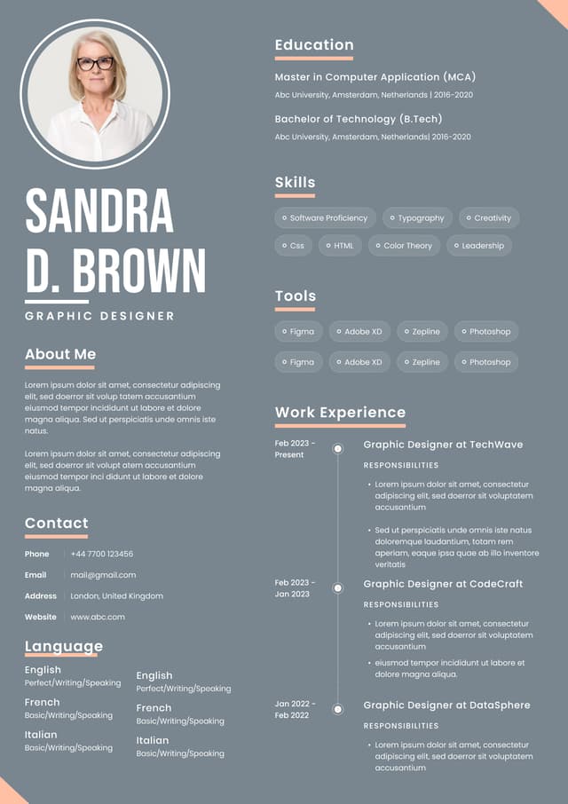
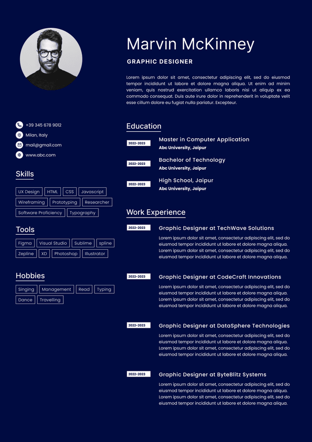
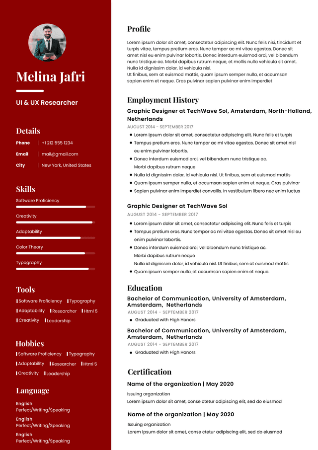
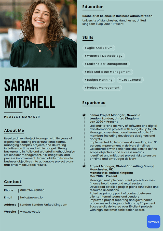
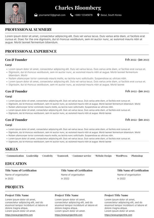
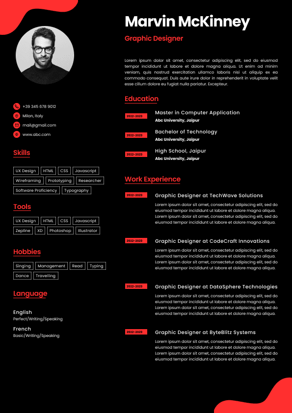
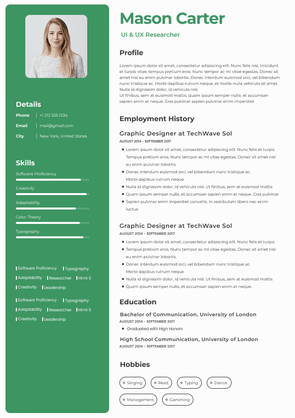
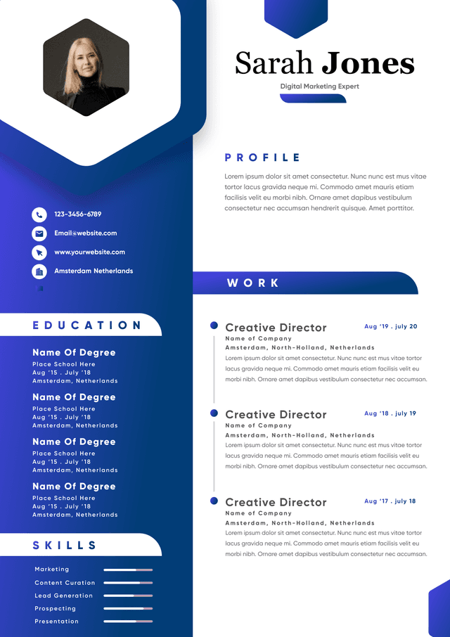
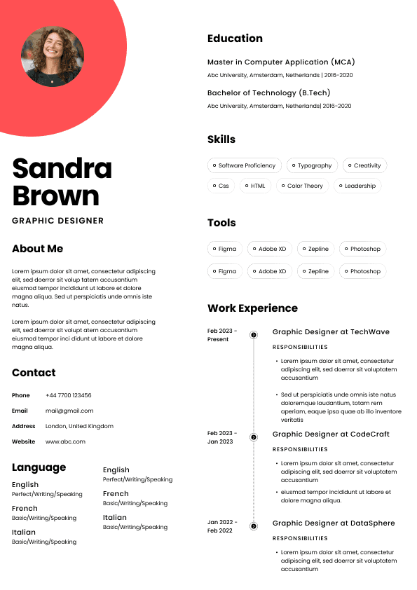
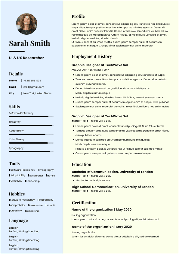
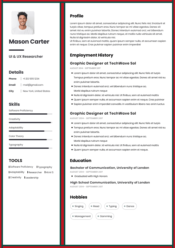
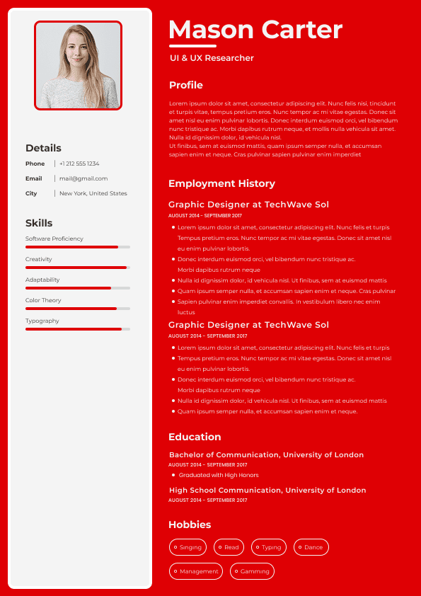
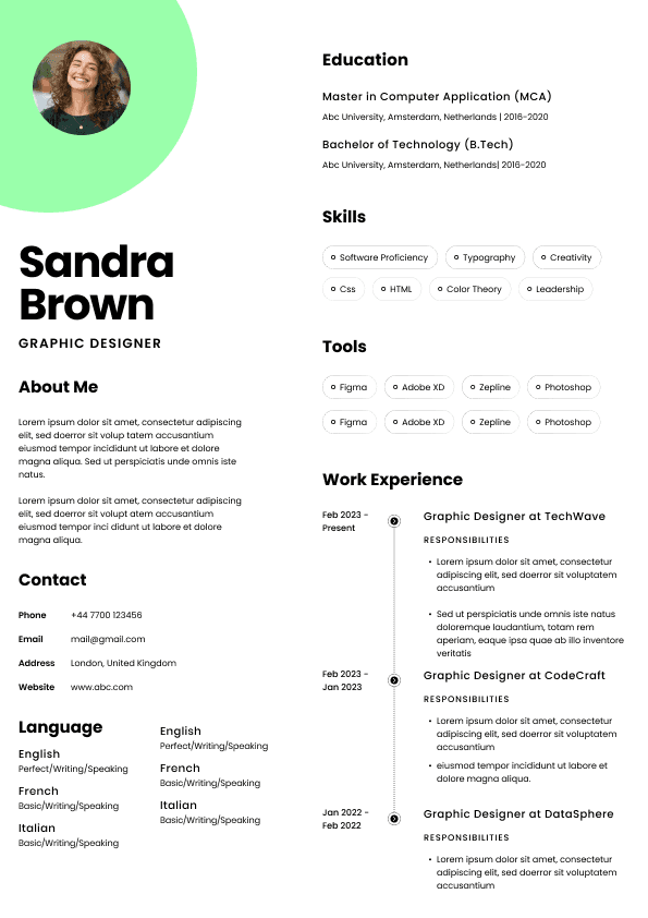
Choose from a wide range of NEWCV resume templates and customize your NEWCV design with a single click.

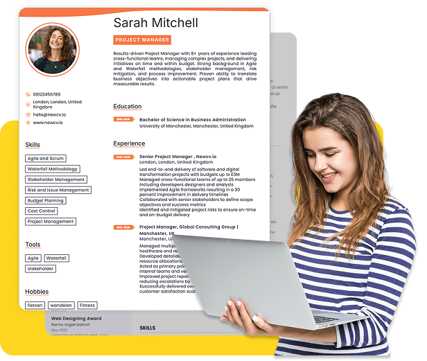
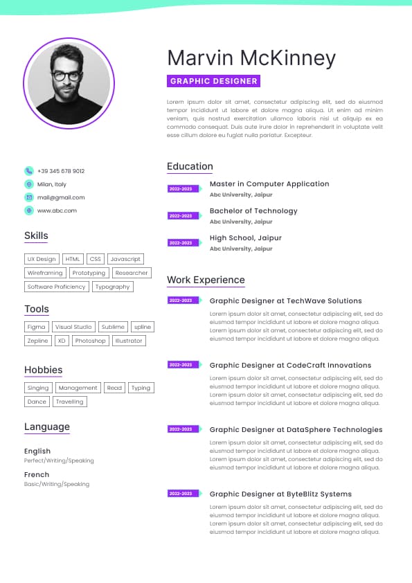
Use professional field-tested resume templates that follow the exact Resume rules employers look for.
Create ResumeWhen you search “best resume fonts,” most articles list aesthetic suggestions.
That misses how fonts influence machine parsing quality and recruiter readability in real-world hiring.
Modern Applicant Tracking Systems (ATS) do not judge beauty.
They judge extractability — whether text can be reliably parsed without errors.
Recruiters, on the other hand, scan resumes in under 10 seconds.
The right font improves both:
•Text extraction accuracy
• Eye-tracking efficiency
• Perceived professionalism
This page explains which fonts actually perform best in screening systems, why others fail, and how font choice interacts with real hiring outcomes.
ATS extract text layers from resumes. When fonts are unusual:
•Text spacing becomes irregular
• Character recognition errors appear
• Bullets and tables may break
• Section headers fail extraction
Recruiters unconsciously react to:
•Letter clarity
• Line spacing
• Consistent visual hierarchy
The right font reduces cognitive load and improves skimming.
Fonts that perform well in screening systems share these characteristics:
•Standardized Unicode mapping
• Even character width (predictable spacing)
• Distinct character shapes (no ambiguity between 1, l, I)
• Moderate x-height for readability
• Supported across PDF and DOCX exports
Fonts that fail often:
•Use decorative serifs
• Replace standard glyphs with styled alternatives
• Are custom branding fonts
• Render inconsistently in PDF conversion
•Sans-serif
• Excellent screen readability
• Uniform spacing
• Supported natively in Microsoft Word and ATS parsers
Why it works:
•Common default font
• Minimal style noise
• Clean extraction
•Sans-serif
• Slightly wider spacing
• Easy to scan
Recruiter impact:
•Letters are distinct
• Little visual clutter
ATS impact:
•Highly extractable
• Rare parsing errors
•Sans-serif
• Professional and clean
• Common in Mac environments
Notes:
•Good for layouts with heavier headers
• Ensure PDF export retains text layer
•Serif font that can work well
• Excellent print readability
Best use:
•When applying to traditional industries (legal, publishing, academia)
Not ideal:
•On resumes with heavy technical terms — spacing can compress characters
•Classic serif
• Good extraction
Why it’s no longer default:
•Slightly tight letter spacing
• Can appear dated in creative fields
•Too casual
• Poor recruiter perception
• Unexpected glyph mapping
•Decorative only
• Parsing breaks occur frequently
• Recruiters skip resumes with poor readability
•Any font outside standard OS packages
• Risk of conversion to image text
• High parsing error rate
•Reduced legibility
• Cause ATS character misreads
Font size interacts with readability and extraction.
Recommended sizes:
•Body text: 10–11 pt
• Section headers: 12–14 pt
• Name/Header: 16–18 pt
Margins and spacing:
•1.0–1.15 line spacing
• 0.5–0.75 inch margins
Too small fonts:
•Reduce scannability
• Increase parsing errors
Too large fonts:
•Reduce content density
• Push important keywords below initial view
Recruiters scan in an “F” or “Z” pattern.
Clear fonts:
•Facilitate rapid focus on section headers
• Improve number recognition
• Separate text blocks efficiently
Poor fonts:
•Cause slow eye movement
• Increase cognitive fatigue
• Decrease time spent on key accomplishments
Preferred:
•Calibri
• Arial
• Helvetica
Rationale:
•Clean, modern, screen-friendly
Preferred:
•Georgia
• Times New Roman
• Calibri
Rationale:
•Blend of tradition and readability
Acceptable:
•Modern minimalist sans-serif (e.g., Lato, Proxima Nova)
Caution:
•Only if ATS parsing is confirmed
Switching fonts disrupts parsers and recruiter focus.
Keep 1–2 fonts maximum:
•One for body
• One for headers (optional)
Bullets should be:
•Standard Unicode characters
• Not embedded symbols
Avoid:
•Wingdings
• Icon-based bullets
If PDF converts text to image:
•ATS cannot read it
• Resume is effectively invisible
Always export PDF with embedded text layer.
Checklist:
•Open PDF and try selecting text — it should highlight normally.
• Copy and paste text into a plain document — characters should transfer correctly.
• Confirm no unusual spacing in headers or bullets.
• Ask a friend to skim your PDF and time their read.
Poor extraction patterns indicate font issues.
Use ATS-optimised Resume and resume templates that pass applicant tracking systems. Our Resume builder helps recruiters read, scan, and shortlist your Resume faster.

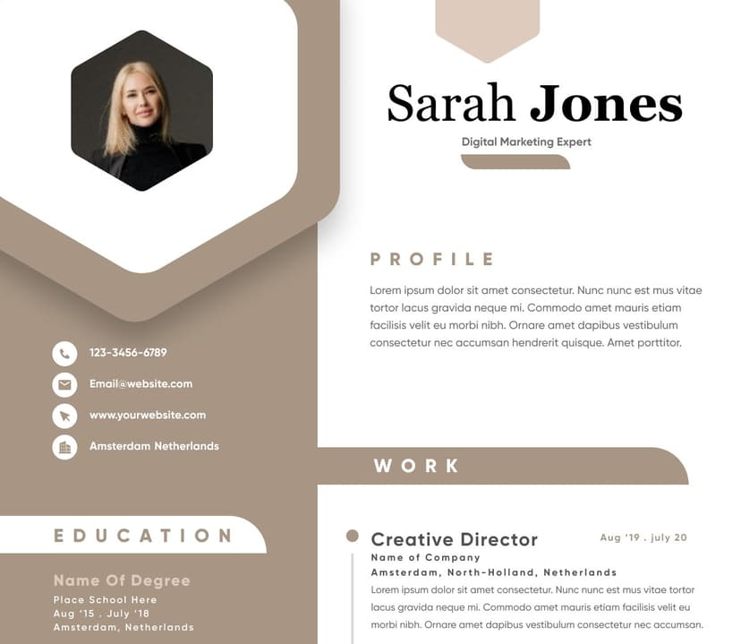
Use professional field-tested resume templates that follow the exact Resume rules employers look for.
Create Resume