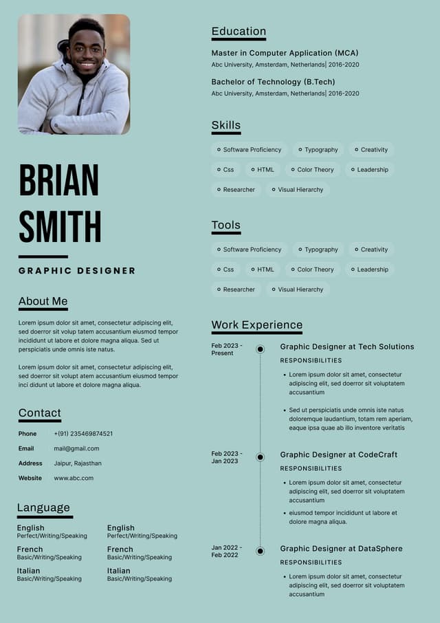
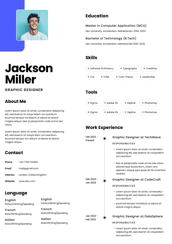
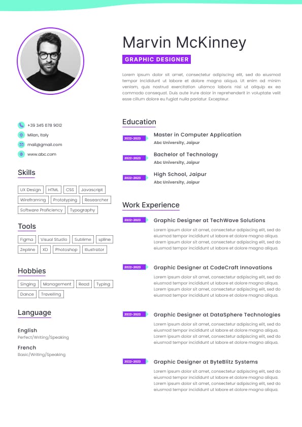
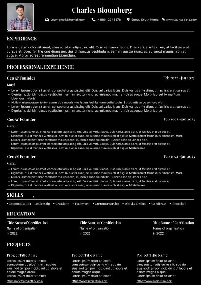
Choose from a wide range of NEWCV resume templates and customize your NEWCV design with a single click.

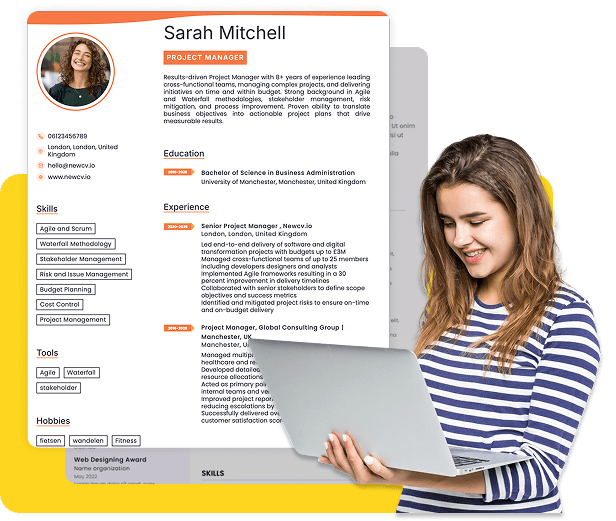

Use professional field-tested resume templates that follow the exact Resume rules employers look for.
Create ResumeThe best resume format according to recruiters is the reverse chronological resume format. It consistently performs better because it mirrors how recruiters actually evaluate candidates: recent experience first, career progression second, qualifications third. It also works best with modern Applicant Tracking Systems (ATS), supports faster scanning, and aligns with real hiring behavior.
Most recruiters spend only a few seconds on an initial resume review. They are not reading your document from top to bottom. They scan for role relevance, progression, job titles, achievements, and recent experience. If a format slows down that process, creates confusion, or hides critical information, your chances drop immediately.
While functional and hybrid formats still exist, they are often misunderstood by candidates and frequently underperform in competitive hiring situations. The reality is simple: the best resume format is the one that helps recruiters make a fast "yes" decision.
Candidates often assume resume formats are a matter of style preference. They are not.
Recruiters evaluate resumes based on efficiency.
Hiring teams may review hundreds of applications for one opening. Anything that creates extra work becomes a problem.
The reverse chronological structure helps recruiters answer their biggest questions instantly:
What does this person do today?
Have they done this before?
Is there career growth?
Does their background match the role?
How recently have they used these skills?
When recruiters cannot answer these questions quickly, uncertainty increases.
And uncertainty hurts interview rates.
Most recruiters perform a rapid pattern evaluation:
Current role
Company names
Job title progression
Time spent at each employer
Recent accomplishments
Industry relevance
Missing dates or gaps
Keywords matching the job description
A chronological format naturally supports this behavior.
A functional format often interrupts it.
Candidates searching for the "best resume format" usually encounter three options:
Reverse chronological
Functional
Combination or hybrid
Not all perform equally.
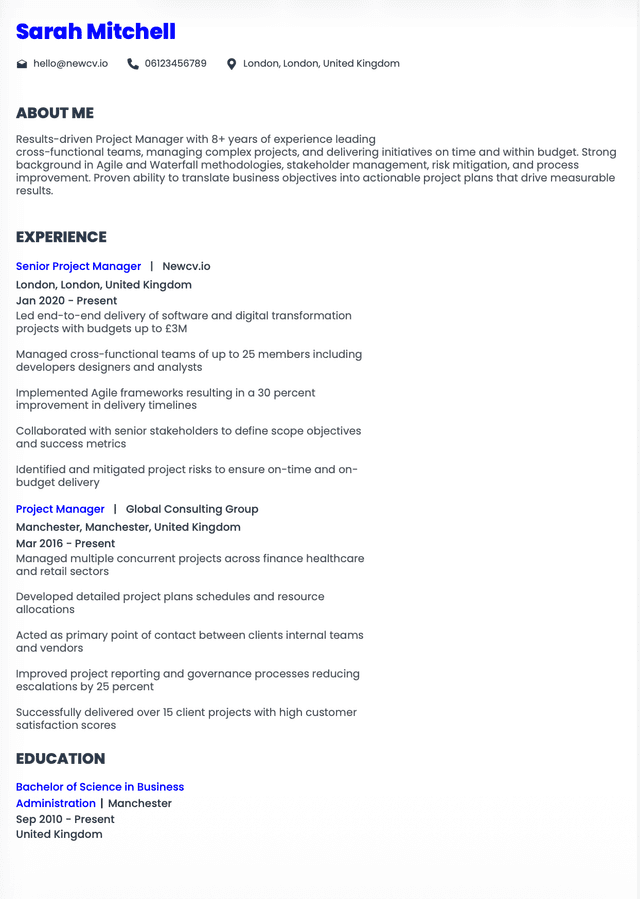
Structure:
Contact information
Professional summary
Work experience
Skills
Education
Certifications if relevant
This remains the default recommendation for:
Experienced professionals
Career changers with transferable experience
Mid level candidates
Senior professionals
Most corporate roles
Structure:
Skills categories
Projects
Accomplishments
Experience later
Functional resumes prioritize abilities over work history.
This format became popular years ago as a way to hide gaps or inconsistent experience.
Today, recruiters often view them cautiously.
Why?
Because they sometimes signal:
Employment gaps
Weak work history
Frequent job hopping
Hidden timelines
Lack of direct experience
That does not mean every functional resume is bad.
But many recruiters immediately become skeptical.
This mixes skills and chronological experience.
Useful situations include:
Career transitions
Technical professionals
Specialized fields
Candidates with extensive project work
However, candidates often overload hybrid resumes and accidentally create clutter.
Complexity rarely helps.
One of the biggest myths in job searching is that ATS systems reject resumes automatically because of minor formatting choices.
The truth is more nuanced.
ATS software parses information into searchable fields.
The problem is not creativity.
The problem is structure.
Recruiters consistently recommend:
Single column layouts
Standard section headings
Clear dates
Traditional formatting
Consistent spacing
Standard fonts
ATS systems struggle with:
Text boxes
Tables
Multi column layouts
Graphics
Excessive icons
Complex design elements
Candidates frequently confuse attractive with effective.
A resume is not a marketing brochure.
Its purpose is to communicate qualifications quickly.
Many job seekers optimize for appearance.
Recruiters optimize for decision speed.
Those are different goals.
Candidates ask:
"Does this look impressive?"
Recruiters ask:
"Can I understand this in six seconds?"
That mindset changes everything.
Professional Summary:
"Highly motivated and results driven individual seeking opportunities where I can utilize my skills and grow professionally."
Problems:
Generic language
Says nothing specific
No role alignment
No measurable value
Professional Summary:
"Marketing Manager with 8 years of B2B SaaS experience leading demand generation initiatives that increased pipeline growth by 43% across enterprise accounts."
Why recruiters prefer it:
Clear identity
Industry context
Quantified impact
Immediate relevance
Specificity reduces uncertainty.
Candidates obsess over templates.
Recruiters care far more about content quality.
A perfectly designed resume cannot fix weak positioning.
Strong resumes consistently demonstrate:
Clear career narrative
Relevant experience
Business impact
Measurable outcomes
Role alignment
Progression
Formatting supports content.
Formatting does not replace content.
Many rejected resumes fail because they communicate weak value, not because margins were wrong.
For most candidates, use this order:
Include:
Name
Phone
Professional email
LinkedIn profile
City and state
Skip:
Full address
Photos
Birth dates
Marital status
Focus on:
Experience level
Core specialization
Industry
Major achievements
Value proposition
Keep it concise.
For each role include:
Job title
Employer
Location
Dates
Then show achievement focused bullets.
Strong bullets follow:
Action + context + measurable outcome
Keep skills relevant to the role.
Avoid giant keyword lists.
Place education lower unless:
You are a student
Recent graduate
Academic professional
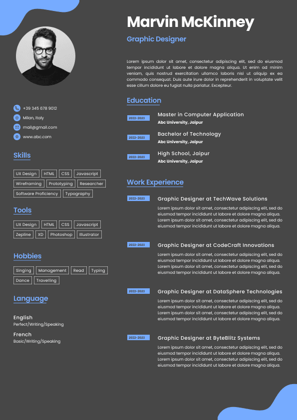
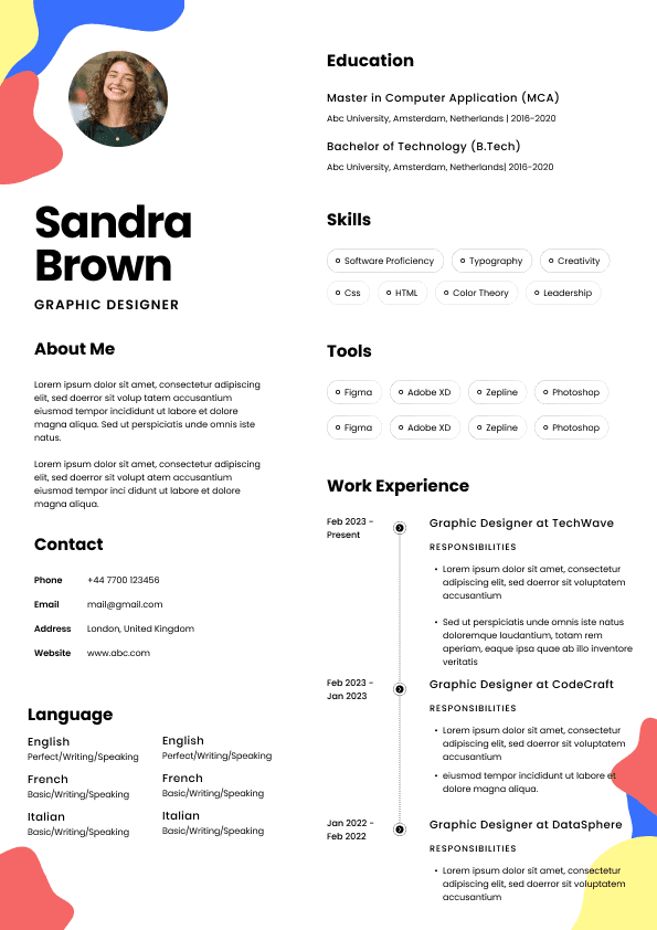
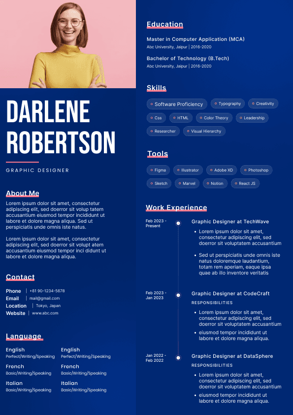
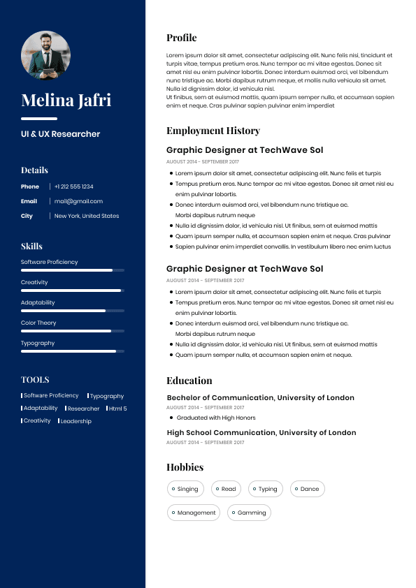
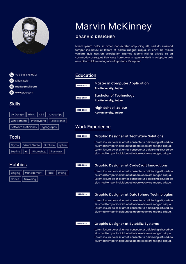
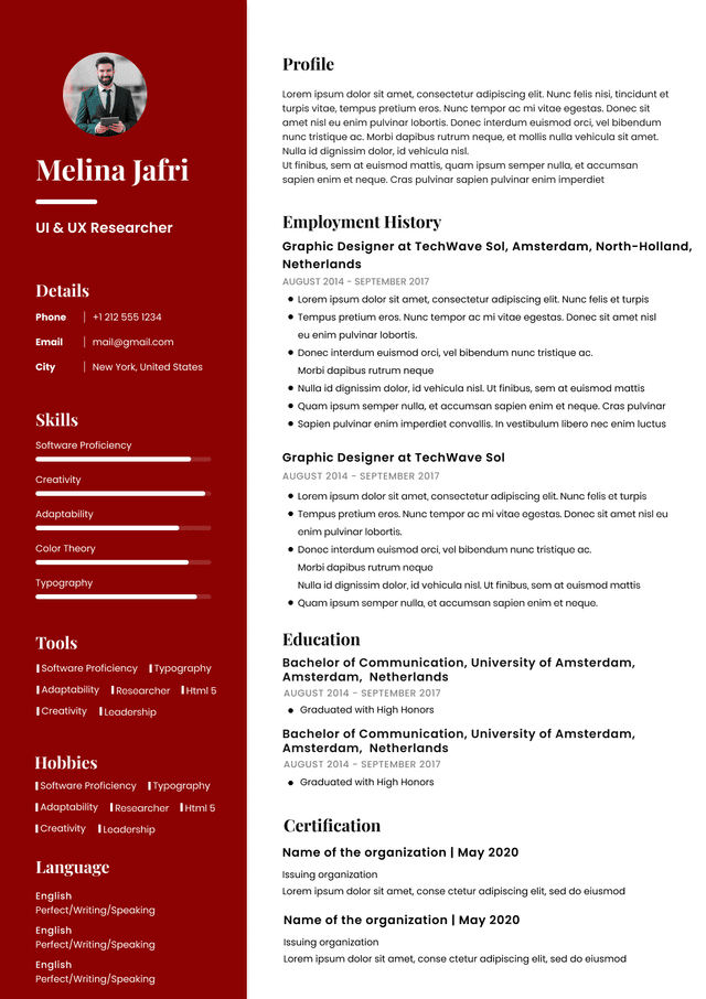
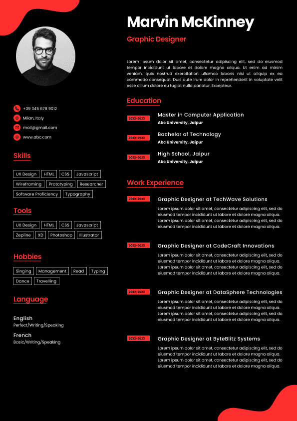
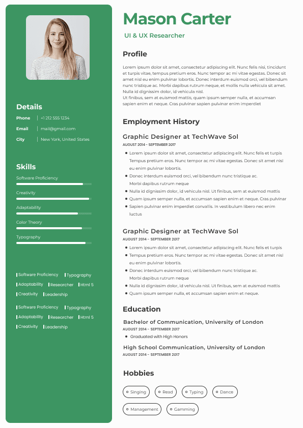
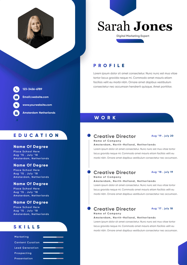
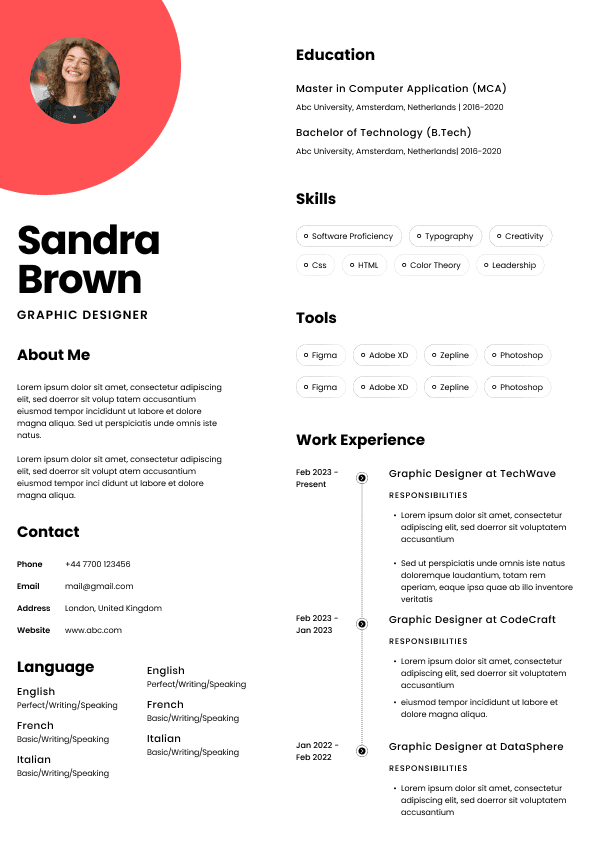
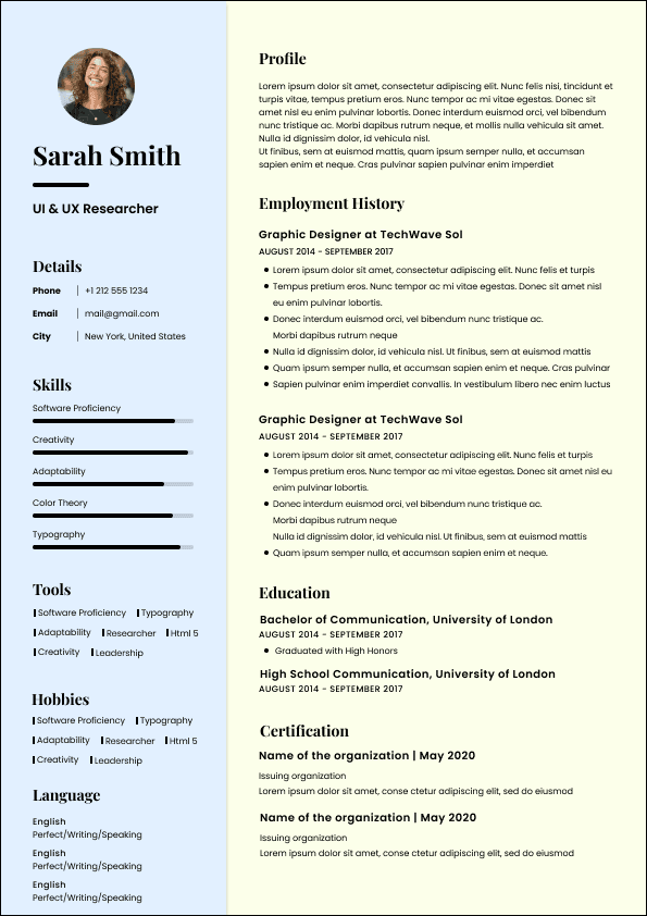
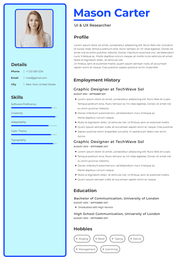
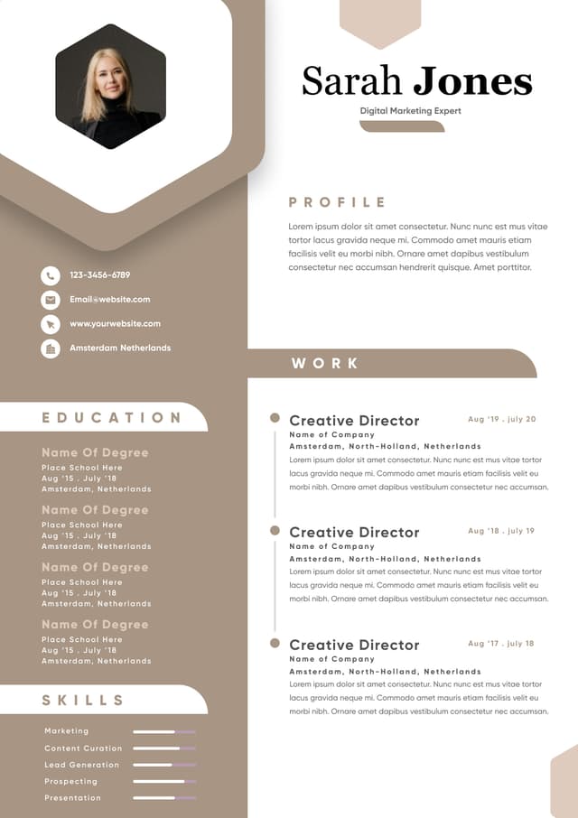
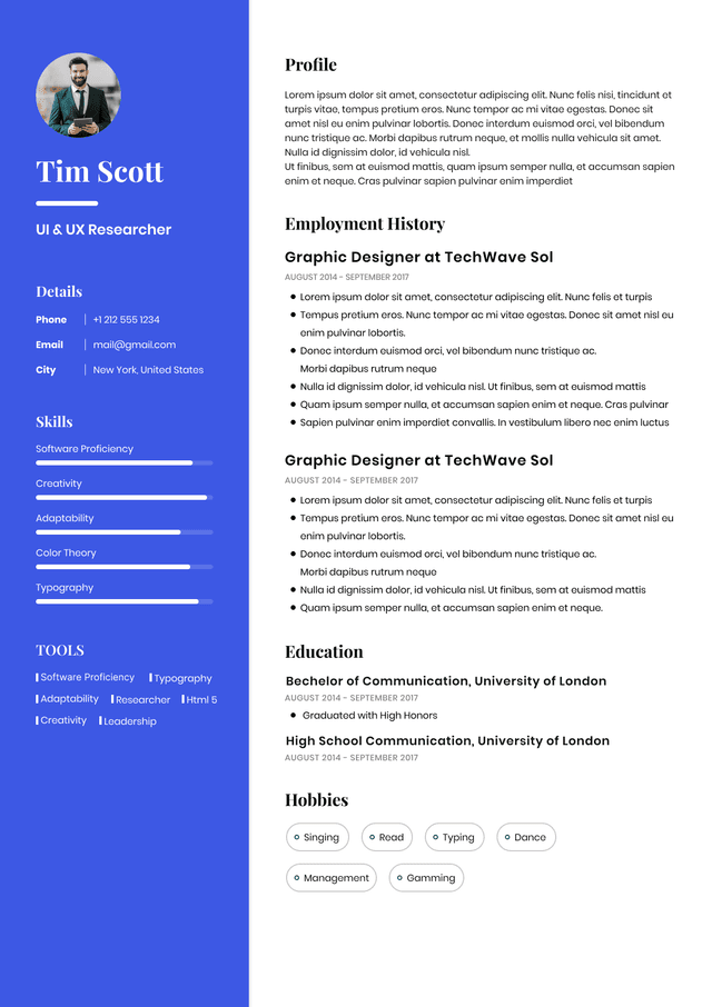
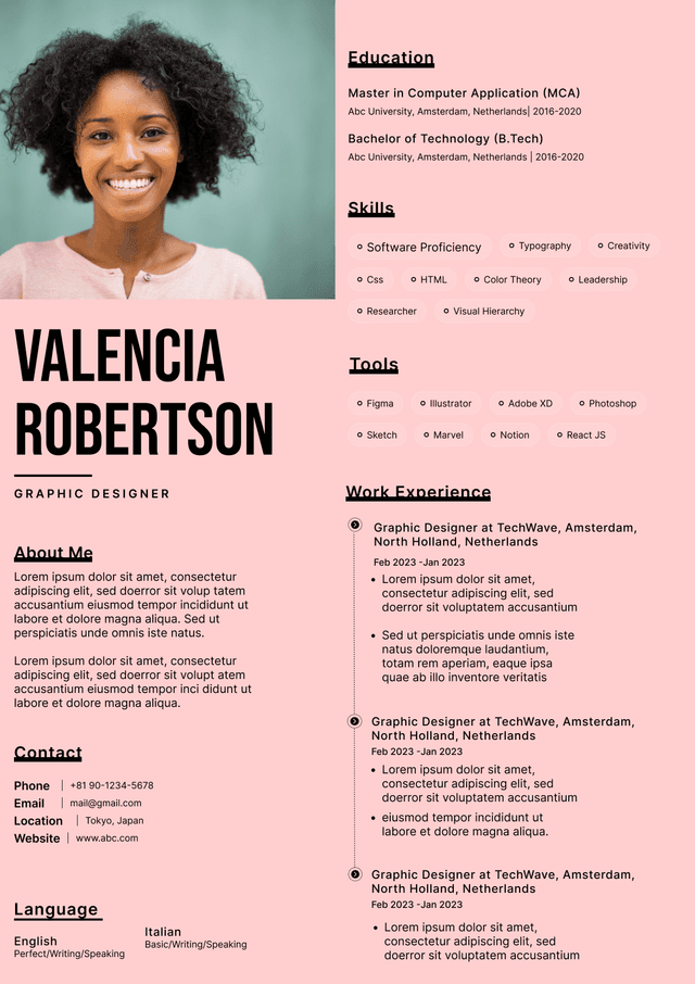
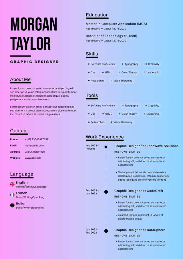
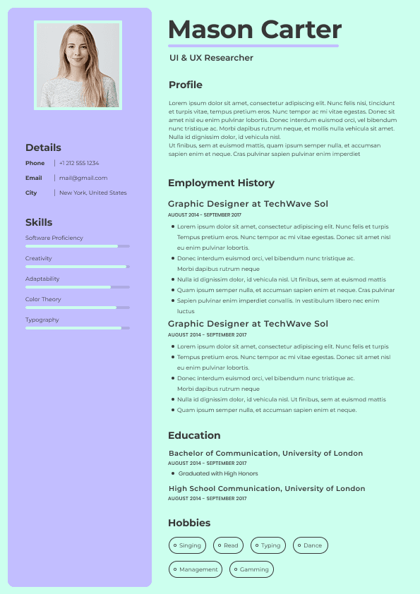
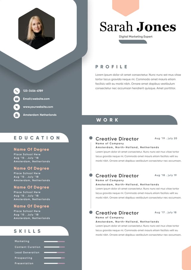
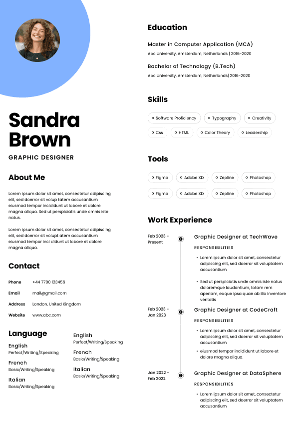
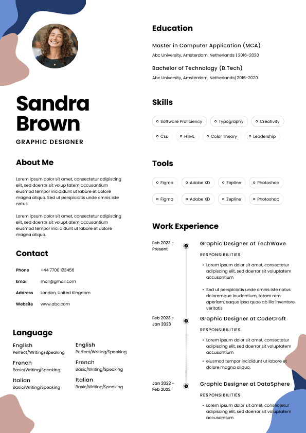
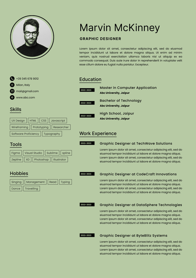
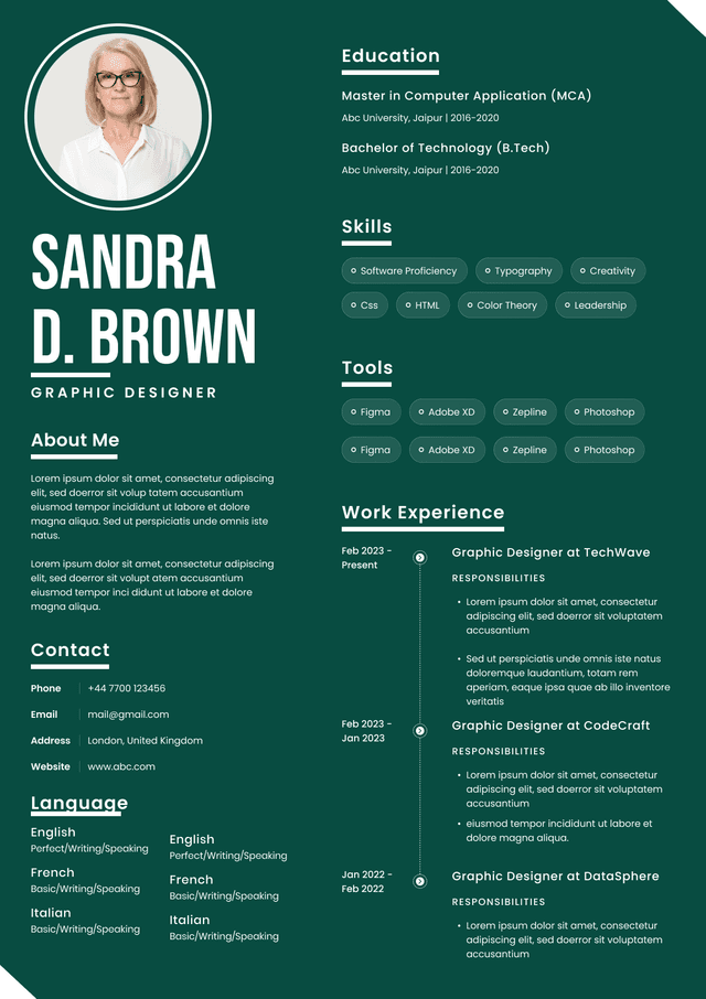
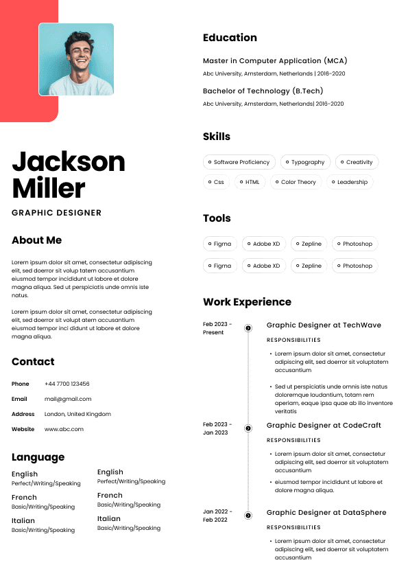
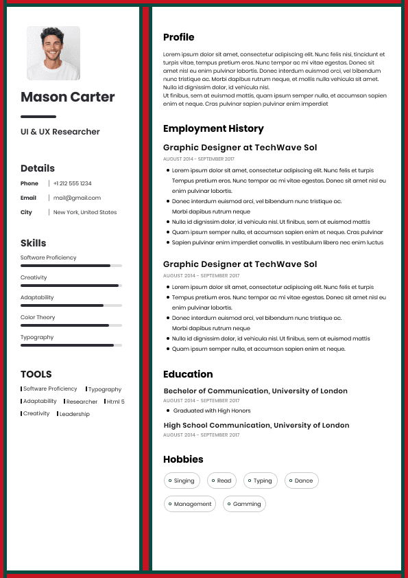
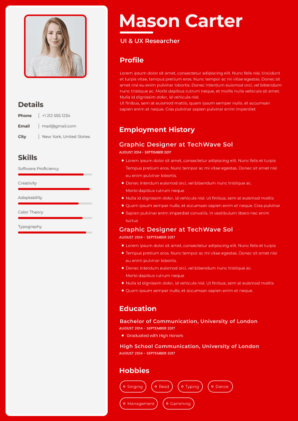
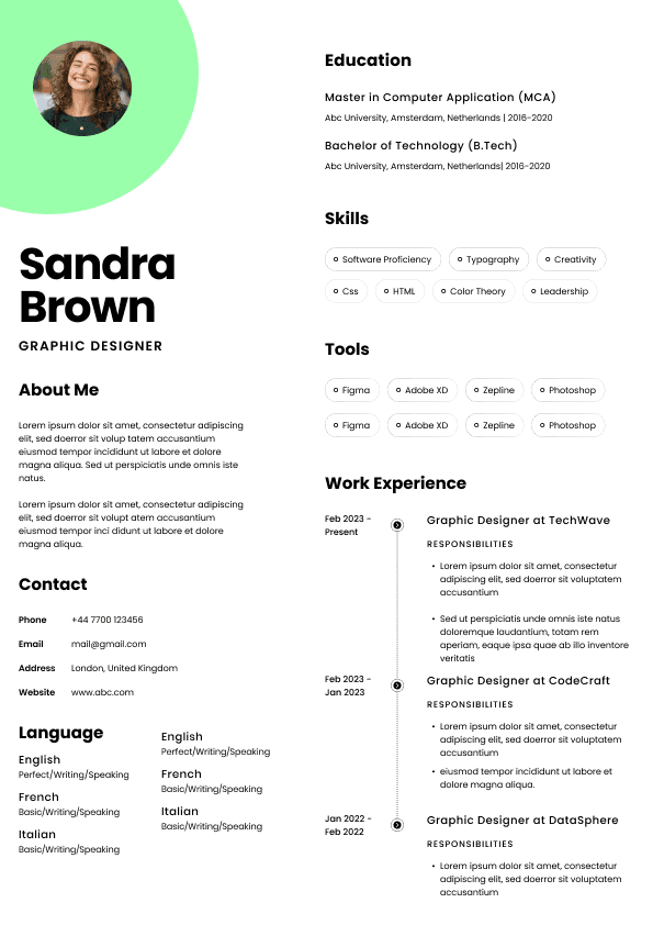
Candidates frequently download highly designed templates.
Recruiters often dislike them.
Not because they look bad.
Because they interrupt reading patterns.
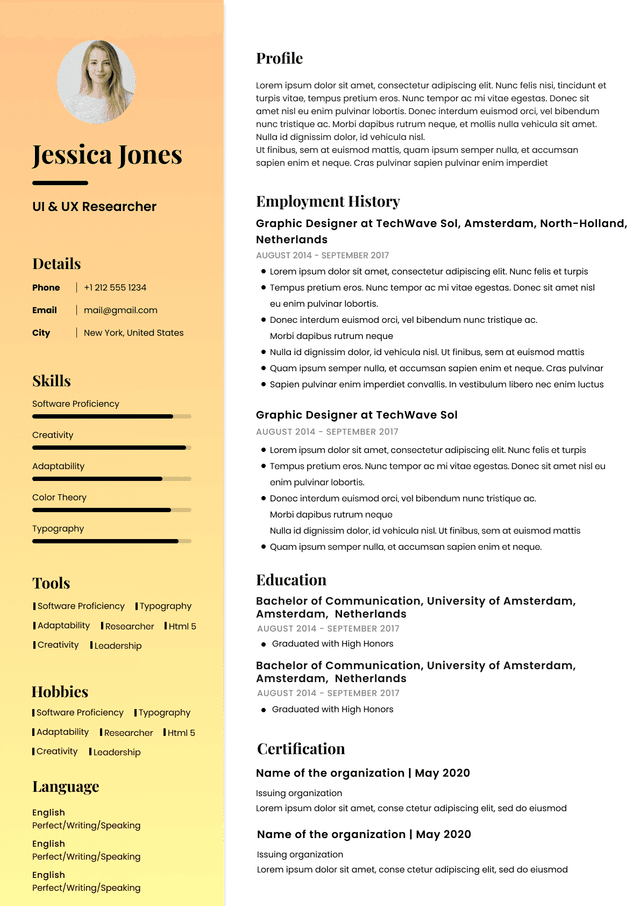
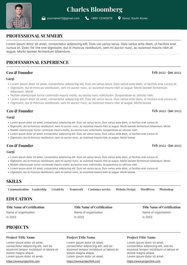
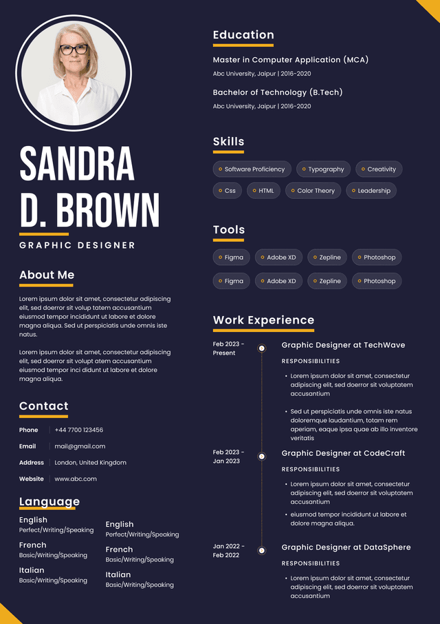
Common issues:
Narrow columns
Tiny fonts
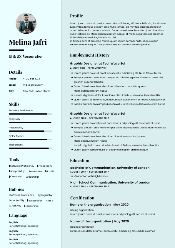
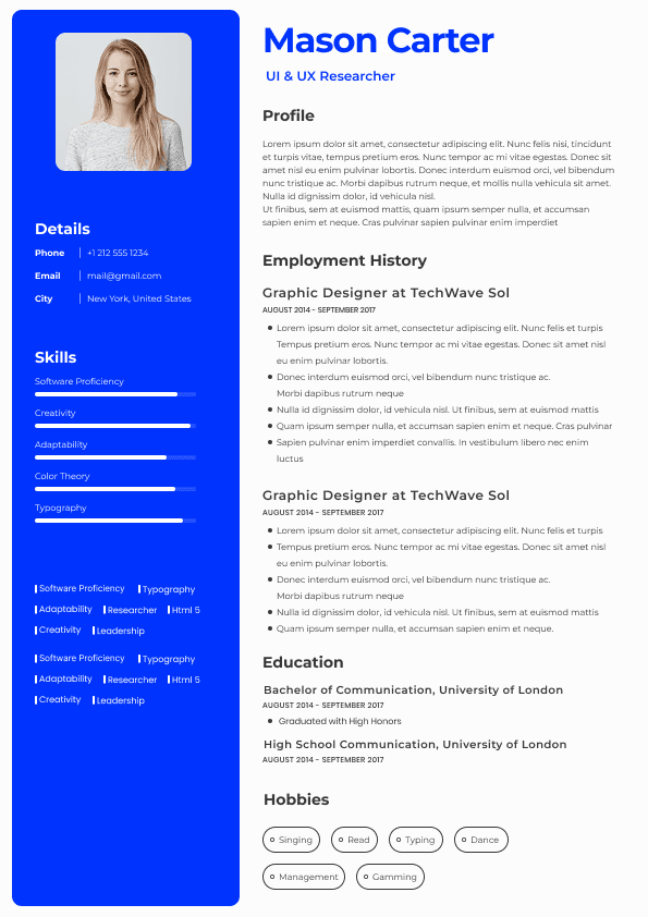
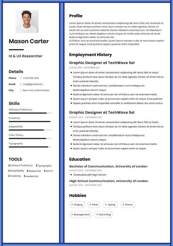
Skill bars
Icons everywhere
Visual ratings
Hidden information
Skill bars create one major issue.
What does:
"Leadership 90%"
actually mean?
Nothing.
Recruiters trust evidence.
Not graphics.
Keep formatting simple and highly readable.
Recommended:
Font size: 10–12
Headings: 12–14
White space throughout
Standard fonts
Consistent date formatting
Black text on white background
Popular fonts:
Calibri
Arial
Georgia
Cambria
Helvetica
Avoid trying to stand out through design.
Stand out through relevance.
Recent experience first
Quantified achievements
Role specific keywords
Clear progression
Easy scanning
ATS friendly formatting
Dense paragraphs
Generic summaries
Functional layouts without reason
Graphics and tables
Keyword stuffing
Hiding employment dates
Recruiters do not reward complexity.
They reward clarity.
Candidates think resumes are persuasion documents.
Recruiters often use them as risk filters.
Hiring teams ask:
"Does this person feel predictable enough to move forward?"
Unclear formatting increases perceived risk.
Hidden timelines increase perceived risk.
Confusing career stories increase perceived risk.
Strong formatting lowers cognitive effort.
Lower effort improves interview odds.
That is why the best resume format is not the most creative.
It is the easiest to trust.
If you are applying to modern jobs today:
Use reverse chronological.
Keep formatting clean.
Prioritize readability.
Show measurable outcomes.
Optimize for recruiter behavior rather than personal preference.
The candidates who get interviews fastest are usually not the ones with the most visually impressive resumes.
They are the candidates whose value becomes obvious immediately.
Use ATS-optimised Resume and resume templates that pass applicant tracking systems. Our Resume builder helps recruiters read, scan, and shortlist your Resume faster.

Use professional field-tested resume templates that follow the exact Resume rules employers look for.
Create Resume