Choose from a wide range of NEWCV resume templates and customize your NEWCV design with a single click.
Canva was built as a visual design platform first.
Resume creation is only one use case inside a broader design ecosystem intended for social graphics, presentations, marketing assets, and visual content creation.
Hiring systems operate differently.
Recruiters and ATS software prioritize:
Structured information
Machine readability
Consistent formatting patterns
Fast human scanning
Predictable content hierarchy
Low-friction review workflows
Canva prioritizes:
Many users assume ATS systems fail because of keywords.
That is often incorrect.
Modern ATS systems are generally capable of reading keywords. The larger issue is document structure.
Canva resumes commonly introduce:
Text boxes
Multi-column layouts
Decorative icons
Floating design elements
Custom section positioning
Graphic skill meters
Embedded visuals
A common myth says ATS systems reject every visually designed resume.
That is outdated.
Modern platforms have improved dramatically.
However, ATS performance varies depending on:
Employer software stack
System age
Resume upload format
Parsing engine quality
Custom configurations
A resume that parses perfectly inside one platform can behave differently elsewhere.
This inconsistency creates risk.
The issue is unpredictability.
Workflow reliability matters more than isolated success.
One of Canva's biggest design strengths creates one of its largest resume weaknesses.
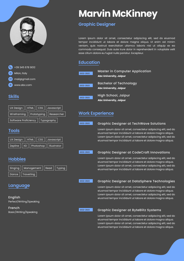
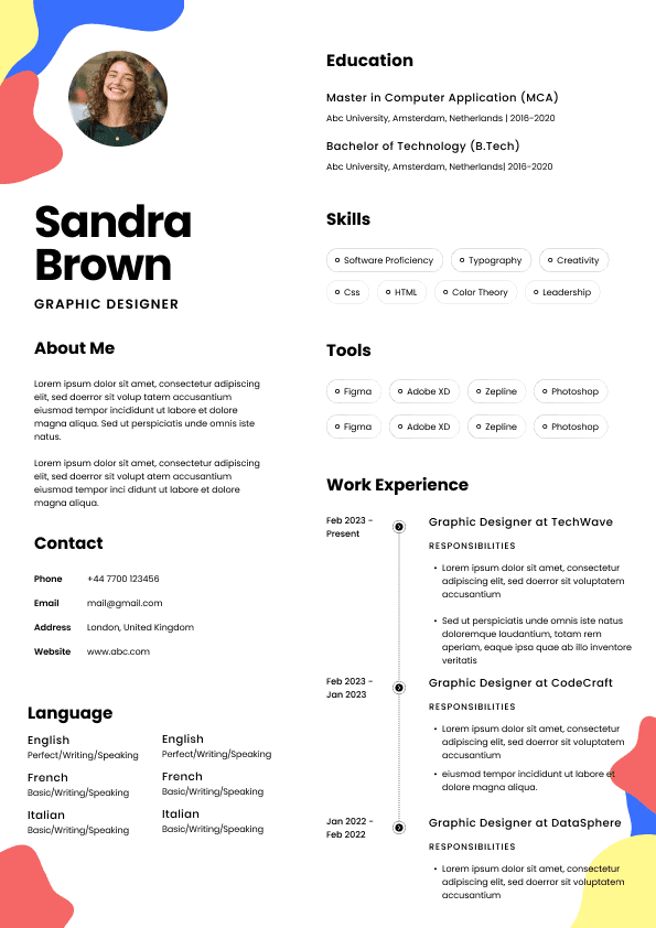
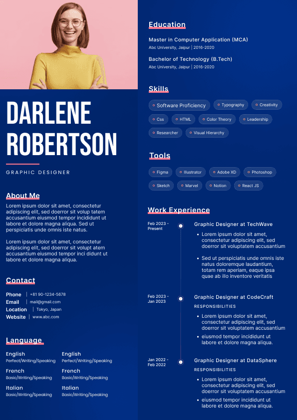
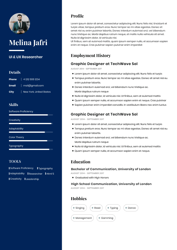
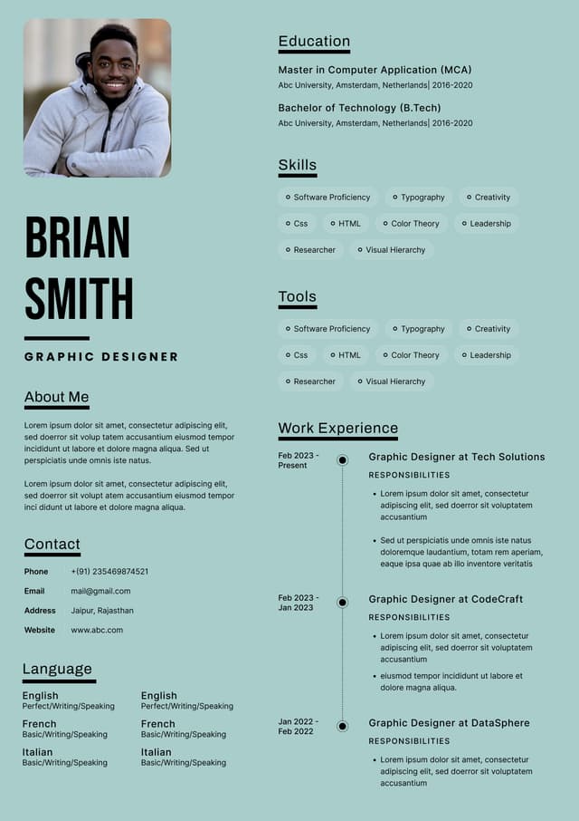
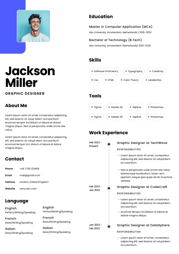
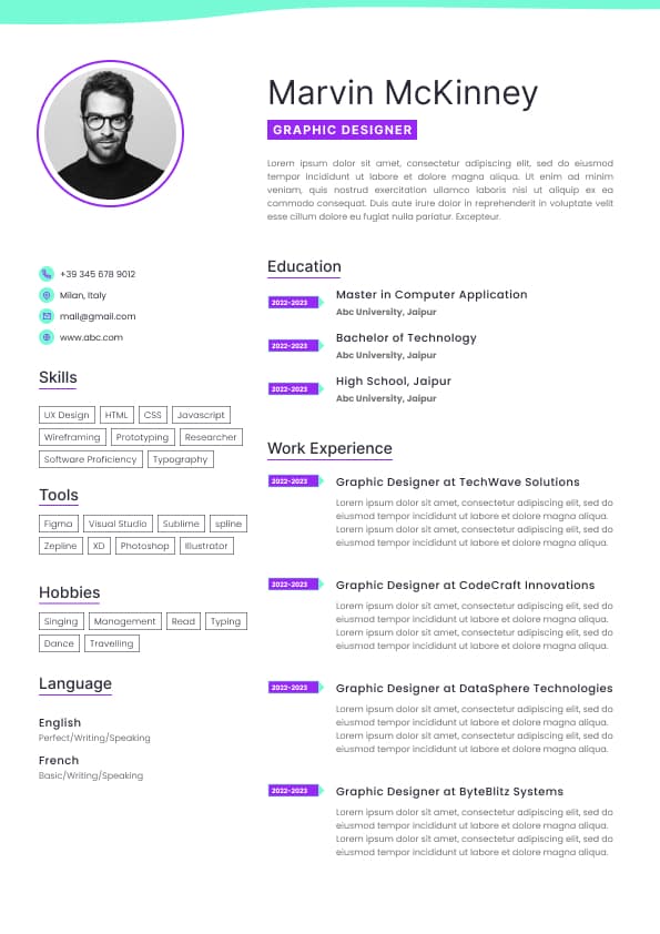
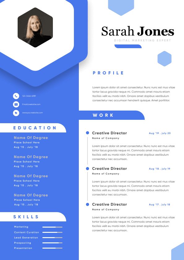
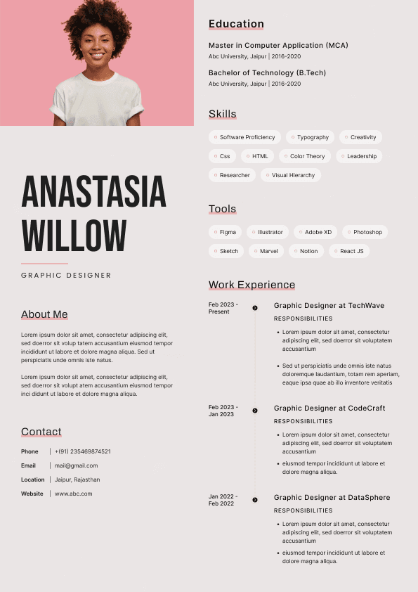
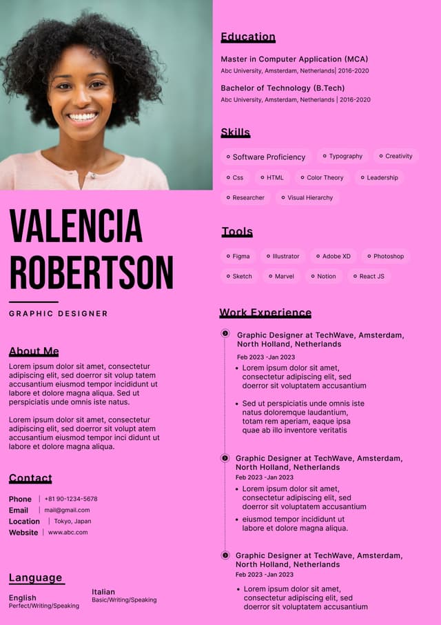
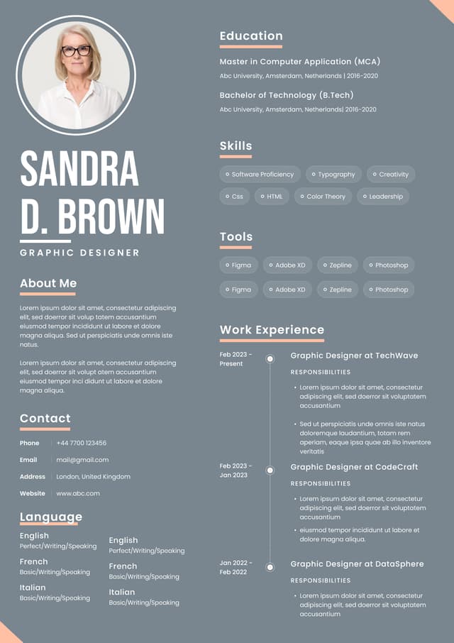
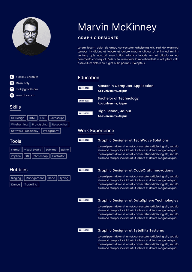
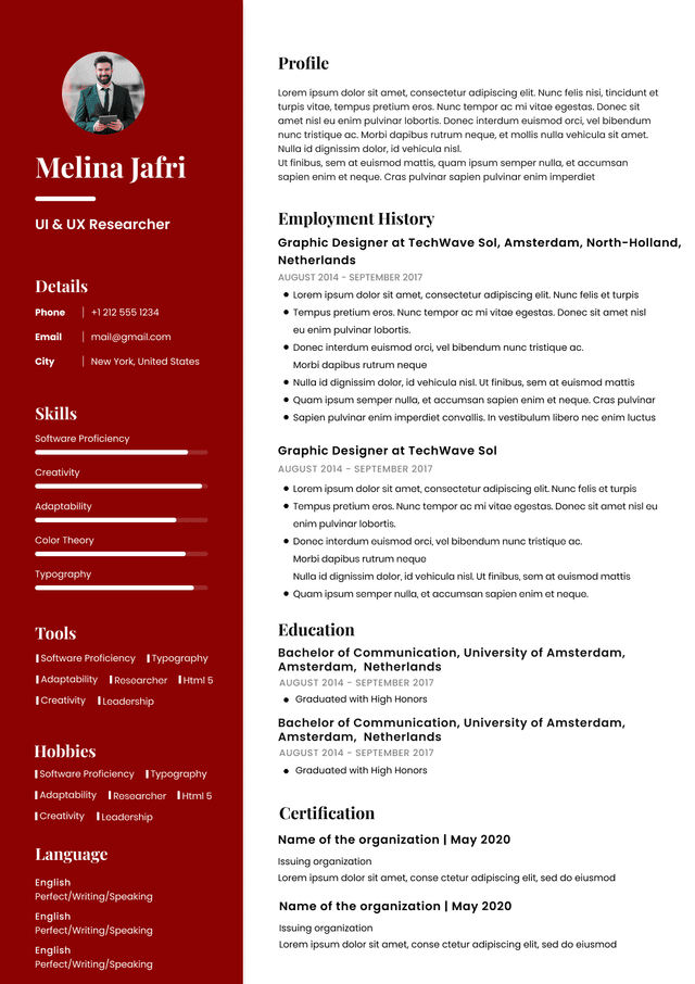
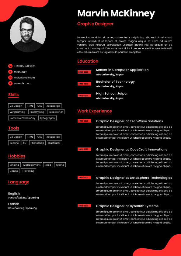
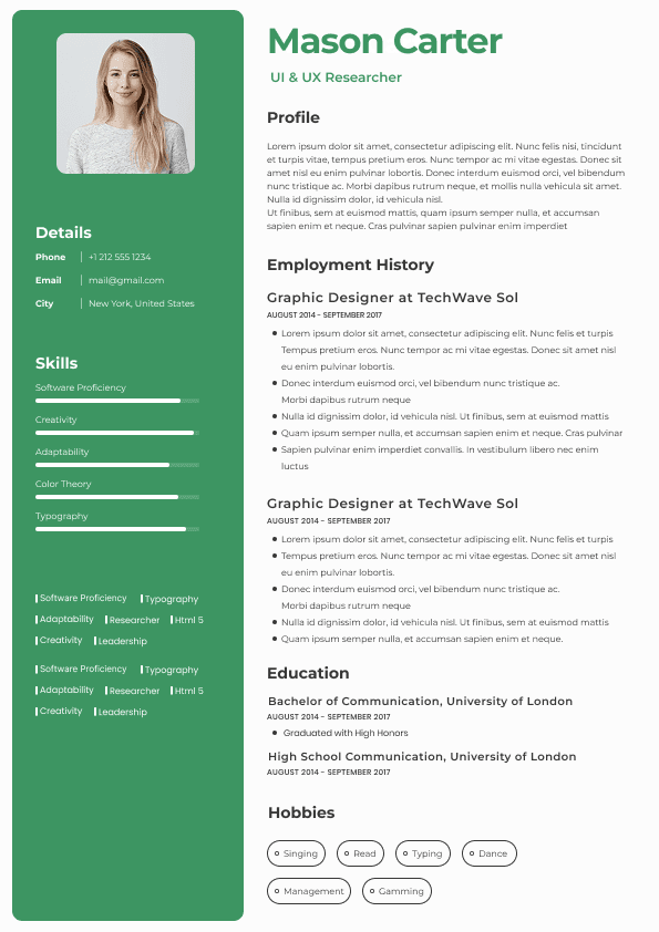
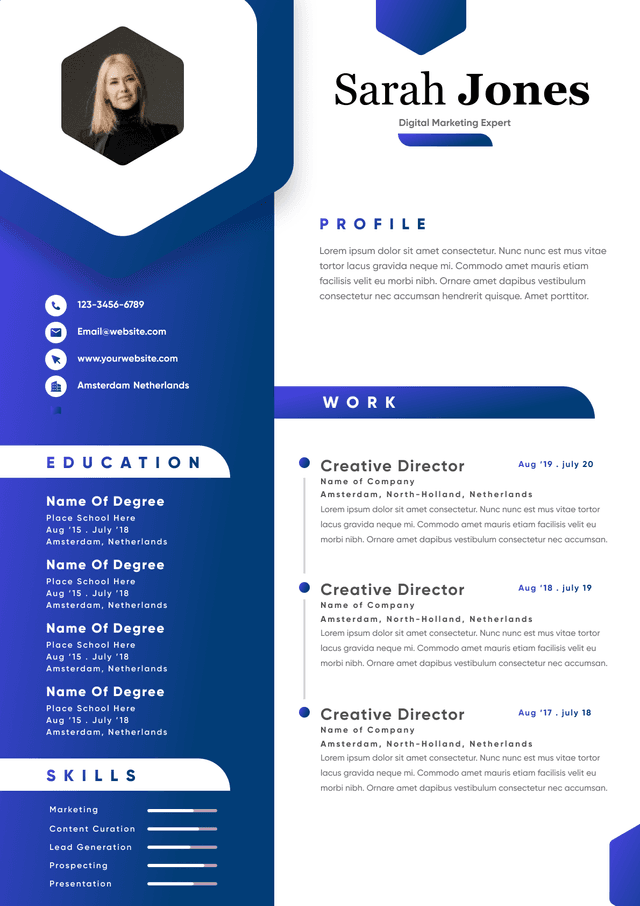
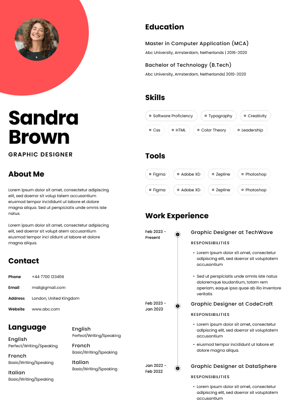
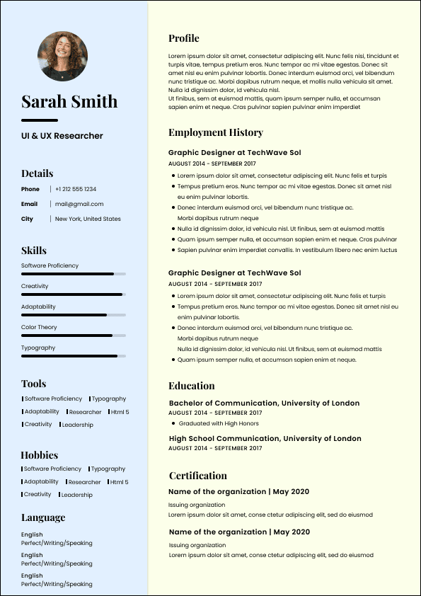
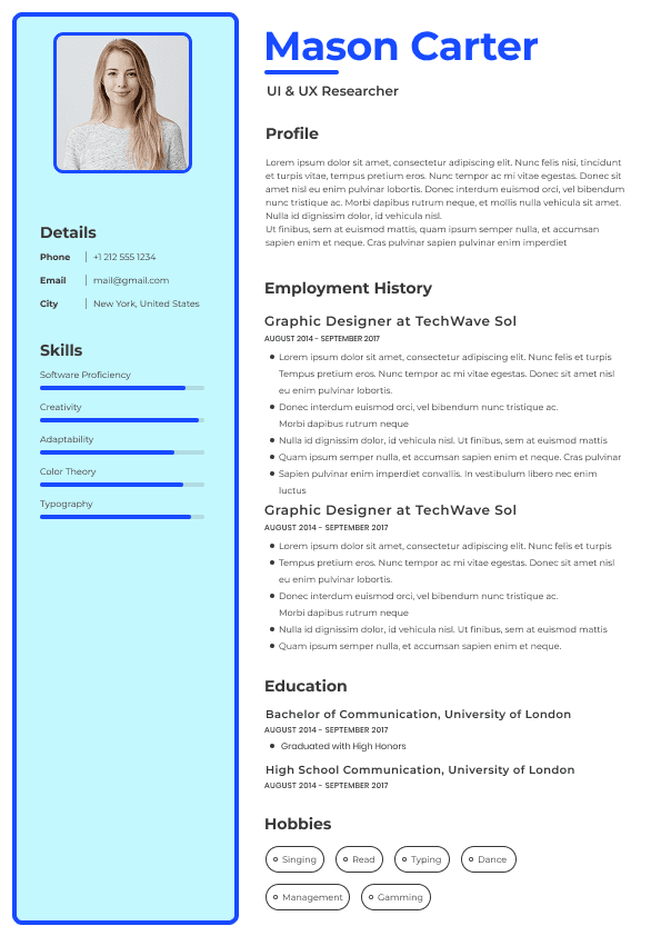
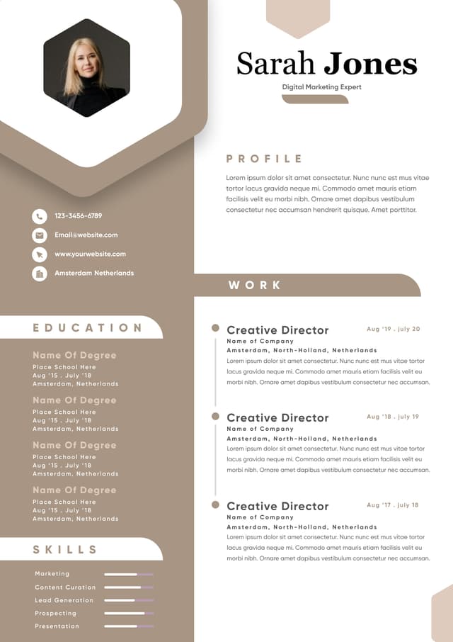
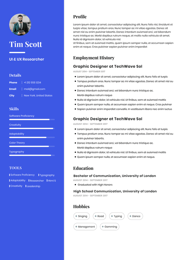
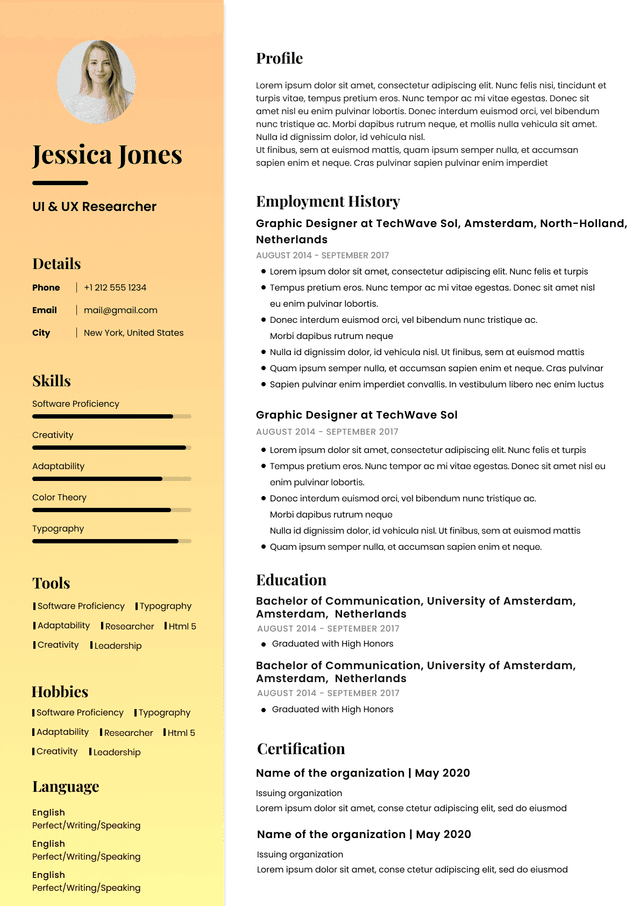
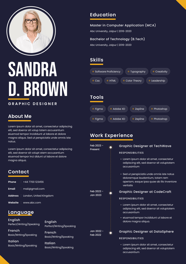
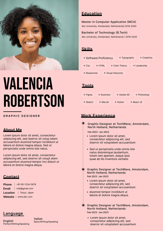
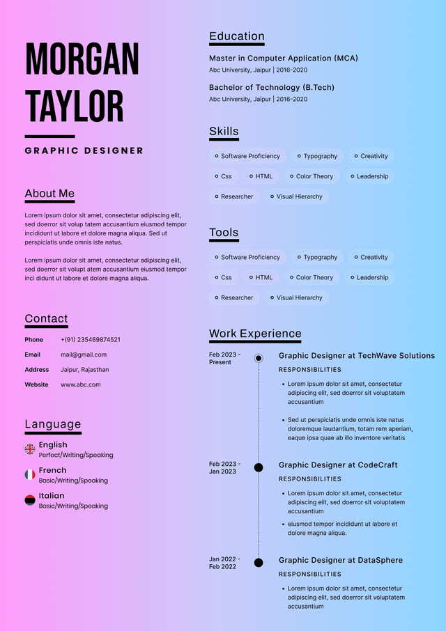
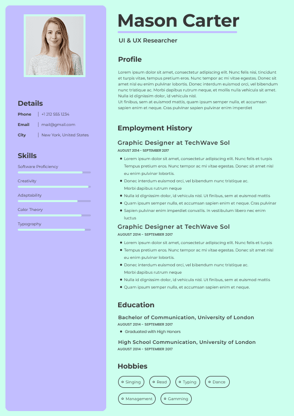
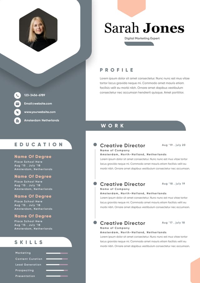
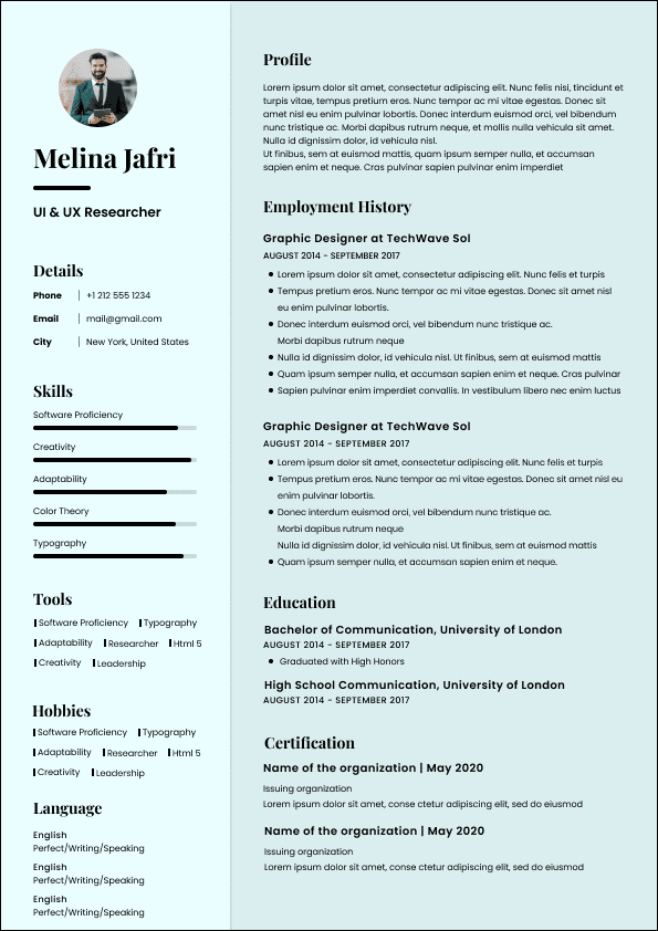
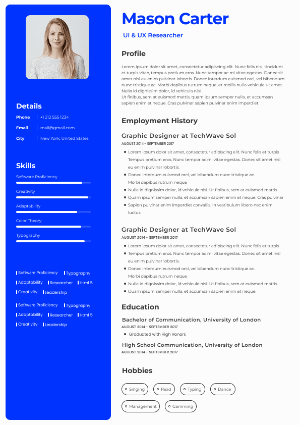
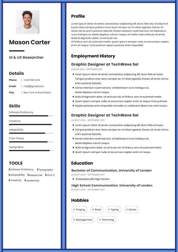
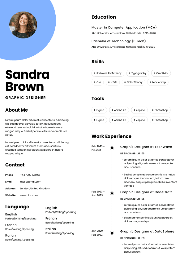
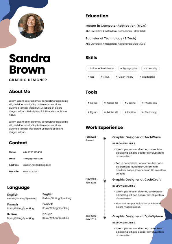
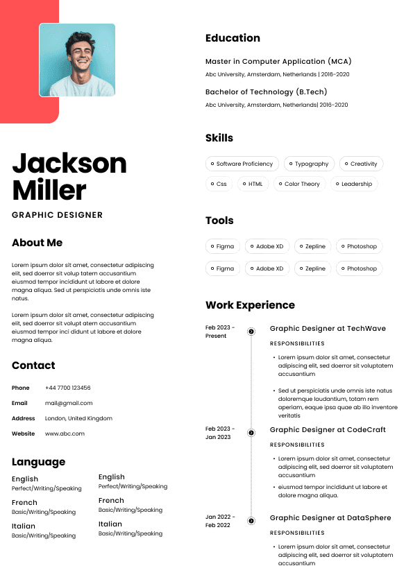
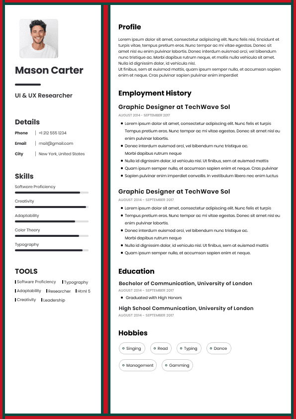
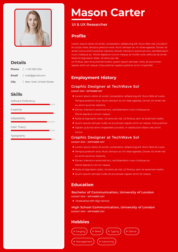
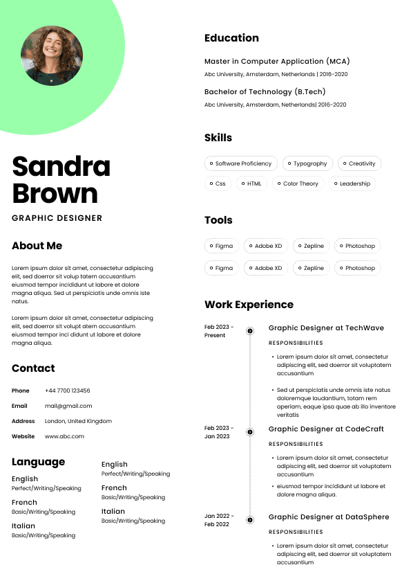
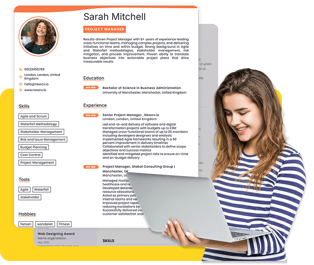
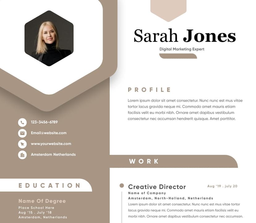
Many Canva templates use sidebars.
Typical examples:
Left side:
Skills
Contact details
Certifications
Right side:
Work experience
Education
Summary
Humans process these layouts easily.
ATS systems sometimes do not.
Some systems read left-to-right.
Another issue competitors rarely explain:
Recruiter behavior.
Most hiring managers do not study resumes.
They scan.
Often extremely quickly.
Studies repeatedly suggest recruiters spend only seconds during initial review.
Scanning behavior usually prioritizes:
Job title relevance
Experience chronology
Recent roles
measurable outcomes
qualifications
Canva templates frequently emphasize aesthetics over scan flow.
Design elements can create friction:
Canva encourages visual expression.
This introduces another problem.
Graphic elements frequently communicate less effectively than text.
Examples:
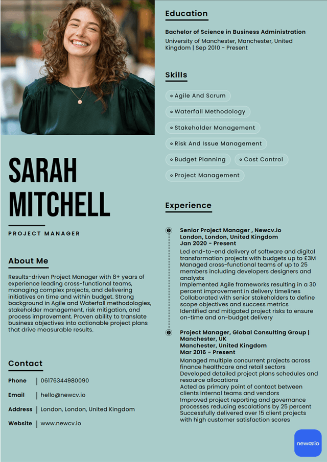
Skill bars:
★★★★★
Progress circles:
85%
Charts:
Leadership — 90%
These create problems.
Questions recruiters often ask:
What does 90% leadership mean?
Compared to whom?
How was it measured?
Visual metrics create ambiguity.
Simple language performs better:
Good Example
Led a team of 12 across product and operations initiatives.
Managed cross-functional delivery timelines.
Weak Example
Leadership: 95%
Communication: 85%
Visual graphics often reduce clarity rather than improve it.
Many Canva users export resumes directly without checking file behavior.
Potential issues include:
Large file sizes
text rendering inconsistencies
embedded font issues
export compression problems
selectable text failures
Some PDFs appear normal visually but contain structural problems underneath.
Before applying:
Highlight text inside the PDF
Copy content into a plain document
The problem is not Canva itself.
The issue is context.
Canva can work well for:
Portfolio resumes
Design industries
Creative roles
personal websites
speaking profiles
marketing applications
visual professions
Examples:
Many users focus only on design.
The larger issue is workflow inefficiency.
Candidates often:
Design resume in Canva
Export PDF
Upload
Test ATS compatibility
Re-edit layout
Re-export
Retest
Adjust formatting
Repeat
This creates friction.
Especially during high-volume applications.
Applying to 50–100 positions magnifies every inefficiency.
Small formatting problems become large productivity costs.
Workflow simplicity matters.
Users rarely switch because Canva looks bad.
They switch because workflows become difficult.
Common frustrations:
ATS uncertainty
repetitive edits
template limitations
multiple file versions
formatting inconsistency
lack of optimization tools
inefficient updating
As application volume grows, users prioritize:
Resume expectations changed significantly.
Users increasingly want:
ATS-friendly structure
modern presentation
personal branding
faster editing
AI-assisted optimization
recruiter readability
Historically, users had to choose:
Professional design
or
ATS performance
That tradeoff created friction.
Modern platforms increasingly combine both.
Solutions like NewCV aim to reduce workflow complexity by combining structured resume architecture with visual presentation and AI-assisted optimization.
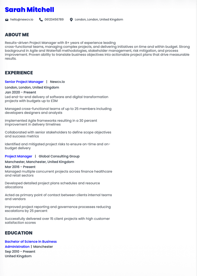
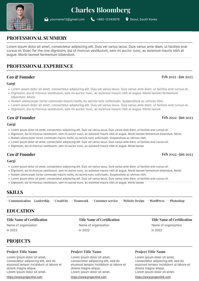
Single-column layouts
Standard section headings
clear hierarchy
readable fonts
simple formatting
measurable accomplishments
consistent structure
Not necessarily.
Canva is not automatically bad.
The issue is understanding where risk exists.
If using Canva:
choose single-column templates
avoid graphics
minimize sidebars
export carefully
test ATS readability
prioritize structure over decoration
Design should support communication.
Not compete with it.
The strongest resumes combine:


Use professional field-tested resume templates that follow the exact Resume rules employers look for.
Create ResumeUse ATS-optimised Resume and resume templates that pass applicant tracking systems. Our Resume builder helps recruiters read, scan, and shortlist your Resume faster.
Use professional field-tested resume templates that follow the exact Resume rules employers look for.
Create ResumeIf you're using Canva for resume creation, the issue usually isn't design quality. The problem is structure. Canva prioritizes visual layout and creative flexibility, while hiring workflows prioritize readability, ATS parsing, speed, and recruiter usability. A resume can look premium yet still create friction inside real hiring systems.
Many candidates unknowingly introduce formatting elements that confuse applicant tracking systems, create inconsistent parsing behavior, or reduce scan efficiency for recruiters. These problems become more noticeable at scale when applying to dozens of roles.
The challenge is not whether Canva resumes work. The challenge is understanding where Canva creates hidden workflow risks—and when those risks matter. Knowing the limitations helps you make better decisions without sacrificing professional presentation.
Visual freedom
Custom layouts
Graphic elements
Creative design flexibility
Aesthetic customization
Those priorities do not always align.
This mismatch creates the core issue.
Unusual spacing systems
These elements may appear perfectly organized to humans while creating ambiguity for parsing software.
Common ATS failures include:
Contact information appearing in incorrect fields
Job dates separating from roles
Skills being missed entirely
Work history reading out of order
Sections merging together incorrectly
Applicants often never realize these failures happened.
The resume looks polished.
The ATS receives something very different.
Others read top-to-bottom.
Some attempt hybrid interpretation.
Results vary.
Instead of:
Name
Experience
Skills
Education
The parser may read:
Skills
Phone number
Education date
Random skill list
Experience title
Structure becomes unpredictable.
Decorative spacing
Side columns
Visual distractions
Heavy graphics
Non-standard content hierarchy
Beautiful design does not always improve readability.
Sometimes it slows it down.
Test upload into resume scanners
Verify reading order
If copied text appears scrambled, ATS systems may experience similar problems.
Graphic designers
Brand strategists
art directors
social media creatives
Visual presentation may matter heavily.
Traditional ATS-heavy applications operate differently.
Corporate recruiting environments often prioritize structured readability over visual differentiation.
speed
consistency
ATS confidence
repeatable workflows
Visual design becomes only one variable.
Reliability becomes more important.
The advantage is not appearance alone.
The larger benefit is workflow simplicity.
Users increasingly prioritize:
fewer formatting decisions
faster updates
easier customization
cleaner recruiter experiences
Graphic-heavy templates
sidebars
text boxes everywhere
visual skill ratings
decorative elements
inconsistent hierarchy
Good resumes reduce friction.
They do not create it.
readability
workflow efficiency
ATS compatibility
recruiter usability
professional presentation
Visual appeal matters.
But usability wins.