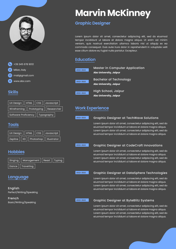
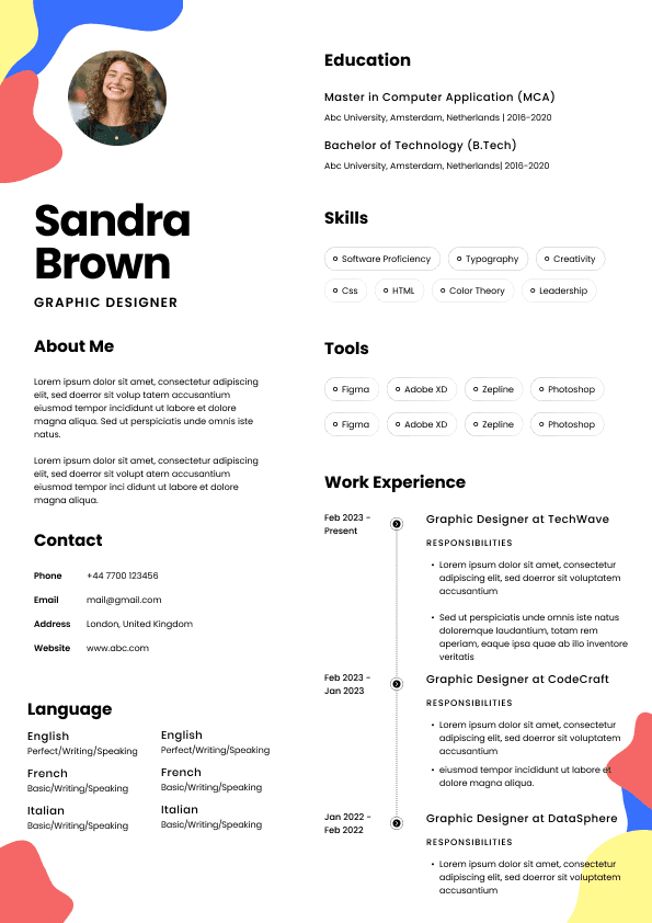
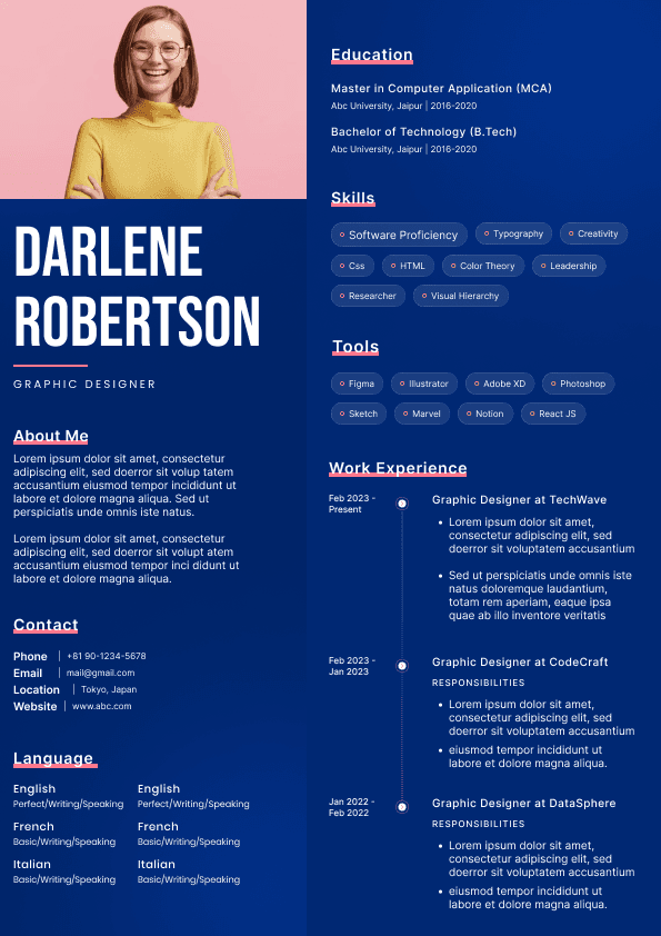
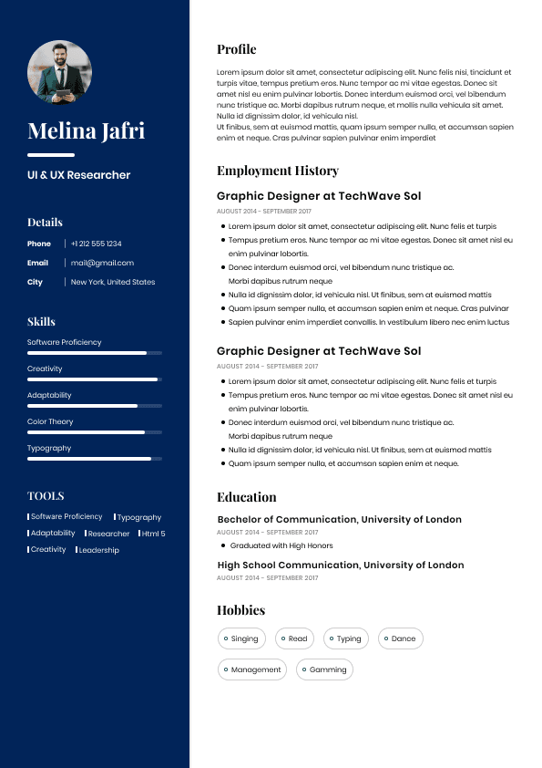
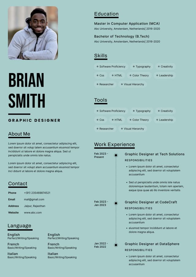
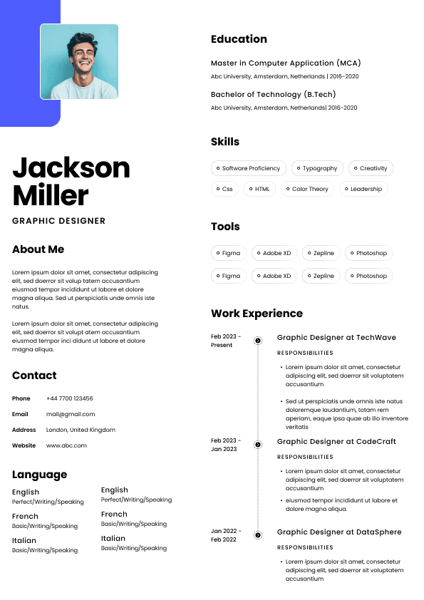
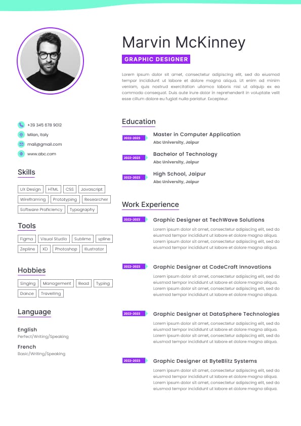
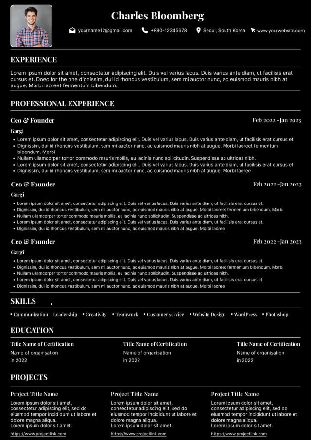
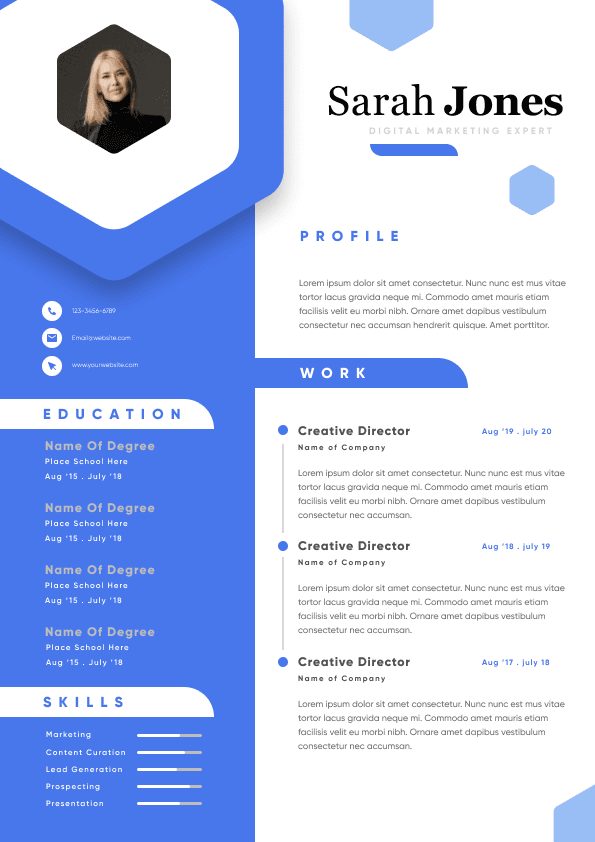
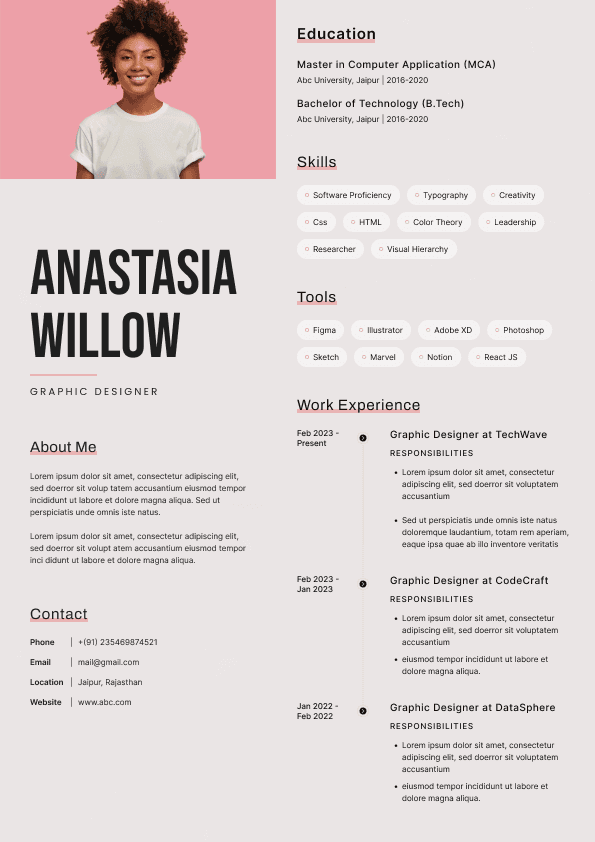
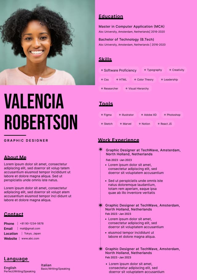
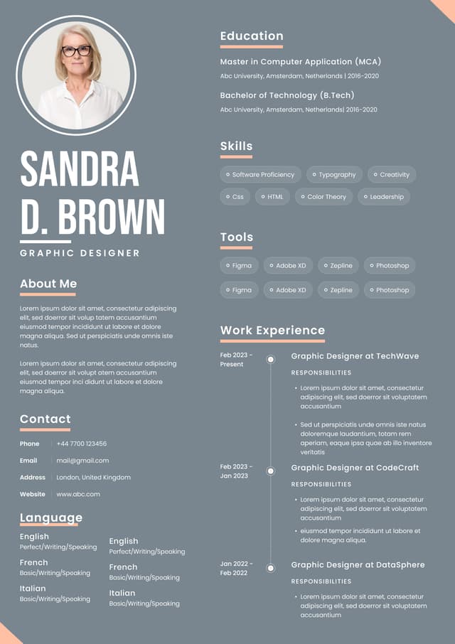
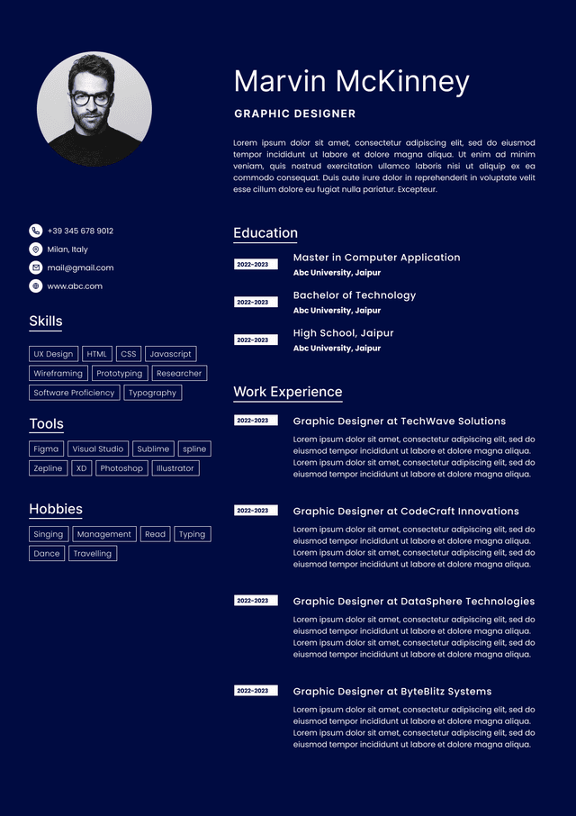
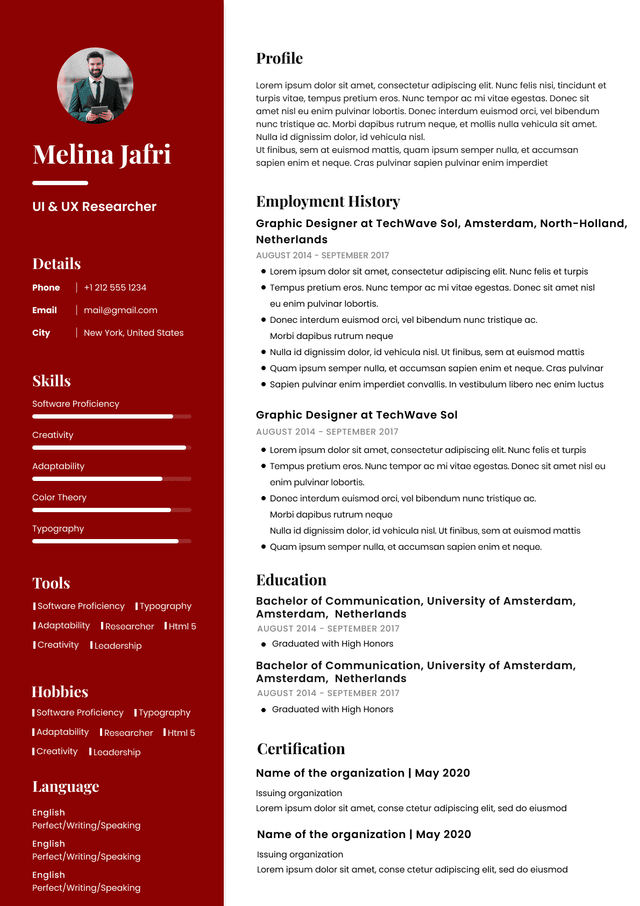
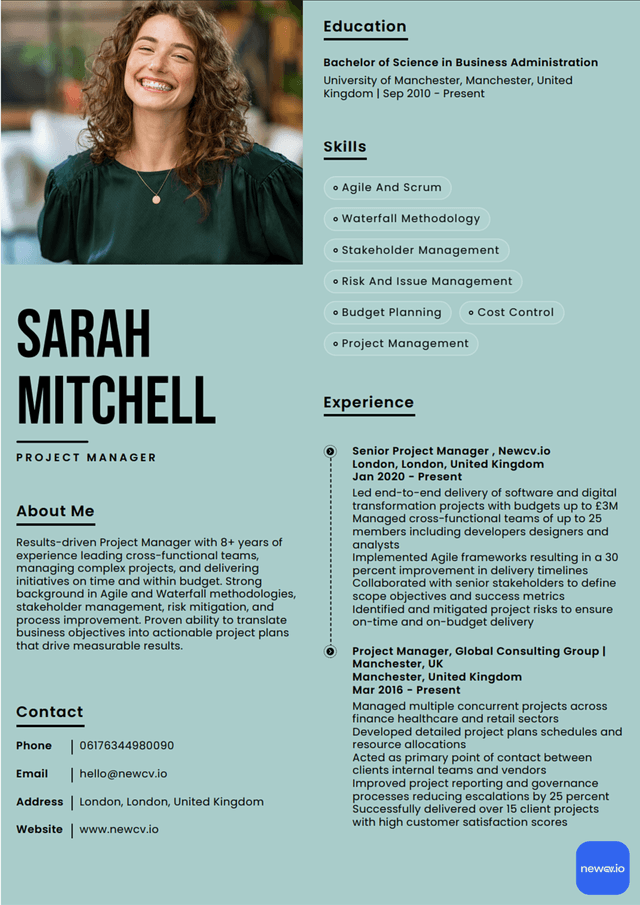
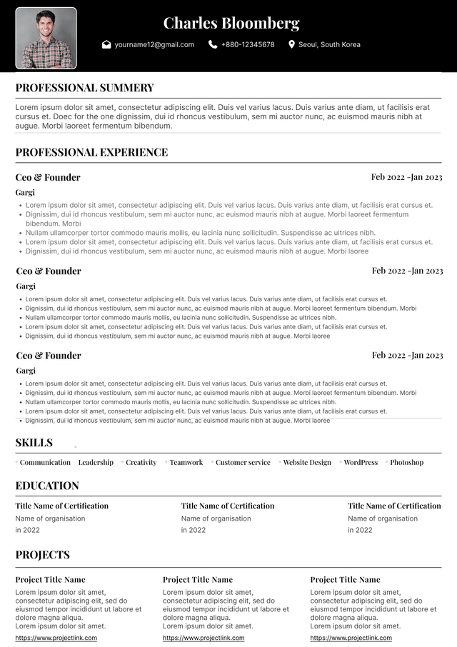
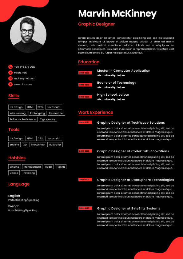
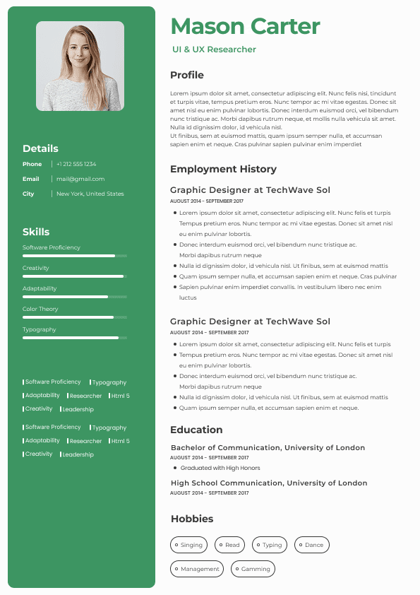
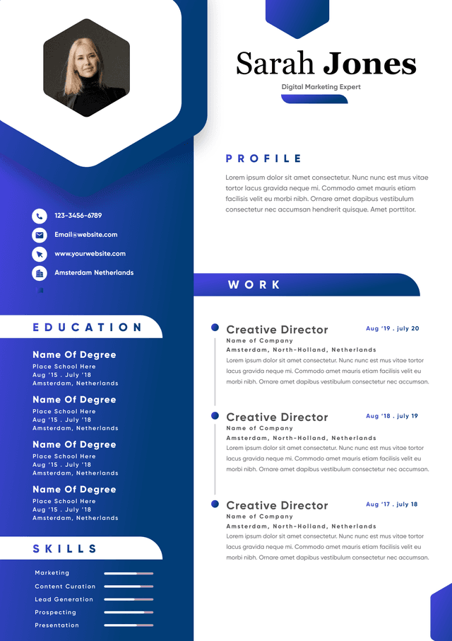
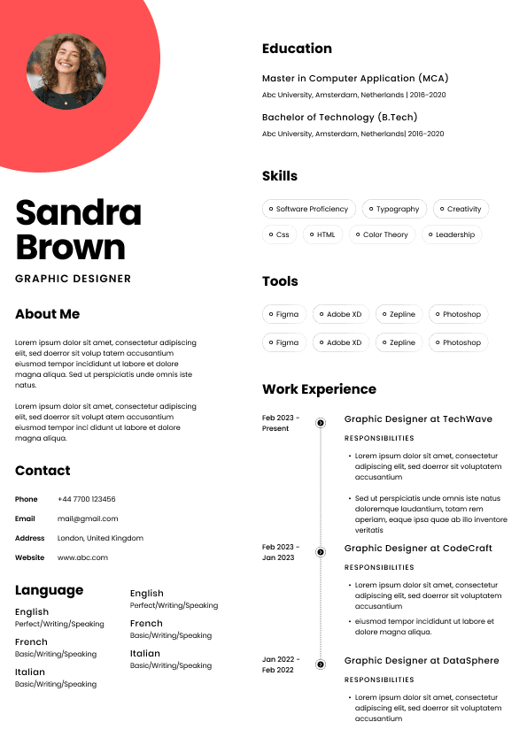
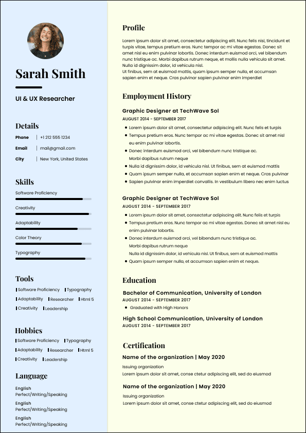
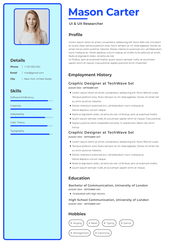
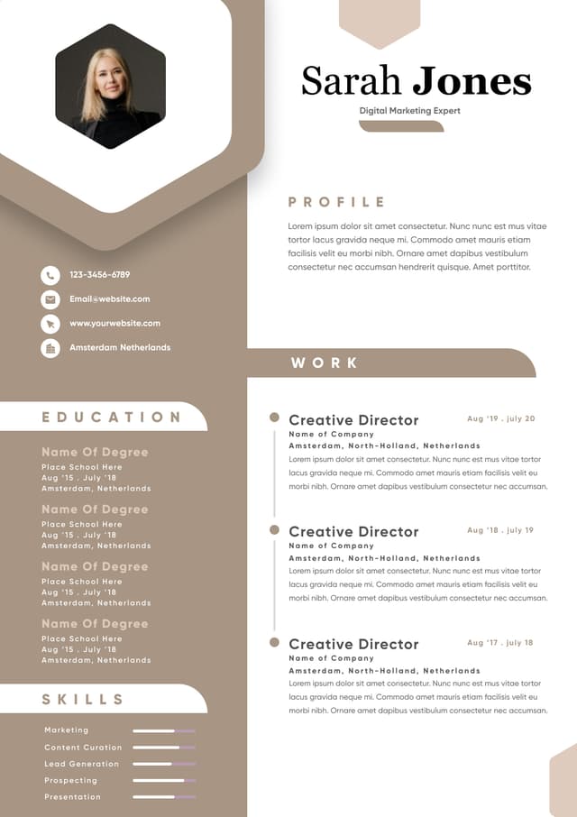
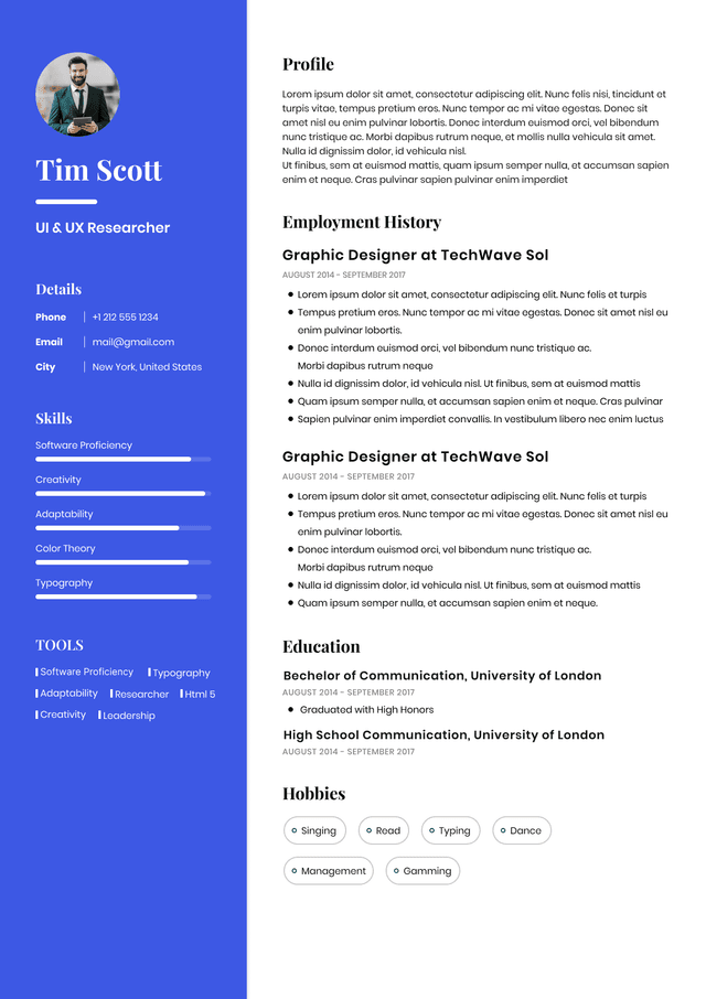
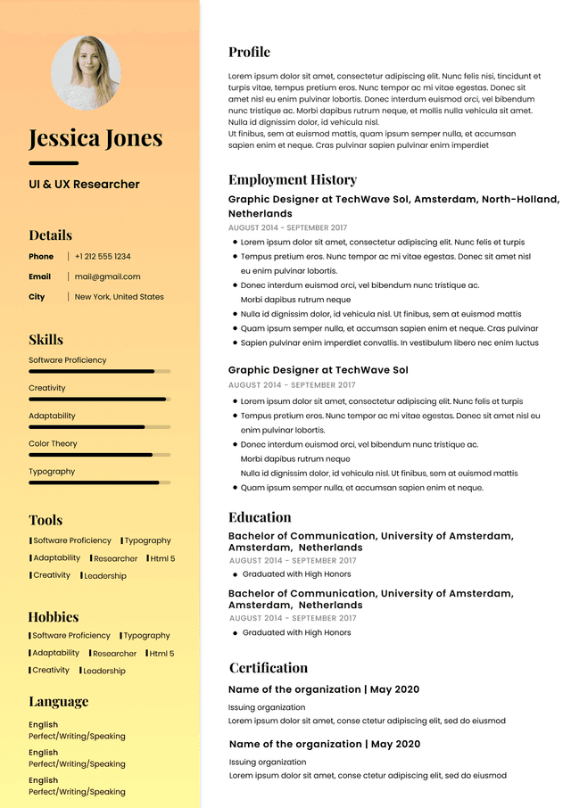
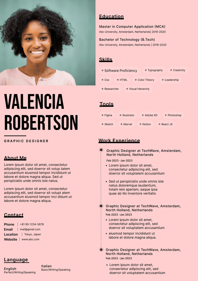
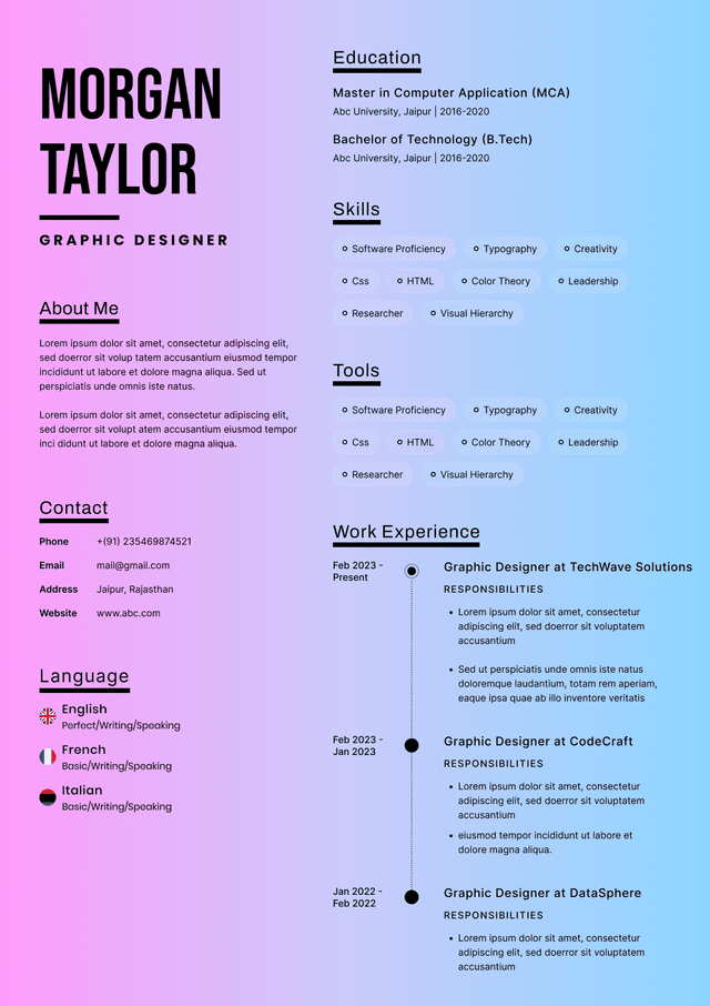
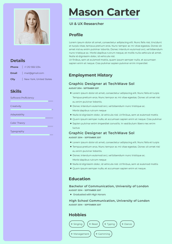
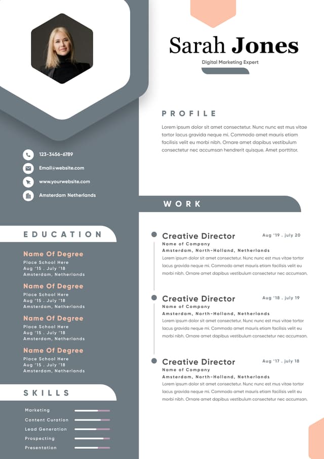
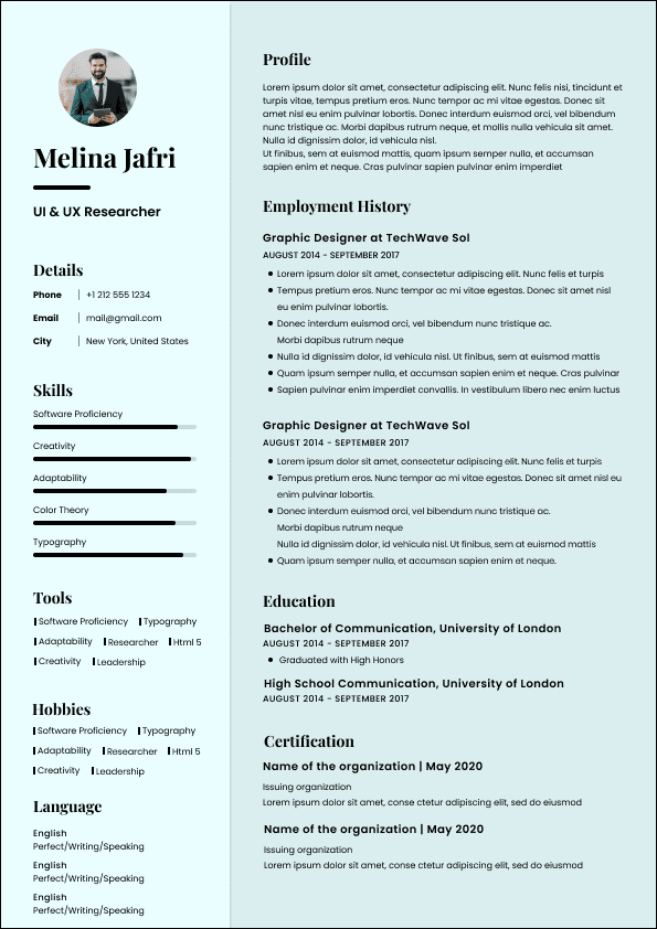
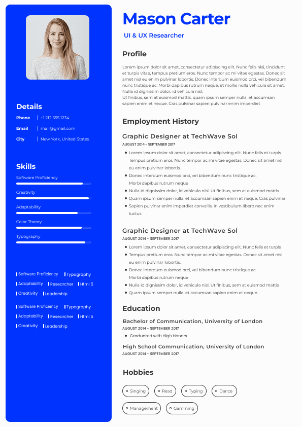
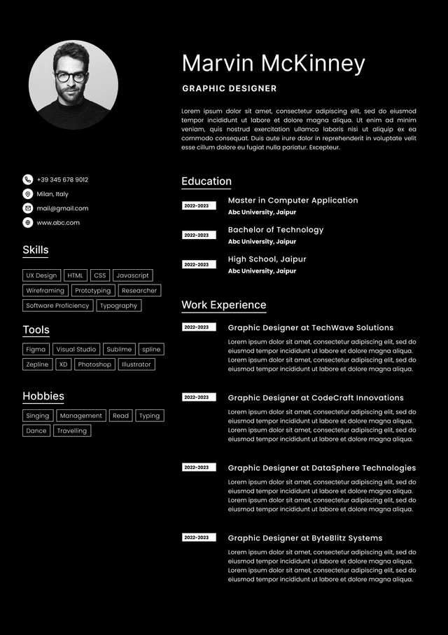
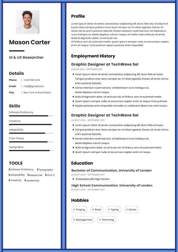
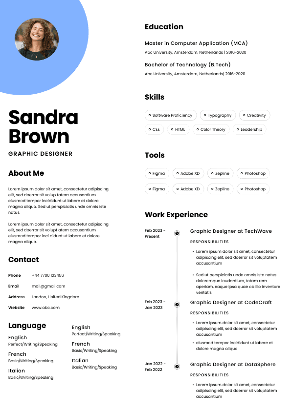
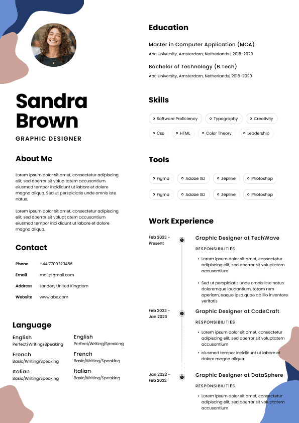
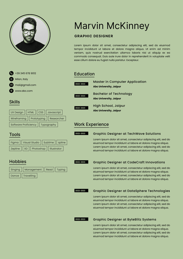
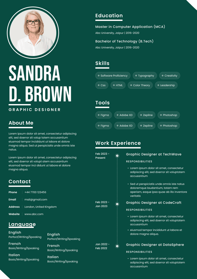
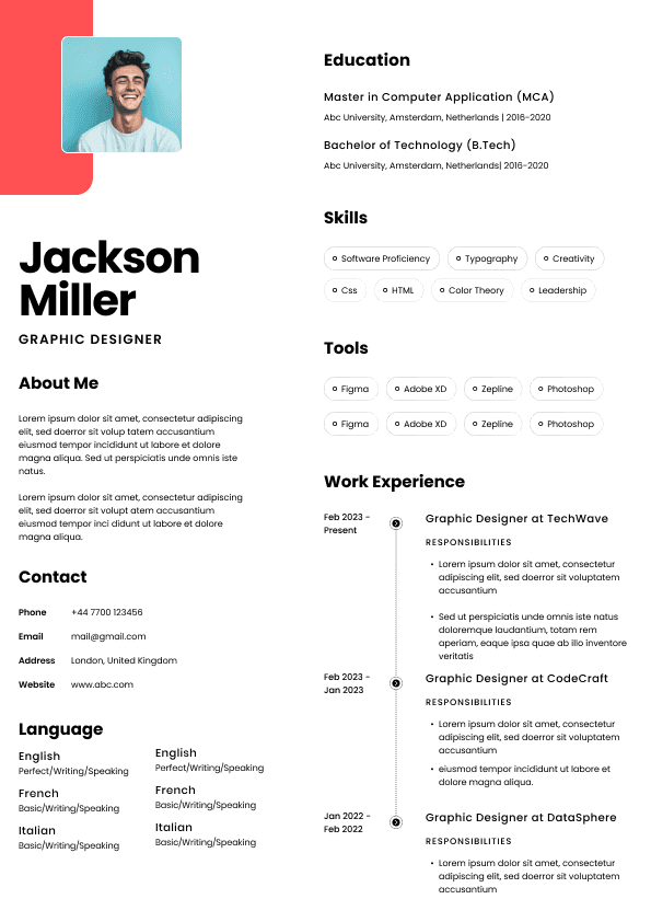
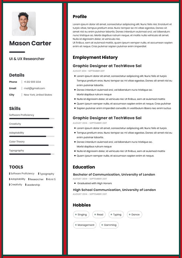
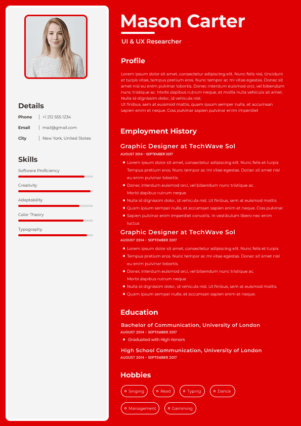
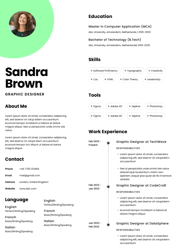
Choose from a wide range of NEWCV resume templates and customize your NEWCV design with a single click.

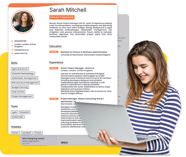

Use professional field-tested resume templates that follow the exact Resume rules employers look for.
Create ResumeMost job seekers think resume font choice is a minor design decision. Recruiters do not. Font selection directly affects how quickly someone can scan your resume, how comfortable it is to read, and whether key information gets absorbed during a fast screening process.
The reality of hiring today is simple: recruiters often spend seconds on an initial resume scan. If your font creates visual friction, forces extra effort, or makes the page feel cluttered, it can quietly work against you before your experience is even evaluated.
A great resume font does not get noticed. It disappears.
The goal is not style. The goal is readability.
Hiring managers are not scoring creativity in font selection. They are unconsciously responding to ease of processing. When information is easy to read, candidates often appear more organized, clearer, and more credible.
That effect matters more than most people realize.
Most resume advice online talks about applicant tracking systems and keywords. Far fewer sources explain how human screening actually works.
Recruiters do not read resumes line by line on the first pass.
They scan for patterns:
•Job titles
• Company names
• Career progression
• Skills alignment
• Education
• Keywords tied to role requirements
• Metrics and accomplishments
During a first review, the brain looks for signals quickly.
If your font makes scanning harder, even slightly, several things happen:
•Eye movement slows
• Important information becomes harder to locate
• Cognitive fatigue increases
• Resume sections blend together
• Achievements become easier to overlook
Recruiters rarely think:
"This font is bad."
Instead they think:
"This candidate feels harder to evaluate."
That distinction matters.
Candidates often assume rejection happens because of experience gaps. In many cases, poor presentation quietly reduces engagement before qualifications are fully processed.
There is a concept in behavioral psychology called processing fluency.
Information that feels easier to process often creates stronger positive reactions.
When people absorb information effortlessly, they tend to perceive it as:
•More credible
• More professional
• Better organized
• More trustworthy
• Higher quality
Recruiters are not immune to this.
If two candidates have similar experience, the easier resume to review frequently creates a stronger first impression.
This does not mean font determines hiring outcomes by itself.
It means presentation can influence perception when recruiters compare candidates quickly.
That is especially important in competitive hiring markets where dozens or hundreds of applicants may meet minimum qualifications.
The strongest resume fonts prioritize clarity over personality.
These consistently perform well across ATS systems, desktop screens, mobile devices, and recruiter reviews.
•Calibri
• Arial
• Helvetica
• Georgia
• Cambria
• Aptos
• Verdana
• Tahoma
These fonts work because they:
•Have clean letter spacing
• Remain readable at smaller sizes
• Display consistently across devices
• Separate characters clearly
• Reduce visual strain
Calibri became widely used because it balances modern appearance with readability.
Georgia performs especially well for candidates wanting a slightly more traditional appearance without sacrificing readability.
Arial and Helvetica remain safe choices because of their simplicity.
Aptos is increasingly appearing in newer workplace systems and may become more common going forward.
Some fonts create subtle problems that candidates overlook.
Common issues include:
•Letters crowding together
• Decorative elements distracting attention
• Inconsistent screen rendering
• Difficult scanning patterns
• Poor small size readability
Fonts that frequently create problems include:
•Times New Roman in dense layouts
• Comic Sans
• Papyrus
• Brush Script
• Courier
• Decorative display fonts
Times New Roman deserves nuance.
It is not inherently bad.
The issue is that many candidates pair it with cramped formatting and small sizes. The result often feels visually dense and outdated.
A font is rarely bad in isolation.
The combination of font, spacing, margins, and page structure determines readability.
One of the biggest debates involves serif and sans serif fonts.
Serif fonts contain small decorative strokes at letter edges.
Examples:
•Georgia
• Cambria
• Times New Roman
Sans serif fonts remove these strokes.
Examples:
•Arial
• Calibri
• Helvetica
• Aptos
For modern resume readability, sans serif fonts usually perform better on screens.
Why?
Most recruiting now happens digitally.
Recruiters often review resumes on:
•Applicant tracking systems
• Desktop monitors
• Laptops
• Mobile devices
• Internal recruiting software
Sans serif fonts generally maintain cleaner readability in digital environments.
That said, serif fonts like Georgia and Cambria still work very well when used correctly.
The question is less about rules and more about context.
Candidates often focus heavily on font selection and ignore size.
This is a mistake.
Even excellent fonts become difficult to read when compressed.
General guidelines:
•Name: 18 to 24 point
• Headings: 12 to 14 point
• Body text: 10 to 12 point
Many candidates shrink text to fit extra content.
Recruiters notice immediately.
Dense resumes create resistance.
A common hiring reality:
Candidates rarely lose opportunities because a resume is too short.
They frequently lose opportunities because the resume feels overwhelming.
White space improves readability more than squeezing additional information onto the page.
Weak Example
Font: Times New Roman
Size: 9 pt
Minimal spacing
Dense paragraphs
Compressed margins
Result:
The resume feels crowded and difficult to scan.
Recruiters often skim faster and absorb less information.
Good Example
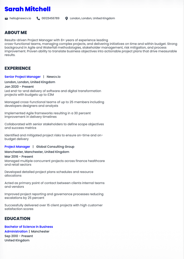
Font: Calibri
Size: 11 pt
Consistent spacing
Clear section separation
Balanced margins
Result:
Information becomes easier to process quickly.
Accomplishments stand out.
Scanning improves dramatically.
Many resume problems are not obvious.
Candidates often create readability issues unintentionally.
Common mistakes include:
•Mixing multiple fonts
• Using different body text sizes
• Excessive italics
• Heavy underlining
• Condensed spacing
• Overusing bold formatting
• Using custom downloaded fonts
• Shrinking text under 10 point
Too much formatting creates visual noise.
Recruiters should instantly recognize hierarchy:
•Name
• Headlines
• Sections
• Experience
• Accomplishments
If everything stands out, nothing stands out.
Applicants often worry that ATS software rejects resumes because of font choices.
Usually this concern is exaggerated.
Modern applicant tracking systems can process most standard fonts effectively.
Problems typically happen when candidates use:
•Decorative fonts
• Graphic text elements
• Embedded images instead of text
• Unusual symbols
• Text boxes used excessively
ATS failures usually stem from formatting decisions rather than font choice alone.
Safe fonts reduce risk.
But readability for human reviewers remains more important than chasing ATS myths.
Strong resumes follow a practical readability structure.
Think of it as visual hierarchy rather than design.
Use:
•One primary font
• Consistent font sizes
• Clear section breaks
• Strong spacing
• Strategic bolding
• Bullet formatting that supports scanning
• Balanced white space
Every formatting choice should answer one question:
Can a recruiter find important information immediately?
If not, simplify.
Hiring managers rarely comment on fonts.
But they absolutely react to readability.
After reviewing thousands of resumes, patterns become obvious.
Strong resumes often feel:
•Easy to scan
• Organized
• Professional
• Fast to understand
• Low effort to review
Weak resumes often feel:
•Busy
• Dense
• Chaotic
• Hard to process
• Visually exhausting
Candidates frequently underestimate how much these emotional reactions influence screening.
Hiring decisions involve psychology as much as qualifications.
The best resume font is the one recruiters barely notice because the information flows effortlessly.
Calibri, Arial, Georgia, Helvetica, Cambria, and Aptos consistently perform well because they support readability rather than competing for attention.
Do not optimize for uniqueness.
Optimize for clarity.
A recruiter should spend mental energy evaluating your experience, not decoding your formatting.
That single distinction often separates resumes that get skimmed from resumes that get seriously considered.
Use ATS-optimised Resume and resume templates that pass applicant tracking systems. Our Resume builder helps recruiters read, scan, and shortlist your Resume faster.

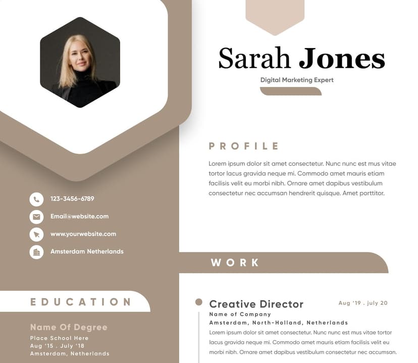
Use professional field-tested resume templates that follow the exact Resume rules employers look for.
Create Resume