Choose from a wide range of NEWCV resume templates and customize your NEWCV design with a single click.


Use professional field-tested resume templates that follow the exact Resume rules employers look for.
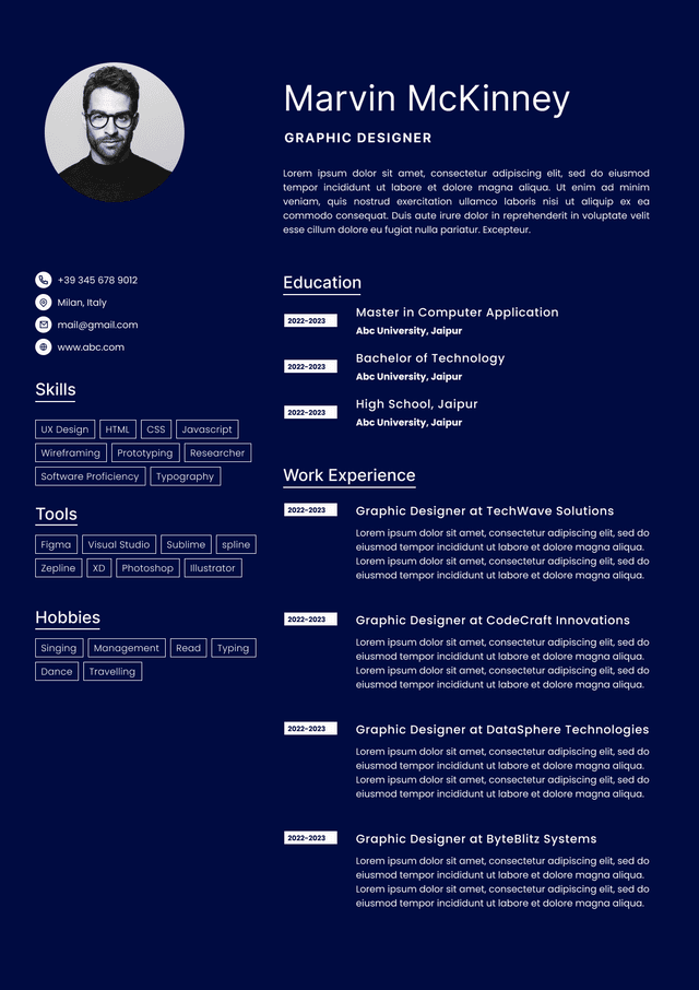
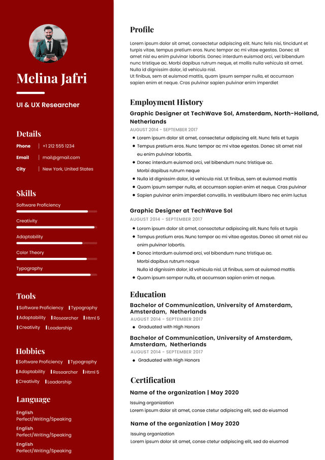
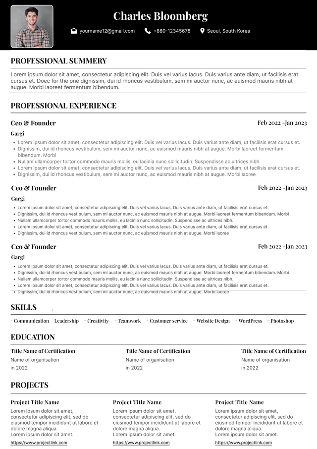
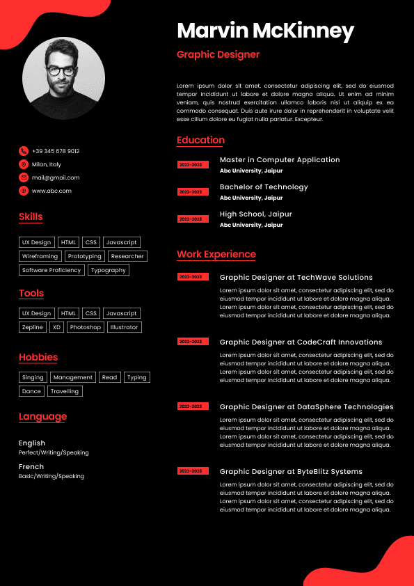
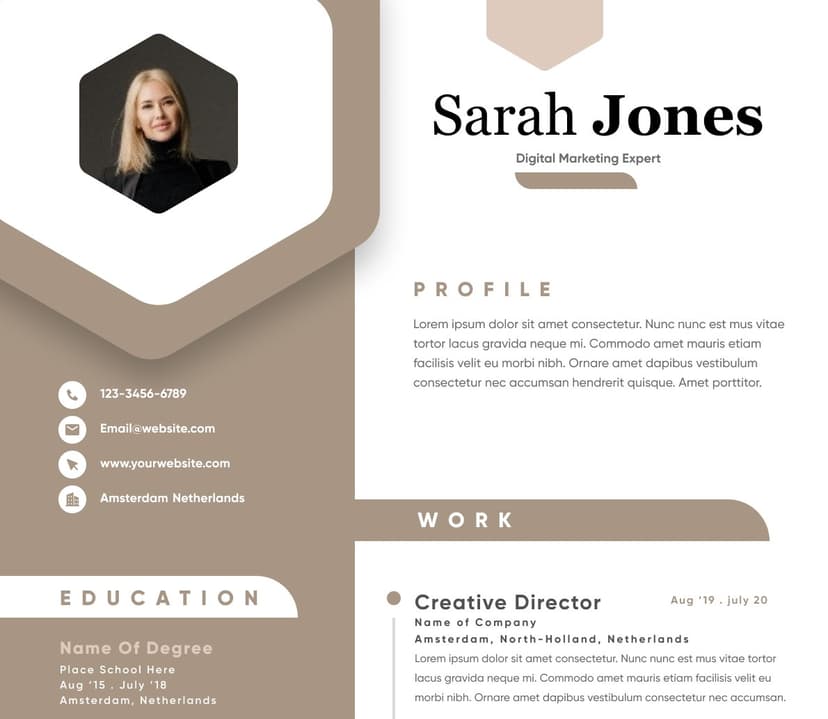
Create ResumeResume graphics can absolutely interfere with Applicant Tracking Systems (ATS), and in many cases, they fail in ways job seekers never realize. Charts, icons, text boxes, skill bars, tables, logos, side columns, and visual design elements may look polished to humans but can confuse resume parsing software. The result is often invisible damage: missing keywords, scrambled work history, misplaced contact information, or skills that never get indexed.
This matters because ATS software is frequently the first gatekeeper. Recruiters often review parsed candidate profiles before opening the original resume file. If graphics disrupt parsing, your qualifications may never appear correctly in the system. A visually impressive resume that cannot be read properly is often less effective than a clean, simple format.
The goal is not creating an ugly resume. The goal is creating a resume that machines can interpret and humans can quickly scan.
Most candidates misunderstand how resume screening works.
Many assume the ATS simply stores a PDF and forwards it to a recruiter. Modern hiring systems do much more.
When you upload a resume, the system usually:
Extracts contact information
Parses work experience
Identifies job titles
Pulls skills and certifications
Detects education
Maps dates and employment history
Builds a structured candidate profile
Matches keywords against the job posting
Recruiters often search this parsed profile rather than reading every uploaded document individually.
That creates an important reality:
If your content parses incorrectly, your experience can become partially invisible.
The resume file may look perfect to you and still appear broken inside the hiring system.
ATS software reads text differently than humans.
Humans understand visual structure instantly. Software often reads content line by line and follows document order.
Graphics introduce ambiguity.
Common resume graphics that create problems include:
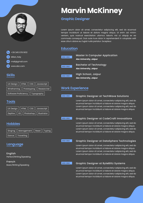
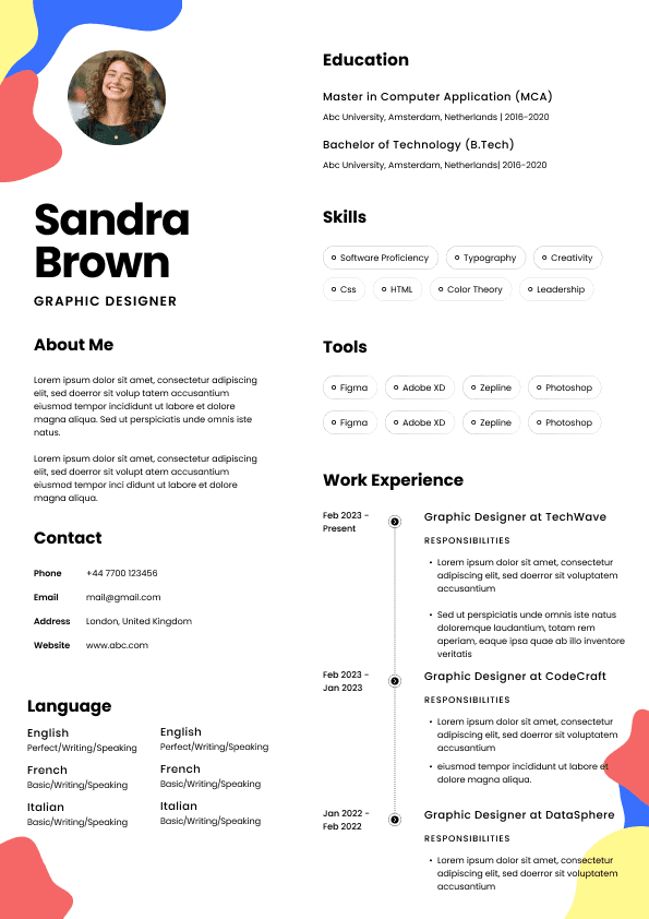
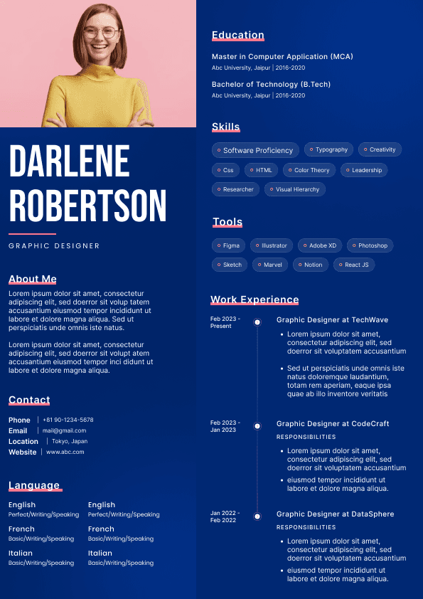
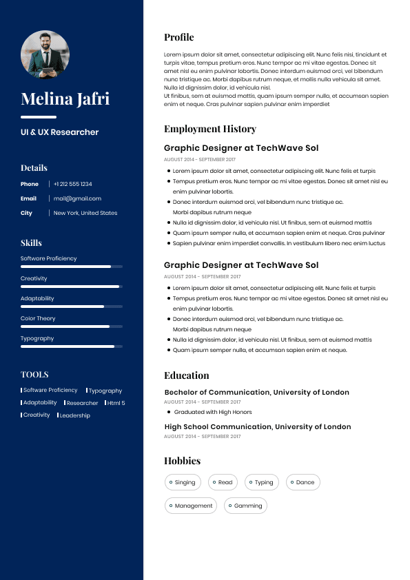
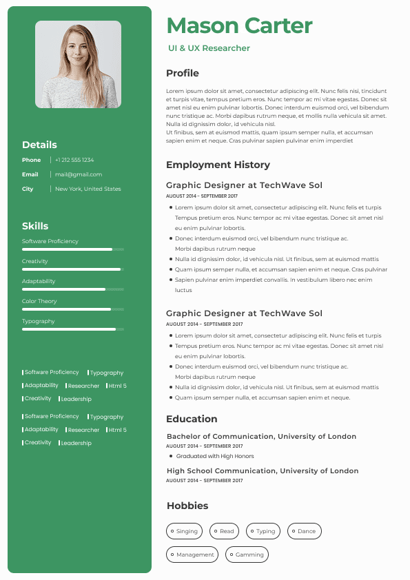
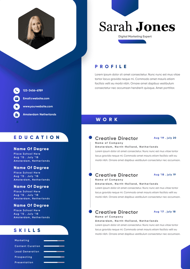
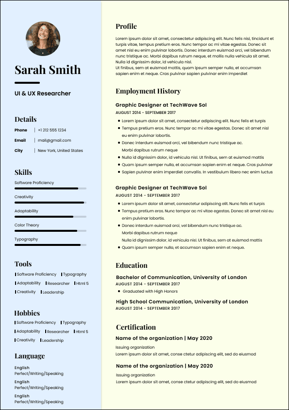
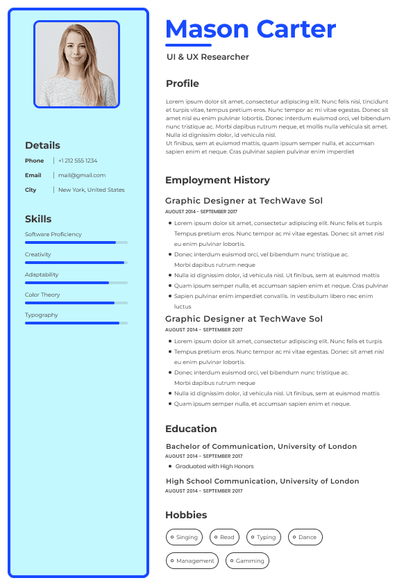
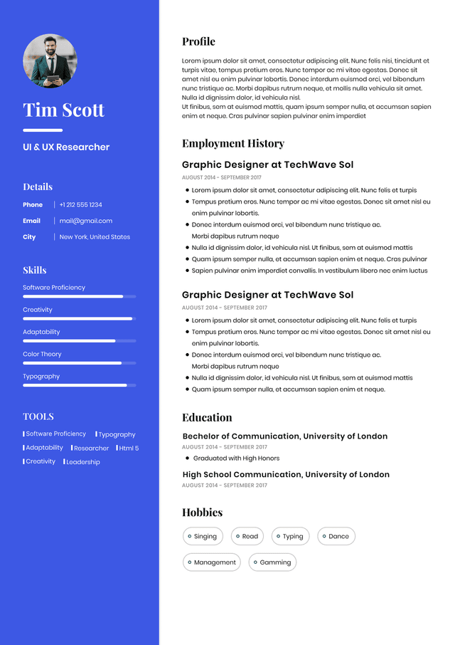
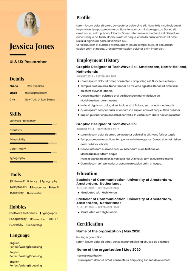
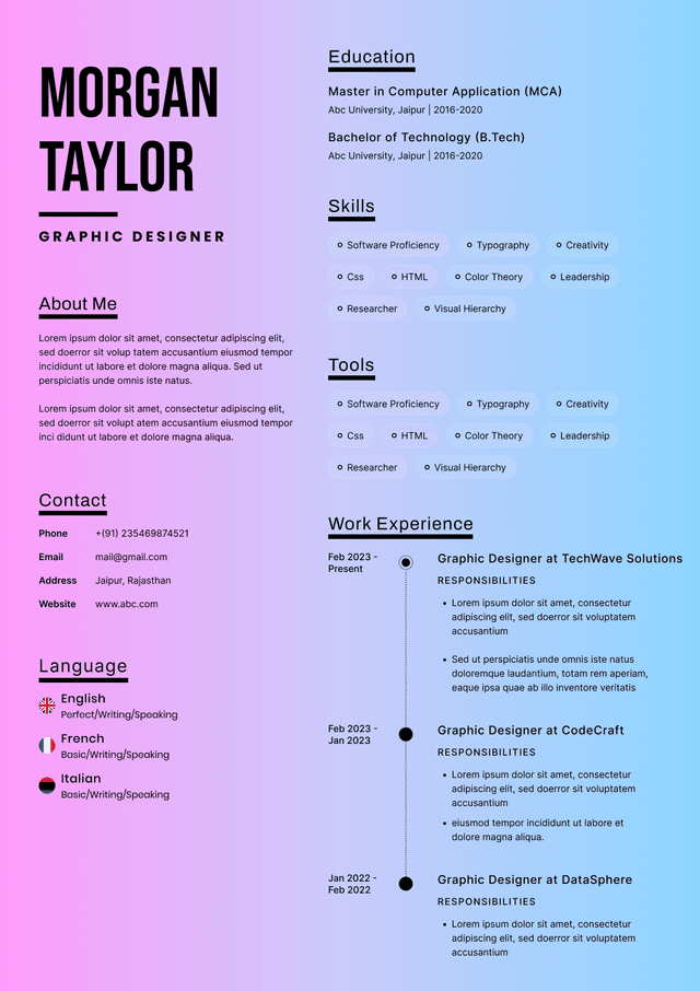
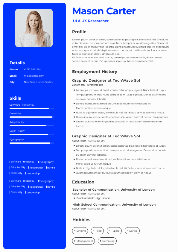
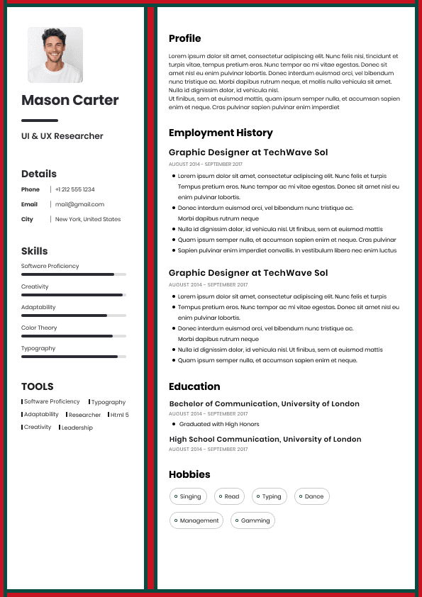
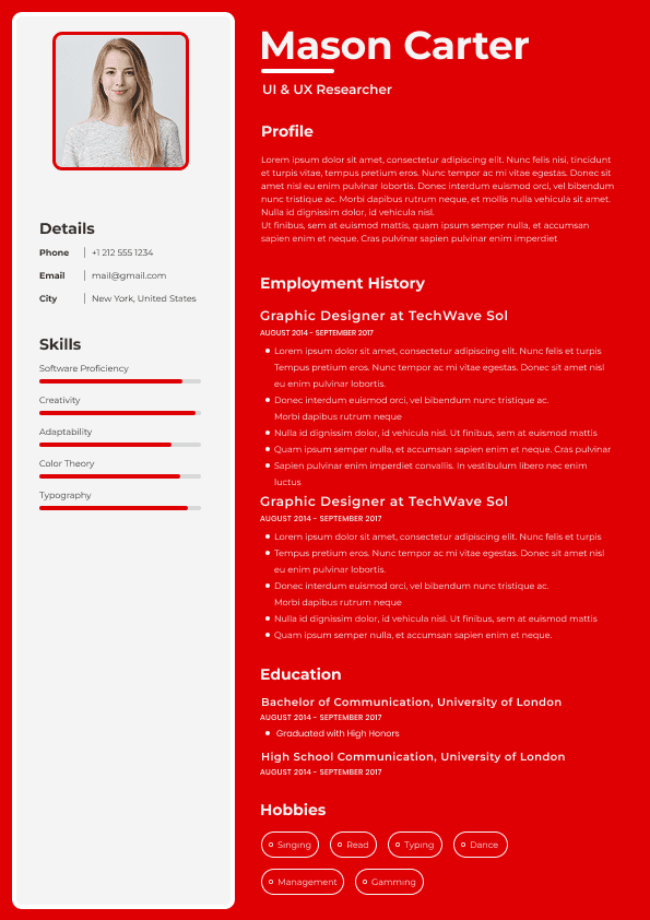
Skill bars
Star ratings
Icons
Infographics
Logos
Timelines
Sidebars
Text boxes
Charts
Tables
Columns with embedded graphics
Progress indicators
Decorative headers
Images containing text
Many systems struggle to determine:
Reading order
Content hierarchy
Section relationships
Embedded text placement
The result can become chaotic.
A skills section designed as visual progress bars may parse as:
"Leadership 90% Project Management 75% Communication 80"
Or:
"Leadership Communication Management"
Or disappear entirely.
The candidate never sees the failure.
The recruiter sees incomplete information.
Candidates increasingly replace labels with icons.
Examples:
📧 instead of Email
📞 instead of Phone
📍 instead of Location
Visually this appears modern.
ATS systems may ignore symbols completely.
Weak Example
📧 john@email.com
Good Example
Email: john@email.com
Simple labels create better parsing consistency.
This is one of the most common ATS mistakes.
Candidates create visual systems such as:
Python ████████
Excel ██████
Leadership ★★★★★
Recruiters generally dislike these for two reasons:
First, ATS systems often misread them.
Second, they communicate almost nothing useful.
What does 80% Python actually mean?
What defines 5 out of 5 leadership?
Hiring managers evaluate demonstrated experience, not self-scored graphics.
A stronger approach:
Good Example
Skills: Python, SQL, Tableau, Power BI, Excel, Salesforce
Or:
"Built Python automation workflows reducing reporting time by 40%."
Demonstrated outcomes outperform visual ratings every time.
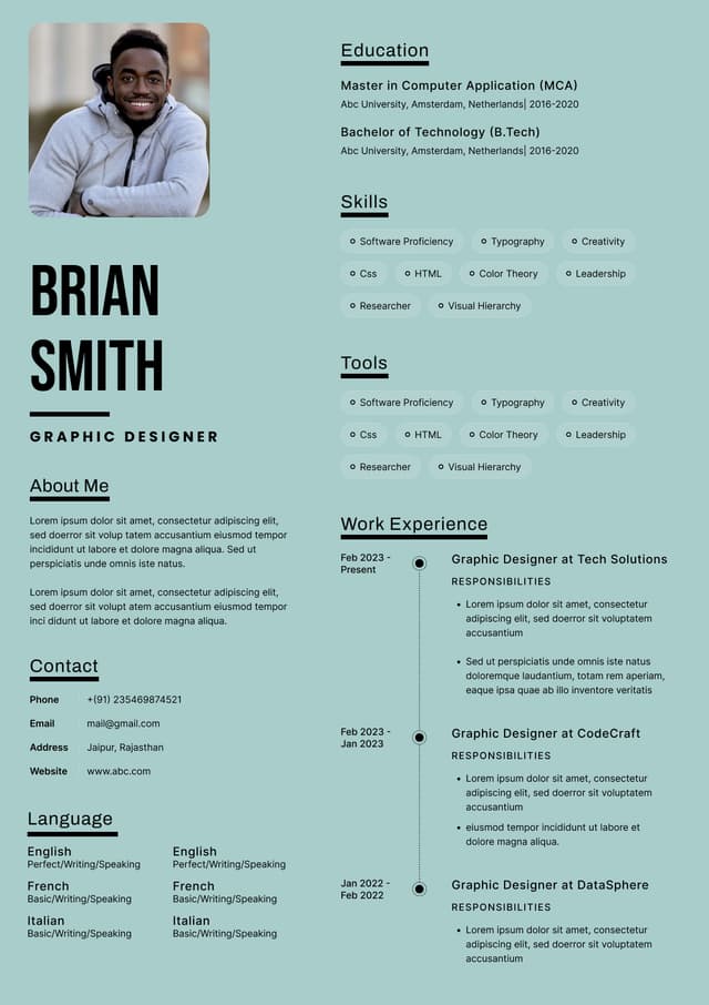
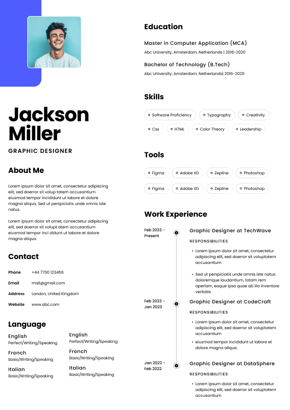
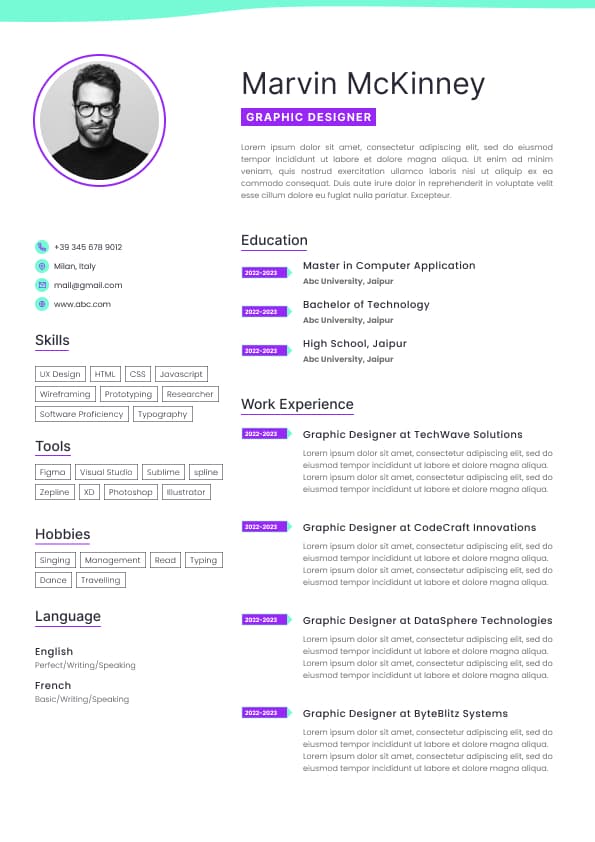
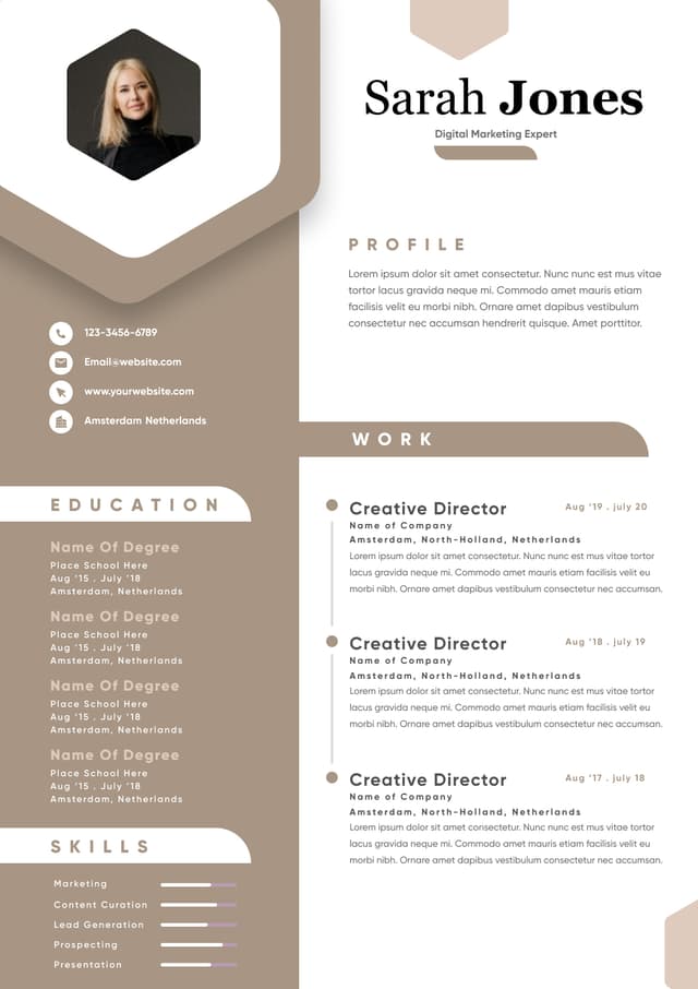
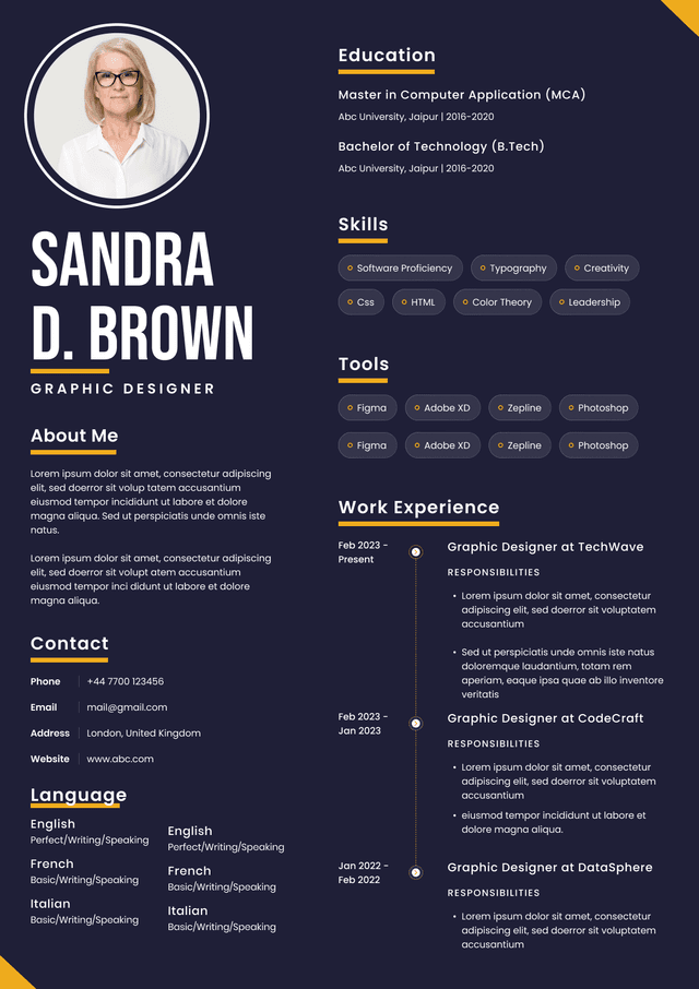
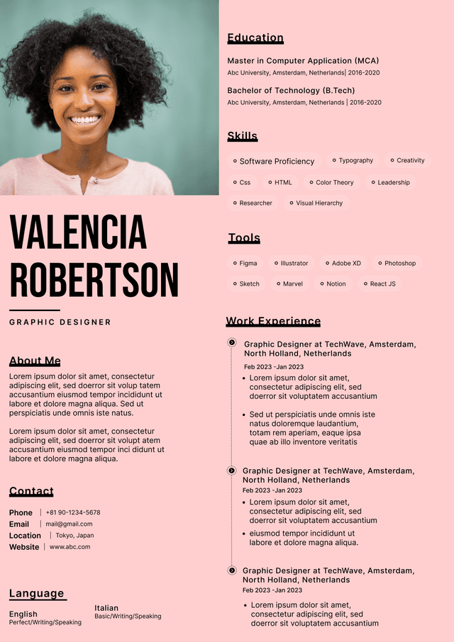
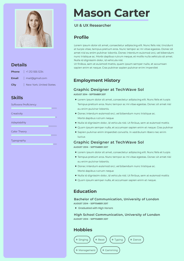
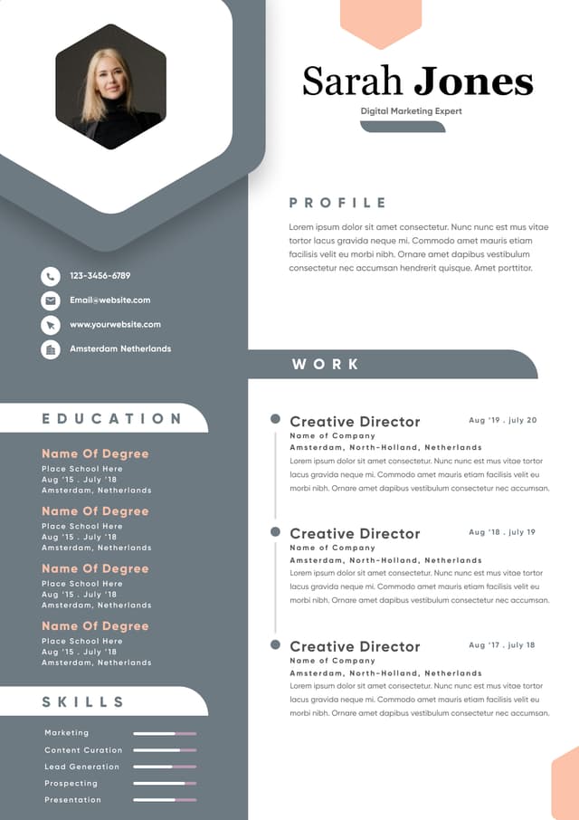
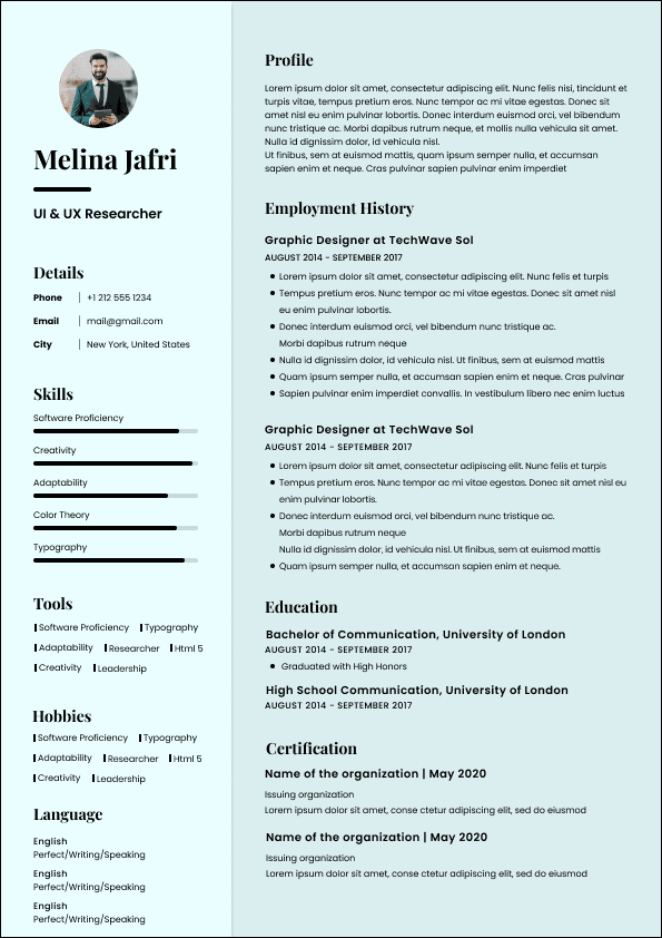
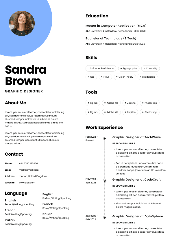
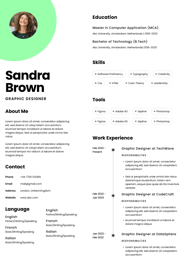
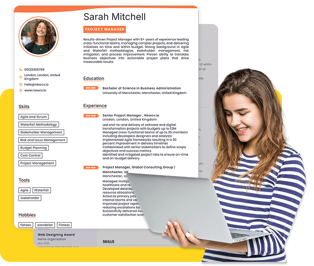
Many modern templates use sidebars.
Typical layouts:
Left side:
Contact information
Skills
Certifications
Main section:
Experience
Education
Humans read this easily.
ATS systems sometimes read horizontally.
That can create output like:
"Marketing Manager Chicago Illinois Leadership Salesforce ABC Company"
Suddenly information appears mixed together.
Recruiters reviewing parsed profiles may see confusing records.
This becomes more common when resumes use:
Narrow side columns
Floating text boxes
Graphic containers
Imported design templates
Simple single column structures remain safer.
Candidates frequently use tables to organize information:
| Skills | Software |
| Certifications | Languages |
Looks organized.
ATS parsing frequently struggles.
The software may read:
Software Skills Languages Certifications
or skip cells entirely.
Simple text formatting usually works better:
Skills: Salesforce, HubSpot, Excel, SQL
Certifications: PMP, Google Analytics
Less visual complexity often means more reliable extraction.
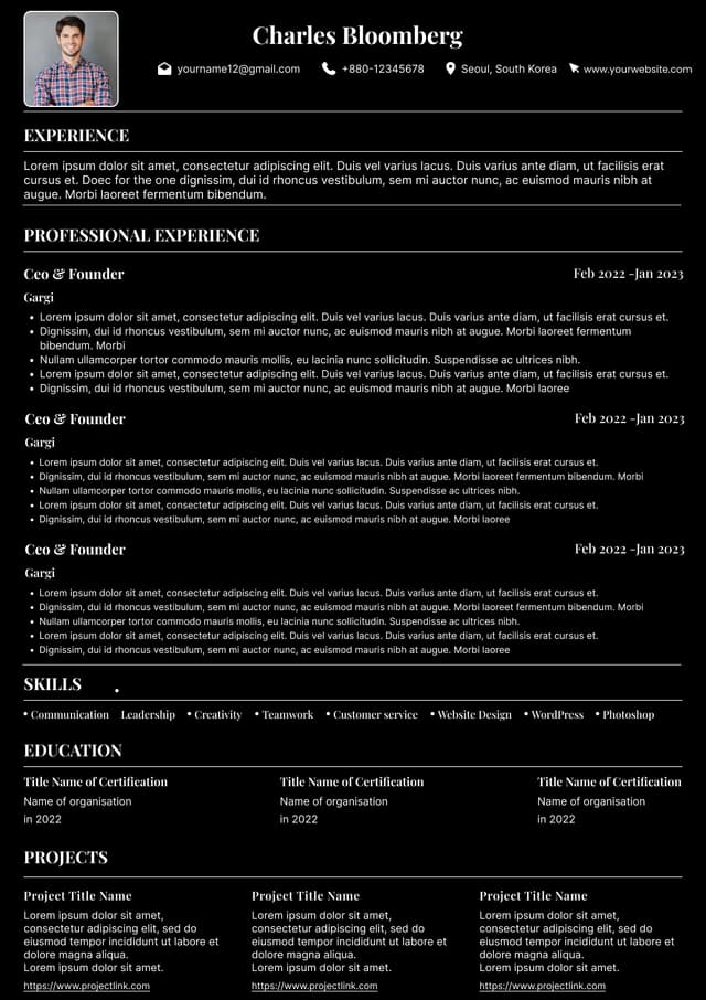
Some candidates create resume headers in design tools and export them as graphics.
Examples:
Name embedded into a banner image
Contact information inside a graphic
Skills inside icons
Branded headers
Humans see them.
ATS software may see nothing.
If contact information exists only inside an image, systems may fail to capture:
Name
Phone number
LinkedIn profile
This creates catastrophic parsing failures.
Many candidates ask:
"Should I submit PDF or Word?"
The answer depends less on file extension and more on structure.
Modern ATS systems often process PDFs successfully.
Problems happen when PDFs contain:
Graphic elements
Design software exports
Layered objects
Complex formatting
Embedded visual structures
A simple PDF usually performs fine.
A highly designed PDF exported from graphic software creates more risk.
If uncertain:
Submit a .docx file unless the employer requests otherwise.
Candidates often believe visually impressive resumes stand out.
That assumption is partly wrong.
Recruiters typically spend very little time during initial review.
They scan for:
Job title relevance
Recent experience
measurable accomplishments
industry keywords
scope of responsibility
progression
alignment with requirements
A graphic-heavy resume can slow scanning.
Visual design should support readability.
It should never compete with content.
A recruiter rarely rejects a candidate because a resume looked too simple.
Candidates get rejected because key information was unclear or missing.
There is an important distinction many job seekers miss.
Good formatting:
Clear headings
White space
consistent spacing
logical structure
readable fonts
strong hierarchy
Bad formatting:
Decorative icons
graphics replacing text
excessive color usage
skill meters
visual gimmicks
infographic layouts
Design improves readability.
Decoration often creates friction.
Before submitting your resume:
Copy all content.
Paste into plain text.
Look at the result.
Questions:
Is information in the correct order?
Did section titles survive?
Did dates remain attached to jobs?
Are skills intact?
Did contact information stay visible?
Is anything missing?
If plain text looks messy, ATS systems may struggle too.
You can also upload resumes into ATS simulation tools.
But simple text extraction often reveals problems quickly.
Safer formatting usually includes:
Single column layout
Standard headings
Clear section labels
simple bullet structure
no embedded graphics
no icons replacing labels
minimal tables
text based formatting
standard fonts
consistent spacing
Common section headings:
Summary
Experience
Skills
Education
Certifications
Predictable structure helps systems classify information correctly.
Candidates often assume:
"If my resume looks better, I'll stand out."
Sometimes the opposite happens.
Graphic-heavy resumes can create invisible disadvantages:
Lower keyword extraction
Missing skills
Broken employment history
inaccurate parsing
weaker search visibility inside ATS databases
recruiter confusion
These issues rarely generate error messages.
The resume simply performs worse.
That makes them dangerous.
Candidates may spend months improving content while the actual problem is formatting.
Strong accomplishment bullets
measurable outcomes
standard formatting
clear organization
readable structure
ATS friendly layouts
Skill bars
infographic resumes
icons replacing text
excessive graphics
text inside images
complicated multi column layouts
Hiring systems reward clarity.
Recruiters reward relevance.
Both reward simplicity.
Candidates often overestimate design and underestimate discoverability.
Inside ATS databases, recruiters frequently search:
"Project Manager + Agile + SaaS"
or:
"Financial Analyst + Tableau + SQL"
If your skills failed to parse because of visual formatting, you may never appear in search results.
That means resume graphics do not just create readability issues.
They can affect whether you appear at all.
That changes the entire job search equation.
Use ATS-optimised Resume and resume templates that pass applicant tracking systems. Our Resume builder helps recruiters read, scan, and shortlist your Resume faster.

Use professional field-tested resume templates that follow the exact Resume rules employers look for.
Create Resume