Choose from a wide range of NEWCV resume templates and customize your NEWCV design with a single click.
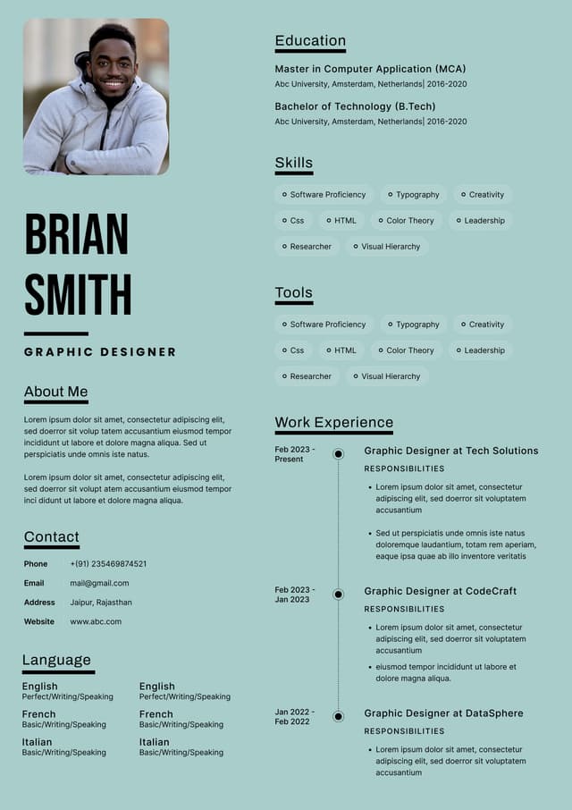
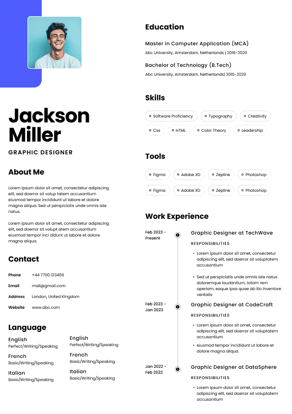
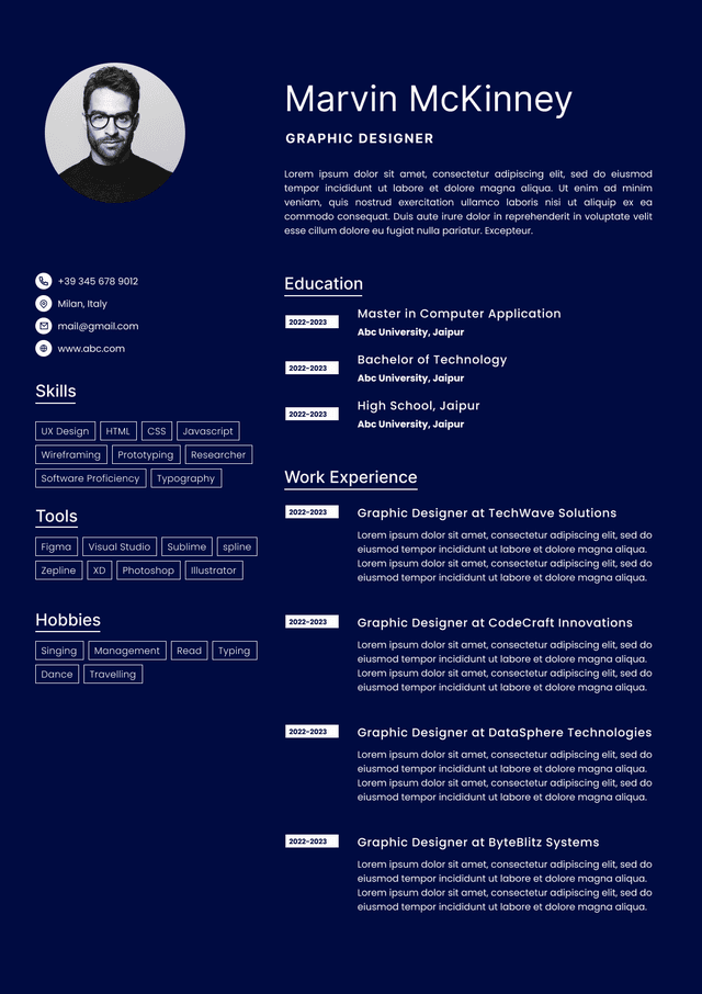
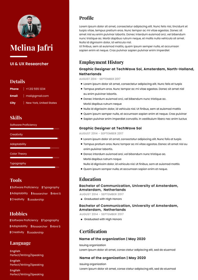
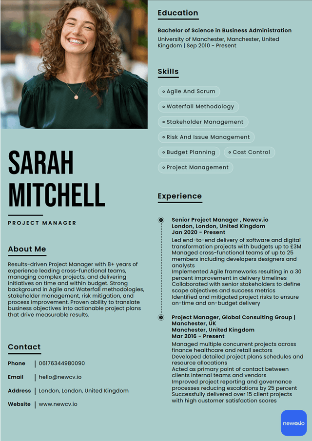
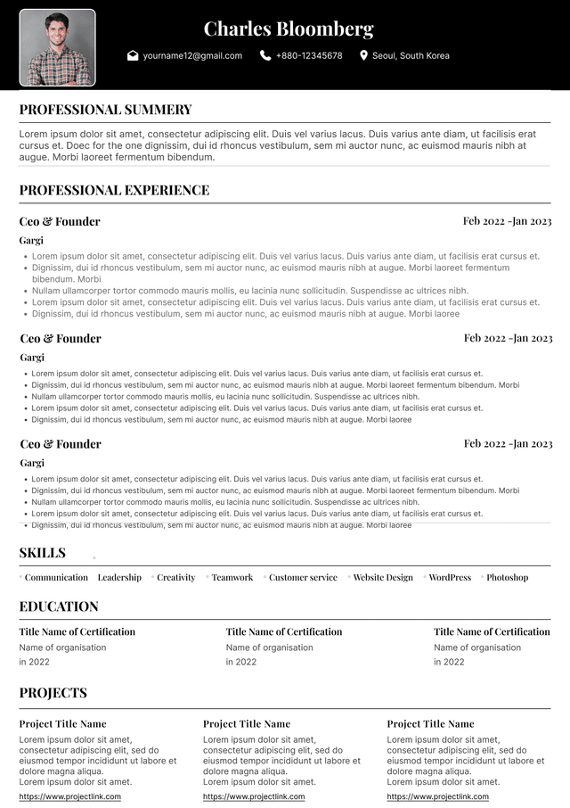
Minimal Resume Templates for Designers
Minimal resume templates for designers work best when they remove visual noise without removing personality. Hiring managers and creative directors rarely reject resumes because they are "too simple." They reject them because they're hard to scan, overloaded with design effects, or fail to communicate value quickly.
For designers, minimalism is not just a style choice. It's a usability decision.
The strongest minimalist resume templates create a balance between clean design, recruiter readability, portfolio visibility, and professional identity. They communicate taste, hierarchy, and visual judgment in the same way a product interface or landing page does. Done well, a minimal resume becomes proof of design thinking—not just a document.
Many top-ranking articles reduce this topic to downloadable template lists. What they miss is why minimal layouts succeed, where designers over-design, and how resume structure affects real hiring workflows.
This guide focuses on exactly that.
Recruiters spend only seconds scanning resumes during initial review. Creative teams move fast. Agency environments move even faster.
Minimal design supports how hiring decisions actually happen.
A strong minimalist layout helps recruiters instantly identify:
•Name and role
• Specialty area
• Experience progression
• Skills relevance
• Portfolio access
• Professional credibility
Minimal design also demonstrates something hiring teams care deeply about:
Constraint discipline.
Any designer can add gradients, columns, animations, and decorative elements. Strong designers know what to remove.
A minimalist resume subtly signals:
•Strong visual hierarchy
• Information architecture skills
• UX thinking
• Editorial judgment
• Attention to whitespace
• Clarity-first communication
These traits often matter more than visual decoration.
Many designers assume recruiters prioritize creativity.
Most prioritize clarity.
Creative directors, design leads, startup founders, and recruiters typically ask:
"Can I understand this person in under 15 seconds?"
The resume often acts as a navigation layer before someone opens:
•Portfolio site
• Dribbble profile
• Behance account
• LinkedIn profile
• Case studies
If navigation fails, deeper review often never happens.
The goal is not visual spectacle.
The goal is progression.
Resume → Portfolio → Interview
Minimal templates optimize that flow.
Designers frequently apply portfolio thinking to resumes.
Those are different products.
A portfolio exists for exploration.
A resume exists for fast decision-making.
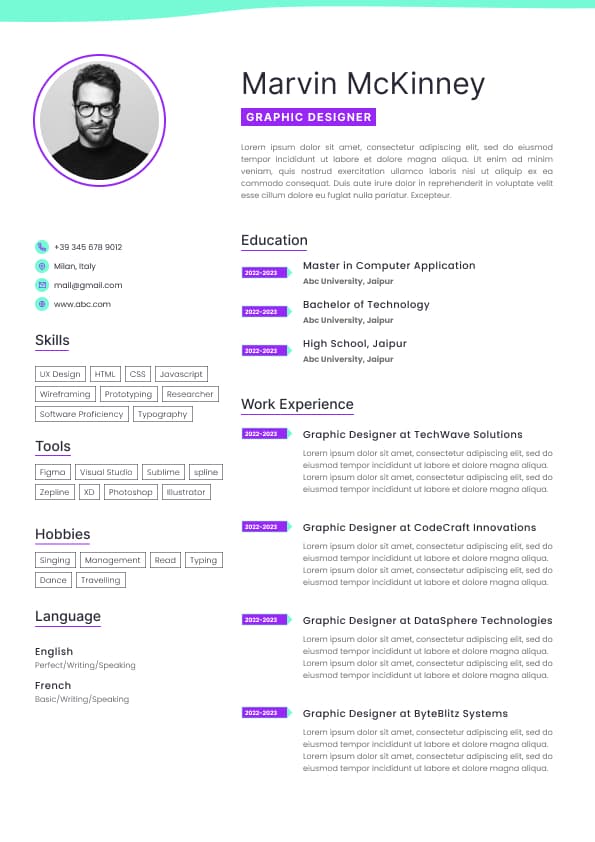
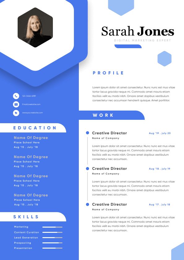
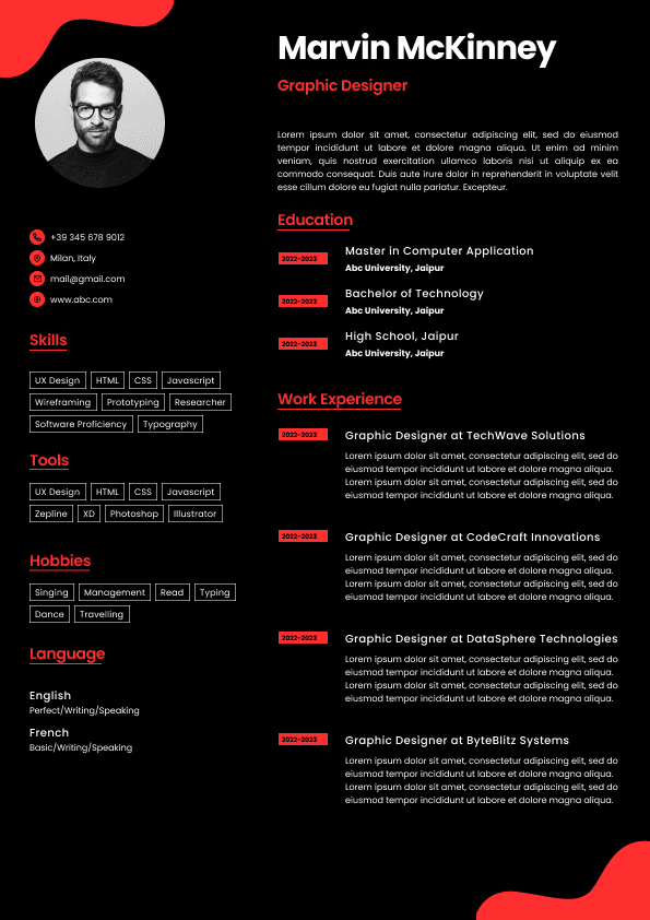
Common mistakes include:
•Large hero graphics
• Excessive color systems
• Timeline experiments
• Heavy visual icons
• Progress bars for skills
• Multi-column complexity
• Tiny typography
• Decorative grids
• Dense project sections
These choices often create friction.
The problem is not aesthetics.
The problem is usability.
Recruiters reviewing dozens of candidates do not want interaction design experiments inside resumes.
They want fast information retrieval.
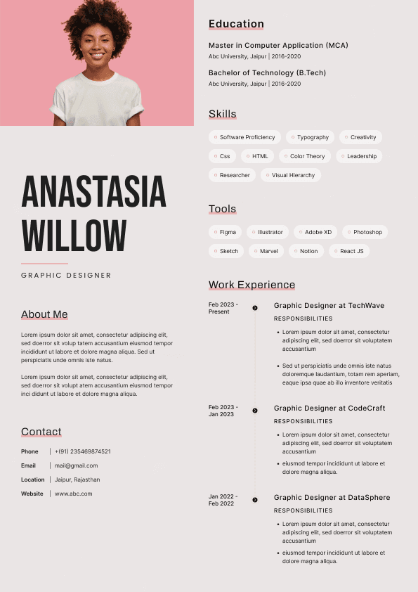
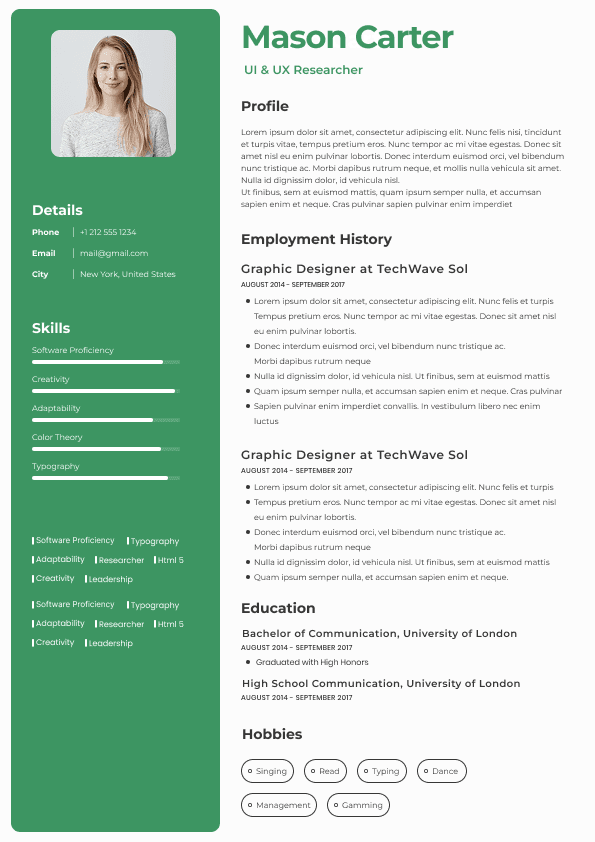
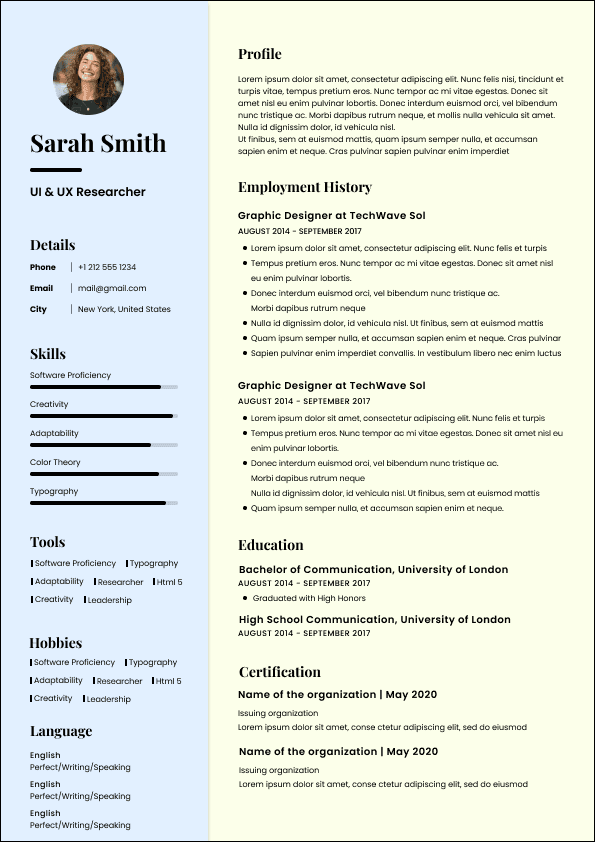
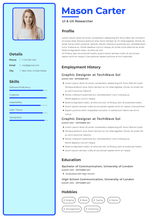
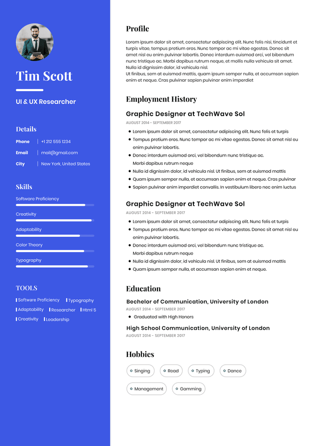
Minimal does not mean empty.
Strong minimal templates still contain structure.
Key characteristics include:
•Clear hierarchy
• Generous spacing
• Consistent typography
• Limited color usage
• Portfolio prominence
• Scannable sections
• Predictable layout patterns
• Strong readability
The best layouts often feel invisible.
Readers move through information naturally without noticing the design itself.
That is sophisticated design.
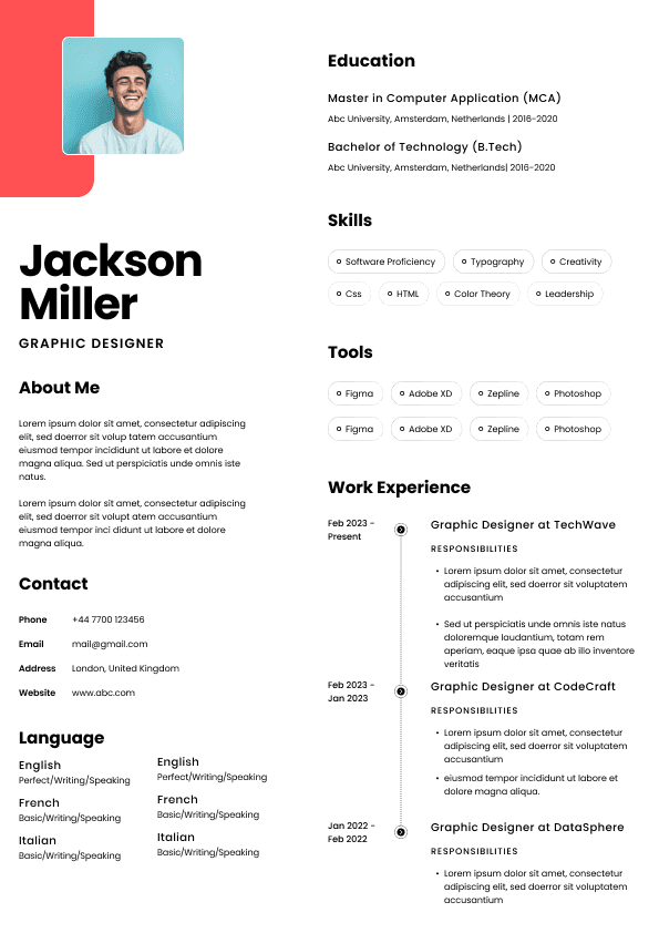
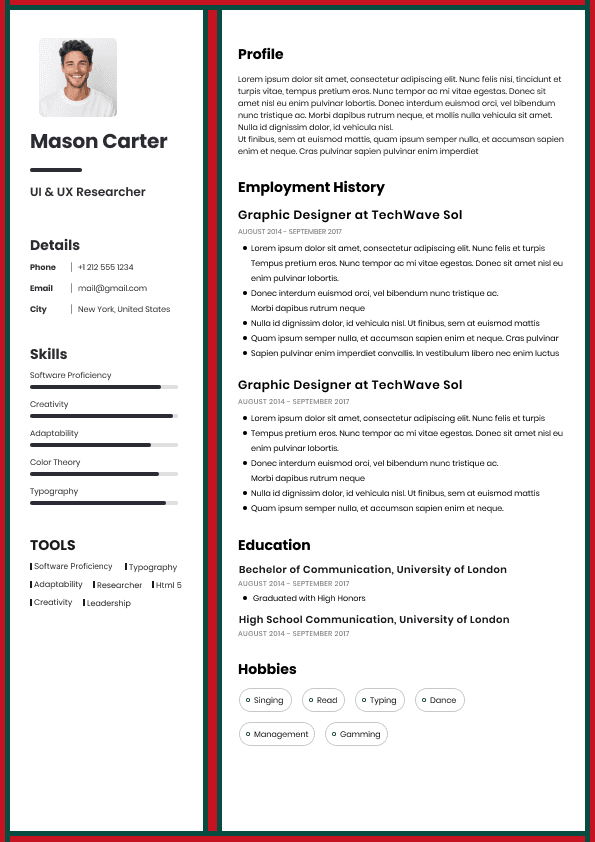
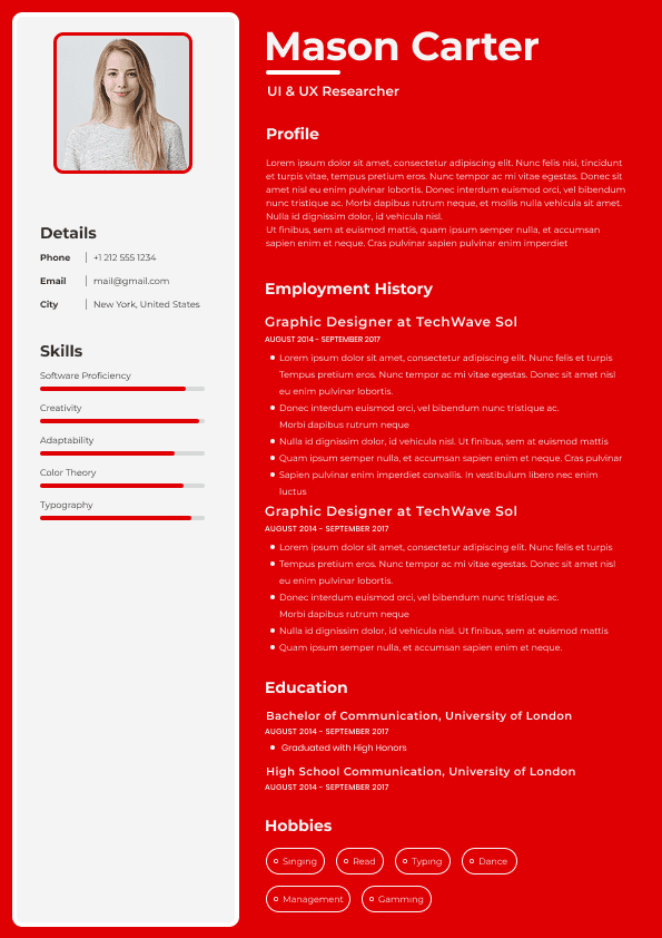
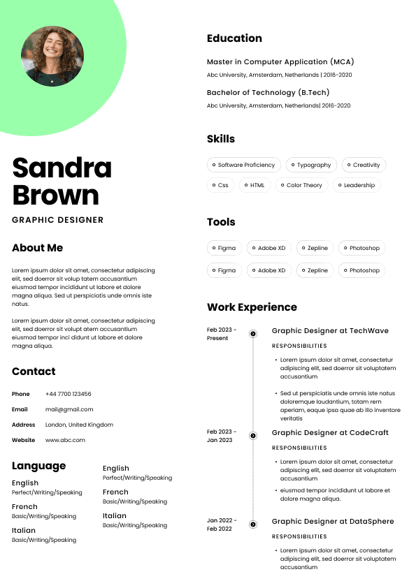
Different design roles benefit from different minimalist structures.
This is often the safest and strongest option.
Best for:
•Product designers
• UX designers
• UI designers
• Visual designers
• Brand designers
• Senior creatives
Advantages:
•ATS-friendly structure
• Strong reading flow
• Mobile-friendly formatting
• Clear progression
Editorial layouts resemble magazine design principles:
•hierarchy
• spacing
• typography rhythm
This style consistently performs well.
Ideal for:
•Freelance designers
• Brand designers
Typography often determines whether a minimal resume succeeds.
Designers sometimes underestimate this.
Minimal layouts remove decoration.
Typography becomes the primary design system.
Strong combinations include:
•Inter + Georgia
• Helvetica Neue + Garamond
• Avenir + Merriweather
• IBM Plex Sans + Source Serif
Focus on:
•line spacing
• visual rhythm
• hierarchy contrast
• alignment consistency
Weak typography immediately becomes visible in minimalist design.
Minimalism exposes flaws.
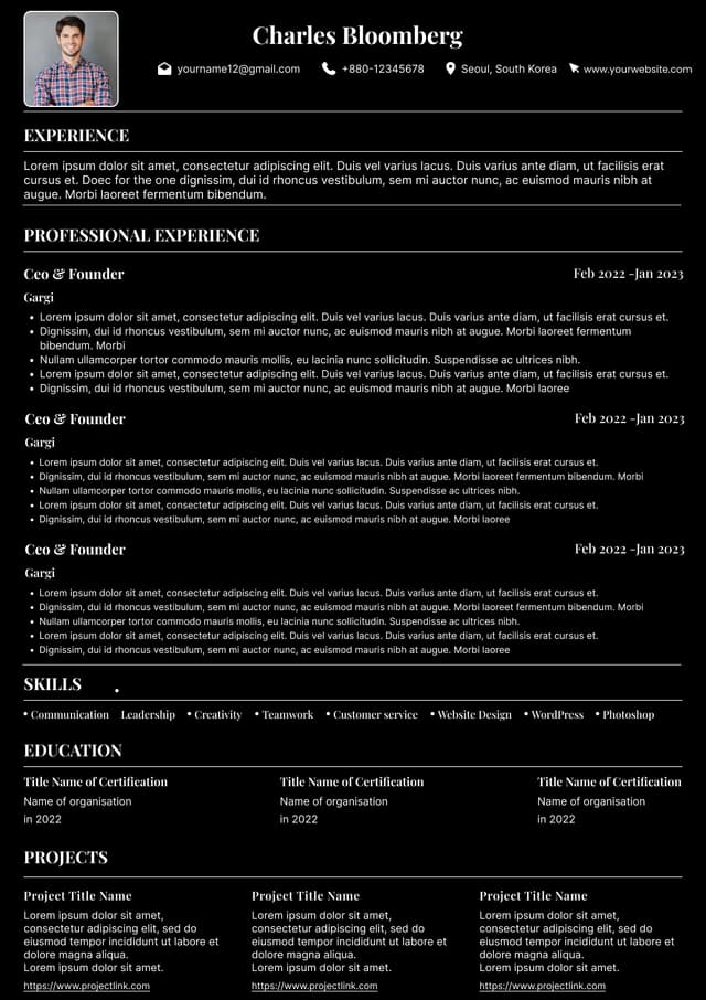
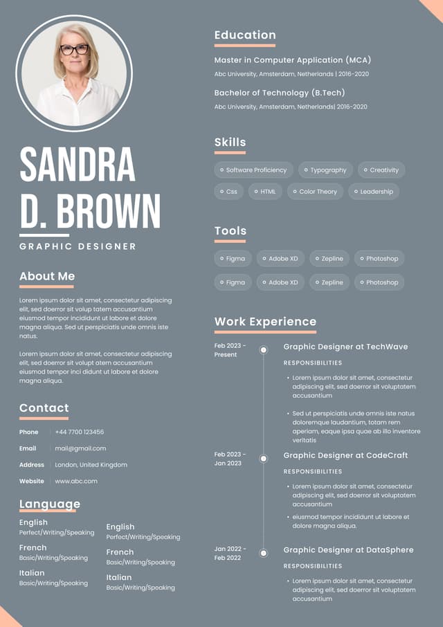
Minimal templates do not require black-and-white design.
They require intentional design.
Effective approaches:
•one accent color
• muted palettes
• subtle dividers
• restrained highlights
Good uses:
•section labels
• links
• portfolio callouts
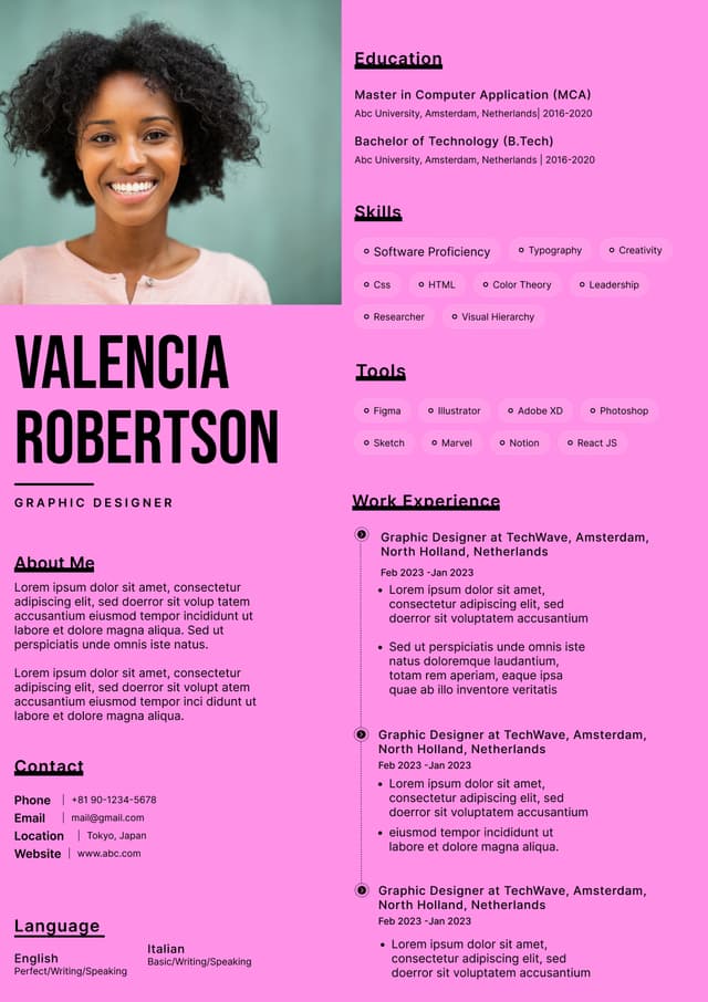
Bad uses:
•rainbow systems
• multiple bright colors
• decorative backgrounds
A resume should not compete with your portfolio.
Many designers panic about ATS compatibility.
The internet created unnecessary fear.
Modern ATS systems handle design better than older systems, but structure still matters.
Problems occur when resumes use:
•text embedded in graphics
• tables for layout
• unusual columns
• excessive icons
• image-heavy sections
Minimal templates naturally avoid many of these issues.
A clean layout improves both:
•machine readability
• human readability
For designers wanting modern aesthetics without sacrificing parsing performance, platforms like NewCV increasingly focus on combining strong visual presentation with recruiter-friendly structure and streamlined creation workflows.
This removes a common tradeoff:
Design quality versus ATS usability.
You no longer need to choose one or the other.
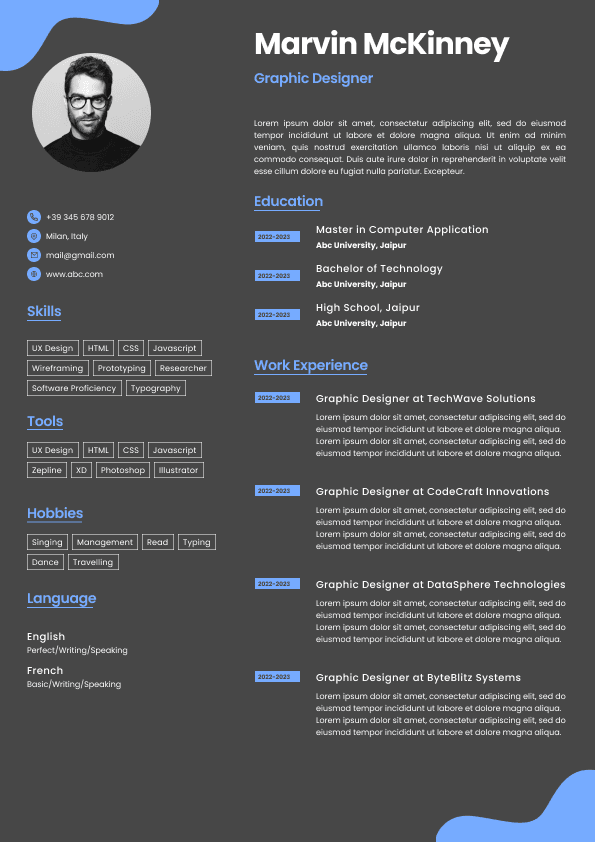
Many designer resumes bury portfolios.
This is a serious mistake.
Recruiters frequently look for portfolios immediately.
Best placement:
Directly below:
Name
Role
Location
Contact information
Good example:
alexreed.design
Portfolio links should feel obvious.
Not hidden.
Not styled as tiny hyperlinks.
Not buried at the bottom.
Think of the portfolio as the primary conversion action.
Weak Example
Header
Large graphic banner
About Me paragraph
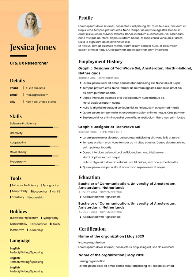
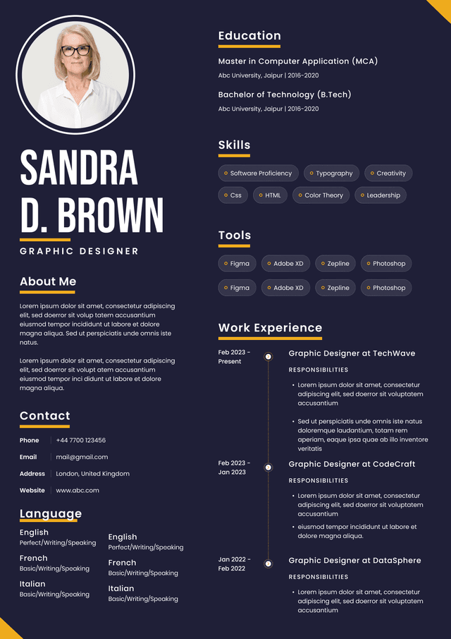
Skills with visual progress bars
Two-column layout
Experience buried below
Portfolio at bottom
This creates friction.
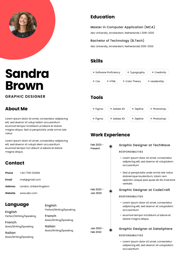
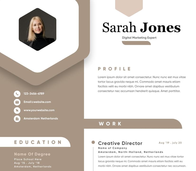
Good Example
Name
Role specialization
Portfolio URL
Contact information
Experience
Selected achievements
Skills
Education
This structure supports recruiter behavior.
Information appears where users expect it.
Design usability improves.
Many designers misunderstand minimalism as neutrality.
Minimal does not mean generic.
Personality can appear through:
•typography choices
• spacing style
• portfolio integration
• subtle color systems
• writing voice
• project descriptions
Your resume should feel like a designed product.
Not a blank document.
The goal:
Professional restraint with identifiable style.
Designers increasingly optimize workflows rather than manually building resumes repeatedly.
Modern resume workflows now include:
•AI-assisted drafting
• portfolio syncing
• reusable content systems
• adaptive versions for roles
• design optimization
Instead of redesigning resumes from scratch, designers increasingly use systems that reduce repetitive work.
The workflow shift matters.
Manual resume iteration creates bottlenecks.
Streamlined systems create consistency.
The strongest designers increasingly treat resumes as evolving assets rather than static documents.
Choose based on workflow needs rather than aesthetics alone.
Ask:
•Does this emphasize my portfolio?
• Can recruiters scan it quickly?
• Does typography feel intentional?
• Is spacing creating hierarchy?
• Is the layout ATS-friendly?
• Will this scale as I update it?
• Does it reflect my design style?
A template should improve communication.
Not simply look attractive.
Minimal designer resumes succeed because they respect attention.
Design hiring teams review enormous volumes of candidates. A clean, thoughtful template creates less friction and faster understanding.
Strong minimalism is rarely about removing content.
It's about removing obstacles.
The best designer resumes communicate visual judgment, usability thinking, and professional identity before a portfolio even opens.
For designers, that is often the first design challenge employers evaluate.

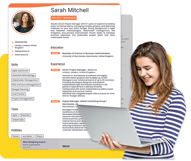
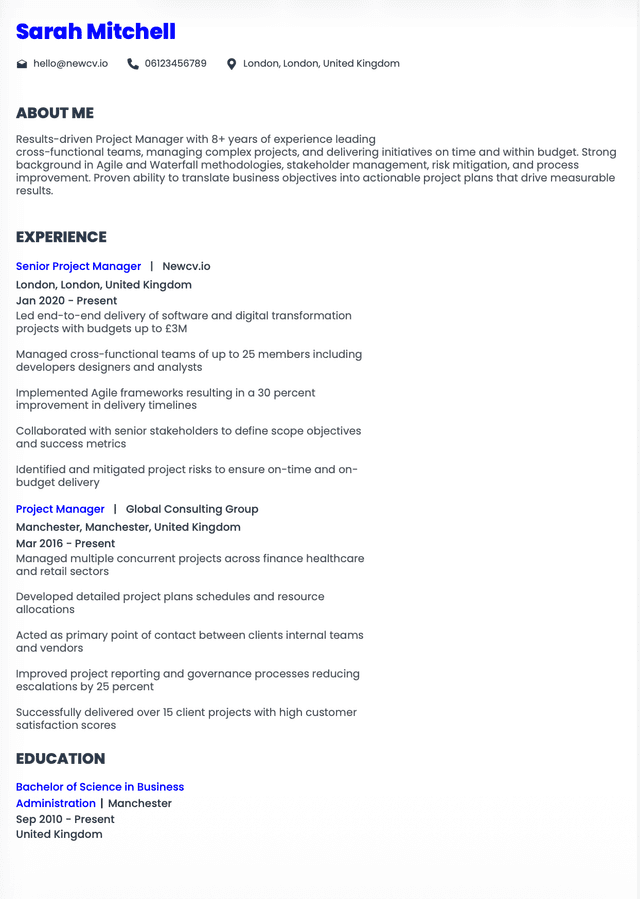
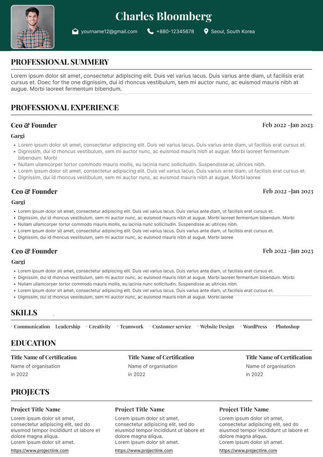
Use ATS-optimised Resume and resume templates that pass applicant tracking systems. Our Resume builder helps recruiters read, scan, and shortlist your Resume faster.
Use professional field-tested resume templates that follow the exact Resume rules employers look for.
Create Resume
Use professional field-tested resume templates that follow the exact Resume rules employers look for.
Create ResumeCharacteristics:
•prominent portfolio URL
• selected project highlights
• concise work history
Recruiters increasingly move directly from resumes to portfolio review.
Templates should support this behavior.
Works best for:
•Graphic designers
• Visual communication designers
• Creative specialists
Should remain restrained.
Small grid systems can create elegant structure.
Overly experimental grids often become difficult to parse.