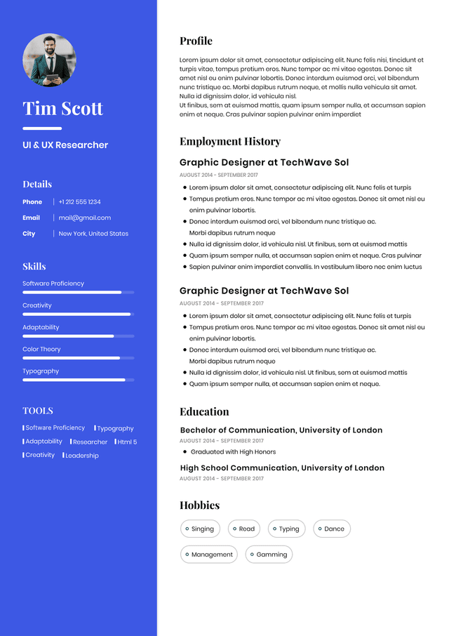
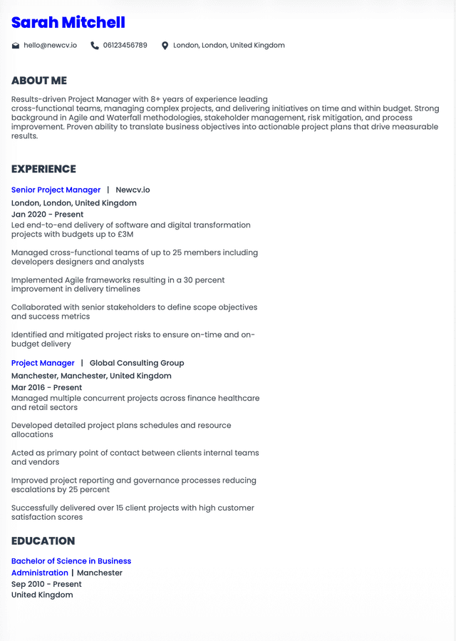
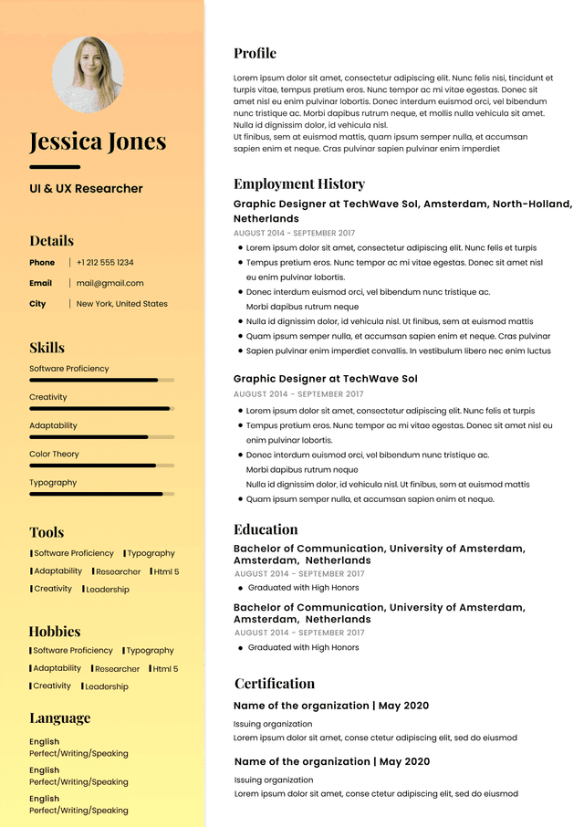
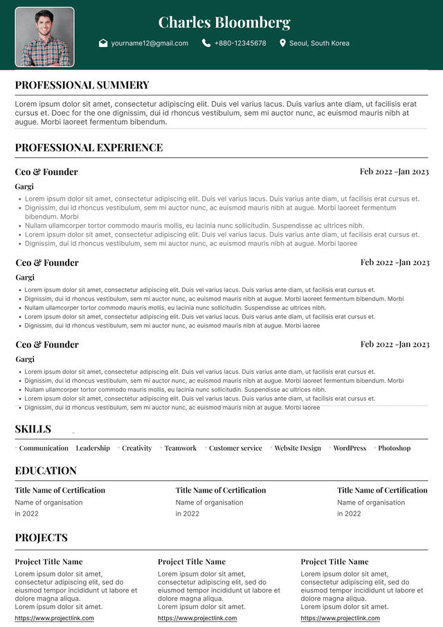
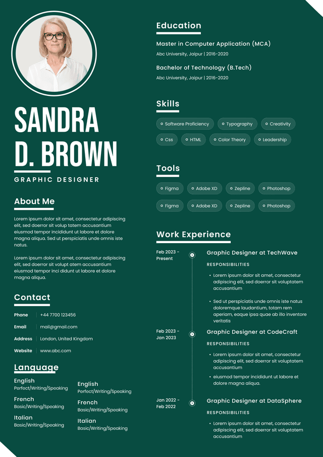
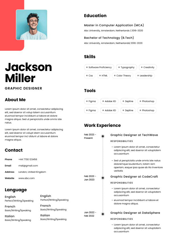
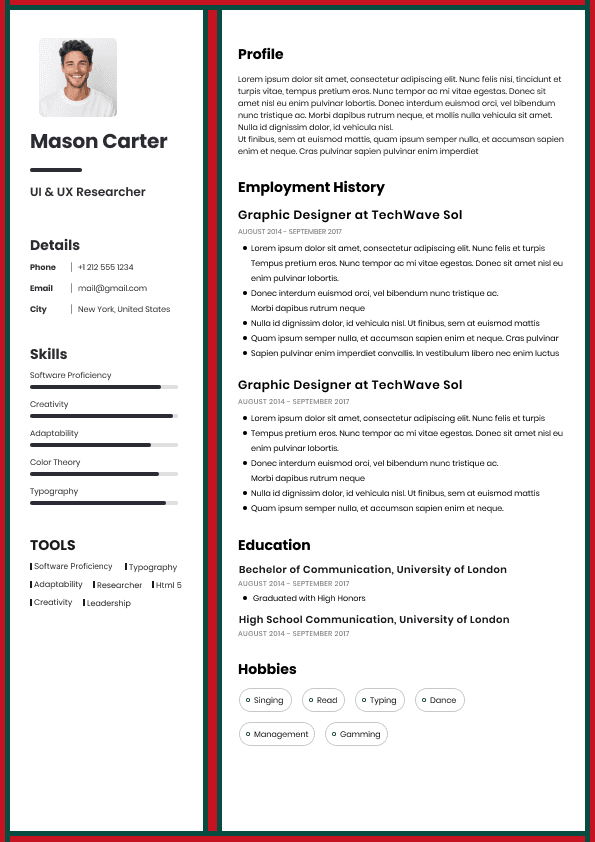
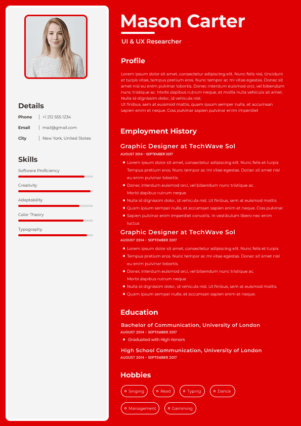
Choose from a wide range of NEWCV resume templates and customize your NEWCV design with a single click.
A Next.js design system is a structured frontend architecture that helps teams build consistent, accessible, reusable, and scalable user interfaces across multiple products. For enterprise teams, it is not just a component library or visual UI kit. It is a complete system of design tokens, reusable React components, documentation, governance, quality checks, accessibility standards, and release workflows. The goal is simple: help engineers ship faster without creating inconsistent UI, duplicate components, or long-term maintenance debt. Strong Next.js design systems support product velocity, brand consistency, developer experience, and frontend reliability at the same time.
A serious Next.js design system combines design, engineering, documentation, testing, and governance into one shared frontend foundation. The component library is only one part of it.
A complete system usually includes:
Design tokens for colors, spacing, typography, shadows, radius, motion, and themes
Reusable React components built for consistency and accessibility
Shared UI patterns for forms, navigation, dashboards, tables, dialogs, and layouts
Storybook documentation for component behavior, states, and usage rules
Accessibility standards for keyboard support, screen readers, focus handling, and contrast
Visual regression testing through tools like Chromatic or similar workflows
Next.js is widely used by enterprise frontend teams because it supports modern React architecture, performance optimization, scalable routing, server rendering patterns, and strong developer workflows. For teams building shared UI systems, that matters because the design system must work inside real production applications, not just in isolated demos.
Next.js supports enterprise frontend needs such as:
Shared layouts across large applications
Server and client component boundaries
Performance focused rendering strategies
Image, font, and metadata optimization
Monorepo friendly workflows
Strong TypeScript and React ecosystem alignment
Flexible deployment and CI/CD patterns
Component architecture determines whether a design system becomes useful or painful. A good architecture makes components predictable, composable, accessible, and easy to adopt. A weak architecture creates bloated components, unclear usage rules, inconsistent styling, and frustrated engineering teams.
Strong component architecture usually follows these principles:
Components have clear responsibilities
Component APIs are simple and predictable
Variants are standardized instead of improvised
Styling rules come from tokens, not random values
Accessibility is built into the component behavior
Components support composition instead of excessive configuration
Atomic design can help organize frontend systems, but it works best when teams use it practically rather than rigidly. The goal is not to create perfect theoretical categories. The goal is to make component relationships easier to understand.
In a Next.js design system, atomic design often breaks down like this:
Atoms are small primitives such as buttons, labels, icons, inputs, and badges
Molecules combine primitives into reusable patterns such as search fields, form rows, and card headers
Organisms represent larger UI sections such as navigation bars, dashboards, filters, and profile panels
Templates define reusable page structures and layout patterns
Pages apply real content, business logic, and route level behavior
The recruiter level insight here is important: senior frontend candidates should not just name atomic design. They should explain when it helps and when it creates unnecessary complexity. Enterprise teams value practical judgment more than textbook structure.
Atomic design works when it improves clarity, reuse, and maintainability. It fails when engineers spend more time debating categories than shipping usable UI.
Design tokens are one of the most important parts of a scalable frontend design system. They turn visual decisions into reusable, controlled variables that both designers and engineers can understand.
Tokens commonly define:
Brand colors
Semantic colors
Typography scale
Font weights
Spacing scale
Border radius
Elevation and shadows
Motion timing
Storybook is one of the most important tools in a modern Next.js design system because it gives teams a shared place to document, test, review, and understand components outside the main application.
A strong Storybook setup helps teams document:
Component purpose
Approved variants
Interactive states
Accessibility behavior
Responsive behavior
Usage rules
Do and do not guidance
Many Next.js teams use shadcn/ui and Radix because they support flexible, accessible, and customizable component architecture. This is especially valuable for enterprise teams that want strong foundations without being locked into a rigid third party component library.
Radix provides accessible primitives for complex interaction patterns such as dialogs, dropdowns, popovers, tabs, menus, and focus management. These are difficult to build correctly from scratch, especially when keyboard navigation and screen reader behavior matter.
shadcn/ui is popular because teams can own the component source instead of depending on a closed abstraction. That gives engineering teams more control over styling, tokens, theming, behavior, and long term maintenance.
This matters in hiring because senior frontend engineers are often evaluated on tradeoff awareness. A strong candidate can explain why a team might choose composable primitives over a fully packaged UI framework. They can also explain the risks, including maintenance responsibility, consistency challenges, and the need for strong internal standards.
Accessibility should not be handled separately in every feature team. A design system should centralize common accessibility patterns so teams do not repeatedly solve the same problems incorrectly.
A strong Next.js design system should account for:
Keyboard navigation
Focus states
Focus trapping for dialogs and overlays
Screen reader labels
ARIA behavior where appropriate
Color contrast
Error messaging
Visual regression testing protects design systems from accidental UI changes. This becomes critical when many teams contribute to shared components or consume the same component package across multiple applications.
Common enterprise workflows include:
Storybook CI checks
Chromatic visual regression testing
Pull request previews
Automated screenshot comparison
Accessibility checks inside component review workflows
Design review before release
Visual regression testing helps catch issues such as:
Unexpected spacing changes
Most design systems do not fail because the components are bad. They fail because governance is unclear.
Governance answers practical questions such as:
Who owns the design system?
Who approves new components?
When should teams reuse an existing component?
When is a new component justified?
How are breaking changes handled?
How are deprecated patterns removed?
How are accessibility issues prioritized?
For senior frontend engineers, UI platform engineers, and frontend architects, design system experience is evaluated differently than basic React experience.
Hiring managers usually look for evidence of:
Reusable component architecture
Design token strategy
Storybook documentation
Accessibility implementation
Cross team adoption
Frontend governance
Testing strategy
The biggest mistakes usually come from treating design systems as visual libraries instead of operational systems.
Common failure patterns include:
Building too many components before proving adoption
Creating overly flexible components with too many options
Ignoring accessibility until late in the process
Allowing teams to bypass tokens
Failing to document real usage patterns
Not testing visual changes before release
Creating governance rules nobody follows
Strong Next.js design systems usually succeed because they are practical, adopted, and maintained.
What works:
Simple, predictable component APIs
Clear design token usage
Strong Storybook documentation
Accessibility built into core components
Visual regression testing in CI
Shared ownership between design and engineering
Clear governance without excessive bureaucracy
Contribution rules that engineers can follow
A scalable Next.js design system should be built in stages, not all at once.
The first step is identifying repeated UI patterns across real products. Do not start by designing a theoretical perfect library. Start with components and patterns that teams actually use.
Focus on:
Forms
Buttons
Inputs
Modals
Navigation
Cards
Tables
A well built Next.js design system creates measurable business and engineering value.
It can improve:
Development speed
UI consistency
Accessibility quality
Design to engineering handoff
Product scalability
Onboarding speed
Release confidence
Brand consistency

Use ATS-optimised Resume and resume templates that pass applicant tracking systems. Our Resume builder helps recruiters read, scan, and shortlist your Resume faster.

Use professional field-tested resume templates that follow the exact Resume rules employers look for.
Create Resume
Use professional field-tested resume templates that follow the exact Resume rules employers look for.
Create ResumeClear contribution rules so teams know when to reuse, extend, or create components
Versioning and release management so updates do not break production applications
Governance standards that prevent teams from duplicating or forking UI patterns
The key difference between a basic component library and an enterprise design system is operational maturity. A component library gives engineers reusable pieces. A design system gives the organization a repeatable way to build, maintain, scale, and govern frontend experiences.
For hiring managers, Next.js experience becomes more valuable when it is connected to architecture decisions. A senior engineer who can explain how a design system supports performance, accessibility, maintainability, and team adoption is much stronger than someone who only says they built reusable components.
Documentation shows real usage patterns, not only visual examples
The best enterprise systems avoid trying to make one component solve every possible use case. Overly flexible components usually become harder to understand, harder to test, and harder to maintain. Strong design systems give teams enough flexibility to build real products without allowing unlimited inconsistency.
Breakpoints
Theme values
The most mature systems separate raw tokens from semantic tokens. Raw tokens describe base values, while semantic tokens describe meaning. For example, a raw token may represent a specific shade of blue, while a semantic token may represent a primary action background. This distinction matters because semantic tokens make theming and large scale changes much easier.
Enterprise teams often connect design tokens to Figma workflows through tools such as Tokens Studio, Figma token systems, Style Dictionary, or custom pipelines. The purpose is to reduce drift between design files and production interfaces.
When tokens are missing, teams eventually create inconsistent spacing, colors, typography, and component behavior across products. When tokens are well governed, design changes become safer, faster, and easier to scale.
Edge cases
Deprecated patterns
Storybook becomes especially valuable in enterprise teams because many engineers may use the same design system without working directly with the core UI platform team. Good documentation reduces repeated questions, speeds onboarding, and prevents misuse.
Weak Storybook implementation is easy to spot. It usually has outdated stories, missing states, unclear examples, incomplete accessibility notes, and components that no longer match production behavior. Once engineers stop trusting Storybook, adoption drops.
The strongest teams treat Storybook as product infrastructure, not optional documentation.
Form accessibility
Reduced motion preferences
Accessible component states
Accessibility is not only a compliance issue. It is also a quality signal. Hiring managers evaluating senior frontend talent often look for engineers who understand accessibility as part of architecture, not as a final checklist.
The hidden mistake many teams make is assuming that accessible primitives automatically create an accessible product. They do not. The design system can provide the foundation, but teams still need documentation, usage rules, testing, and review practices.
Broken dark mode behavior
Typography drift
Layout shifts
Component state regressions
Theme inconsistencies
Responsive design failures
Without visual regression testing, teams often discover UI breakage after deployment. In large organizations, that creates unnecessary QA cycles, design escalations, and production defects.
A mature frontend architecture does not rely only on human review. It automates the quality checks that humans miss.
How are design and engineering decisions documented?
Without governance, teams start creating their own workarounds. Over time, the organization ends up with duplicate buttons, inconsistent forms, conflicting table patterns, and fragmented frontend standards.
Good governance does not mean bureaucracy. It means clear decision making. The best systems make the right path easier than the wrong path.
Monorepo experience
Performance awareness
Collaboration with design teams
Ability to balance consistency and flexibility
Recruiters often search for terms like design systems, component architecture, reusable frontend systems, Storybook, design tokens, frontend platform, React architecture, Next.js UI architecture, and accessibility.
But keyword matching is only the first layer. In interviews, hiring teams want to hear how the candidate made decisions. They want to understand tradeoffs, constraints, failure patterns, adoption challenges, and how the system improved real engineering outcomes.
A candidate who says “I built reusable components” sounds average. A candidate who explains how they reduced duplicate UI patterns, improved accessibility consistency, standardized tokens, documented components in Storybook, and supported multiple product teams sounds much stronger.
Making contribution workflows too complicated
Treating Storybook as a demo instead of documentation infrastructure
Forgetting that developer experience drives adoption
The most damaging mistake is over abstraction. Teams often try to build components that support every possible scenario. This makes the system harder to learn and easier to misuse.
The better strategy is to build clear, composable components with strong defaults and well documented extension points.
Components designed around real product needs
Regular audits to remove unused or outdated patterns
What fails:
Treating the design system as a side project
Building components without product team input
Creating rigid patterns that block real use cases
Allowing unlimited customization
Ignoring performance and bundle impact
Publishing undocumented components
Letting teams fork components instead of improving the system
Measuring success by component count instead of adoption and quality
The strongest design systems are not the biggest. They are the most trusted.
Filters
Status indicators
Layout patterns
This prevents wasted effort and increases adoption.
Tokens should be established early because they influence every component decision. Without a token system, components become visually inconsistent and harder to theme later.
Every shared component should answer:
When should this be used?
When should it not be used?
What variants are approved?
What accessibility behavior is included?
What content rules apply?
What customization is allowed?
This level of clarity prevents misuse.
Documentation should show real states and scenarios, not only ideal cases. Include disabled states, loading states, error states, empty states, responsive behavior, and accessibility notes.
Testing becomes harder to retrofit later. Add visual regression testing, accessibility checks, and component interaction validation before many teams depend on the system.
Governance should help teams move faster, not slow them down. Provide clear paths for requesting changes, proposing new patterns, and contributing improvements.
Code maintainability
Cross team collaboration
From a hiring perspective, this is why design system experience is valuable. It shows that a candidate understands frontend work beyond individual screens. It shows they can think in systems, support other engineers, and build infrastructure that improves how product teams operate.
The strongest frontend professionals do not only ask, “Can I build this interface?” They ask, “Can this interface pattern scale across teams without creating future problems?”
That is the mindset behind strong Next.js design system architecture.


 Upload Resume
 Import from Linkedin