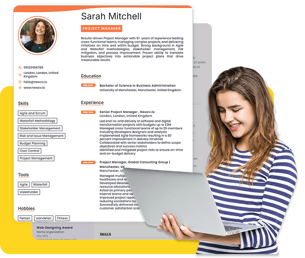
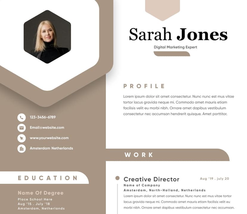
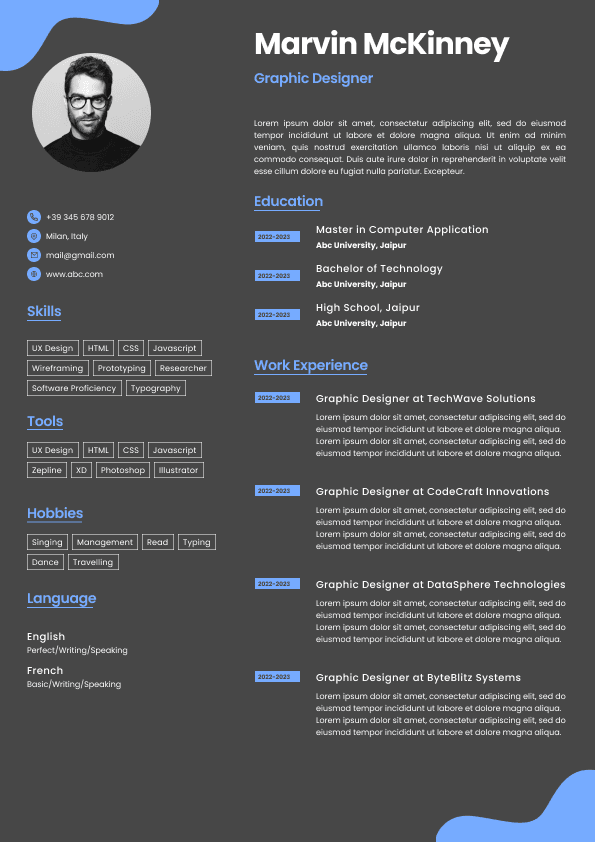
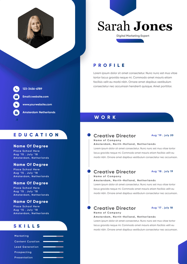
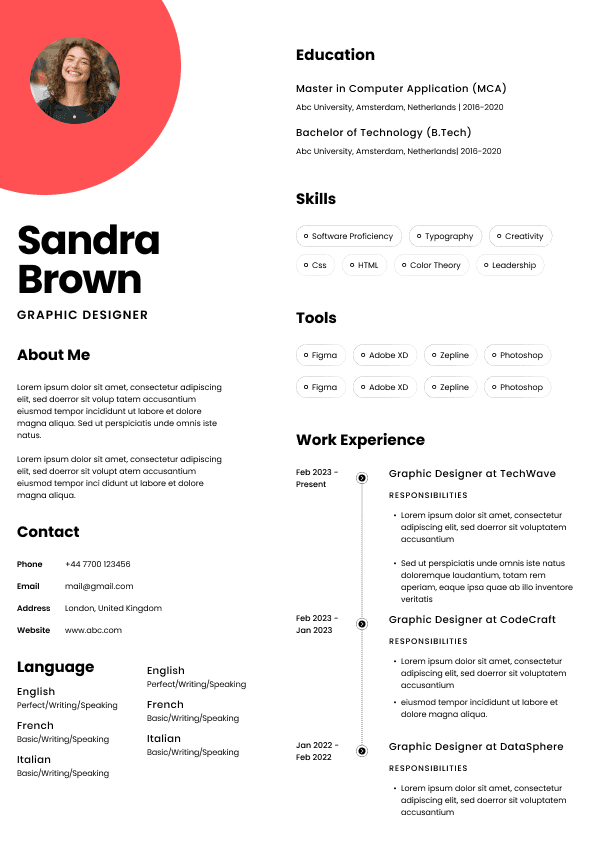
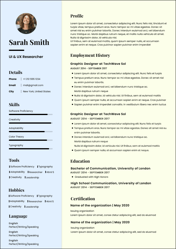
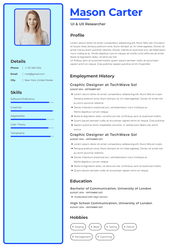
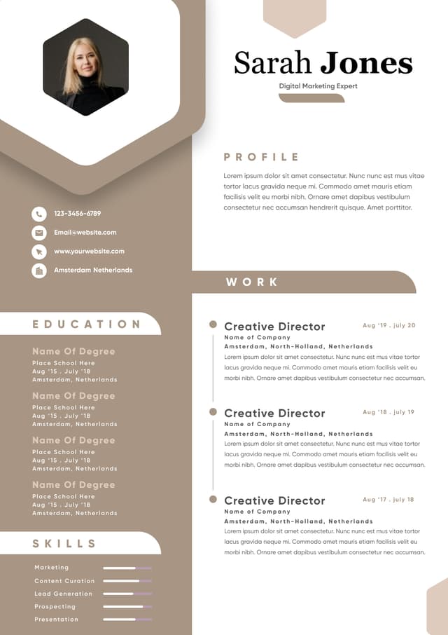
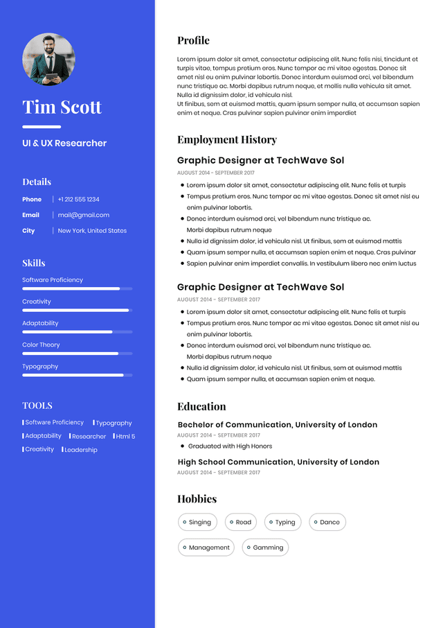
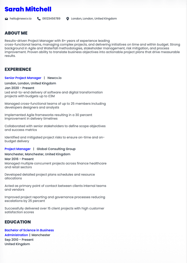
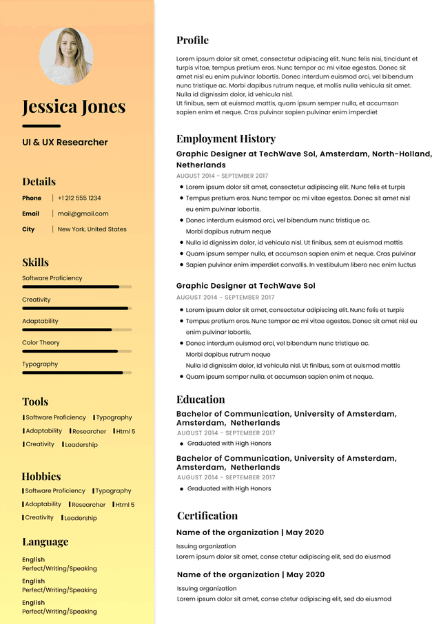
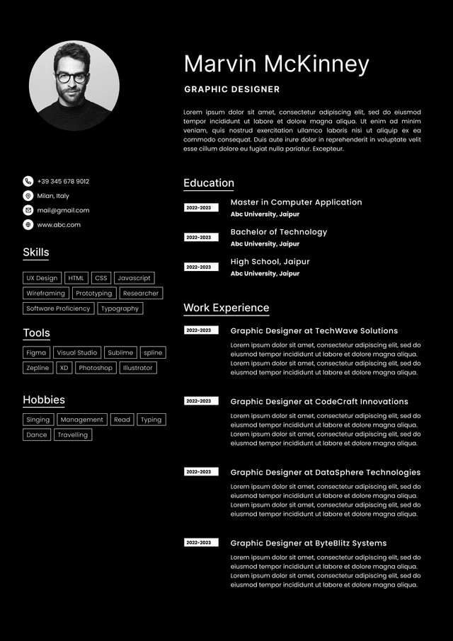
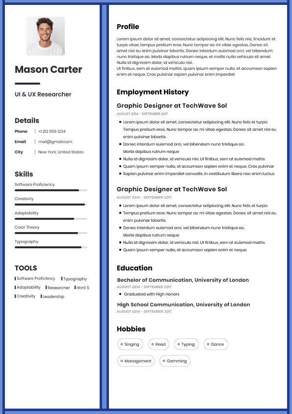
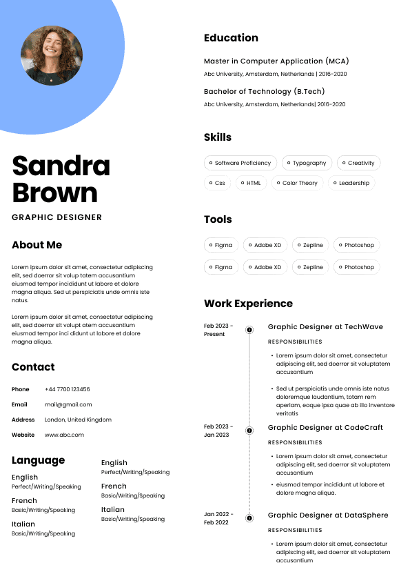
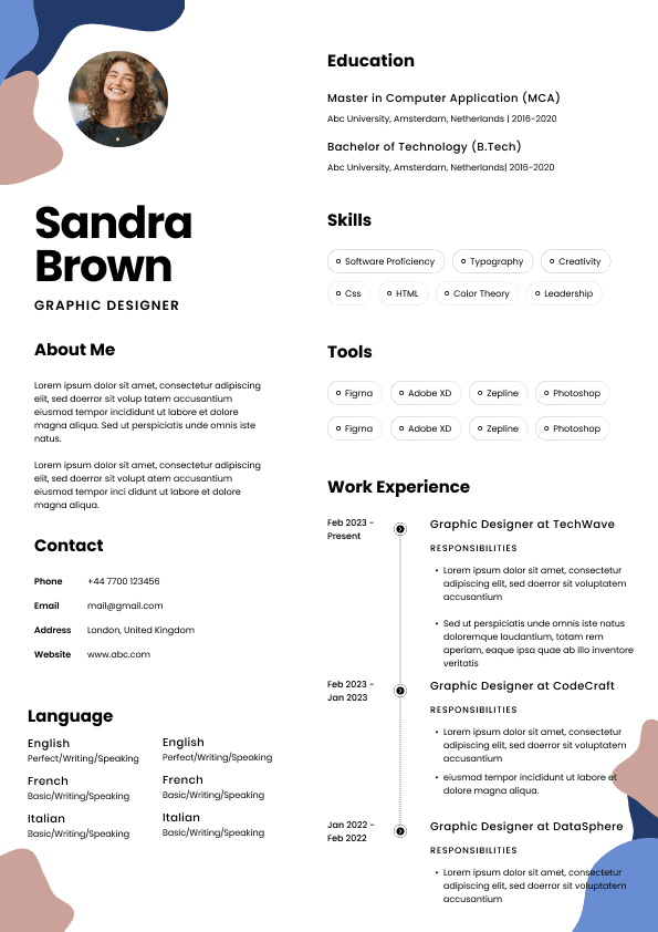
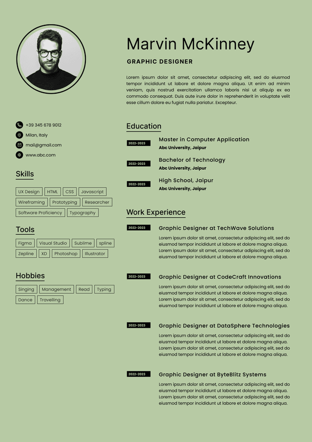
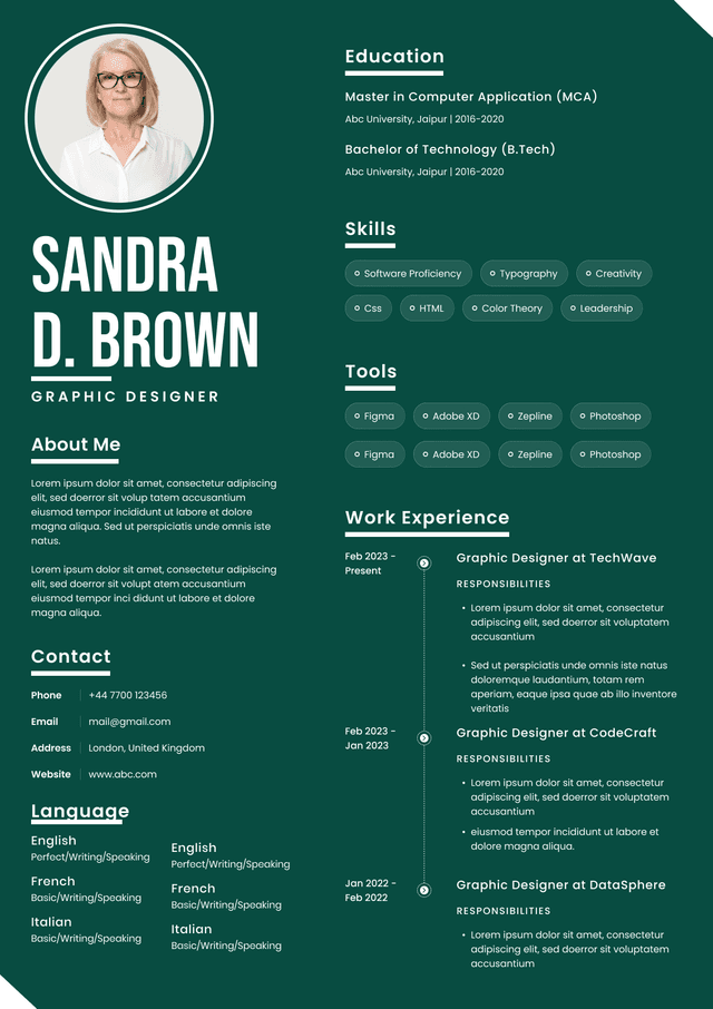
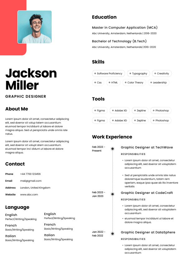
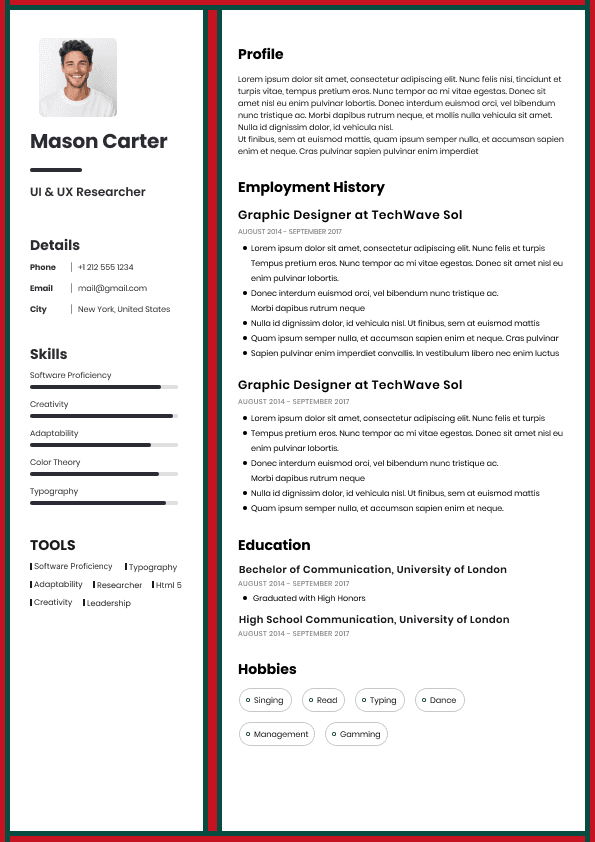
Choose from a wide range of NEWCV resume templates and customize your NEWCV design with a single click.

A React design system helps engineering teams build consistent, accessible, reusable user interfaces at scale. In enterprise environments, it is not just a set of shared components. It is a frontend platform that connects design standards, React component architecture, design tokens, Storybook documentation, accessibility rules, release workflows, and team adoption. For senior React developers, design system experience is a strong hiring signal because it shows platform thinking, not just feature delivery. Hiring managers want engineers who can reduce duplication, improve UI consistency, speed up development, and create reusable systems that multiple product teams can trust.
A React design system is a structured UI foundation used to standardize how products are designed and built. It usually includes reusable React components, design tokens, documentation, usage guidelines, accessibility standards, theme rules, contribution processes, and governance.
The mistake many developers make is treating a design system like a basic React UI library. A component library may include buttons, modals, forms, cards, tables, menus, and navigation patterns. A true design system goes further. It defines how those components should behave, how they should be themed, when they should be used, how they should support accessibility, and how teams should contribute improvements over time.
In enterprise companies, this matters because multiple teams are often building related products at the same time. Without a shared system, teams duplicate work, create inconsistent interfaces, and solve the same accessibility and styling problems repeatedly. A strong React design system gives teams one reliable source of truth.
Enterprise companies care about design systems because inconsistency becomes expensive at scale. When every product squad builds its own UI patterns, the company pays for that duplication through slower delivery, weaker user experience, inconsistent branding, and higher maintenance costs.
A mature React component library helps teams:
Build features faster
Reuse proven UI patterns
Reduce duplicate frontend code
Improve product consistency
Standardize accessibility behavior
Lower QA effort
Onboard engineers faster
Improve collaboration between design and engineering
Support multiple brands or themes
Maintain frontend quality across large applications
From a hiring manager’s perspective, this kind of work signals seniority. A developer who can build a working feature is valuable. A developer who can build systems that help dozens of engineers build better features faster is much more valuable.
That is why design system ownership often appears in senior React developer, frontend platform engineer, UI architect, and staff frontend engineer roles.
A React UI library and a React design system are related, but they are not the same.
A React UI library focuses on reusable interface components. It helps developers avoid rebuilding common UI elements from scratch. Libraries such as Material UI, Chakra UI, Radix, and Tailwind UI can accelerate development because they provide ready made patterns or primitives.
A React design system is broader. It includes the component library, but also defines product standards, design language, token structure, accessibility expectations, documentation, governance, contribution rules, and adoption strategy.
A simple way to think about it:
A React UI library gives teams reusable parts
A React design system gives teams a shared way to build products
This distinction matters in interviews. Mid level candidates often describe components. Senior candidates explain systems, tradeoffs, adoption, governance, and long term maintainability.
A strong enterprise design system usually includes several connected layers.
Design tokens define the visual decisions behind the interface. They may include color, typography, spacing, radius, elevation, motion, layout, and breakpoints.
Tokens matter because they prevent teams from hardcoding visual decisions in random places. Instead, design and engineering teams work from shared variables that can support brand consistency, dark mode, responsive design, and theme changes.
Strong token systems usually support:
Light and dark themes
Brand customization
Product specific themes
Accessibility friendly color contrast
Consistent spacing and typography
Easier design updates across multiple products
Tools such as Figma, Tokens Studio, and Style Dictionary are commonly used to connect design tokens with engineering workflows.
Components are the working building blocks of the design system. They may include buttons, inputs, forms, modals, alerts, cards, tabs, tables, tooltips, dropdowns, navigation, and layout primitives.
Strong components are reusable, predictable, accessible, and documented. Weak components may look correct visually but fail when teams need edge cases, accessibility support, responsive behavior, or theme flexibility.
Storybook is commonly used to document and test React components in isolation. Enterprise teams use it as more than a visual catalog. They use it to show component states, variants, accessibility behavior, usage rules, design review scenarios, and developer guidance.
A strong Storybook setup helps product teams understand how to use components correctly without constantly asking the design system team for clarification.
Accessibility should be built into the component system from the beginning. Teams should not depend on each product squad to solve accessibility separately.
A mature React design system defines standards for keyboard navigation, focus behavior, screen reader support, semantic structure, form validation, color contrast, and error messaging.
Governance determines how the system evolves. Without governance, teams often fork components, create one off variations, or bypass the system completely.
Strong governance includes:
Clear ownership
Contribution guidelines
Review standards
Deprecation rules
Versioning strategy
Release notes
Migration support
Adoption tracking
This is often where design systems succeed or fail.
Storybook is one of the most important tools in enterprise component engineering because it gives teams a shared place to view, test, and understand UI components.
A weak Storybook setup only shows a few happy path examples. A strong Storybook setup documents real usage.
Effective Storybook documentation usually includes:
Component purpose
Accepted variants
Common use cases
Accessibility notes
Theme examples
Responsive behavior
Error states
Loading states
Empty states
Disabled states
Design guidance
Developer usage notes
This matters because enterprise teams need repeatable quality. If a component can only be understood by reading source files or asking the original author, adoption will suffer.
From a recruiting standpoint, strong Storybook experience tells hiring teams that a candidate understands developer experience, documentation, and scalable collaboration.
Component API design is one of the clearest signs of frontend maturity. A component API defines how other developers interact with a component. If the API is confusing, inconsistent, or overly flexible, the system becomes difficult to maintain.
Strong component APIs are:
Predictable
Simple to understand
Flexible without being chaotic
Consistent across the library
Easy to document
Hard to misuse
Aligned with design rules
Weak component APIs often create hidden problems. Developers may use components inconsistently, override styles too often, create unsupported combinations, or request unnecessary new components because the existing ones are hard to understand.
Senior React engineers think carefully about component boundaries. They ask whether a component should be opinionated, flexible, composable, or primitive. That decision affects adoption, maintainability, and product consistency.
Theme systems become especially important when a company supports multiple products, brands, customer segments, or accessibility modes.
A scalable theme system allows teams to adjust visual presentation without rewriting component logic. This is where design tokens become powerful. Instead of treating colors, spacing, typography, and elevation as isolated styling choices, teams treat them as system level decisions.
A strong theme architecture can support:
Dark mode
Multiple brand themes
Enterprise customer customization
Regional product variations
Accessibility focused themes
Consistent design updates across products
The risk is overengineering. Some teams build extremely abstract theme systems before they have real business needs. Strong design system engineers balance flexibility with simplicity. They design for known scale, not imaginary complexity.
Atomic design is a common way to think about design system structure. It organizes UI into smaller building blocks that combine into larger patterns.
In practical enterprise React work, the value is not the terminology itself. The value is the discipline of separating primitives, components, patterns, and product specific experiences.
A useful structure may include:
Foundational tokens
Low level UI primitives
Reusable components
Complex patterns
Product templates
Page level experiences
This prevents teams from turning every product need into a new component. It also helps design system teams decide what belongs in the shared library and what should remain inside a specific product.
A common mistake is promoting product specific UI into the design system too quickly. Not every reusable looking pattern belongs in the shared system. Strong teams validate repeated use before standardizing it.
Accessibility is one of the strongest indicators of professional frontend engineering. In enterprise environments, accessibility affects legal risk, customer contracts, usability, brand trust, and product quality.
A React design system should help teams ship accessible interfaces by default.
Important accessibility areas include:
Keyboard navigation
Focus management
Screen reader support
Semantic HTML
Color contrast
Form labels and validation
Error messaging
Modal behavior
Menu behavior
Tooltip behavior
Status announcements
Hiring managers often test this knowledge in senior frontend interviews. They may ask how a modal should handle focus, how a dropdown should support keyboard users, or how error states should be announced.
Candidates who only say they care about accessibility but cannot explain implementation decisions usually do not stand out. Candidates who can explain accessible behavior at the component system level are viewed as much stronger.
Large companies often manage design systems inside monorepos or shared package ecosystems. This allows teams to coordinate component packages, token packages, documentation sites, shared utilities, testing tools, and release workflows.
Common monorepo benefits include:
Better dependency coordination
Shared tooling
Faster internal releases
Easier package updates
Centralized quality checks
Consistent testing standards
Better collaboration across frontend teams
Tools such as Nx, Turborepo, pnpm, and internal build systems are often used in these environments.
For recruiters, monorepo experience can signal enterprise readiness because it shows that a candidate has worked in larger codebases with shared ownership, versioning concerns, and platform level dependencies.
Strong design system engineers do not simply build attractive components. They create scalable systems other teams want to use.
They usually think in terms of:
Product consistency
Developer experience
Accessibility by default
API quality
Design and engineering alignment
Long term maintenance
Adoption strategy
Contribution workflows
Release management
Migration planning
The best engineers also know when not to add something to the system. Every new component creates maintenance responsibility. Every new variant increases complexity. Every new exception can weaken consistency.
This judgment is what separates senior frontend engineers from developers who only focus on implementation.
Many design systems fail because of adoption problems, not technical limitations.
Some teams try to build a complete enterprise system before understanding actual product needs. This leads to bloated components, confusing abstractions, and low adoption.
Better teams start with repeated patterns, validate demand, and expand intentionally.
If the system is hard to use, teams will avoid it. Good documentation, predictable naming, clear examples, and responsive support are essential.
A component that is technically powerful but frustrating to use will eventually be bypassed.
Accessibility should be built into primitives and components early. Retrofitting accessibility later is slower and less reliable.
Too much customization can destroy consistency. A design system should provide flexibility, but not so much that every team creates a different product experience.
Without clear ownership, components become stale. Teams stop trusting the system when bugs are not fixed, requests are ignored, or documentation falls behind.
Design systems should create measurable value. Enterprise leaders usually care about outcomes, not just component counts.
Useful design system KPIs include:
Component reuse percentage
Reduction in duplicate UI code
Faster feature delivery
Fewer UI bugs
Improved accessibility compliance
Higher design consistency
Faster onboarding for engineers
Reduced design review cycles
Increased Storybook usage
Adoption across product teams
For resume and interview positioning, measurable outcomes matter. A candidate who says they built reusable components sounds average. A candidate who says they helped increase component adoption across multiple teams and reduced duplicate UI patterns sounds much stronger.
For senior React roles, design system experience can be a major differentiator. It signals that the candidate understands frontend architecture beyond individual screens.
Recruiters and hiring managers often look for:
Ownership of shared React component libraries
Storybook documentation experience
Design token implementation
Accessibility knowledge
Collaboration with product designers
Support for multiple product teams
Experience with theming
Monorepo or package management exposure
Strong component API judgment
Evidence of platform thinking
Weak candidates usually describe design systems visually. Strong candidates describe business impact, developer adoption, tradeoffs, and maintainability.
A hiring manager may be thinking:
Can this person help our frontend organization move faster without creating chaos?
That is the real evaluation behind many senior React design system interviews.
When discussing design system work in interviews, focus on scope, decisions, tradeoffs, and outcomes.
A strong explanation should cover:
What problem the design system solved
How many teams or products used it
What components or foundations you owned
How Storybook or documentation supported adoption
How accessibility was handled
How design tokens or themes were structured
What tradeoffs you made
What measurable impact the work created
Weak Example
Good Example
The second version shows platform thinking. That is what hiring managers want to hear.
A strong React design system should be built intentionally, not randomly. The best approach is to start with the highest value patterns and scale based on real usage.
A practical framework includes:
Audit repeated UI patterns across products
Identify the components causing the most duplication
Define core design tokens with design partners
Build foundational components first
Document usage in Storybook
Add accessibility standards from the start
Create clear contribution rules
Track adoption and feedback
Improve based on real product use
Retire outdated patterns over time
This approach keeps the system practical. It avoids the common trap of building a beautiful internal product that nobody actually uses.
React design systems are now a major part of modern enterprise frontend engineering. They improve consistency, accessibility, speed, maintainability, and collaboration across product teams.
For developers, design system experience is valuable because it demonstrates senior level thinking. It shows that you can create scalable UI architecture, support other engineers, work with designers, improve developer experience, and make frontend delivery more efficient.
For companies, a strong React design system reduces waste and creates a more consistent product experience. For candidates, it is one of the clearest ways to prove platform impact in a competitive frontend job market.
The strongest React engineers are not just building screens. They are building systems that help entire teams ship better products.
Use ATS-optimised Resume and resume templates that pass applicant tracking systems. Our Resume builder helps recruiters read, scan, and shortlist your Resume faster.
Use professional field-tested resume templates that follow the exact Resume rules employers look for.
Create Resume
Use professional field-tested resume templates that follow the exact Resume rules employers look for.
Create Resume


 Upload Resume
 Import from Linkedin