Choose from a wide range of NEWCV resume templates and customize your NEWCV design with a single click.


Use professional field-tested resume templates that follow the exact Resume rules employers look for.
Create ResumeResume colors absolutely shape first impressions, but not in the way many job seekers think. Recruiters rarely reject someone because they used blue instead of gray. What they react to is the signal color sends about judgment, professionalism, readability, and role fit.
In real hiring environments, recruiters often scan a resume for 6–10 seconds during the first pass. Color becomes part of a fast subconscious evaluation process: Does this look trustworthy? Organized? Easy to read? Appropriate for the role?
Strong color choices make information easier to process and reinforce professionalism. Poor color choices create friction, visual fatigue, or suggest weak judgment.
The goal is not to make your resume "stand out." The goal is to make a hiring manager immediately feel comfortable reading it.
Candidates often underestimate this distinction. Recruiters do not reward attention-seeking design. They reward clarity.
People process visuals before they process content.
Before recruiters read your achievements, they unconsciously evaluate:
•Layout structure
• Visual hierarchy
• Ease of scanning
• Professional appearance
• Overall polish
• Industry appropriateness
Color affects all of these.
In hiring, first impressions happen fast because recruiters are managing volume. A recruiter reviewing 150 resumes for a role is making micro-decisions repeatedly:
"Looks easy to scan."
"Feels polished."
"Too busy."
"Hard to read."
"Looks like a design student portfolio."
Those reactions happen before detailed evaluation begins.
Color influences perception because it changes how the brain experiences information.
This is where job seekers misunderstand resume advice.
Recruiters are not thinking:
"I prefer navy blue over forest green."
Instead, they evaluate:
"Does this person demonstrate good professional judgment?"
Resume color becomes a proxy for decision making.
Poor visual decisions create concern because hiring managers naturally wonder:
"If this person exercises weak judgment on something highly controllable, where else might that happen?"
That may sound harsh, but hiring decisions involve pattern recognition.
Small details contribute to confidence.
Color psychology is not absolute. Industry context matters.
Still, certain patterns appear consistently.
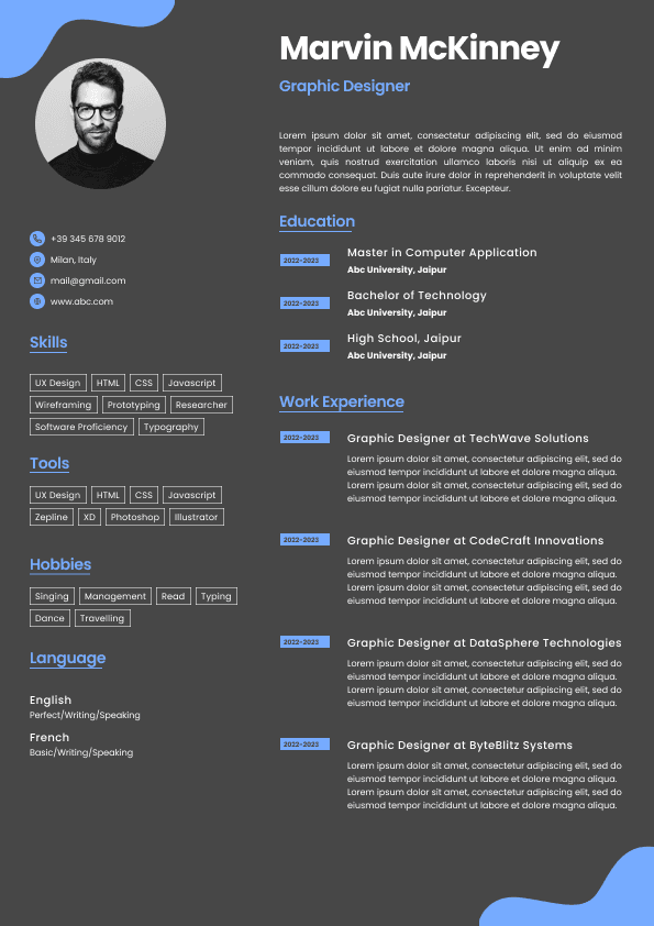
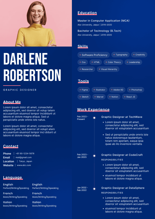
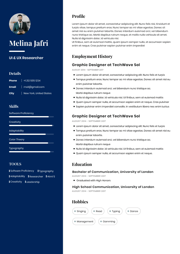
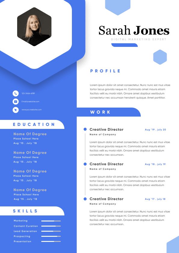
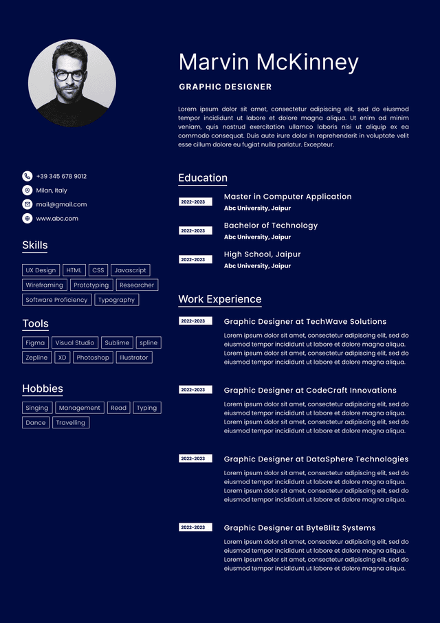
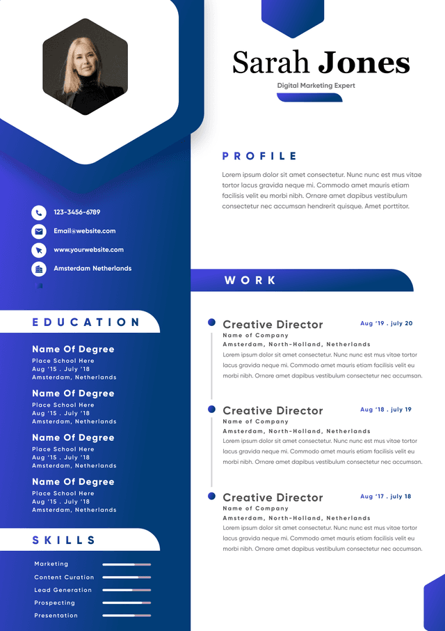
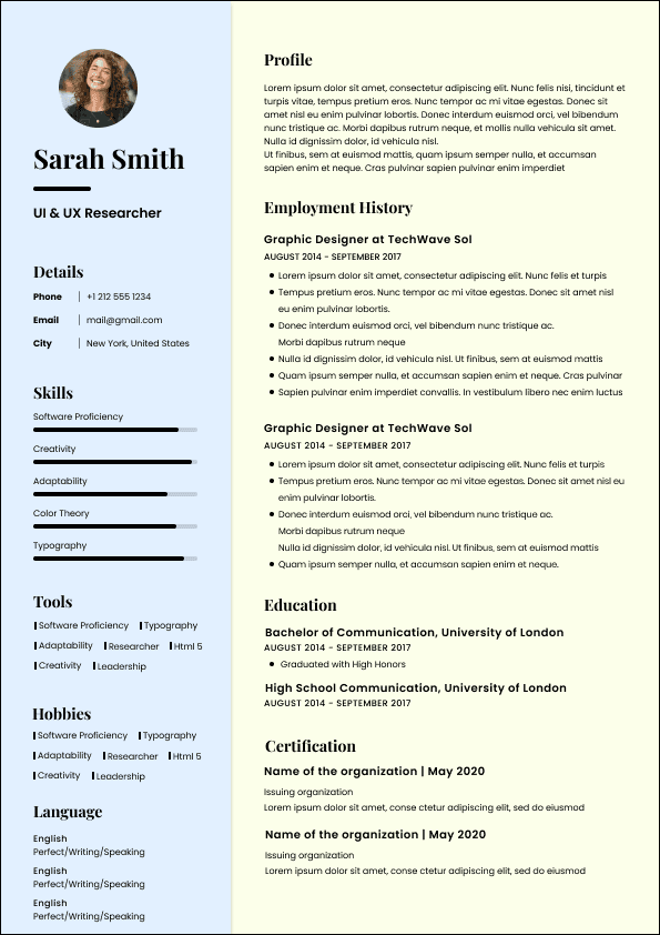
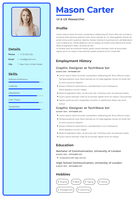
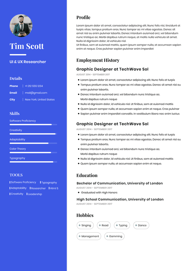
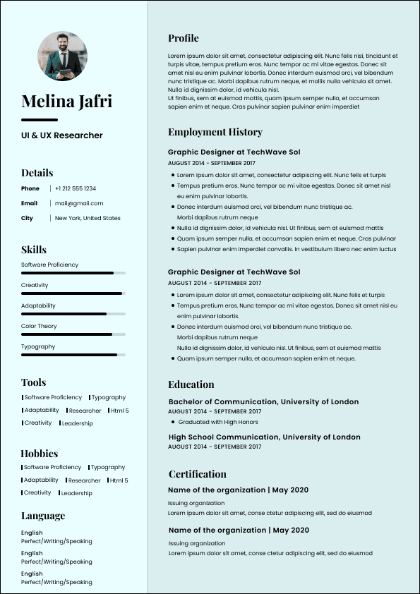
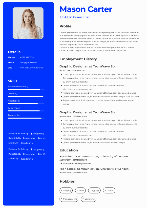
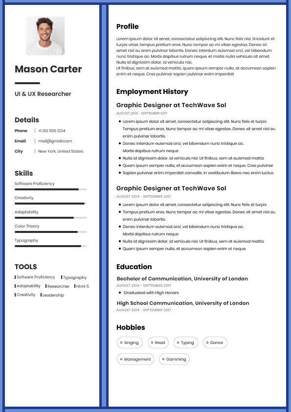
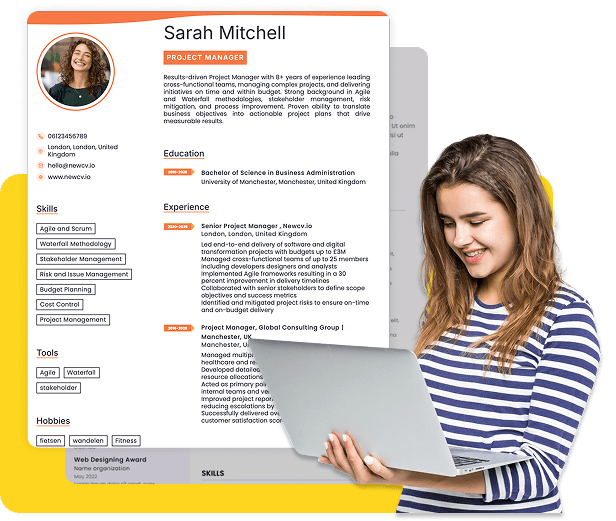
Blue is the safest professional accent color.
It often communicates:
•Trust
• Stability
• Competence
• Reliability
• Professionalism
This explains why many corporate brands and resume templates lean heavily toward navy or muted blue.
Blue works especially well for:
•Finance
• Healthcare
• Technology
• Operations
• Project management
• Corporate roles
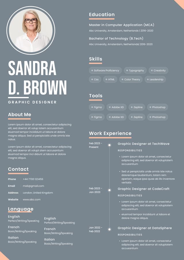
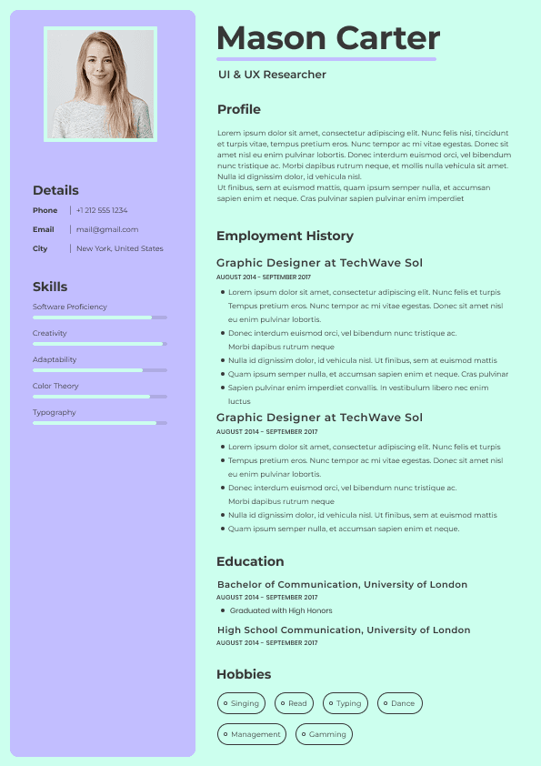
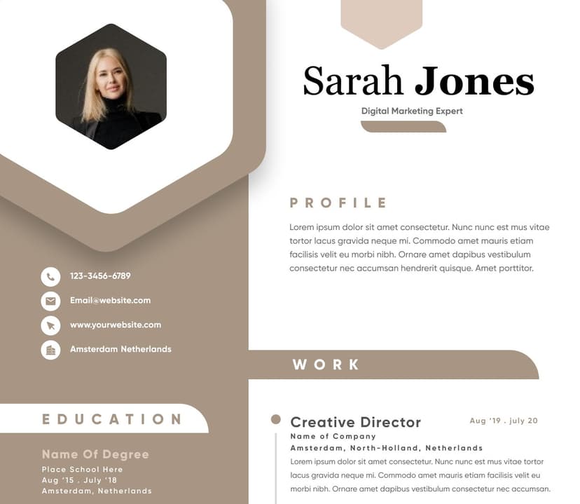
Gray creates a neutral and understated appearance.
Common perceptions:
•Mature
• Professional
• Minimalist
• Controlled
Gray works well for experienced professionals and executive resumes where authority matters more than personality.
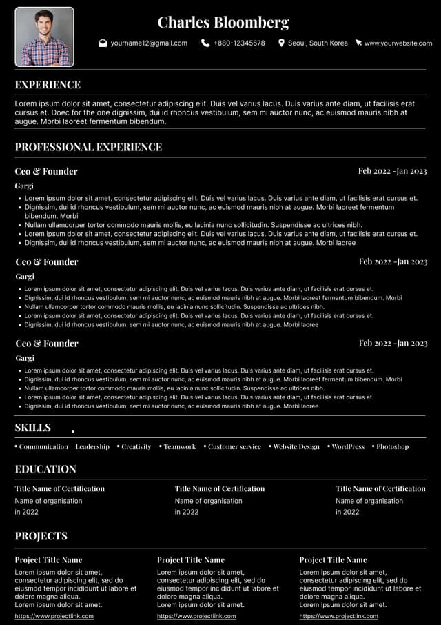
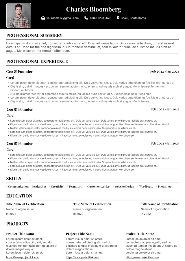
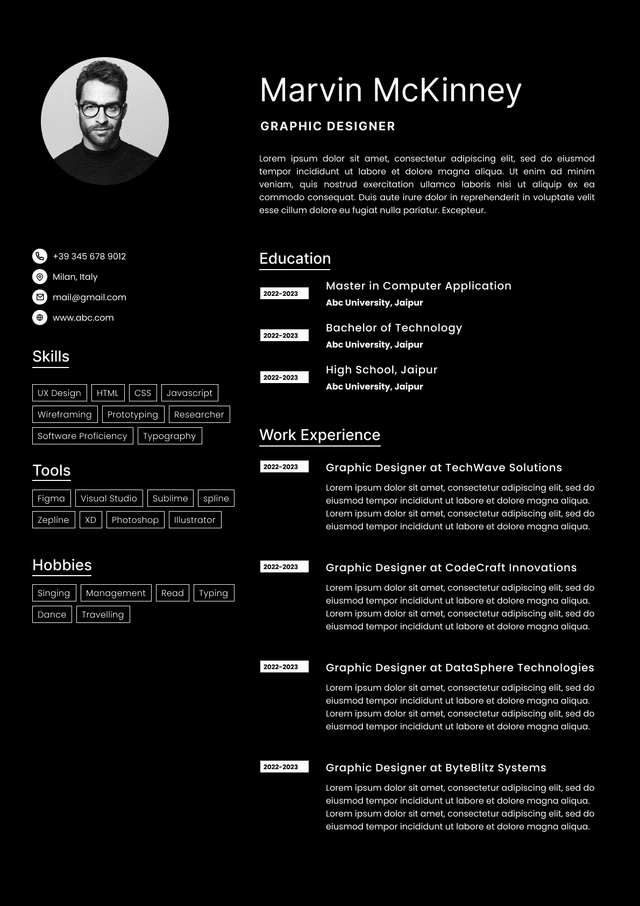
Black creates maximum readability and formality.
It communicates:
•Seriousness
• Traditional professionalism
• Simplicity
For many industries, black remains perfectly effective.
The downside is that entirely black resumes can sometimes appear visually flat.
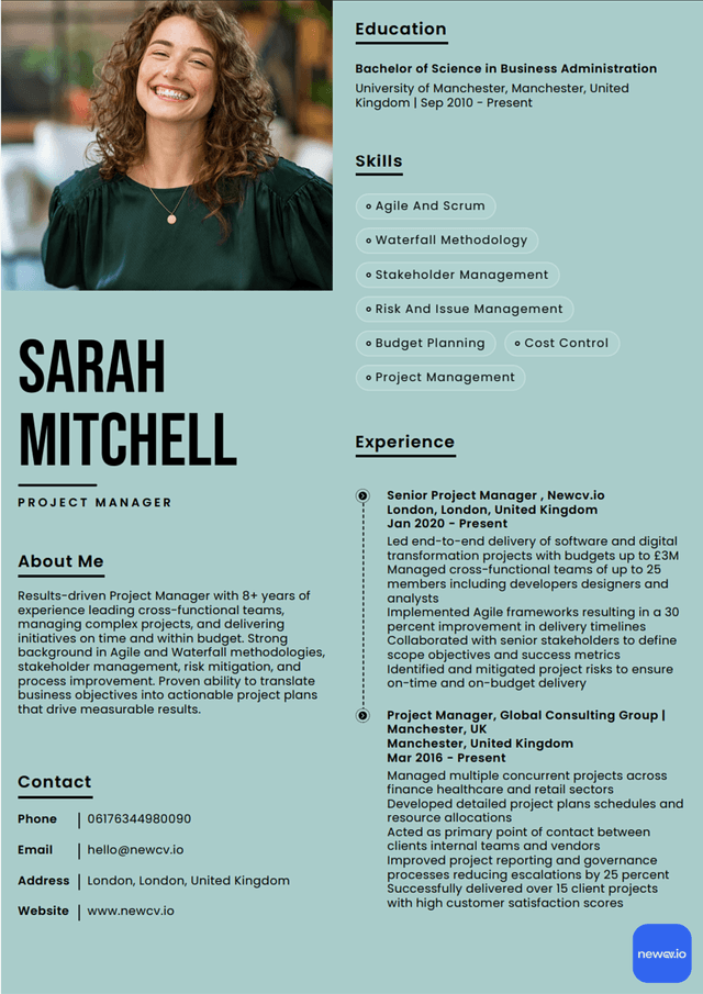
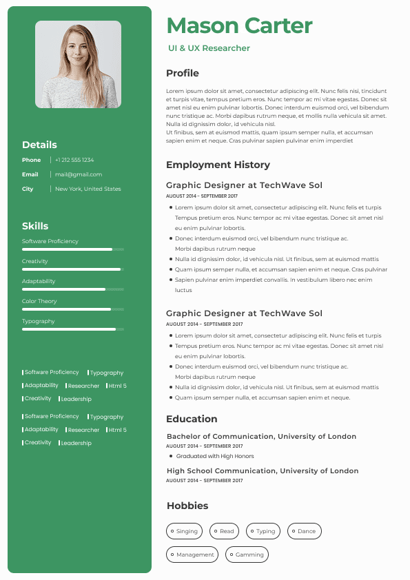
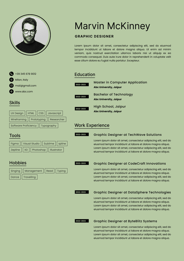
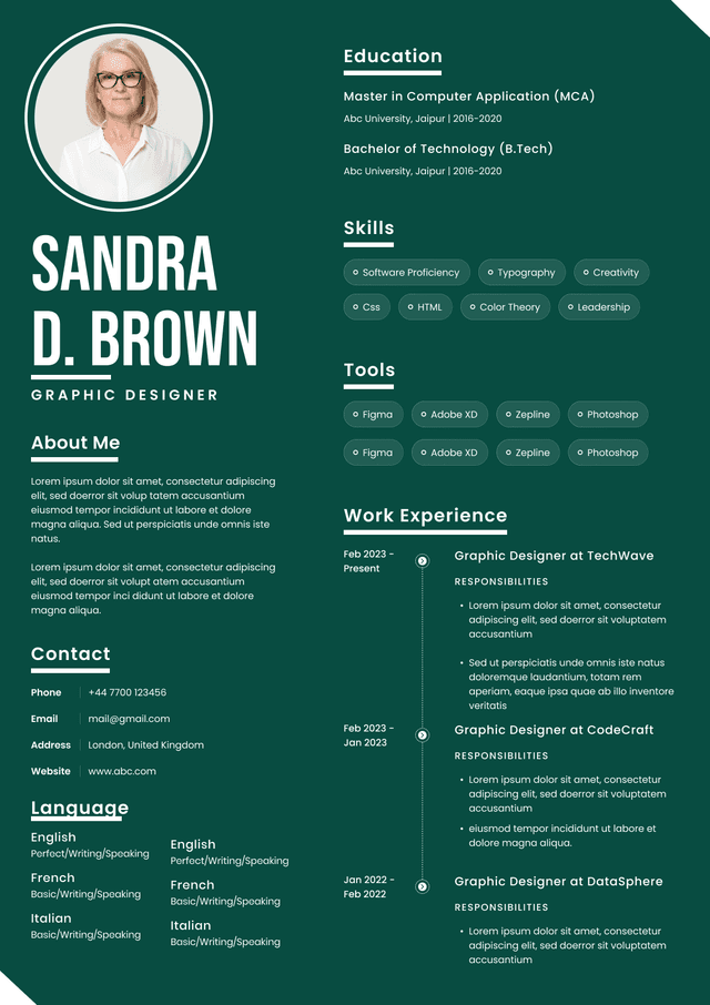
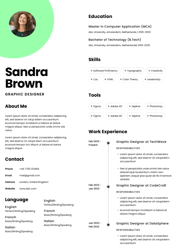
Green can communicate:
•Growth
• Calmness
• Balance
• Sustainability
This may fit:
•Environmental careers
• Wellness industries
• Nonprofit sectors
• Some startup environments
However, green varies dramatically depending on shade.
Muted green may look sophisticated.
Bright neon green almost never does.
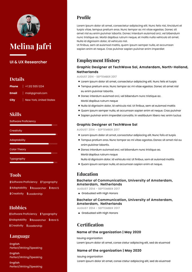
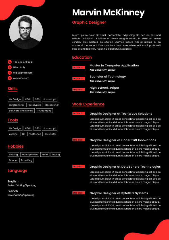
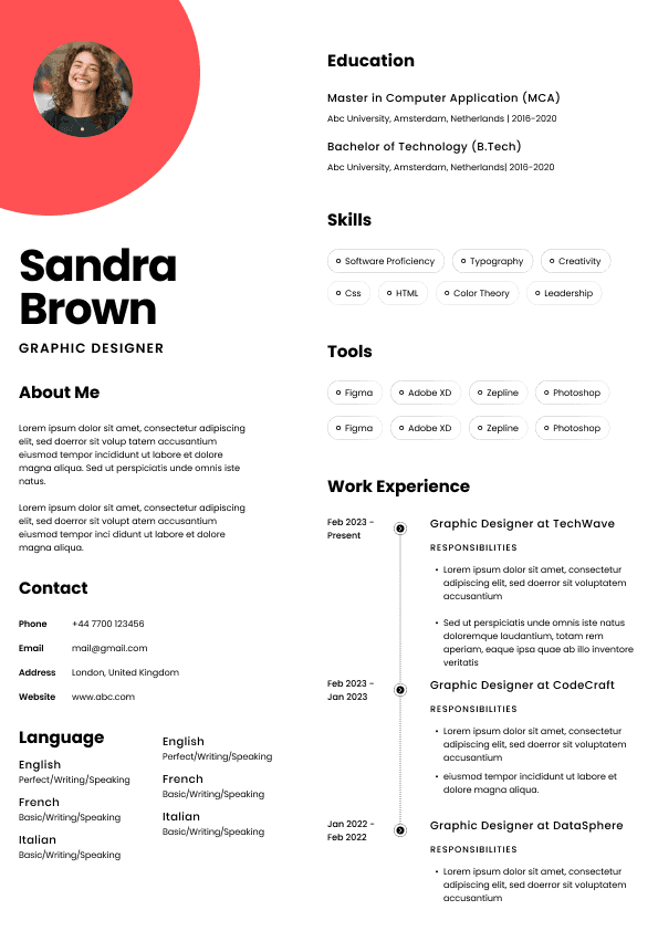
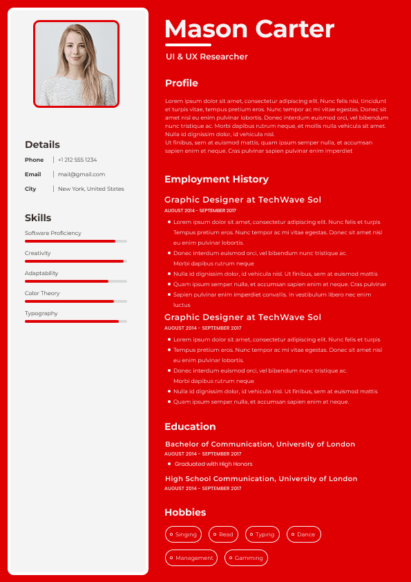
Red creates urgency and attracts attention.
That sounds helpful.
In practice, it often creates problems.
Red can unintentionally communicate:
•Aggression
• Excess intensity
• Visual strain
Recruiters rarely recommend red as a primary resume color.
These colors can work selectively in creative environments.
But outside creative industries, they often introduce risk.
Hiring managers may interpret them as:
•Trying too hard to stand out
• Prioritizing design over substance
• Poor professional calibration
The issue is not the color itself.
The issue is audience expectations.
Candidates often obsess over tiny design decisions while ignoring what matters.
Recruiters usually notice these elements first:
•Name and headline visibility
• White space balance
• Section organization
• Readability
• Font consistency
• Information hierarchy
• Ease of scanning
Color supports those elements.
It should never compete with them.
If recruiters consciously notice your color choices, that can actually be a warning sign.
Great resume design often feels invisible.
Some applicants subconsciously think:
"If I make it look impressive, maybe it feels stronger."
Recruiters immediately recognize this.
A visually aggressive resume cannot hide weak experience.
Strong candidates use design to support substance.
Weak candidates use design to distract.
Hiring teams can usually tell the difference.
Many templates online look attractive on social media.
They often perform poorly in real hiring situations.
Common issues include:
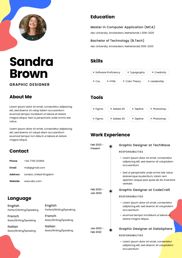
•Light gray text
• Colored backgrounds
• Low contrast sections
• Decorative graphics
• Excessive accent use
A resume exists to communicate information quickly.
Design should reduce effort, not create it.
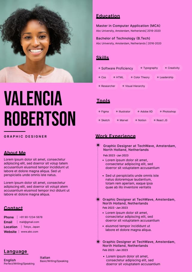
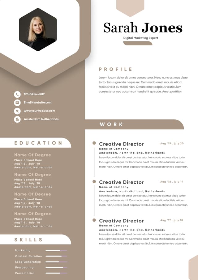
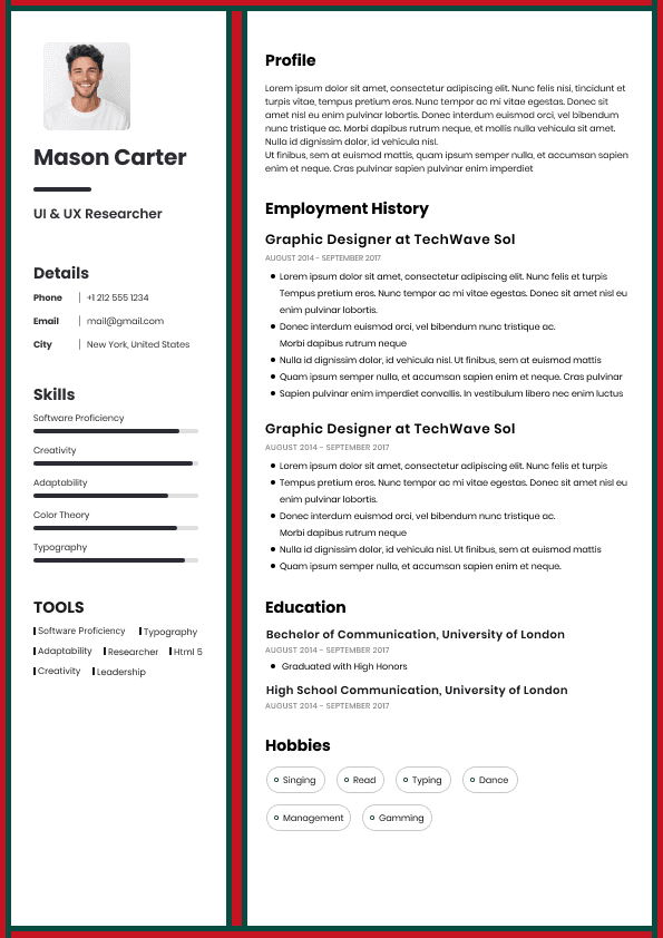
One accent color is usually enough.
Two can work carefully.
Three or more often creates visual noise.
Recruiters frequently describe overly colorful resumes as:
"Busy"
"Messy"
"Hard to focus on"
Visual overload increases cognitive effort.
In hiring, extra effort hurts outcomes.
Applicant Tracking Systems continue to create confusion.
Contrary to internet myths, moderate color itself does not usually break ATS systems.
Problems come from design complexity.
Risk factors include:
•Colored text inside graphics
• Text boxes
• Tables
• Embedded icons
• Multi column structures
• Decorative elements replacing text
ATS systems prioritize readable structure.
Simple formatting almost always wins.
Color should remain secondary.
The biggest mistake with resume color advice is pretending one answer fits everyone.
Different industries interpret presentation differently.
Examples:
•Accounting
• Banking
• Legal
• Government
• Compliance
Safer choices:
•Black
• Navy
• Dark gray
Examples:
•Technology
• Healthcare
• Operations
• Human resources
Moderate accent colors often work:
•Muted blue
• Soft gray
• Dark green
Examples:
•Graphic design
• Marketing
• Advertising
• UX design
Color flexibility increases.
But judgment still matters.
Creative hiring managers expect visual skill.
Ironically, this means bad color decisions may receive even greater scrutiny.
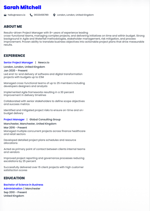
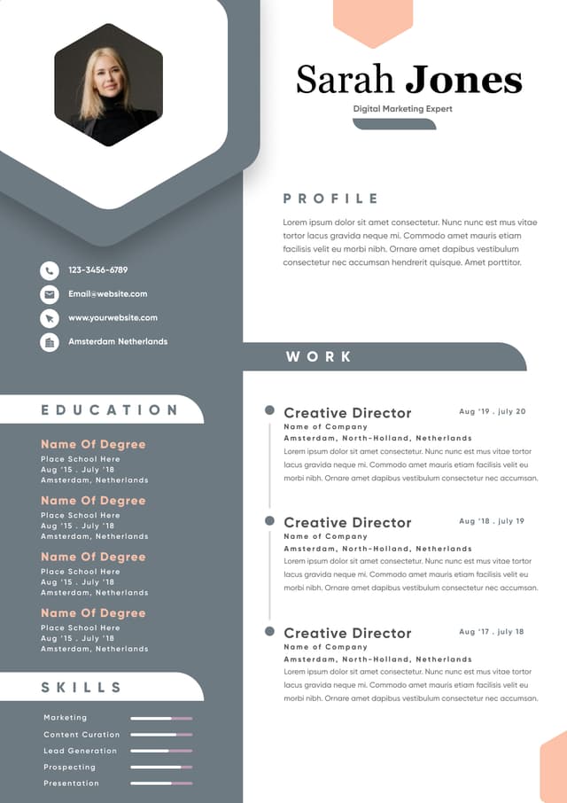
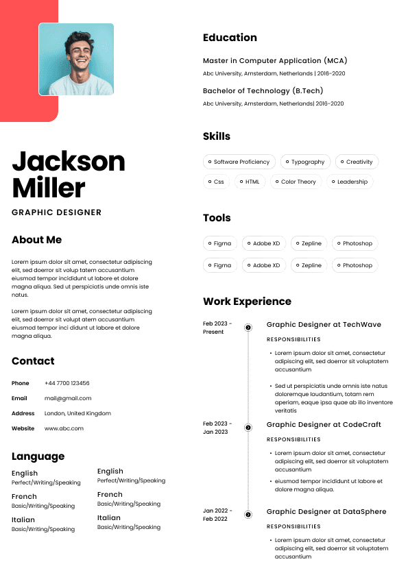
Good Example
•Black text with navy section headers
• High contrast
• Plenty of white space
• Minimal accent use
• Clear visual hierarchy
Why it works:
Recruiters immediately understand where to look.
Reading feels effortless.
Professional judgment appears strong.
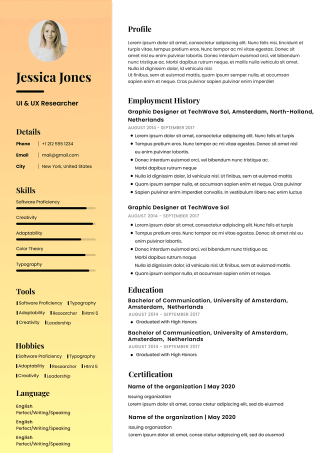
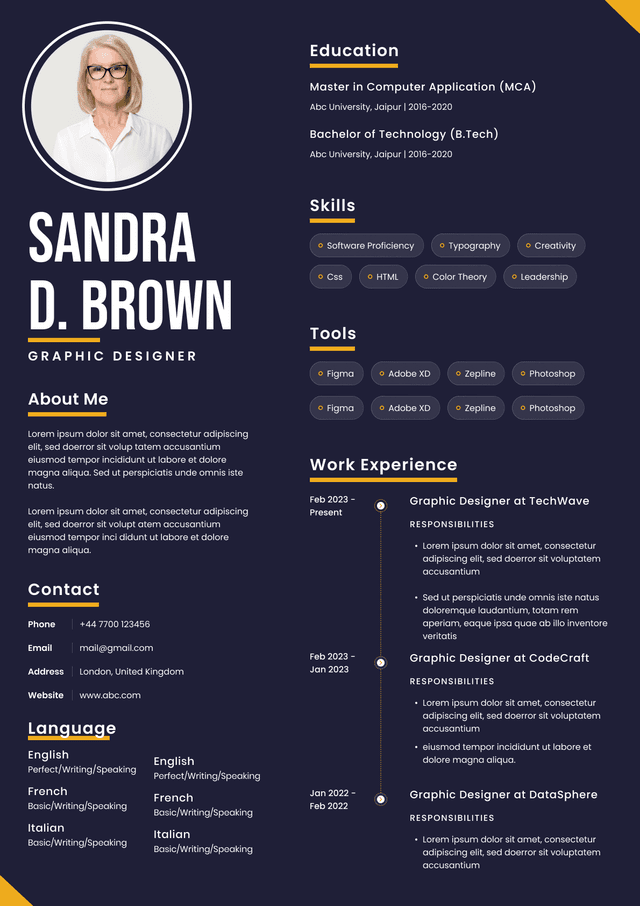
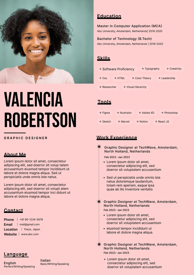
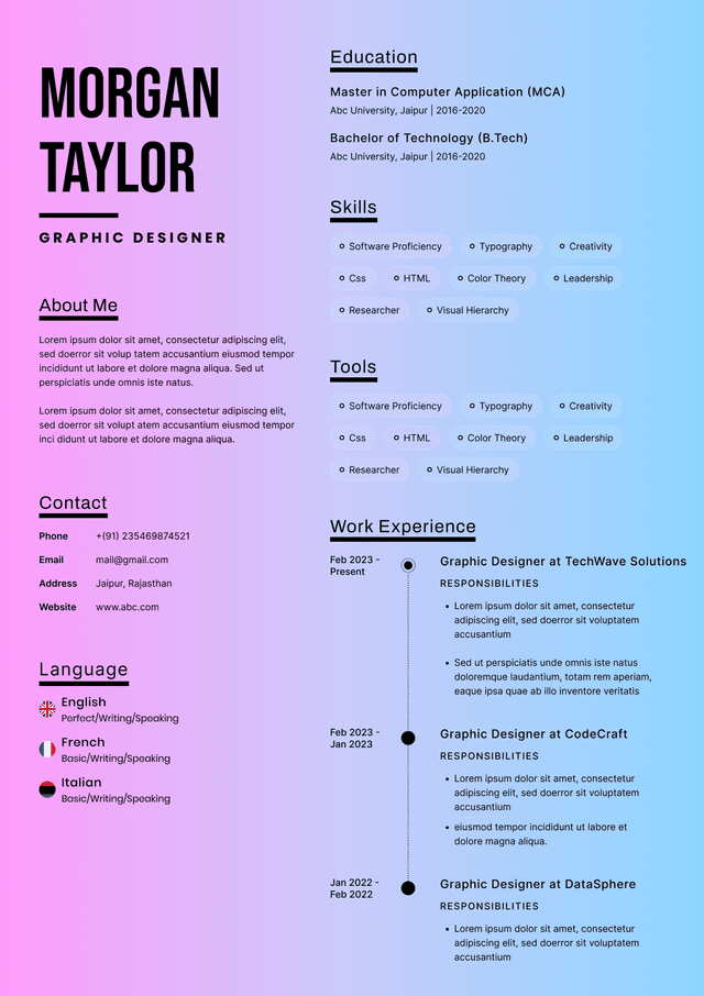
Weak Example
•Bright orange headers
• Gray body text
• Colored sidebars
• Multiple accent colors
• Decorative icons throughout
Why it fails:
Visual noise competes with content.
The resume feels harder to process.
Recruiters become aware of design instead of qualifications.
Use this framework before sending your resume.
Open your document.
Look at it for six seconds.
Then ask:
•Can your eye instantly identify key sections?
• Does reading feel easy?
• Does it look appropriate for your industry?
• Does the design feel confident rather than attention-seeking?
• Does color improve structure or distract from it?
• Does it look like someone who exercises sound judgment created it?
This mirrors real recruiter behavior more closely than perfectionist editing.
Hiring decisions involve uncertainty.
Recruiters are constantly reducing perceived risk.
Every resume detail contributes to an impression:
"Can I picture this person succeeding here?"
Subtle visual signals matter because they affect confidence.
Strong color choices communicate:
"I understand professional expectations."
Poor color choices sometimes communicate:
"I focused on appearance over communication."
Candidates rarely lose jobs because of color alone.
But color can quietly reinforce positive or negative assumptions.
That influence becomes meaningful in competitive applicant pools.
Resume colors shape first impressions because they influence readability, professionalism, and perceived judgment. The strongest resumes rarely use color aggressively. Instead, they use restrained design choices that guide attention and reduce effort.
The safest approach for most professionals remains:
•Black body text
• One muted accent color
• Strong contrast
• Clear hierarchy
• Industry appropriate styling
The best resumes do not scream for attention.
They make recruiters want to keep reading.
Use ATS-optimised Resume and resume templates that pass applicant tracking systems. Our Resume builder helps recruiters read, scan, and shortlist your Resume faster.

Use professional field-tested resume templates that follow the exact Resume rules employers look for.
Create Resume