Most resume design mistakes are not visual mistakes. They are workflow mistakes. Designers often optimize for aesthetics, visual originality, or portfolio-style creativity while unintentionally reducing readability, slowing recruiter scanning behavior, or introducing formatting problems that interfere with resume performance.
The biggest issue is simple: resumes are not posters, landing pages, or branding pieces. They are decision-support tools used inside high-speed hiring workflows. Recruiters typically scan resumes in seconds, hiring managers review them under time pressure, and digital systems often process information before humans even see it.
The best resume design balances visual quality with speed, hierarchy, readability, and structure. The strongest resumes help recruiters find information faster, not admire design longer.
Many beautifully designed resumes fail because designers optimize the wrong thing.
Designers are trained to create visual differentiation. That instinct works for marketing assets, websites, packaging, and brand systems.
Resumes operate differently.
A resume exists inside a constrained workflow where the objective is clarity and fast evaluation.
Recruiters are not evaluating visual artistry first. They are answering practical questions:
What does this person do?
Are they qualified?
What results did they produce?
Does their experience align with this role?
Can I evaluate them quickly?
Designers frequently assume stronger design equals stronger outcomes.
In hiring workflows, stronger usability usually wins.
The problem is not overdesign itself.
The problem is prioritizing aesthetics over decision speed.
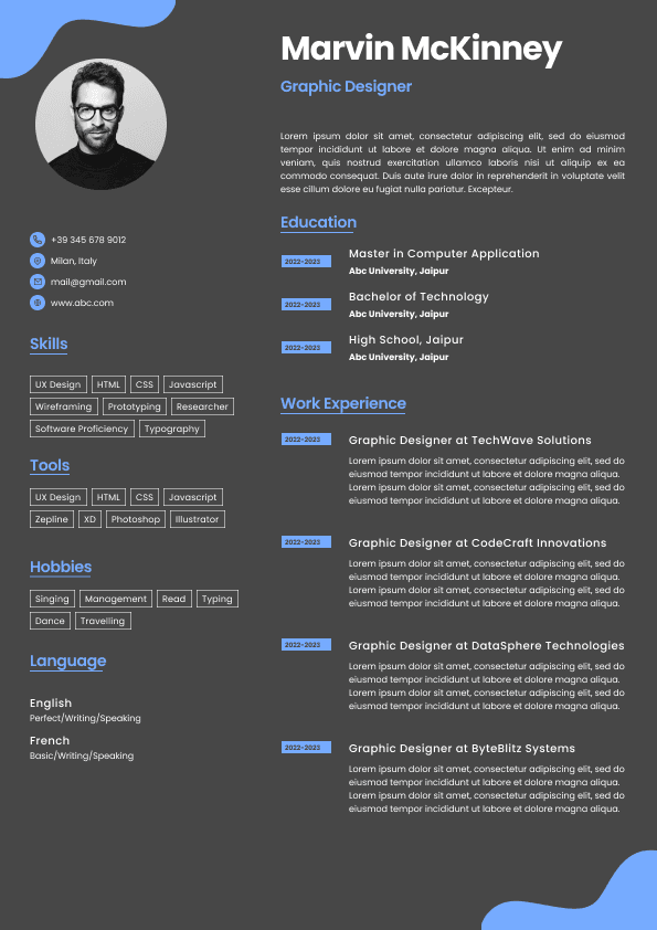
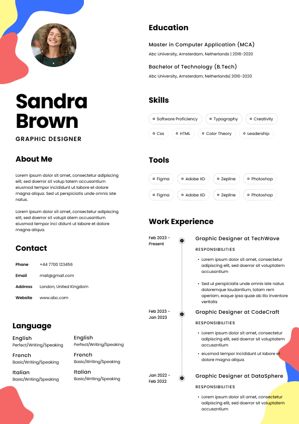
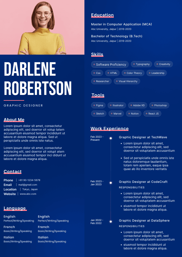
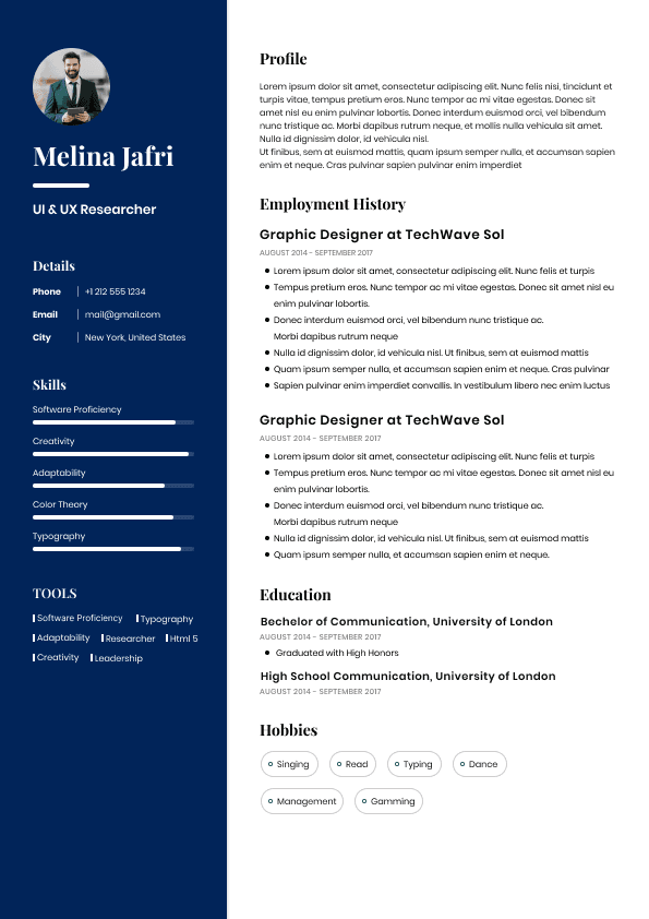
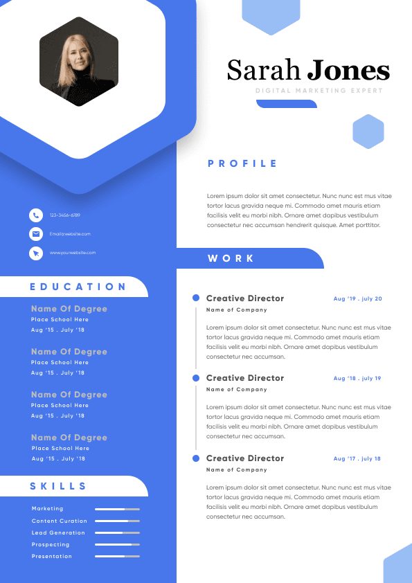
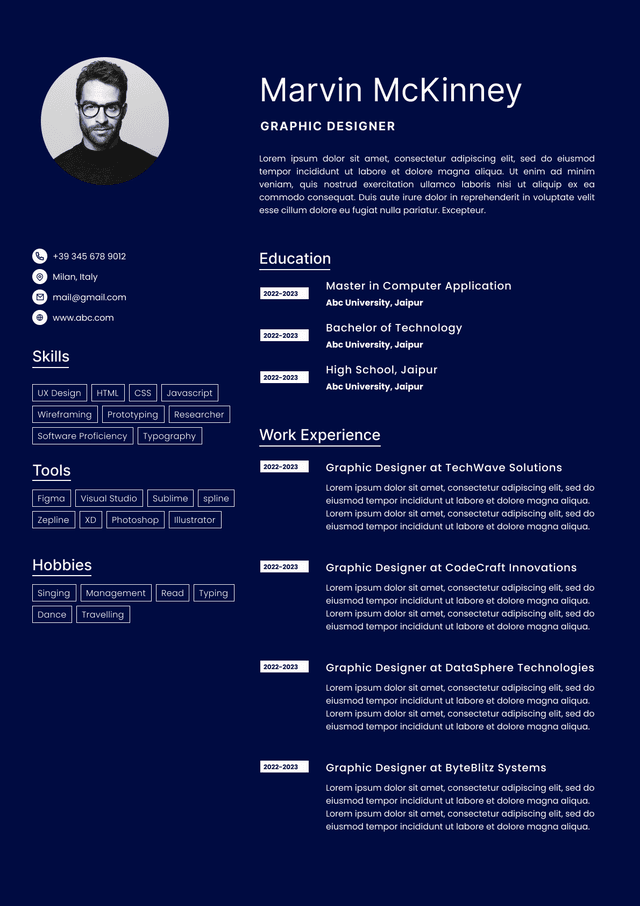
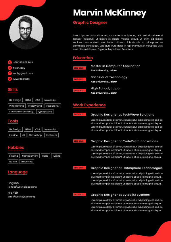
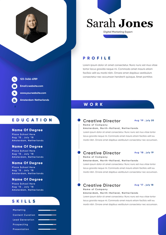
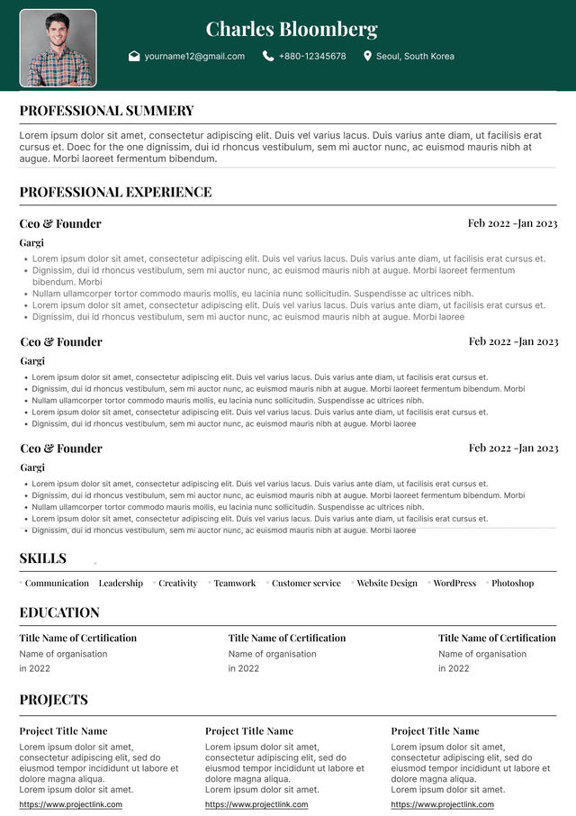
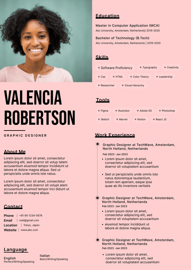
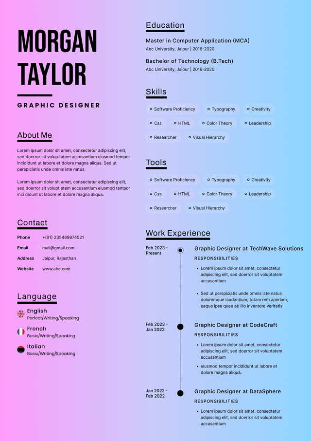
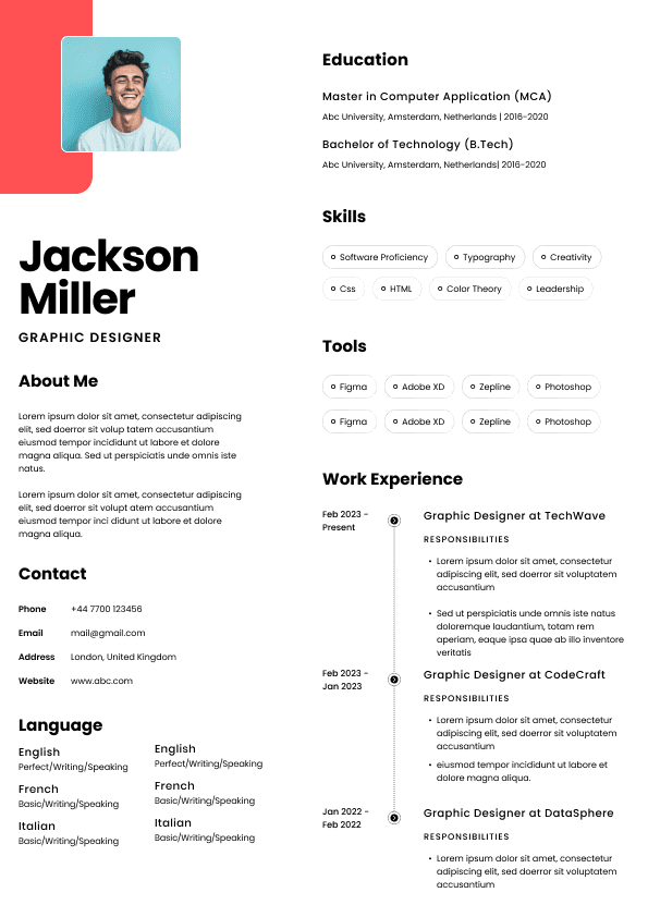
One of the most common resume failures happens when designers turn resumes into visual showcases.
These often include:
Large hero headers
Heavy illustration use
Experimental layouts
Full-page graphics
Visual storytelling sections
Decorative timelines
Excessive branding elements
Portfolio logic and resume logic are not the same.
A portfolio demonstrates capability.
Designers love grids.
Recruiters often do not.
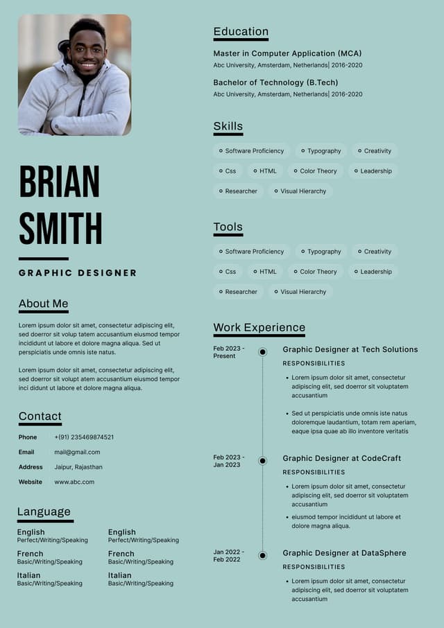
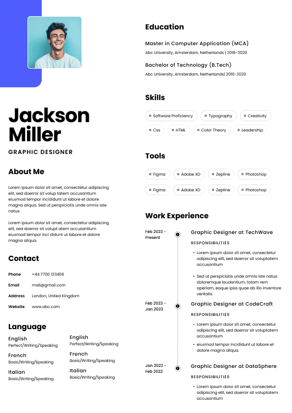
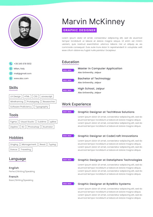
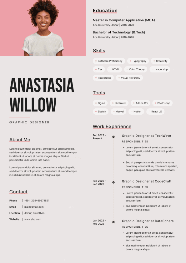
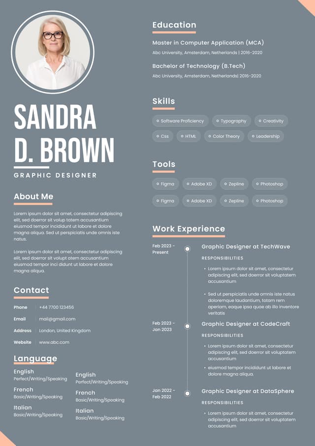
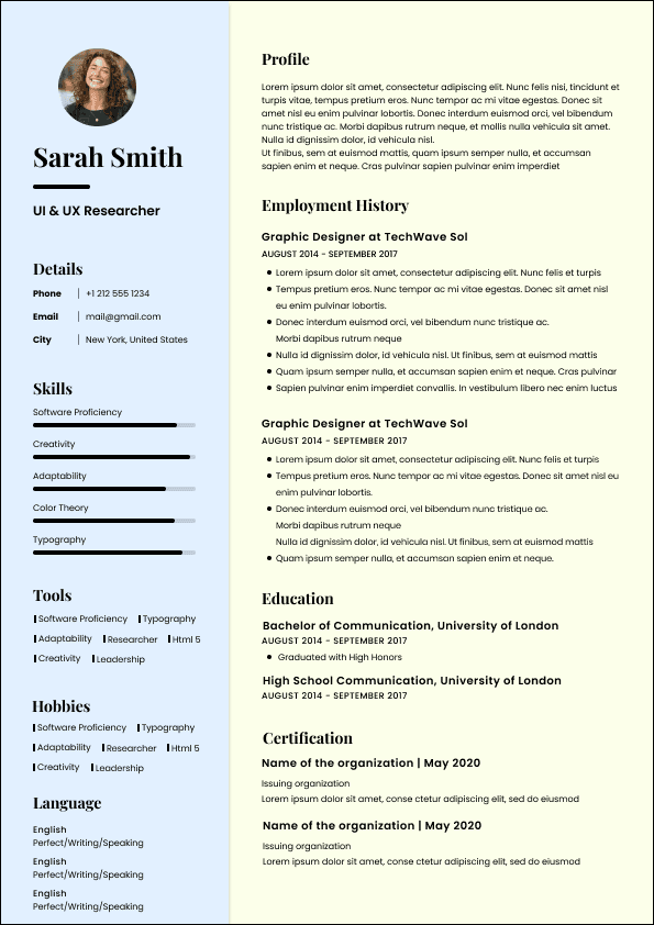
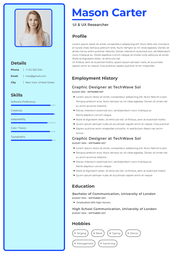
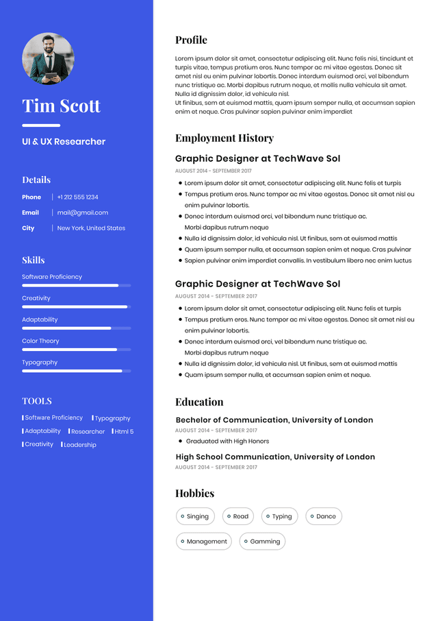
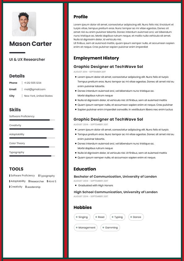
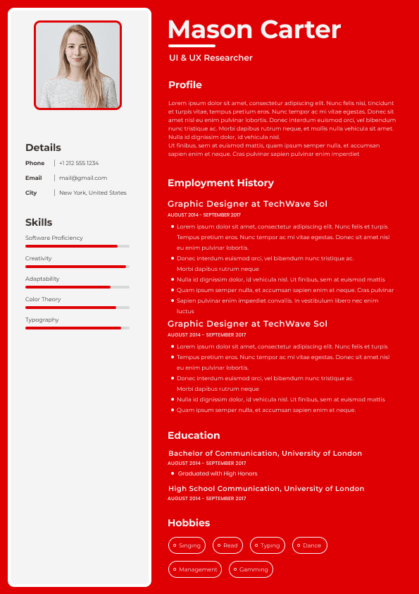
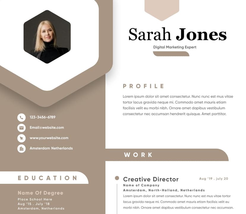
Two-column resume layouts can create several workflow issues:
Uneven reading paths
Missed information
Poor visual flow
Difficult scanning behavior
Layout compression on smaller screens
Potential parsing inconsistencies
Human readers process information linearly under time pressure.
Recruiters frequently skim vertically.
When information jumps horizontally between sidebars and content columns, friction increases.
Even if ATS systems have improved significantly, unusual content placement still creates usability problems.
Typography can improve hierarchy.
Too much variation destroys it.
Many designer resumes include:
Four font families
Multiple text weights
Excessive capitalization
Decorative display fonts
Inconsistent sizing systems
Random emphasis styles
Design systems depend on consistency.
Resume systems are no different.
Excessive type variation forces readers to continuously reinterpret hierarchy.
Recruiters should immediately understand:
Primary information
Designers frequently attempt to fit maximum content into limited space.
This creates:
Tiny font sizes
Reduced line spacing
Compressed margins
Dense paragraphs
Visual overload
The reasoning feels logical:
"More information means more value."
Recruiter behavior says otherwise.
Dense resumes increase cognitive load.
Cognitive load slows decisions.
Slower decisions reduce engagement.
Hiring teams often prefer resumes that feel easy.
Easy-to-read resumes create perceived competence because information retrieval becomes effortless.
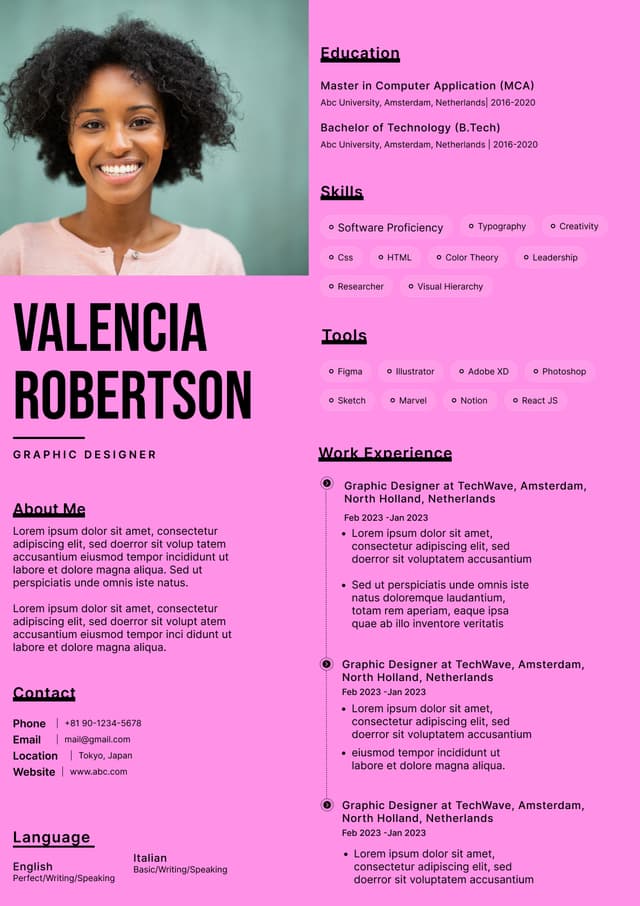
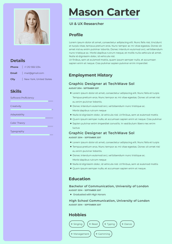
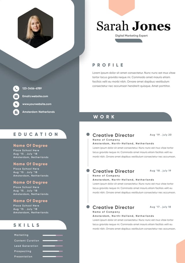
Icons became a major trend in modern resume templates.
Used carefully, they can help.
Used excessively, they create clutter.
Common examples:
Contact icons beside every item
Skill rating icons
Decorative section symbols
Timeline graphics
Social media graphics
Visual proficiency indicators
Visual elements only help when they reduce effort.
Many icon-heavy resumes create the opposite effect.
Recruiters do not need a phone icon to recognize a phone number.
This remains one of the most misunderstood resume trends.
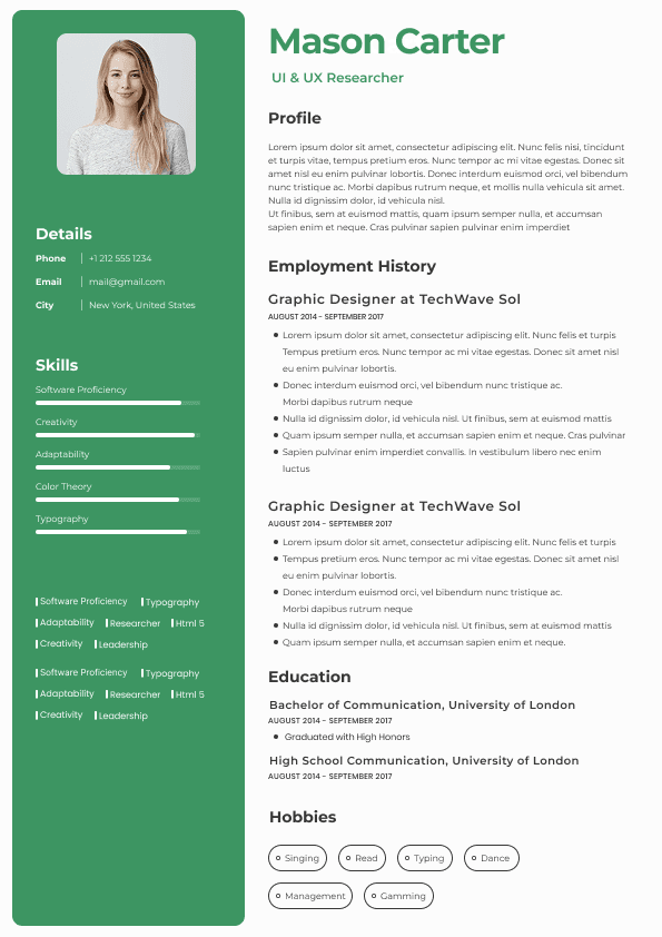
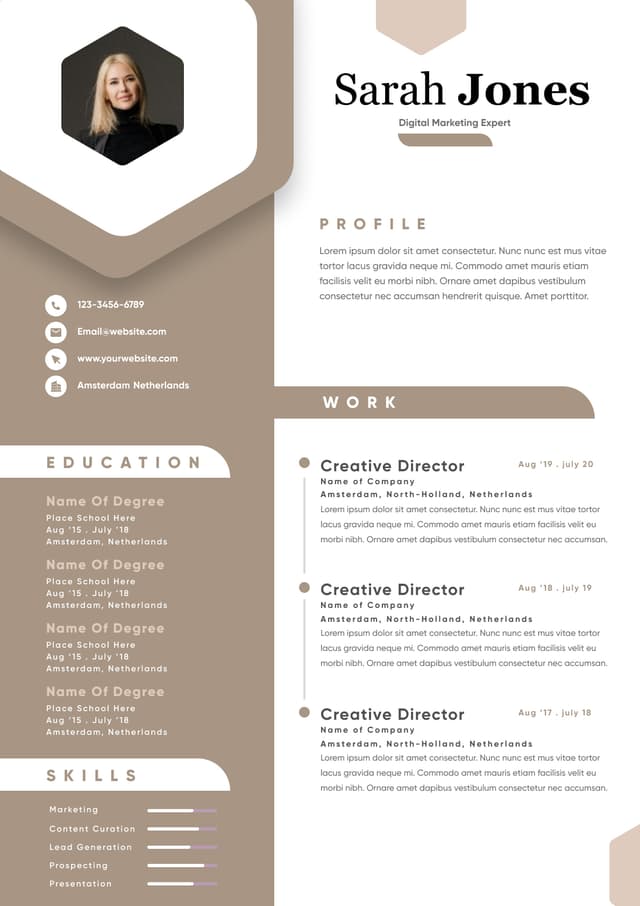
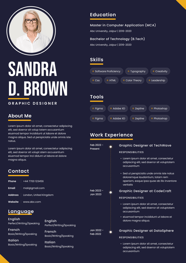
Designers love visual scales:
Photoshop ████████
Figma ██████
Illustrator █████████
The problem:
What does 80% Photoshop actually mean?
Compared to whom?
Against what benchmark?
Skill bars create artificial precision.
Recruiters generally do not trust them.
Experience evidence matters more.
Instead of:
Adobe Creative Suite: 90%
Use:
Adobe Creative Suite expertise used across 40+ client projects involving branding systems and digital campaigns.
Context creates credibility.
Ratings create ambiguity.
Recruiter workflows changed.
Many resumes are viewed:
On laptops
On mobile devices
Through applicant platforms
Inside recruiting software
In compressed preview windows
Through PDFs rendered at reduced sizes
Designers frequently build resumes on large monitors.
Small-screen behavior gets ignored.
Layouts that appear polished at full scale may become difficult to scan elsewhere.
Common failures:
This mistake is subtle.
Many resumes look visually organized but fail strategically.
Designers often emphasize:
Logos
Brand elements
Color systems
Personal identity assets
But underemphasize:
Results
achievements
experience relevance
Most resume advice talks about ATS.
Fewer discussions explain recruiter behavior itself.
Recruiters often scan:
Top area
Recent role
Job titles
Keywords
Results
Education
Skills
This process happens extremely quickly.
Designers frequently assume readers consume resumes line by line.
They do not.
People scan first.
Read second.
Evaluate third.
Good resume design supports scanning behavior.
Poor design interrupts it.
This mistake explains nearly every other problem.
Designers naturally ask:
"What looks impressive?"
Better question:
"What reduces hiring friction?"
The answer changes design decisions entirely.
Hiring outcomes depend on:
Fast understanding
Clear positioning
Information accessibility
Readability
Relevance
efficient scanning
Design quality matters.
Many articles frame resume design as an appearance problem.
Real-world hiring shows a workflow problem instead.
Resumes move through multiple stages:
Applicant → software platform → recruiter → hiring manager → interview decision
Each stage introduces friction opportunities.
Designers frequently optimize for only one stage:
Human visual appeal.
High-performing resumes survive the entire workflow.
That means balancing:
Visual quality
Reader speed
structure
usability
machine compatibility
Traditional resume tools often forced users into tradeoffs:
Either choose:
Or:
Or:
Or:
Modern platforms increasingly remove those compromises.
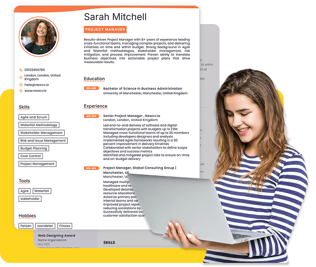
For example, platforms such as NewCV reflect a broader shift toward workflow-oriented resume creation. Instead of forcing users to choose between design quality and usability, newer systems combine ATS-friendly structure, cleaner formatting logic, faster editing workflows, and stronger personal presentation.
The practical benefit is not aesthetics alone.
The advantage is reducing workflow friction.
Users increasingly want:
Professional visual presentation
Instead of asking:
"Does this look good?"
Ask:
If yes, design supports outcomes.
If no, design may be competing against hiring performance.
The strongest resume designs usually share similar traits:
Clear single-direction reading flow
Moderate visual styling
Strong typography consistency
Clean spacing systems
Easy scanning patterns
Prioritized achievement visibility
Minimal decorative elements
Structured information hierarchy
Resume design is not about maximizing creativity.
It is about maximizing comprehension.
Designers often bring portfolio thinking into hiring systems that reward speed and usability. The most effective resumes are not the most visually ambitious. They are the easiest to process.
Strong resume design helps recruiters make decisions faster.
Everything else is secondary.
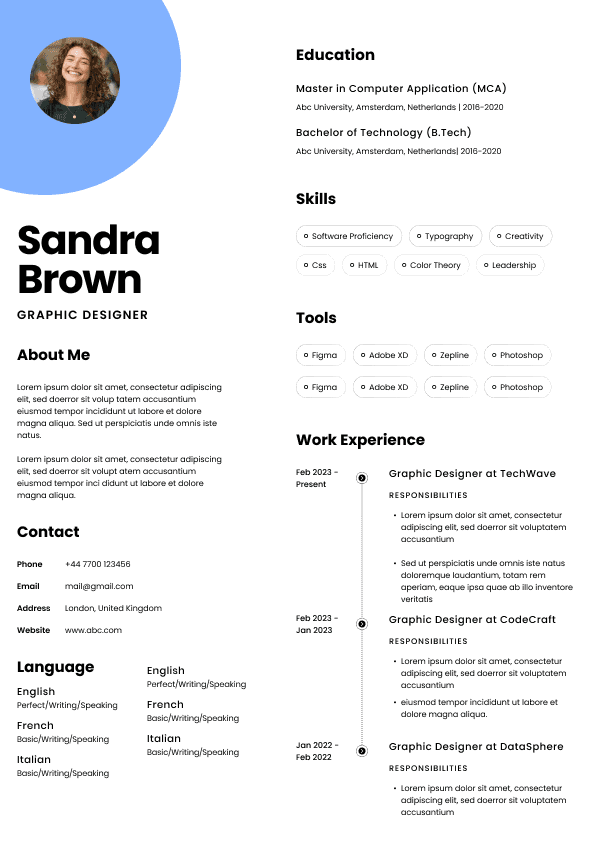
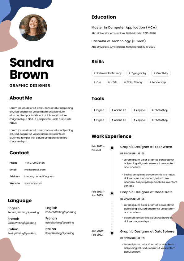
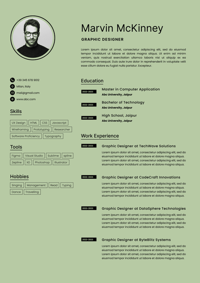
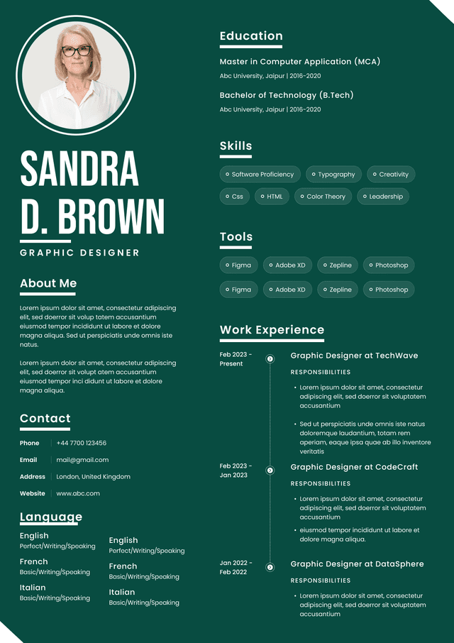
Choose from a wide range of NEWCV resume templates and customize your NEWCV design with a single click.

Use ATS-optimised Resume and resume templates that pass applicant tracking systems. Our Resume builder helps recruiters read, scan, and shortlist your Resume faster.
Use professional field-tested resume templates that follow the exact Resume rules employers look for.
Create Resume
Use professional field-tested resume templates that follow the exact Resume rules employers look for.
Create ResumeA resume organizes qualifications.
Recruiters often move through resumes at extremely high speed. Every decorative element competes with content for attention.
If visual design delays understanding, design is actively hurting performance.
Use design to improve scanning:
Strong visual hierarchy
Clear section structure
Consistent spacing
Predictable content flow
Strategic typography
Limited visual emphasis
Good resume design becomes almost invisible.
The reader notices ease rather than decoration.
The issue is rarely technical failure.
The issue is cognitive interruption.
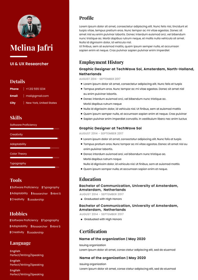
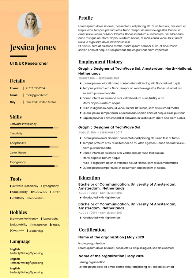
Left column:
Skills
Tools
Languages
Awards
Right column:
Experience
Projects
Education
The reader constantly shifts attention.
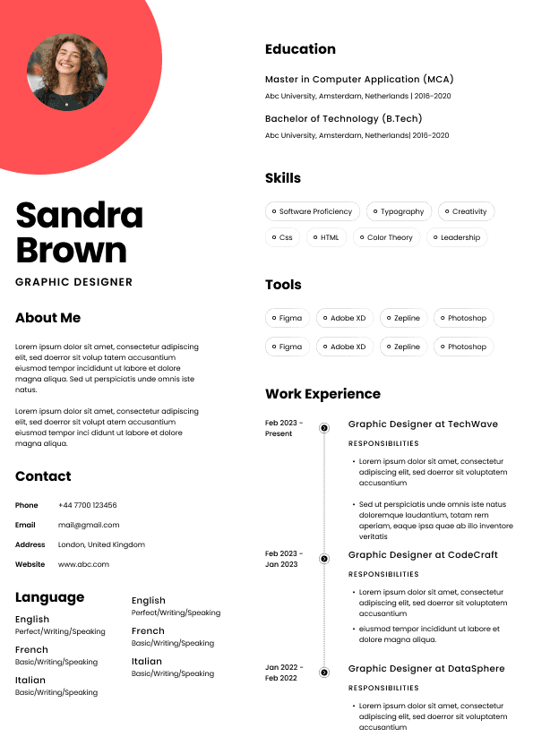
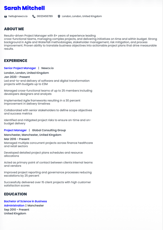
Single-column hierarchy:
Summary
Experience
Projects
Skills
Education
The reader stays in one flow.
Less effort creates faster evaluation.
Secondary information
Supporting information
Dates
Titles
Achievements
The hierarchy should feel obvious.
Not creative.
Whitespace is not wasted space.
Whitespace is navigation.
They do not need five stars beside Photoshop.
Icons should support usability, not decorate space.
Tiny text
Narrow columns
Misaligned spacing
Hard-to-read hierarchy
Visual crowding
Good resume design survives compression.
Bad resume design depends on perfect viewing conditions.
measurable outcomes
Hiring decisions prioritize evidence.
Visual hierarchy should reinforce importance.
Ask:
What information influences hiring decisions?
That information should receive priority.
Not decorative assets.
But usability wins first.
information hierarchy
The strongest resumes function as systems.
Not artworks.
Cleaner structure
faster creation
better readability
recruiter-friendly layouts
personal identity support
The market is shifting from templates toward workflow systems.
That distinction matters.
Content-first design logic
Ironically, highly effective resumes often appear simpler than designer resumes.
Because simplicity reduces effort.
Reducing effort improves outcomes.