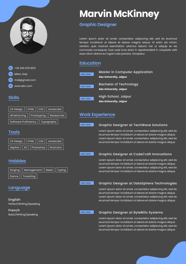
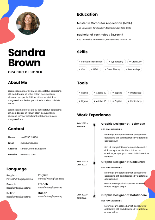
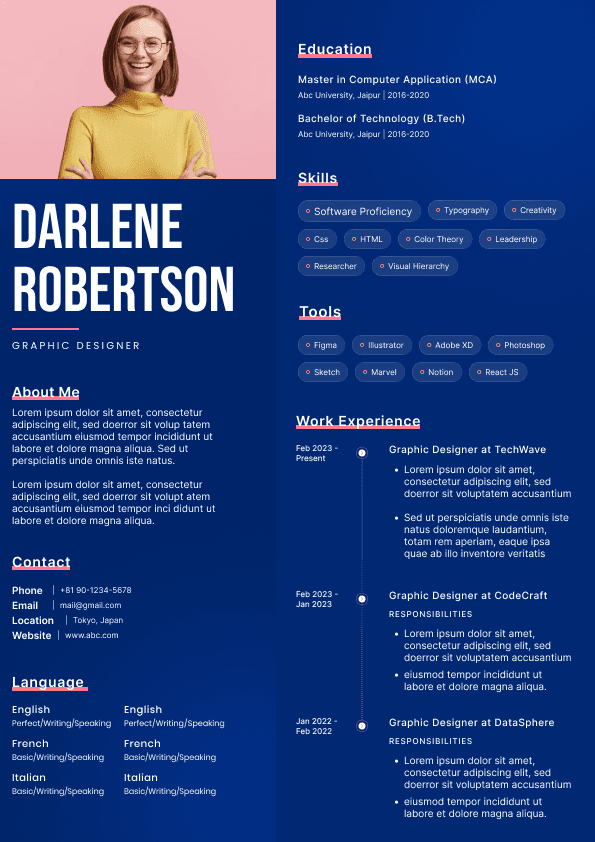
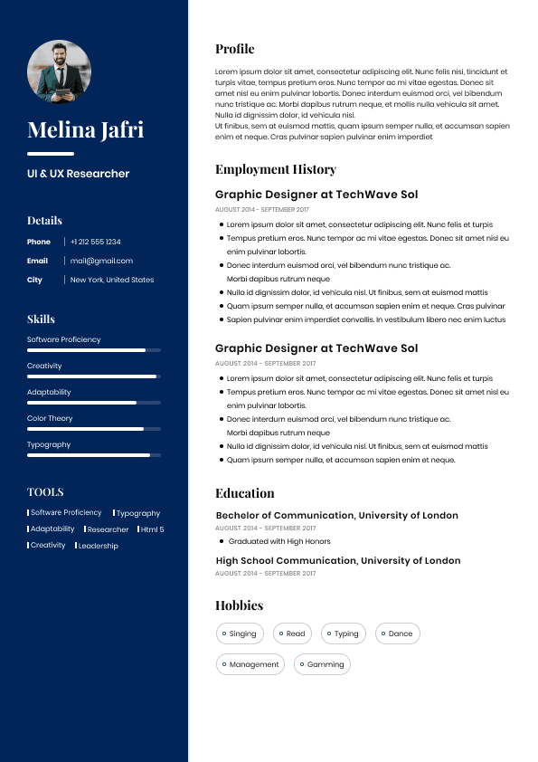
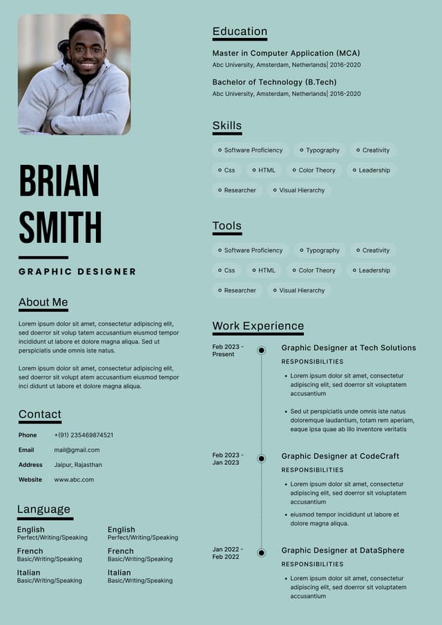
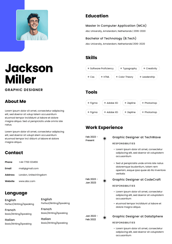
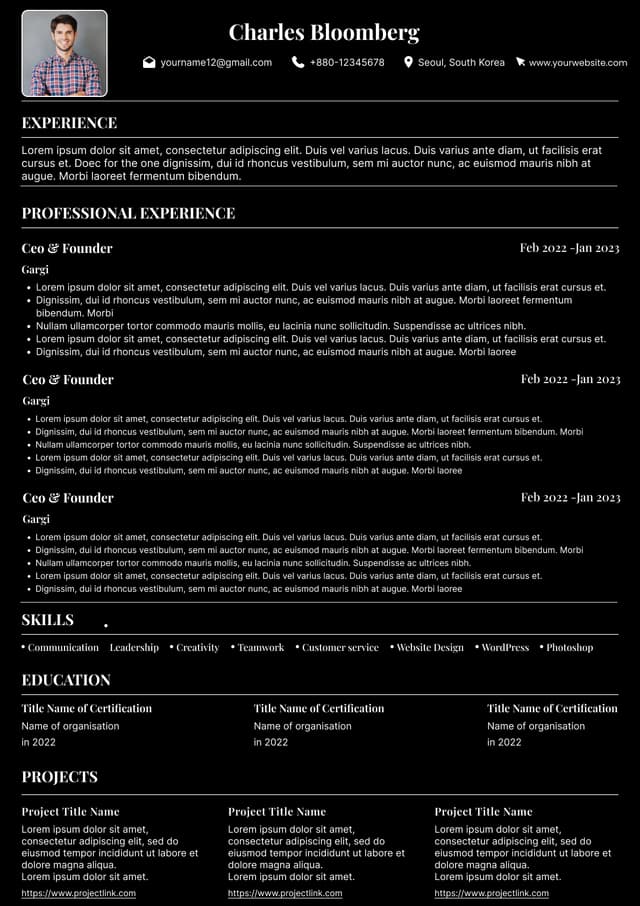
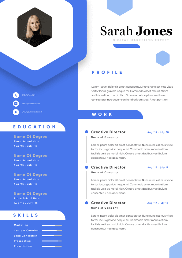
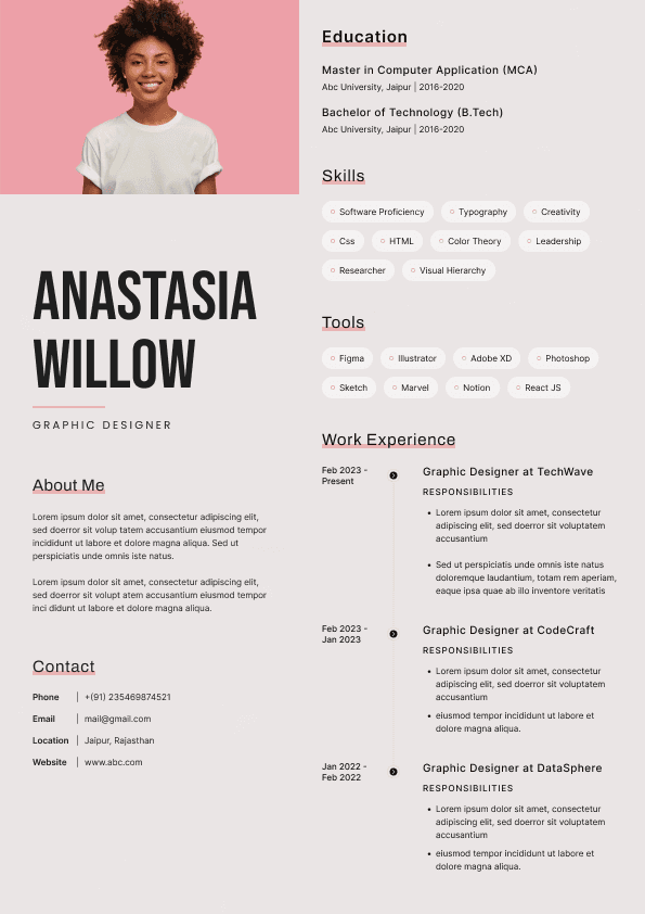
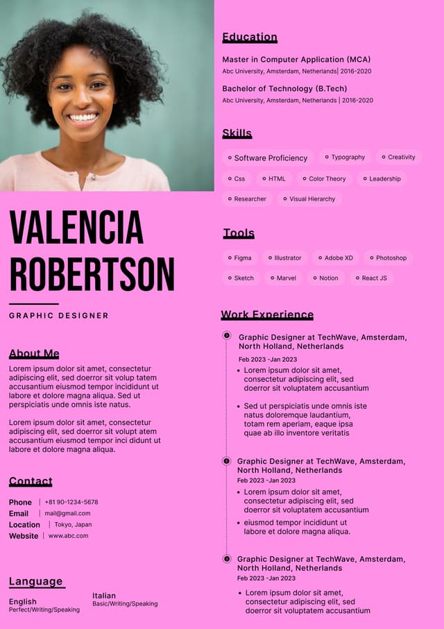
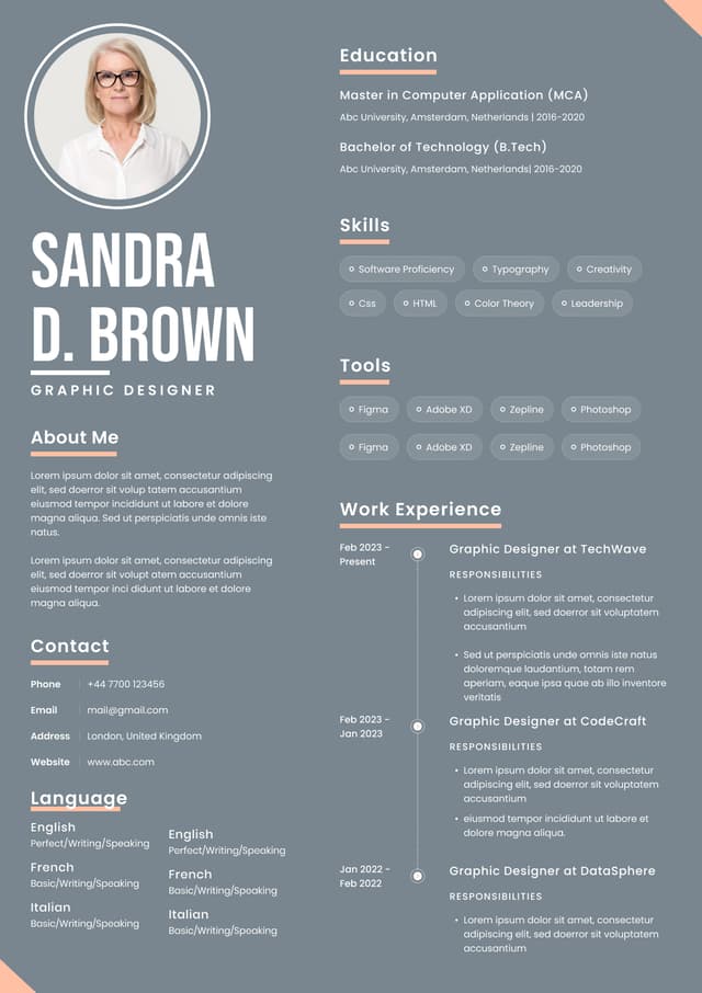
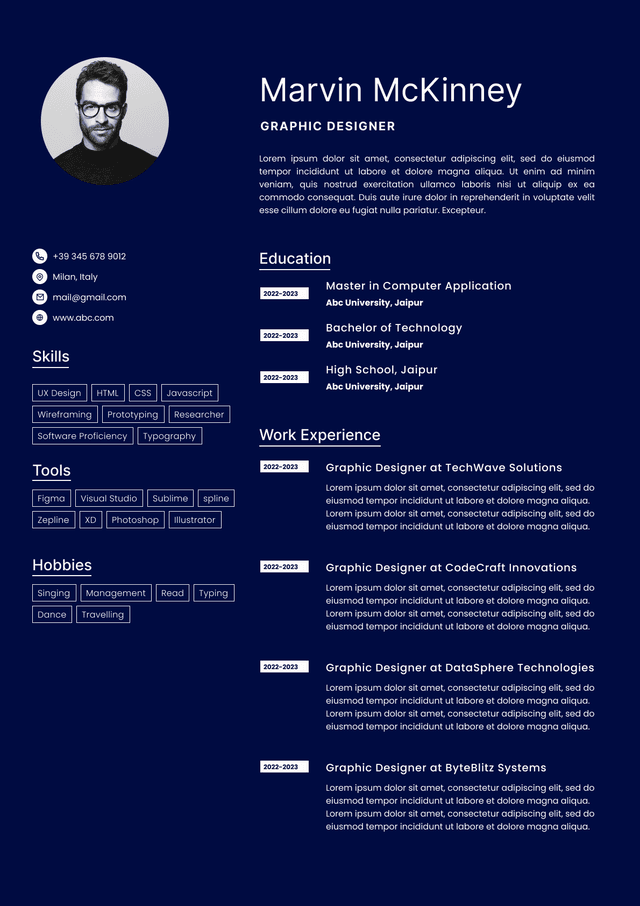
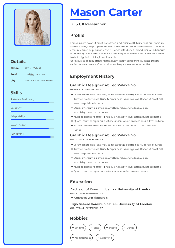
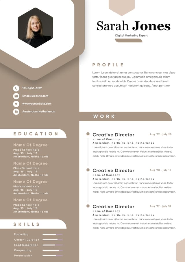
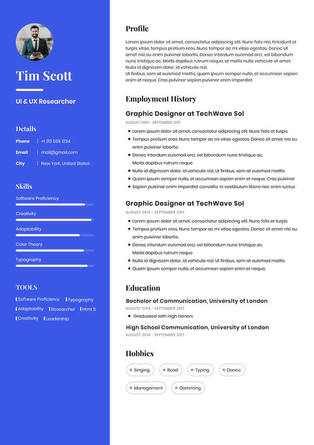
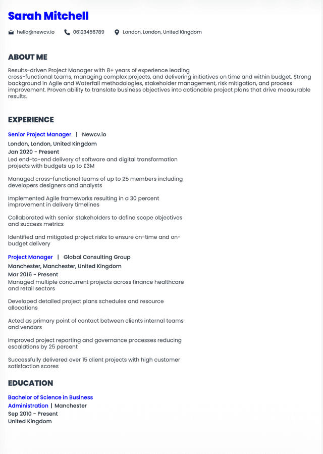
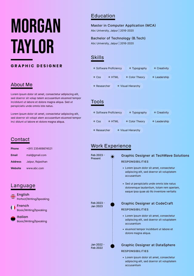
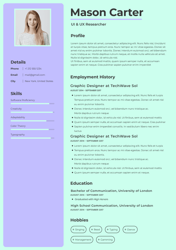
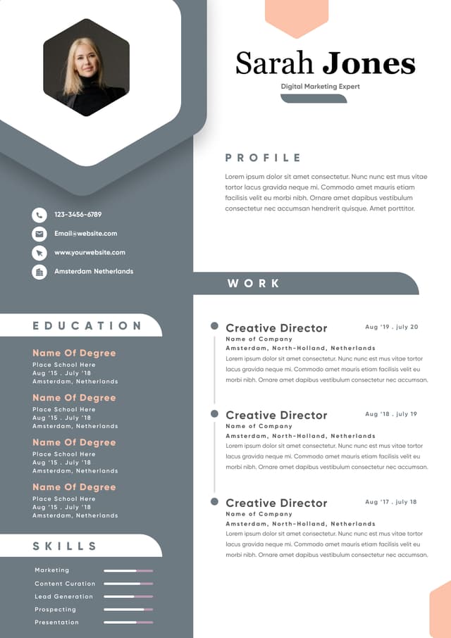
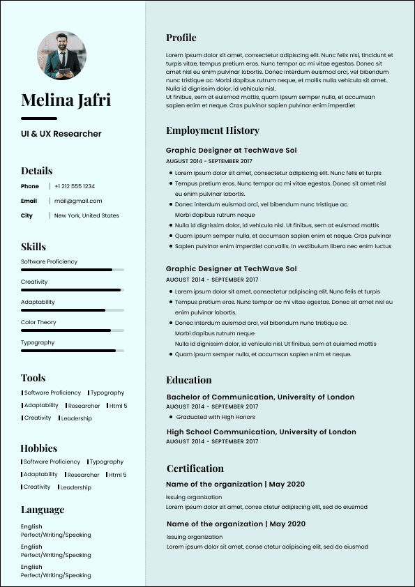
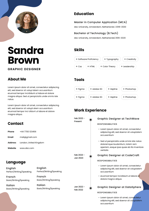
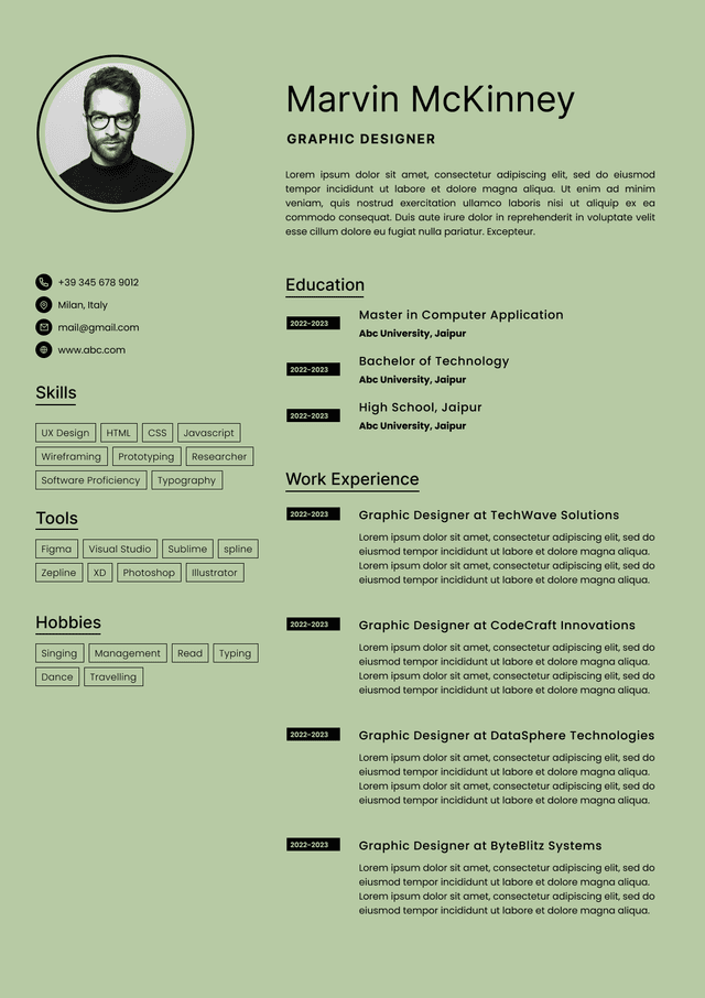
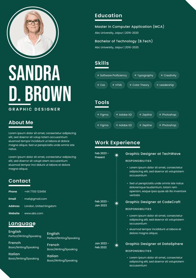
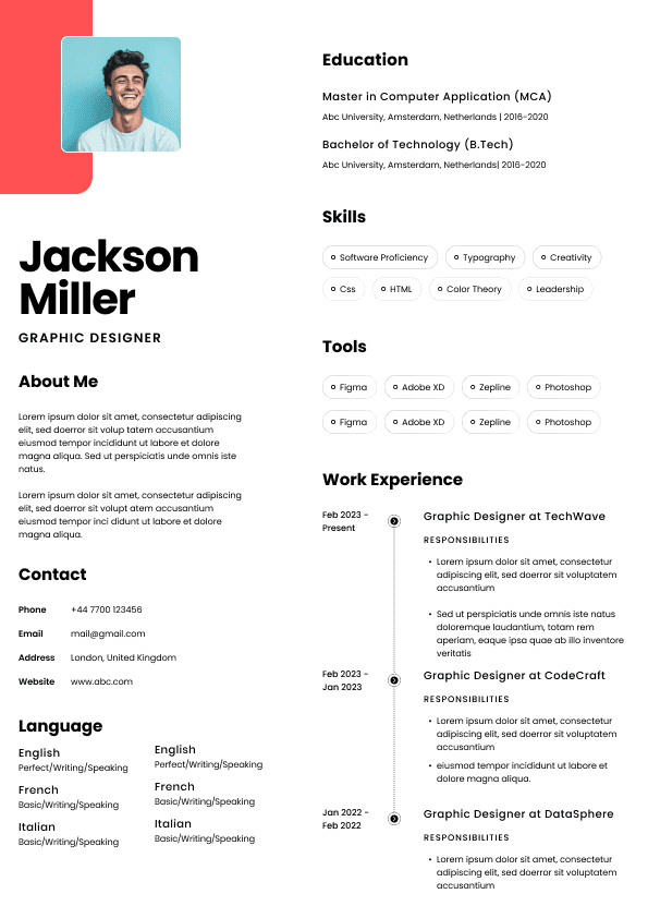
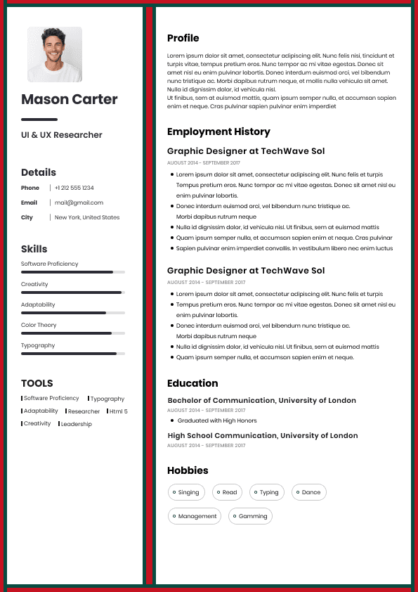
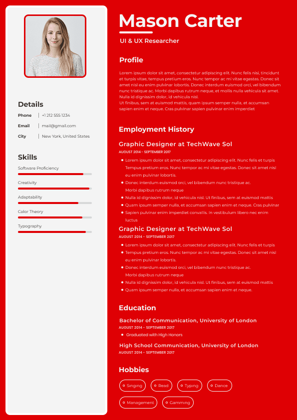
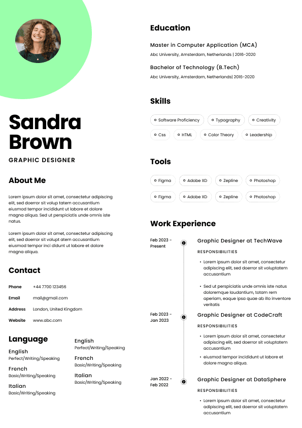
Choose from a wide range of NEWCV resume templates and customize your NEWCV design with a single click.

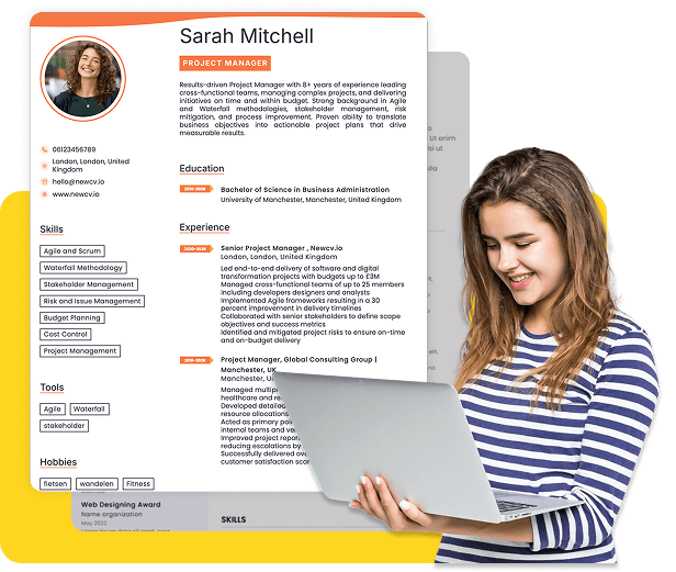
Use professional field-tested resume templates that follow the exact Resume rules employers look for.
Create ResumeResume fonts are not a design preference.
They directly influence ATS parsing accuracy, recruiter readability speed, and perceived professionalism.
In modern hiring pipelines, resumes are first ingested by applicant tracking systems and then scanned rapidly by recruiters. Font choice affects:
•Character recognition reliability
• Parsing stability
• Visual hierarchy clarity
• Cognitive load during 6–10 second recruiter scans
• Perceived seniority and professionalism
This page focuses strictly on how resume fonts impact screening outcomes.
ATS systems do not evaluate aesthetics.
They extract text layers from submitted files.
However, certain font choices can cause:
•Character misinterpretation
• Encoding errors in PDFs
• Spacing distortion
• Symbol corruption
• Inconsistent parsing across platforms
Fonts that are non-standard, decorative, or embedded improperly in PDFs increase risk.
Safest font categories:
•Standard system fonts
• Clean sans-serif fonts
• Simple serif fonts
• Universally supported typefaces
ATS stability favors predictability over uniqueness.
Widely compatible and recruiter-friendly resume fonts include:
Sans-serif options
• Arial
• Calibri
• Helvetica
• Tahoma
Serif options
• Times New Roman
• Georgia
These fonts:
•Render consistently across devices
• Maintain character clarity
• Avoid glyph substitution errors
• Support PDF and DOCX parsing
They are not “creative,” but they are safe.
High-risk font types:
•Script fonts
• Handwritten-style fonts
• Ultra-light weight fonts
• Highly condensed fonts
• Custom embedded brand fonts
Risks include:
•ATS stripping text formatting
• Character misalignment
• Visual distortion after upload
• Reduced recruiter readability
A resume rejected because it “looked different” is avoidable.
Recruiters scan resumes in seconds.
Fonts influence:
•Readability speed
• Eye fatigue
• Visual trust
• Perceived maturity
Examples:
Overly modern thin fonts may appear:
•Difficult to read
• Trend-driven
• Junior-level
Overly ornate serif fonts may appear:
•Outdated
• Academic
• Hard to skim
Neutral professional fonts increase:
•Cognitive efficiency
• Scan speed
• Perceived seriousness
Clarity beats style.
Font selection is only one factor.
Hierarchy consistency matters more.
Recommended sizing structure:
•Name: 16–20 pt
• Section headers: 12–14 pt
• Body text: 10–12 pt
Too small:
•Reduces readability
• Signals overcrowding
• Causes recruiter fatigue
Too large:
•Wastes space
• Suggests lack of experience
• Reduces information density
Balance ensures clarity and signal concentration.
Most modern ATS systems support both PDF and DOCX.
However:
•Improperly embedded fonts in PDF can cause text flattening
• Some older systems parse DOCX more reliably
• Complex formatting increases risk regardless of format
Best practice:
•Use standard fonts
• Avoid layered text boxes
• Avoid excessive kerning or spacing adjustments
Clean text ensures consistent ingestion.
•Custom Google font
• Light gray body text
• Narrow spacing
• Mixed serif and script headings
Risk:
•Parsing instability
• Recruiter readability strain
• Perceived lack of professionalism
•Calibri 11 pt body text
• Bold section headers
• Clear spacing between roles
• Consistent font throughout
Result:
•Stable ATS extraction
• Fast recruiter scanning
• Professional presentation
Font stability supports content strength.
While clarity remains universal, subtle differences apply.
Corporate and finance roles:
•Conservative fonts
• Standard serif or sans-serif
Creative roles:
•Slightly modern sans-serif acceptable
• Still maintain readability and ATS compatibility
Technical roles:
•Clean sans-serif often preferred
• No design-driven experimentation
Regardless of industry, novelty rarely improves screening outcomes.
Font color affects readability.
Best practice:
•Black or very dark gray for body text
• Avoid light gray
• Avoid multi-color body text
ATS systems may not interpret color, but recruiters are influenced by contrast clarity.
Low contrast reduces readability.
•Using multiple font families
• Choosing ultra-light weights
• Excessively shrinking font to fit content
• Using stylized initials
• Inconsistent header styling
Consistency signals professionalism.
Font choices subtly influence perceived experience level.
Clean, standard fonts signal:
•Executive maturity
• Corporate alignment
• Professional awareness
Overly stylized fonts can unintentionally signal:
•Inexperience
• Informality
• Portfolio-style branding
For most professional roles, neutrality wins.
Use ATS-optimised Resume and resume templates that pass applicant tracking systems. Our Resume builder helps recruiters read, scan, and shortlist your Resume faster.

Use professional field-tested resume templates that follow the exact Resume rules employers look for.
Create Resume