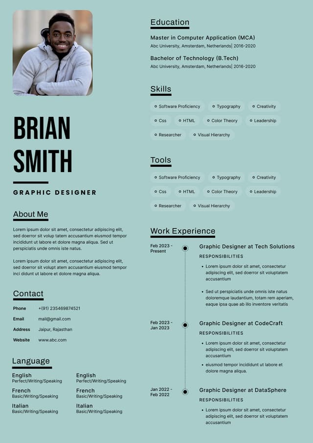
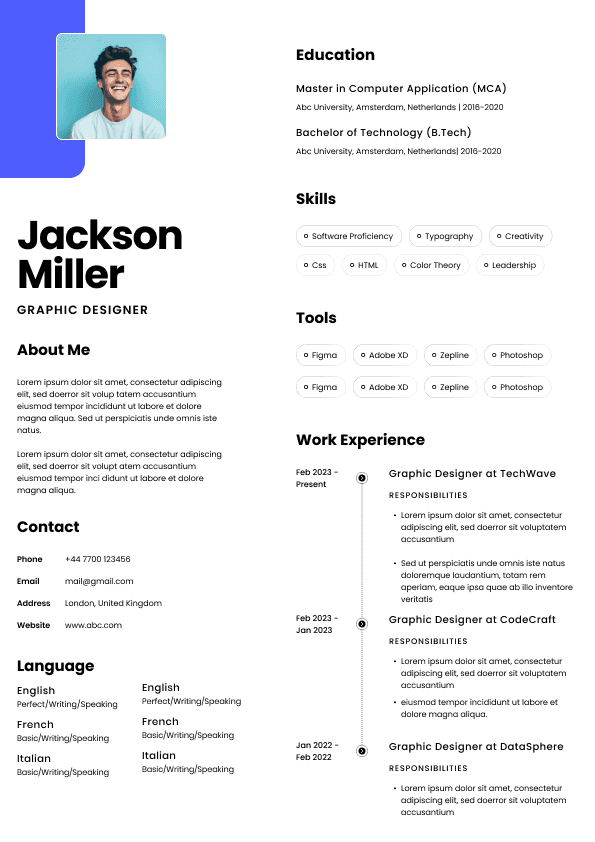
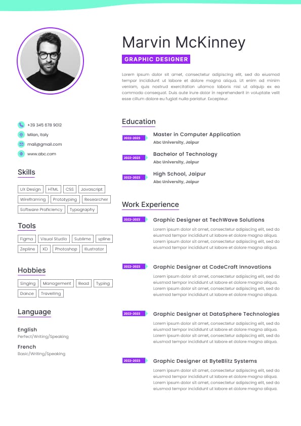
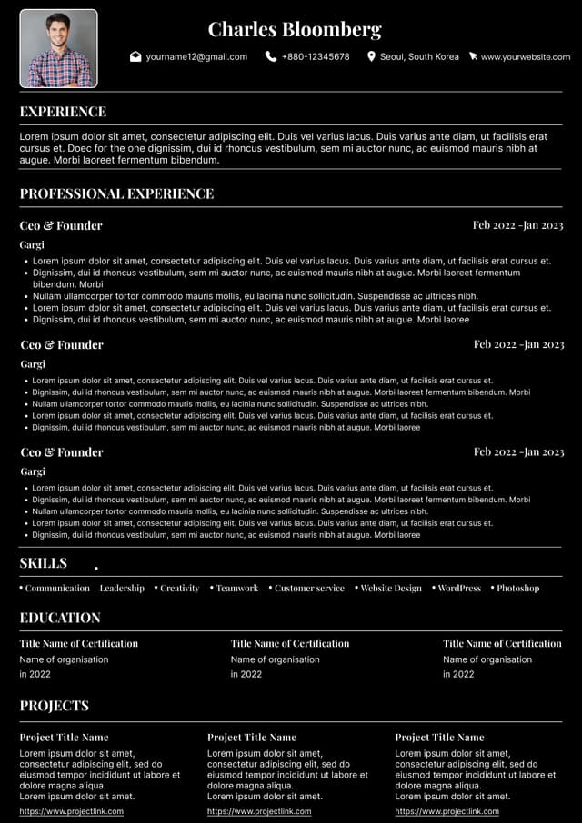
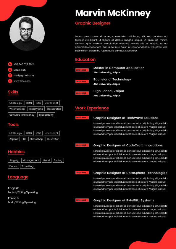
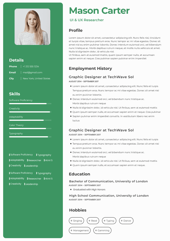
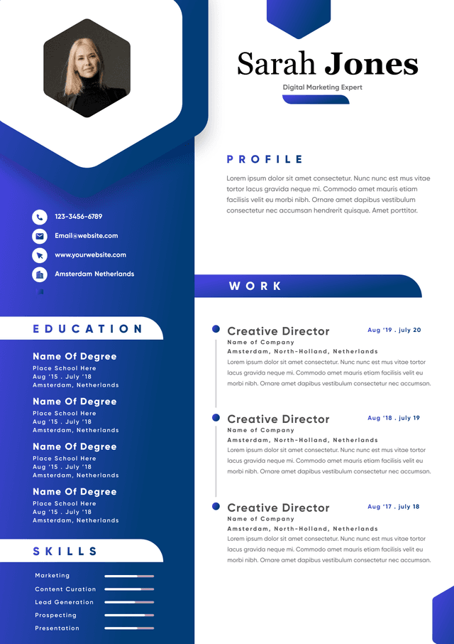
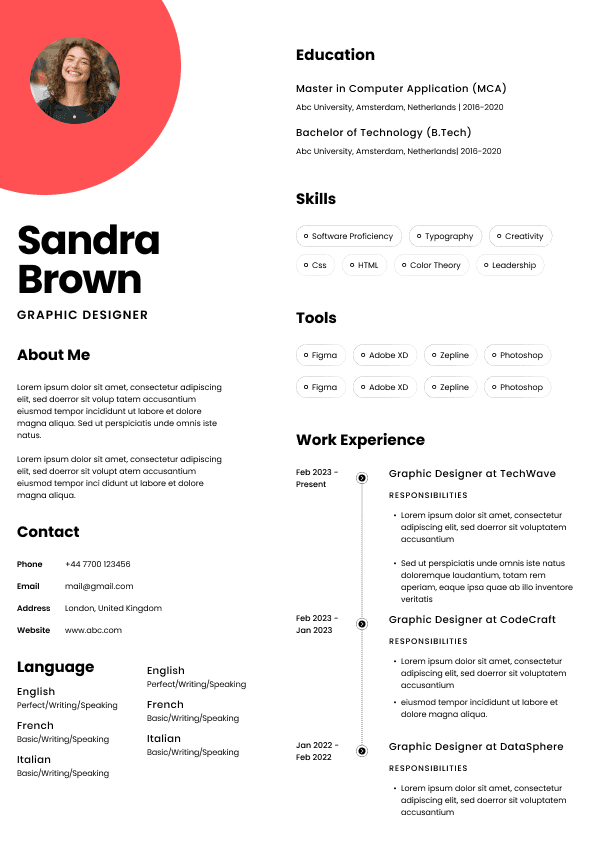
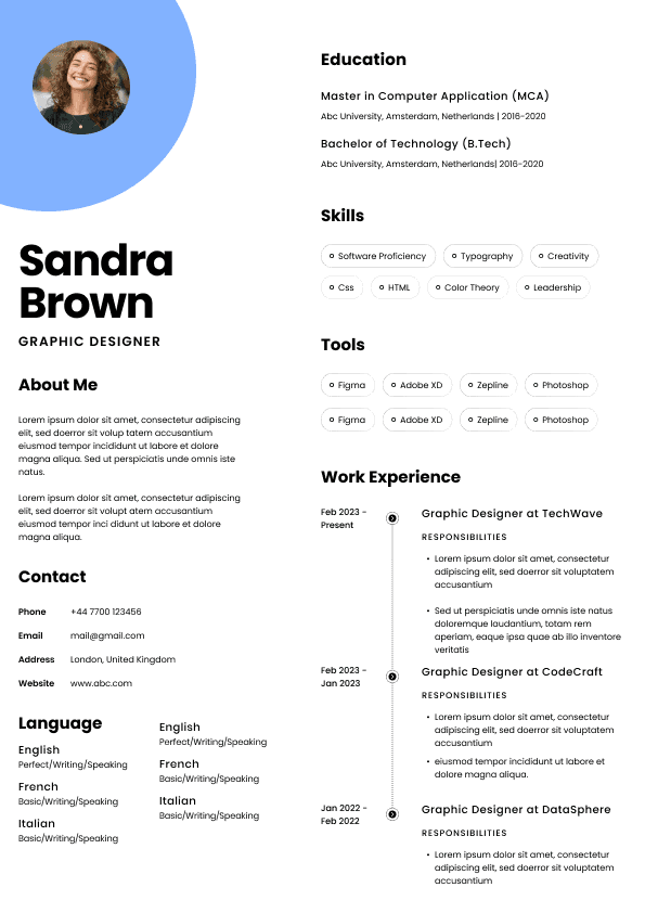
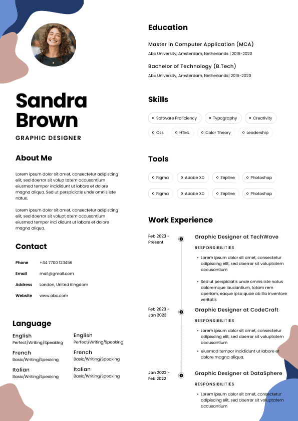
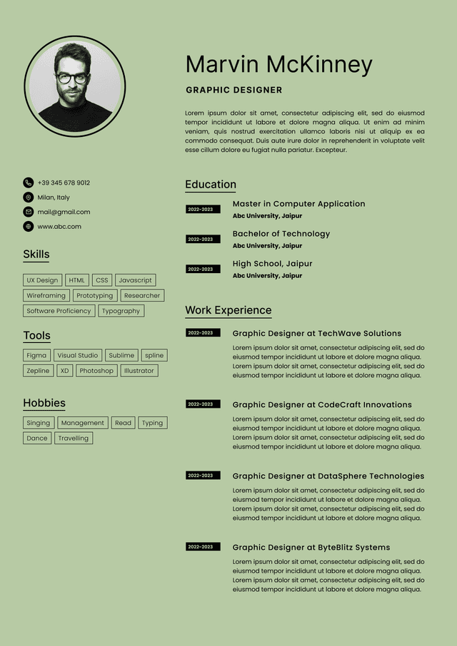
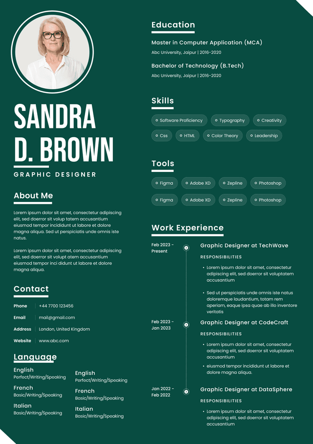
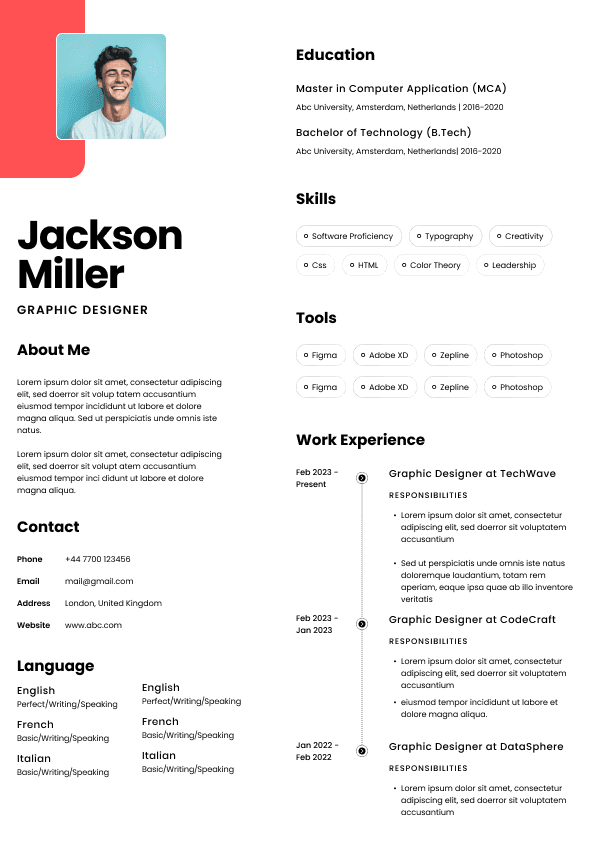
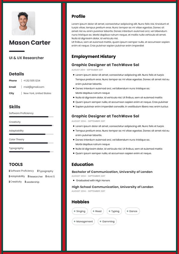
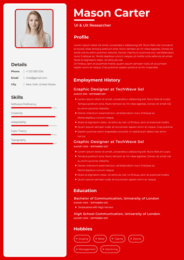
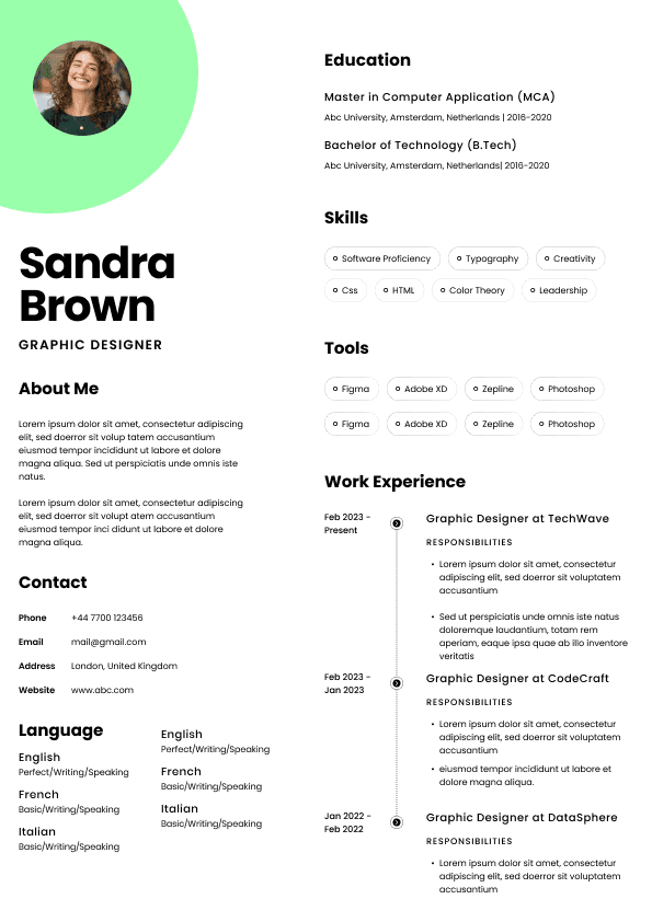
Choose from a wide range of NEWCV resume templates and customize your NEWCV design with a single click.

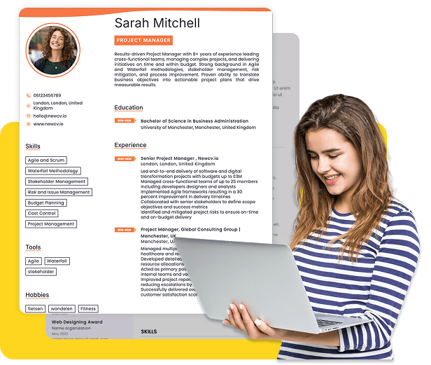

Use professional field-tested resume templates that follow the exact Resume rules employers look for.
Create ResumeIf you're wondering which resume fonts recruiters actually prefer, the short answer is this: recruiters consistently favor clean, highly readable fonts that make scanning easy in six to ten seconds. Fonts like Calibri, Arial, Aptos, Helvetica, Georgia, and Cambria perform well because they reduce visual friction and display consistently across applicant tracking systems (ATS), desktops, and mobile devices. The wrong font can make a resume feel outdated, crowded, difficult to read, or unprofessional—even if your experience is strong.
Most candidates think font choice is a design decision. Recruiters see it differently. Fonts affect speed. During resume screening, anything that slows reading creates friction. Friction creates skips. Skips create missed opportunities. A great font doesn't get you hired, but a poor one absolutely can hurt you.
Recruiters are not looking for stylish typography. They're looking for fast information extraction.
The best resume fonts support three things:
Fast scanning
High readability across devices
ATS compatibility
The most recruiter-friendly resume fonts today include:
Calibri
Aptos
Arial
Helvetica
Cambria
Georgia
Garamond
Trebuchet MS
Among these, Calibri and Aptos remain especially common because they appear familiar, clean, and easy to process.
A recruiter reviewing 200 resumes is unconsciously making micro-judgments every few seconds. Fonts influence perceived professionalism more than candidates realize.
Calibri became a dominant business font for a reason. It feels modern without drawing attention to itself.
Why recruiters like it:
Clean spacing
Easy to read at smaller sizes
Excellent on screens
ATS friendly
Potential downside:
Some hiring teams see Calibri constantly. It can feel safe rather than distinctive.
Aptos replaced Calibri in newer environments and is gaining adoption quickly.
Why it works:
Modern appearance
Excellent readability
Balanced spacing
Professional feel without looking generic
Arial remains one of the safest resume choices available.
Recruiters like Arial because:
It displays consistently
Nearly every system supports it
It scans cleanly
It rarely creates formatting surprises
Arial may not feel exciting, but hiring managers never reject resumes because the font was too simple.
Helvetica has long been associated with clean professional design.
Benefits:
Highly readable
Minimal visual clutter
Premium visual appearance
Works well in modern resume layouts
Potential issue:
Some operating systems may substitute similar fonts.
Cambria works especially well for traditional industries.
Strong fit for:
Finance
Legal roles
Government
Executive positions
Its slight serif design adds professionalism without reducing readability.
Georgia is one of the few serif fonts recruiters regularly tolerate.
Why:
Strong readability on screens
Professional appearance
More personality than Arial
For candidates wanting a slightly more polished look without becoming decorative, Georgia often works well.
Candidates often obsess over ATS keyword optimization while overlooking formatting compatibility.
Applicant tracking systems can process text differently depending on:
Font rendering
Embedded formatting
PDF conversion behavior
Device compatibility
The safest fonts are widely supported standard fonts.
Recruiters regularly see resumes that look perfect on a candidate's laptop but appear broken inside ATS previews.
Common problems include:
Shifted spacing
Strange character substitutions
Collapsed formatting
Misaligned bullet sections
This is why unusual or downloaded fonts create unnecessary risk.
A recruiter never rewards creativity in resume typography. They absolutely notice formatting problems.
Font choice matters, but size matters almost as much.
Recommended resume font sizes:
Name: 18–24 pt
Section headings: 12–14 pt
Body text: 10–12 pt
Contact details: 10–11 pt
Smaller than 10 often becomes difficult during fast screening.
Larger than 12 for body copy wastes space and creates the impression that candidates are stretching content.
Most resumes are not read line by line.
They're scanned.
Recruiters often follow a pattern:
Name
Current title
Company
Dates
Skills
Achievements
Education
Your font should support that movement naturally.
Candidates frequently choose fonts that feel unique but create hidden problems.
These fonts often hurt resume performance:
Times New Roman
Comic Sans
Papyrus
Courier
Brush Script
Lucida Handwriting
Decorative fonts
Times New Roman is not automatically bad.
But many recruiters associate it with:
Older templates
Academic documents
Little design effort
Outdated formatting
A resume in Times New Roman can still work. It simply lacks the cleaner screen readability modern recruiters prefer.
Decorative fonts create cognitive load.
When a recruiter has limited time, effort becomes the enemy.
Anything causing pause or interpretation slows reading.
Slow reading creates friction.
Friction reduces engagement.
Good Example
Calibri size 11 with strong spacing, clear sections, and balanced white space.
Why it works:
Easy scanning
Professional appearance
ATS safe
Strong screen readability
Weak Example
Script font at size 9 with compressed margins and dense paragraphs.
Why it fails:
Hard to scan quickly
Poor ATS behavior
Looks visually crowded
Creates reading fatigue
Most resume problems are not dramatic mistakes.
They're tiny friction points.
Recruiters experience hundreds of tiny friction points every day.
The resumes creating the least resistance often win attention.
Candidates think recruiters consciously evaluate fonts.
Usually they don't.
Instead, typography creates subconscious reactions.
A resume may feel:
Organized
Modern
Professional
Easy
Difficult
Crowded
Dated
The candidate assumes the reaction came from content.
Often presentation created part of the perception.
Recruiters rarely say:
"The font was bad."
They say:
"The resume felt messy."
Or:
"I couldn't quickly find information."
Typography often sits underneath those reactions.
Different industries tolerate different visual styles.
Strong choices:
Calibri
Cambria
Arial
Aptos
These industries prioritize professionalism and low visual risk.
Strong choices:
Helvetica
Calibri
Arial
Aptos
Tech hiring managers often prefer modern minimal formatting.
Strong choices:
Georgia
Helvetica
Trebuchet MS
Creative roles allow slightly more personality.
But even designers rarely benefit from highly experimental fonts.
Strong choices:
Cambria
Georgia
Garamond
Leadership resumes often benefit from a slightly more polished appearance.
If recruiters built a simple decision framework, it would look like this:
Step one:
Can I read this instantly?
Step two:
Does this feel professional?
Step three:
Can I scan accomplishments quickly?
Step four:
Does anything distract me?
Candidates often reverse the process.
They ask:
"What looks unique?"
Recruiters ask:
"What slows me down?"
That difference matters.
Mixing fonts creates inconsistency.
Use one font family across the document.
Two at most if headings require distinction.
Candidates often force content onto one page by reducing font size.
This creates:
Dense formatting
Reading fatigue
Poor visual flow
Two strong pages beats one crowded page.
Resumes are sales documents.
They're not branding experiments.
Clarity wins.
Many recruiters review resumes from phones.
Fonts that look acceptable on a laptop can become difficult on smaller screens.
If you want a slightly more polished look without creating risk:
Heading font:
Georgia
Cambria
Body font:
Calibri
Arial
Aptos
This creates subtle visual hierarchy while remaining recruiter friendly.
Avoid dramatic font contrasts.
Resumes should feel seamless.
Not designed.
The best resume font does something strange:
It disappears.
Recruiters should never consciously notice it.
They should notice:
Achievements
results
promotions
impact
qualifications
If a recruiter remembers your font, something probably went wrong.
Candidates spend hours debating typography while overlooking accomplishment quality and positioning. Font matters, but only because it removes barriers between your experience and the person screening your resume.
Choose readability over creativity every time.
Use ATS-optimised Resume and resume templates that pass applicant tracking systems. Our Resume builder helps recruiters read, scan, and shortlist your Resume faster.
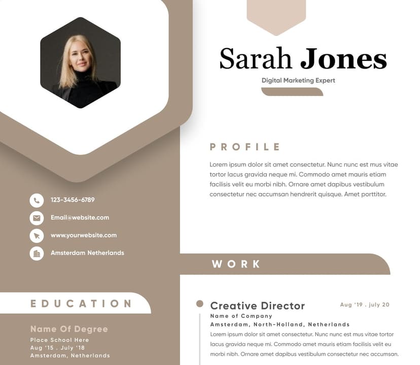
Use professional field-tested resume templates that follow the exact Resume rules employers look for.
Create Resume