Choose from a wide range of NEWCV resume templates and customize your NEWCV design with a single click.


Use professional field-tested resume templates that follow the exact Resume rules employers look for.
Create ResumeRecruiters do not reject resumes because of small design preferences. They reject resumes when the layout creates friction. If a recruiter cannot find your experience, understand your value quickly, or scan your qualifications in seconds, your resume becomes harder to evaluate—and harder resumes lose.
Most recruiters spend only a short initial screening window deciding whether a candidate moves forward. The issue is rarely “ugly design.” The real problem is layout choices that hide information, slow scanning, confuse ATS systems, or make candidates look less credible.
The resume layouts recruiters hate usually have one thing in common: they prioritize appearance over usability.
Candidates often believe unique formatting helps them stand out. In reality, strong candidates stand out because recruiters instantly understand what they do, where they worked, and why they fit the role. Layout should support that goal—not compete with it.
Recruiters are not reading resumes like books.
They're scanning.
A recruiter usually follows a predictable visual process:
Current job title
Company history
Dates and progression
Skills alignment
Relevant accomplishments
Education if needed
When your layout interrupts this process, recruiters work harder.
And harder almost always loses.
The reality inside hiring teams is simple:
When reviewing dozens or hundreds of applications, the easiest resumes to evaluate often move forward first.
That doesn't mean easier candidates win.
It means clearer candidates win.
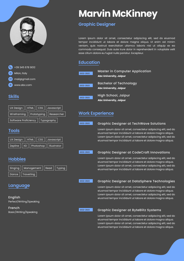
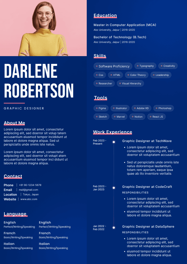
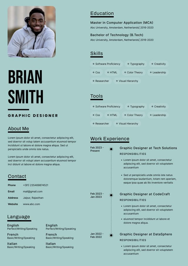
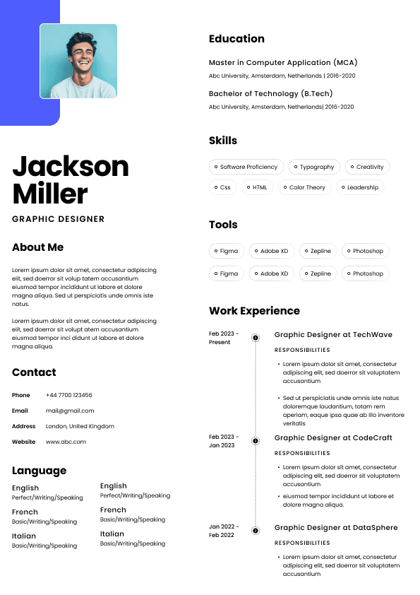
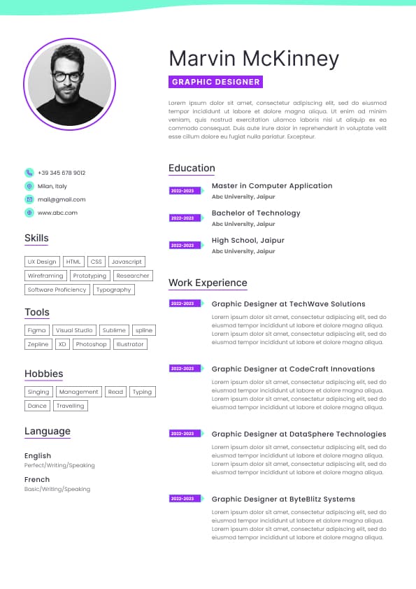
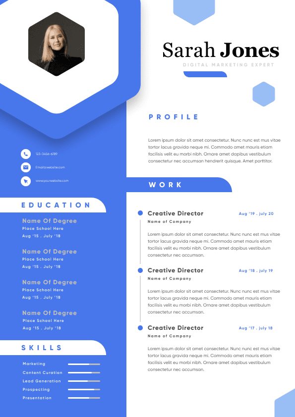
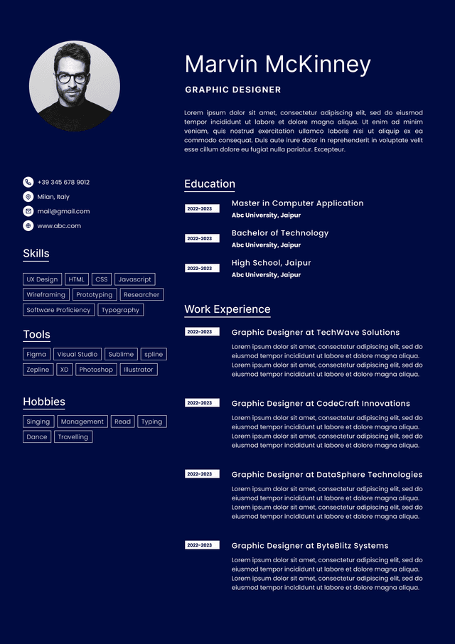
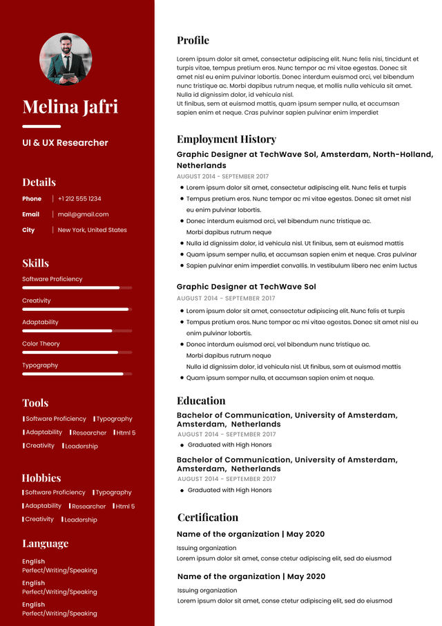
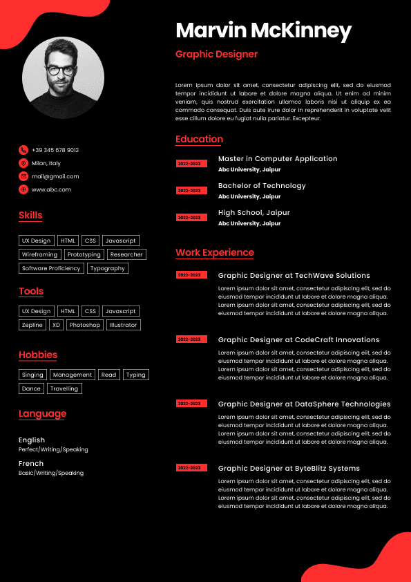
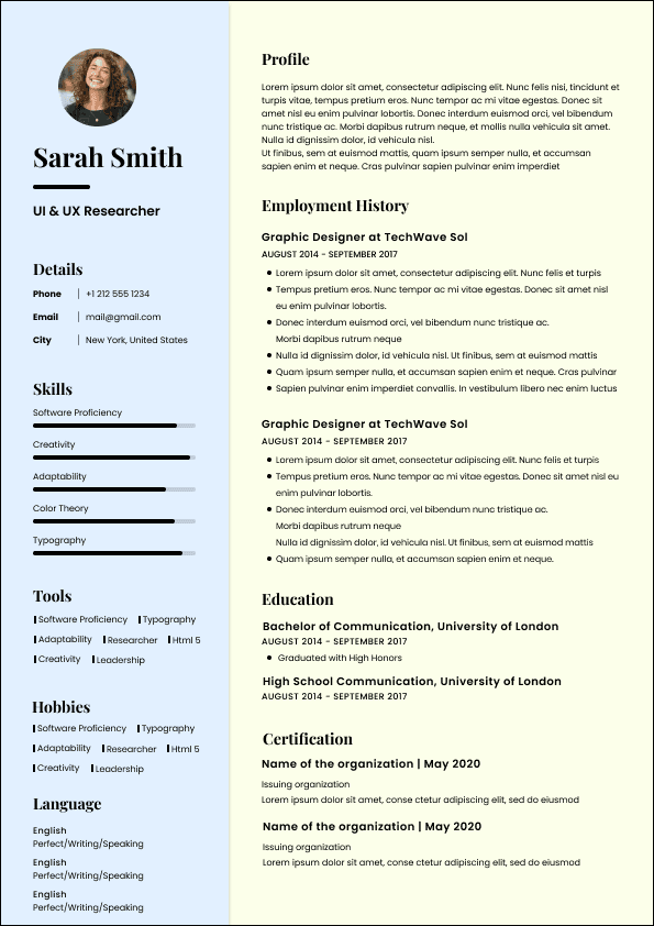
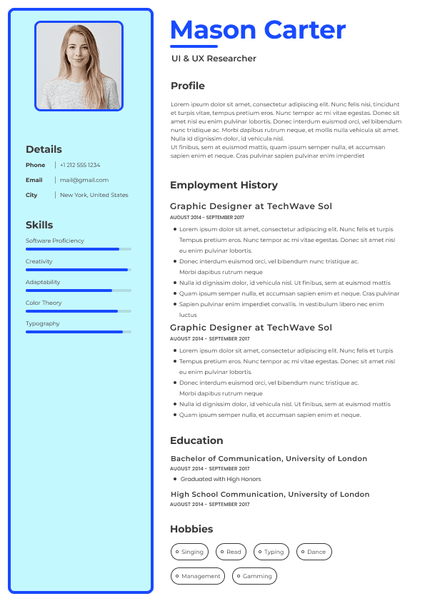
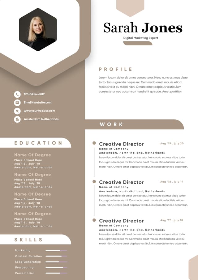
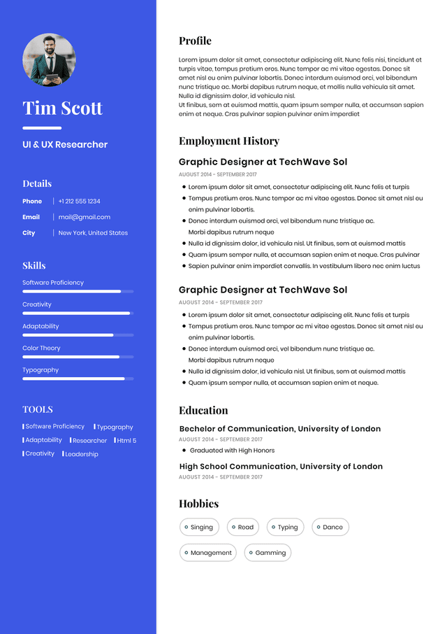
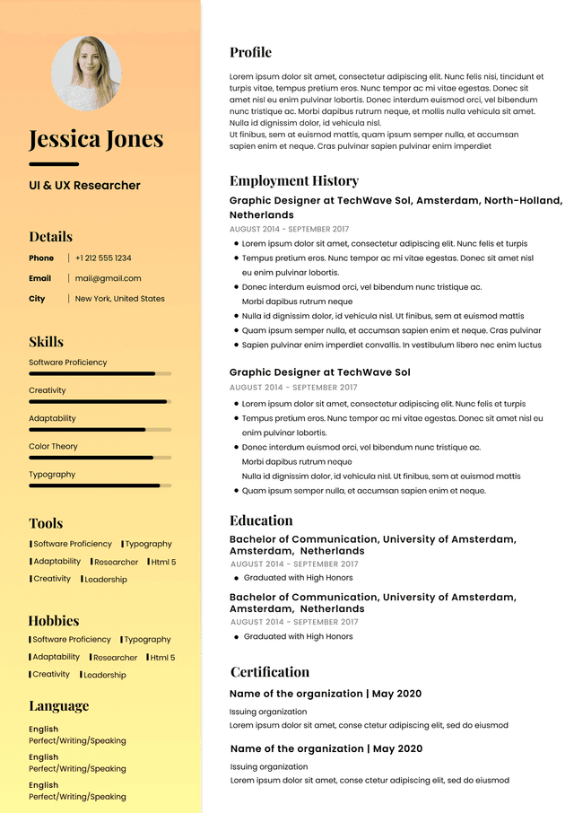
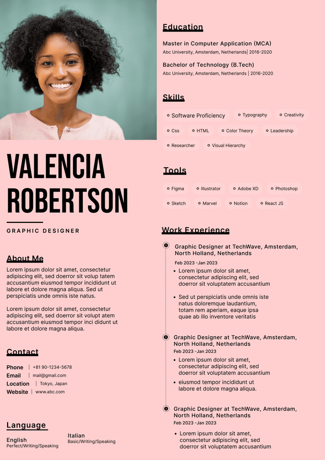
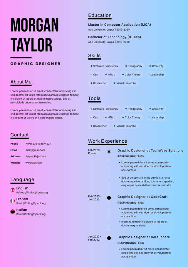
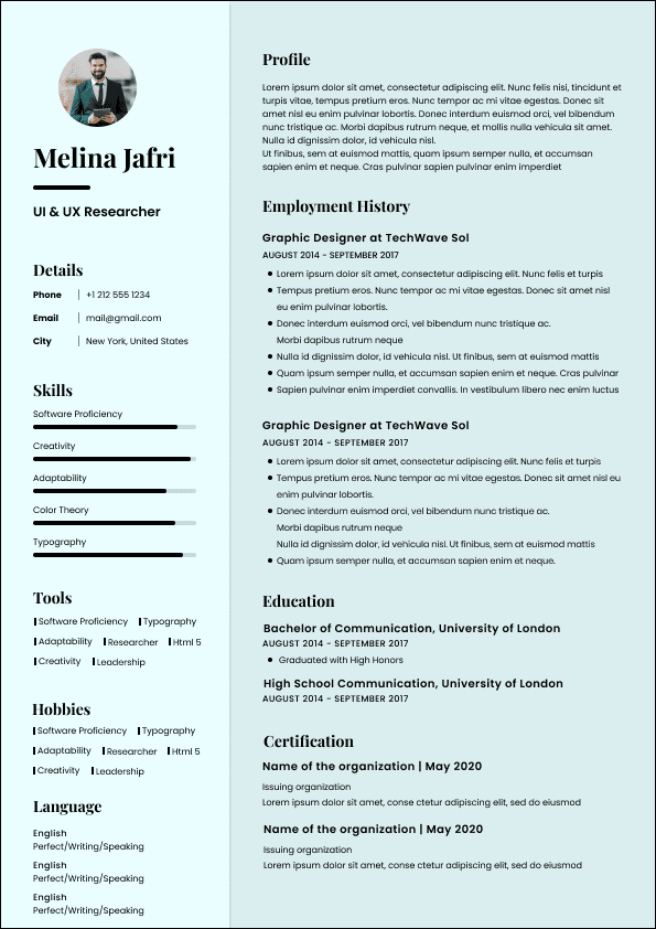
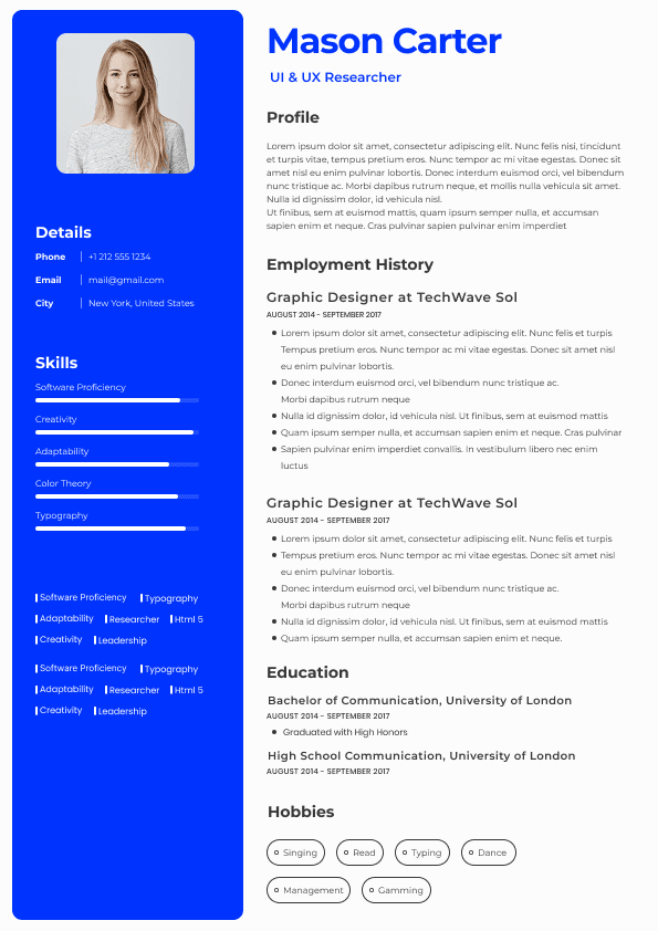
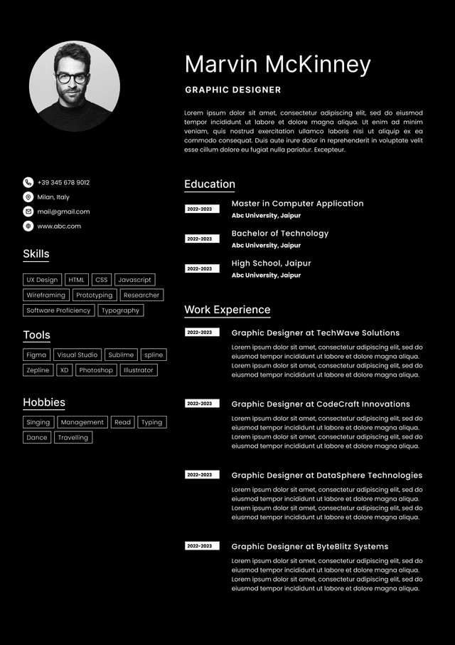
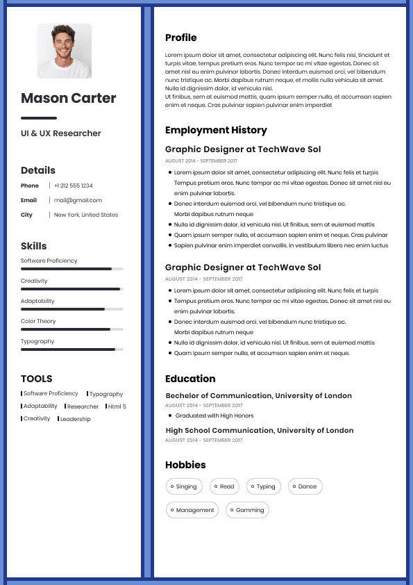
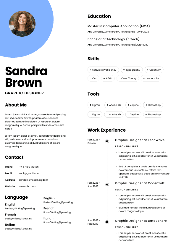
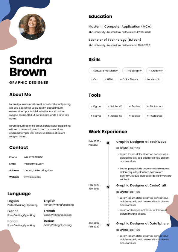
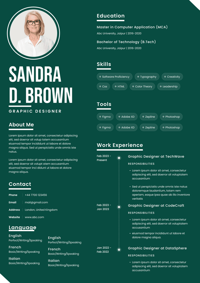
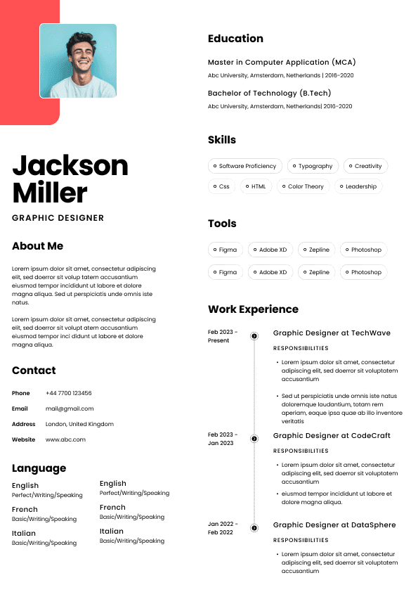
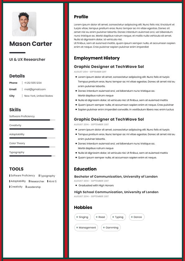
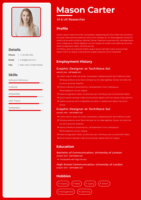
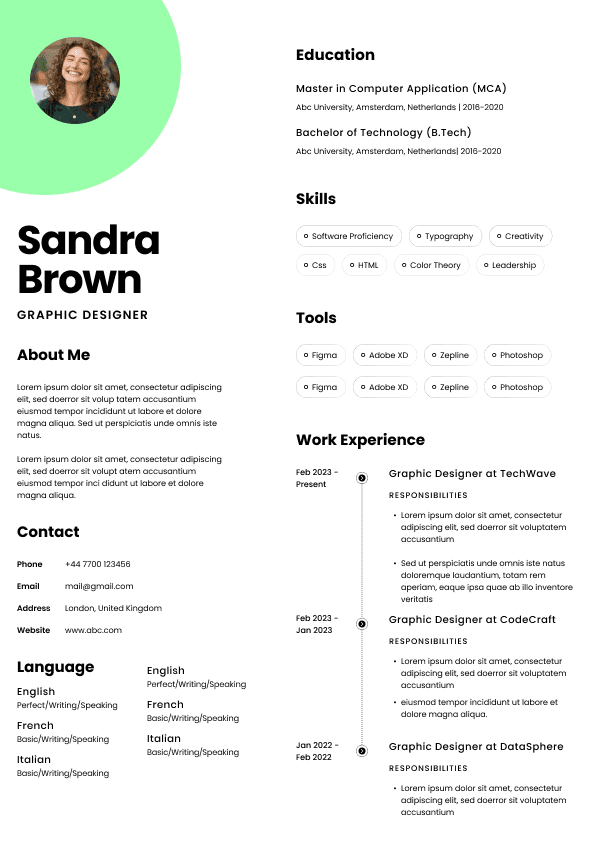
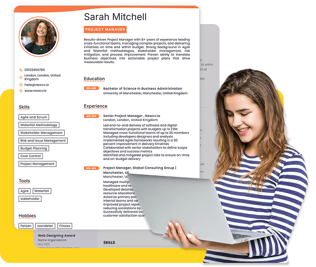
Two-column layouts are one of the most common designs recruiters dislike.
Candidates often use them because templates look modern and visually polished.
But recruiters repeatedly run into problems:
ATS systems sometimes parse information incorrectly
Work history may split across sections
Skills become separated from context
Dates become difficult to follow
Narrow columns create scanning fatigue
Mobile viewing becomes harder
The issue isn't aesthetics.
The issue is information flow.
A recruiter opens the resume and sees:
Left side:
Skills
Certifications
Contact details
Right side:
Now instead of naturally scanning top to bottom, they jump around the page.
That interruption matters.
Especially when reviewing hundreds of applications.
Weak Example:
Tiny left column:
Skills | Tools | Interests | Languages | Portfolio Links
Large right section:
Compressed job descriptions with wrapped lines and inconsistent spacing.
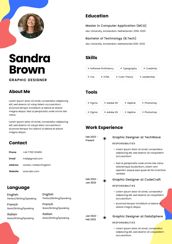
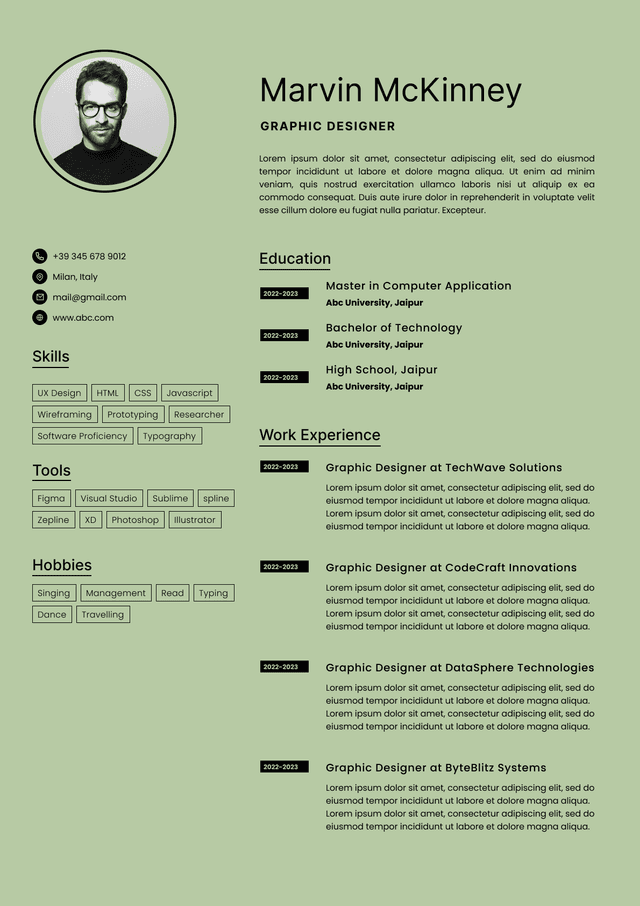
Good Example:
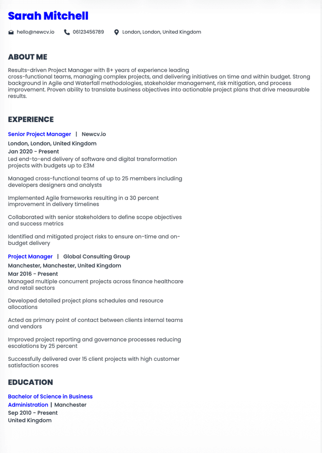
Single-column flow:
Name
Headline
Professional Summary
Experience
Skills
Education
Certifications
The recruiter sees information in the order they naturally evaluate candidates.
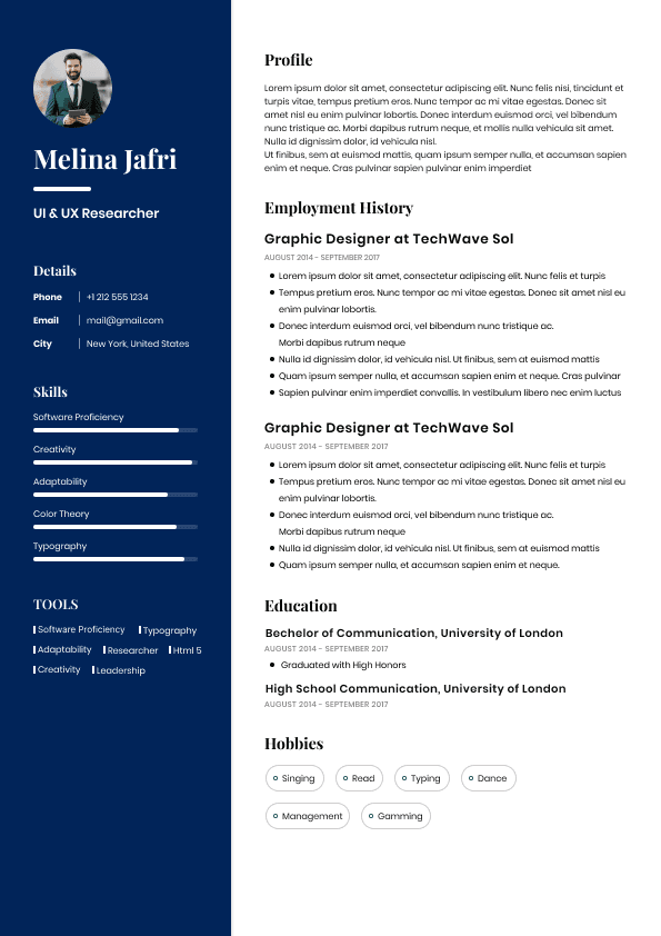
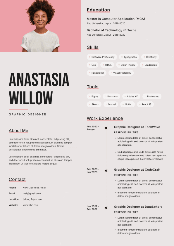
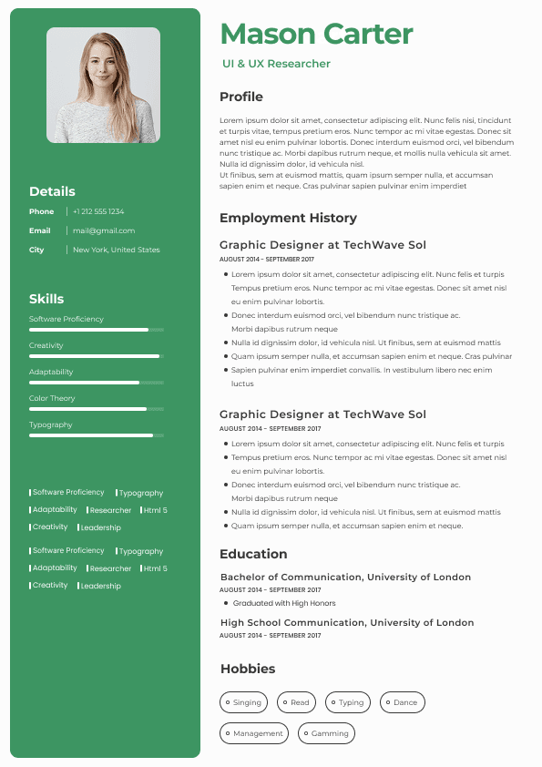
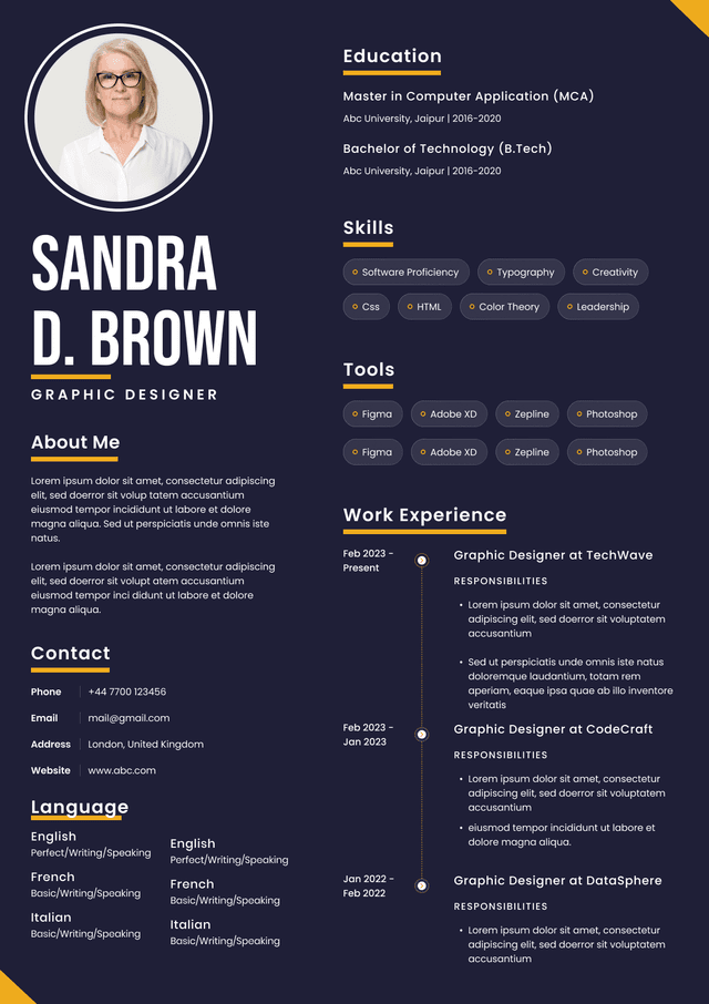
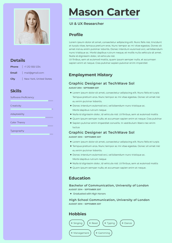
Visual timelines look impressive on design websites.
Recruiters usually hate them.
Common examples:
Skill bars
Circular charts
Timeline graphics
Percentage indicators
Rating systems
Infographic resumes
Why?
Because these visuals communicate almost nothing useful.
A "Leadership: 90%" graphic has no meaning.
Ninety percent according to whom?
Recruiters care about evidence.
Not self-scored graphics.
Candidate A:
Leadership: 95%
Candidate B:
Led cross-functional team of 14 people across product and engineering initiatives.
Candidate B wins instantly.
Results beat graphics every time.
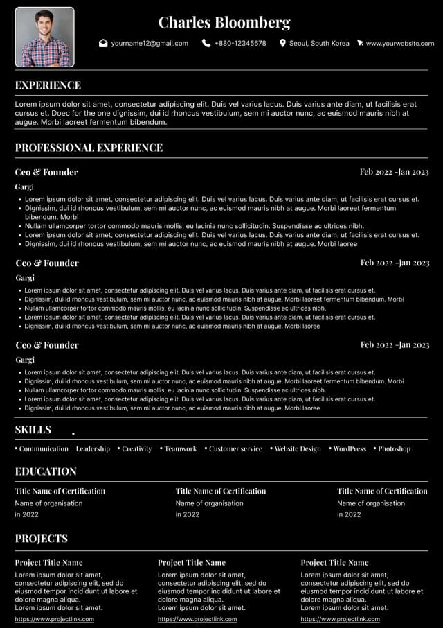
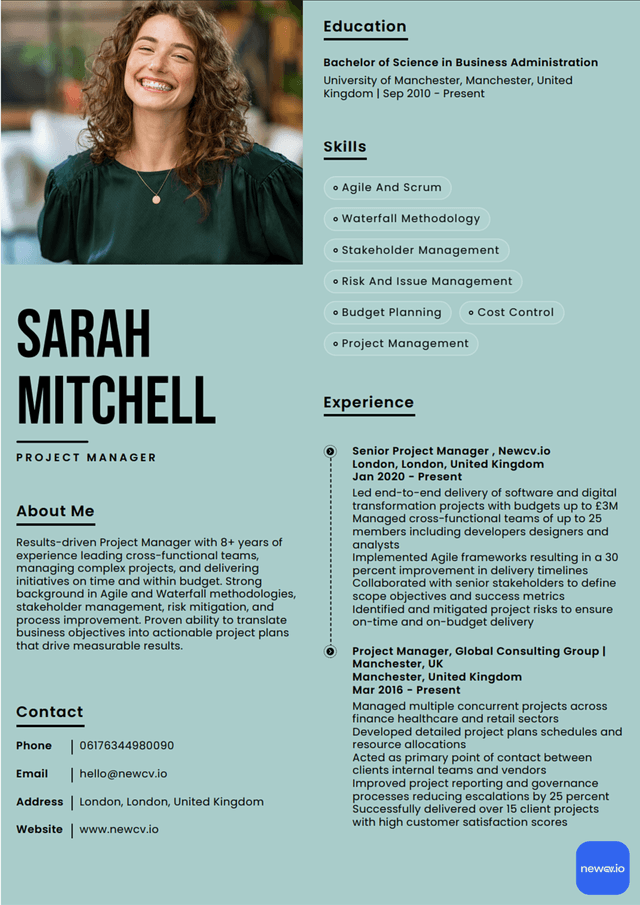
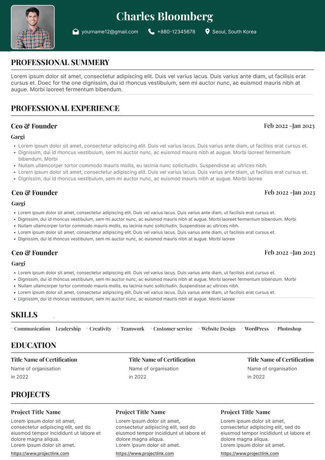
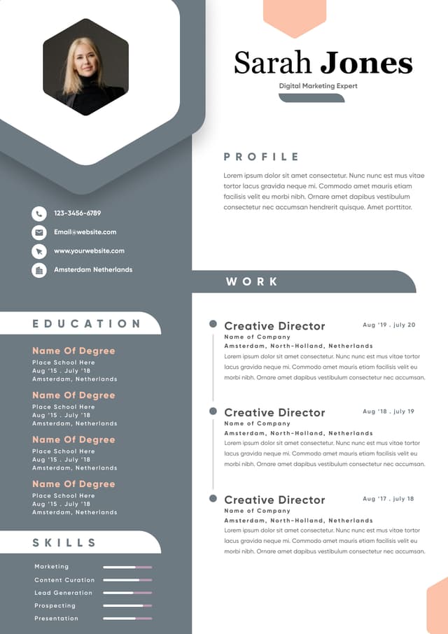
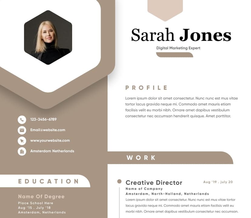
Oversized headers became common because of resume templates and design marketplaces.
They consume valuable space with:
Huge names
Large photos
Giant contact blocks
Decorative banners
Empty whitespace
Space on page one is expensive.
The top section should immediately answer:
Who are you?
What role are you targeting?
Why should we care?
Keep the opening section compact:
Name
Target role
Location
Professional summary
Then immediately transition into experience.
Recruiters want evidence early.
Not decoration.
Candidates sometimes minimize employment dates because they worry about:
Job hopping
Career gaps
Frequent role changes
So they push dates to the side or bury them.
Recruiters hate this.
Not because of suspicion initially.
Because it interrupts evaluation.
Timeline matters.
Hiring managers want to understand:
Career progression
Stability
Growth trajectory
Promotion patterns
Hidden dates create unnecessary friction.
Sometimes recruiters assume candidates are intentionally hiding information.
That assumption rarely helps.
Functional resumes organize by skill category rather than chronological work history.
Example:
Leadership Experience
Communication Skills
Project Management Success
Without immediately connecting achievements to employers.
Recruiters dislike this format because it hides context.
They immediately ask:
Where did this happen?
How long?
Under what conditions?
For whom?
Functional resumes became popular among career changers and candidates with gaps.
Ironically, they often create more concern—not less.
A hybrid structure:
Brief skills summary
Chronological work experience
Clear achievements attached to each role
This preserves context while highlighting transferable strengths.
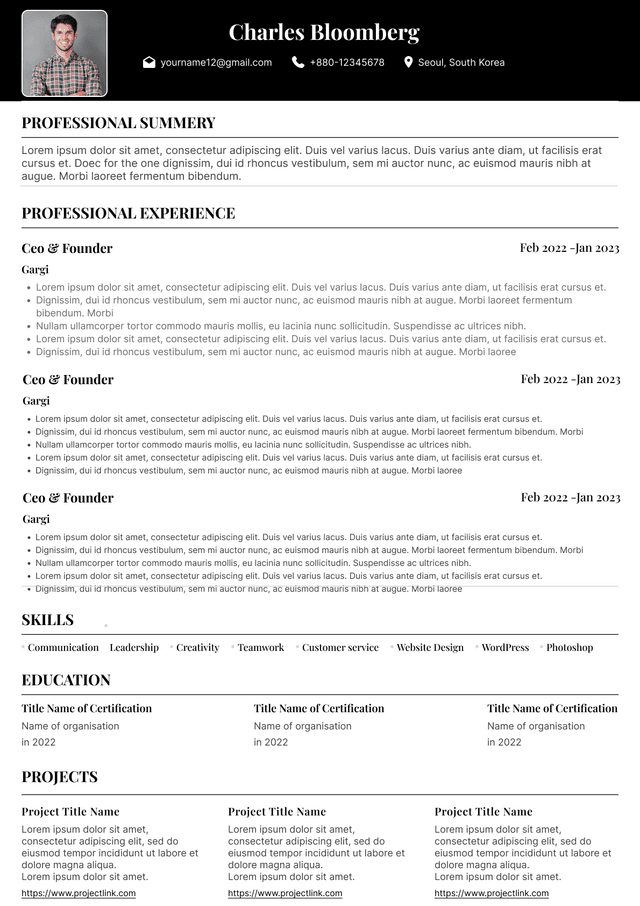
Large blocks of text kill readability.
Recruiters scan.
Dense paragraphs force reading.
Those are different behaviors.
Common issues:
Paragraphs longer than six lines
Minimal spacing
Few bullets
Overloaded summaries
Excessive wording
People think more words equal stronger resumes.
The opposite is often true.
Responsible for supporting organizational initiatives and participating in team activities while managing operational functions and collaborating cross-functionally to achieve goals.
Reduced onboarding time by 28% through process redesign
Managed 12-person implementation team
Improved customer retention by 18%
Specific outcomes scan faster.
Candidates frequently shrink font size trying to fit more information.
Recruiters notice immediately.
Problems include:
Eye strain
Poor mobile readability
Dense appearance
Faster rejection risk
Typical safe range:
Body text: 10–12 pt
Headings: 12–16 pt
If your content only fits at 8-point font, the issue isn't space.
The issue is editing.
Many resume layouts fail before recruiters even review them.
Applicant tracking systems can struggle with:
Text boxes
Tables
Icons
Columns
Embedded graphics
Complex formatting
Candidates often think ATS rejection means missing keywords.
Sometimes the system simply couldn't interpret the layout.
Recruiters regularly see resumes where:
Dates disappear.
Sections merge.
Employers become unreadable.
Skills become fragmented.
Good content can become invisible.
Most recruiters consistently prefer a simple structure:
Clear header
Brief professional summary
Chronological experience
Skills section
Education
Certifications if relevant
No distractions.
No guessing.
No visual puzzles.
Simple layouts reduce cognitive effort.
Recruiters remember substance more than design.
Candidates often optimize for emotional reactions.
They think:
"I want my resume to look impressive."
Recruiters think:
"I need to understand this candidate quickly."
Those goals are different.
Candidates focus on appearance.
Recruiters focus on evaluation speed.
The best resume layout quietly supports decision-making.
Great formatting becomes almost invisible.
Across industries, strong resumes typically share the same characteristics:
Fast scanning
Clear chronology
Strong achievement bullets
Visible career progression
ATS compatibility
Minimal visual clutter
Rarely do recruiters say:
"This design was amazing."
They say:
"This person looks qualified."
That distinction matters.
Your resume is not a design portfolio unless you're applying for design work.
It is a decision document.
Build it accordingly.
Use ATS-optimised Resume and resume templates that pass applicant tracking systems. Our Resume builder helps recruiters read, scan, and shortlist your Resume faster.
Use professional field-tested resume templates that follow the exact Resume rules employers look for.
Create Resume