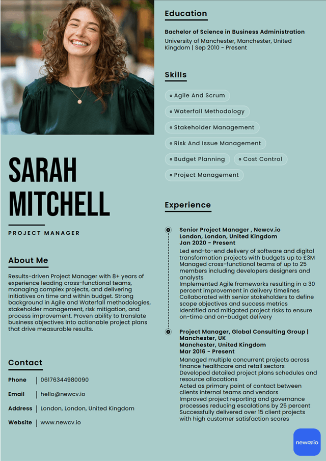
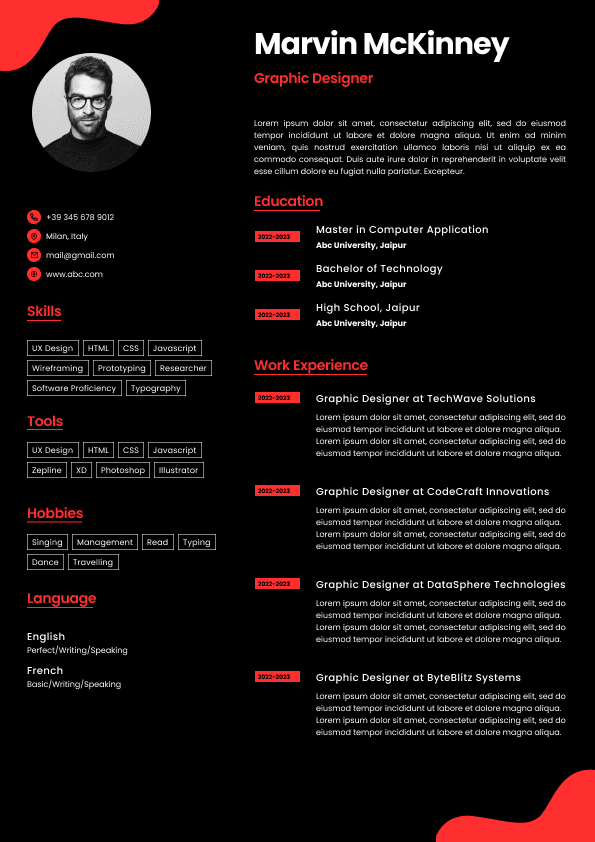
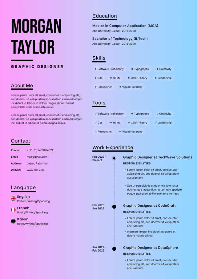
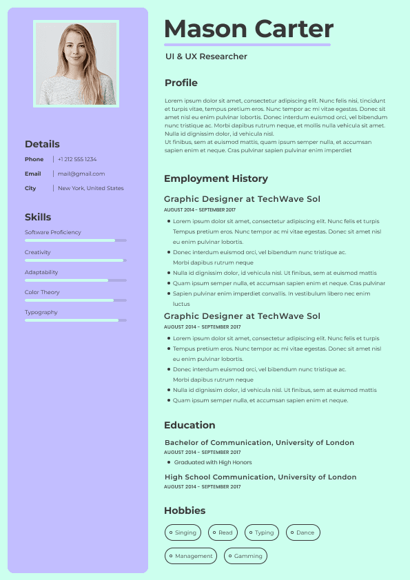
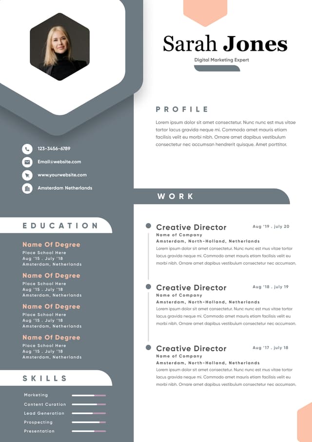
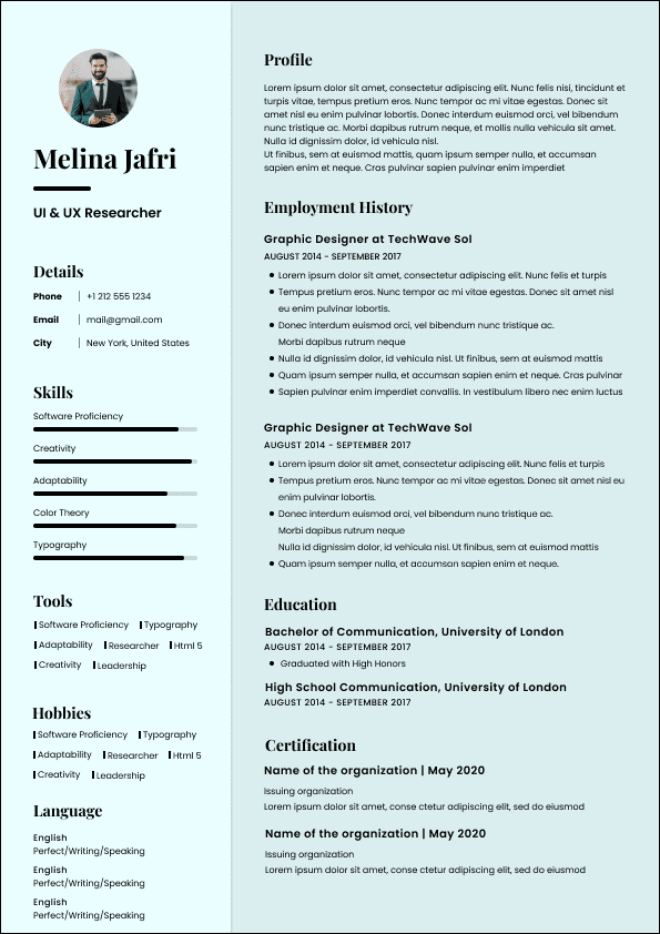
Choose from a wide range of NEWCV resume templates and customize your NEWCV design with a single click.

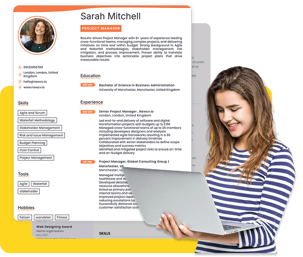

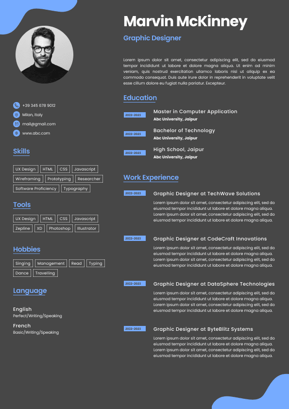
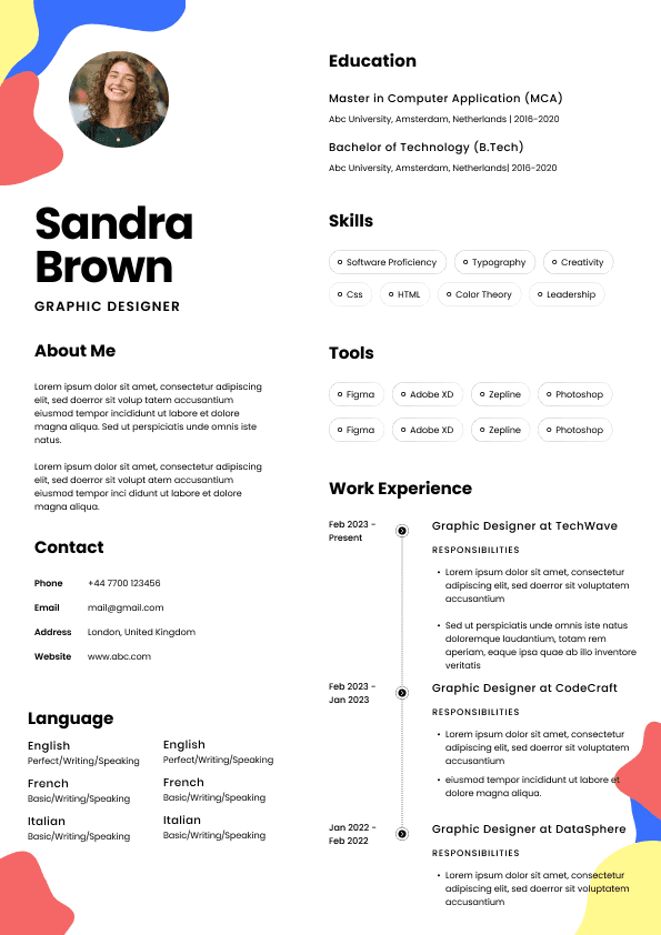
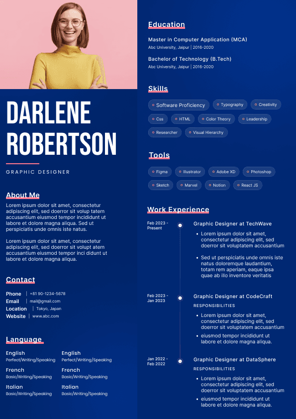
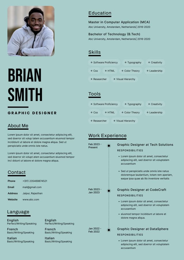
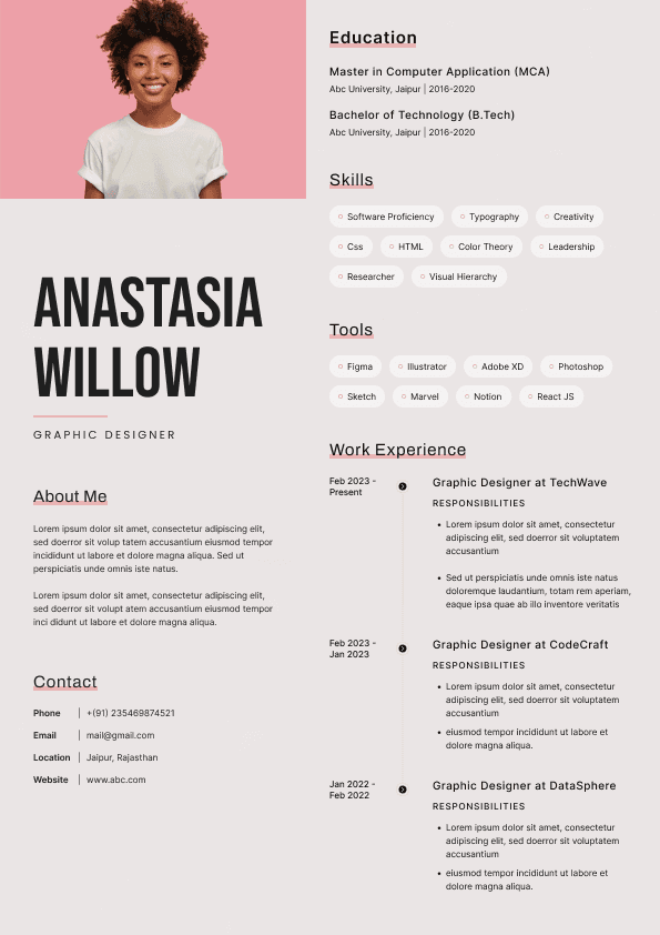
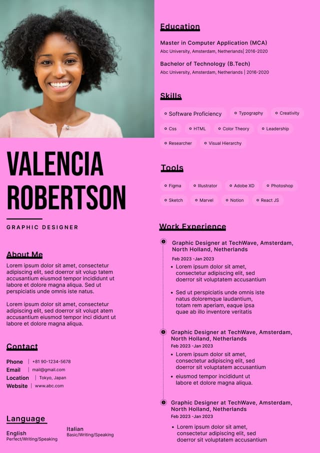
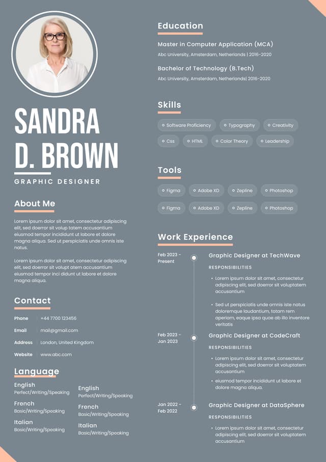
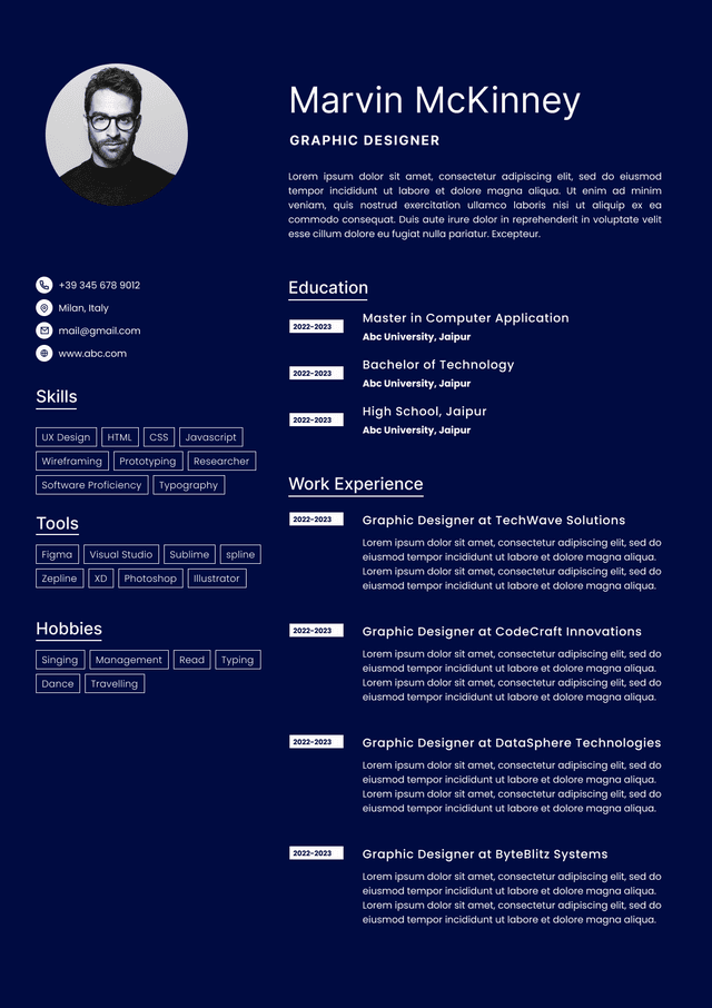
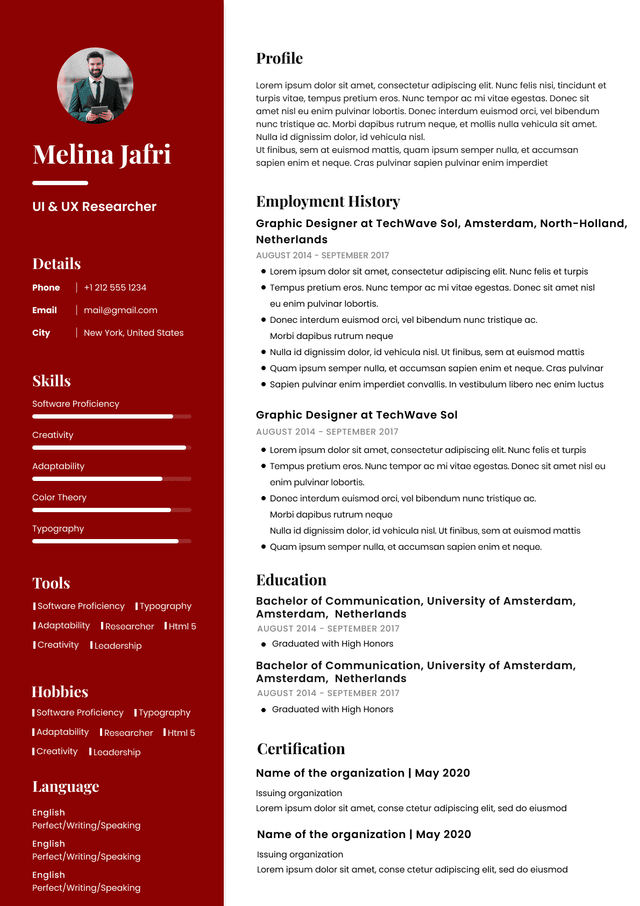
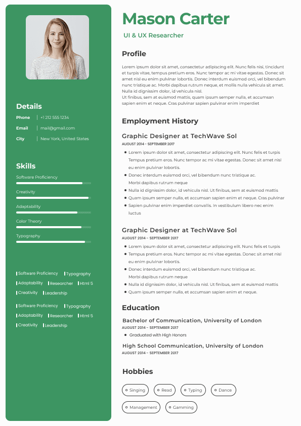
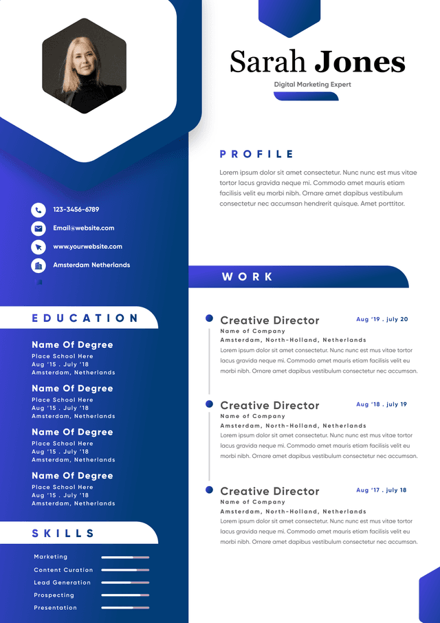
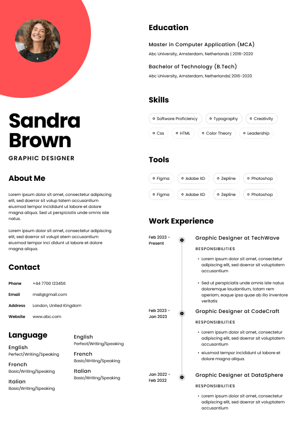
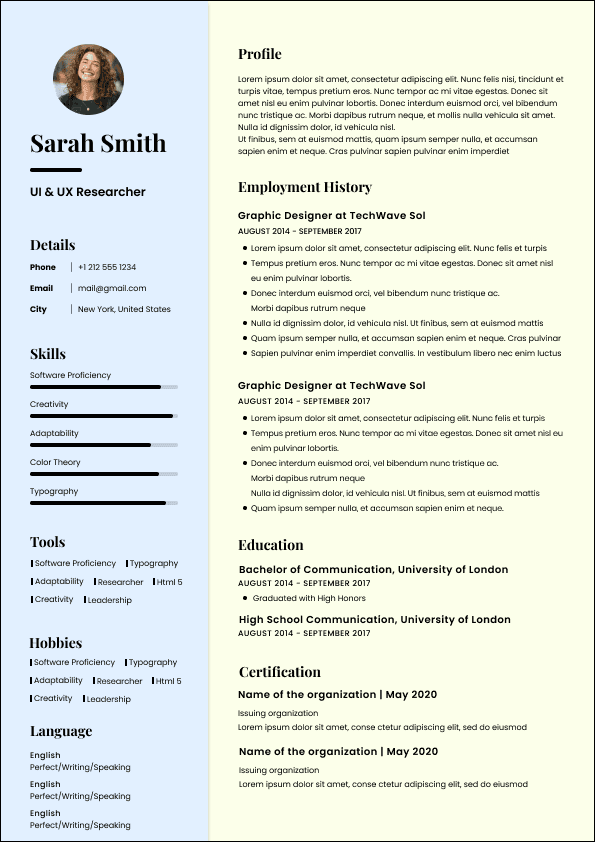
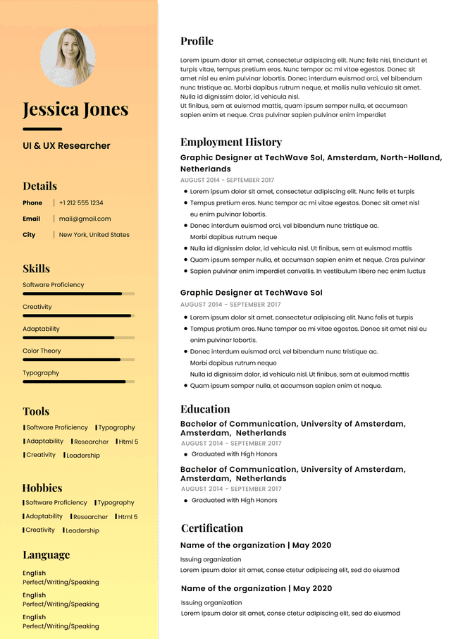
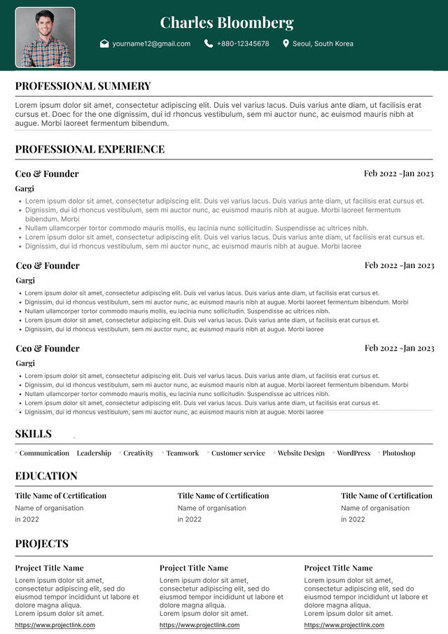
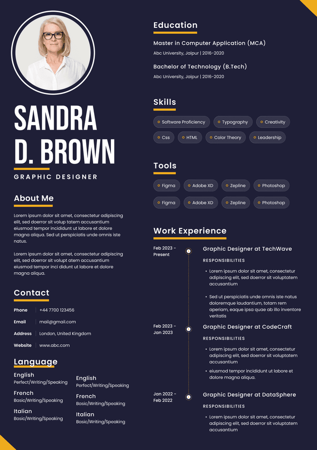
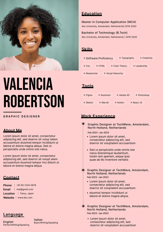
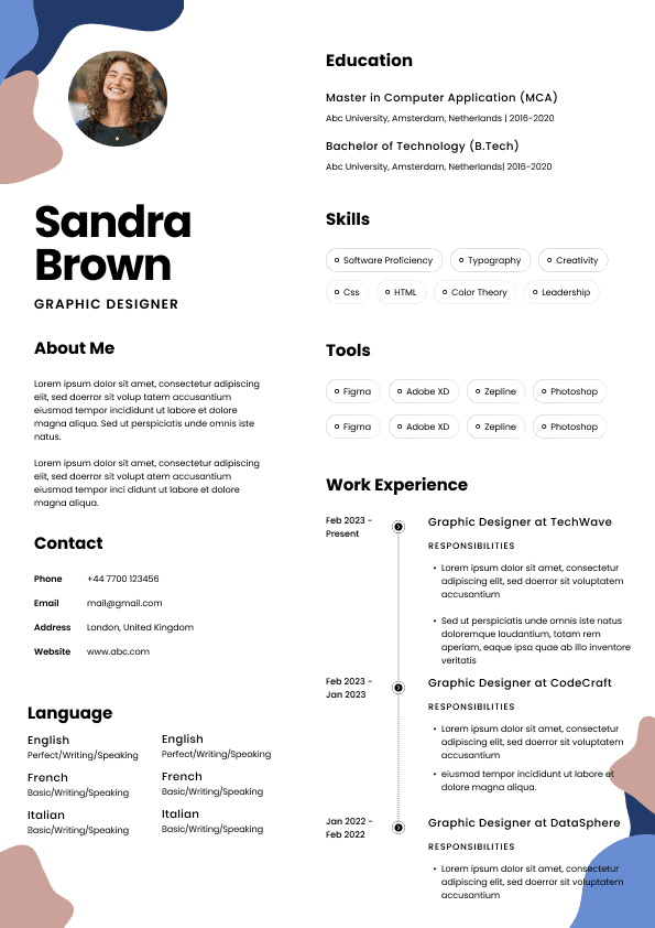
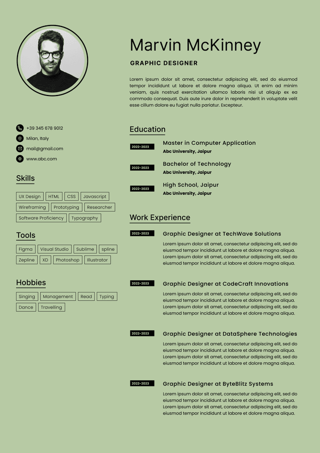
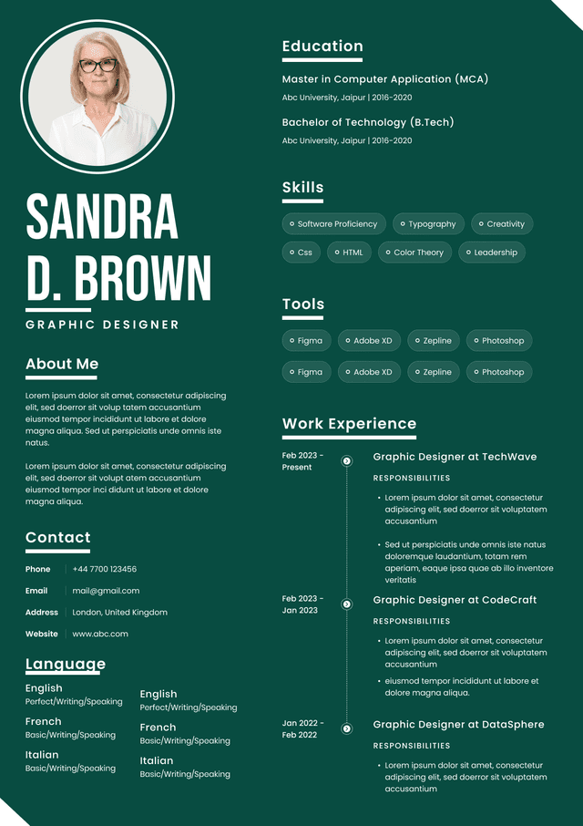
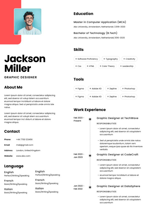
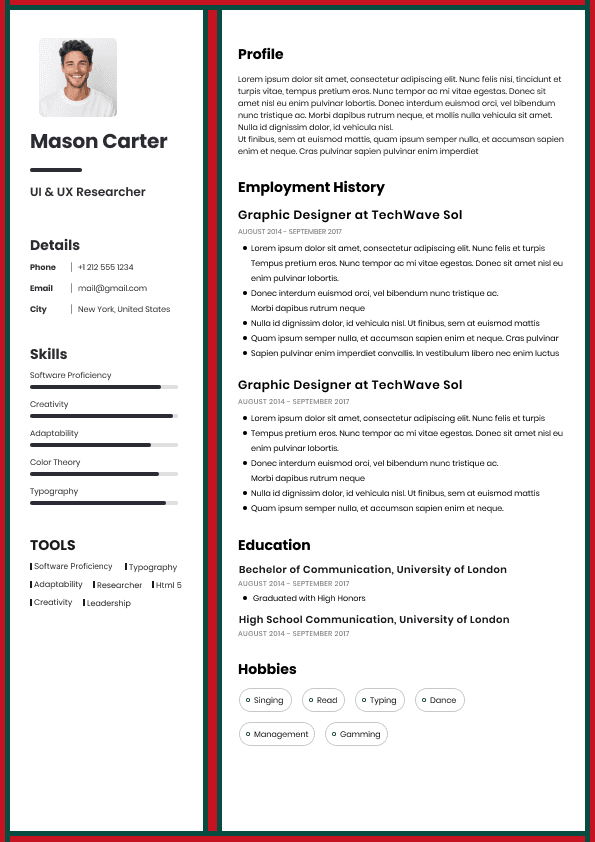
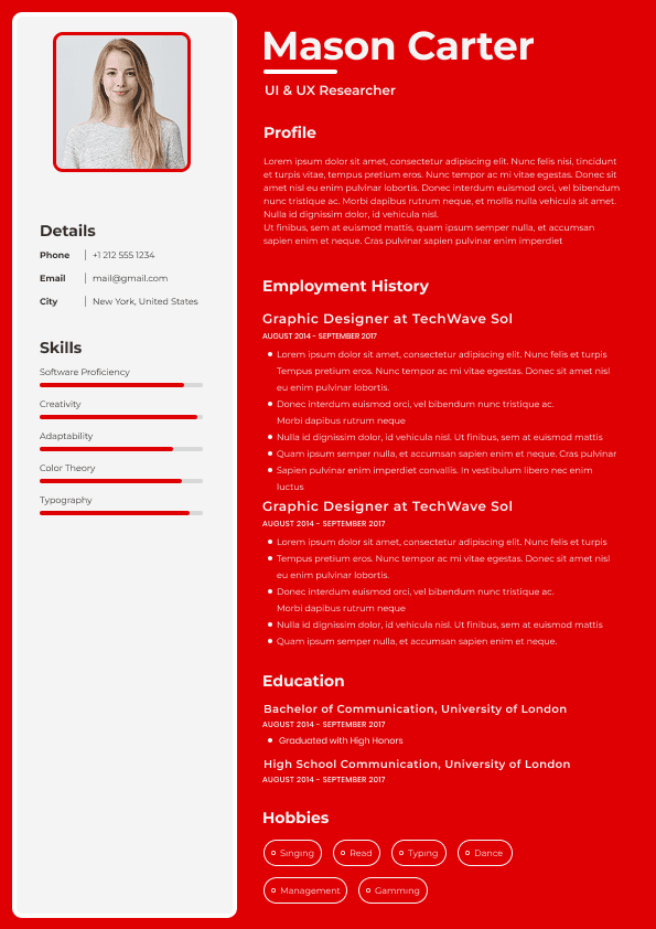
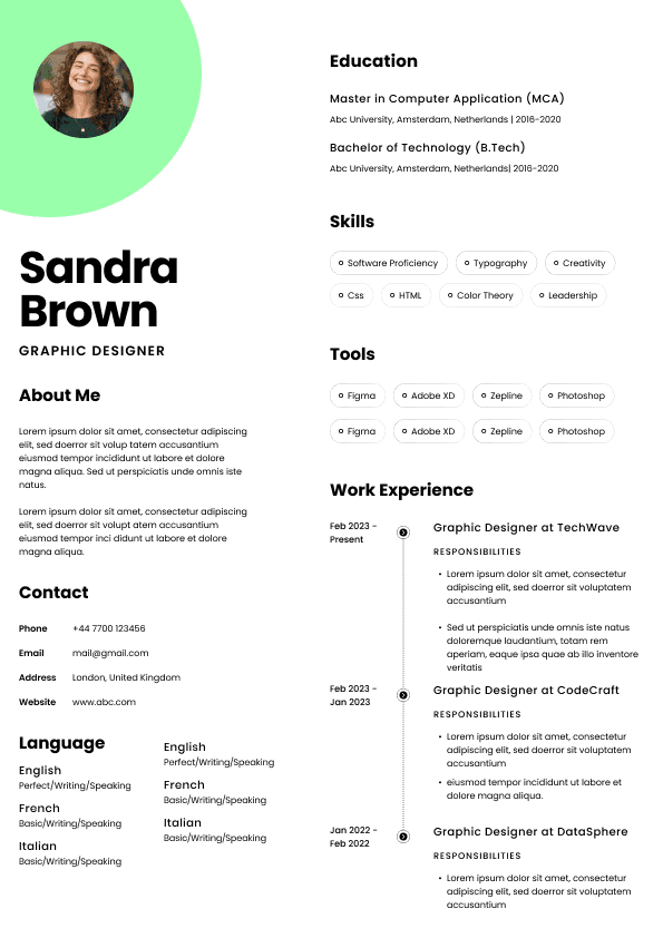
Use professional field-tested resume templates that follow the exact Resume rules employers look for.
Create ResumeA Svelte design system is more than a collection of reusable components. In enterprise environments, it becomes a shared UI platform that enables teams to build products faster, reduce duplicate work, and maintain a consistent user experience across applications.
Companies hiring Svelte developers increasingly want engineers who can think beyond pages and features. They want people capable of creating frontend systems that other developers depend on every day.
That changes the hiring conversation completely.
Building isolated components proves you can code.
Owning a design system proves you can scale.
For developers building internal platforms, reusable architecture, or enterprise frontend systems, understanding component design strategy, design tokens, accessibility patterns, documentation workflows, and platform ownership has become a major differentiator.
Many developers think a component library and a design system are the same thing.
Hiring managers usually do not.
A component library is one layer.
A design system is an operating model for frontend development.
A mature Svelte design system often includes:
Reusable components
Shared design tokens
Documentation standards
Theme architecture
Accessibility requirements
Component governance
UI testing workflows
Internal package management
Design and engineering collaboration processes
Organizations invest in these systems because inconsistent interfaces create hidden costs.
Without standardization, every team eventually starts solving the same problems repeatedly.
That creates duplicate work, fragmented user experiences, and frontend technical debt.
Most hiring teams are not evaluating design system work because they care about prettier buttons.
They care about scale.
Leaders want infrastructure that improves delivery across multiple teams.
Common business goals include:
Faster feature development
Reduced duplicate frontend code
Higher component reuse rates
More consistent experiences
Better accessibility compliance
Faster onboarding for engineers
Lower maintenance overhead
When recruiters review candidates for design system engineering roles, they often ask a different question than traditional frontend hiring:
Can this person build systems that improve how an entire organization works?
Candidates who understand that business outcome usually stand out.
Strong UI systems rarely evolve by accident.
Enterprise component architecture typically operates in layers.
At the foundation level, teams define standards.
This includes:
Color systems
Typography scales
Spacing frameworks
Responsive behavior
Interaction patterns
Motion guidelines
Theme rules
These standards become the language used across every component.
Above that foundation sits reusable UI primitives.
Examples include:
Buttons
Inputs
Dropdowns
Modals
Tabs
Form controls
Tooltips
Higher layers combine these pieces into larger product experiences.
Scalable architecture prevents every team from reinventing common patterns.
Atomic design remains popular because it creates predictable organization.
The concept becomes more valuable as systems grow.
Small foundational pieces become larger UI structures through composition.
Typical progression includes:
Atoms such as buttons, labels, and icons
Molecules combining smaller elements together
Organisms representing larger interface sections
Templates defining layout structures
Pages representing complete experiences
The value is not the terminology.
The value is preventing architectural chaos.
Without structure, large component systems become difficult to maintain.
One of the biggest differences between small projects and enterprise systems is the use of design tokens.
Design tokens establish reusable values across products.
Teams commonly tokenize:
Colors
Font sizes
Spacing systems
Shadows
Border radius values
Motion behavior
Responsive settings
Instead of hardcoding values throughout applications, teams create centralized definitions.
This approach creates major advantages:
Easier dark mode implementation
Faster redesign efforts
Better consistency
Multi brand support
Reduced maintenance work
Hiring teams increasingly search for candidates with design token experience because modern systems rely heavily on them.
Many design systems fail because components exist without clear usage standards.
Documentation is often underestimated.
High performing teams treat documentation as infrastructure.
Strong component documentation usually includes:
Intended use cases
Variations and states
Accessibility guidance
Usage examples
Interaction rules
Edge case handling
This is where Storybook often becomes central.
For enterprise organizations, component documentation is not optional.
Without it, teams eventually create duplicate implementations.
That defeats the purpose of the design system.
Early component libraries appear simple.
As systems mature, complexity increases rapidly.
A single button eventually needs:
Multiple visual styles
Different sizes
Loading states
Disabled behavior
Theme compatibility
Accessibility states
Many systems become difficult to maintain because variants are added without structure.
Strong component architecture creates predictable behavior.
Weak architecture creates endless customization requests.
Hiring managers often evaluate candidates on how they think through scale problems like this.
Because system complexity rarely appears during the first release.
It appears after two years of growth.
Enterprise products increasingly support multiple brands, clients, or product environments.
This introduces a new challenge.
The system cannot assume one visual identity.
Organizations commonly support:
White label platforms
Enterprise client branding
Regional products
Product suites
Internal tools
Scalable Svelte design systems separate presentation from implementation.
Teams that tightly couple design decisions to component behavior eventually create difficult migration problems.
Flexible theme architecture protects long term scalability.
Accessibility is increasingly tied to hiring decisions.
Large organizations cannot treat it as optional.
Strong design systems build accessibility directly into components rather than requiring product teams to add it later.
Core patterns include:
Keyboard navigation
Focus visibility
Semantic structure
Screen reader support
ARIA implementation
Contrast standards
Recruiters increasingly use terms such as:
Accessibility ownership
Inclusive design
WCAG implementation
Accessible component systems
because companies want scalable solutions built correctly from the beginning.
Many applicants say they built reusable components.
That alone usually does not create differentiation.
Hiring teams care about outcomes.
Weak Example
Built reusable Svelte components.
Good Example
Owned a Svelte design system supporting multiple product teams, improving component reuse by 42% and reducing duplicate frontend implementation work.
The difference is scale.
Strong candidates explain:
Ownership scope
Team impact
Architecture decisions
Business outcomes
Adoption metrics
Recruiters evaluate influence, not activity.
Some failures only become visible after growth.
Common patterns include:
Components designed around one application only
No documentation standards
Missing governance processes
Accessibility added later
Inconsistent naming systems
Product logic embedded inside primitives
Early shortcuts become expensive architectural problems.
Teams usually discover this after scaling.
Unfortunately, by then the redesign effort becomes much larger.
Traditional frontend interviews often focus on implementation.
Design system interviews usually focus on systems thinking.
Common interview topics include:
Component governance strategy
Design token implementation
Theme architecture decisions
Accessibility ownership
Scaling component libraries
Documentation workflows
Cross team collaboration
Candidates who explain tradeoffs and organizational impact generally outperform candidates focused only on syntax.
Because enterprise design systems are organizational systems as much as technical systems.
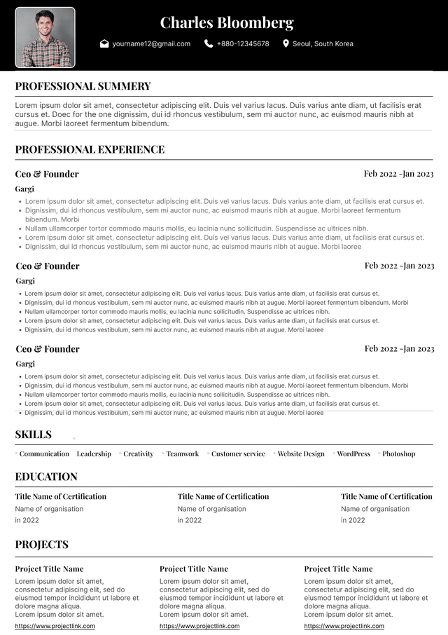
Use ATS-optimised Resume and resume templates that pass applicant tracking systems. Our Resume builder helps recruiters read, scan, and shortlist your Resume faster.
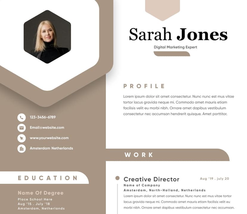
Use professional field-tested resume templates that follow the exact Resume rules employers look for.
Create Resume


 Upload Resume
 Import from Linkedin