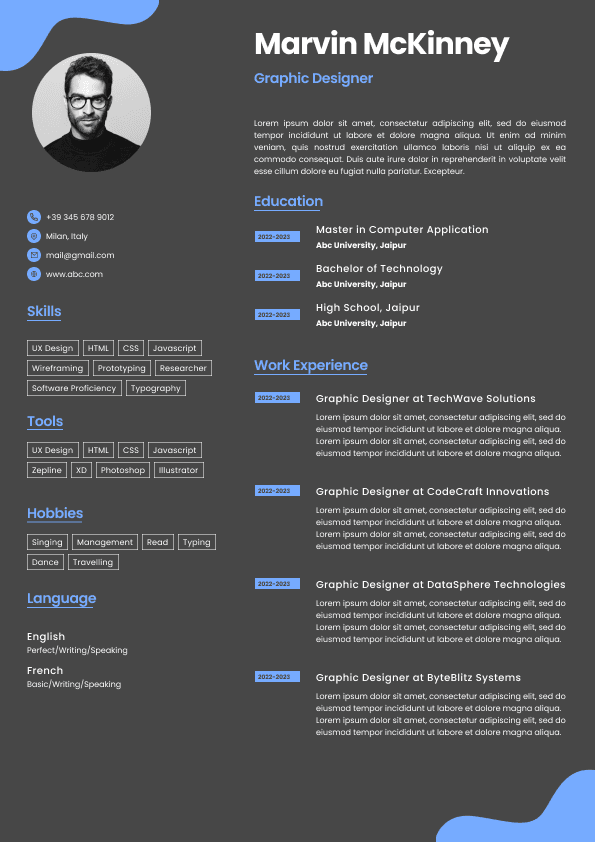
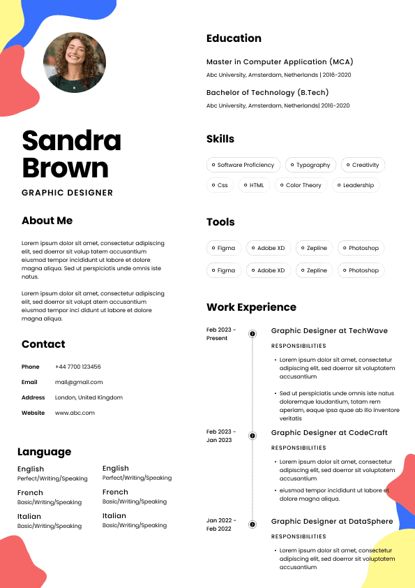
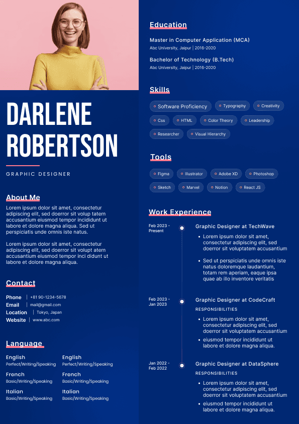
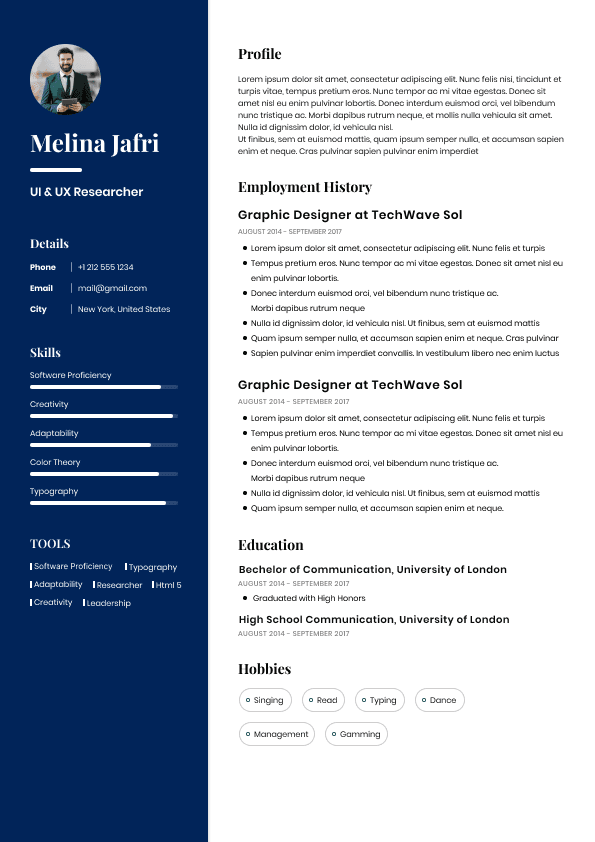
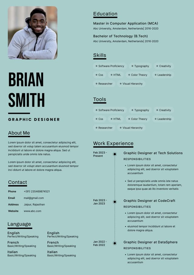
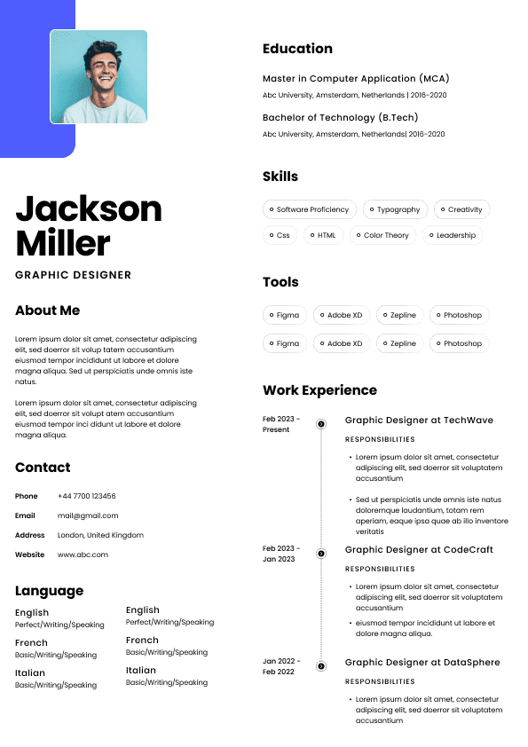
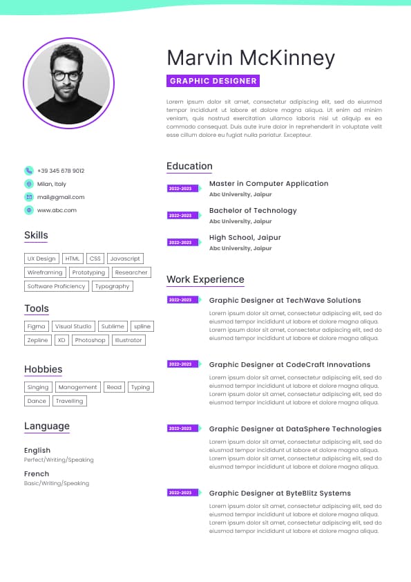
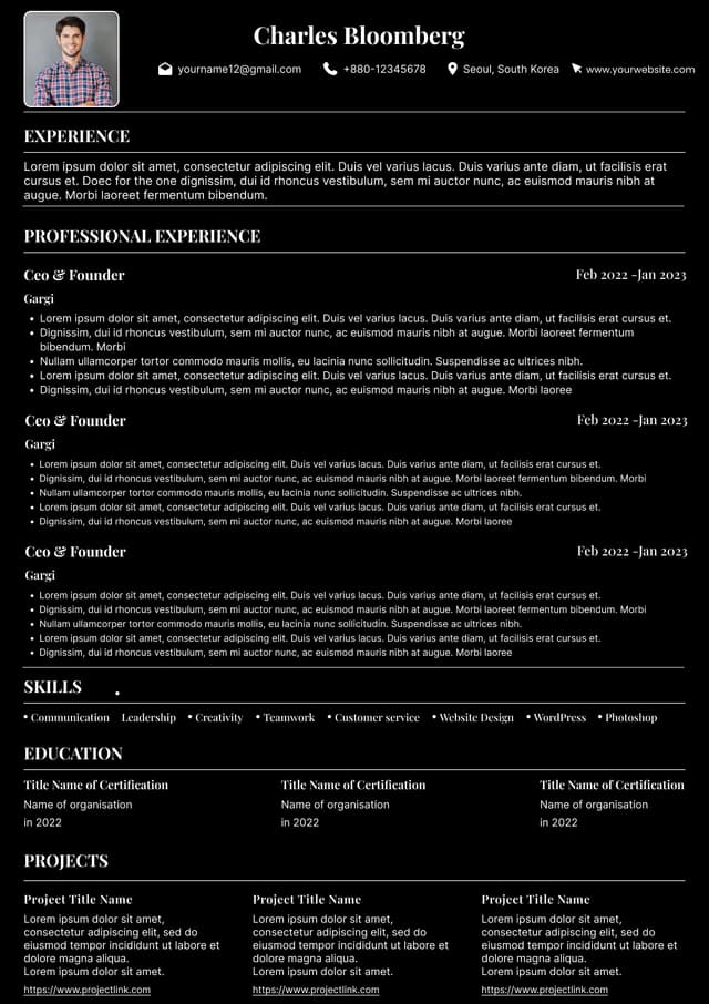
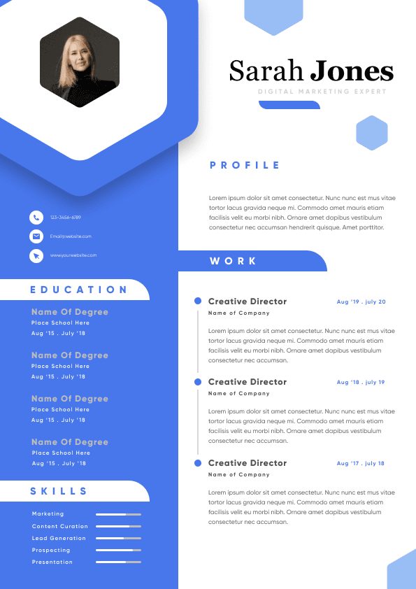
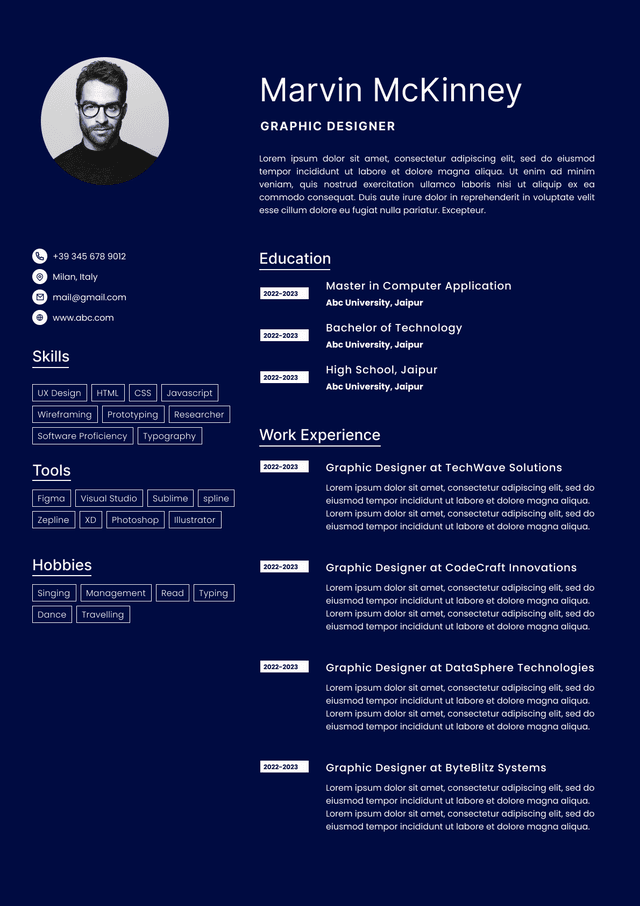
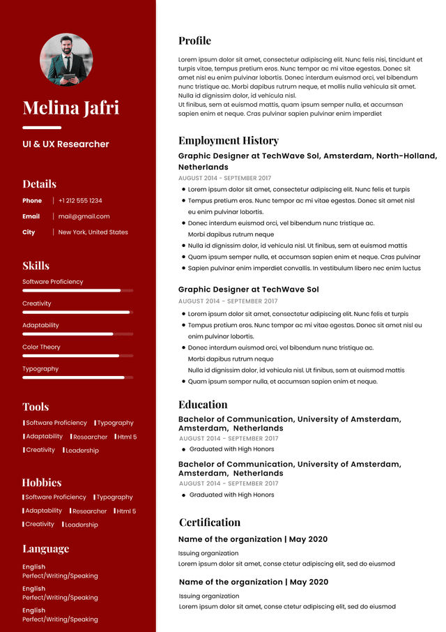
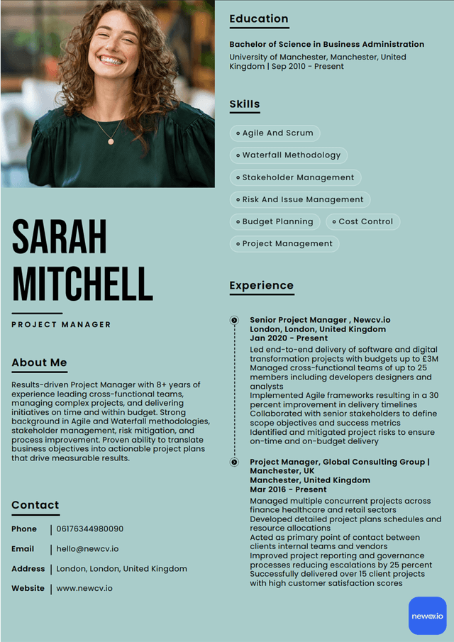
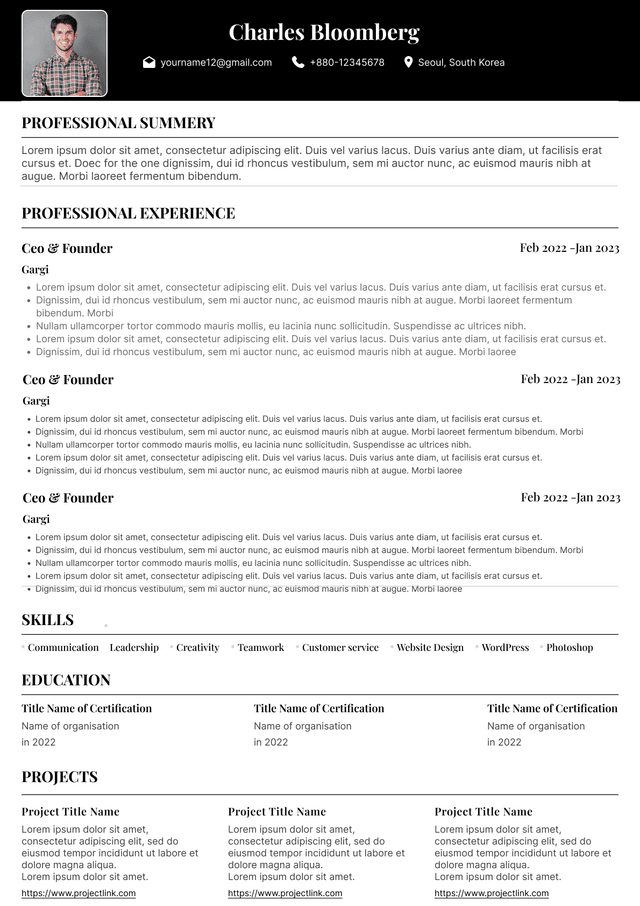
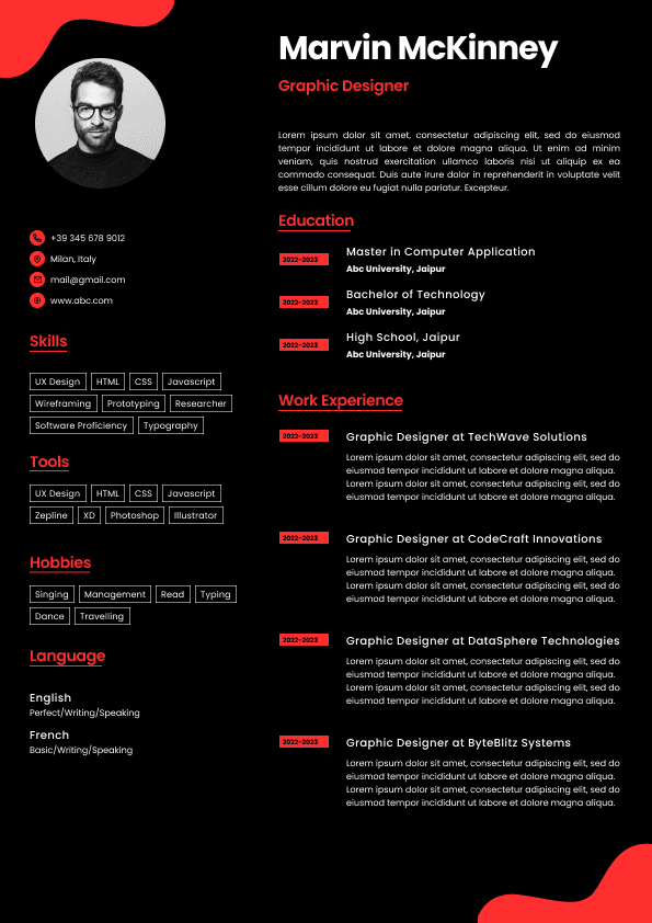
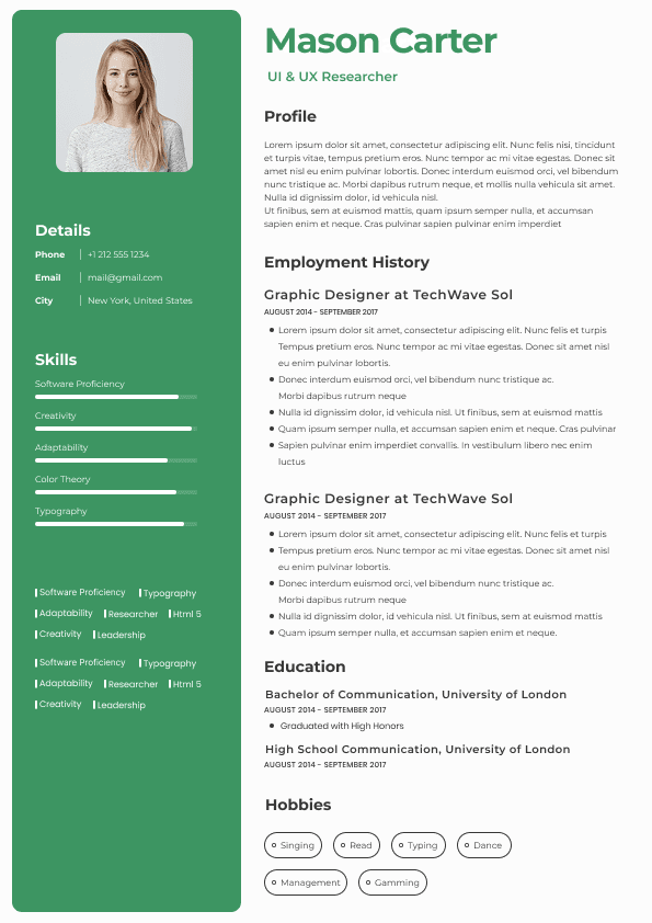
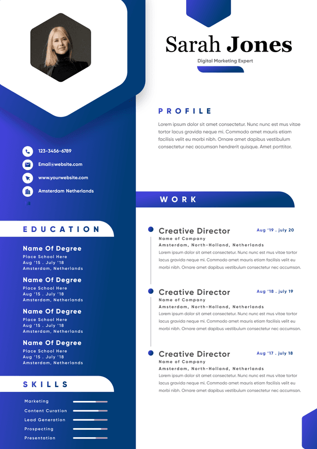
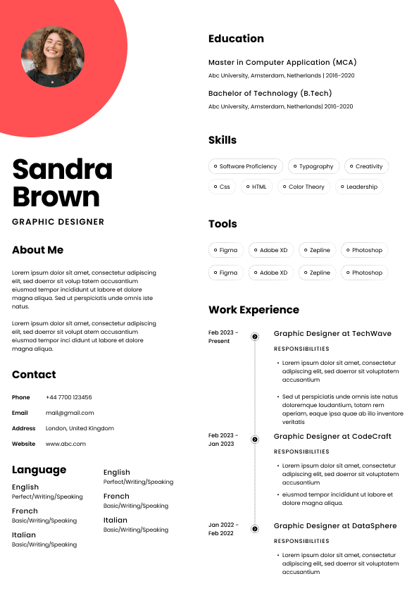
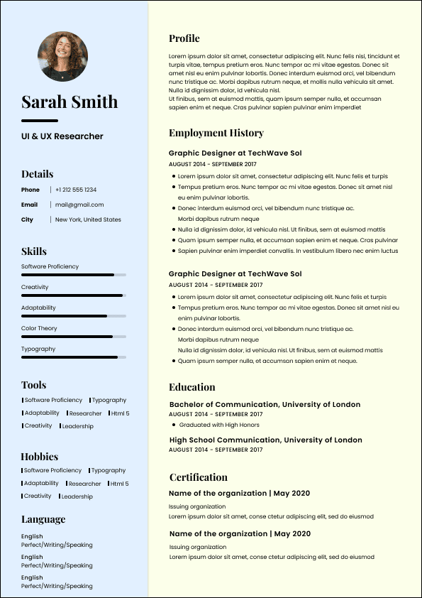
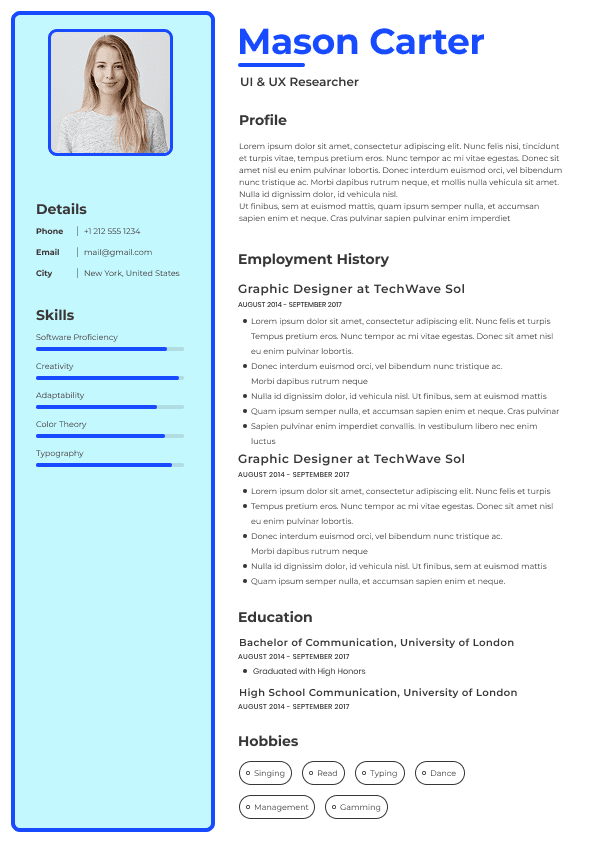
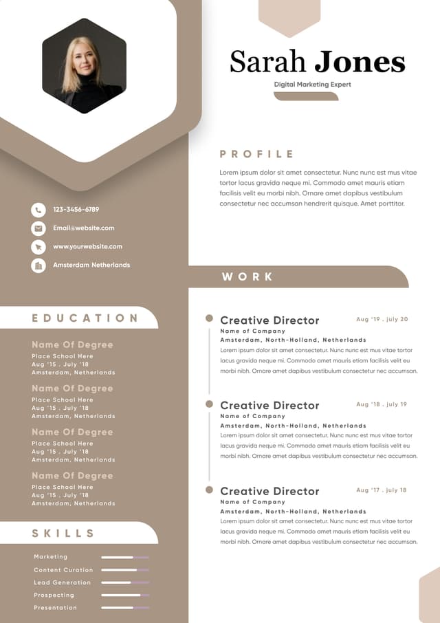
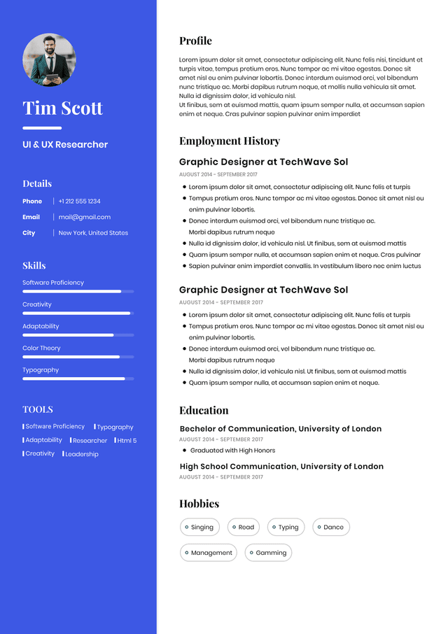
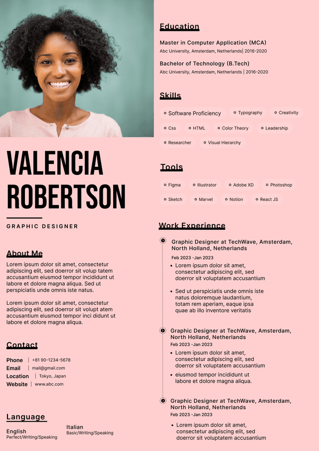
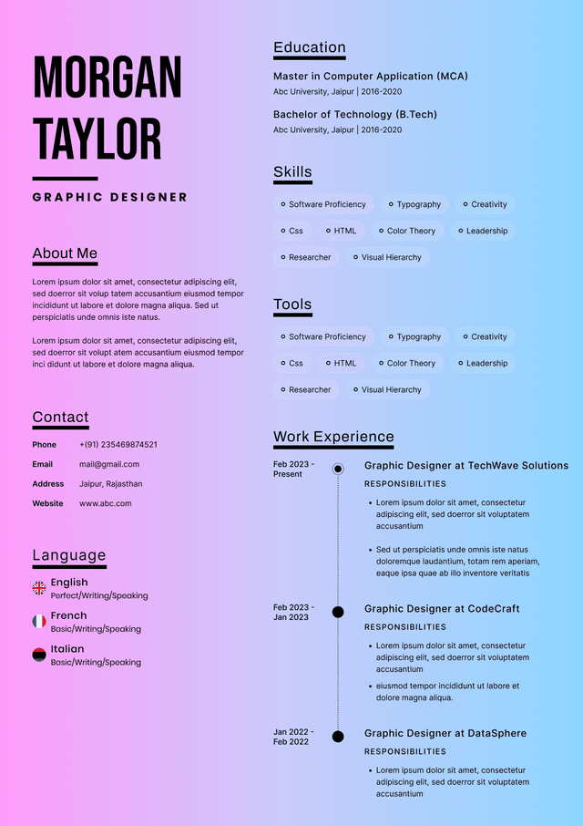
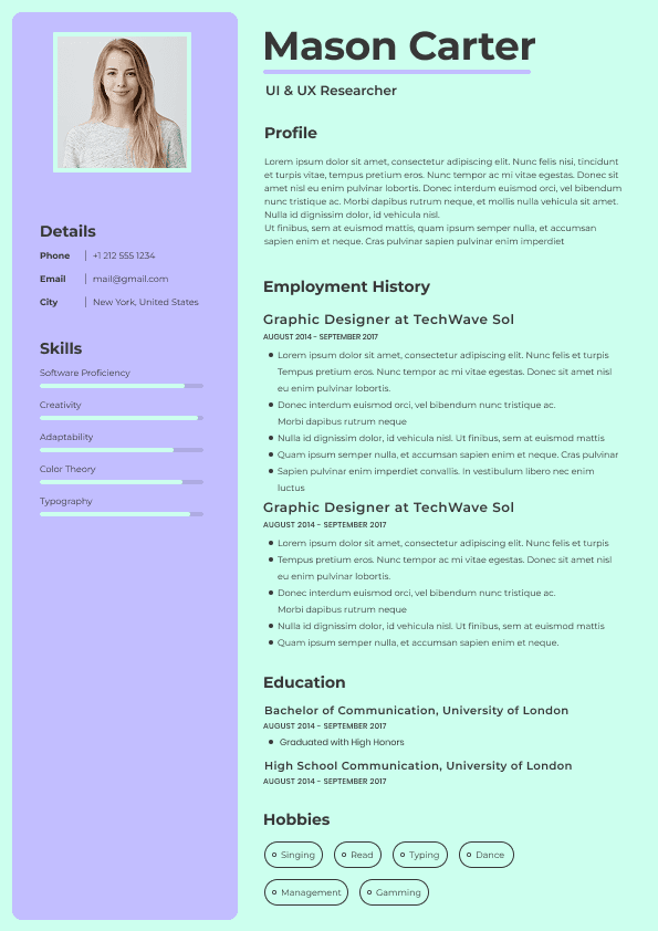
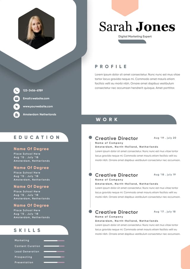
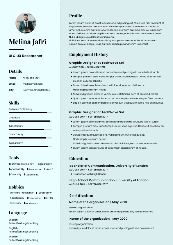
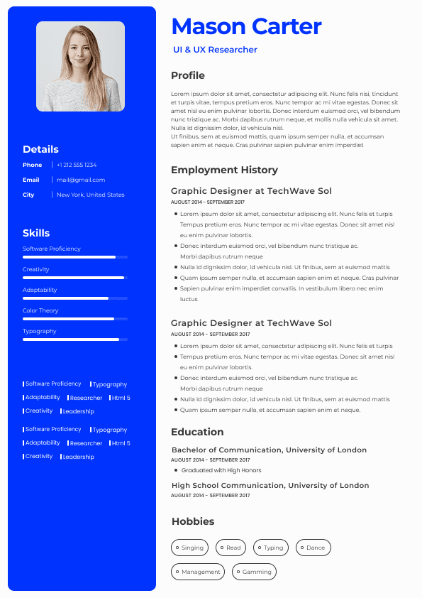
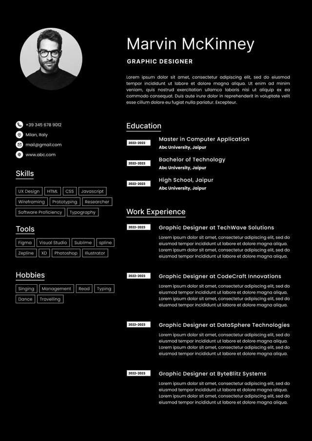
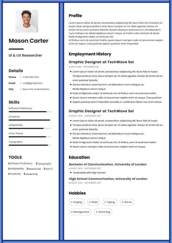
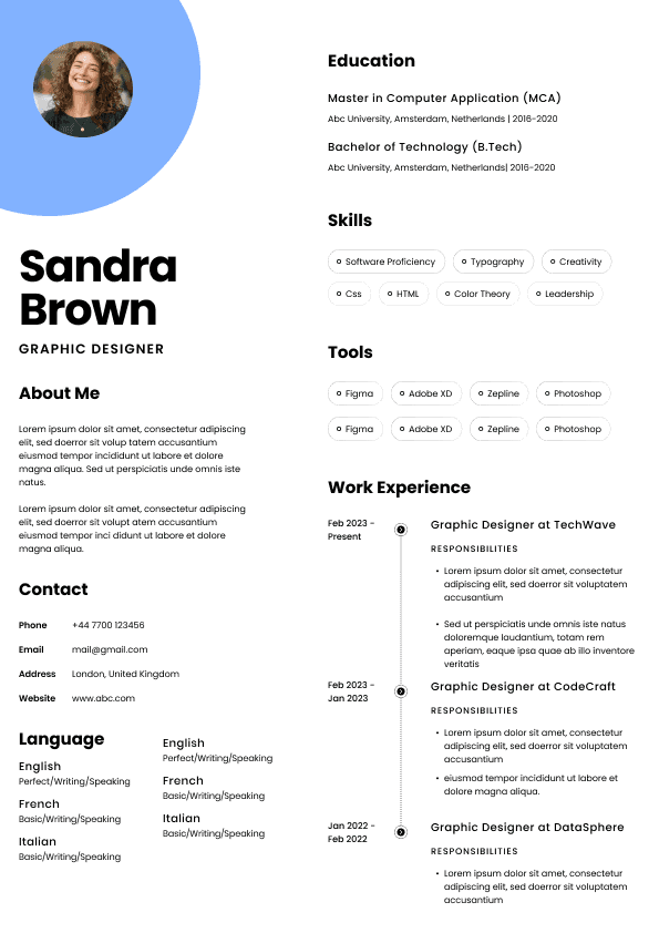
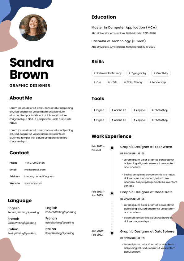
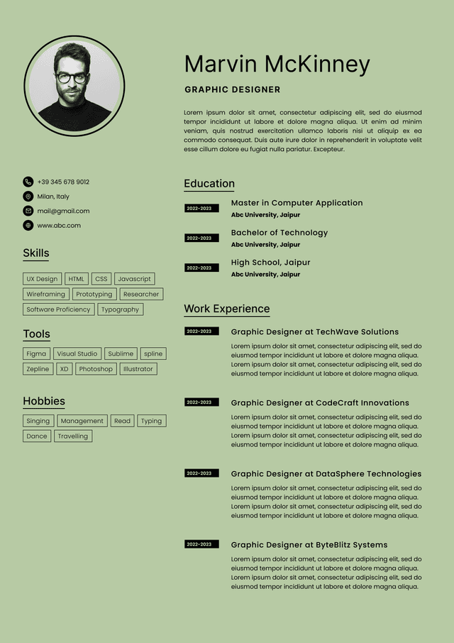
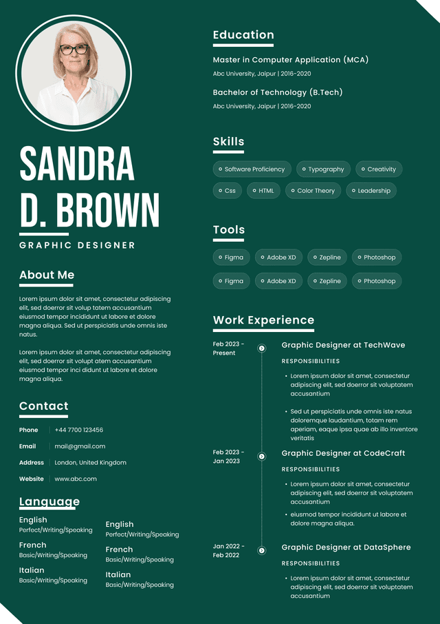
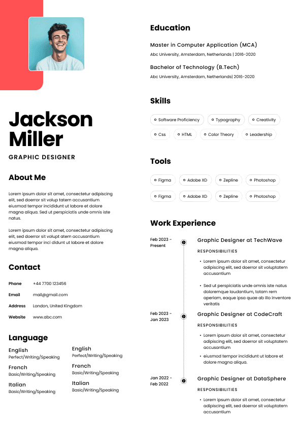
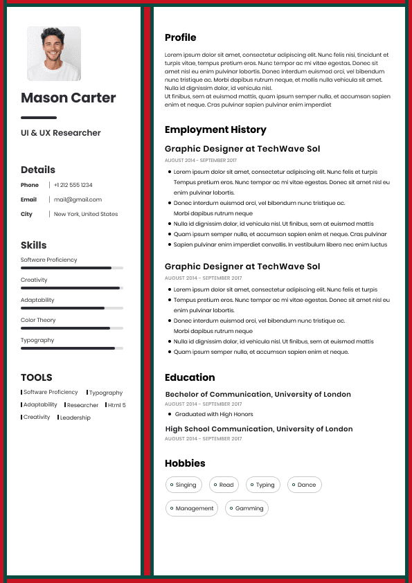
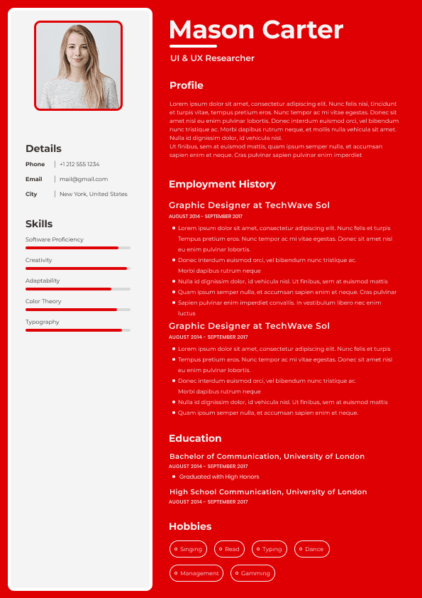
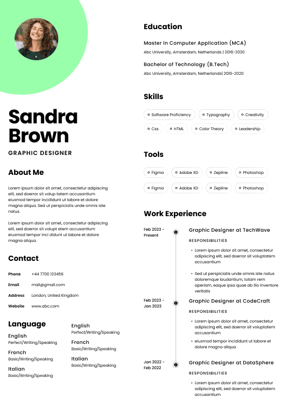
Choose from a wide range of NEWCV resume templates and customize your NEWCV design with a single click.
The result is subtle but important: awkward spacing, weak visual hierarchy, inconsistent typography, excessive white space, broken exports, and layouts that feel more like internal documentation than polished professional assets. This does not mean Notion resumes always fail. It means users frequently mistake simplicity for professionalism.
The bigger issue is workflow mismatch. Resumes are conversion documents. Their job is not to look creative. Their job is to communicate competence in under 10 seconds while surviving recruiter workflows, PDF sharing, mobile viewing, and sometimes ATS parsing. That is where many Notion resume approaches begin to break down.
Most resume tools optimize for:
•Information hierarchy
• Recruiter reading patterns
• Document presentation
• Print consistency
• PDF behavior
• ATS compatibility
• Personal branding
Notion optimizes for:
•Modular content blocks
• team collaboration
• databases
• note organization
• workspace flexibility
• dynamic editing
That distinction matters.
People often choose Notion because:
•It feels modern
• Templates look minimal
• Setup is fast
• Personal sites are easy to create
• It supports links and portfolios
• It appears cleaner than Word documents
But a recruiter reviewing 100 resumes per day evaluates entirely different signals.
Professional presentation is less about aesthetics and more about friction reduction.
Many resume templates in Notion suffer from a hidden problem: they all look structurally similar.
Common patterns include:
•Large header sections
• Oversized profile images
• Excessive whitespace
• Uniform text styling
• Weak distinction between sections
• Minimal visual hierarchy
• Database-style layouts
This creates a "creator economy portfolio" appearance rather than a hiring-focused presentation.
Minimalism works only when hierarchy is strong.
Many Notion resumes remove design elements without replacing them with scanning cues.
As a result:
Experience blends together.
Achievements lose emphasis.
Skills become hard to locate.
Important information visually competes at the same priority level.
Recruiters scan. They do not read line by line.
That distinction changes everything.
Competing articles often discuss appearance but ignore recruiter behavior.
Eye-tracking studies and hiring workflows consistently show recruiters scan resumes rapidly.
They often look for:
•Current role
• Company progression
• measurable outcomes
• years of experience
• skills alignment
• location
• role fit
This usually happens within seconds.
A Notion page often forces slower processing because:
•Sections lack visual anchors
• spacing creates long scrolling behavior
• blocks disrupt flow
• text hierarchy feels flat
• content appears page-like rather than document-like
The issue is cognitive friction.
The reader works harder.
When recruiters work harder, engagement drops.
There is an important psychological distinction users miss.
Professional resumes communicate:
"I understand professional presentation standards."
Many Notion resumes unintentionally communicate:
"I exported a page from my productivity system."
That sounds harsh, but workflow context shapes perception.
Notion pages visually resemble:
•team documents
• internal notes
• startup wiki pages
• project documentation
• knowledge bases
Users familiar with SaaS tools instantly recognize those patterns.
Recruiters do too.
Professional documents create a different feeling:
Intentional structure.
Controlled typography.
Predictable spacing.
Clear reading flow.
Small details create perceived credibility.
Many users build resumes in Notion and export PDFs.
This creates several workflow issues.
Common export problems include:
•strange page breaks
• inconsistent spacing
• oversized margins
• unexpected content shifts
• awkward line wrapping
• excessive empty space
• scaling issues on mobile devices
These issues often appear after content edits.
A resume is not static.
Users revise:
•skills
• achievements
• job descriptions
• projects
• formatting
Every adjustment creates opportunities for layout degradation.
Professional resume systems anticipate these updates.
Notion does not.
Minimal design and low effort are not the same thing.
Many users confuse:
Simple = Professional
That assumption causes problems.
Professional resume design relies on:
•spacing discipline
• hierarchy rules
• typography systems
• emphasis control
• alignment consistency
• information architecture
Notion templates frequently simplify by removing structure rather than improving structure.
This creates resumes that feel unfinished.
A resume should appear intentional.
Not accidental.
Competing content rarely discusses typography behavior.
Typography heavily affects perceived professionalism.
Notion gives limited control over:
•font hierarchy
• spacing precision
• line-height tuning
• visual density
• emphasis systems
• layout balance
This creates a uniform appearance where everything competes equally.
Professional resumes use typography strategically.
Good resume systems subtly guide attention.
Readers should naturally notice:
Role → company → achievement → impact
Notion frequently presents:
Block → block → block → block
The difference sounds small.
The impact is significant.
Traditional resumes evolved around page constraints for a reason.
Pages create natural information boundaries.
Scrolling changes reader behavior.
Long Notion resumes often become:
•biography-like
• portfolio-heavy
• overly detailed
• difficult to skim
Users frequently add more because Notion encourages expansion.
That creates a dangerous workflow issue.
More content rarely improves hiring outcomes.
Most resumes improve through editing and compression.
Not expansion.
Professional resumes optimize signal.
Not content volume.
Many discussions immediately jump into ATS concerns.
That oversimplifies the problem.
Modern ATS systems are better than many outdated myths suggest.
The larger issue is workflow compatibility.
Resumes move through:
•email attachments
• recruiter databases
• hiring managers
• mobile devices
• PDFs
• internal review systems
• interview panels
A resume can technically parse correctly and still underperform.
Why?
Because presentation influences human behavior.
ATS compatibility matters.
Human readability matters more.
Despite these limitations, Notion resumes continue growing in popularity.
For good reasons:
•fast setup
• easy editing
• portfolio integration
• personal websites
• creator branding
• startup culture appeal
• modern appearance
For certain use cases, Notion works well:
•freelance portfolios
• creator profiles
• startup founder pages
• public work showcases
• consulting pages
But these differ from traditional hiring workflows.
The problem is using one format for every context.
Notion can work if the goal extends beyond hiring documentation.
Examples:
•personal websites
• portfolio hubs
• developer showcases
• knowledge-based personal brands
• project archives
• startup operator profiles
In these situations, readers expect exploration.
Scrolling becomes acceptable.
Links become useful.
Dynamic content becomes an advantage.
Traditional resumes and digital identity systems are not always identical products.
The strongest resume tools optimize around hiring behavior rather than content storage.
Modern systems increasingly combine:
•ATS-friendly formatting
• visual hierarchy
• design quality
• AI assistance
• editing speed
• recruiter readability
• personal branding
This is where workflow-focused platforms have shifted expectations.
Users increasingly want:
"I need something that performs well and looks modern."
Not:
"I need something that forces a tradeoff."
For example, platforms like NewCV reflect a newer workflow model where users do not necessarily choose between:
•ATS performance
• premium design
• speed
• personal branding
• usability
That shift matters because resume workflows increasingly involve multiple outputs:
•recruiter PDFs
• digital identity pages
• portfolio presentation
• AI-assisted optimization
Professional design is not:
Less content.
Fewer colors.
More whitespace.
Cleaner templates.
Professional presentation is friction reduction.
A resume succeeds when readers instantly understand:
Who you are.
What you do.
Why you matter.
Minimalism helps only if it improves clarity.
When simplicity removes structure, professionalism drops.
That is the hidden issue behind many Notion resumes.

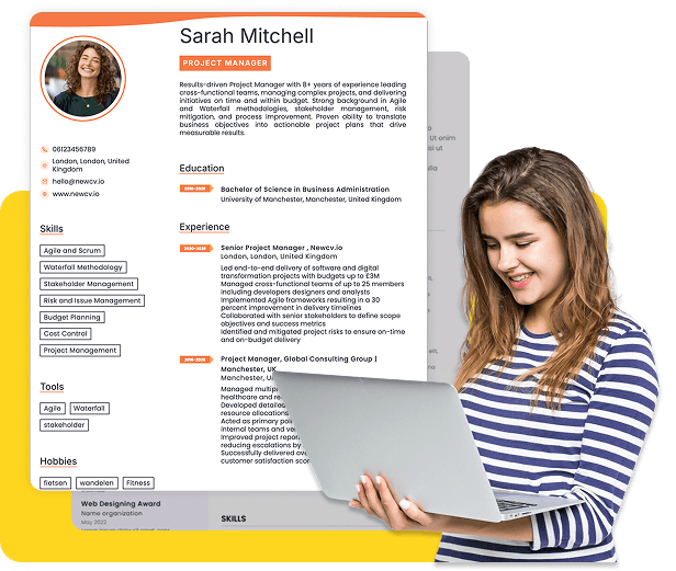
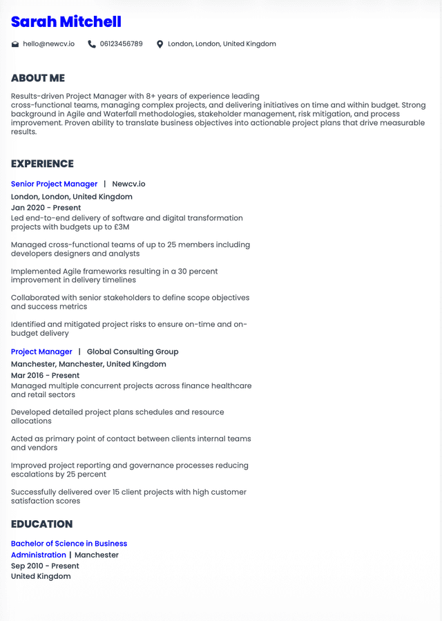
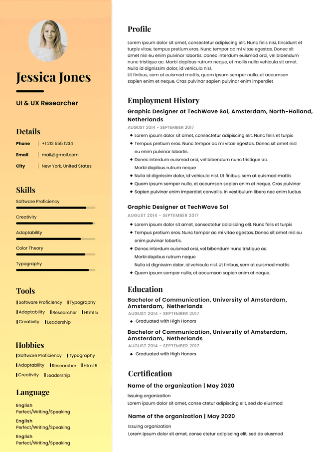
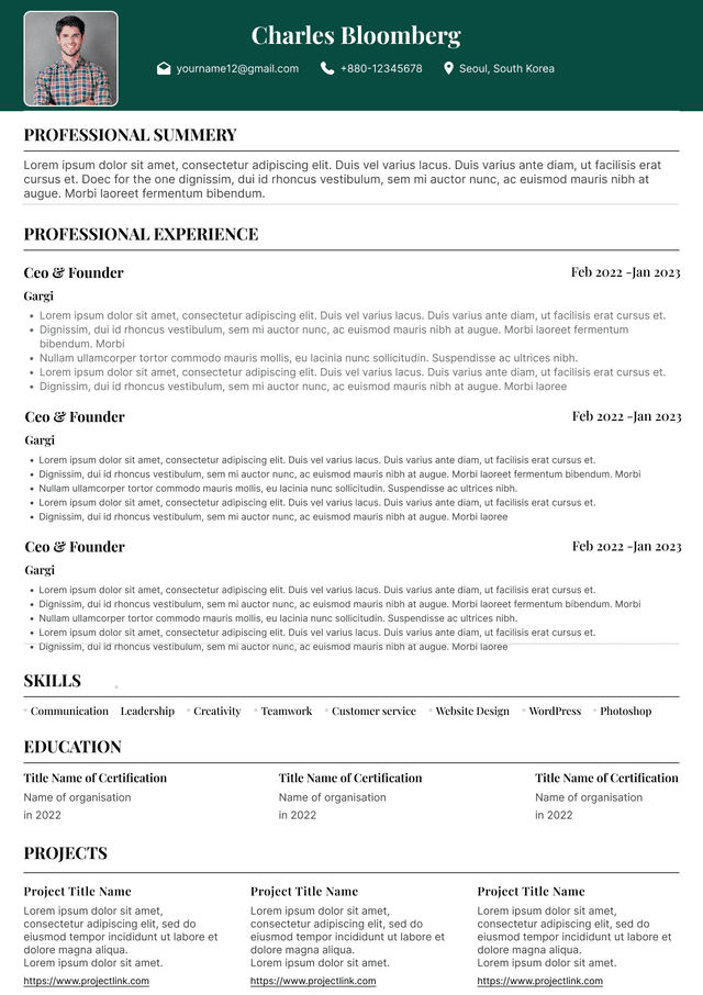
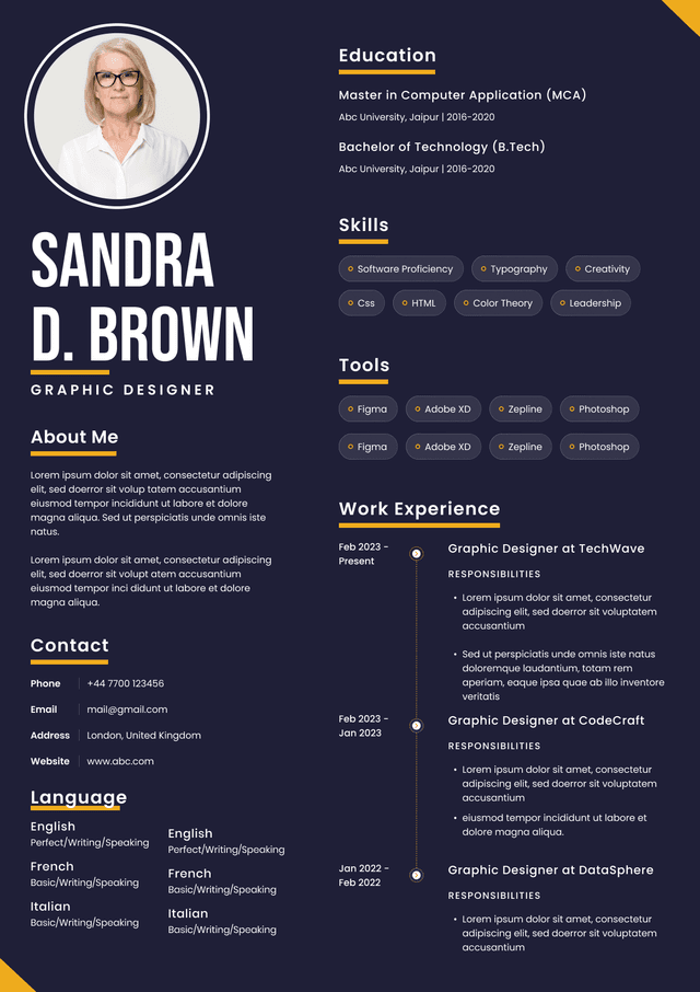
Use ATS-optimised Resume and resume templates that pass applicant tracking systems. Our Resume builder helps recruiters read, scan, and shortlist your Resume faster.
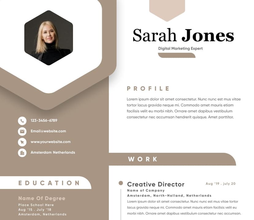
Use professional field-tested resume templates that follow the exact Resume rules employers look for.
Create Resume
Use professional field-tested resume templates that follow the exact Resume rules employers look for.
Create ResumeThe workflow itself changed.
Many older approaches have not.