A Canva resume can look visually impressive and still fail during an actual hiring process. Recruiters typically spend only a few seconds on an initial review, and they prioritize clarity, structure, scan speed, and information hierarchy over aesthetic design. The problem is not Canva itself. The problem is that many Canva templates prioritize visual appeal over hiring workflow realities.
Common issues include text embedded in graphics, multi-column layouts, decorative icons replacing labels, poor hierarchy, unconventional formatting, and designs that break parsing systems. Recruiters are not rejecting creativity; they are rejecting friction.
The strongest resumes today balance visual quality with recruiter usability, ATS compatibility, and speed of comprehension. That is where many Canva resumes struggle.
Most Canva templates are optimized for visual presentation.
Hiring systems are optimized for processing information quickly.
Those goals are not always aligned.
Graphic design platforms assume users want:
•Attractive layouts
• Visual differentiation
• Creative expression
• Strong aesthetics
• Flexible design control
Recruiters and hiring teams need:
•Fast information extraction
• Consistent formatting
• Predictable section structures
• High readability
• Low-friction review workflows
This creates a structural mismatch.
Many job seekers mistakenly assume:
"Better-looking resume = better hiring outcomes."
Recruiters often think differently:
"Easier-to-review resume = better candidate experience."
That difference explains why visually impressive Canva resumes frequently underperform.
Many articles discuss ATS compatibility while ignoring recruiter behavior.
This misses a major issue.
Recruiters rarely analyze resumes deeply during the first review stage.
Initial resume screening often looks more like pattern recognition.
Recruiters scan:
•Current role
• Job titles
• Relevant skills
• Career progression
• Experience relevance
• Dates
• Education
• Keywords matching requirements
When layouts become visually complex, recruiters experience cognitive friction.
Examples:
•Sidebars interrupt reading flow
• Multiple columns create scanning confusion
• Skill meters communicate little value
• Large icons slow visual processing
• Graphic-heavy sections bury important information
The result:
More effort.
More effort often means less attention.
Less attention frequently means rejection.
The issue is not Canva itself.
The issue is template behavior.
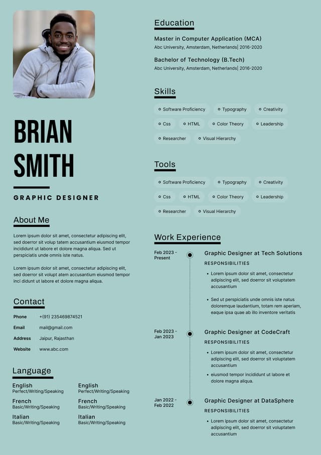
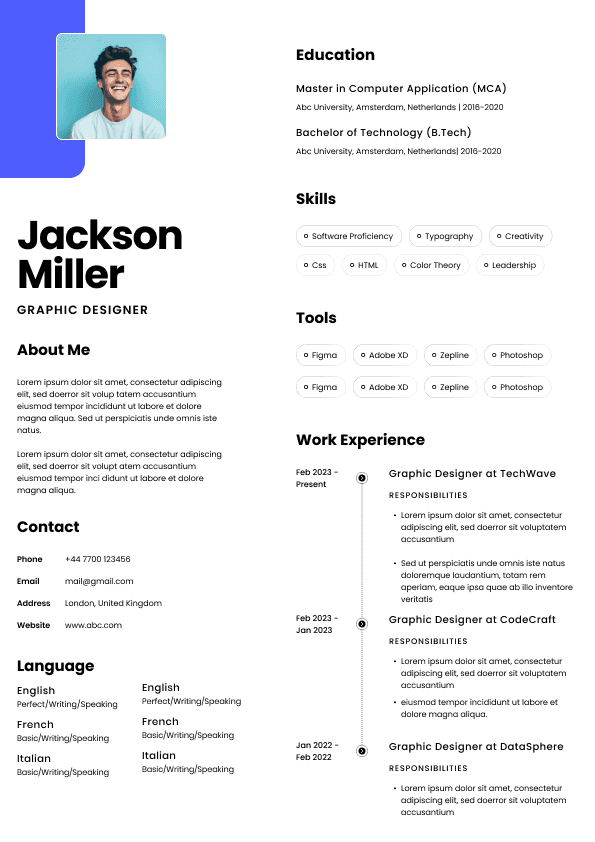
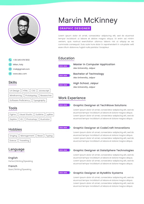
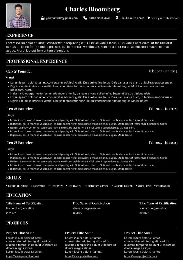
Many popular Canva resume designs rely on elements that look professional but perform poorly in hiring environments.
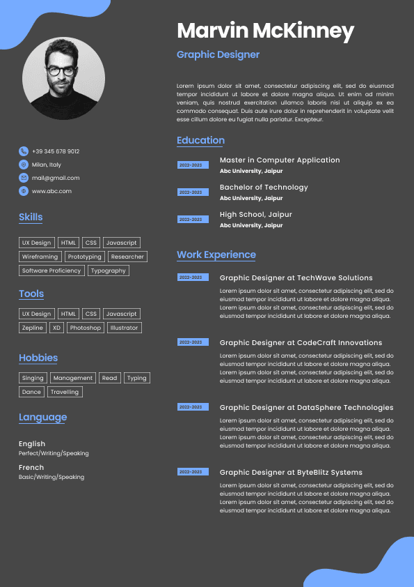
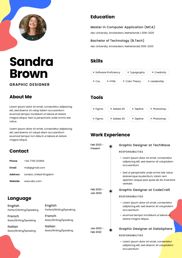
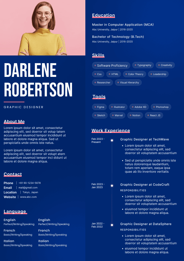
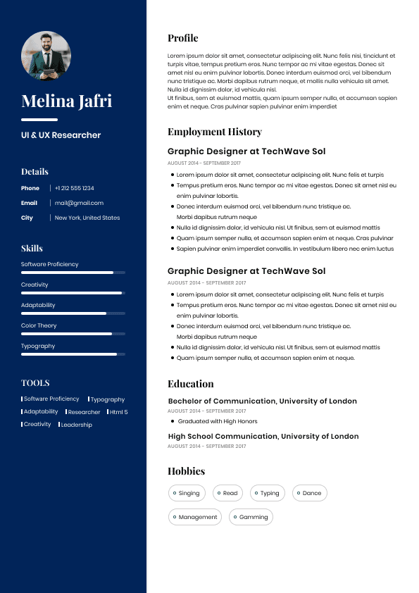
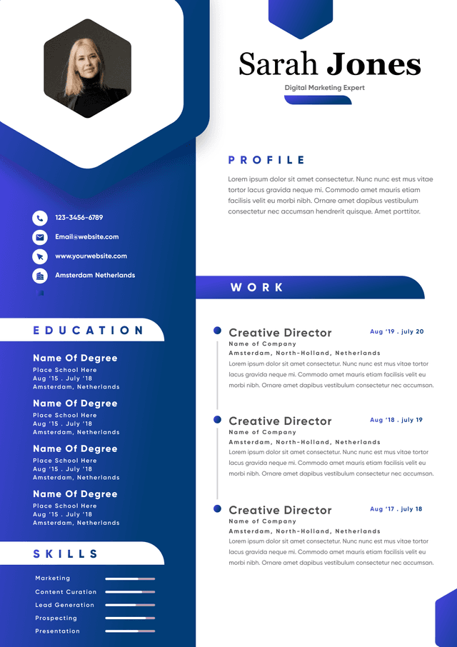
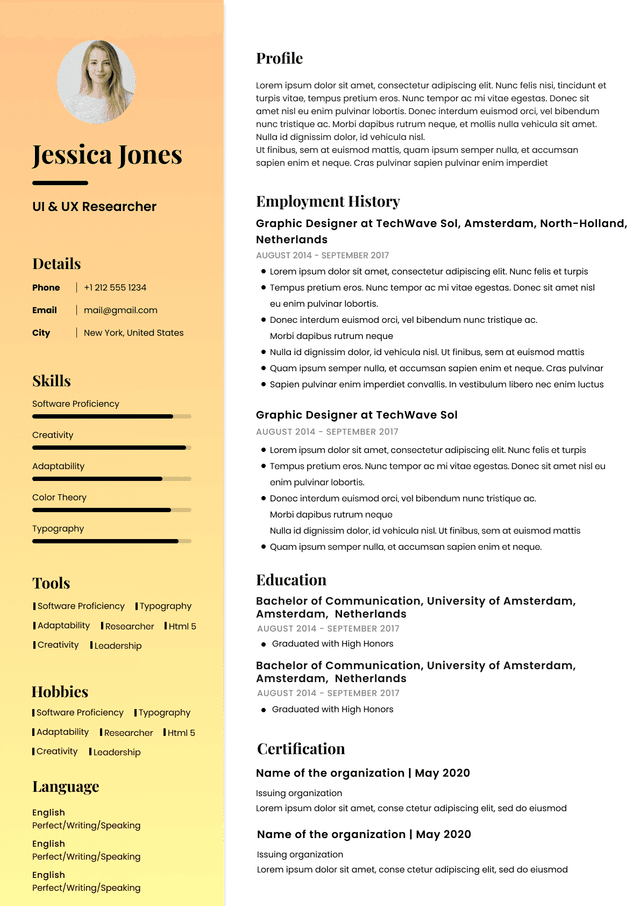
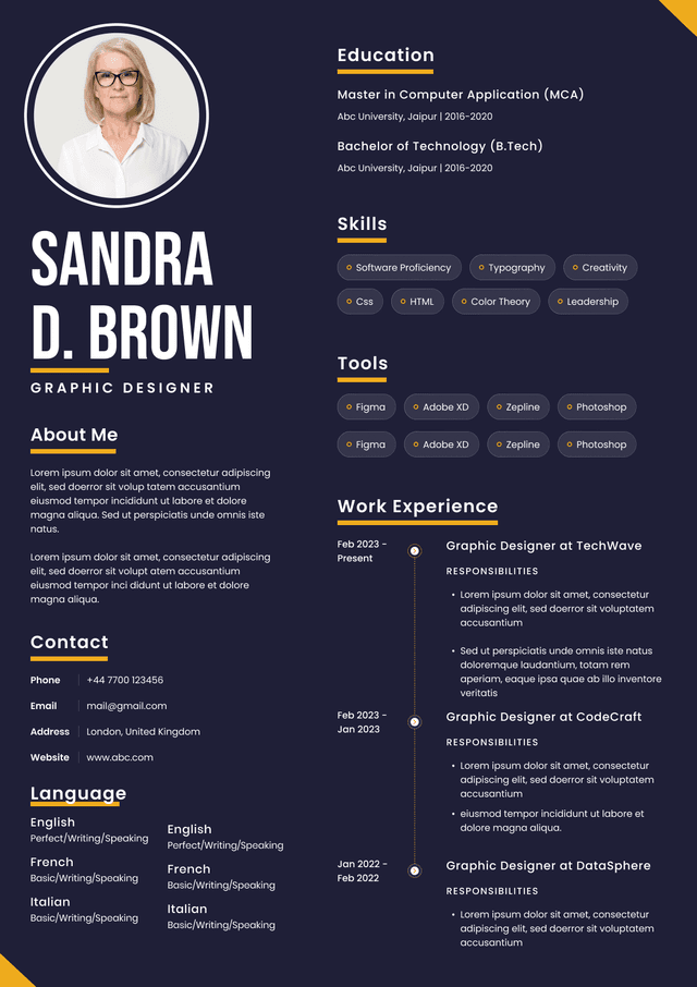
Designers love columns.
Recruiters often do not.
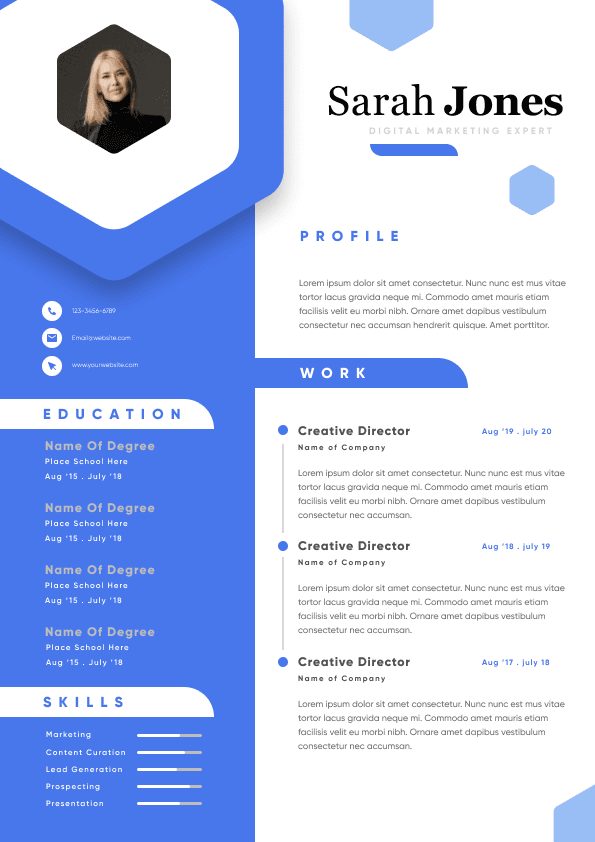
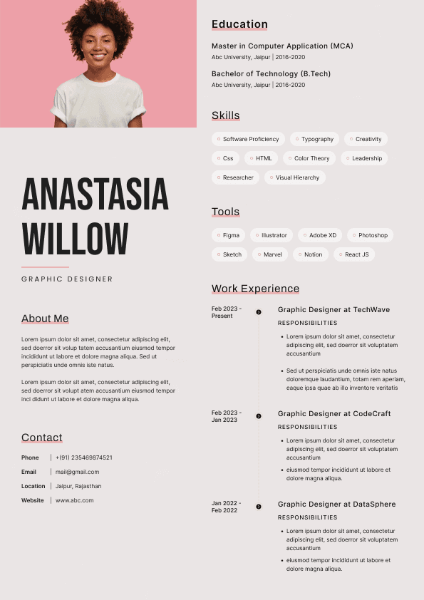
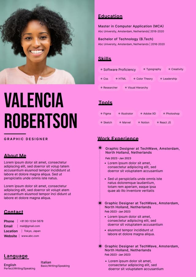
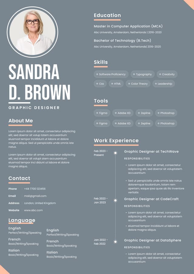
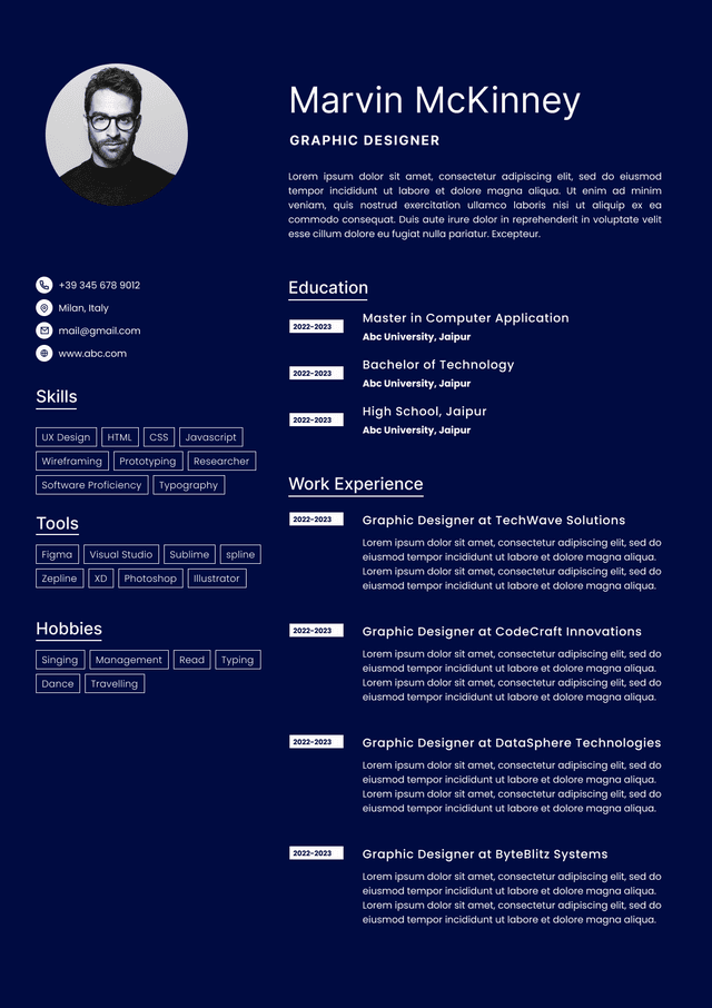
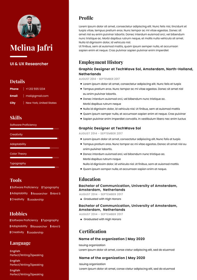
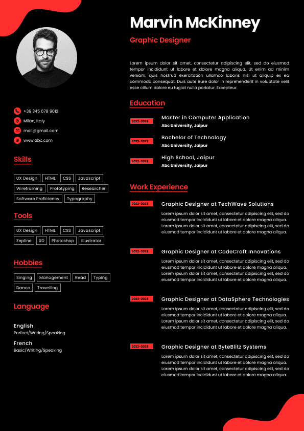
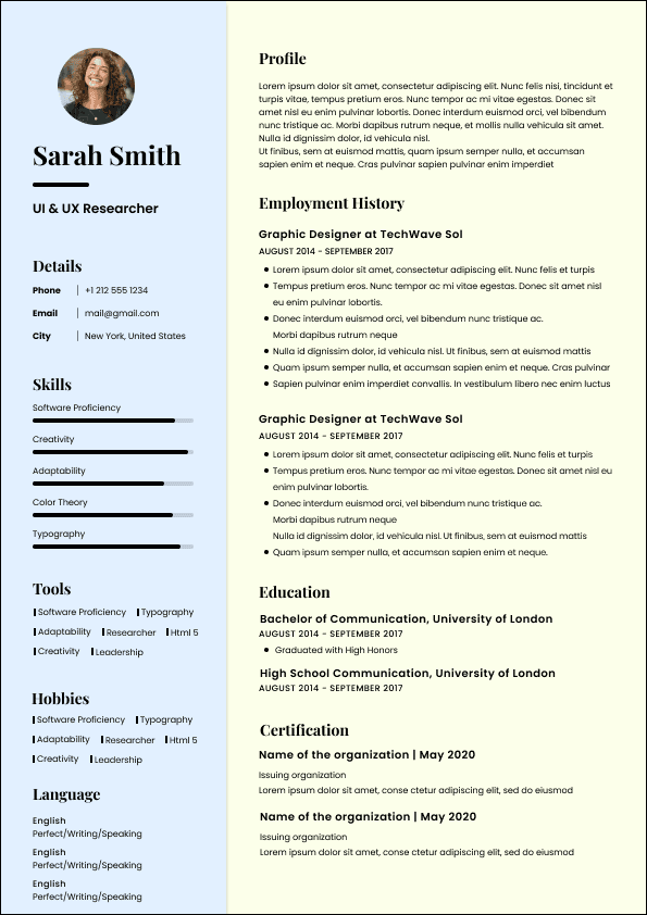
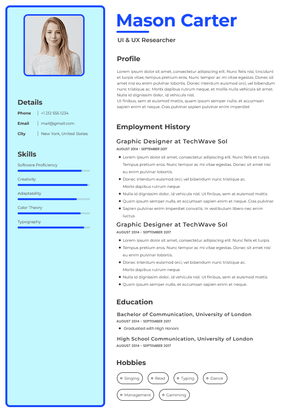
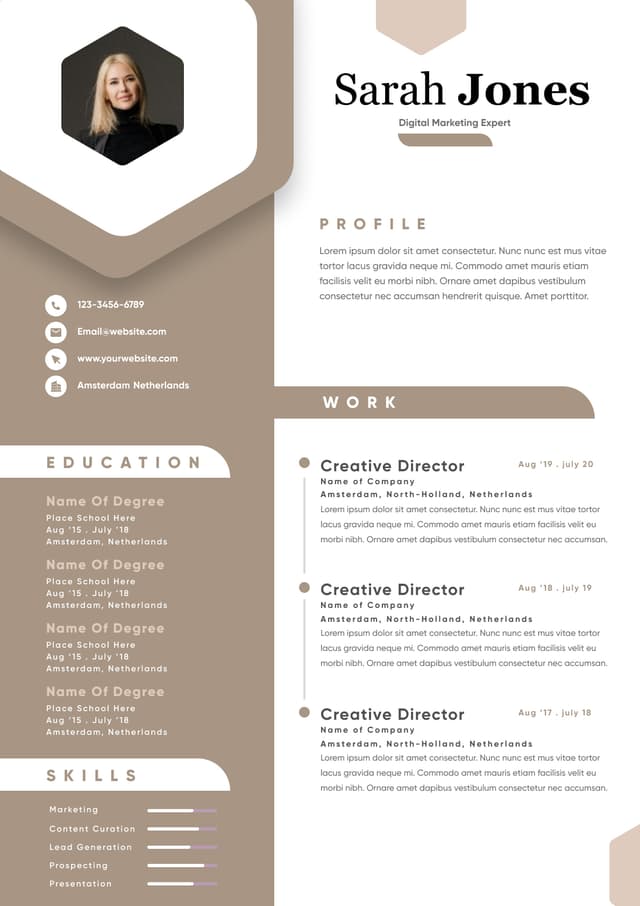
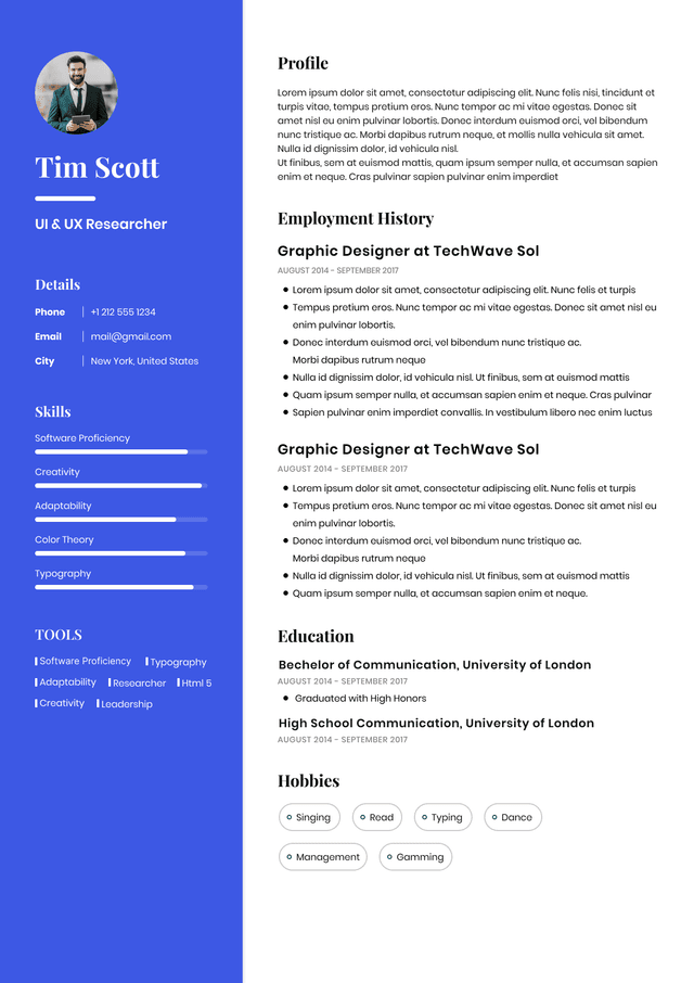
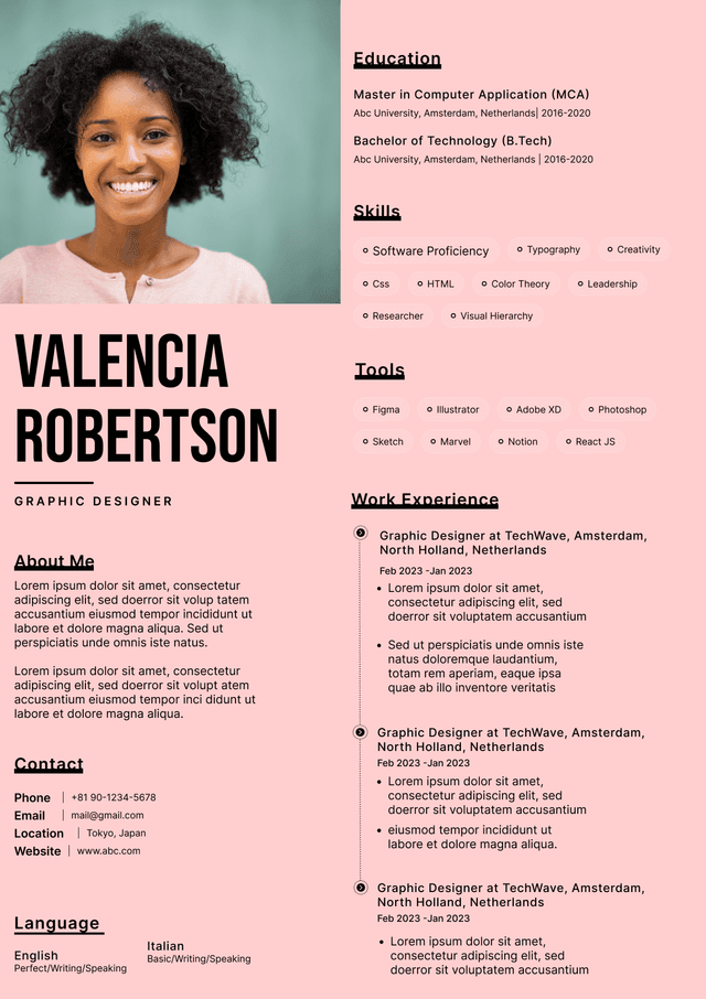
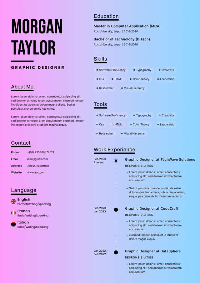
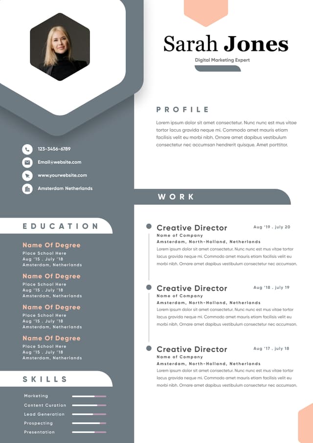
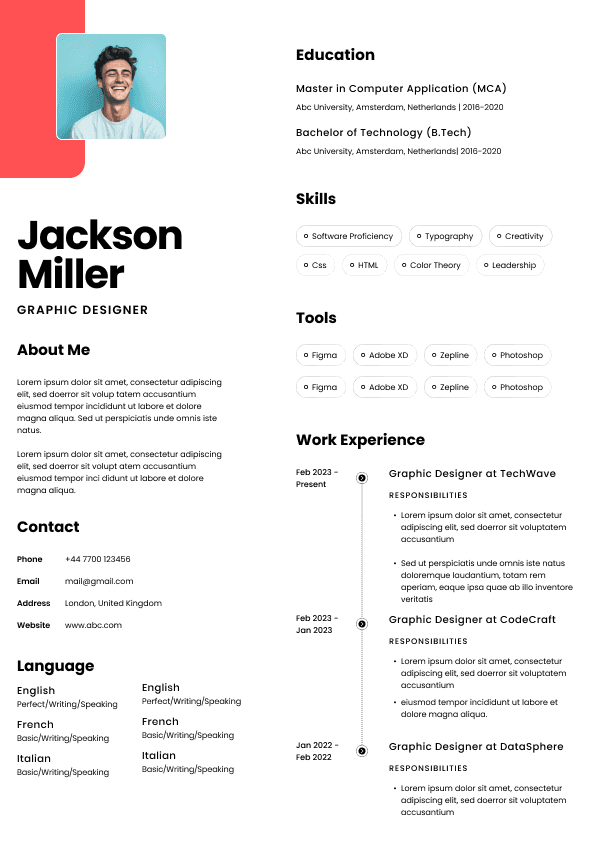
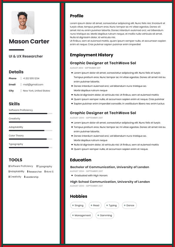
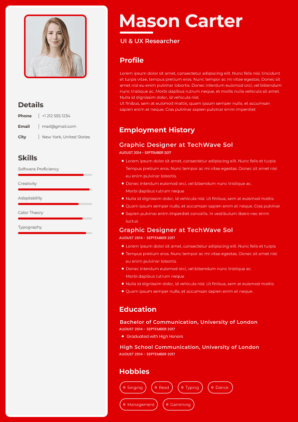
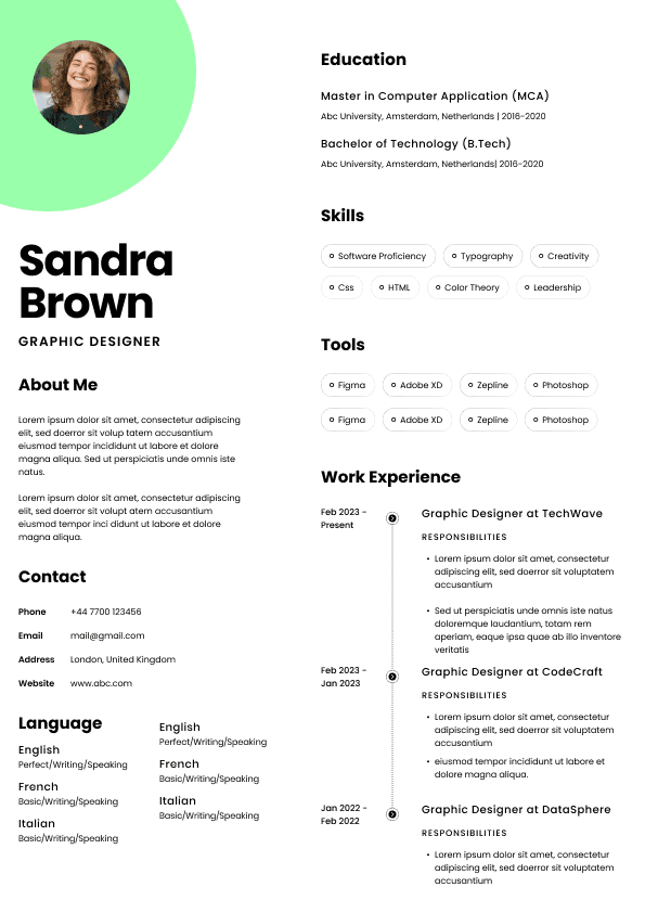
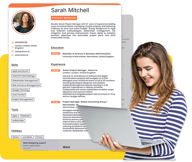
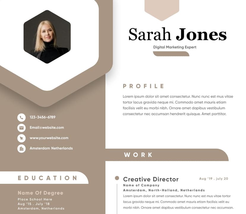
Many Canva templates place:
•Skills on the left
• Experience on the right
• Contact information in sidebars
• Education in narrow columns
Humans can adapt.
Systems and recruiters scanning rapidly often struggle.
The eye naturally reads from top to bottom.
Complex layouts force users to constantly shift focus.
This slows comprehension.
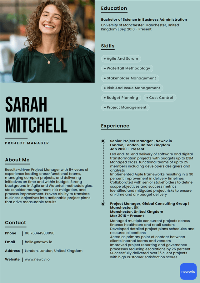
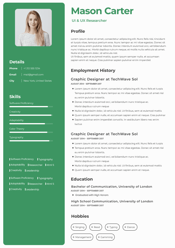
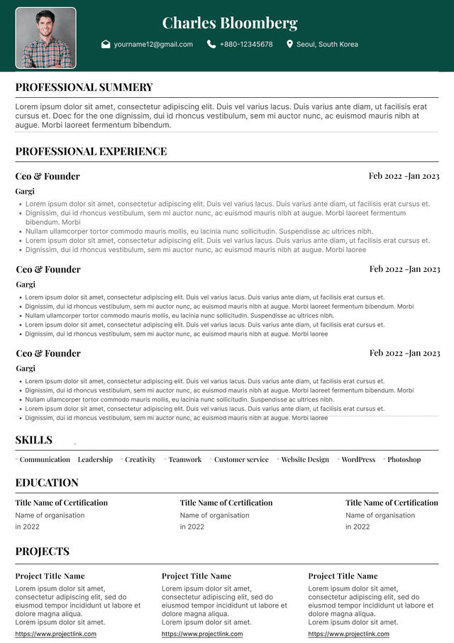
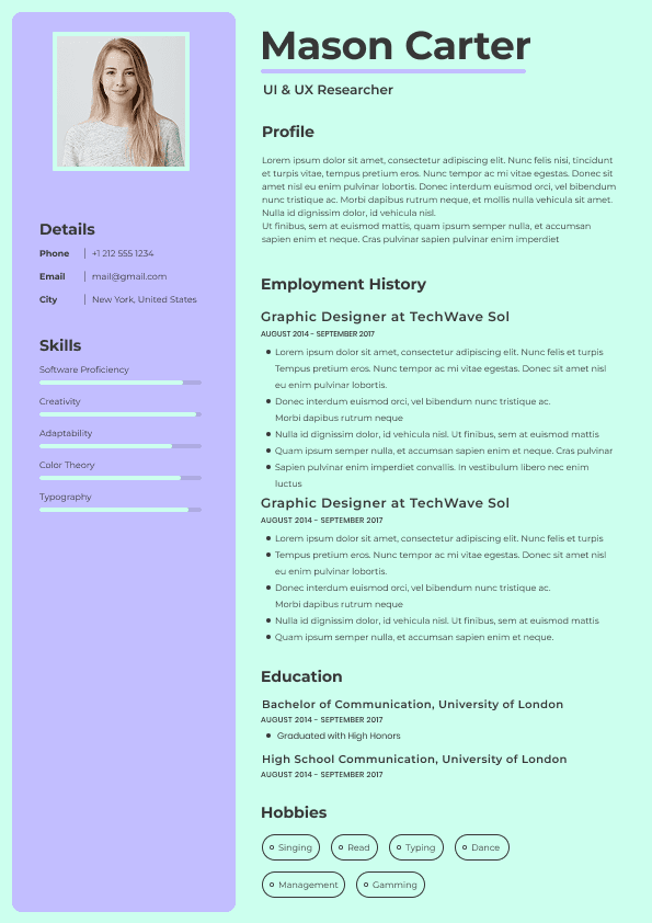
Candidates frequently add:
•Progress bars
• Skill percentages
• Icons everywhere
• Large profile photos
• Graphic timelines
• Colored blocks
• Visual charts
These elements rarely improve hiring decisions.
Skill bars create especially weak signals.
A recruiter seeing:
Python: 85%
has no meaningful context.
Compared with:
"Built Python automation workflows reducing reporting time by 60%."
The second communicates measurable capability.
The first communicates decoration.
One of the biggest frustrations with Canva resumes:
Candidates often believe everything looks perfect.
But ATS systems do not see resumes the same way humans do.
Common Canva-related issues include:
•Text layered over graphics
• Elements exported incorrectly
• Tables used for structure
• Unrecognized section labels
• Columns parsed out of sequence
• Icons replacing standard labels
Candidates never see these failures.
They only experience fewer interviews.
Many people assume ATS systems instantly reject resumes.
That is exaggerated.
Modern ATS systems have improved.
However, formatting friction still creates risk.
Especially at scale.
Many job seekers think standing out means appearing different.
Recruiters often prefer familiar structures.
Why?
Because predictable layouts reduce processing time.
Recruiters know where they expect:
•Experience
• Skills
• Education
• Certifications
• Contact information
When sections appear in unusual locations, comprehension slows.
Speed matters.
During high-volume hiring, even small inefficiencies become costly.
Most recruiters want resumes that feel effortless.
Not flashy.
Not artistic.
Not overloaded.
Effortless.
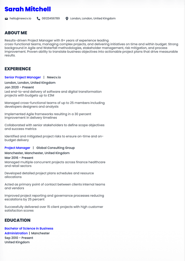
Strong resumes usually have:
•Clear section labels
• Single-column structures
• Consistent spacing
• Strong hierarchy
• Easy scan patterns
• Relevant achievements
• Fast readability
• Minimal visual distractions
Notice what is missing:
Excess design.
Many candidates optimize for emotional reaction.
They think:
"If this looks impressive, recruiters will remember me."
Recruiters optimize differently.
They think:
"Can I evaluate this candidate in seconds?"
Those are completely different objectives.
Design without usability creates friction.
And friction reduces outcomes.
Canva itself is not inherently bad.
Some users create excellent resumes with Canva.
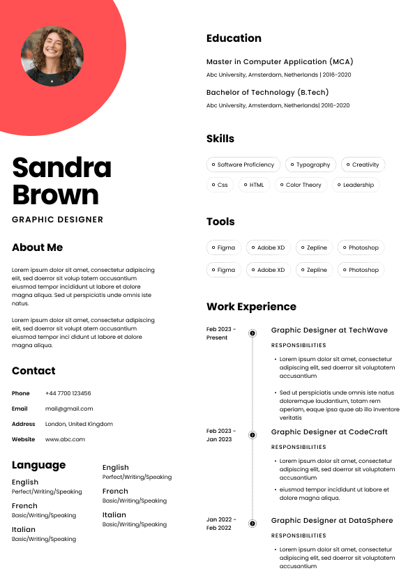
Successful Canva resumes usually follow traditional resume principles:
•Single-column layouts
• Minimal graphic elements
• Standard section names
• Strong spacing
• Clear typography
• ATS-friendly structure
• Content-first formatting
At that point, Canva becomes a design tool rather than a design system.
That distinction matters.
The platform is not the issue.
Template choices are.
The resume market has shifted significantly.
Candidates increasingly want:
•ATS compatibility
• Professional design
• Speed
• Personal branding
• Better readability
• Automation support
Historically this required compromise.
You either chose:
Or:
Modern platforms increasingly combine both.
Solutions like NewCV reflect this shift by prioritizing recruiter readability, ATS performance, AI-assisted workflow improvements, and professional presentation without forcing users to choose between usability and design.
The broader trend matters more than any individual tool:
Users no longer want beautiful resumes that break hiring workflows.
They want systems that support both.
Candidates often blame:
•Competition
• ATS systems
• Recruiters
• Job market conditions
Sometimes the problem is simpler.
Tiny friction points compound.
Examples:
•Resume difficult to scan
• Keywords hidden inside graphics
• Information buried in sidebars
• Experience sections fragmented
• Layout slowing review speed
None alone guarantees rejection.
Together they create risk.
Hiring decisions rarely fail because of one catastrophic mistake.
They often fail because of multiple small inefficiencies.
•Single-column layouts
• Standard headings
• Strong achievement-focused bullets
• Clear hierarchy
• Readable typography
• Minimal visual noise
• Fast scanning structure
•Heavy sidebars
• Skill progress bars
• Decorative charts
• Graphic timelines
• Multi-column dependency
• Excess icons
• Style prioritized over usability
The difference often appears subtle.
The hiring impact can be significant.
Instead of asking:
"Does this resume look impressive?"
Ask:
"Can a recruiter understand my value in six seconds?"
Evaluate your resume using:
•Can key information be found instantly?
• Does reading feel effortless?
• Does layout help or slow comprehension?
• Are achievements visible immediately?
• Would ATS systems interpret sections correctly?
• Does design support content rather than compete with it?
This framework usually predicts performance better than aesthetics.
Recruiters do not reject Canva resumes because they dislike Canva.
They reject resumes that create unnecessary effort.
Many Canva templates unintentionally prioritize design over hiring workflows. The strongest resumes reduce friction, improve readability, support ATS parsing, and communicate value immediately.
The future of resume design is unlikely to be minimalist or highly creative.
It will be workflow-aware.
Candidates increasingly expect systems that combine design quality, recruiter usability, ATS performance, and speed without forcing tradeoffs.
That shift is already happening.
And it explains why resume success today depends less on visual style and more on how well your resume functions inside real hiring environments.
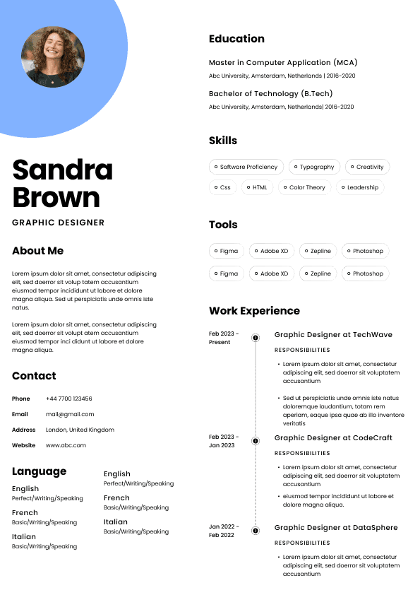
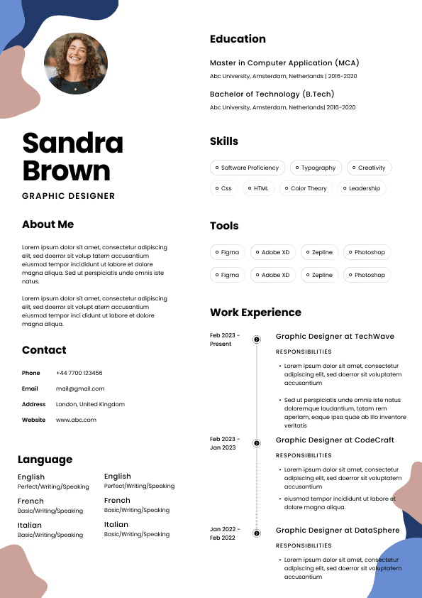
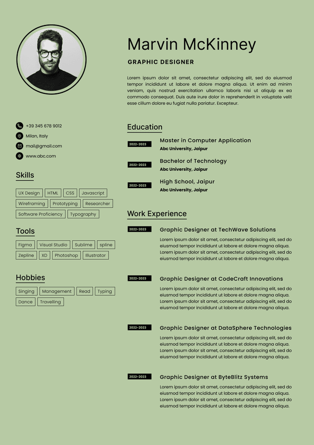
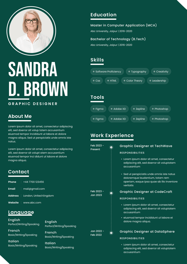
Choose from a wide range of NEWCV resume templates and customize your NEWCV design with a single click.

Use ATS-optimised Resume and resume templates that pass applicant tracking systems. Our Resume builder helps recruiters read, scan, and shortlist your Resume faster.
Use professional field-tested resume templates that follow the exact Resume rules employers look for.
Create Resume
Use professional field-tested resume templates that follow the exact Resume rules employers look for.
Create Resume