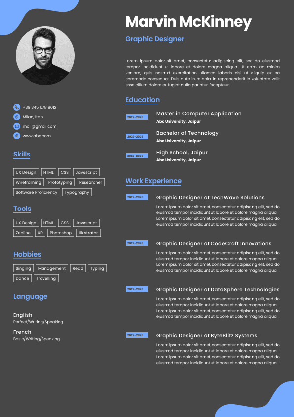
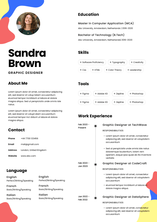
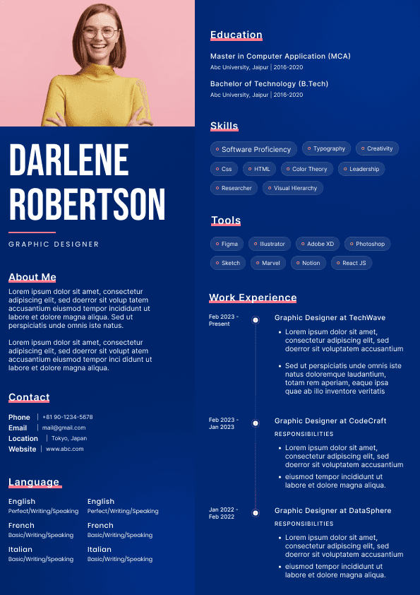
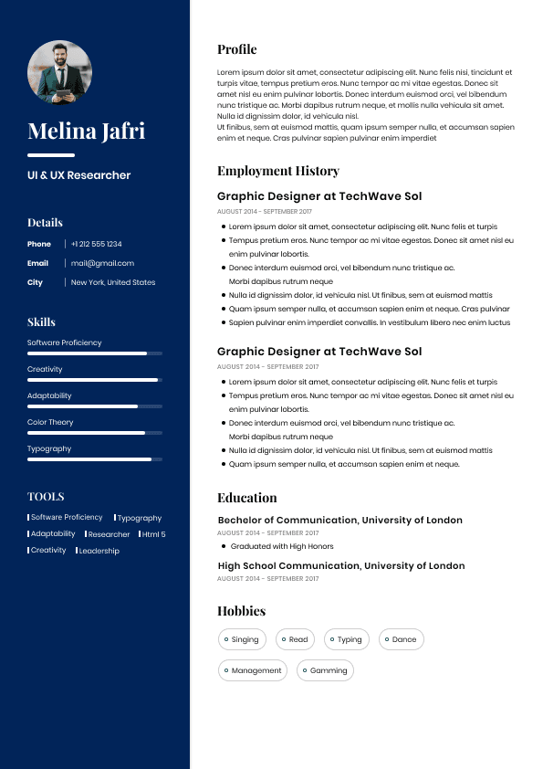
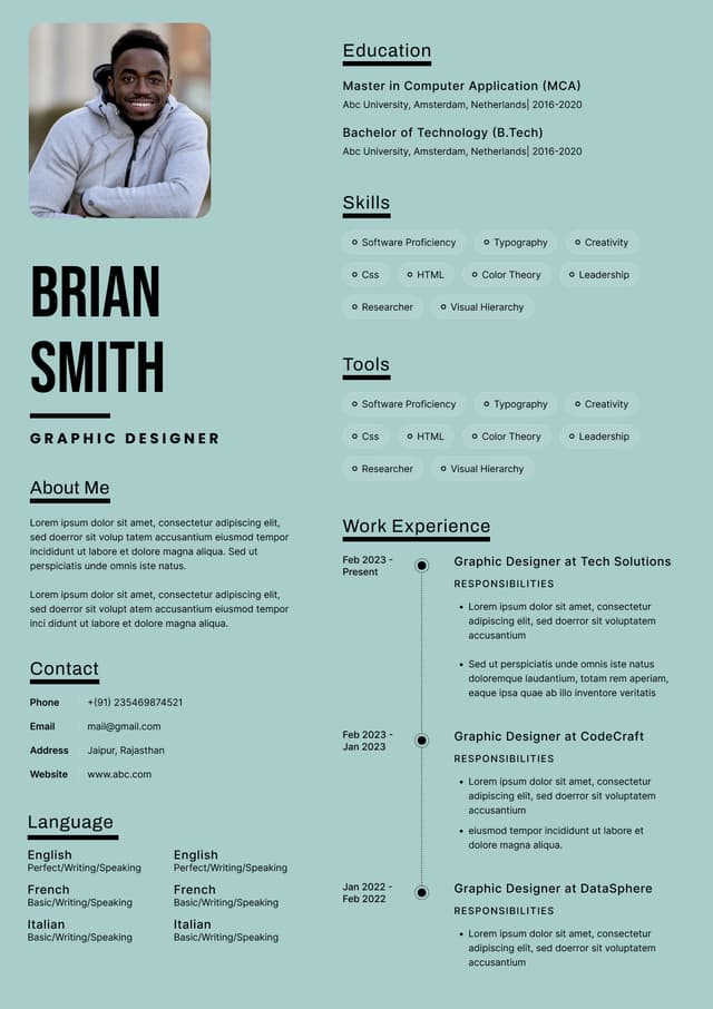
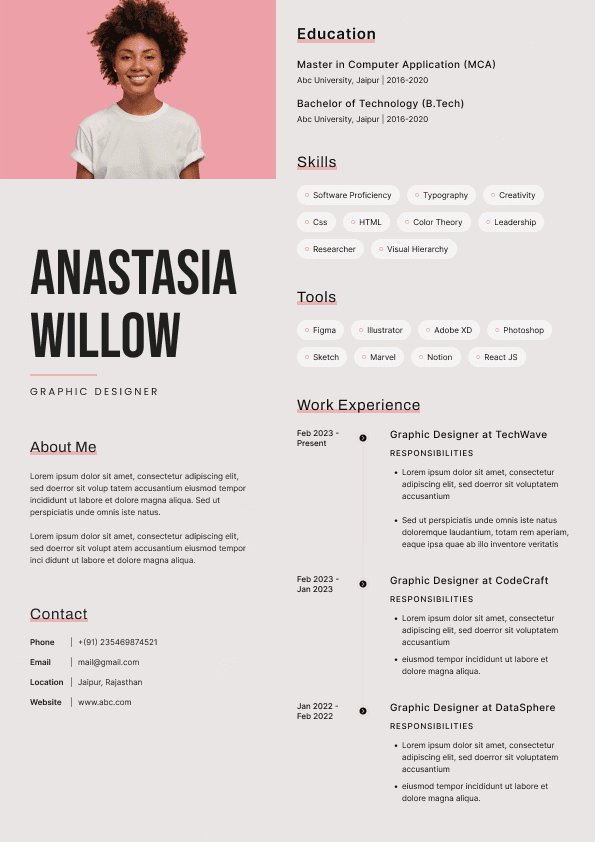
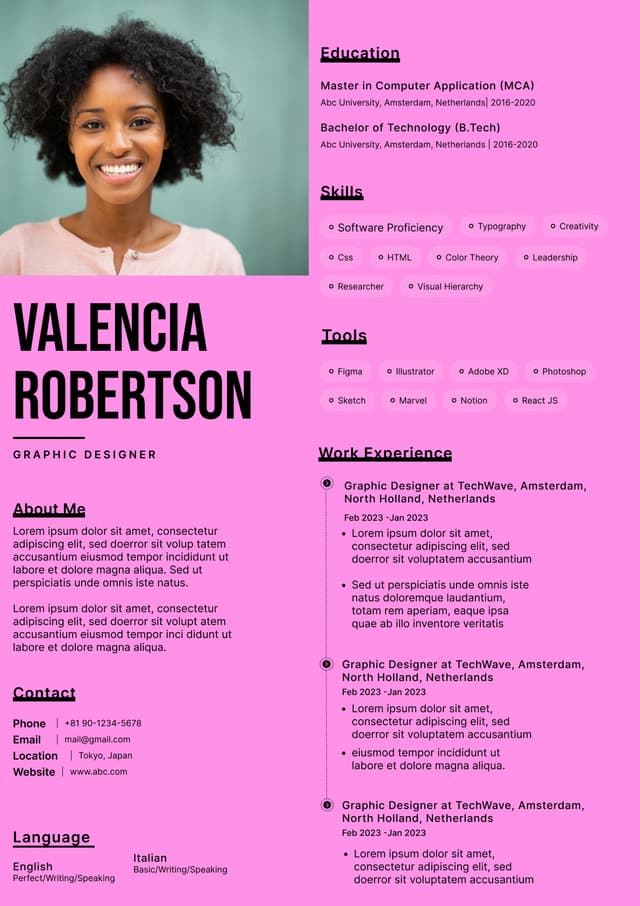
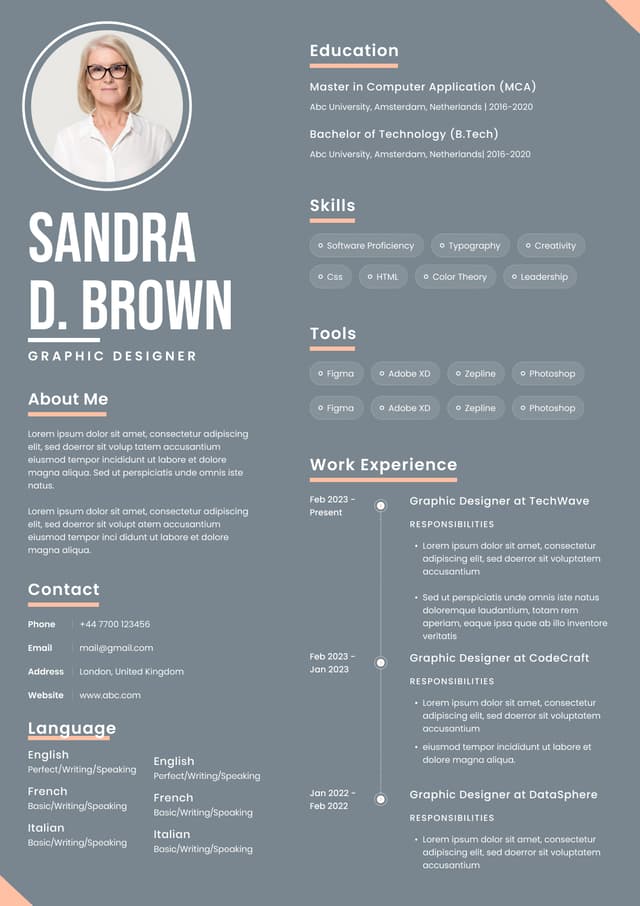
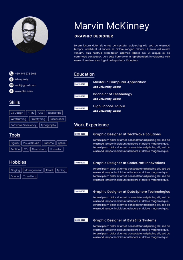
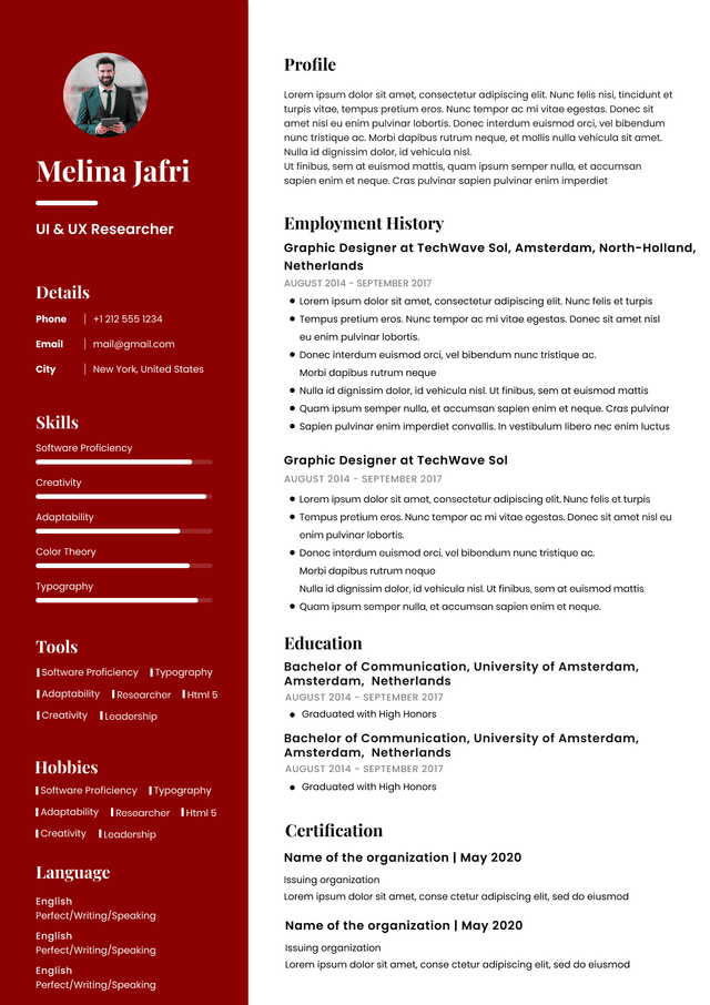
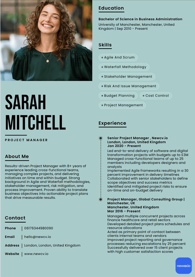
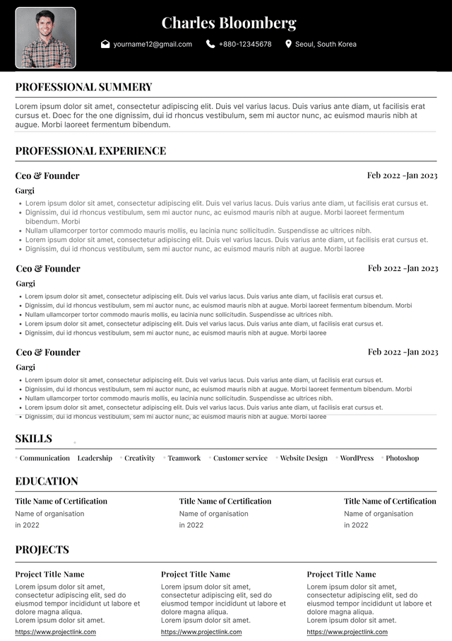
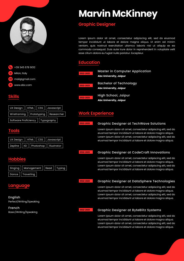
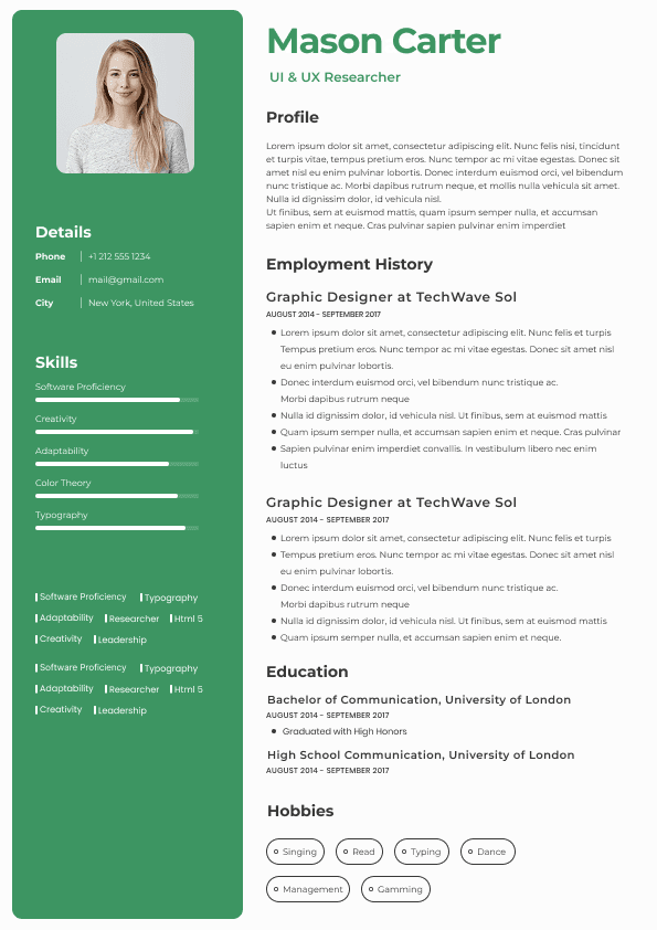
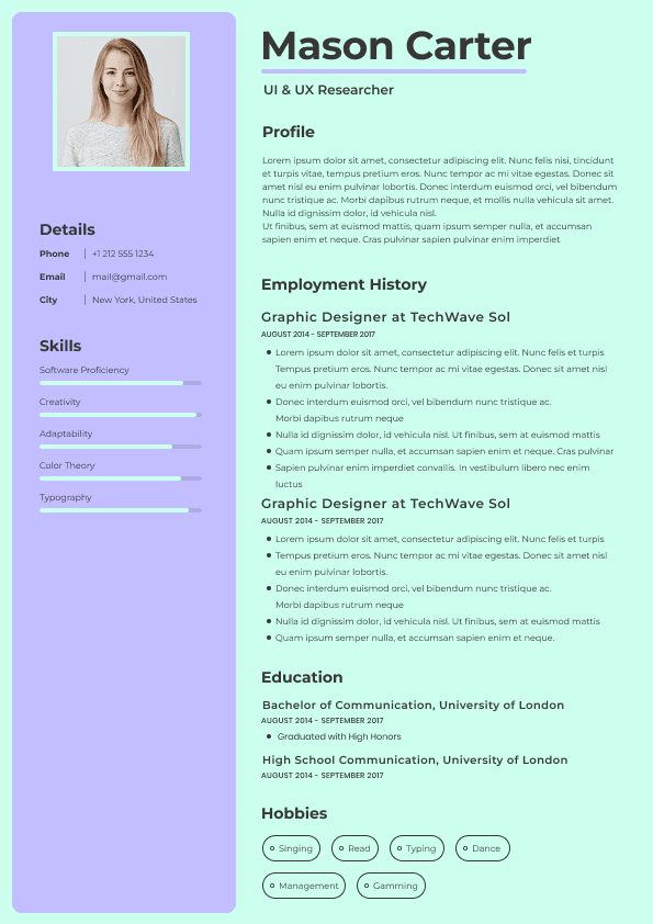
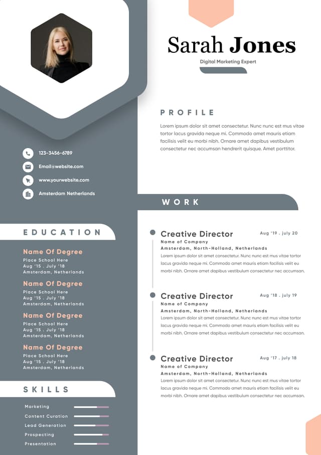
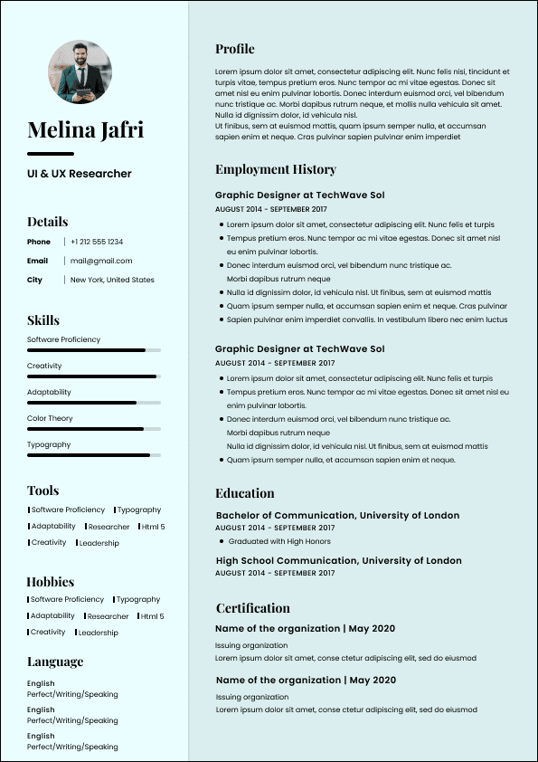
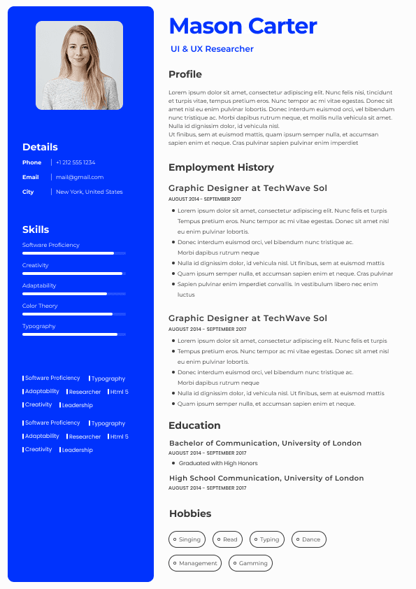
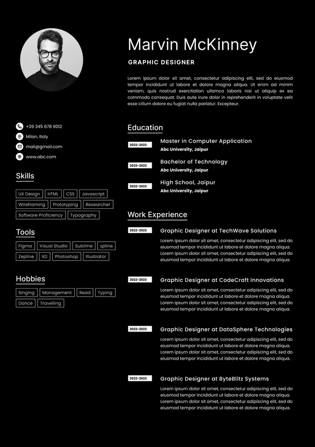
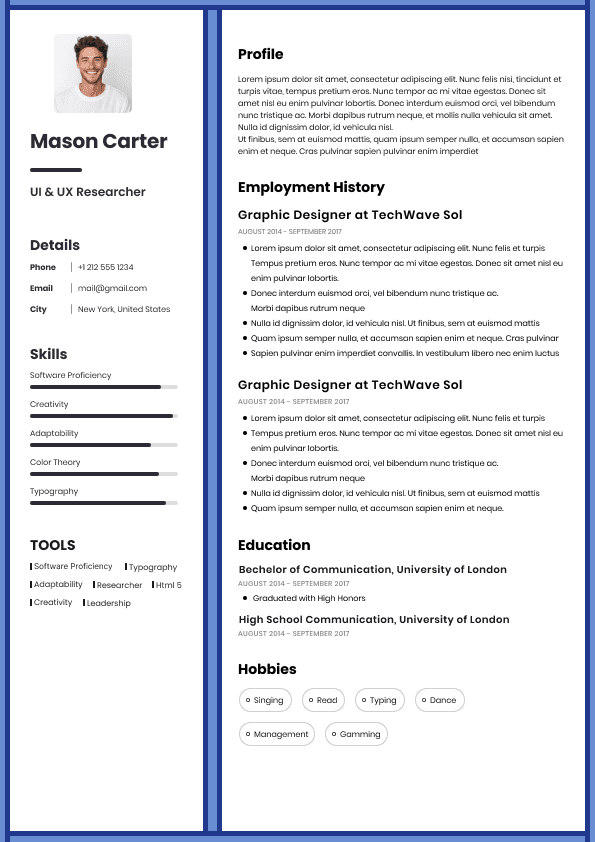
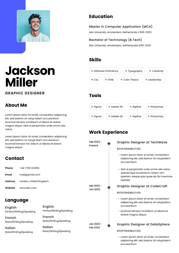
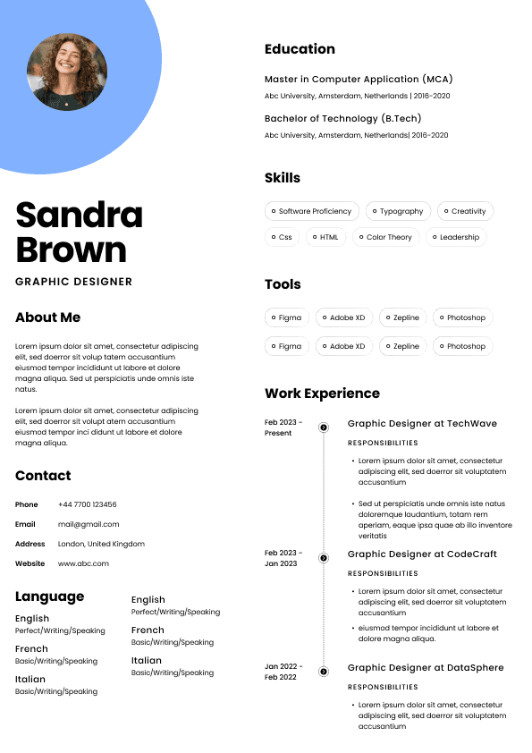
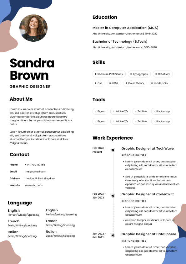
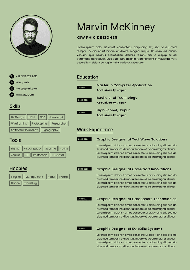
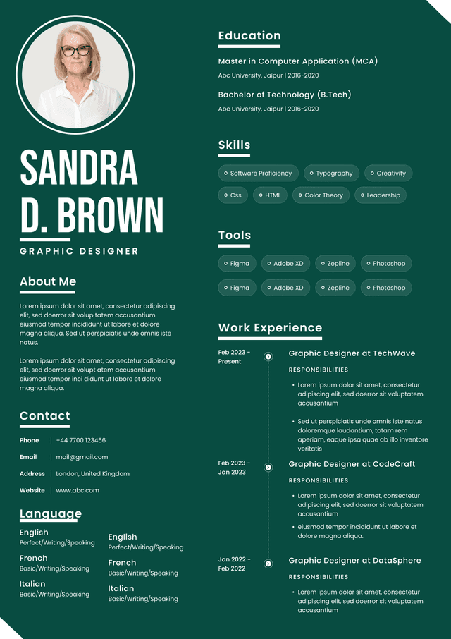
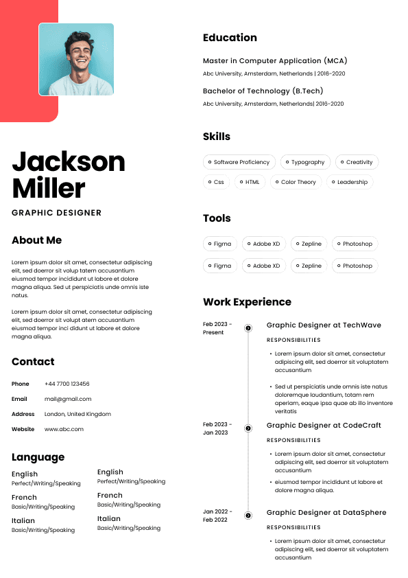
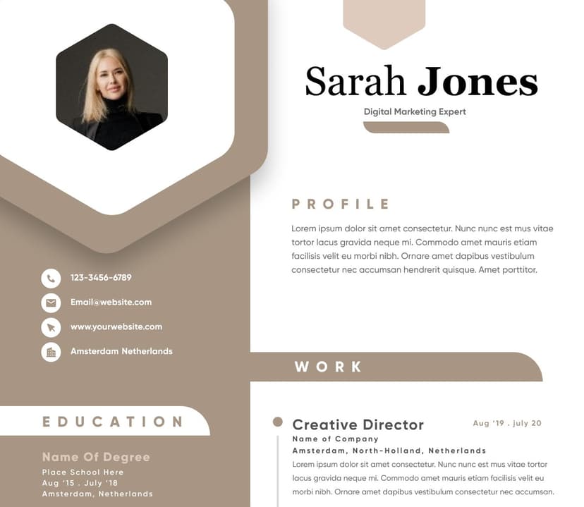
Choose from a wide range of NEWCV resume templates and customize your NEWCV design with a single click.
The best font for a resume is a clean, readable, professional font such as Calibri, Arial, Aptos, Helvetica, Garamond, Cambria, or Georgia. For most Singapore job applications, I usually recommend Calibri, Aptos, Arial, or Helvetica because they are safe, modern, ATS-friendly, and easy for recruiters to scan quickly. The point of your resume font is not to show personality. It is to make your experience easy to read, easy to trust, and easy to move forward.
This is where many candidates overthink the wrong thing. A beautiful font will not rescue weak content. But a bad font can absolutely make a decent resume look messy, dated, junior, or difficult to screen. In hiring, small visual signals matter more than candidates realise.
The best resume font is one that makes your resume look clear, structured, professional, and easy to read on screen. In the Singapore job market, where recruiters and hiring managers often review many applications quickly, your font should reduce friction. It should not make the reader work harder.
My safest recommendations are:
Calibri for a clean, familiar, corporate-friendly resume
Aptos for a modern Microsoft-style resume
Arial for a simple, highly readable resume
Helvetica for a polished, modern look
Garamond for senior, academic, legal, policy, or editorial roles
Cambria for a more traditional professional resume
Candidates often treat resume font as a design choice. Recruiters treat it as a readability choice.
When I open a resume, I am not thinking, “What a creative font.” I am thinking:
Can I scan this quickly?
Can I understand the candidate’s current role in seconds?
Does the resume look professional enough to send to a hiring manager?
Does the formatting make the candidate look careful or careless?
Will this document survive ATS parsing, email forwarding, PDF viewing, and mobile screening?
That last point matters. In Singapore recruitment, resumes move through different systems and people. A resume might be uploaded into an applicant tracking system, downloaded by HR, forwarded to a hiring manager, viewed on a laptop, opened on mobile, or printed before an interview. Your font has to survive all of that without turning your resume into visual nonsense.
A poor font choice creates tiny doubts. Not always consciously, but it happens.
A childish font makes the candidate look less serious. A decorative font makes the resume harder to scan. A cramped font makes the resume feel overloaded. A dated font can make the candidate look out of touch, especially in tech, marketing, product, finance transformation, consulting, and modern corporate roles.
For Singapore job seekers, I would divide resume fonts into three practical groups: safest fonts, polished fonts, and fonts to use carefully.
These fonts work for most industries, levels, and application types.
Calibri
Calibri is still one of the safest resume fonts. It is familiar, readable, and widely supported. Some people call it boring, but boring is not always bad in recruitment. Boring can mean the recruiter reads your achievements instead of noticing your formatting.
Use Calibri if you want a clean corporate resume for roles in finance, HR, operations, administration, sales, customer success, logistics, procurement, or general management.
Aptos
Aptos is a strong modern option because it has replaced Calibri as the default Microsoft font in many environments. It looks cleaner and slightly more current while staying professional.
Use Aptos if you want your resume to feel modern without looking designed for the sake of it.
Arial
Arial is simple, readable, and safe across systems. It does not have much personality, but that is exactly why it works. It is especially useful when your resume has dense information and you need strong readability.
Use Arial if you want maximum clarity and minimal risk.
Helvetica
Helvetica gives a resume a more polished, modern feel. It works especially well for product, design-adjacent, marketing, tech, consulting, communications, and corporate roles where presentation matters, but you still need restraint.
The only caution is spacing. Helvetica can look very clean, but if you cram too much into one page, it can become visually tight.
For most resumes, the best font size is:
10.5 to 11.5 pt for body text
12 to 14 pt for section headings
16 to 22 pt for your name
9.5 to 10 pt only for secondary details such as dates, locations, or contact information
I rarely recommend body text below 10 pt. Yes, you can fit more content. No, that does not mean the reader will absorb more content.
This is one of the most common resume formatting mistakes I see: candidates make the font smaller because they are scared to remove information. But a crowded resume does not make you look more experienced. It often makes you look less strategic.
A strong resume is not a storage unit for every task you have ever performed. It is a positioning document. The font size should support that positioning.
Recruiters do not measure your font size like designers. We notice whether the resume feels easy or tiring to read.
A resume with tiny text creates a bad screening experience. It quietly says, “I did not prioritise your attention.” That may sound harsh, but hiring is full of these small signals.
An ATS-friendly resume font is a standard font that applicant tracking systems can read without parsing errors. Most modern ATS platforms can handle common fonts, but you still do not want to make the system guess.
The safest ATS-friendly resume fonts are:
Calibri
Aptos
Arial
Helvetica
Times New Roman
Cambria
Georgia
Garamond
Some fonts create the wrong impression immediately. I would avoid these for a professional resume:
Comic Sans
Papyrus
Brush Script
Courier New
Impact
Lucida Handwriting
Curlz MT
Any script, handwriting, novelty, or decorative font
The problem is not that recruiters are font snobs. The problem is that these fonts send the wrong professional signal.
A sans serif font does not have small decorative strokes at the ends of letters. Examples include Calibri, Arial, Aptos, and Helvetica. A serif font does have those strokes. Examples include Garamond, Georgia, Cambria, and Times New Roman.
For most modern resumes, I prefer sans serif fonts because they are cleaner on screen and easier to scan quickly.
Use sans serif fonts when applying for:
Tech roles
Finance and banking roles
Marketing roles
Product roles
Sales and business development roles
HR and recruitment roles
Operations roles
Font choice should also reflect seniority. A fresh graduate resume and a senior executive resume should not always feel visually identical.
For fresh graduates in Singapore, I recommend Calibri, Aptos, Arial, or Helvetica. Keep it simple. At this stage, the danger is trying too hard to look creative or senior.
Your resume should make your internships, projects, education, technical skills, CCA leadership, part-time work, and achievements easy to understand.
A fresh graduate using a dramatic font often looks less polished, not more impressive. Hiring managers are not expecting you to have a CEO-style resume. They are looking for evidence of potential, learning ability, communication, reliability, and role fit.
For mid-career candidates, font choice should support structure. You usually have more information to manage, so readability becomes more important.
Calibri, Aptos, Arial, Helvetica, Cambria, and Georgia can all work. The stronger question is whether your font helps the reader understand your career progression.
At this level, recruiters are scanning for:
Current scope
Industry relevance
Different industries have different tolerance levels for design, tradition, and formatting.
Use Calibri, Aptos, Arial, Helvetica, or Cambria. These industries value clarity, credibility, and professionalism.
Avoid fonts that look too playful or overly designed. In Singapore’s finance and banking sectors, a clean resume usually performs better than a visually experimental one.
Use Aptos, Arial, Helvetica, or Calibri. Keep the layout clean and skimmable.
For technical roles, the recruiter and hiring manager care more about your stack, systems, scale, projects, architecture, metrics, and problem-solving than your font personality. Do not let design distract from substance.
Use Helvetica, Aptos, Arial, Georgia, or a clean modern font. You can have slightly more visual polish, but your resume still needs to be readable and ATS-friendly.
Creative candidates sometimes misunderstand this. Your portfolio is where your creative identity can breathe. Your resume still has to function as a hiring document.
Use Cambria, Georgia, Garamond, Calibri, or Times New Roman. A slightly more formal font can work well here.
The key is restraint. Legal and policy resumes should feel credible, precise, and well organised, not decorative.
Font mistakes rarely happen alone. They usually come with broader formatting problems.
Use one font throughout your resume. If you really want contrast, use bold, size, and spacing instead of adding another font.
When candidates use three or four fonts, the resume starts looking patched together. It can feel like multiple documents were copied into one file. That creates a subtle impression of carelessness.
Tiny text is not efficient. It is avoidance. It usually means the candidate has not made hard editing decisions.
A recruiter should not have to zoom in to read your resume. If your resume only works at 150 percent zoom, it does not work.
Fonts with rounded, playful, handwritten, or decorative styles can make your resume feel less serious. Even if your experience is strong, the presentation creates doubt.
This is especially risky in Singapore corporate applications, where employers often expect a professional, structured resume even for modern roles.
Bold text is useful when it guides the eye. It becomes a problem when everything is bold.
Use bold for:
Weak Example
A candidate uses a narrow decorative font at 9 pt, squeezes six jobs onto one page, uses icons for contact details, and formats the resume in two columns. It looks stylish at first glance, but the recruiter has to work hard to understand the career story.
Why this fails: The resume prioritises appearance over screening efficiency. It may also create ATS parsing issues, especially if uploaded through a company careers portal.
Good Example
A candidate uses Aptos at 11 pt, clear section headings at 13 pt, consistent spacing, simple round bullets, and bold only for job titles, company names, and key section labels. The resume is not flashy, but the reader can understand the candidate’s current role, achievements, and relevance quickly.
Why this works: The font supports the content. The recruiter can scan it, the ATS can read it, and the hiring manager is less likely to get distracted by formatting issues.
Here is the practical framework I would use.
Choose your resume font based on four things:
Readability: Can someone scan it quickly without zooming in?
Professional signal: Does it match the role and industry?
System compatibility: Will it display properly across devices and ATS platforms?
Content discipline: Does it help the resume feel structured, not crowded?
If you are applying across different industries in Singapore, choose a safe font like Calibri, Aptos, Arial, or Helvetica. You do not need a different font for every application. You need a strong, readable base resume that can be tailored by content, not redesigned every time.
A good resume font should disappear into the background. The reader should remember your achievements, not your typography.
For most Singapore job seekers, my recommendation is simple:
Use Aptos or Calibri at 11 pt for body text, 13 pt for section headings, and 18 to 20 pt for your name. Save the resume as a PDF unless the employer specifically asks for Word format. Keep the layout single-column, clean, and easy to scan.
If you want something slightly more modern, use Helvetica or Arial.
If you are in a traditional field, use Cambria, Georgia, or Garamond.
Do not use font choice as a way to compensate for weak content. A resume gets shortlisted because the experience, achievements, relevance, and positioning make sense. The font’s job is to make that evidence easy to see.
That is the part many candidates miss. Your resume font is not there to impress. It is there to remove friction. When the recruiter can read faster, understand faster, and trust the document faster, you have already improved your odds.
Written by Simar Malhi, a recruiter and headhunter with international recruitment experience. I write about CVs, job applications, hiring decisions, and the reality behind recruitment processes. My goal is to help candidates understand more honestly how employers, recruiters, and hiring managers actually select candidates.

Use ATS-optimised Resume and resume templates that pass applicant tracking systems. Our Resume builder helps recruiters read, scan, and shortlist your Resume faster.

Use professional field-tested resume templates that follow the exact Resume rules employers look for.
Create Resume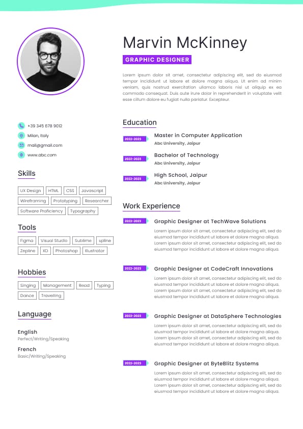
Use professional field-tested resume templates that follow the exact Resume rules employers look for.
Create ResumeGeorgia for a readable serif option with good screen clarity
If you want the simplest answer, use Calibri, Aptos, Arial, or Helvetica in 10.5 to 11.5 pt for body text. Use 12 to 14 pt for section headings and your name in a larger but still controlled size.
That is not exciting advice, but resume formatting is not supposed to be exciting. It is supposed to quietly work.
The hiring manager may not reject you because of the font alone. But if your resume already feels borderline, bad formatting can push it in the wrong direction.
That is the reality candidates do not always like hearing. Hiring decisions are not made in a vacuum. They are made under time pressure, comparison, assumptions, and imperfect information. Your font is part of that first impression.
These fonts can work very well when used correctly.
Cambria
Cambria feels slightly more formal and traditional. It works well for legal, compliance, policy, research, academia, public sector, and senior corporate roles.
It has more character than Calibri, but it still looks professional. I would not use it for every modern tech resume, but for the right audience, it works.
Georgia
Georgia is a good serif font for screen readability. It has a more classic feel but does not look as old-fashioned as some traditional serif fonts.
Use Georgia if you want a professional resume with a slightly warmer, more editorial look.
Garamond
Garamond can look elegant and senior when used well. It also helps fit more text into limited space because it is narrower than many other fonts.
But here is the recruiter warning: Garamond can become too small too quickly. Some candidates use it to squeeze too much into one page, and then the resume becomes technically compact but practically annoying to read. That is not a win.
Use Garamond carefully, preferably at 11 or 12 pt, not tiny.
If I have two resumes with similar experience and one is clean, readable, and structured while the other looks like a wall of small text, the cleaner one gets read with more patience. That does not mean the cleaner candidate is better. It means their information is easier to evaluate.
In recruitment, clarity creates advantage.
The bigger ATS issue is usually not the font itself. It is what candidates do around the font.
Common ATS formatting problems include:
Text placed inside graphics or images
Fancy headers that do not parse properly
Icons used for phone, email, or LinkedIn details
Columns that confuse reading order
Unusual symbols replacing normal bullet points
Downloaded decorative fonts that do not display correctly
PDFs created from design tools without selectable text
This is why I get slightly impatient with advice that says, “Just use an ATS-friendly font.” That is only part of the story. A resume can use Arial and still be a disaster if the structure is messy.
For Singapore job applications, assume your resume may be screened by both software and humans. It has to work for both. ATS readability gets your information into the system. Human readability gets your information taken seriously.
A resume font should never make the recruiter pause for the wrong reason. If I notice the font before I notice your job title, achievements, industry relevance, or career direction, the font is too loud.
Times New Roman is not wrong. It is readable, ATS-safe, and still accepted in many formal industries. But it can make a resume look dated if the rest of the formatting is not sharp.
In Singapore, I would not panic if a candidate used Times New Roman, especially for law, academia, government, policy, or traditional corporate roles. But for tech, product, marketing, digital, transformation, fintech, and modern commercial roles, I would usually choose something cleaner.
This is the nuance many articles miss. A font is not good or bad in isolation. It has to match the market, role, seniority, and document design.
Consulting roles
Startups and scaleups
Most modern corporate jobs in Singapore
Use serif fonts when applying for:
Legal roles
Academic roles
Research roles
Policy roles
Editorial roles
Senior advisory roles
Traditional corporate environments
This is not a strict rule. A well-formatted Cambria resume can look stronger than a badly formatted Arial resume. But if you are unsure, choose a clean sans serif font and move on. Your energy is better spent improving the content.
People, budget, region, or project ownership
Tools and systems used
Business impact
Progression and stability
Whether your next move makes sense
Your font should make that evaluation easy. If the resume looks crowded, the issue is probably not only the font. It is the lack of editing.
For senior candidates, I prefer fonts that feel controlled and mature. Helvetica, Aptos, Cambria, Georgia, and Garamond can work well.
But senior candidates often make a different mistake: they create a resume that looks like a board paper, not a hiring document. Too dense. Too much old history. Too many responsibilities. Not enough sharp commercial impact.
At senior level, the font should support authority without making the resume look heavy. White space matters. Section hierarchy matters. The summary must be readable. The first page must show strategic value quickly.
A senior resume with tiny text and endless paragraphs does not look senior. It looks unfiltered.
Use Calibri, Aptos, Arial, or Helvetica. These roles benefit from clarity and quick scanning.
For these functions, recruiters often look for scope, volume, systems, stakeholder management, targets, service levels, and measurable results. A clean font helps those details stand out.
Your name
Job titles
Company names
Section headings
Selected achievements or keywords only when truly useful
Do not bold every tool, skill, metric, and keyword. That does not make the resume easier to read. It makes it visually noisy.
A polished font cannot fix unclear positioning. This is the uncomfortable truth.
If your resume does not clearly show what role you are targeting, what value you bring, and why your background fits, the font is not the main issue. Formatting can improve presentation, but positioning gets interviews.
I have seen very plain resumes perform well because the content was sharp. I have also seen beautifully designed resumes fail because the candidate’s relevance was buried under vague responsibilities.