
The best font for a resume is a clean, professional, easy to read font that works well on screen, in PDF format, and inside applicant tracking systems. For most Canadian job applications, I would choose Calibri, Arial, Aptos, Helvetica, Garamond, Georgia, or Times New Roman. My personal recruiter preference is simple: use a font that lets me understand your experience quickly without making your resume look crowded, dated, overly designed, or difficult to scan. A resume font will not get you hired by itself, but the wrong font can absolutely make your resume harder to read. And in hiring, harder to read often means easier to skip.
The best resume font is one that helps your resume look professional, readable, and modern without distracting from your actual experience. That sounds simple, but candidates often overthink this part and somehow end up making the resume worse.
In real recruitment screening, nobody is giving bonus points because your font has personality. I am not sitting there thinking, “Interesting, this candidate used a charming serif font. Let’s move them to interview.” What actually happens is much more practical. I open the resume, scan the top third, check job titles, company names, dates, skills, and relevance. If the font slows that process down, it works against you.
For most resumes in Canada, the safest and strongest font choices are:
Calibri
Arial
Aptos
Helvetica
Garamond
Georgia
A lot of resume advice online treats font choice like it is a secret hiring advantage. It is not. Your resume font is not supposed to be impressive. It is supposed to disappear.
That may sound blunt, but it is important. The strongest resume formatting usually feels almost invisible because the reader can move through the information without friction. The font supports the content. It does not compete with it.
When I review resumes, I am usually asking questions like:
Does this person match the role requirements?
Have they done similar work before?
Is their career path clear?
Do the dates make sense?
Are the achievements specific enough?
Can I quickly understand their level of responsibility?
Canadian employers generally expect resumes to be clean, direct, and easy to evaluate. Unless you work in a highly visual creative field, your resume should lean professional and readable rather than styled and experimental.
Here are the resume fonts I would consider safest and most effective.
Calibri has been one of the most common resume fonts for years, and there is a reason it still works. It is clean, familiar, and easy to read on screen.
Some people call Calibri boring. Fine. Boring is not always bad in recruitment. A resume does not need to entertain me. It needs to communicate your fit for the role quickly.
Calibri works especially well for:
Corporate roles
Administrative roles
Finance and accounting resumes
Human resources resumes
Operations resumes
Both serif and sans serif fonts can work for a resume, but they create a different impression.
Sans serif fonts, such as Arial, Calibri, Aptos, and Helvetica, look cleaner and more modern. They are usually easier to read on screens, which matters because most Canadian recruiters and hiring managers review resumes digitally.
Serif fonts, such as Georgia, Garamond, Cambria, and Times New Roman, can look more traditional, formal, or polished. They can work well in law, academia, policy, publishing, communications, and senior advisory roles.
Here is the practical recruiter view: choose based on readability and industry expectations, not personal taste.
If you are applying for technology, operations, sales, customer success, finance, HR, administration, or general business roles, I would usually lean toward a clean sans serif font.
If you are applying for law, policy, academia, education, communications, or writing focused roles, a serif font can work if the layout is clean and modern.
What you should not do is choose a font because it feels unique. Most hiring processes are not looking for unique formatting. They are looking for clear evidence that you can do the work.
The best resume font size is usually 10.5 to 12 points for the main body text. Your name can be larger, usually around 16 to 22 points, and section headings can sit around 12 to 14 points depending on the font.
For most resumes, I recommend:
Main body text: 10.5 to 11.5 points
Section headings: 12 to 14 points
Name: 16 to 22 points
Contact information: 10 to 11 points
The mistake I see all the time is candidates shrinking the font to fit more content. That does not make the resume stronger. It just makes the problem smaller and harder to read.
If your resume only fits when the font is 9 points, the issue is not the font. The issue is that the resume has too much content, too many old details, weak prioritization, or bullet points that are trying to describe every task you have ever touched.
Hiring managers do not need your entire professional autobiography. They need the most relevant evidence.
Applicant tracking systems are often used in Canada to store, filter, search, and review applications. Candidates sometimes treat ATS like a mysterious robot that rejects resumes because of one wrong font. That is not usually how it works.
Still, font choice does matter because clean formatting improves parsing and readability. ATS issues often happen when candidates use unusual fonts, text boxes, graphics, columns, headers, footers, icons, or heavily designed templates.
For ATS friendly resume formatting, use:
Standard fonts
Clear section headings
Simple formatting
Normal text instead of images
Consistent spacing
Standard bullet points
Some fonts make a resume look unprofessional before the recruiter has even reached the experience section. That is not fair, maybe, but it is real.
Avoid fonts that are decorative, childish, overly casual, overly stylized, or difficult to read.
Fonts I would avoid include:
Comic Sans
Papyrus
Brush Script
Curlz
Impact
Courier New
Lucida Handwriting
A font does not tell me whether you can do the job. But it can influence my first impression of how carefully the resume was prepared.
That first impression usually falls into one of these categories.
This tells me the candidate understands business communication. The resume feels easy to read, relevant, and organized. I can focus on the experience instead of fighting the formatting.
This often happens when the resume uses tiny Times New Roman, narrow margins, long paragraphs, and old style objective statements. The concern is not simply aesthetic. The concern is that the candidate may not understand current hiring expectations or how to position themselves in a modern job market.
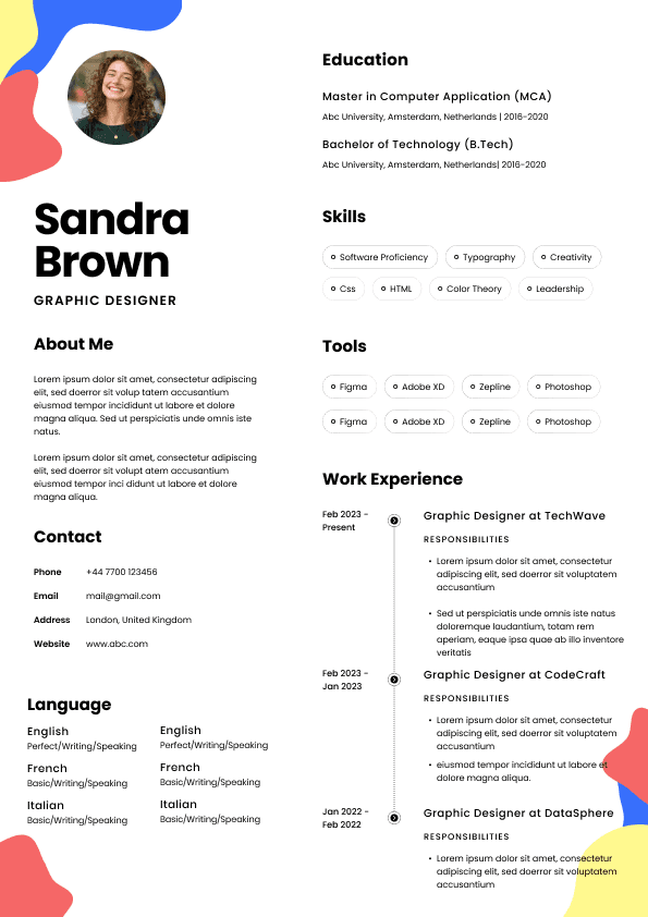
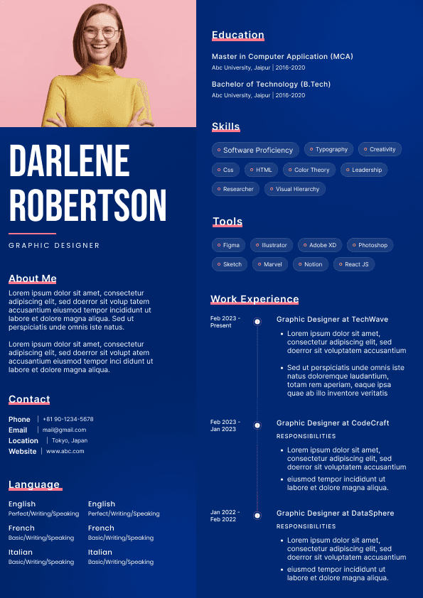
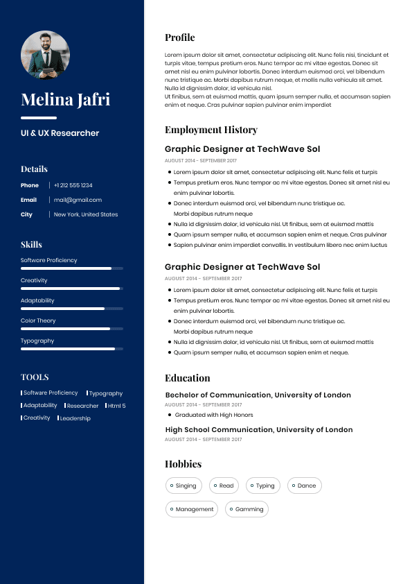
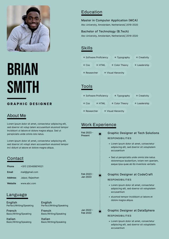
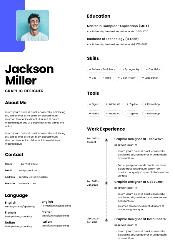
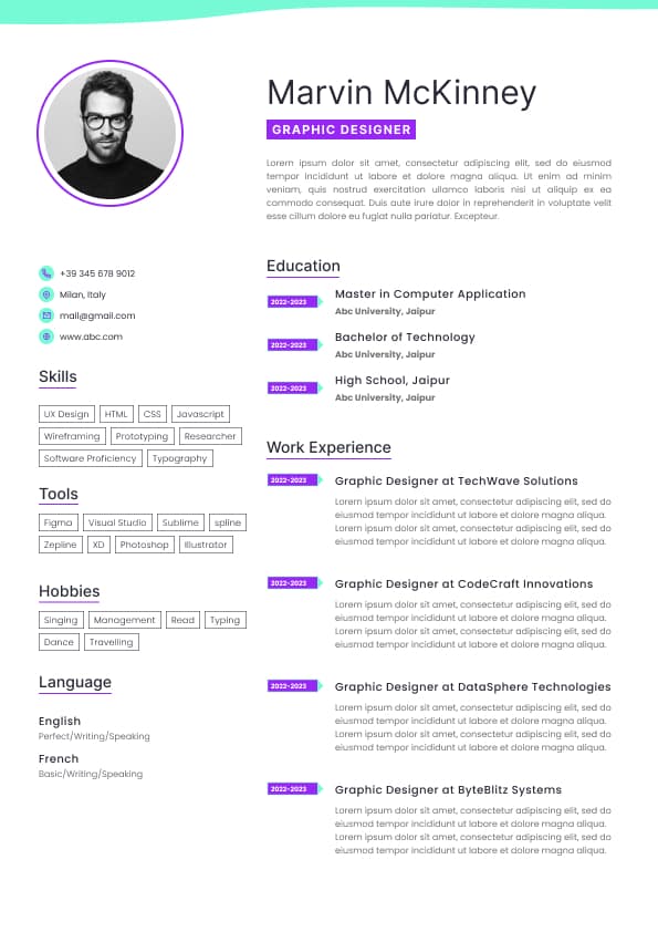
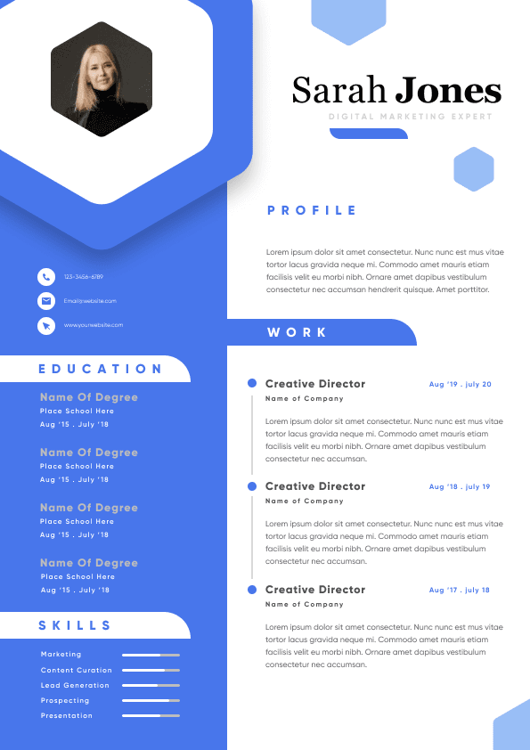
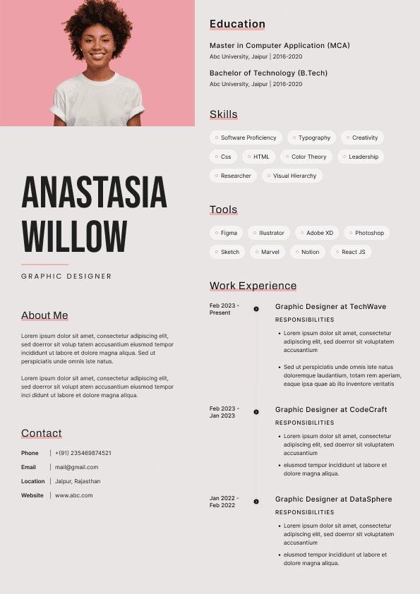
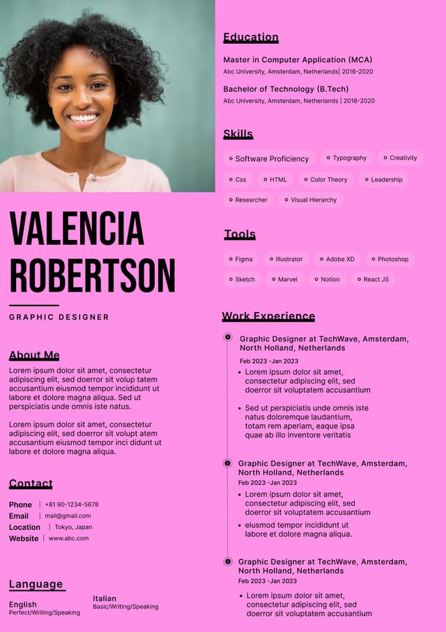
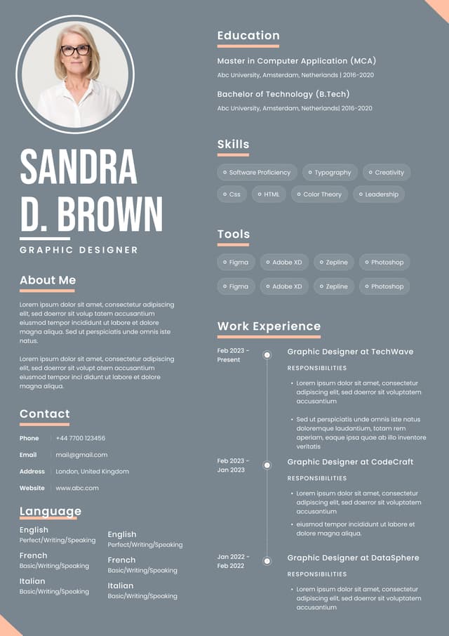
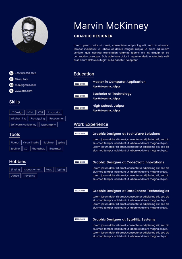
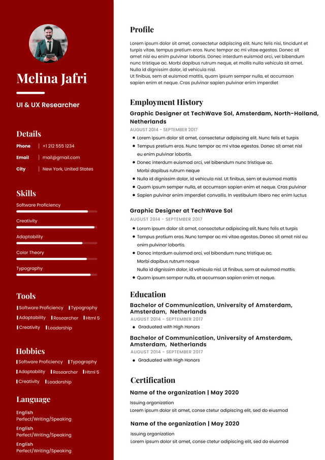
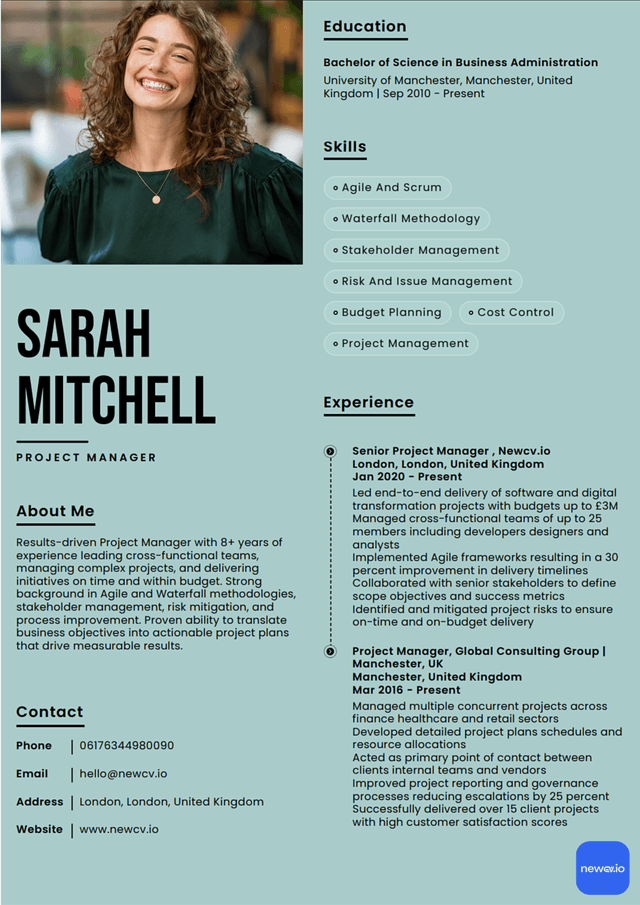
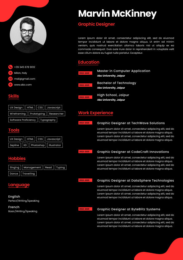
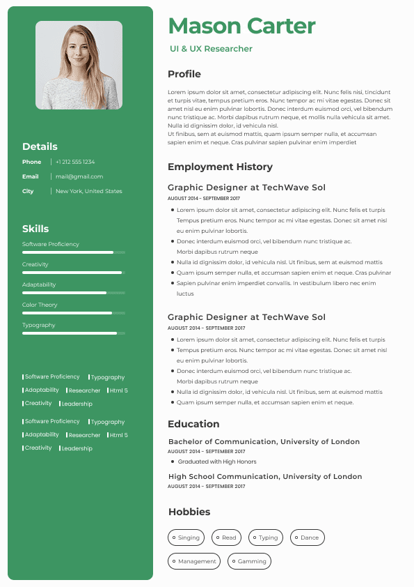
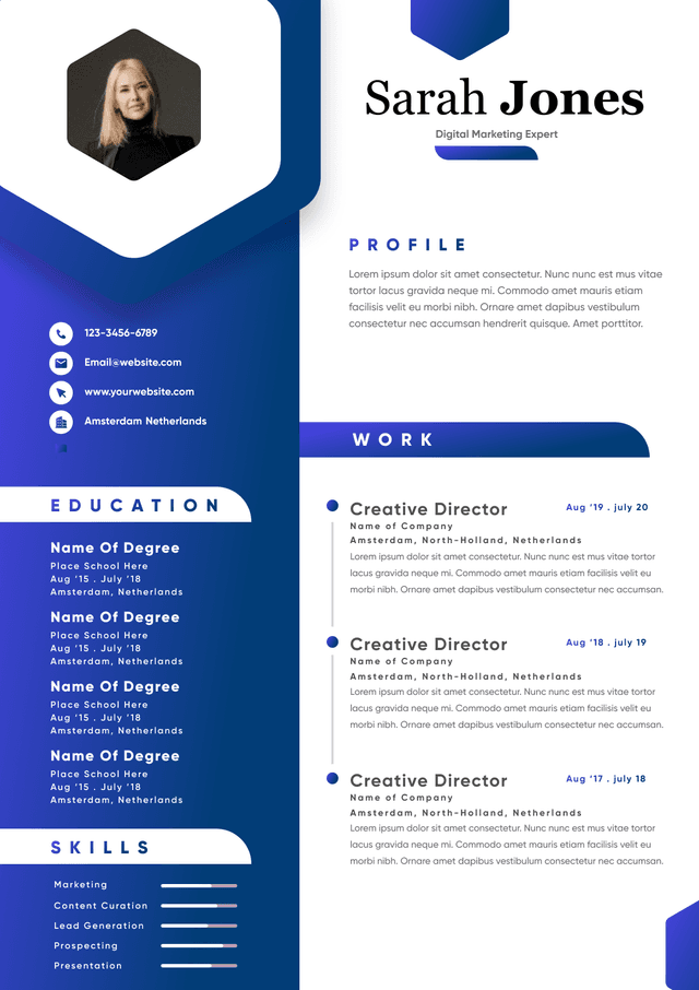
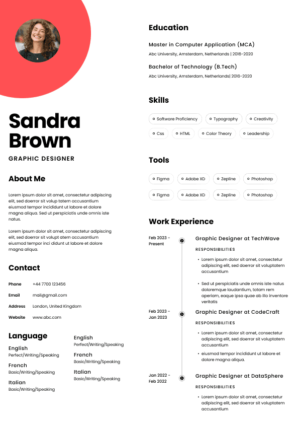
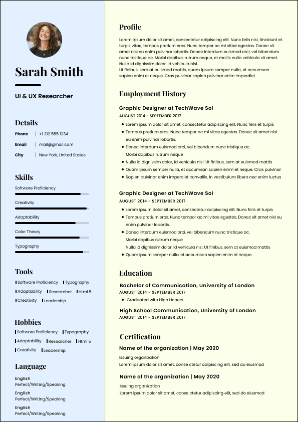
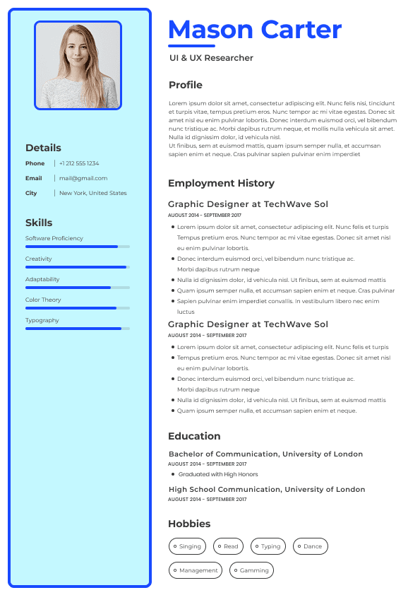
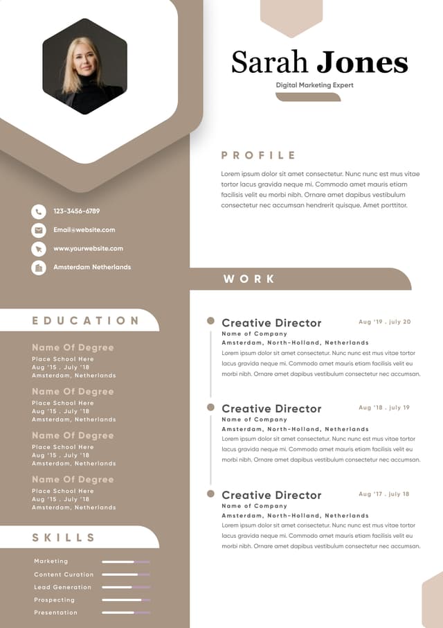
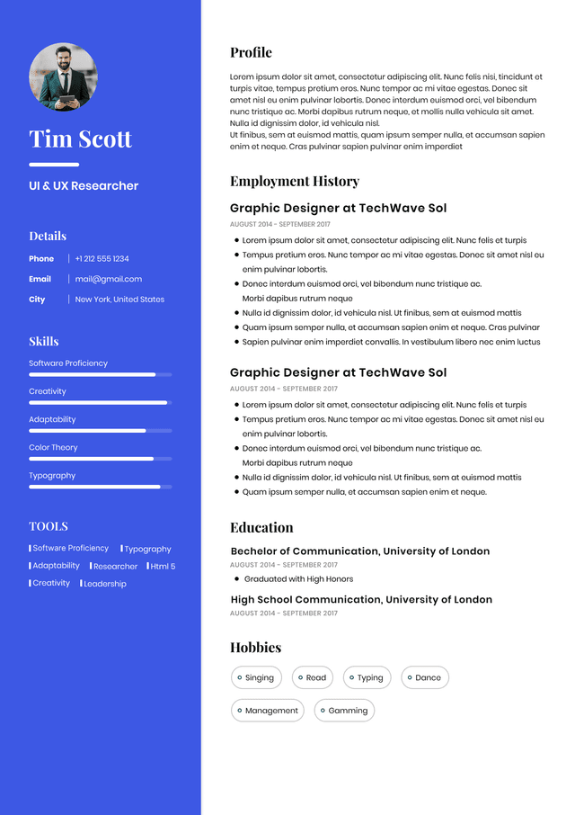
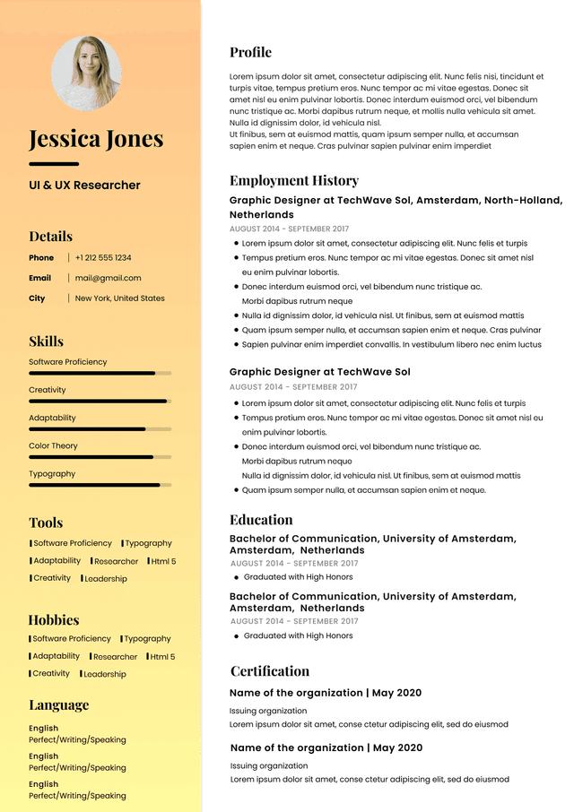
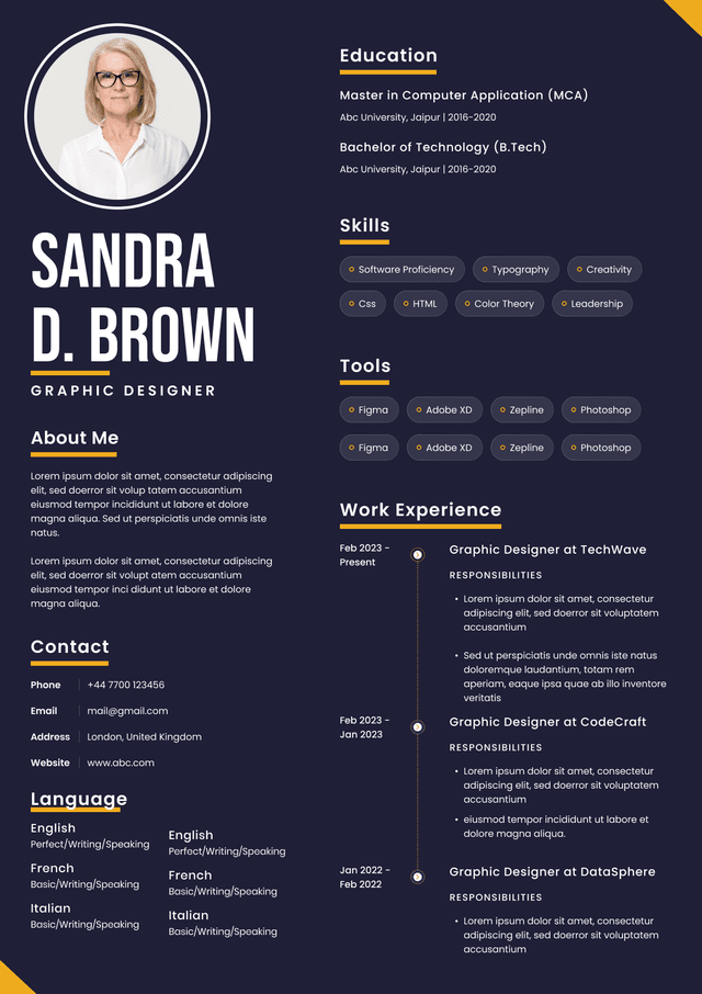
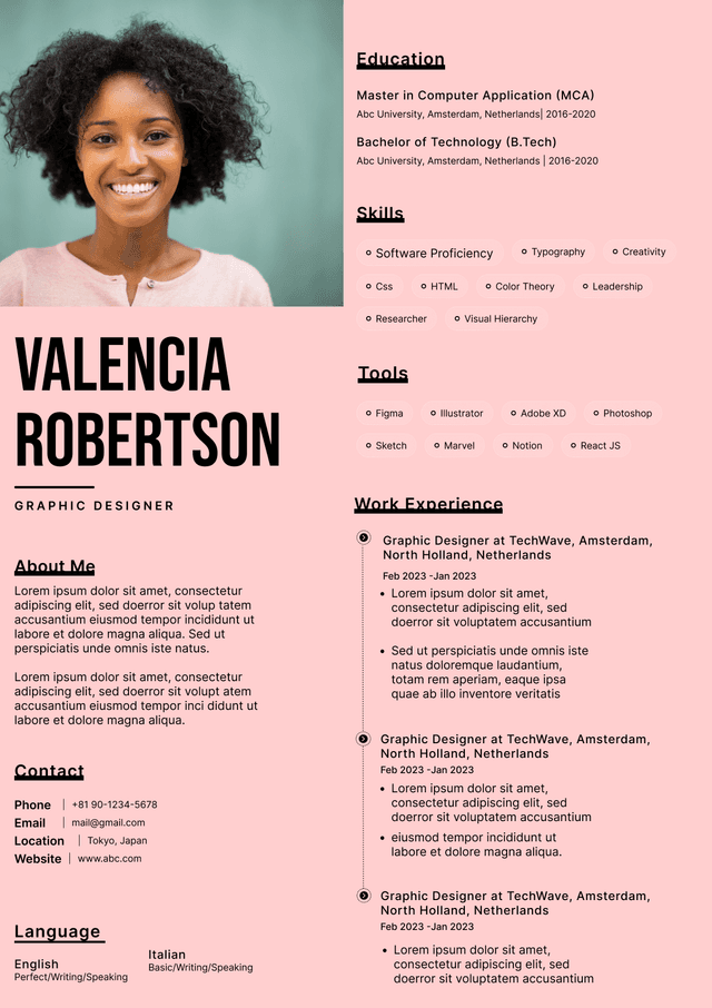
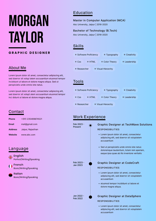
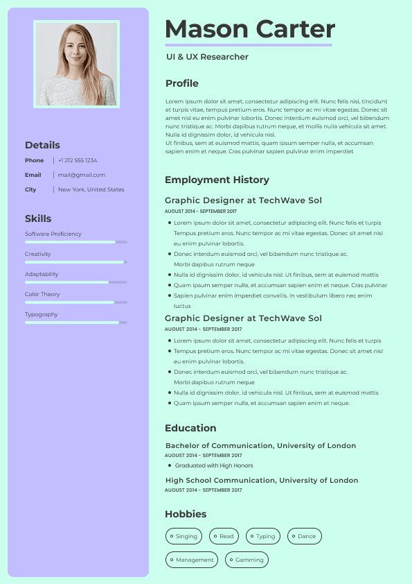
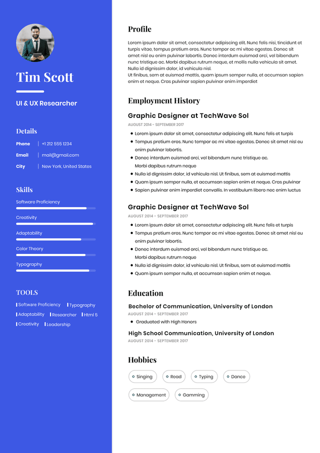
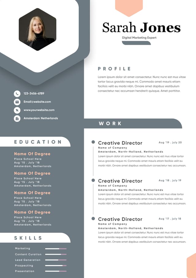
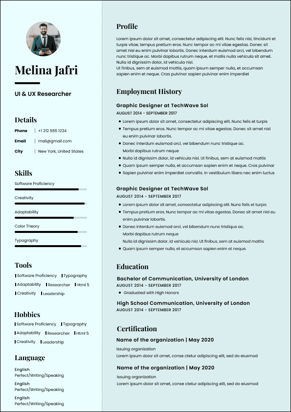
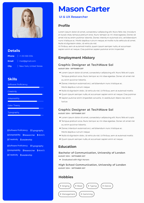
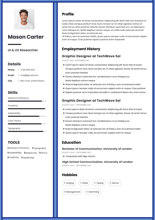
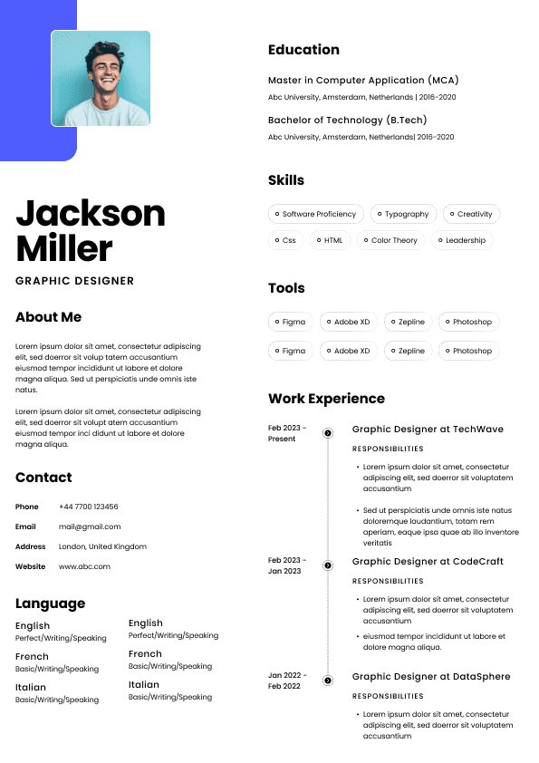
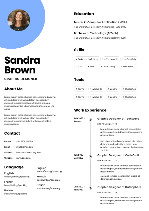
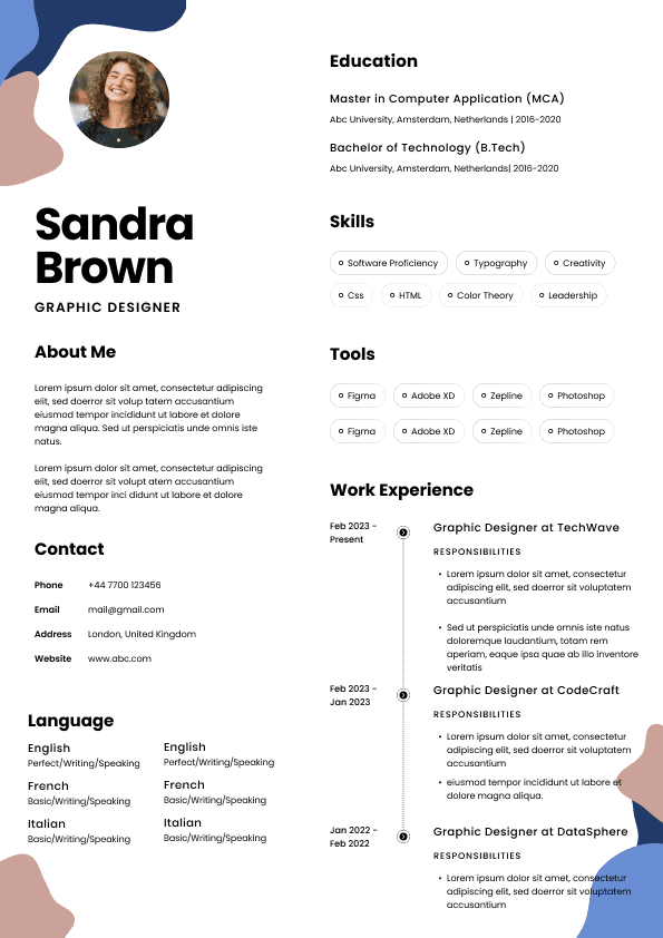
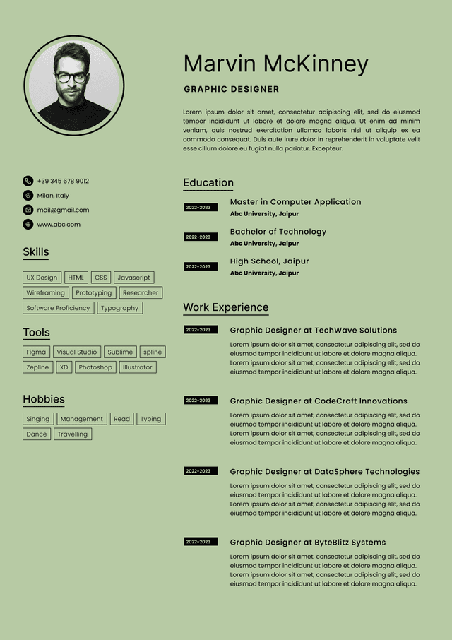
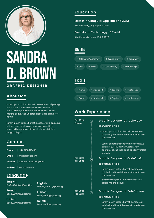
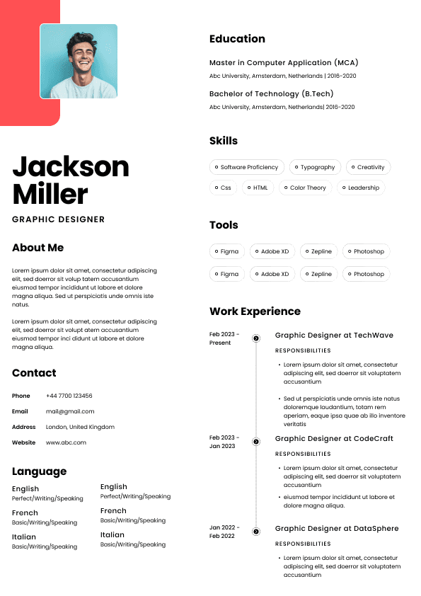
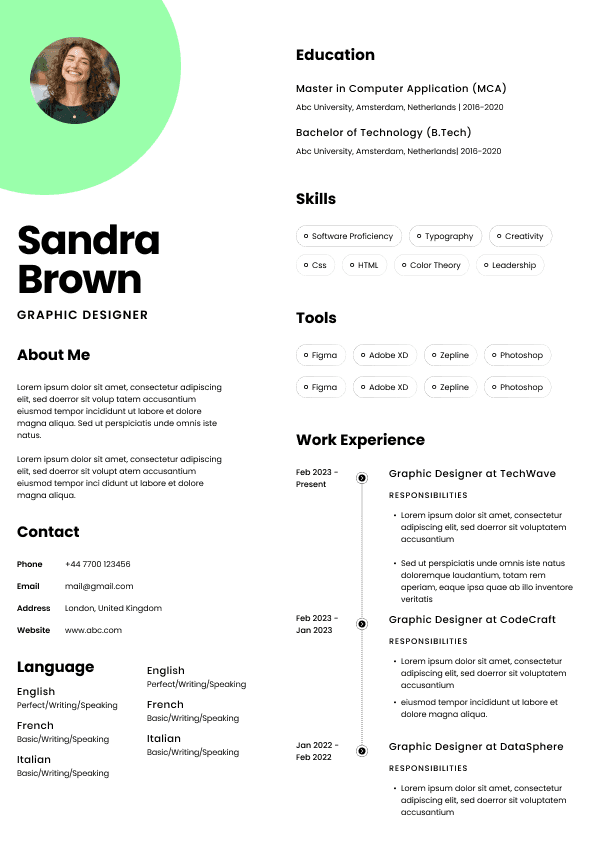
This is common with resume templates that use icons, skill bars, heavy colour blocks, photos, columns, and unusual fonts. These resumes may look attractive at first glance, but they often make the actual screening process harder.
The hiring reality is that a resume is not being judged like a poster. It is being used as a decision document. If the design makes the evidence harder to find, the design has failed.
Inconsistent fonts, random bolding, mixed sizes, and uneven spacing suggest the document was patched together. That may not be true, but it can look that way.
Recruiters notice patterns. When the formatting looks careless, we start wondering whether the same lack of attention appears elsewhere. Nobody wants to admit that because it sounds harsh, but hiring is full of small judgement calls.
There is no single font that is perfect for every candidate. The best choice depends on the role, industry, seniority, and overall resume structure.
Use Calibri, Arial, Aptos, Helvetica, or Cambria. These fonts feel professional and practical. In these fields, readability matters more than visual personality.
Your resume should communicate structure, accuracy, responsibility, and relevance. A clean font supports that.
Use Arial, Aptos, Calibri, Helvetica, or Verdana. These fonts work well for technical skills, tools, certifications, and project descriptions.
For technical resumes, I care much more about whether your skills are clearly grouped and whether your experience shows practical application. Do not hide the important tools in a dense paragraph. Make them easy to find.
Use Calibri, Arial, Aptos, or Helvetica. Sales resumes should feel sharp, clear, and results focused.
The font should not be flashy. Your numbers, territory, quota performance, client type, deal size, pipeline ownership, and revenue impact should do the heavy lifting.
Use Helvetica, Aptos, Georgia, Calibri, or Garamond. You have slightly more room for style, but do not confuse creativity with decoration.
A good resume font choice is not just about the font name. It is about how the font works with the rest of the document.
One professional font throughout the resume
Clear section headings
Main text around 10.5 to 11.5 points
Enough spacing between sections
Bold used only to guide the reader
Consistent formatting for job titles, company names, and dates
A layout that is readable on both desktop and mobile previews
Most font mistakes are not dramatic. They are small choices that slowly reduce readability.
The one page resume rule is often misunderstood. A one page resume can be great for students, early career candidates, and people with limited experience. But if you have enough relevant experience to justify two pages, forcing everything into one page with tiny text does not make you look concise. It makes the resume uncomfortable to read.
In Canada, a two page resume is completely normal for many experienced professionals. The issue is not page count by itself. The issue is whether the content earns the space.
Your resume may look polished on your laptop and strange on someone else’s system. This is why standard fonts are safer. If you are submitting a PDF, check that the formatting is preserved. If you are submitting a Word document, use a common font that will display properly.
Section headings should help the recruiter navigate. They do not need flair. Use simple headings like Professional Summary, Work Experience, Skills, Education, and Certifications.
Creative headings like My Journey, Where I Shine, or Career Highlights So Far may feel personal, but they slow down screening. Hiring documents need clarity more than charm.
Bolding is useful only when it creates hierarchy. If every second line is bold, nothing stands out.
If you want the safest answer, use Calibri, Arial, or Aptos in 10.5 to 11.5 point size with clear spacing and simple headings. That combination works for most Canadian job seekers and avoids unnecessary formatting risk.
If you want a slightly more polished or traditional feel, use Georgia, Garamond, Cambria, or Times New Roman, but make sure the resume still feels current and readable.
My personal ranking for most Canadian resumes would be:
Aptos: best modern all purpose option
Calibri: safest familiar option
Arial: strongest practical and ATS friendly option
Helvetica: polished option for clean professional resumes
Georgia: readable serif option with personality
elegant option when used carefully
Use these settings as a practical baseline.
Font: Calibri, Arial, Aptos, Helvetica, Georgia, Garamond, Cambria, or Times New Roman
Body size: 10.5 to 11.5 points
Name size: 16 to 22 points
Headings: 12 to 14 points
Margins: around 0.7 to 1 inch
Line spacing: single or slightly above single
File format: PDF unless the employer specifically requests Word
A candidate uses a narrow decorative font at 9 point size, adds icons beside every section heading, uses two columns, places contact details in a header, and saves the resume as a PDF without checking whether the ATS can read it properly.
Why this fails: The resume may look designed, but it creates friction. The recruiter has to work harder to find the basics. The ATS may not parse the content cleanly. The hiring manager may see style before substance.
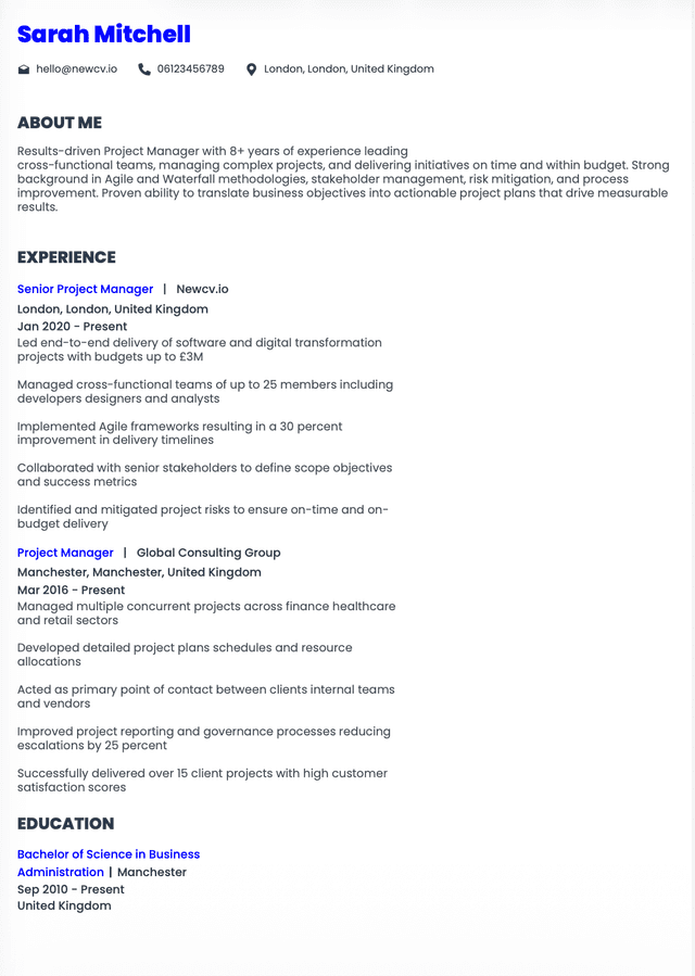
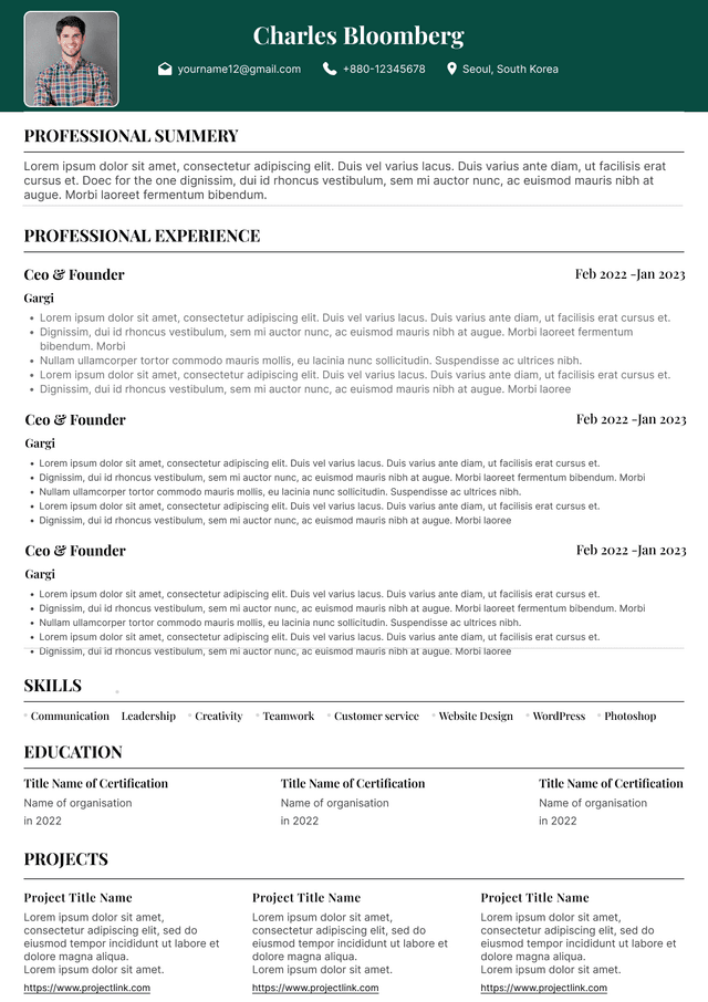
A candidate uses Aptos at 11 point size, keeps section headings clear, uses bold consistently for job titles and company names, leaves enough spacing between roles, and saves the resume as a clean PDF. The experience section starts with relevant achievements and uses specific tools, scope, and outcomes.
Why this works: The font supports the message. The resume is easy to scan, easy to search, and easy to discuss with a hiring manager. Nothing distracts from the candidate’s fit.
The best font for a resume is the one that makes your experience easy to read, easy to understand, and easy to evaluate. For most Canadian job applications, use Calibri, Arial, Aptos, Helvetica, Georgia, Garamond, Cambria, or Times New Roman in a readable size.
Do not choose a resume font to stand out. Stand out through relevance, clarity, achievements, and positioning.
A recruiter does not need your resume to be beautiful. A recruiter needs your resume to answer the hiring question quickly: Is this person worth moving forward?
Your font should help that answer become easier, not harder.
Written by Simar Malhi, a recruiter and headhunter with international recruitment experience. I write about CVs, job applications, hiring decisions, and the reality behind recruitment processes. My goal is to help candidates understand more honestly how employers, recruiters, and hiring managers actually select candidates.
Choose from a wide range of NEWCV resume templates and customize your NEWCV design with a single click.

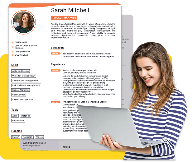
Use ATS-optimised Resume and resume templates that pass applicant tracking systems. Our Resume builder helps recruiters read, scan, and shortlist your Resume faster.

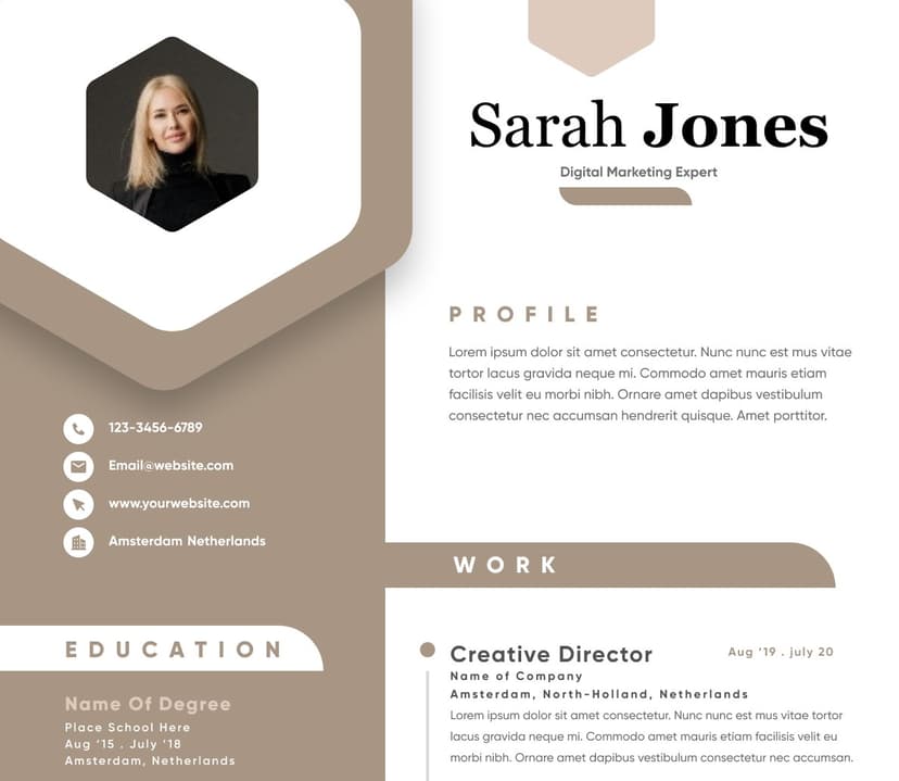
Use professional field-tested resume templates that follow the exact Resume rules employers look for.
Create Resume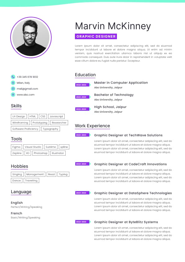
Use professional field-tested resume templates that follow the exact Resume rules employers look for.
Create ResumeTimes New Roman
Cambria
Verdana
Tahoma
My usual advice is to pick one clean font and use it consistently throughout the resume. Use size, spacing, bolding, and section structure to create hierarchy. Do not use multiple fonts because you are trying to make the document look “designed.” A resume is not a restaurant menu. It is a hiring document.
Will the hiring manager see the relevance immediately?
I am not thinking deeply about font unless something feels off. That is the uncomfortable truth. Resume fonts usually become noticeable only when they create a problem.
That problem might be:
The resume looks cramped
The font is too small
The font looks childish or decorative
The resume feels outdated
The text is hard to read on screen
The formatting looks inconsistent
The ATS may not parse the file properly
Important information gets buried because everything looks the same
A good resume font does not make you look “creative.” It makes you look clear. And clarity is underrated in job applications.
Customer service resumes
Early career resumes
General professional resumes
The only risk with Calibri is that it can look a little plain if the rest of your formatting is weak. That is not really the font’s fault. It just means your spacing, section headings, and content structure need to do their job.
Arial is one of the safest resume fonts because it is simple, widely available, and readable across different systems. It is not glamorous, but it works.
Arial is a good choice when you want your resume to feel clean and direct. It is especially useful if your resume has a lot of technical skills, bullet points, or dense employment history because the letters remain easy to scan.
Arial works well for:
Technology roles
Trades and operations roles
Project management resumes
Sales resumes
Healthcare administration resumes
Government applications
Resume versions uploaded through ATS platforms
Arial can look slightly heavier than some other fonts, so be careful with spacing. If the resume feels crowded, do not immediately reduce the font size. First, tighten the writing. Most crowded resumes have a writing problem before they have a font problem.
Aptos is a modern Microsoft font that has started replacing Calibri in many current documents. It feels clean, professional, and slightly more updated without looking trendy.
For Canadian resumes, Aptos is a strong choice because it gives the resume a modern feel while staying practical. It is not too stylized, and it works well for both corporate and technical applications.
Aptos works well for:
Modern professional resumes
Technology and product roles
Marketing roles
Business analyst resumes
Coordinator and manager resumes
Candidates who want a fresher look without taking formatting risks
If your resume currently uses Calibri and feels a bit tired, Aptos can be a nice update without changing the whole layout.
Helvetica is clean, polished, and professional. It often gives a resume a slightly more refined look than Arial, while still being highly readable.
The catch is that Helvetica may not display the same way across every system if the font is not installed. That matters less if you submit your resume as a PDF, but it can matter if you are uploading a Word document.
Helvetica works well for:
Design adjacent roles
Marketing roles
Communications roles
Product roles
Consulting resumes
Senior professional resumes
I like Helvetica when the resume is well structured and not overloaded with text. If the content is dense, Helvetica can still work, but spacing becomes very important.
Garamond is a serif font that can look elegant and professional. It is also useful when a resume needs to fit more content without looking as cramped as some other fonts.
But Garamond needs judgment. Used well, it can make a resume look polished. Used badly, it can make the resume feel old fashioned or harder to read, especially if the font size is too small.
Garamond works well for:
Academic resumes
Legal resumes
Policy roles
Communications roles
Senior professional resumes
Candidates with strong writing or advisory backgrounds
My warning with Garamond is simple: do not use it to squeeze too much onto the page. Candidates often choose smaller looking fonts because they are trying to hide the fact that the resume is too long. Recruiters can tell. We always can.
Georgia is one of the more readable serif fonts for screens. It has a professional feel without being as formal as Times New Roman.
Georgia can work nicely if you want your resume to feel slightly warmer and more traditional, but still readable. It is a good option for candidates in writing heavy, advisory, education, nonprofit, or policy related roles.
Georgia works well for:
Communications resumes
Education resumes
Nonprofit resumes
Policy and public sector resumes
Editorial or content roles
Senior advisory roles
The main risk is that Georgia can take up more space. If your resume is already long, Georgia may push your content onto an extra page.
Times New Roman is still acceptable, but I would not call it the most modern choice. It is familiar, professional, and safe in conservative industries, but it can make a resume look dated if the formatting is not sharp.
That does not mean you must avoid it. In law, academia, public sector, and certain formal environments, Times New Roman can still look appropriate. But for many modern Canadian job applications, I would usually choose Calibri, Arial, Aptos, or Georgia before Times New Roman.
Times New Roman works best for:
Legal resumes
Academic CVs
Formal public sector applications
Traditional corporate environments
Conservative professional roles
The issue is not that Times New Roman is “bad.” The issue is that many resumes using Times New Roman also use outdated formatting, dense paragraphs, tiny margins, and long responsibility lists. The font gets blamed, but the bigger problem is usually the whole resume style.
A Word document or PDF depending on the employer’s instructions
Avoid using decorative fonts, script fonts, symbols, or anything that requires special rendering. If the system or recruiter cannot read it properly, your qualifications may not show up the way you intended.
Here is the part candidates miss: ATS friendliness is not only about software. It is also about recruiter search behaviour. Recruiters may search the database using job titles, skills, certifications, systems, and industry terms. If your resume is visually beautiful but poorly structured, it may still underperform because the content is not easy to search, scan, or match.
A good font supports ATS readability. It does not replace strong keyword alignment, clear job titles, measurable achievements, and relevant experience.
Bradley Hand
Any script font
Any font that looks like handwriting
Any font that is difficult to read at small sizes
Courier New deserves a special mention. It is not offensive, but it often makes resumes look like old technical documentation or a screenplay. Unless there is a very specific reason, I would not use it for a modern Canadian resume.
Also be careful with ultra thin fonts. They can look elegant on your screen and then become faint or difficult to read on another device. A resume has to survive different screens, downloads, previews, email attachments, ATS views, and sometimes printing. Pretty but fragile formatting is not your friend.
For marketing and communications resumes, I expect the writing to be strong. A polished font helps, but weak positioning will still show. If you claim brand, content, campaign, or communication expertise, your resume itself becomes a work sample.
Use Garamond, Georgia, Cambria, Times New Roman, or Calibri. These environments often tolerate or prefer more traditional formatting.
That said, traditional does not mean outdated. You can use a formal font and still have a clean, modern resume structure.
Use Arial, Calibri, Aptos, or Verdana. Keep the resume practical and readable.
For these roles, employers often want to see certifications, licences, equipment, safety training, availability, project types, and work history quickly. Do not bury that information under fancy formatting.
A PDF version that preserves formatting unless the employer requests Word
Font size that is too small to read comfortably
Decorative fonts that distract from the content
Multiple fonts competing with each other
Overly narrow margins
Dense paragraphs with no scanning structure
Skill bars, icons, and graphics that add no hiring value
Font choices based on personality instead of readability
Formatting that looks nice but hides the most important evidence
The simplest test is this: can a recruiter understand your current role, target fit, strongest qualifications, and career level in 20 to 30 seconds? If not, the font may be part of the problem, but the structure is probably the bigger issue.
Use bold for things like:
Your name
Section headings
Job titles
Company names
Select achievements if the format supports it
Do not bold random keywords in every bullet point. It looks desperate, and yes, recruiters can feel that energy through the screen.
Many recruiters and hiring managers preview resumes quickly from email, LinkedIn, or mobile devices. Your resume still needs to be readable when viewed smaller. Fonts that are too thin, too compressed, or too small can become difficult to read fast.
Cambria: formal but still readable
Times New Roman: acceptable but can feel dated
But here is the real point: once you choose a clean font, stop obsessing over it. Spend your energy on stronger content. A beautiful font will not save vague bullet points, unclear job titles, missing achievements, or a resume that does not match the role.
The font gets the resume read comfortably. The content gets you considered.
Font consistency: one font throughout the resume
Colour: black or dark grey for body text
Do not use pale grey text because it looks elegant. It may also be harder to read. Hiring is not the place to test how subtle your typography can be.




 Upload Resume
 Import from Linkedin