Canva resume mistakes usually happen when job seekers design for visual appeal before hiring performance. A resume is not only a graphic document. It must move through applicant tracking systems, recruiter review screens, hiring manager inboxes, mobile previews, and sometimes resume databases. The most common Canva resume problems include overly designed templates, two-column layouts, text boxes, icons, skill bars, photos, weak hierarchy, poor keyword placement, and PDF exports that do not parse cleanly. These mistakes can make a resume harder to scan, harder to search, and easier to reject even when the candidate is qualified. The goal is not to avoid Canva completely. The goal is to use resume design in a way that improves clarity, protects ATS compatibility, and helps recruiters understand your value faster.
Canva is built for visual design. Hiring workflows are built for fast evaluation.
That mismatch creates the biggest risk.
Most Canva resume templates are optimized to look attractive in a template gallery. They often use visual elements that help the template stand out, such as columns, icons, blocks of color, graphics, profile photos, decorative headings, and compact spacing. Those choices may look modern, but they can weaken resume performance when the document is uploaded into an ATS or reviewed quickly by a recruiter.
A resume has to work in several environments:
ATS upload forms
Recruiter dashboards
PDF previews
Email attachments
Mobile screens
Printed interview packets
Many Canva users choose a resume template the same way they choose a presentation cover or social media graphic. They pick the design that looks the most polished at first glance.
That is the wrong selection criteria.
Recruiters do not evaluate resumes like design portfolios unless the role specifically requires visual presentation. For most jobs, recruiters are looking for relevance, role fit, experience, skills, dates, employers, accomplishments, and keywords. If the design slows that process down, it hurts the resume.
Common template problems include:
Heavy sidebars
Oversized headers
Decorative shapes
Multiple background colors
Thin or low-contrast fonts
Unusual section order
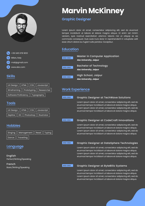
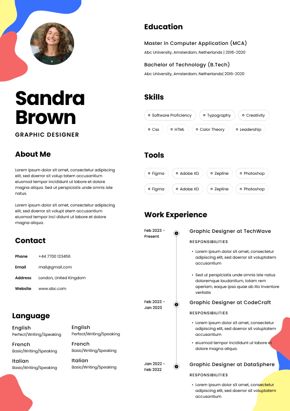
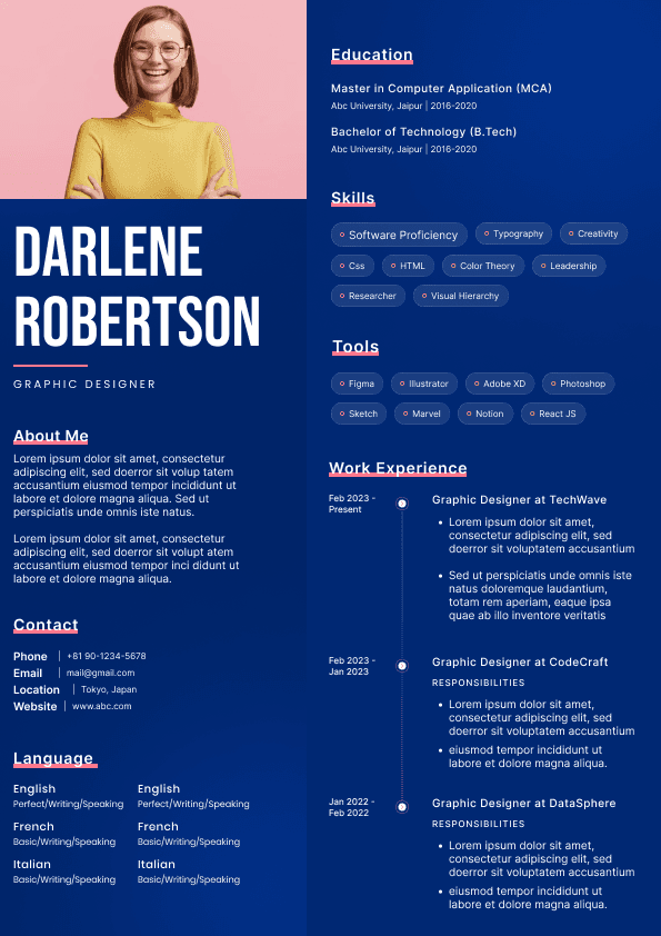
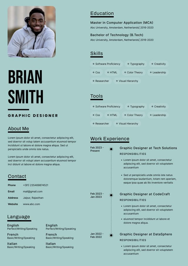
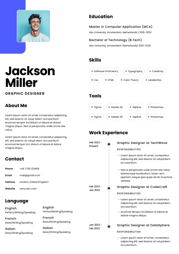
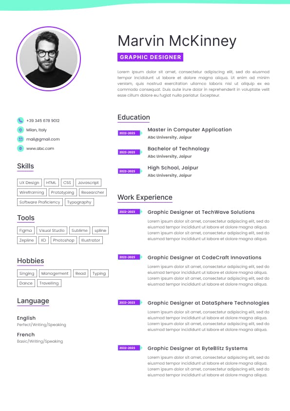
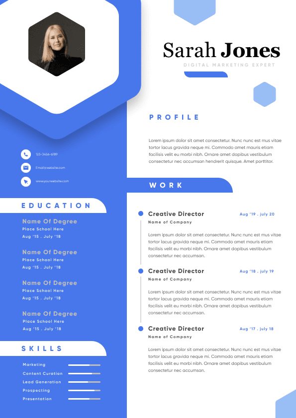
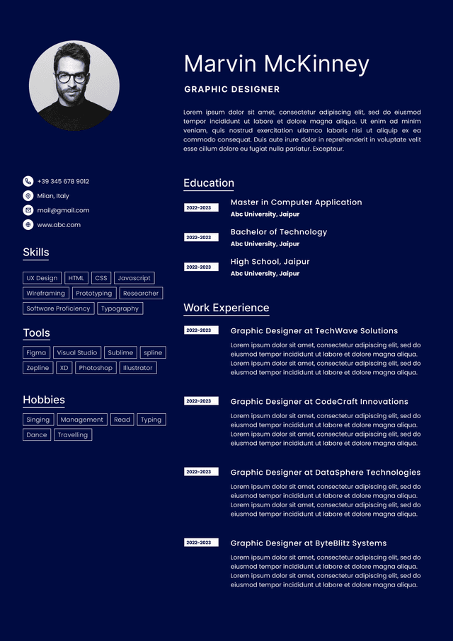
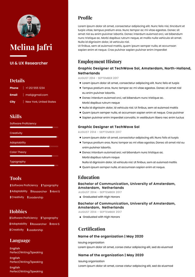
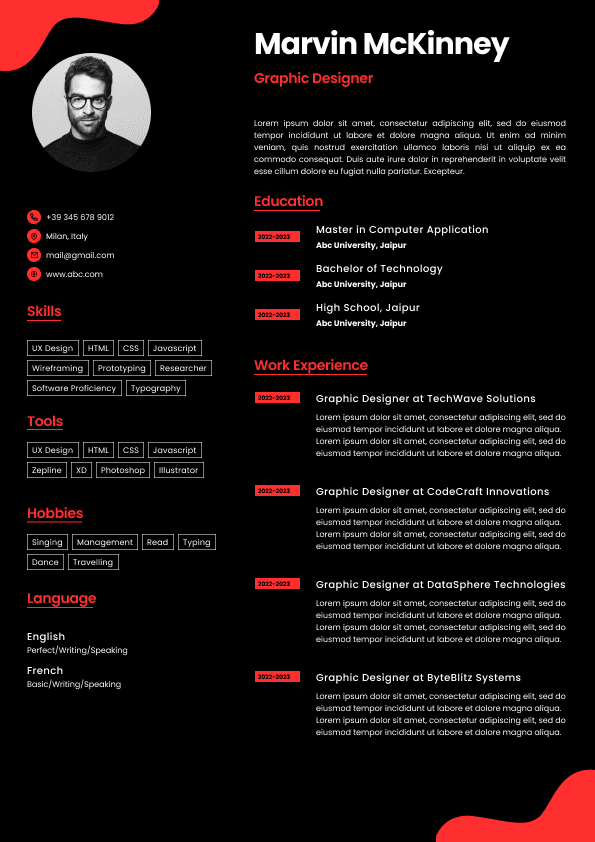
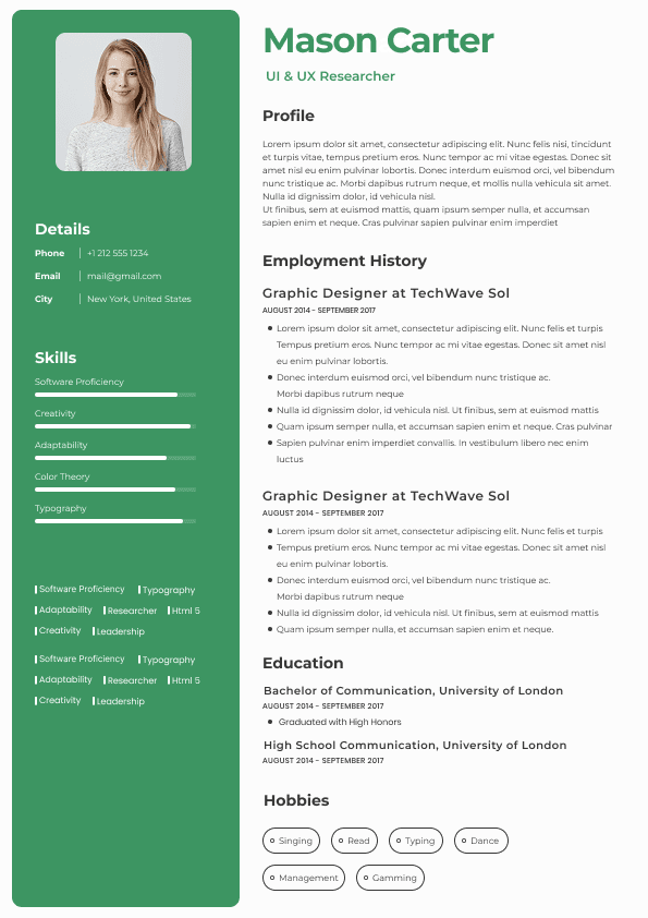
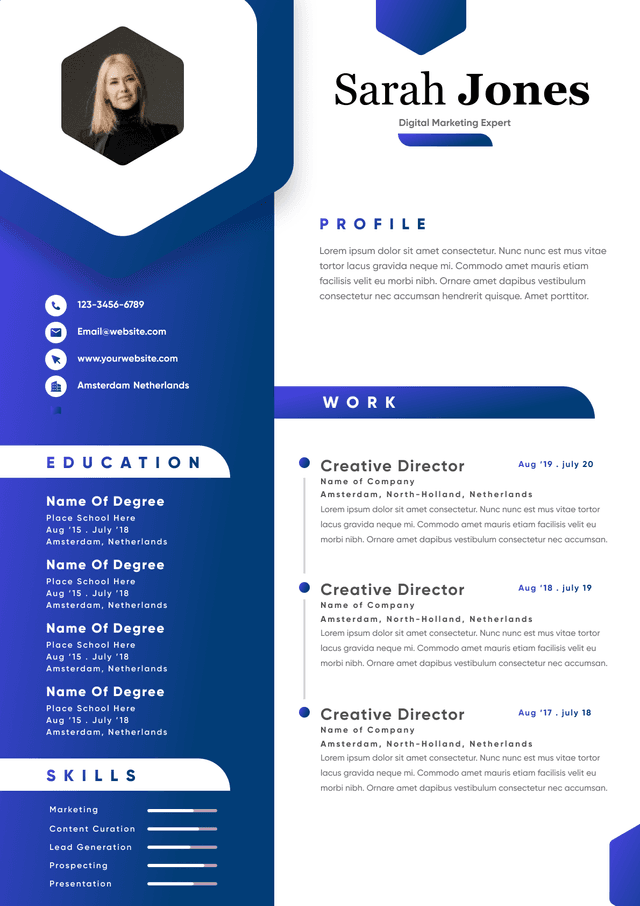
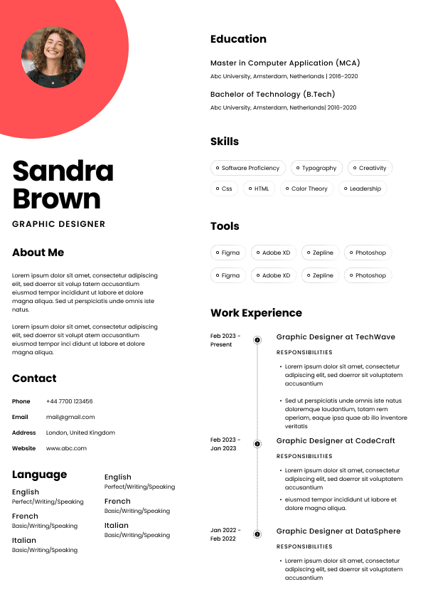
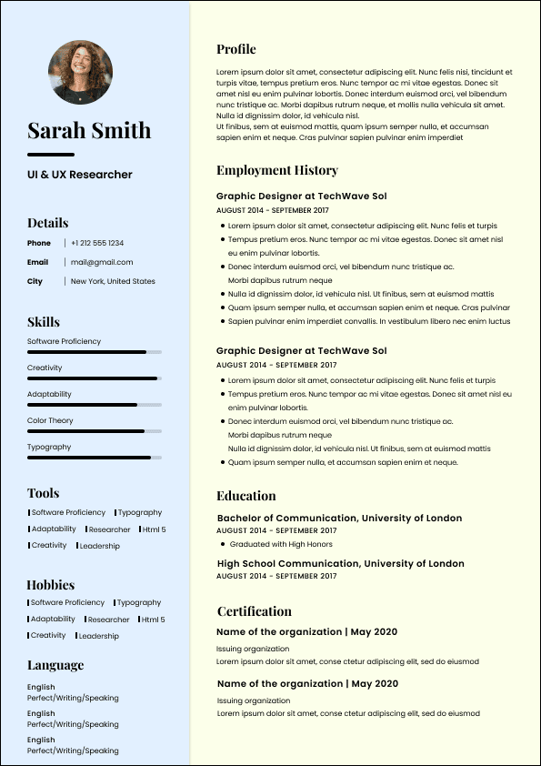
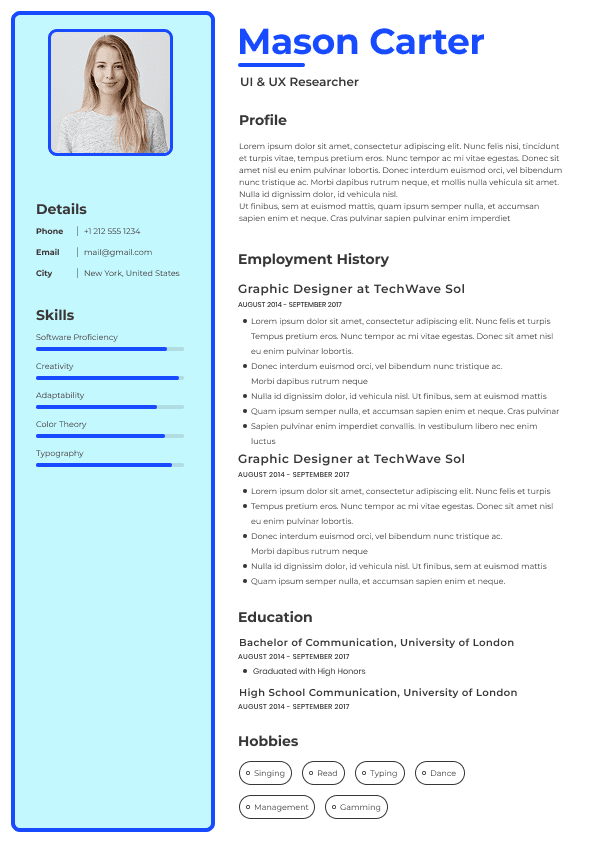
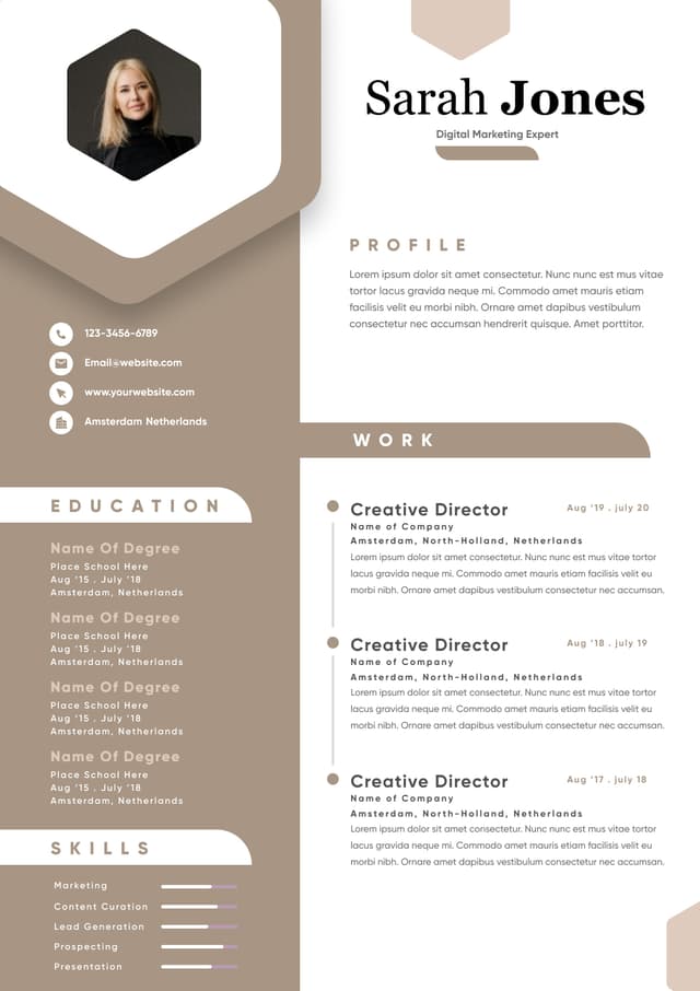
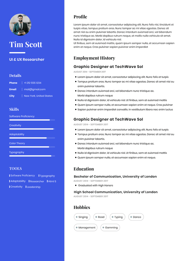
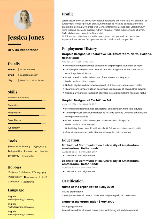
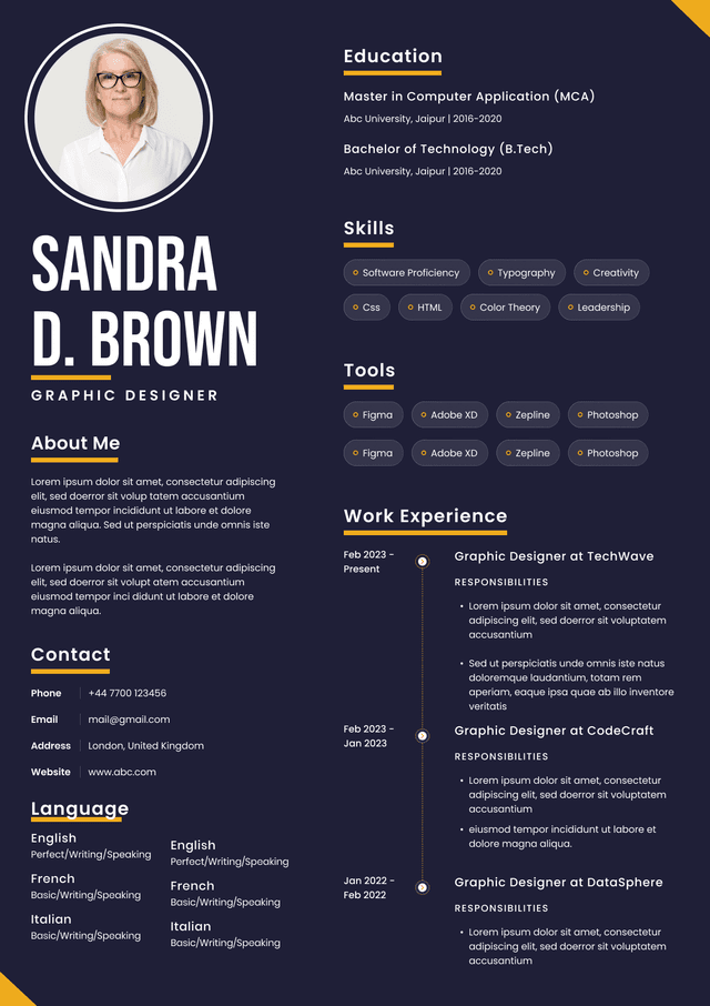
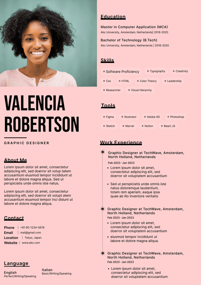
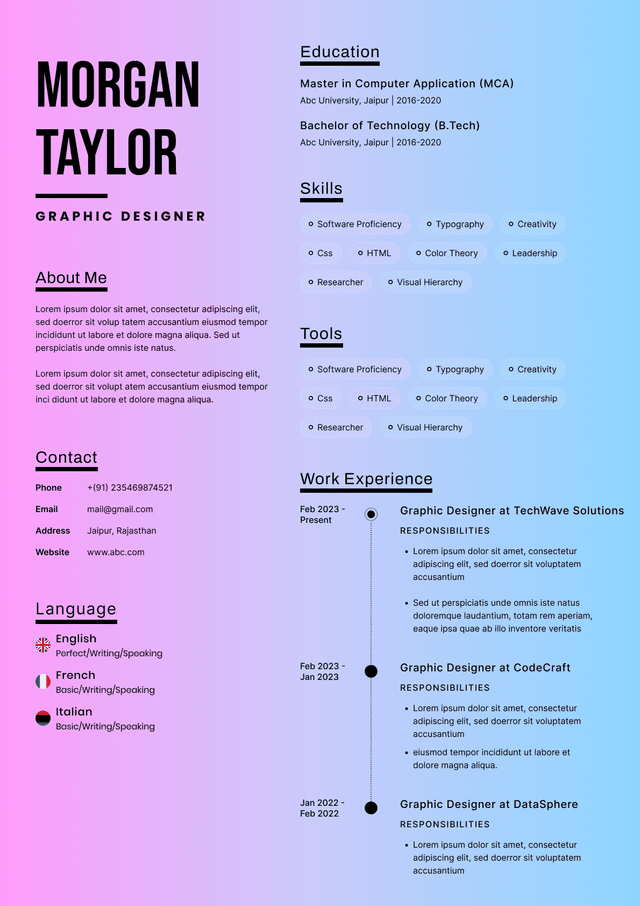
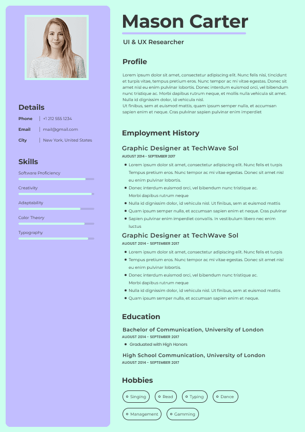
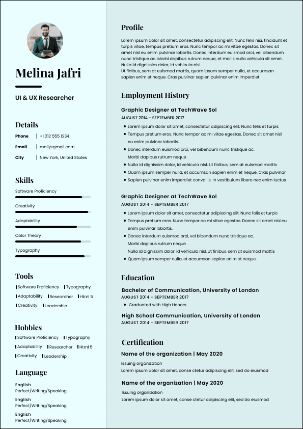
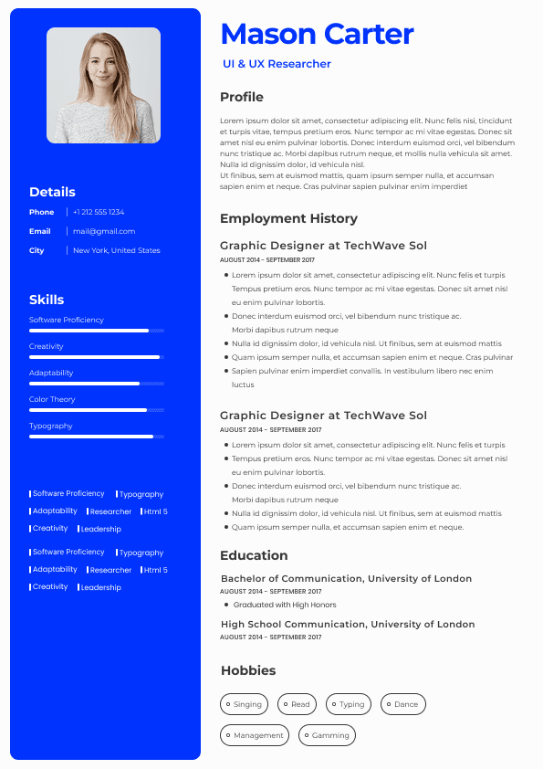
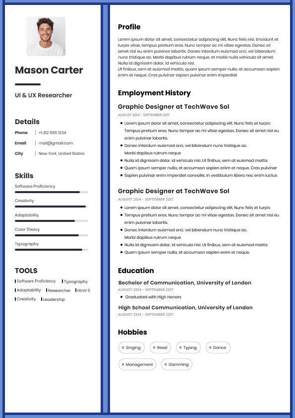
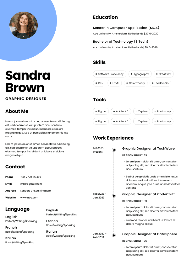
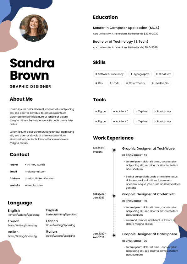
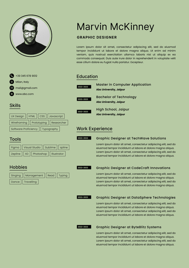
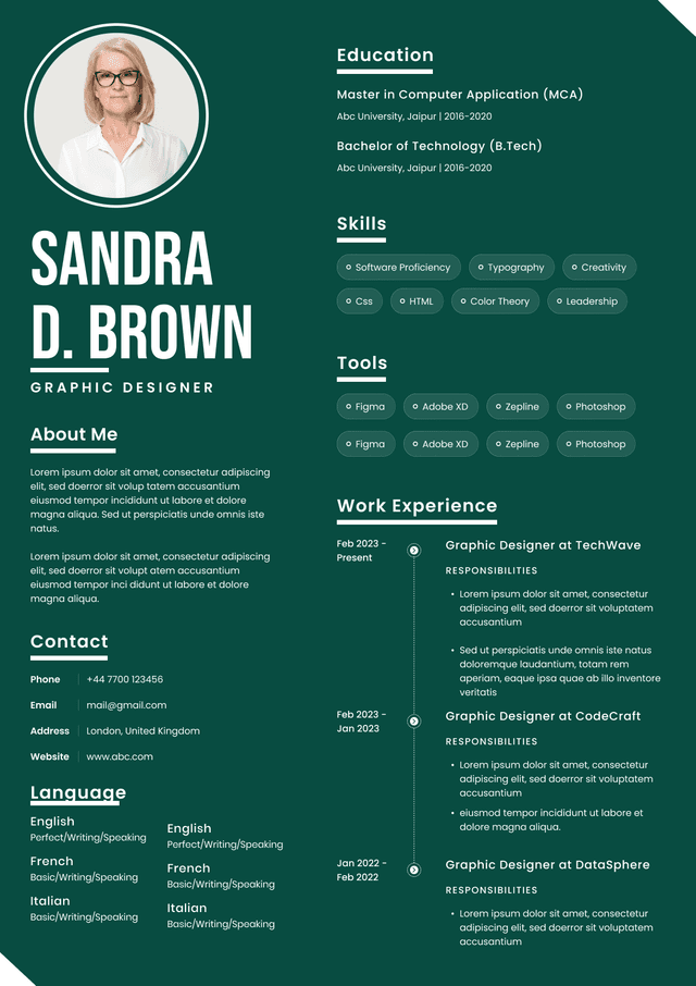
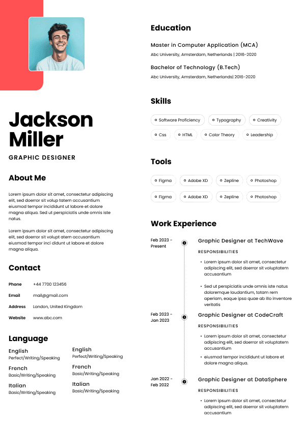
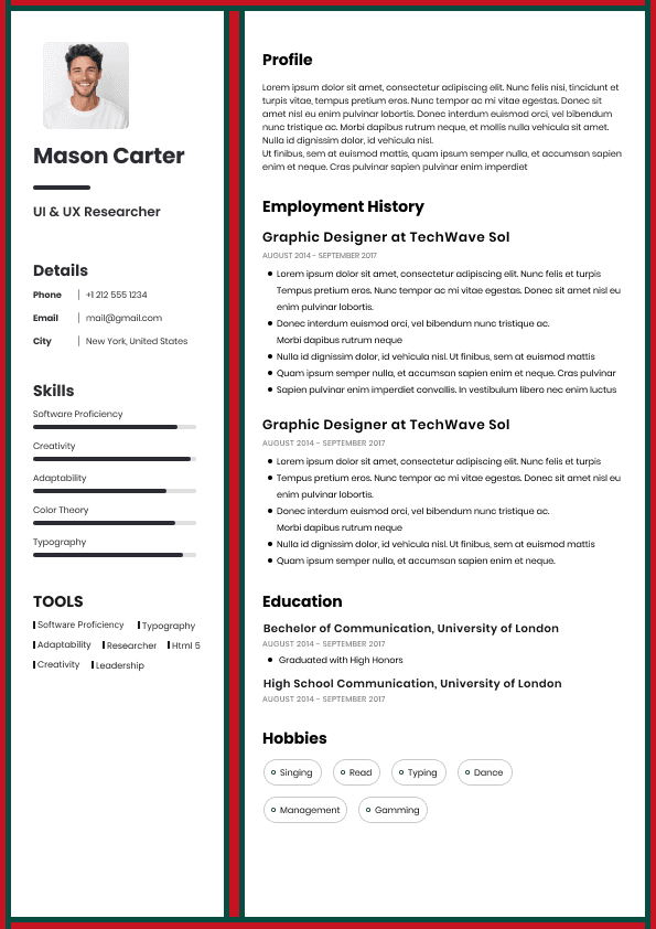
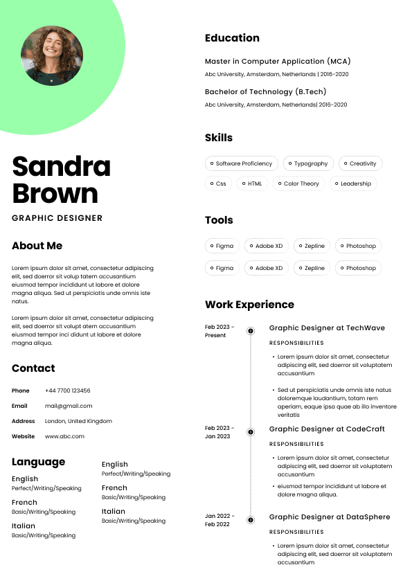
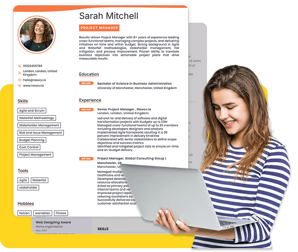
Two-column resumes are one of the most common Canva resume mistakes because they look efficient. They allow users to place skills, education, contact details, certifications, and tools in a sidebar while keeping experience in the main column.
The problem is that ATS systems do not always read columns the way humans do.
Some systems may read across the page. Others may extract text by object order. Some may separate sidebar content from the section where it belongs. This can cause job titles, employers, dates, skills, and education details to appear out of order in the recruiter’s system.
The risk is not that every ATS will completely reject a two-column resume. That is an outdated oversimplification. The real risk is parsing inconsistency.
A two-column Canva resume can create issues such as:
Skills appearing before your name
Dates separating from job titles
Contact information being missed
Education details appearing in the wrong section
Resume content appearing out of sequence
Canva resumes are often built with independent text boxes. That gives users flexible control over placement, but it can also create extraction problems.
When text boxes are layered, grouped, duplicated, or arranged manually, the exported PDF may not preserve the logical reading order. A recruiter may see a clean document, while an ATS extracts the text in an unexpected sequence.
This is especially risky when users place:
Dates in separate text boxes
Employers in separate text boxes
Job titles in separate text boxes
Bullets in manually aligned boxes
Skills in small grouped elements
Contact details beside icons
A resume should behave like a structured document, not a collection of floating design objects.
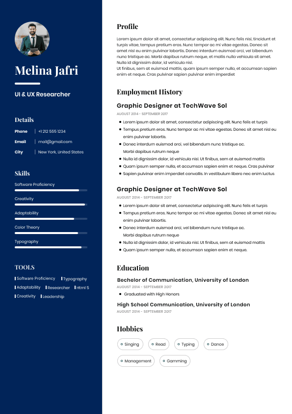
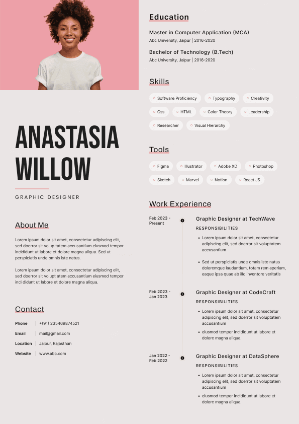
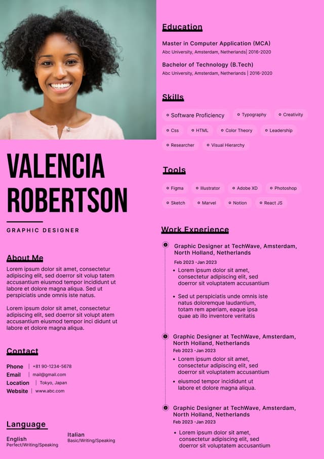
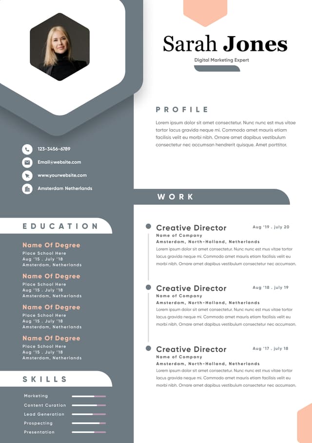
Canva templates often include icons for phone numbers, email addresses, locations, LinkedIn profiles, skills, languages, interests, and section headings. Small icons may seem harmless, but they can create unnecessary friction.
Recruiters do not need an envelope icon to understand an email address. They do not need a phone icon to understand a phone number. These graphics often make the resume feel more designed, but not more useful.
Icons can cause several problems:
They reduce available content space
They may interfere with text extraction
They can make the layout feel busy
They add visual noise to simple information
They can look inconsistent across devices or exports
If an icon does not improve understanding, remove it.
A resume should prioritize information density and clarity. Decorative elements should earn their place.
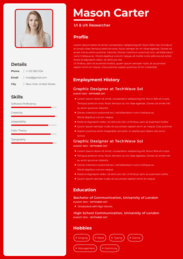
Skill bars are one of the weakest features in many Canva resume templates.
They look modern, but they rarely communicate real value.
A bar showing “Excel 90%” or “Leadership 5/5” does not tell a recruiter what the candidate actually did. It does not explain proficiency level, business impact, context, scale, or outcomes. It also creates problems for ATS parsing because graphic ratings are not meaningful resume content.
Recruiters prefer evidence over self-rating.
Weak Example:
Leadership: 95%
Good Example:
Led a 9-person operations team through a workflow redesign that reduced weekly reporting time by 6 hours.
Weak Example:
Project Management: ★★★★★
Good Example:
Managed cross-functional product launches across marketing, sales, and engineering, improving delivery consistency across three quarterly releases.
Skill bars take up space that should be used for proof. Replace visual ratings with achievement-based bullets, relevant tools, certifications, or measurable outcomes.
A highly creative resume may be useful for some design-heavy or portfolio-driven roles, but it can hurt candidates applying for operations, sales, finance, HR, healthcare, technology, administration, customer success, project management, or corporate roles.
The resume should match the buying behavior of the reader.
A creative director may appreciate visual identity. A recruiter filling an operations analyst role wants clean evidence of relevant experience. A hiring manager for a customer success role wants proof of retention, account management, communication, and process improvement.
The more traditional or system-driven the hiring workflow, the more important structure becomes.
Use design to support the role, not compete with it.
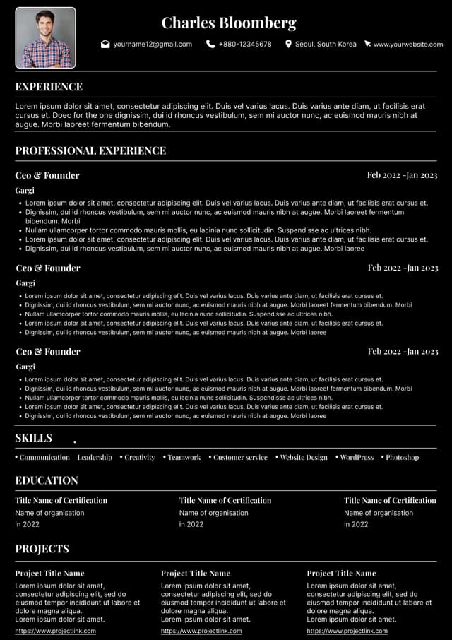
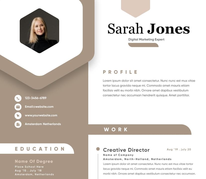
Many Canva resume templates include a profile photo. In the U.S. job market, this is usually unnecessary and often unhelpful.
A photo can create several issues:
It takes space away from qualifications
It can introduce bias concerns
It may distract from experience
It can make the resume feel less standard
It may not align with corporate hiring expectations
There are exceptions. Photos may be relevant for acting, modeling, entertainment, some personal branding contexts, or certain international markets where photos are expected. But for most U.S. job applications, a photo does not improve resume performance.
A recruiter-friendly resume should keep attention on qualifications, not appearance.
Canva templates often look clean because they limit how much text appears on the page. That can be useful, but it becomes a problem when candidates remove important context just to preserve the design.
A beautiful resume with weak content will not perform.
Common content sacrifices include:
Cutting measurable achievements
Removing scope of responsibility
Shortening bullets until they lose meaning
Leaving out tools and systems
Reducing job descriptions to vague phrases
Removing keywords needed for role matching
Design should not force shallow content. The best resumes are concise, but they are not empty.
Every role should communicate:
Canva offers many fonts, but not every font belongs on a resume.
Decorative, thin, condensed, handwritten, or overly stylized fonts can make the resume harder to read. They may also display inconsistently across systems.
Resume fonts should be professional, clean, and readable at normal viewing sizes.
Avoid fonts that:
Are too thin
Are overly condensed
Look handwritten
Use decorative letterforms
Become hard to read in small sizes
Reduce contrast against the background
Recruiters scan quickly. Anything that slows reading creates friction.
A resume should feel modern, but it should never make the reader work to understand basic information.
Color can improve a resume when used carefully. It can separate sections, guide the eye, and create a polished visual identity.
But many Canva resumes overuse color.
Common problems include:
Light gray text on white backgrounds
White text on colored blocks
Pale accent colors with weak contrast
Colored sidebars that compress content
Background shapes behind important text
Designs that print poorly in black and white
Recruiters may view resumes on different screens, in email previews, or in ATS dashboards. Low contrast makes the resume harder to read in every environment.
Use color as an accent, not as the foundation of the document.
A resume should not be submitted as a JPG or PNG. It also should not be submitted as a PDF that behaves like a flat image.
Image-based resumes create major usability problems because ATS systems and recruiters may not be able to extract or search the text properly.
Before submitting a Canva resume, test the export:
Open the PDF
Highlight the text
Copy the text
Paste it into a plain text document
Check whether the order makes sense
Confirm that contact details, headings, job titles, dates, and bullets appear correctly
If the text cannot be selected or appears scrambled, the export is risky.
A resume must be machine-readable and human-readable. Both matter.
Most candidates write resumes as if recruiters read them carefully from top to bottom.
That is rarely how screening works.
Recruiters usually skim first. They look for fast signals:
Current or most recent role
Relevant title alignment
Years of experience
Industry match
Key skills
Tools and systems
Measurable impact
Many job seekers start with a Canva template and then fill in generic content. The result looks finished but lacks strategic positioning.
A resume is not just a design file. It is a relevance document.
Generic phrases such as “hardworking professional,” “team player,” “detail-oriented,” or “excellent communication skills” do not create strong hiring signals unless they are supported by evidence.
Better resume content connects experience to the target role.
Weak Example:
Motivated professional with strong communication and leadership skills.
Good Example:
Customer success specialist with 4 years of experience improving onboarding workflows, reducing churn risk, and supporting SaaS accounts across mid-market teams.
The second version gives the recruiter a clearer reason to continue.
Design cannot compensate for weak positioning. A polished Canva resume still needs role-specific content strategy.
ATS systems and recruiters both rely on keywords, but keyword strategy is often misunderstood.
The goal is not to stuff the resume with repeated phrases. The goal is to naturally include relevant skills, tools, responsibilities, industries, and outcomes where they belong.
Canva resumes sometimes place keywords in sidebars, icons, skill bubbles, or decorative sections. That can weaken context.
A skill listed alone is less powerful than a skill connected to achievement.
Weak Example:
Skills: Salesforce, onboarding, reporting, retention
Good Example:
Used Salesforce and onboarding health reports to identify at-risk accounts, improve follow-up workflows, and support a 14% increase in renewal readiness.
The second version gives keywords context.
For ATS and recruiter readability, place important keywords in:
Resume summary
Work experience bullets
Skills section
One hidden workflow problem with Canva resumes is editing friction.
A resume should be easy to adapt for different roles. If the design is too rigid, every update becomes time-consuming. Candidates then avoid tailoring the resume because changing one bullet breaks spacing, alignment, or page structure.
This creates a productivity problem.
Modern job searching requires fast customization. Candidates often need to adjust:
Resume summary
Skills emphasis
Role keywords
Achievement order
Project details
Tools and systems
A strong Canva resume should balance design with hiring performance.
It should:
Use a clean structure
Preserve logical reading order
Avoid excessive graphics
Keep text selectable
Prioritize work experience
Use measurable achievements
Maintain strong contrast
Keep fonts readable
Canva can work for resumes when used carefully.
It is most useful when:
The layout is simple
The resume is one column
Graphics are minimal
Fonts are readable
Text exports cleanly
Color is used lightly
The resume is designed for clarity
The candidate tests the final PDF
Canva may be less ideal when:
Canva gives design flexibility. Purpose-built resume builders usually give more resume-specific structure.
That difference matters.
Canva works like a design canvas. The user controls layout manually. This gives freedom, but also increases the chance of formatting mistakes.
A resume-focused platform is designed around the resume workflow itself. The better ones help users manage structure, content, formatting, ATS readability, and export behavior more predictably.
NewCV is a practical example of this shift. Instead of forcing users to choose between ATS performance and modern design, it focuses on combining recruiter-friendly formatting, AI-assisted workflow optimization, personal branding, fast resume creation, and premium presentation. That matters because job seekers often do not have time to become resume designers, ATS testers, and content strategists all at once.
The stronger workflow is the one that helps users produce a resume that is:
Easy to read
Easy to customize
Visually professional
ATS-aware
Before using a Canva resume for applications, simplify and test it.
Start by removing anything that does not improve clarity. Most Canva resumes become stronger when they lose decorative elements.
Use this practical review process:
Switch to a single-column layout if ATS compatibility matters
Remove skill bars and star ratings
Limit icons or remove them completely
Delete unnecessary photos
Increase body text readability
Improve contrast
Keep headings predictable
The biggest Canva resume mistake is assuming that a good-looking resume is automatically a good-performing resume.
Hiring workflows reward clarity, relevance, structure, and speed. Canva can support those goals when used carefully, but many templates encourage choices that create ATS issues, recruiter friction, and editing inefficiency.
A better resume workflow starts with the hiring outcome first.
Ask:
Can ATS systems read it?
Can recruiters scan it quickly?
Does the layout support the content?
Is every design element useful?
Can the resume be tailored without breaking?
Does the document communicate value faster than competing candidates?
If the answer is yes, the design is working.
Choose from a wide range of NEWCV resume templates and customize your NEWCV design with a single click.

Use ATS-optimised Resume and resume templates that pass applicant tracking systems. Our Resume builder helps recruiters read, scan, and shortlist your Resume faster.
Use professional field-tested resume templates that follow the exact Resume rules employers look for.
Create Resume
Use professional field-tested resume templates that follow the exact Resume rules employers look for.
Create ResumeResume search databases
Hiring manager review threads
Each environment rewards clarity. The more visual complexity a resume has, the more opportunities there are for information to be misread, skipped, or displayed poorly.
The strongest resume design is not the flashiest design. It is the design that helps the reader find the right information with the least effort.
Crowded spacing
Graphic-heavy layouts
A good resume template should create structure, not distraction. It should make the reader’s eyes move naturally from contact information to summary, experience, skills, education, and relevant credentials.
Weak Example: A colorful template with a large sidebar, profile photo, icons, progress bars, and very little space for work experience.
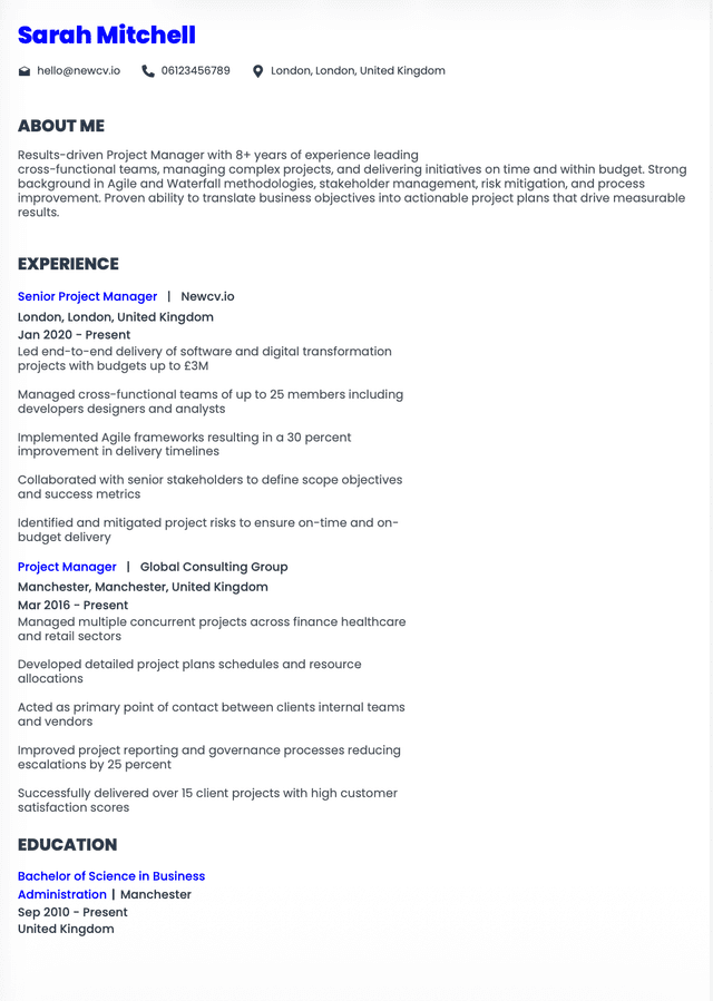
Good Example: A clean one-column resume with clear headings, readable spacing, strong accomplishment bullets, and a simple visual hierarchy.
The best resume templates make your qualifications easier to understand. If the template is doing more work than your experience, it is probably the wrong template.
Keywords becoming harder to associate with experience
This matters because recruiters often search, filter, and skim inside ATS interfaces. If the parsed version looks messy, the recruiter may not see the same polished resume you designed.
For most job applications, a single-column format is safer. It creates a predictable reading order for both humans and software.
Before submitting a Canva resume, copy the text from the exported PDF and paste it into a plain text editor. If the pasted version appears scrambled, missing, or out of order, the resume needs simplification.
What you owned
What tools or systems you used
What problems you solved
What outcomes you improved
What scale you worked at
Why the experience matters for the target role
If the template does not give enough room for that information, choose a different structure.
The safest approach is dark body text, strong heading contrast, and limited accent color.
Career progression
Location or work authorization if relevant
If those signals are buried in a decorative layout, the resume underperforms.
A strong resume creates a fast first impression without requiring interpretation.
Your resume should answer these questions quickly:
What role are you targeting?
Why are you qualified?
What have you achieved?
What tools, skills, and environments do you know?
Why should the recruiter keep reading?
Canva resumes often fail when they make those answers visually scattered.
Certifications
Tools and systems section
Project descriptions when relevant
Keywords work best when they are connected to proof.
Job title framing
If a Canva layout makes customization difficult, it slows the application workflow.
This is one reason purpose-built resume platforms can be more efficient. NewCV, for example, is positioned around a more structured resume workflow where users can combine ATS-friendly formatting, modern design, AI-assisted resume creation, and recruiter-readable presentation without manually rebuilding the layout every time. The value is not just design quality. It is reducing the workflow friction between content, formatting, and job-specific optimization.
Support ATS parsing
Help recruiters scan quickly
The best version of a Canva resume is not the most creative version. It is the version that communicates the candidate’s value with the least friction.
Before submitting, review the resume through three lenses.
Can a recruiter understand your fit in less than 10 seconds?
If not, improve the hierarchy. Your target role, most relevant experience, and strongest proof points should be obvious quickly.
Can the file be parsed cleanly?
Test the PDF by copying and pasting the text. Avoid designs that scramble order, hide key details, or turn text into images.
Can you tailor the resume quickly?
If every change breaks the layout, the workflow is too fragile. A resume system should support repeated applications, not slow them down.
You need frequent resume tailoring
You are applying through ATS-heavy systems
You are targeting corporate or technical roles
The template relies on visuals more than content
You are unsure how the exported file parses
The decision should be based on workflow risk, not personal preference.
If the role depends heavily on ATS screening, recruiter search, or structured application workflows, prioritize performance over decoration.
Recruiter-friendly
Fast to create
Consistent across applications
The best resume tool is not always the one with the most design options. It is the one that helps the candidate make fewer mistakes.
Make job titles, employers, and dates easy to identify
Replace vague bullets with measurable achievements
Export as a text-readable PDF
Copy and paste the PDF text to check reading order
Review the resume on mobile
Tailor the summary and skills for the target role
A strong resume does not need to look plain. It needs to work.
Design should create confidence, not confusion.
If the answer is no, simplify the resume or use a resume-focused platform like NewCV that is built to combine ATS-friendly performance, modern design, AI-assisted optimization, personal branding, and workflow speed without requiring users to manage every formatting risk manually.
Your resume does not need to be the most visually creative document in the hiring pipeline.
It needs to be the easiest qualified resume to understand.