Choose from a wide range of NEWCV resume templates and customize your NEWCV design with a single click.

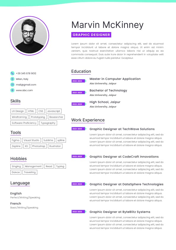
Use professional field-tested resume templates that follow the exact Resume rules employers look for.
Create ResumeCV Fonts play a critical role in both ATS parsing and recruiter readability. The right font ensures your CV is legible, professional, and compatible with automated systems, while a poor choice can reduce clarity or cause parsing errors.
This page explores which fonts perform best in modern resumes, how font choices affect ATS and human review, and best practices for 2026 applications.
•ATS Parsing: Non-standard fonts or decorative characters can break text recognition
• Readability: Clear fonts improve recruiter scanning efficiency
• Professionalism: Typography contributes to first impressions
• Consistency: Uniform font use prevents distraction and ensures structured formatting
ATS systems prefer text-based fonts over stylized or graphic-heavy designs.
•Calibri: Modern, highly legible
• Arial: Simple, widely recognized
• Times New Roman: Classic, conservative, suitable for traditional industries
• Verdana: Clear on screens, especially for online applications
• Cambria: Professional serif font optimized for print and digital
These fonts maintain ATS compatibility and recruiter readability.
•Script or decorative fonts (e.g., Brush Script, Papyrus)
• Comic Sans or casual typefaces
• Overly condensed or stylized display fonts
• Multiple fonts in a single CV (confuses ATS and reader)
Decorative fonts can break parsing and appear unprofessional.
•Body Text: 10–12 pt for readability
• Headings: 12–14 pt for section clarity
• Margins: 0.5–1 inch to maintain structure
• Consistency: Use one font for body and another for headings only if necessary
• Avoid excessive bold, italics, or underlining
Proper sizing ensures ATS readability and recruiter-friendly scanning.
•ATS systems increasingly evaluate text-based content and layout hierarchy
• Font choices remain critical for hybrid digital and PDF submissions
• Minimalist, professional fonts are preferred across remote and mobile applications
• Digital resumes now emphasize clarity and consistency over visual flair
Even subtle font misalignment can impact screening success and recruiter perception.
•Stick to one primary font throughout the CV
• Use bold or italics sparingly to highlight key sections or achievements
• Test PDF and Word exports to ensure fonts are rendered correctly
• Avoid text boxes or columns that may obscure font recognition
• Maintain consistent spacing, headings, and bullets
Use ATS-optimised Resume and resume templates that pass applicant tracking systems. Our Resume builder helps recruiters read, scan, and shortlist your Resume faster.

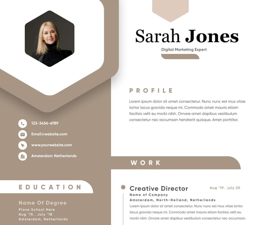
Use professional field-tested resume templates that follow the exact Resume rules employers look for.
Create Resume