Figma Resume Design Mistakes
Figma gives designers complete visual control, which is exactly why many resumes created in Figma fail in real-world hiring workflows.
The biggest Figma resume mistakes are not usually aesthetic problems. They are workflow problems. Recruiters review resumes in seconds. Hiring teams move through hundreds of applications. ATS platforms extract content automatically. A design that looks beautiful on a portfolio page can break under real hiring conditions.
The issue is not Figma itself. Figma can produce outstanding resumes. The problem is that many users optimize for visual creativity while ignoring recruiter behavior, scan patterns, ATS parsing, readability, and information hierarchy.
If you're creating resumes in Figma, these are the mistakes that quietly reduce performance and why they matter.
Most resume builders impose structure.
Figma does not.
That freedom creates a hidden problem: users design resumes like posters instead of information systems.
Recruiters are not evaluating visual experimentation. They are trying to answer questions quickly:
•What does this candidate do?
• What level are they at?
• What impact did they create?
• Are they qualified?
• Should they move to interview?
Every design choice should accelerate those answers.
Most Figma resume mistakes slow them down.
Many users start with visual inspiration from:
•Dribbble
• Behance
• Pinterest
• Resume showcase galleries
The result often looks impressive:
•Giant typography
• Heavy visual blocks
• Large icons
• Experimental layouts
• Portfolio-style compositions
But recruiters do not consume resumes the way designers consume showcase work.
A resume is a decision document.
Its primary purpose is speed and clarity.
Beautiful visuals become harmful when they interrupt information flow.
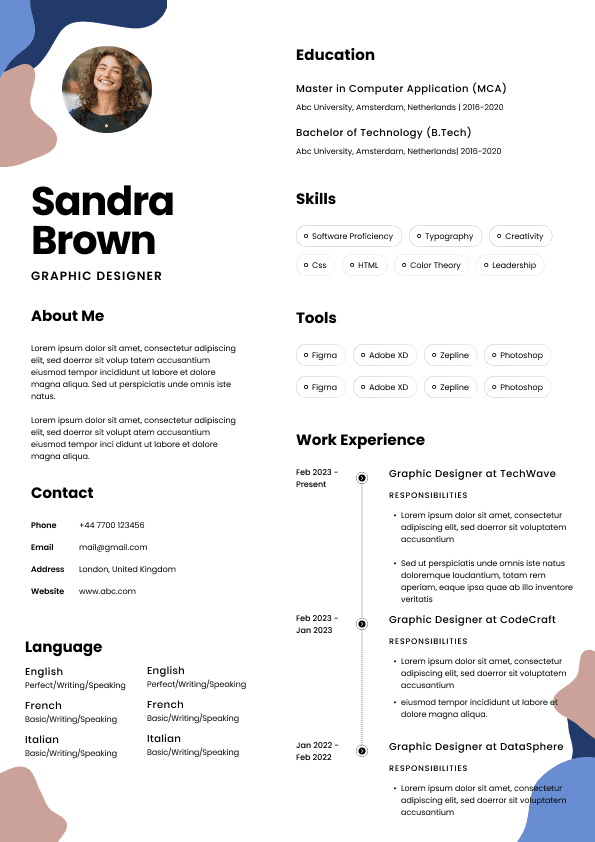
•Oversized hero sections
• Decorative graphics
• Excessive shapes
• Dense visual elements
• Layouts that force eye movement
Design should support information hierarchy, not compete with it.
A recruiter should understand:
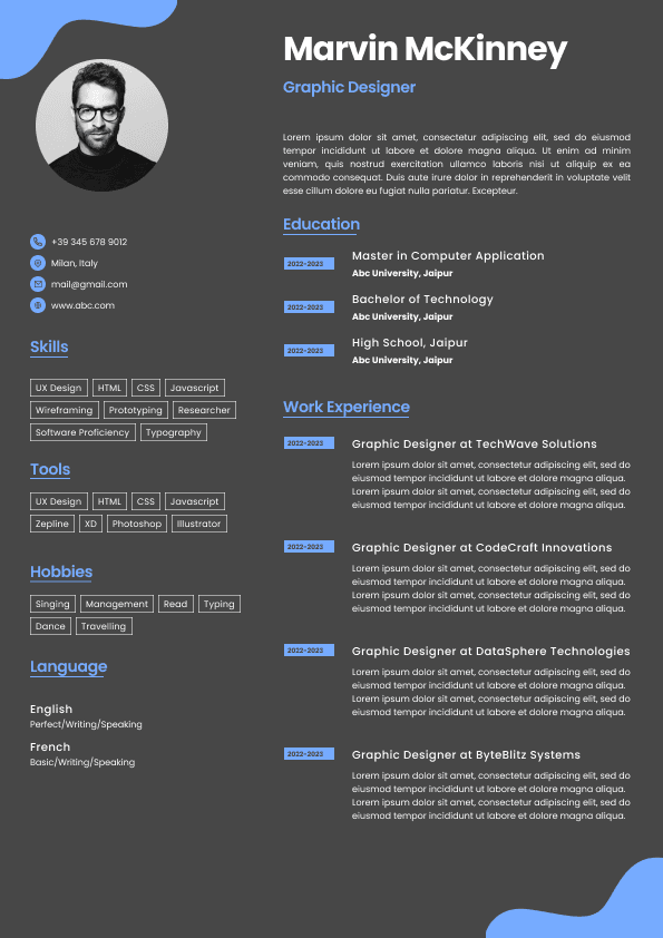
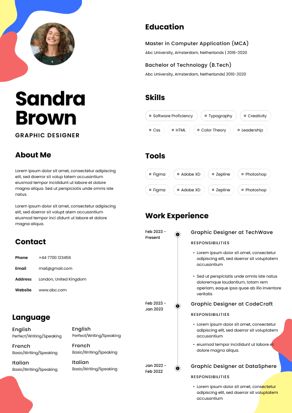
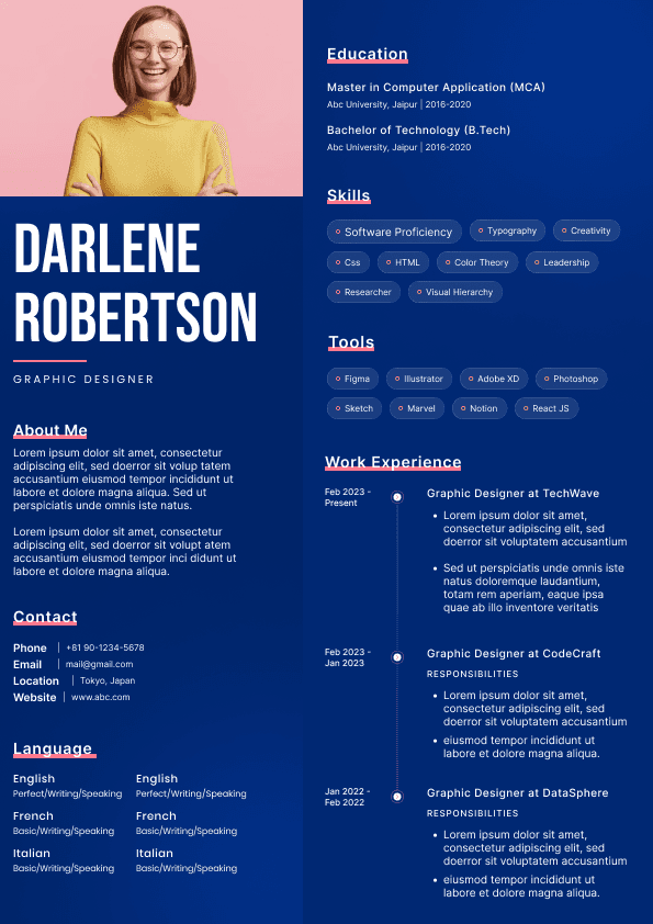
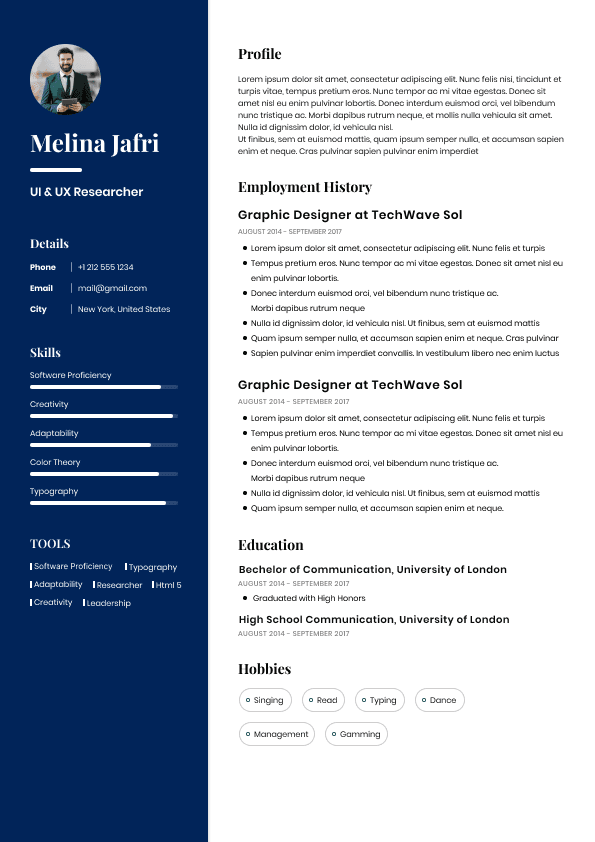
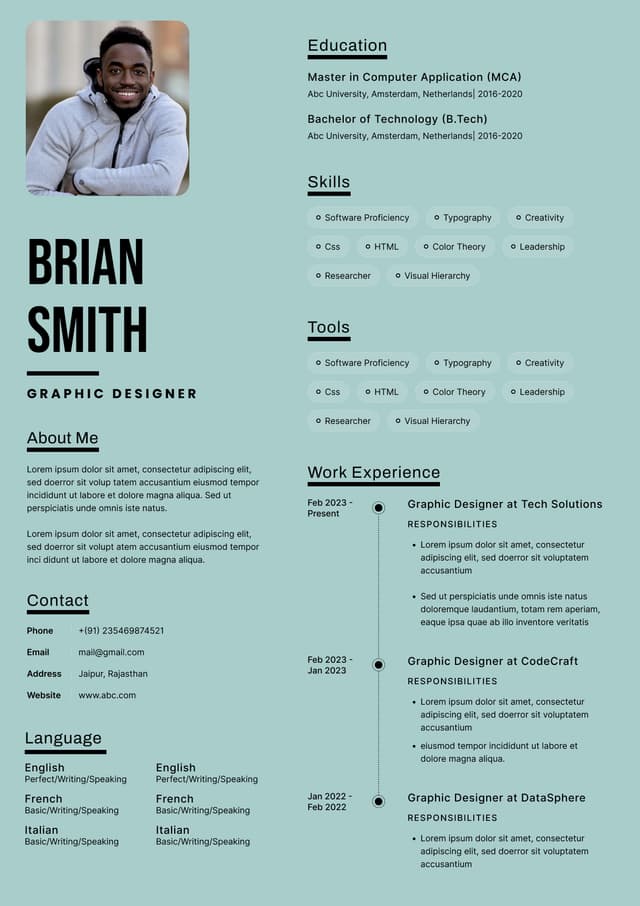
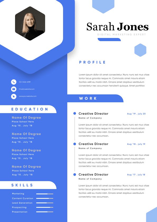
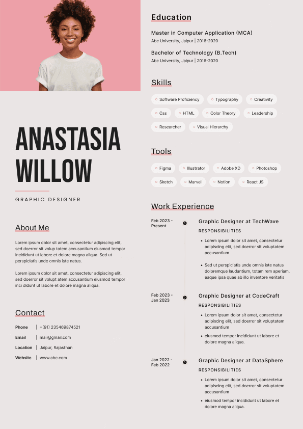
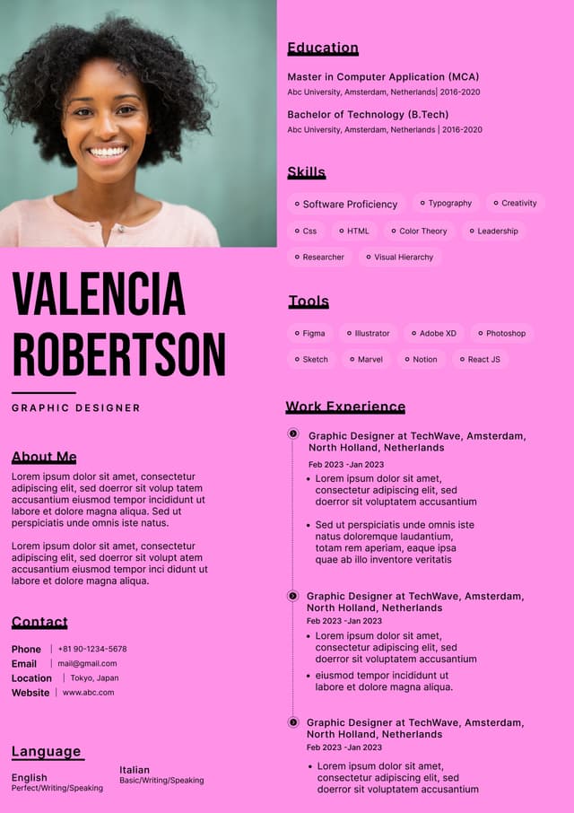
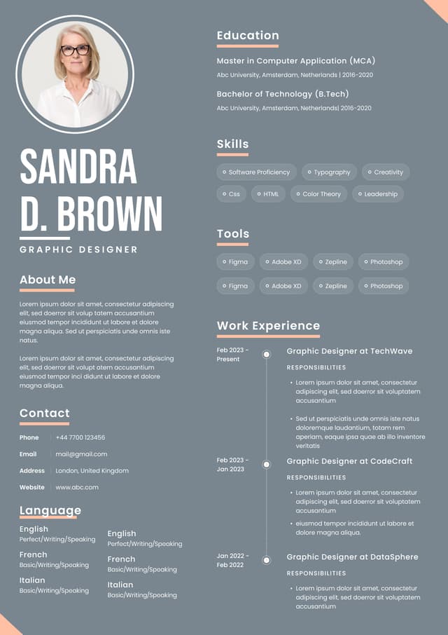
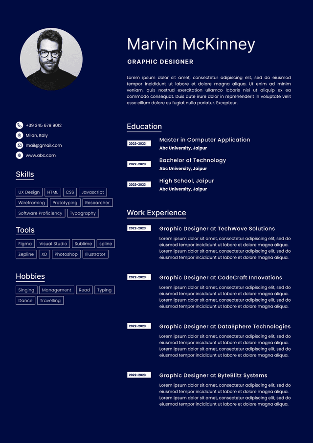
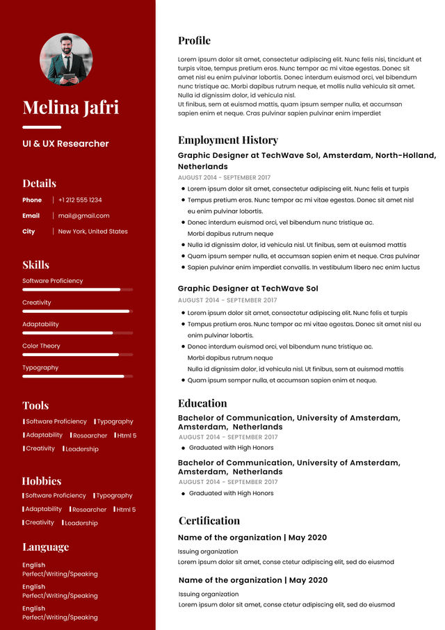
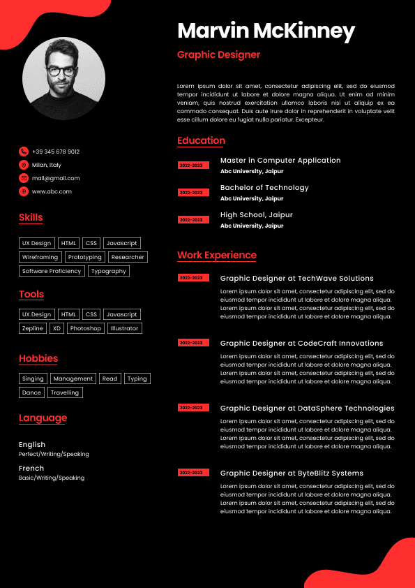
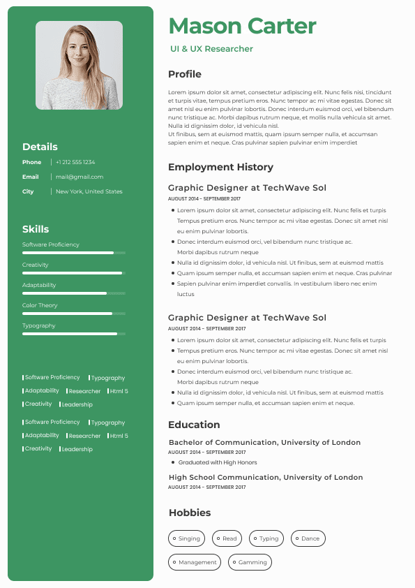
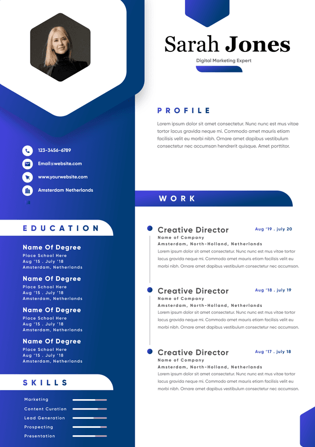
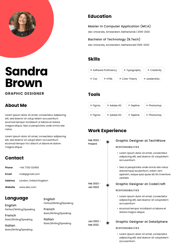
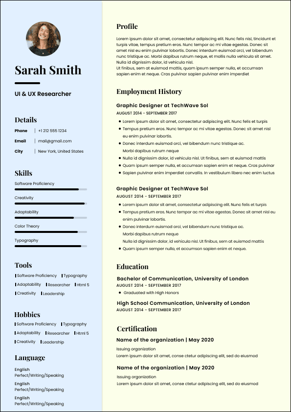
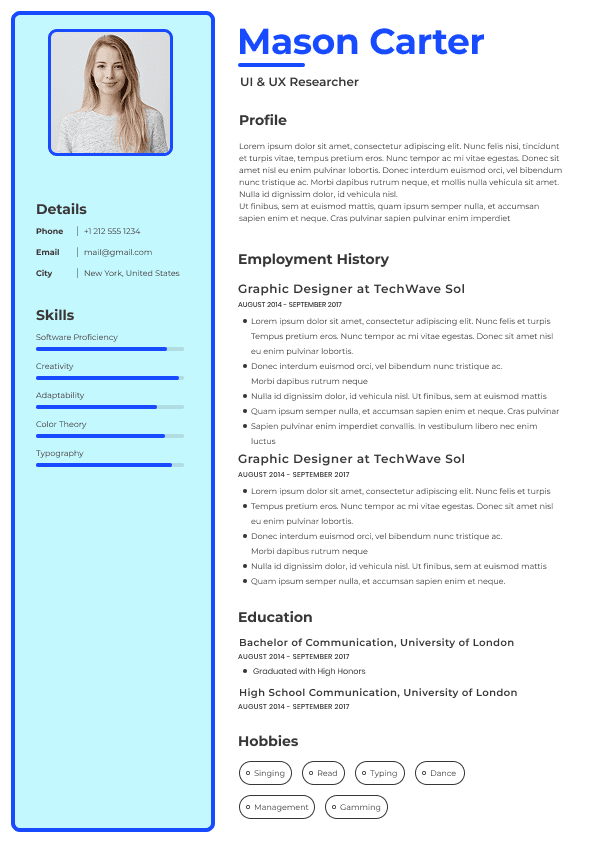
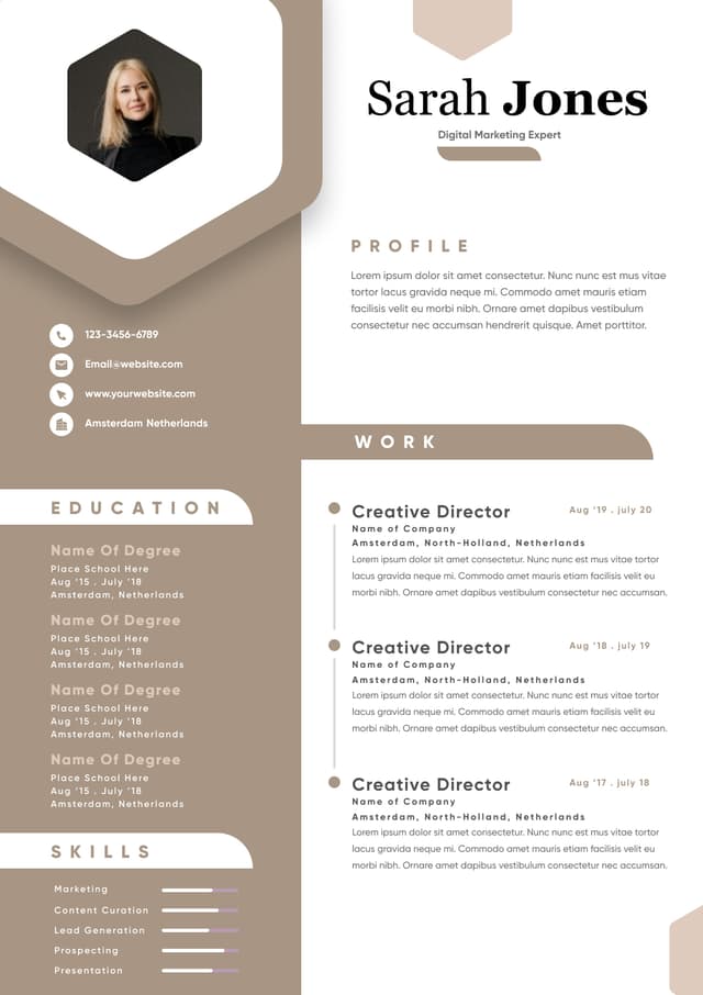
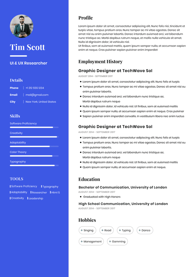
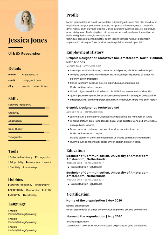
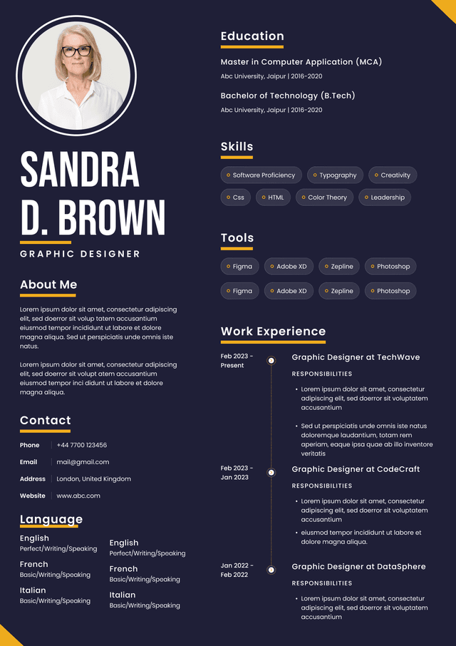
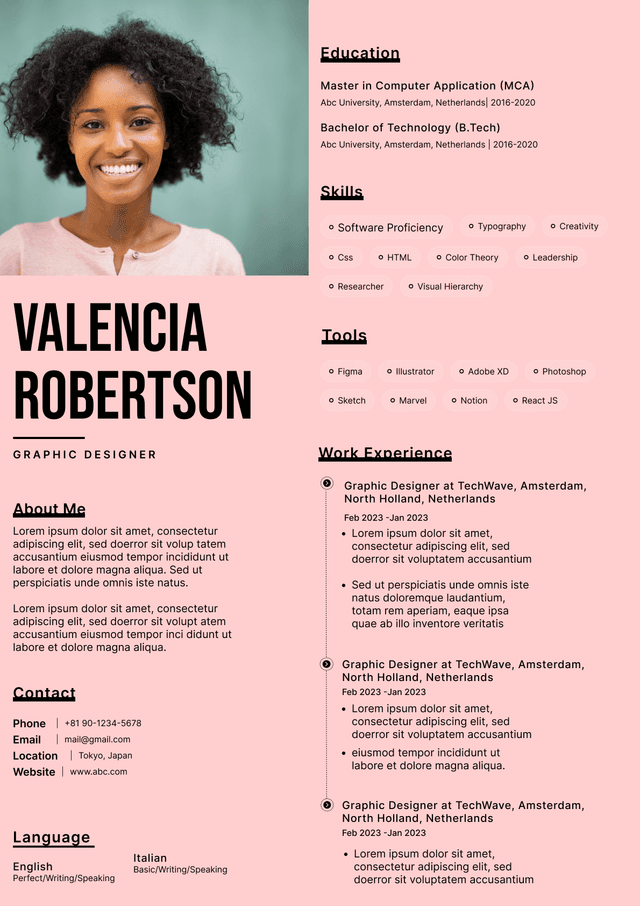
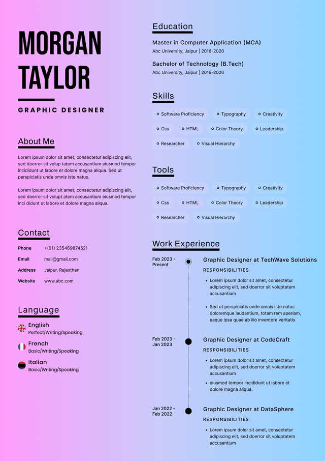
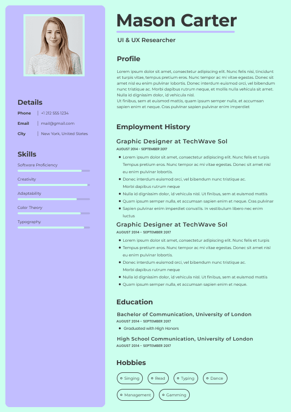
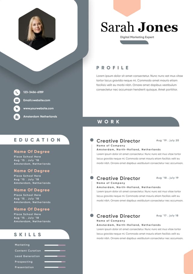
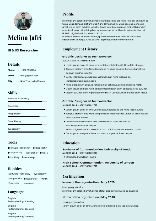
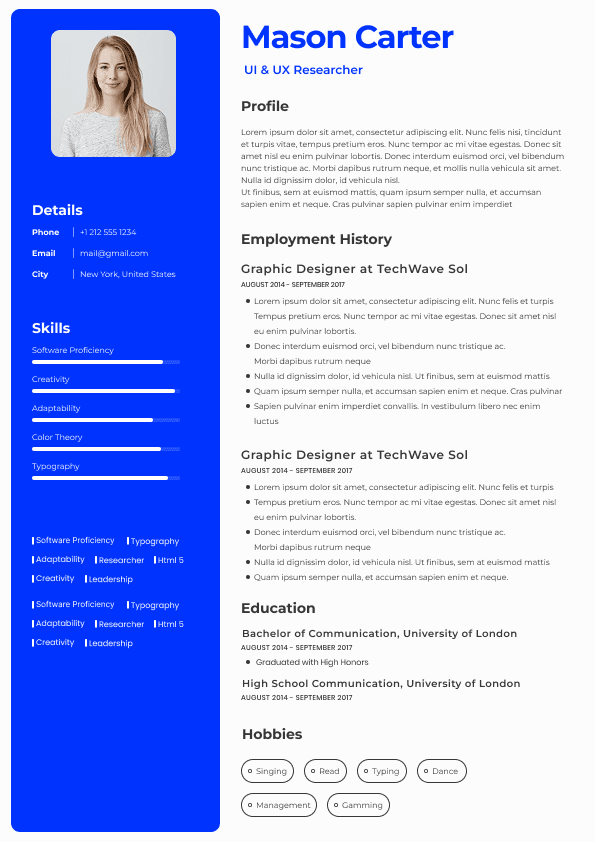
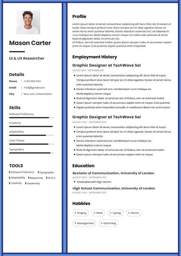
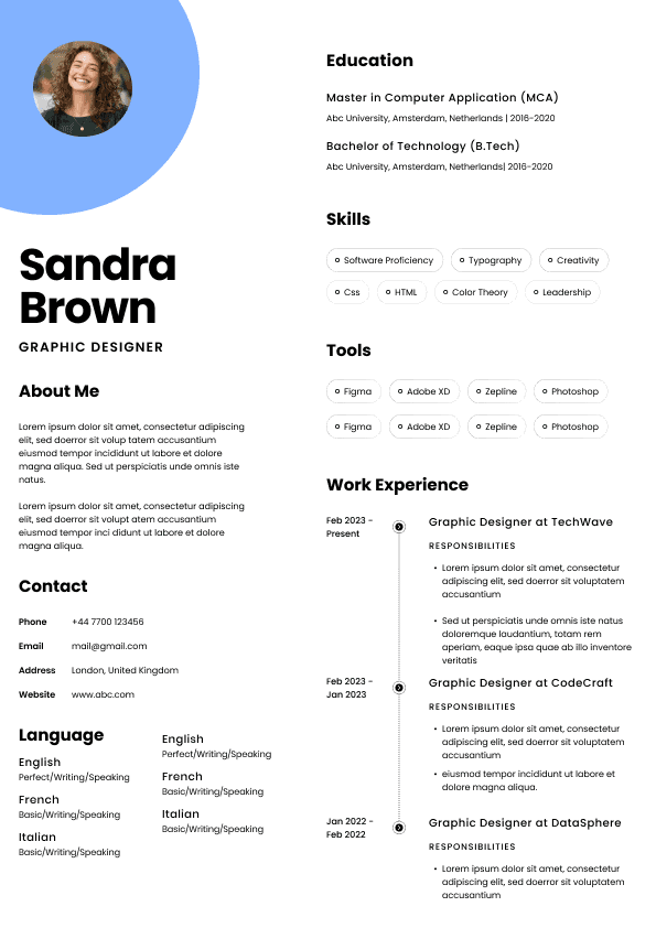
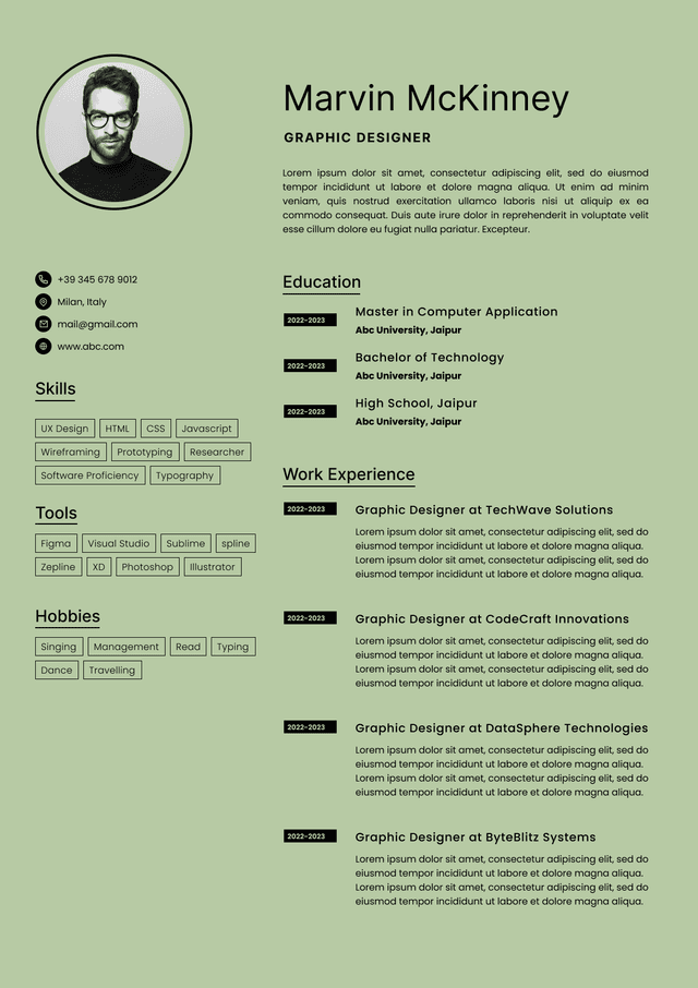
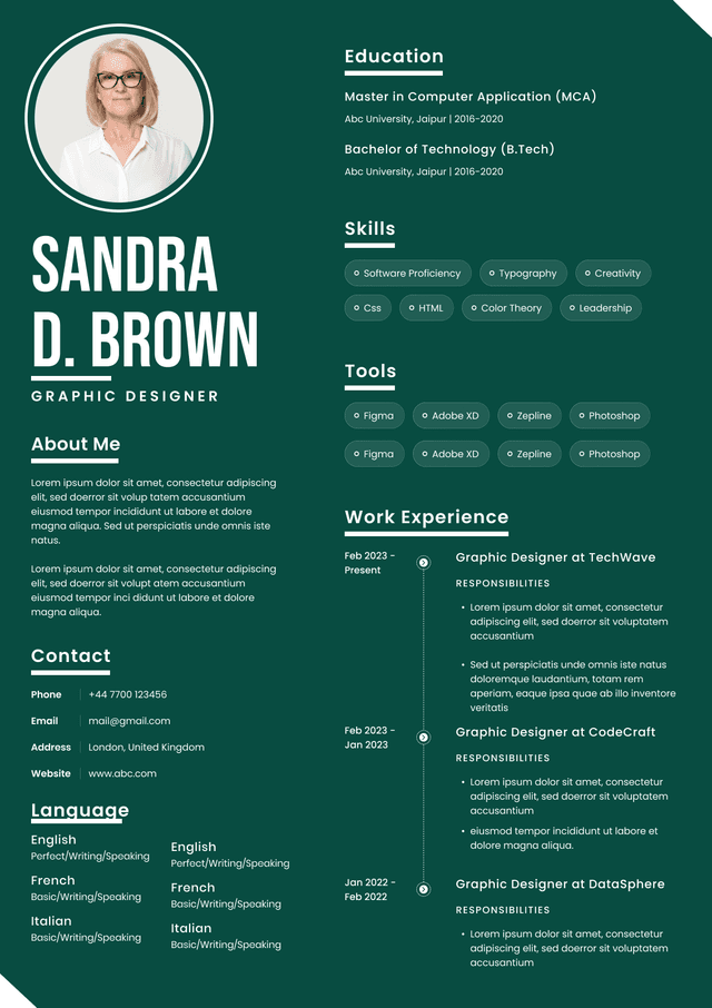
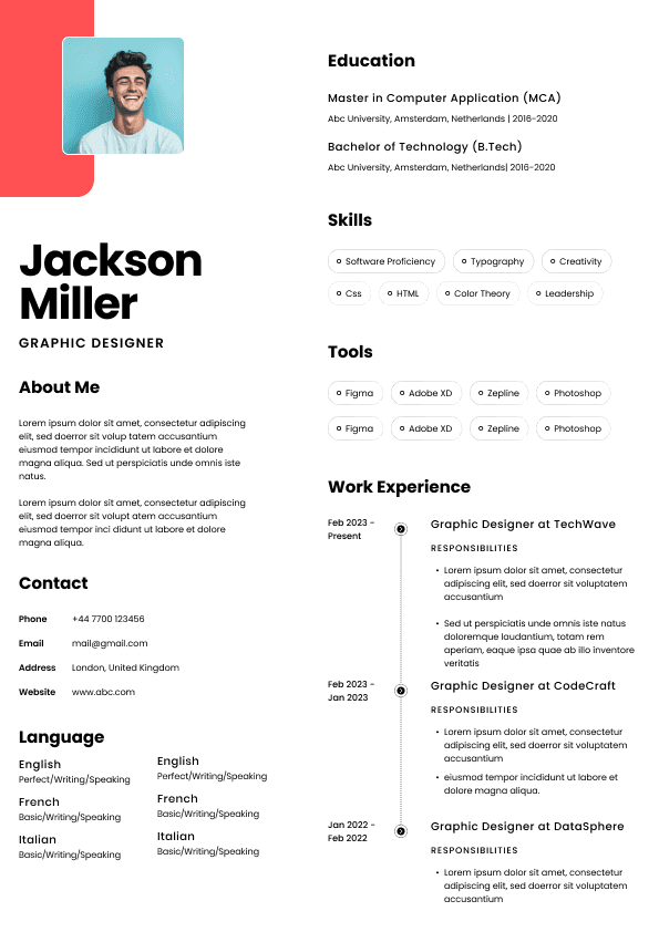
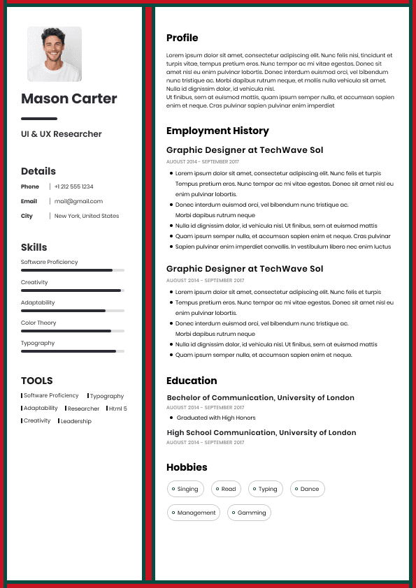
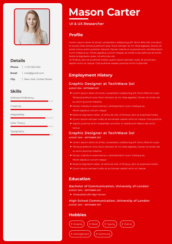
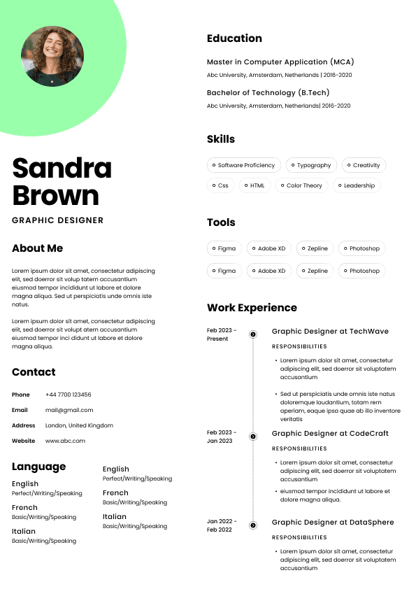
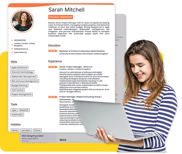
One of the most common Figma resume mistakes is aggressive multi-column design.
Designers often create:
•Left sidebar navigation areas
• stacked skill sections
• narrow content zones
• asymmetrical layouts
They look modern.
But recruiter scanning behavior follows predictable patterns.
Most recruiters scan:
•top to bottom
• left to right
• section by section
Complicated column structures force readers to jump.
That creates friction.
For ATS systems, multi-column layouts can become worse.
Content extraction tools may read:
Skills → Education → Job title → Contact info → Experience
instead of the intended sequence.
The result becomes messy parsing.
Left sidebar:
Contact
Skills
Tools
Main section:
Work history
This mistake silently destroys ATS compatibility.
Some Figma users:
•outline text
• flatten layers
• export design elements as images
Visually nothing appears wrong.
But ATS systems often cannot interpret image-based content.
Recruiters may see:
•missing information
• blank areas
• improperly extracted text
This issue often appears after PDF export.
Users assume:
"It looks fine on my screen."
The ATS sees something entirely different.
Always verify:
•selectable text exists
• PDF text remains searchable
• content is machine-readable
Visual accuracy alone is not enough.
Designers often force content into perfectly balanced layouts.
Examples:
•shortening achievement bullets
• removing measurable outcomes
• deleting context
• compressing sections
Why?
To preserve visual symmetry.
This creates a dangerous tradeoff.
Recruiters care far more about impact than spacing precision.
"Managed marketing projects."
"Managed cross-functional marketing initiatives that increased qualified leads by 34% across three acquisition channels."
The second version may create slightly uneven spacing.
It is still dramatically stronger.
Content quality should always outrank visual symmetry.
Figma templates often include icons for:
•phone numbers
• email
• location
• skills
• software tools
• section labels
Icons create visual noise faster than users realize.
Recruiters already understand:
Phone = contact number
Email = email address
Icons rarely improve comprehension.
They usually:
•reduce whitespace
• distract from content
• consume space
• clutter scanning paths
Use icons only when they genuinely improve usability.
Most resumes perform better with fewer.
Figma users frequently experiment with:
•ultra-thin fonts
• geometric display fonts
• artistic typography
• condensed typefaces
A font that looks elegant at large sizes can become difficult to read in resume conditions.
Remember:
Recruiters review resumes:
•quickly
• on laptops
• on ATS previews
• on PDFs
• sometimes on mobile devices
Small readability issues compound dramatically.
Strong resume typography usually favors:
•Inter
• Arial
• Calibri
• Helvetica
• Georgia
• Source Sans Pro
Not because they are exciting.
Because they disappear.
Good typography should become invisible.
Many Figma users become obsessed with fitting everything onto a single page.
To achieve this, they:
•reduce margins
• shrink font sizes
• tighten spacing
• compress sections
The result:
a visually dense information wall.
This creates scanning fatigue.
Recruiters rarely reject resumes because they become two pages.
They reject resumes because they become hard to read.
The one-page rule has become heavily misunderstood.
For experienced professionals:
Two pages are often completely reasonable.
Readability matters more than arbitrary page limits.
This is one of the most overlooked workflow failures.
Users design.
Export.
Submit.
Done.
No validation.
But PDF export introduces hidden issues:
•text rendering changes
• spacing shifts
• broken links
• font substitutions
• ATS extraction errors
• image flattening
Always test exported resumes before submitting.
Review:
•desktop PDF
• mobile PDF
• copy-and-paste extraction
• ATS preview tools
What you designed inside Figma is not necessarily what recruiters receive.
A large percentage of online Figma resume inspiration comes from environments optimized for visual appreciation.
Hiring workflows operate differently.
Recruiters prioritize:
•clarity
• speed
• structure
• relevance
• measurable outcomes
Not:
•visual novelty
• artistic experimentation
• design complexity
Many showcase resumes would perform poorly in high-volume hiring environments.
Design inspiration can help.
Blind imitation hurts.
Most articles focus only on appearance.
They ignore workflow maintenance.
Real-world resume usage involves:
•tailoring applications
• updating projects
• modifying achievements
• changing skills
• creating variants
Complex Figma files often become difficult to maintain.
Users eventually avoid updating them.
That creates stale resumes.
Workflow simplicity matters.
This is one reason newer platforms increasingly combine:
•structured editing
• ATS optimization
• design quality
• AI-assisted content workflows
Tools like NewCV aim to reduce the old tradeoff where users had to choose between visual design and recruiter usability.
Instead of manually rebuilding layouts every time content changes, workflow-focused systems simplify updates while preserving readability and structure.
That matters more than many users realize.
A resume is not a static design artifact.
It is a living workflow.
Strong Figma resumes rarely look radically different.
They tend to follow consistent principles:
•Strong information hierarchy
• Clear section spacing
• Readable typography
• Minimal visual clutter
• Predictable structure
• Machine-readable text
• Achievement-focused content
• Fast scanning
Ironically, the most effective resumes often feel visually simpler.
Simple usually wins because simple reduces friction.
People often ask:
"Does this resume look good?"
Recruiters ask:
"Can I evaluate this candidate in 10 seconds?"
Those are different questions.
Figma design success is not measured by aesthetics alone.
It is measured by speed, clarity, comprehension, and workflow effectiveness.
That distinction separates portfolio design from hiring performance.
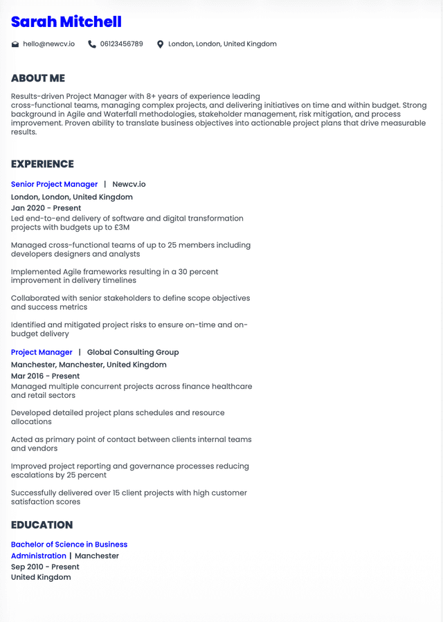
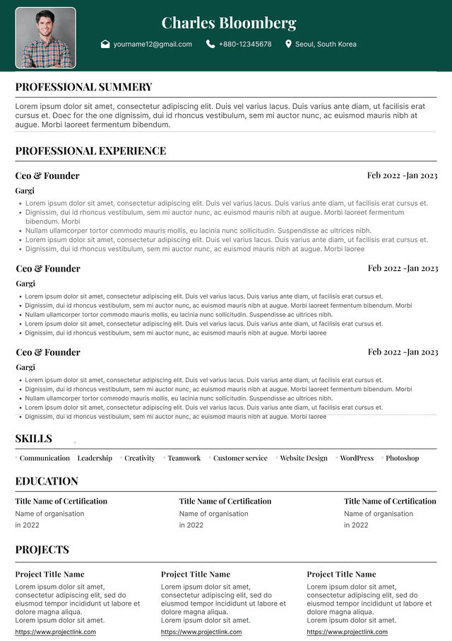
Choose from a wide range of NEWCV resume templates and customize your NEWCV design with a single click.

Use ATS-optimised Resume and resume templates that pass applicant tracking systems. Our Resume builder helps recruiters read, scan, and shortlist your Resume faster.

Use professional field-tested resume templates that follow the exact Resume rules employers look for.
Create Resume
Use professional field-tested resume templates that follow the exact Resume rules employers look for.
Create Resume•Role
• experience level
• skills
• achievements
within seconds.
If visual design slows that process, it is hurting performance.
Bottom:
Education
ATS extraction sequence becomes unpredictable.
Single-column or carefully structured layouts with clear content flow.
Predictability almost always wins.