Choose from a wide range of NEWCV resume templates and customize your NEWCV design with a single click.

Use professional field-tested resume templates that follow the exact Resume rules employers look for.
Create ResumeModern resume design is not about aesthetics.
It is about maximizing readability, ATS compatibility, and signal clarity inside a 20-second recruiter scan.
In 2026 hiring systems, resumes are:
•Parsed by automated systems
• Scored for keyword alignment
• Reviewed on desktop and mobile
• Scanned quickly for impact density
• Evaluated for seniority fit
A modern resume design must optimize for all five.
This guide explains how design decisions influence screening outcomes.
Design must support:
•Information hierarchy
• Scan efficiency
• Parsing accuracy
• Professional credibility
If design reduces clarity, it reduces ranking probability.
Minimalism outperforms decoration in most corporate environments.
High-performing modern resume layout:
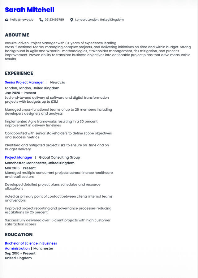
•Clear name header
• Concise professional summary
• Structured experience section
• Targeted skills block
• Education and certifications
White space is strategic.
Strong spacing improves:
•Eye tracking
• Section separation
• Cognitive processing speed
Overcrowded resumes reduce retention.
Effective typography characteristics:
•Clean sans-serif fonts
• Consistent sizing hierarchy
• Clear section headers
• Controlled bold usage
Recommended font types:
•Calibri
• Arial
• Helvetica
• Inter
Avoid:
•Script fonts
• Decorative typefaces
• Excessive font variations
Consistency signals professionalism.
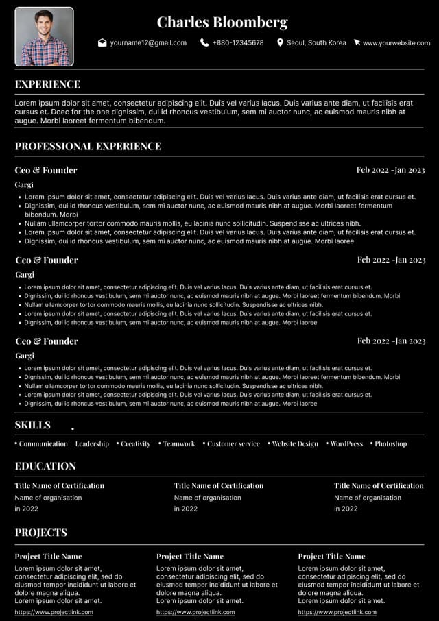
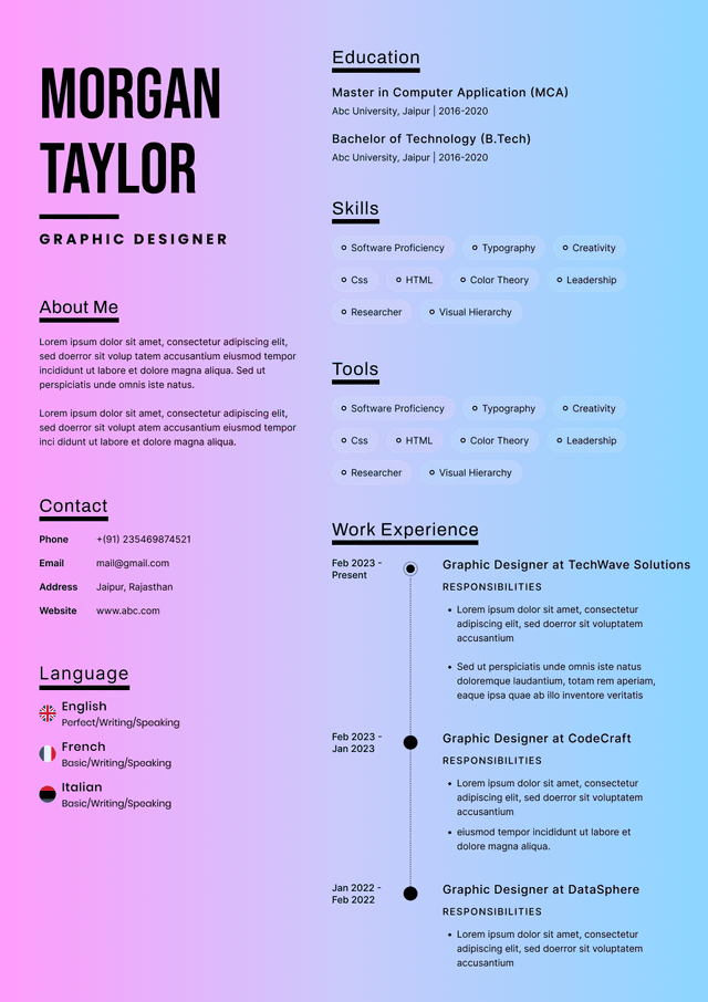
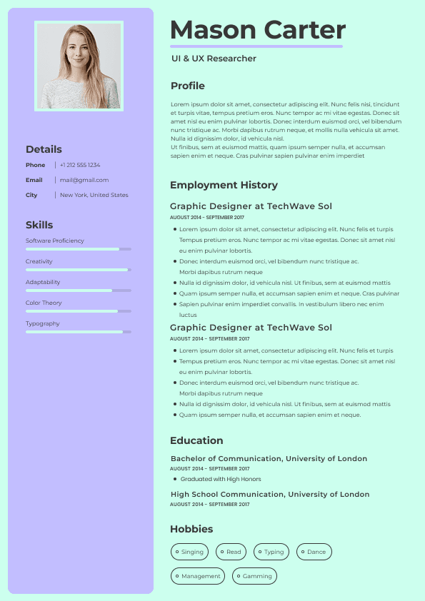
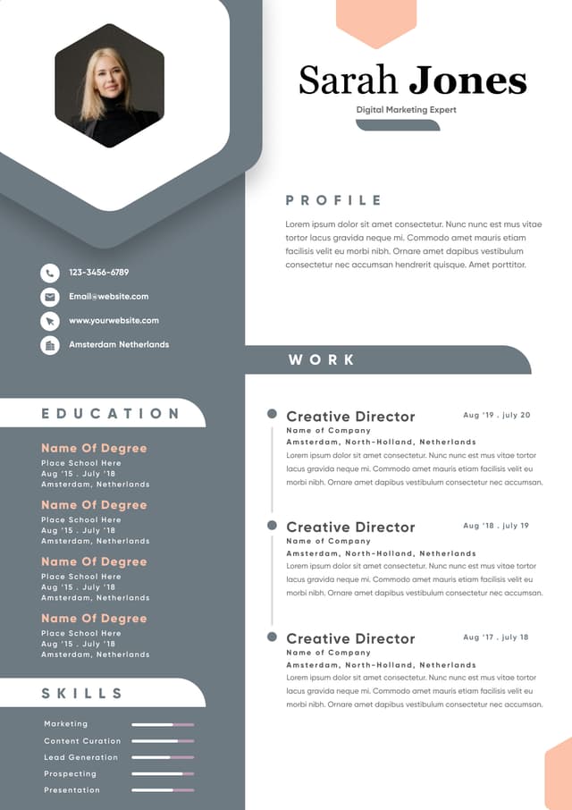
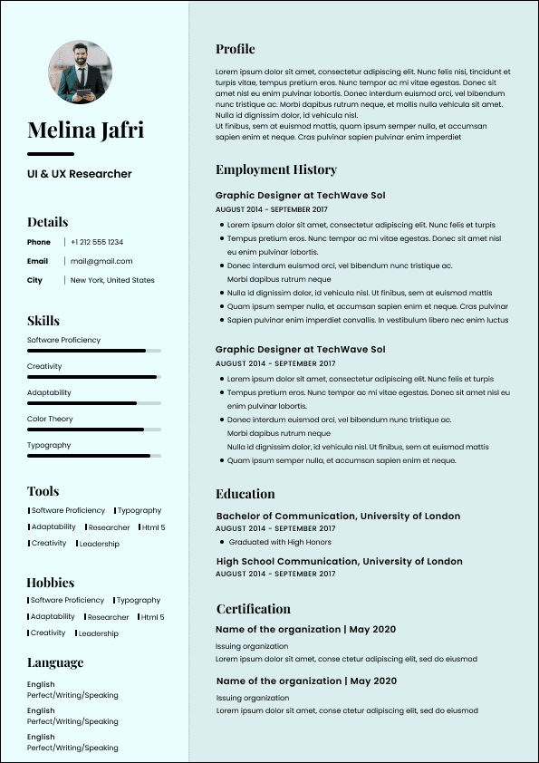
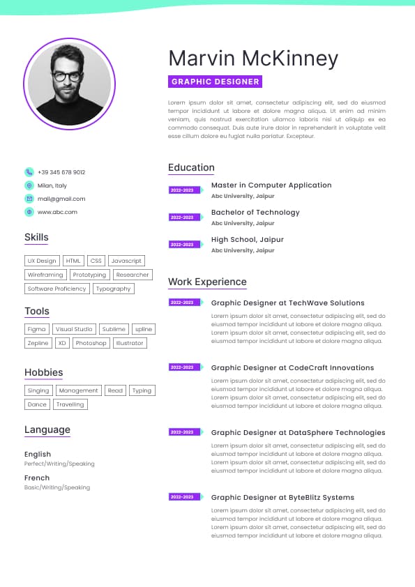
Modern resume design must avoid elements that disrupt parsing:
•Text boxes
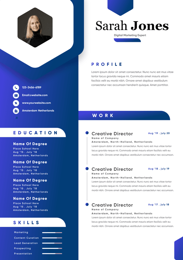
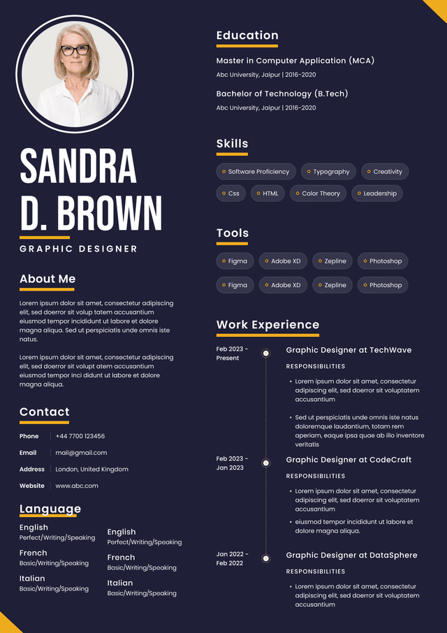
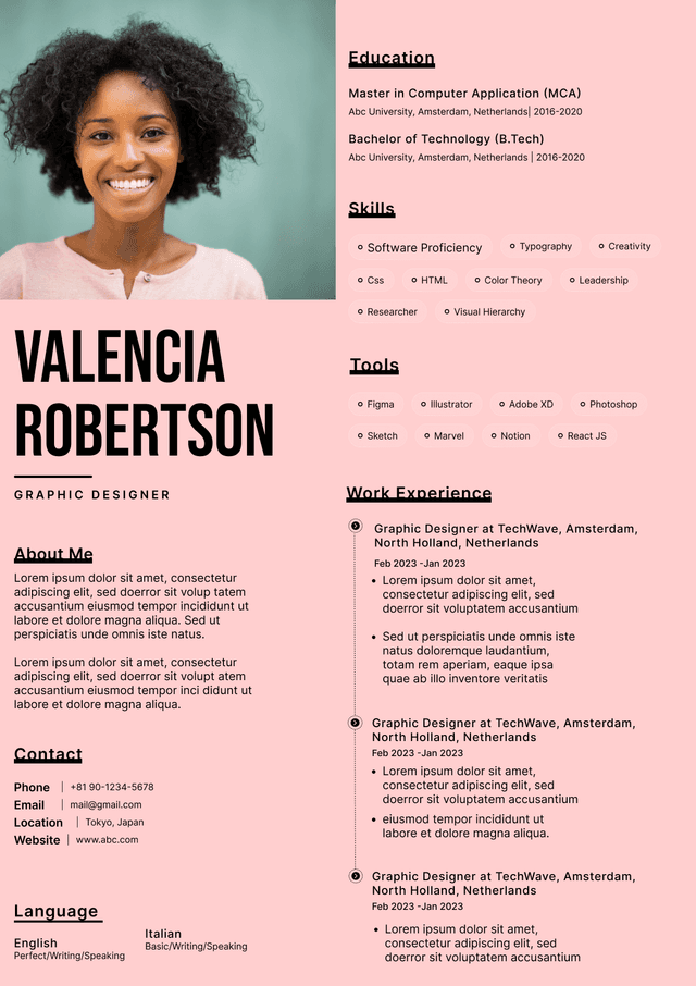
• Multi-column complexity
• Embedded graphics
• Icons replacing text
• Images containing keywords
ATS systems extract plain text.
If a keyword exists inside a graphic, it may not be indexed.
Design must never compromise machine readability.
Recruiters typically scan:
•Name and title
• Most recent job
• Measurable achievements
• Skills alignment
Design must emphasize:
•Role titles
• Company names
• Metrics
• Section headers
Use bold strategically for:
•Job titles
• Quantified results
Do not bold entire paragraphs.
Hierarchy reduces scanning friction.
Entry-Level
•Single-column layout
• Clean spacing
• 1 page
• Skills positioned clearly
Mid-Level
•Slightly expanded spacing
• Strong section separation
• 1 to 2 pages
• Clear achievement blocks
Senior-Level
•Executive summary emphasis
• Strong hierarchy
• 2 pages maximum
• Focus on strategic achievements
Executives should avoid overly stylized layouts. Authority comes from clarity, not visual flair.
Subtle color accents can be used:
•Section headers
• Name header
• Divider lines
Safe color strategy:
•Dark navy
• Charcoal
• Deep gray
Avoid:
•Bright neon colors
• Multiple color schemes
• Excessive design elements
Corporate environments favor restrained palettes.
Optimal design balance:
•0.5 to 1 inch margins
• Clear space between sections
• Bullet spacing for readability
Too-tight margins suggest overcrowding.
Excessive spacing reduces impact density.
Modern design balances density with clarity.
Preferred format:
•PDF for submission
• DOCX when specifically required
Ensure:
•File size is reasonable
• No broken formatting
• Text remains selectable
File formatting errors can nullify strong design.
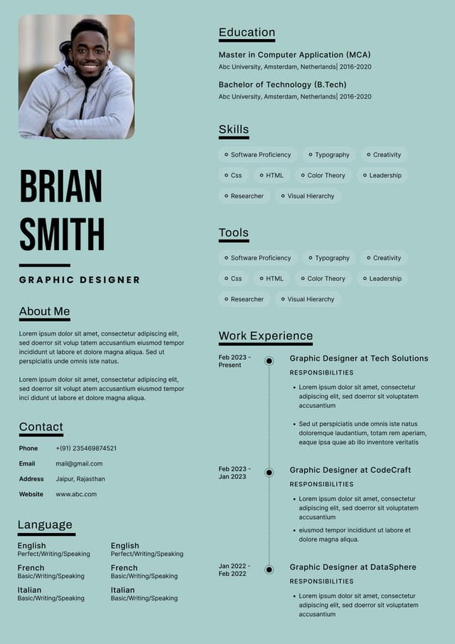
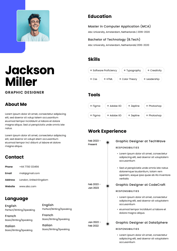
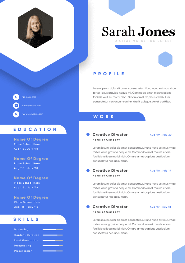
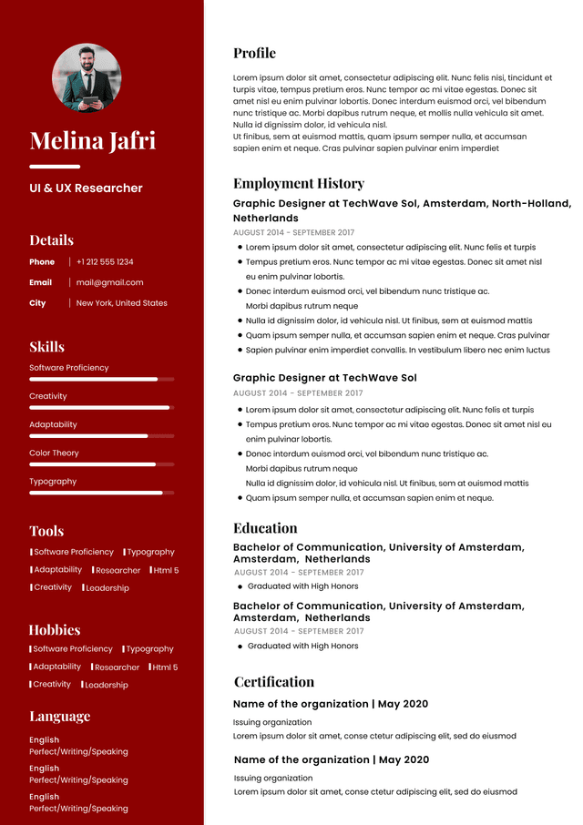
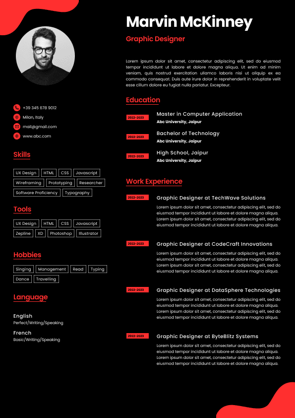
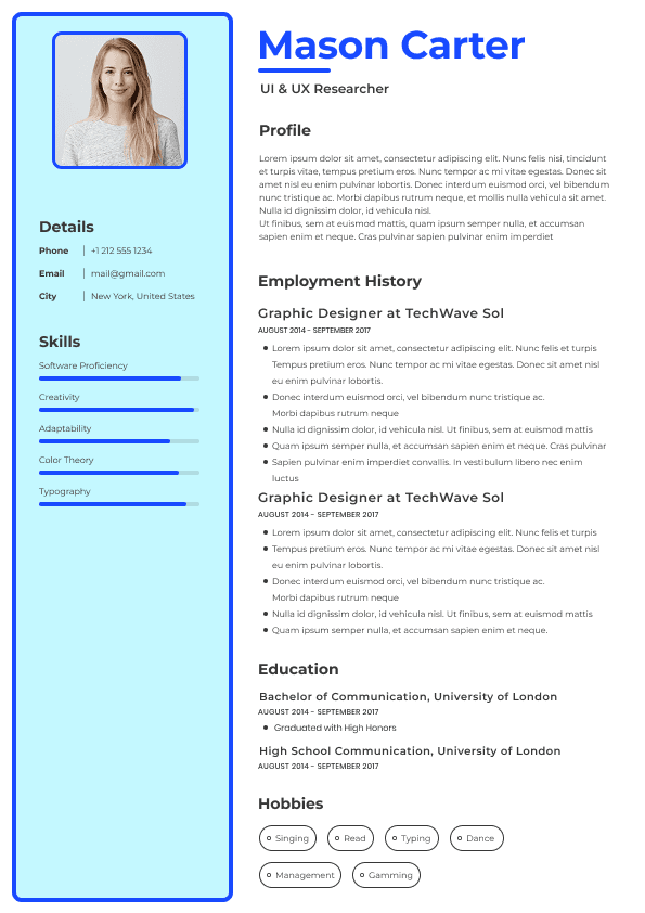
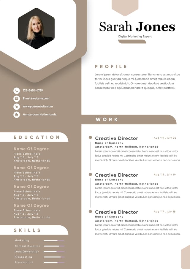
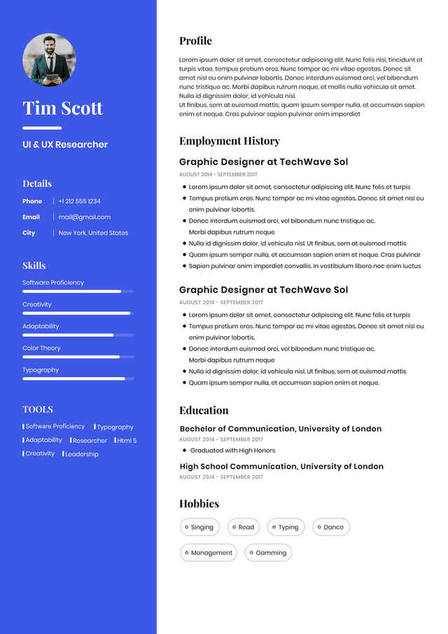
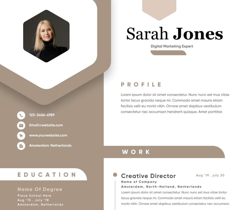
•Over-designed Canva-style templates
• Multi-column layouts that confuse ATS
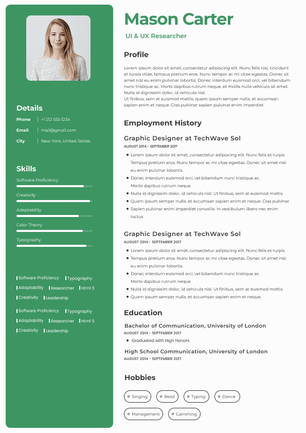
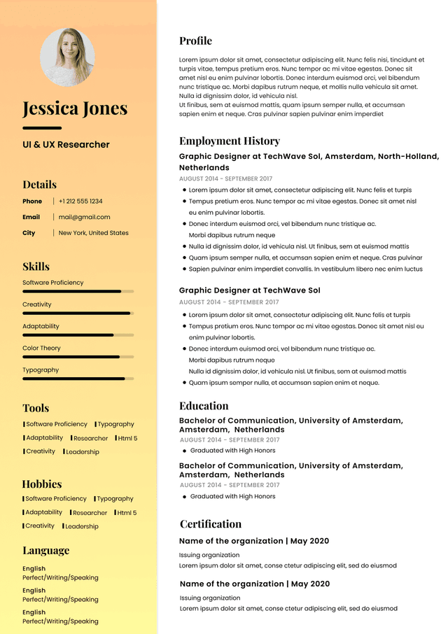
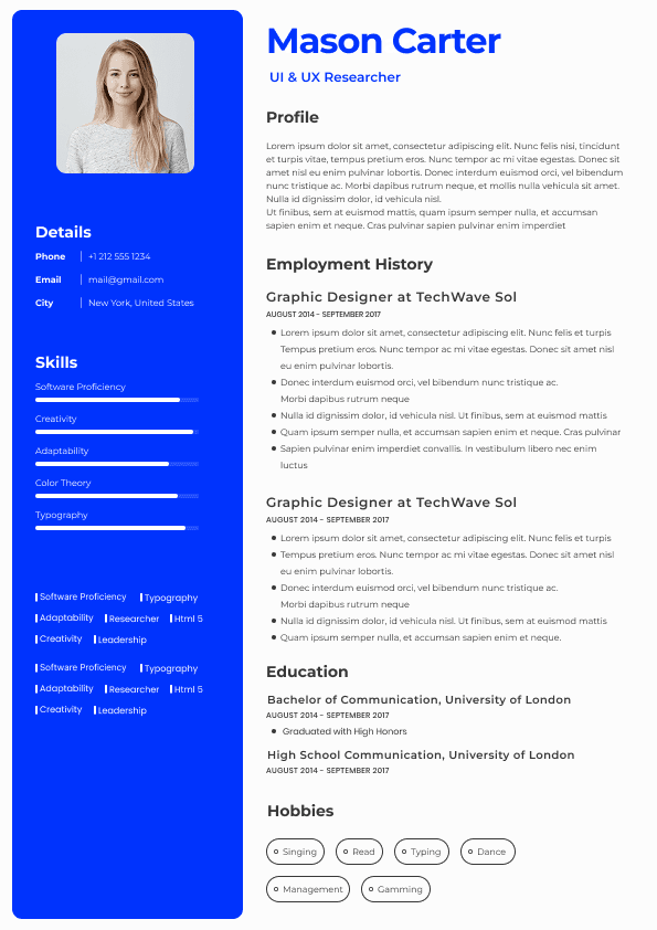
• Skill bars or rating graphics
• Excessive icon use
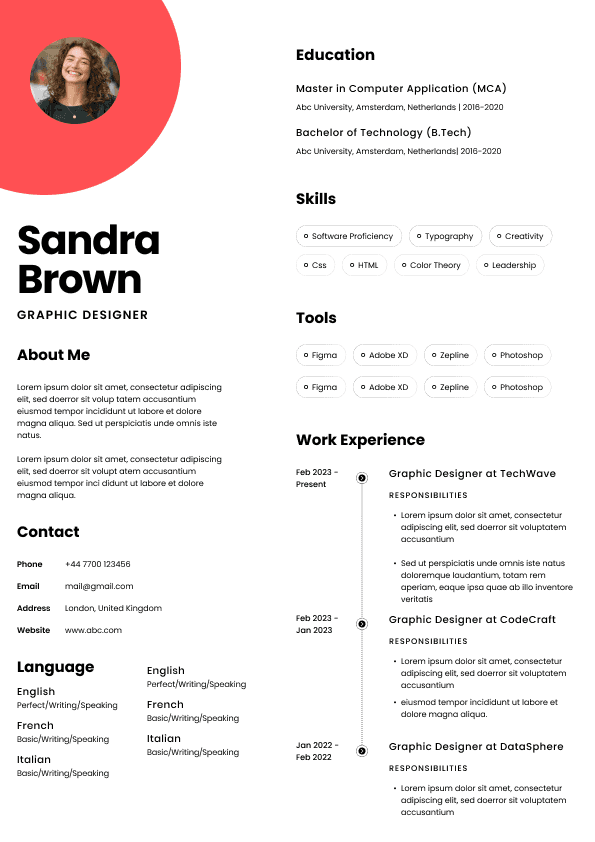
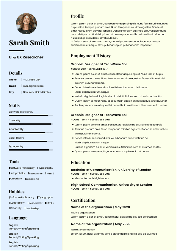
• Profile photos in markets where discouraged
Design must support content, not distract from it.
Recruiters increasingly review resumes on mobile devices.
Modern design should ensure:
•Readable font sizes
• Clear section breaks
• Avoidance of complex columns
• Clean PDF scaling
If a resume is difficult to scroll on mobile, it loses impact.
Modern resume design enhances:
•First impression
• Professional perception
• Readability
But it cannot compensate for:
•Weak achievements
• Poor keyword alignment
• No measurable results
• Lack of progression
Content remains primary. Design amplifies it.
Use ATS-optimised Resume and resume templates that pass applicant tracking systems. Our Resume builder helps recruiters read, scan, and shortlist your Resume faster.
Use professional field-tested resume templates that follow the exact Resume rules employers look for.
Create Resume