React accessibility means building applications that people can use successfully with screen readers, keyboards, voice control, high-contrast settings, magnification, and other assistive technologies. For React developers, this is not just a design preference. It affects usability, legal risk, product quality, and hiring value.
In the US job market, accessibility matters most in healthcare, government, education, enterprise SaaS, insurance, banking, FinTech, and public-facing platforms. Hiring managers increasingly expect frontend developers to understand WCAG 2.1, WCAG 2.2, ADA compliance, ARIA, semantic HTML, keyboard navigation, focus management, accessible forms, accessible modals, and testing tools like axe, Lighthouse, Wave, NVDA, VoiceOver, and Accessibility Insights.
The strongest React developers do not treat accessibility as cleanup. They build it into the frontend system from the beginning.
React accessibility is the practice of making React applications usable for people with different abilities, devices, environments, and interaction methods. It is not limited to blind users or screen readers.
A truly accessible React application supports users who may rely on:
Screen readers
Keyboard-only navigation
Voice control
Switch devices
Screen magnification
High-contrast settings
Captions and transcripts
Accessibility has become a major hiring signal because companies are under pressure to build digital products that work for everyone. In the US, ADA-related expectations, WCAG standards, enterprise procurement requirements, and internal risk management all influence how companies evaluate frontend quality.
This is especially important in industries where accessibility failures can create serious business consequences.
React accessibility is highly valued in:
Healthcare platforms where patients must access records, appointments, billing, and care instructions
Government websites where public services must be available to all citizens
Education technology where students need equal access to learning tools
FinTech and banking where users must complete secure financial workflows
Enterprise SaaS where accessibility affects large customer contracts
Insurance and benefits platforms where users depend on accurate self-service tools
WCAG stands for Web Content Accessibility Guidelines. These standards are commonly used to evaluate digital accessibility and are often referenced in ADA compliance conversations.
React developers do not need to be legal experts, but they do need to understand how WCAG affects frontend decisions.
WCAG is built around four core principles.
Users must be able to perceive the information on the page. This affects text alternatives, color contrast, captions, visible labels, readable layouts, and content structure.
For React developers, this means components should not rely only on color, icons, animation, or visual placement to communicate meaning.
Users must be able to operate the interface. This affects keyboard navigation, focus order, skip navigation, modal behavior, dropdown interaction, and timeout controls.
A React interface that works only with a mouse is not fully accessible.
Users must be able to understand what the interface does. This affects form instructions, validation messages, navigation consistency, button labels, error recovery, and predictable interaction patterns.
A user should not have to guess what will happen after taking an action.
The application must work reliably across browsers, devices, and assistive technologies. This affects semantic HTML, ARIA usage, screen reader compatibility, and standards-based component behavior.
One of the most important accessibility skills for React developers is knowing when not to overbuild.
Many accessibility issues start when developers replace native HTML behavior with custom components that look correct visually but fail for assistive technology users.
Semantic HTML helps browsers and screen readers understand what each part of the interface means.
Strong React developers use semantic structure for:
Buttons
Links
Navigation areas
Forms
Headings
Tables
ARIA stands for Accessible Rich Internet Applications. It helps communicate meaning, state, and behavior to assistive technologies when native HTML is not enough.
React developers often use ARIA for complex interface patterns such as:
Custom dropdowns
Modals
Tabs
Accordions
Comboboxes
Live status updates
Dynamic notifications
Expanded and collapsed content
Keyboard accessibility is one of the clearest indicators of whether a React application is usable beyond the visual interface.
Many users navigate websites without a mouse. Some use keyboards by preference. Others rely on keyboards because of motor disabilities, temporary injuries, assistive devices, or workplace constraints.
Accessible React applications should support:
Logical tab order
Visible focus indicators
Keyboard-operable menus
Accessible dropdowns
Modal focus trapping
Escape key support
Skip navigation links
Screen reader accessibility requires more than passing an automated audit. Tools can identify many issues, but they cannot fully confirm whether the experience makes sense to a real user.
React developers working on accessibility should understand how applications behave with:
NVDA
VoiceOver
JAWS
Browser accessibility trees
Mobile screen readers
Screen reader issues often appear in areas such as:
Missing form labels
Vague button text
The most important React accessibility work usually happens in common interface patterns. These are the areas users interact with most often and the areas audits frequently flag.
Forms should be clear, labeled, predictable, and easy to recover from when errors occur.
Accessible React forms should include:
Clear field labels
Helpful instructions
Properly connected error messages
Required field indicators that do not rely only on color
Validation that explains the problem
Keyboard-friendly field movement
Color contrast is one of the most visible accessibility requirements, but it is also one of the most commonly ignored.
Users with low vision, color blindness, aging-related vision changes, glare sensitivity, or poor screen conditions may struggle with low-contrast interfaces.
Accessible React design should avoid:
Light gray text on white backgrounds
Error states shown only in red
Disabled states that are unreadable
Placeholder text used as the only label
Focus states that are too subtle
Icons without text alternatives
Motion-heavy interactions without reduced motion support
Accessibility testing should combine automated checks, manual review, keyboard testing, and assistive technology testing.
No single tool catches everything.
Important tools include:
axe
Lighthouse
Wave
NVDA
VoiceOver
Accessibility Insights
axe is widely used in frontend accessibility testing because it identifies many common issues, including missing labels, contrast problems, ARIA misuse, and semantic structure errors.
Accessibility becomes more valuable on a resume or in an interview when it is tied to measurable outcomes.
Hiring managers care about proof. They want to know whether a developer improved the product, reduced risk, or made the application more usable.
Strong accessibility-related KPIs include:
Improved Lighthouse accessibility score
Reduced accessibility audit violations
Increased WCAG compliance coverage
Improved keyboard navigation coverage
Remediated critical screen reader issues
Standardized accessible component patterns
Reduced accessibility defects before release
Accessibility expertise improves React developer positioning because it signals practical maturity.
Recruiters often search for accessibility-related terms when sourcing frontend candidates for enterprise roles.
Common recruiter keywords include:
React accessibility
WCAG React
React ADA compliance
Accessible React components
Frontend accessibility
React ARIA
Inclusive UI
Many developers overstate accessibility experience. Hiring teams can often spot this quickly.
Weak accessibility positioning usually sounds like:
Familiar with WCAG
Knowledge of ARIA
Worked on accessible UI
Used Lighthouse
Improved accessibility
These statements are not wrong, but they are too vague to prove value.
They do not explain:
What was inaccessible
What changed
Strong accessibility experience is specific, measurable, and connected to real frontend work.
A strong React developer can explain:
How they improved keyboard navigation
How they handled focus management in complex UI flows
How they made forms easier for screen reader users
How they supported WCAG 2.1 AA or WCAG 2.2 expectations
How they tested with axe, Lighthouse, NVDA, or VoiceOver
How they worked with designers to improve contrast and interaction states
How they reduced accessibility defects across reusable components
Accessibility becomes especially important when React components are reused across multiple teams or products.
A single inaccessible component can create problems across an entire application ecosystem. A single accessible component can improve consistency, compliance, and usability across many workflows.
Enterprise design systems should define accessibility standards for:
Buttons
Inputs
Select menus
Modals
Alerts
Tables
Navigation components
Accessibility mistakes are often hidden until users complain, audits fail, or enterprise customers raise concerns.
Common mistakes include:
Treating accessibility as a final QA step
Relying only on automated tools
Ignoring keyboard navigation
Using ARIA without understanding it
Removing visible focus styles
Using color as the only error indicator
Creating custom components that break native behavior
React developers can build stronger accessibility habits by using a simple framework during planning, development, testing, and release.
Use semantic structure and native browser behavior whenever possible. Custom patterns should only be introduced when they are necessary and carefully tested.
Every interactive workflow should work without a mouse. This includes navigation, forms, dropdowns, dialogs, filters, menus, and account actions.
Automated tools are useful, but they are not enough. Screen reader and keyboard testing should be part of real workflow validation.
Users should understand what changed, what went wrong, what action succeeded, and what they should do next.
Reusable components should include accessibility standards by default so teams do not have to solve the same problem repeatedly.
Accessibility work becomes more valuable when it is measurable. Track scores, defects, audit findings, remediation progress, and compliance coverage.
Accessibility-first React developers stand out because they solve problems many teams struggle with after launch.
They build interfaces that are more usable, more compliant, easier to test, and more scalable.
In interviews, this experience communicates several high-value traits:
Product awareness
Technical maturity
Attention to detail
User empathy
Enterprise readiness
Cross-functional collaboration
Risk reduction mindset
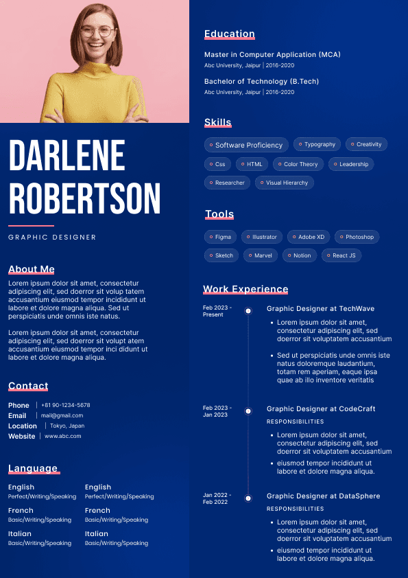
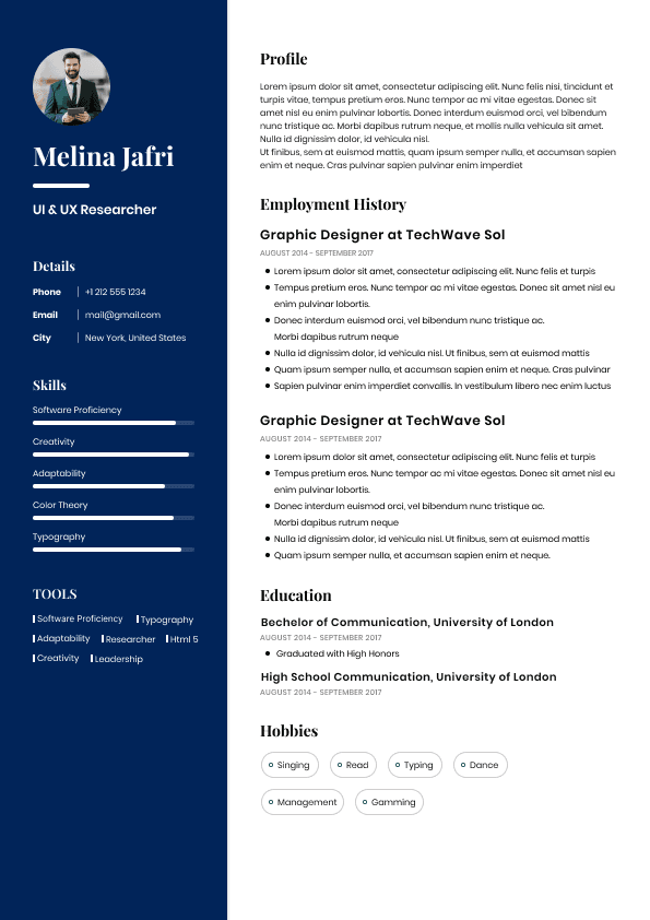
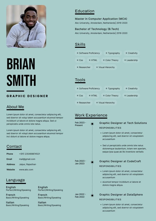
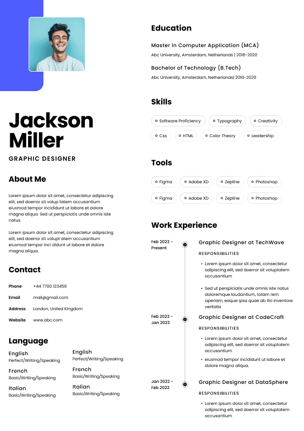
Choose from a wide range of NEWCV resume templates and customize your NEWCV design with a single click.

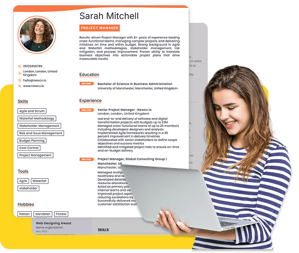
Use ATS-optimised Resume and resume templates that pass applicant tracking systems. Our Resume builder helps recruiters read, scan, and shortlist your Resume faster.

Use professional field-tested resume templates that follow the exact Resume rules employers look for.
Create Resume
Use professional field-tested resume templates that follow the exact Resume rules employers look for.
Create ResumeReduced motion preferences
Clear error messaging
Predictable interface behavior
For frontend teams, accessibility is a product-quality discipline. It affects how components are structured, how state changes are communicated, how forms behave, how modals open and close, how tables are interpreted, and how users move through the interface without a mouse.
A React app can look polished and still be inaccessible. Recruiters and hiring managers know this difference matters because visual quality alone does not prove production readiness.
E-commerce where inaccessible checkout flows directly reduce revenue
From a recruiter’s perspective, accessibility experience helps separate a general React developer from a frontend engineer who understands enterprise delivery standards.
This is where React developers often run into trouble when custom components replace native browser behavior without preserving accessibility.
Lists
Main content regions
Dialogs
Field groups
Semantic HTML improves accessibility, maintainability, testing accuracy, and SEO. It also reduces the need for unnecessary ARIA.
From a hiring manager’s perspective, a developer who understands semantic HTML usually writes cleaner, more reliable frontend code. That matters in large React applications where components are reused across many workflows.
Error descriptions
Interactive data displays
ARIA can improve accessibility when it is used correctly. It can also make accessibility worse when it is used carelessly.
A common mistake is using ARIA as a shortcut instead of fixing the underlying structure. Recruiters may not test this directly, but technical interviewers and accessibility-focused hiring managers often do. Candidates who claim ARIA experience should be able to explain when ARIA is needed, when native HTML is better, and how assistive technologies interpret state changes.
The best rule for React developers is simple: use native semantics first, then use ARIA only when it adds necessary meaning.
Predictable focus return
Clear active states
No keyboard traps
Focus management is especially important in single-page React applications because content often changes without a full page reload. When a modal opens, focus should move into it. When it closes, focus should return to the element that opened it. When routes change, users relying on screen readers should not be left disoriented.
This is one of the areas where experienced frontend engineers stand out. They think about how the user moves through the application, not just how the interface looks.
Incorrect heading order
Hidden content being announced
Dynamic updates not being announced
Modals that do not identify themselves properly
Navigation menus that lack clear state
Error messages that are visually present but not announced
A React developer who has tested with actual screen readers brings more credibility than one who only relies on accessibility scores. In hiring, this difference matters because enterprise teams need people who can identify real user experience problems, not just satisfy a checklist.
Error summaries for complex forms
Logical grouping for related fields
Forms are especially important in healthcare, banking, job applications, insurance, education, and government services because users often complete high-stakes tasks.
Modals are a common source of accessibility failures. A good modal should communicate its purpose, move focus correctly, prevent background interaction, support keyboard dismissal when appropriate, and return the user to the right place after closing.
Poor modal behavior creates confusion for keyboard and screen reader users. In enterprise products, this can block users from completing core workflows.
Tables matter heavily in dashboards, admin systems, financial platforms, healthcare records, analytics tools, and enterprise software.
Accessible tables need clear structure, readable headers, logical relationships, and meaningful labels. When tables become responsive, developers must ensure that mobile layouts do not destroy the relationships between data and labels.
Navigation should be consistent, predictable, and usable without a mouse. Skip navigation links, landmarks, meaningful link text, and clear active states help users move through the product efficiently.
Navigation accessibility is especially important in large React applications with many routes, dashboards, or account workflows.
Inclusive UI is not about making products plain. It is about making products usable, understandable, and reliable for more people.
Design systems often solve this at scale by defining accessible color tokens, typography rules, focus states, spacing patterns, and component behavior standards.
Lighthouse provides an accessibility score and highlights high-level issues. It is useful for tracking improvement, but it should not be treated as a complete accessibility audit.
Wave gives visual feedback on accessibility problems and is useful for reviewing page structure, labels, contrast, and landmarks.
Screen reader testing reveals problems automated tools cannot fully detect. React developers who know how to test real workflows with NVDA or VoiceOver are more valuable in enterprise environments.
Accessibility Insights helps teams run guided checks and identify WCAG-related issues more systematically.
The strongest frontend teams use accessibility testing throughout development, not only before release.
Improved form completion usability
Supported enterprise accessibility requirements
These outcomes are stronger than vague claims like “familiar with accessibility” or “worked on inclusive design.”
A candidate who can explain the business impact of accessibility will usually stand out more than one who only lists tools.
Accessibility-first development
Accessibility audits
Semantic HTML
Screen reader testing
Keyboard navigation
Lighthouse accessibility
The strongest candidates do not just list these keywords. They connect them to outcomes.
Strong positioning focuses on:
What accessibility problems were solved
Which standards or tools were used
What workflows were improved
How the work reduced risk or improved usability
Whether the solution scaled across components or teams
This matters because accessibility is not just a technical topic. It is a business-critical frontend capability.
What standard was followed
What tools were used
How the user experience improved
Whether the solution held up in production
A hiring manager wants to hear how the developer thinks. Accessibility is not only about terminology. It is about judgment.
How they balanced design requirements with inclusive usability
This is the level of detail that helps recruiters and hiring managers trust the candidate’s experience.
Tabs
Accordions
Tooltips
Error states
Loading states
Toast messages
React developers who understand accessibility at the design system level are often stronger candidates for senior frontend roles.
They are not just fixing isolated bugs. They are helping teams prevent accessibility problems from spreading.
Forgetting screen reader testing
Building modals without proper focus behavior
Designing forms without clear labels or error recovery
Assuming accessibility is only the designer’s responsibility
The biggest mistake is thinking accessibility belongs to someone else. In modern frontend teams, React developers own a large part of the accessible user experience.
Strong frontend fundamentals
Hiring managers want frontend developers who understand that a working feature is not complete until users can actually use it.
That is why React accessibility is becoming one of the most valuable skills for developers who want stronger enterprise, healthcare, government, education, and FinTech opportunities.


 Upload Resume
 Import from Linkedin