Choose from a wide range of NEWCV resume templates and customize your NEWCV design with a single click.


Use professional field-tested resume templates that follow the exact Resume rules employers look for.
Create ResumeMost resume design mistakes do not get candidates rejected because they are "ugly." They hurt because they signal poor judgment, weak business communication skills, or a lack of understanding of professional norms. Recruiters often spend only a few seconds on an initial scan. During that first pass, visual design acts as a credibility filter before your experience is even evaluated.
The reality: hiring teams rarely say, "We rejected this candidate because of font choices." Instead, they think:
This looks difficult to read
This feels unprofessional
This candidate lacks attention to detail
This resume feels outdated
Something feels off
Those reactions create friction. Friction lowers interview rates.
The strongest resumes do not try to impress through design. They reduce cognitive load, improve readability, and immediately establish trust.
Recruiters review resumes under pressure. They scan dozens or even hundreds in a sitting.
Their brain is unconsciously asking:
Can I understand this quickly?
Is this candidate organized?
Does this presentation reflect workplace standards?
Does this person understand professional communication?
Resume design becomes a proxy for workplace behavior.
A cluttered, inconsistent resume often creates assumptions:
Poor attention to detail
Weak prioritization skills
Difficulty organizing information
Inexperience with business expectations
Fair or unfair, hiring works through rapid pattern recognition.
Strong candidates lose interviews because presentation created unnecessary doubt.
One of the biggest mistakes candidates make is assuming visual complexity equals quality.
Many downloadable templates prioritize aesthetics over hiring outcomes.
Common offenders include:
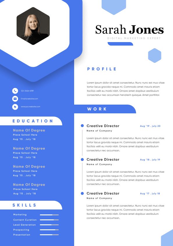
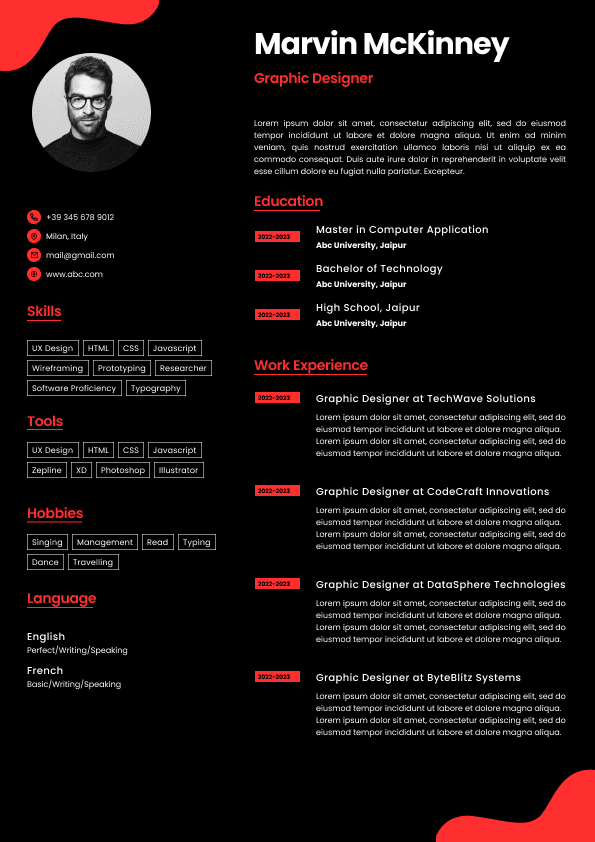
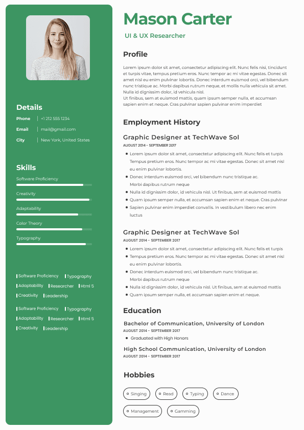
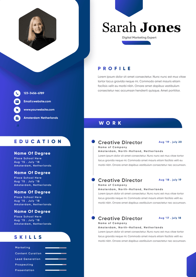
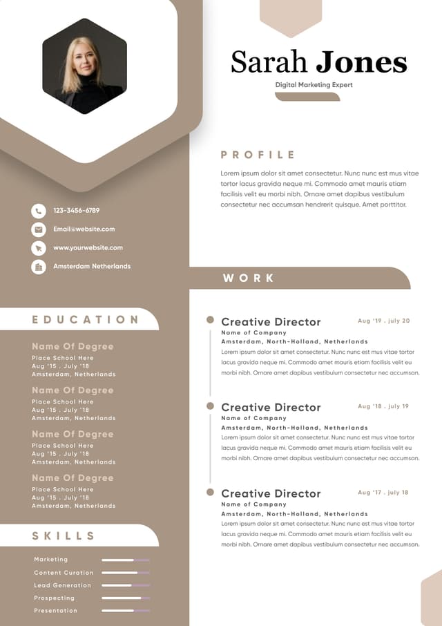
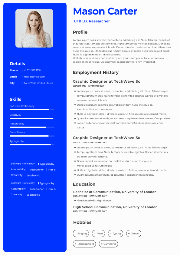
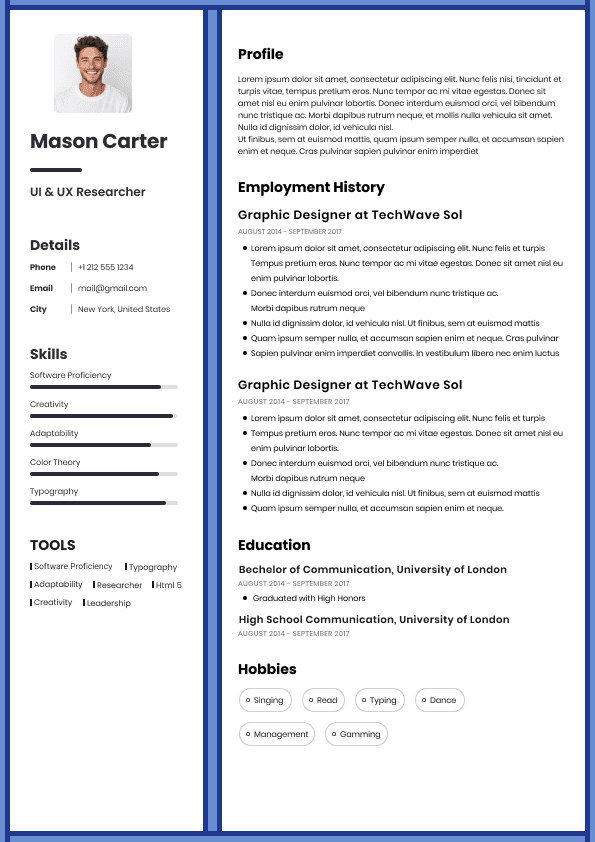
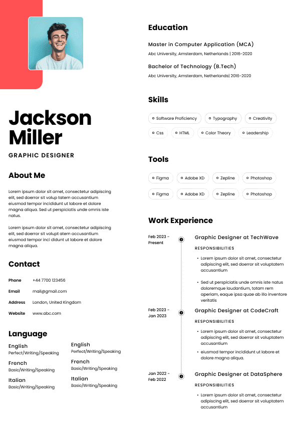
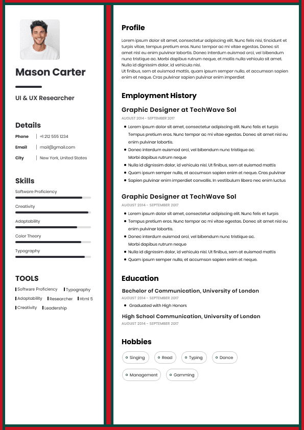
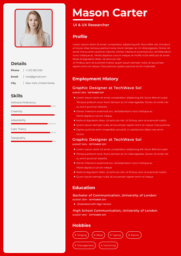
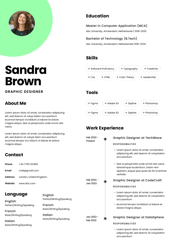
Colored sidebars
Timeline graphics
Skill meters
Progress bars
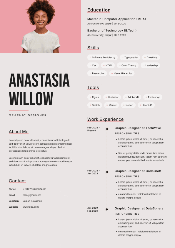
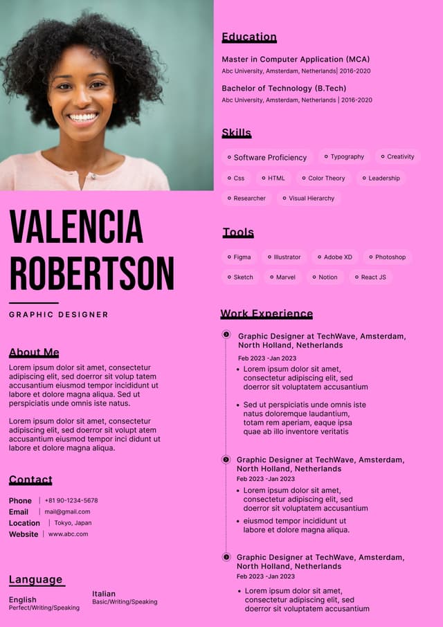
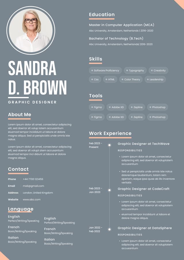
Multiple-column layouts
Heavy visual elements
Infographic resumes
These often look impressive on Pinterest or design marketplaces.
Recruiters usually hate them.
Why?
Because they create scanning friction and frequently break Applicant Tracking Systems.
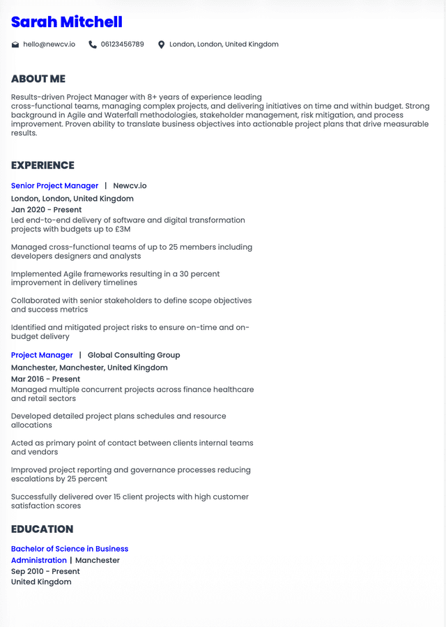
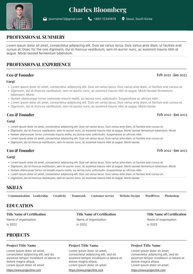
Simple hierarchy:
Name and contact information
Professional summary if relevant
Experience
Skills
Education
Minimal distractions.
The best resume often looks less exciting than candidates expect.
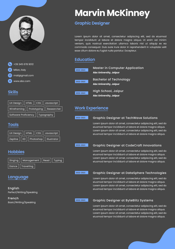
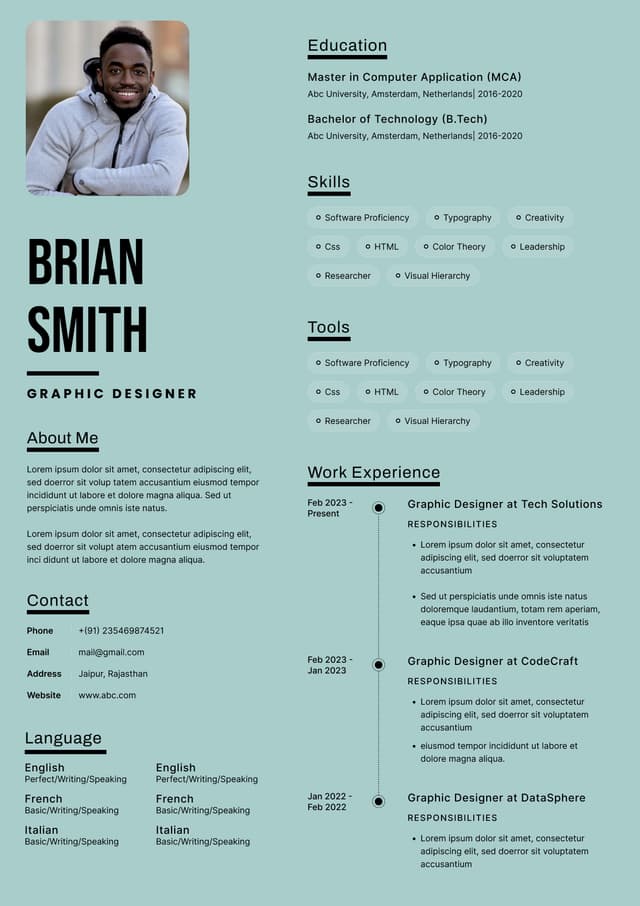
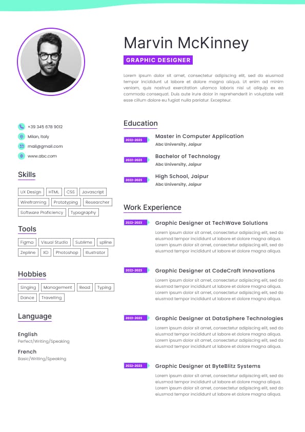
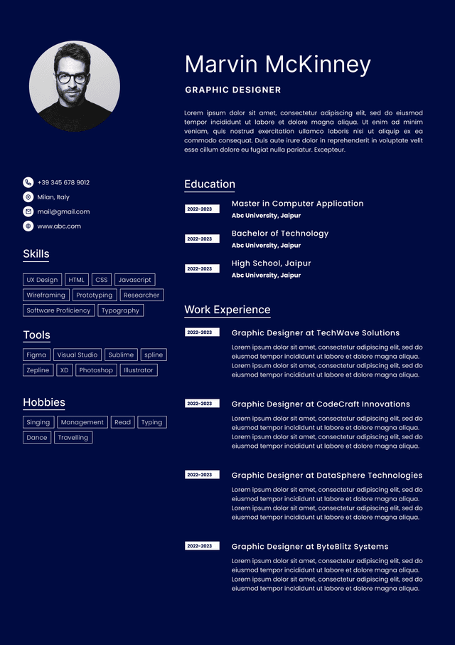
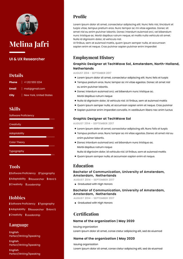
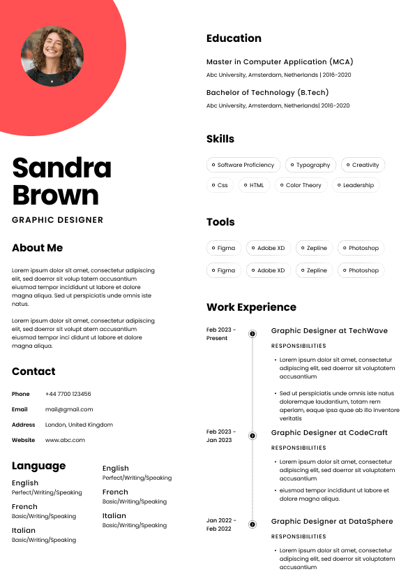
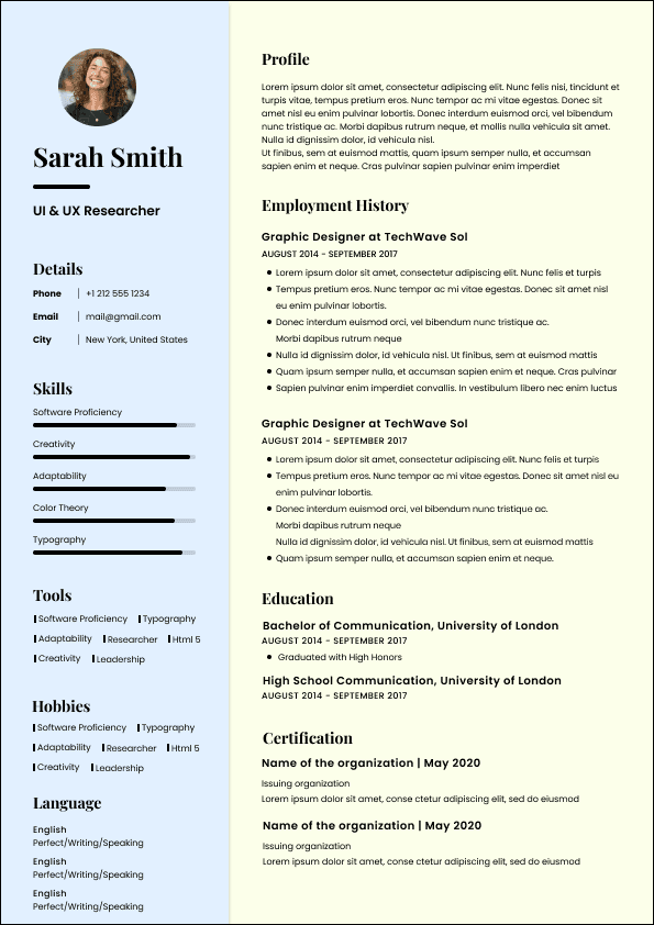
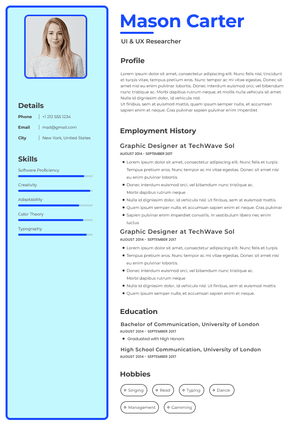
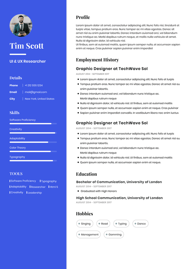
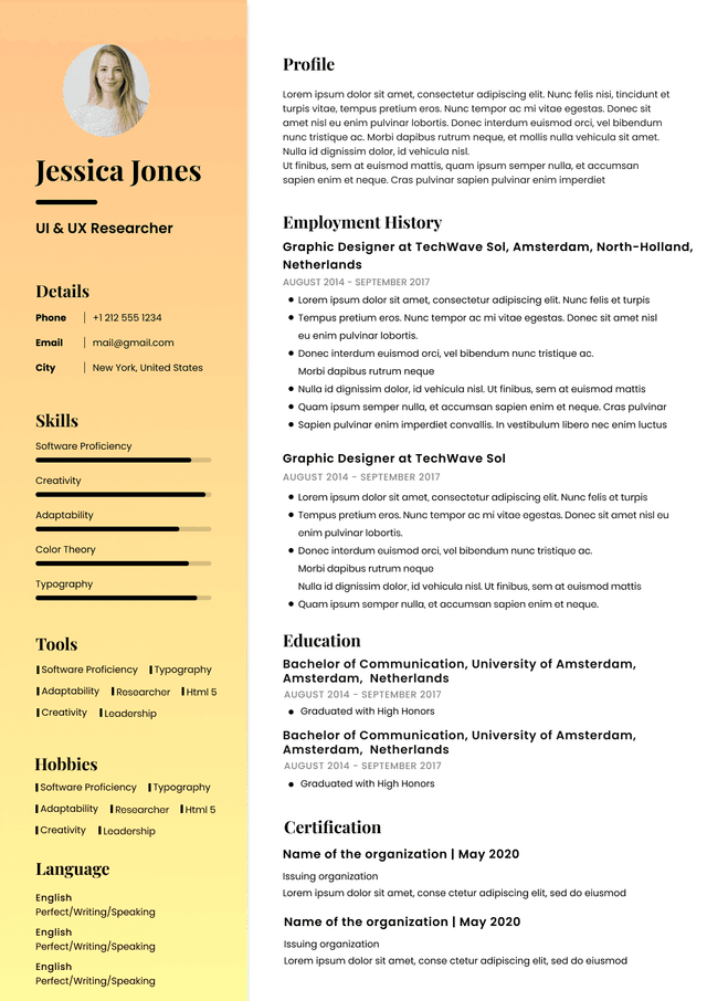
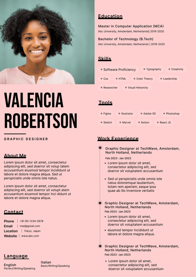
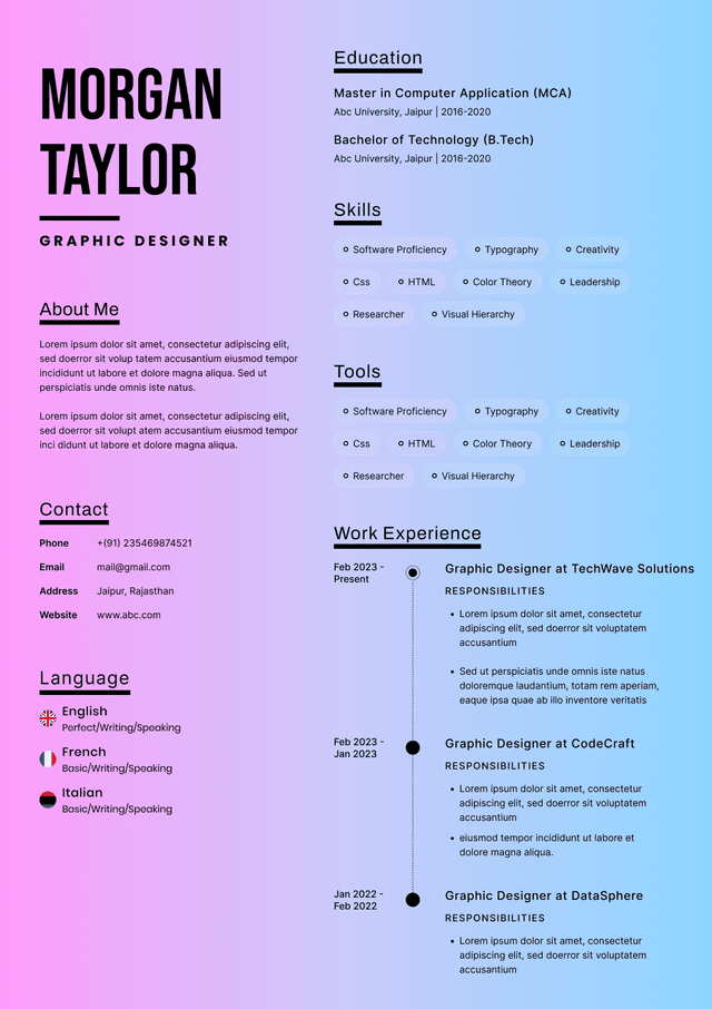
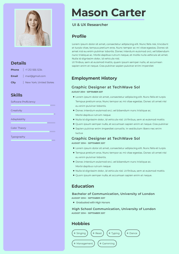
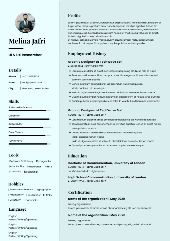
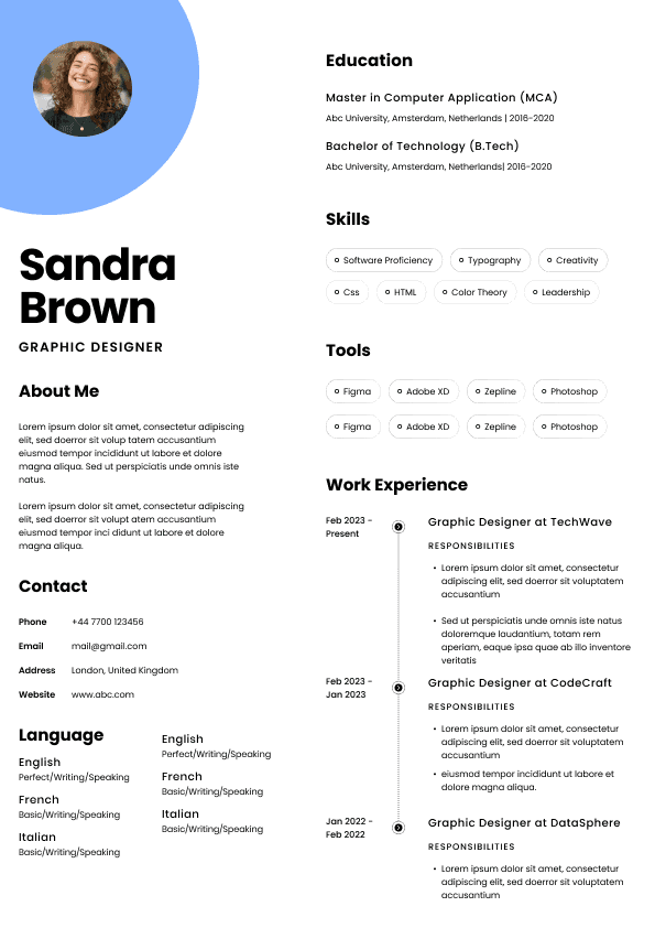
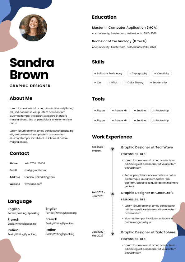
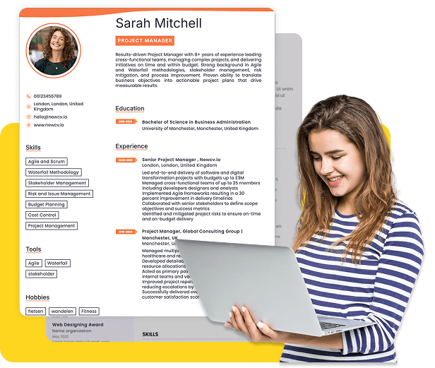
Two-column layouts are one of the most common credibility killers.
Candidates use them because they seem modern.
The problem:
Human readers and ATS systems process information left to right and top to bottom.
When information appears in separate columns, several problems happen:
Reading sequence becomes confusing
Important experience gets overlooked
ATS parsing errors increase
Content hierarchy weakens
Recruiters do not want to solve a visual puzzle.
They want immediate understanding.
Left column:
Skills
Certifications
Languages
Right column:
Work history
Now the reader constantly shifts eye movement across the page.
Single-column structure with clear hierarchy and spacing.
Scanning becomes effortless.
Ease creates credibility.
Candidates often underestimate how strongly typography influences perception.
Certain fonts immediately feel less professional.
Examples include:
Script fonts
Decorative fonts
Handwritten styles
Unusual artistic fonts
Even if readable, they create subconscious reactions.
Recruiters associate business professionalism with familiar typography patterns.
Safer choices include:
Calibri
Arial
Aptos
Helvetica
Georgia
Cambria
The goal is not personality.
The goal is friction reduction.
A recruiter should notice your experience, not your font.
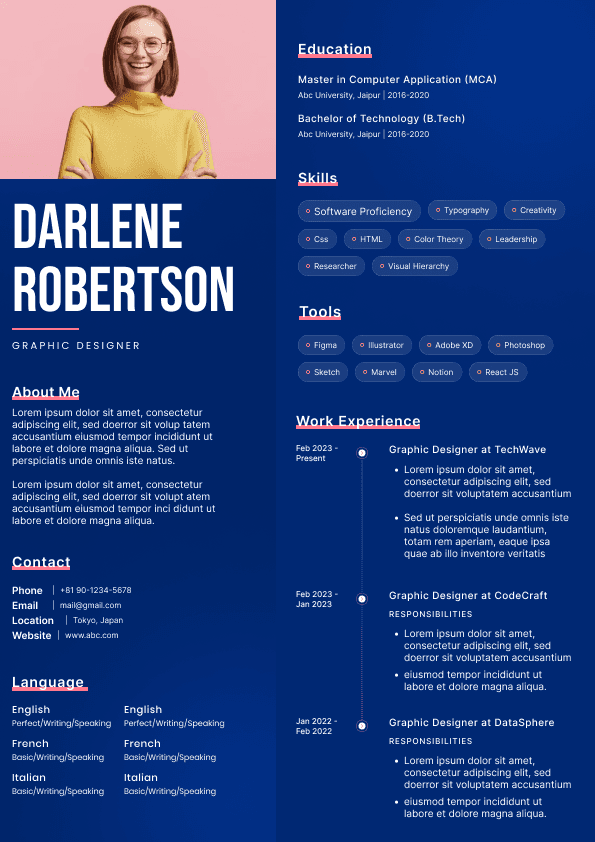
Color itself is not the problem.
Poor use of color is.
Candidates often use:
Bright blues
Orange highlights
Red accents
Multiple color combinations
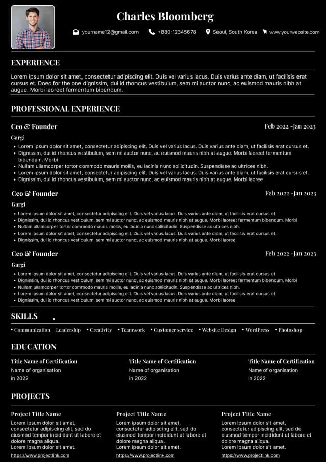
Dark background sections
Problems emerge quickly:
Reduced readability
Printing issues
Visual clutter
Less professional appearance
One subtle accent color is usually enough.
Even then, use it sparingly.
Strong candidates rarely need visual decoration to communicate competence.
Many candidates try to fit everything onto one page.
Their solution:
Reduce font size until content barely fits.
Recruiters immediately notice.
Common issues:
9-point fonts
Extremely compressed spacing
Dense blocks of text
Tiny margins
This creates visual fatigue.
If recruiters need effort to read your resume, they often move on.
Better approach:
Cut weak content instead of shrinking readability.
Body text: 10.5–12 pt
Headings: 13–16 pt
Comfortable white space
Readability beats squeezing in extra details.
Large paragraphs create an immediate negative reaction.
Recruiters skim.
Dense blocks force heavy reading effort.
Managed several projects involving operational responsibilities across multiple departments and collaborated with various teams while contributing to several initiatives and helping improve workflow systems.
This says almost nothing.
Led cross-functional projects across four departments
Reduced process delays by 25%
Improved workflow efficiency through automation initiatives
Cleaner structure.
More credibility.
Better outcomes.
Recruiters notice inconsistency quickly.
Examples:
Different date formats
Random capitalization
Uneven spacing
Misaligned bullets
Multiple font styles
Varying heading sizes
Candidates often think:
"No one notices."
Recruiters absolutely notice.
Because inconsistencies suggest:
Lack of quality control
Rushed work
Weak attention to detail
Hiring managers often assume resumes represent your best effort.
If formatting feels careless, concerns appear.
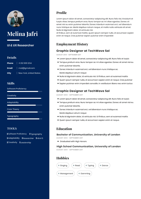
This mistake has become extremely common.
Examples:
Java ████████
Leadership ███████
Excel ██████████
The problem:
Recruiters immediately wonder:
Compared to what?
Who decided these ratings?
What does 80% leadership mean?
Self-scoring systems create skepticism.
Replace them with evidence.
Instead of:
Leadership: 9/10
Write:
Instead of:
Excel: Advanced
Write:
Proof beats ratings.
Always.
Many resume designs include:
Charts
Icons
Visual timelines
Symbols
Graphic headers
These frequently create parsing problems.
ATS systems may:
Misread content
Ignore information
Rearrange sections incorrectly
Candidates blame the system.
Often the design caused the issue.
Modern resumes should prioritize functionality over visual decoration.
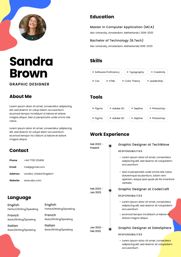
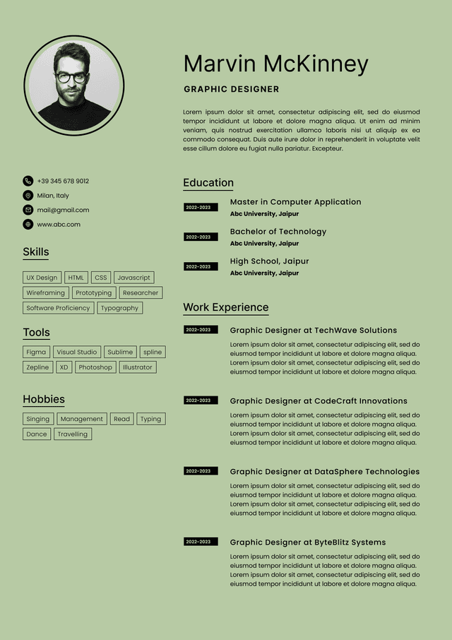
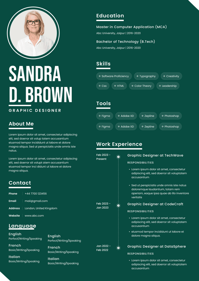
In the U.S. job market, resume photos are generally discouraged.
Candidates sometimes include photos because:
International norms differ
Templates include placeholders
LinkedIn profiles use photos
But many recruiters prefer no photo.
Reasons include:
Potential bias concerns
Distraction from qualifications
Unnecessary space usage
U.S. hiring norms
Unless specific industries request images, avoid them.
Professional credibility comes from experience presentation, not appearance.
Candidates think recruiters ask:
"Is this resume attractive?"
That is rarely the question.
The real questions:
Can I identify value quickly?
Can I understand career progression immediately?
Does this candidate communicate clearly?
Does this presentation feel trustworthy?
Strong design reduces thinking.
Weak design creates work.
Recruiters consistently reward easier experiences.
Before submitting a resume, evaluate it using this practical screening framework.
Ask:
Can someone scan this in 7 seconds?
Does formatting look consistent throughout?
Does reading feel effortless?
Are visuals competing with content?
Does experience stand out more than design?
Would this feel normal inside a Fortune 500 hiring process?
If design attracts more attention than accomplishments, the balance is wrong.
Strong resumes share similar characteristics:
Clean structure
Predictable hierarchy
Consistent spacing
Clear section separation
Minimal design distractions
Readable typography
Results-focused bullet points
Professional design feels invisible.
The candidate becomes the focus.
That is the goal.
Use ATS-optimised Resume and resume templates that pass applicant tracking systems. Our Resume builder helps recruiters read, scan, and shortlist your Resume faster.
Use professional field-tested resume templates that follow the exact Resume rules employers look for.
Create Resume