Recruiters rarely reject candidates because of experience alone. They reject resumes they cannot scan quickly. Modern hiring workflows are built around speed: recruiters often spend seconds on an initial pass, ATS systems parse content before humans see it, and hiring teams compare dozens or hundreds of applications simultaneously.
The layouts recruiters dislike usually have the same problems: overloaded designs, hard-to-read structures, hidden information, visual gimmicks, and formatting choices that slow decision-making. A resume can look impressive yet quietly hurt readability, ATS performance, and recruiter confidence.
The issue isn't design itself. It's workflow friction.
The strongest resume layouts reduce cognitive effort. They make skills, experience, achievements, and qualifications instantly visible. The best-performing resumes balance visual polish with machine readability and recruiter efficiency.
This guide breaks down the resume layouts recruiters consistently dislike, why they fail in real hiring workflows, and what high-performing resume structures do differently.
Most people think recruiters judge resumes based on aesthetics.
That is only partially true.
Recruiters evaluate usability.
During active hiring cycles, recruiters move through large applicant pools quickly. Their workflow is not:
"Read every resume carefully."
Their workflow is:
"Can I identify fit immediately?"
Layouts fail when they interrupt that process.
Common recruiter workflow questions include:
•What role does this person want?
• Do they have relevant experience?
• What companies have they worked for?
• What skills matter?
• What results have they produced?
• Is this candidate worth deeper review?
If the resume structure slows these answers, frustration begins.
That frustration often becomes rejection.
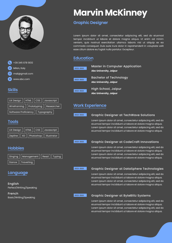
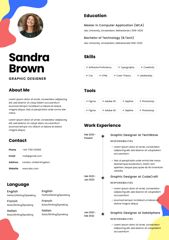
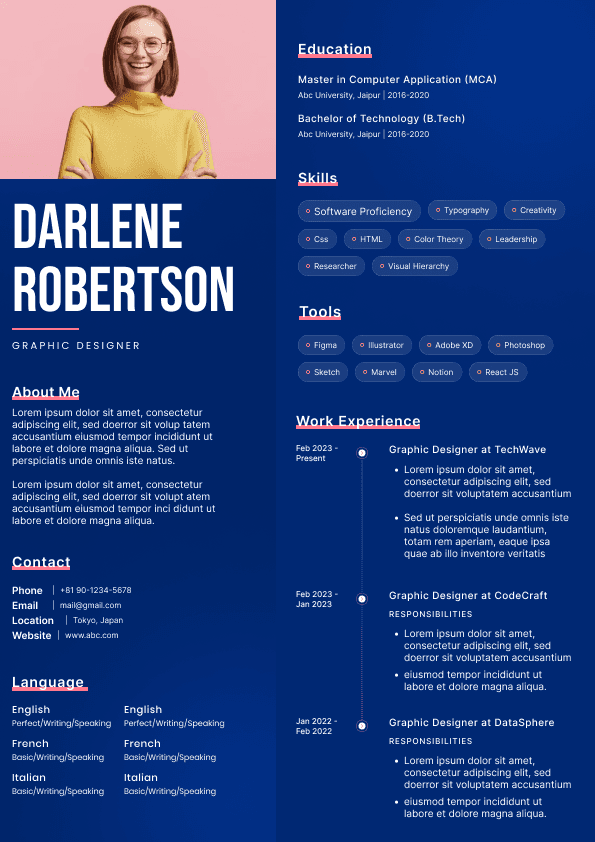
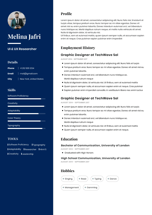
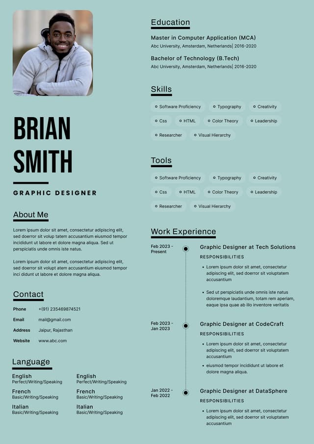
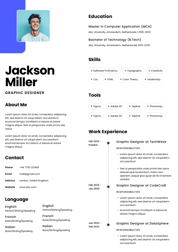
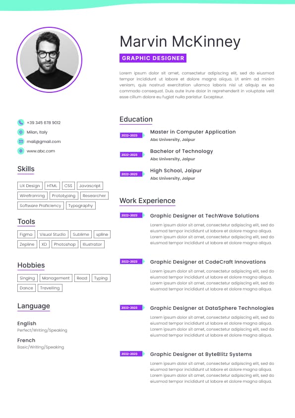
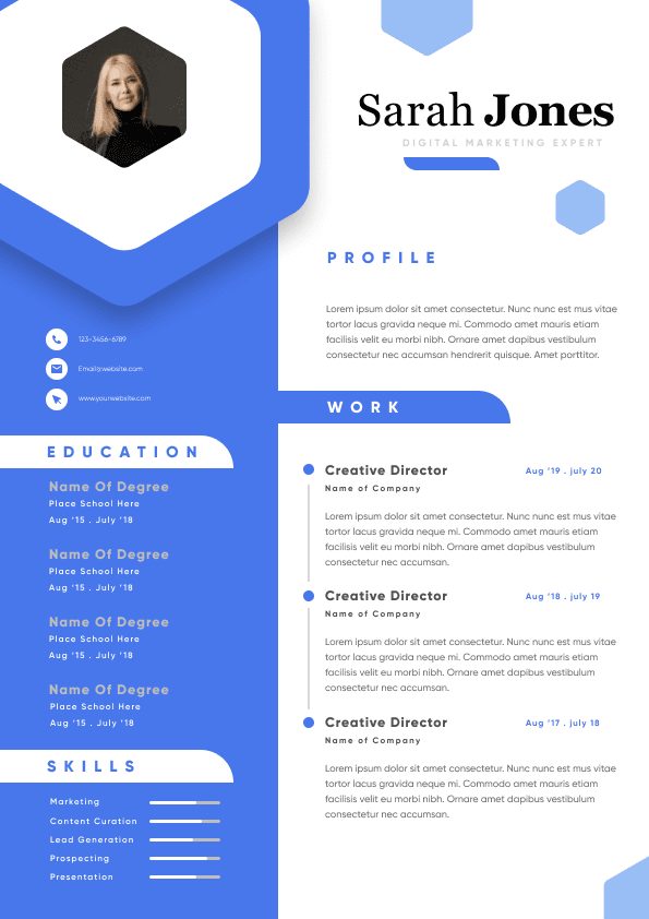
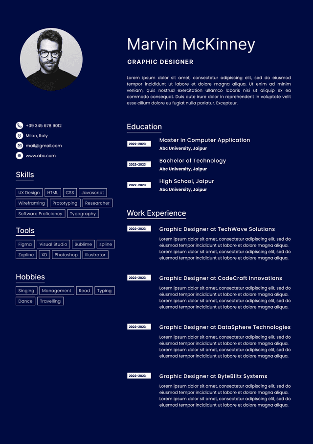
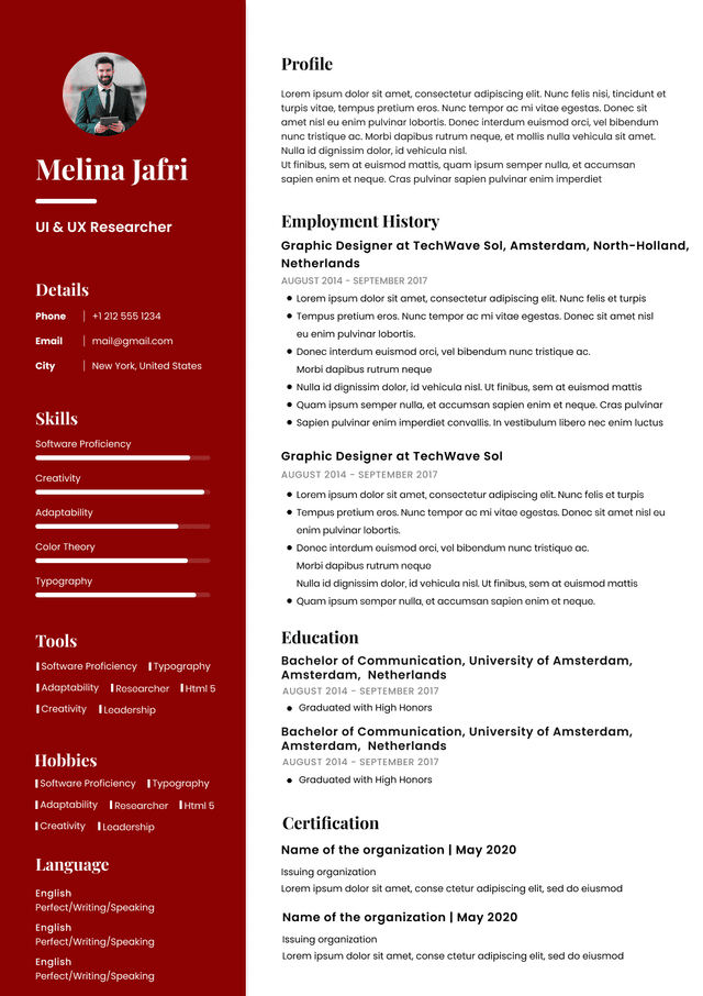
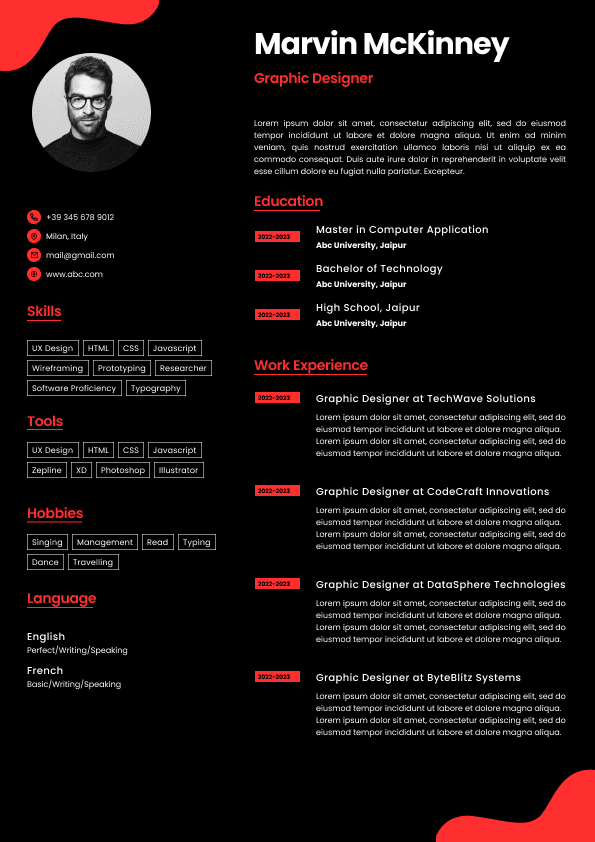
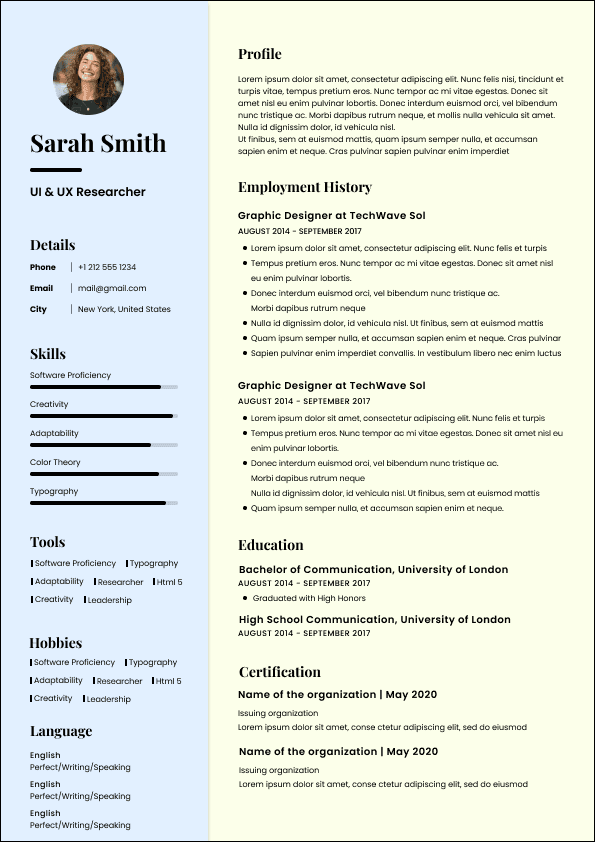
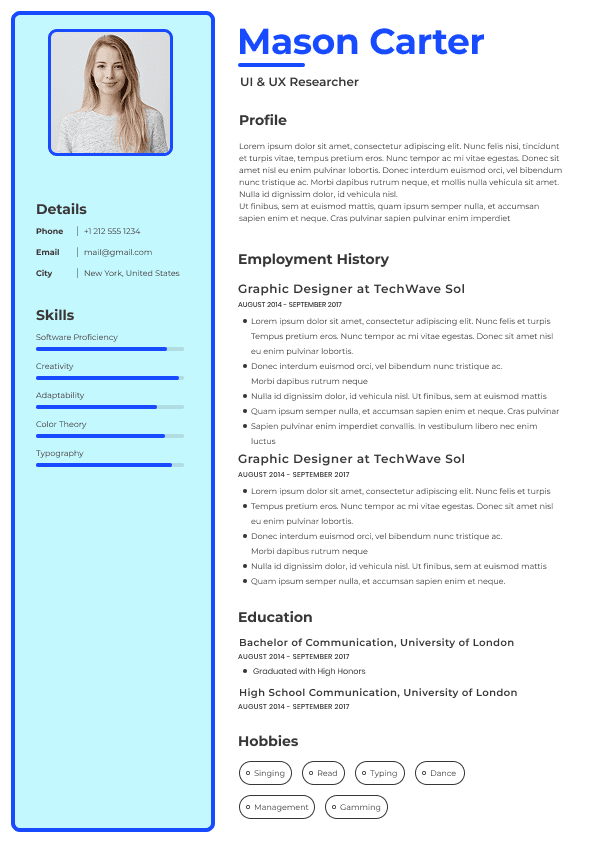
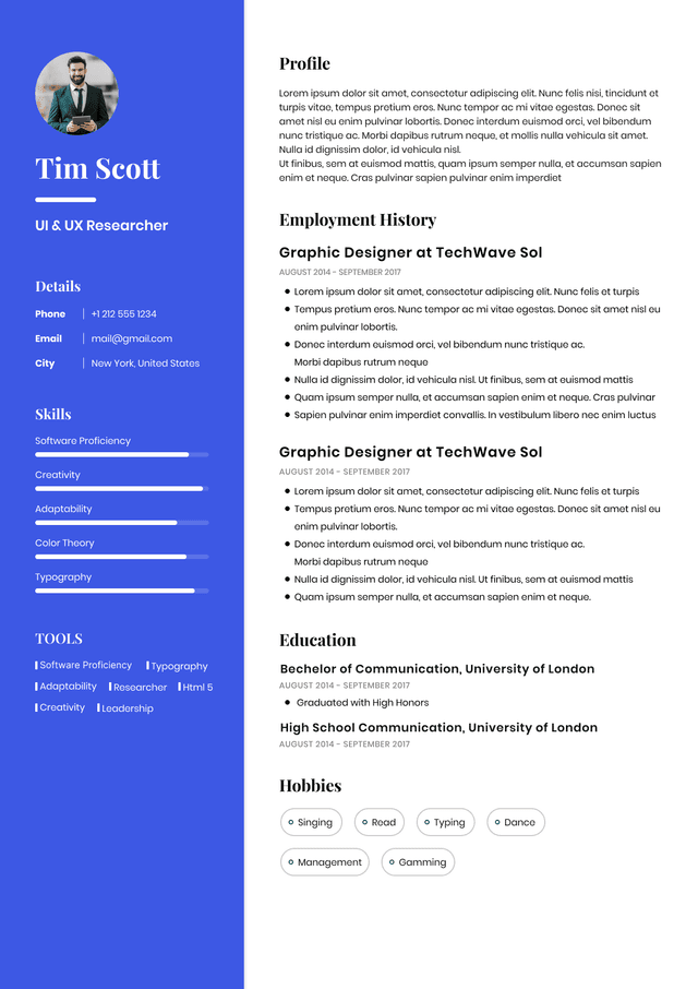
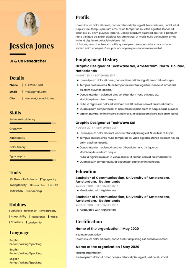
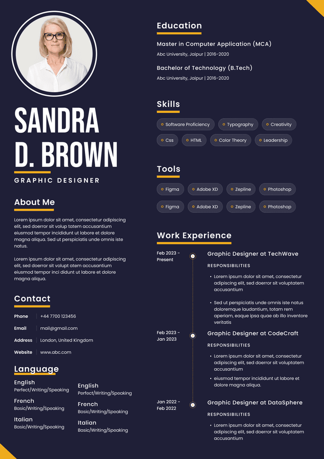
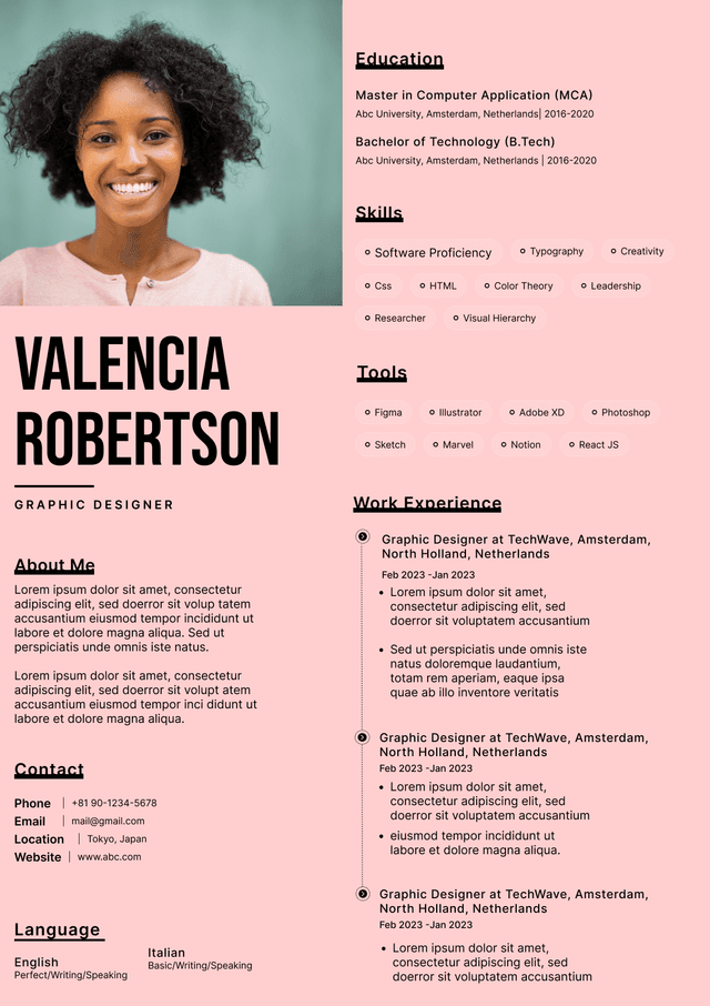
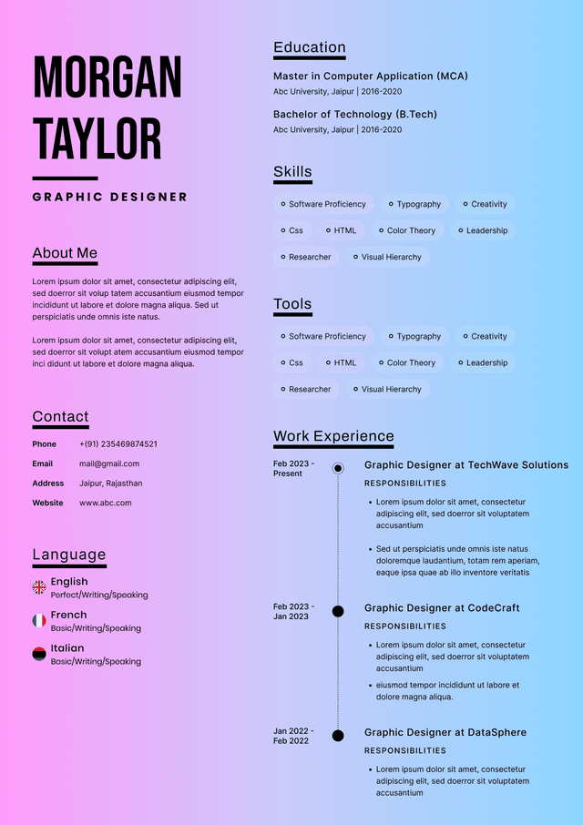
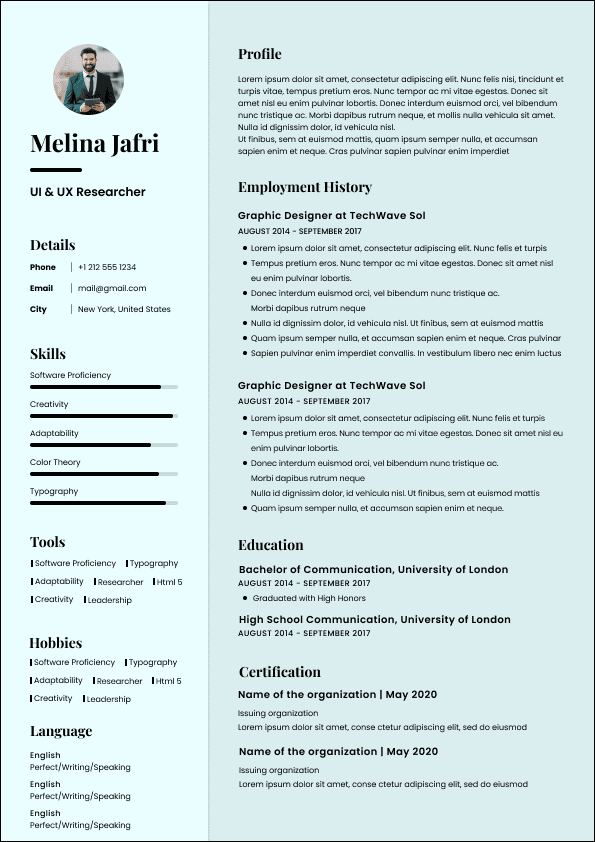
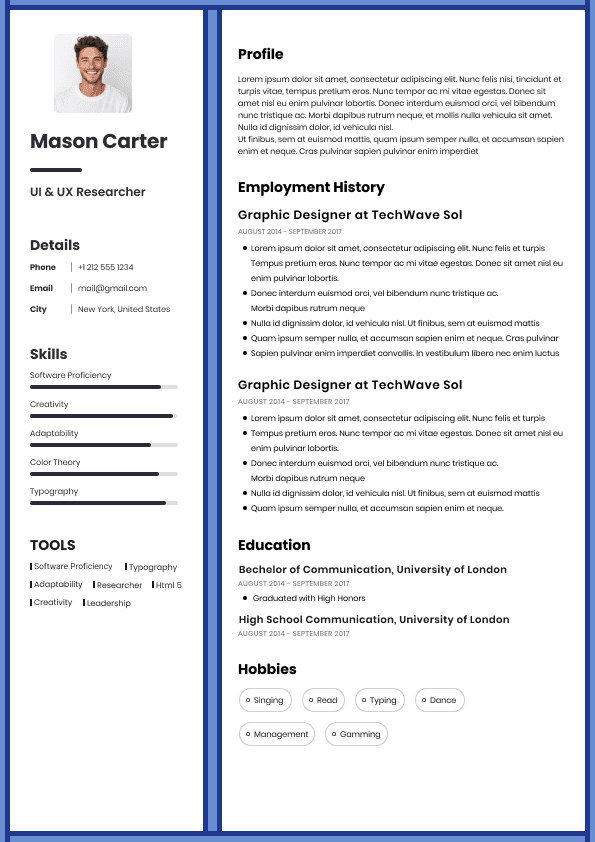
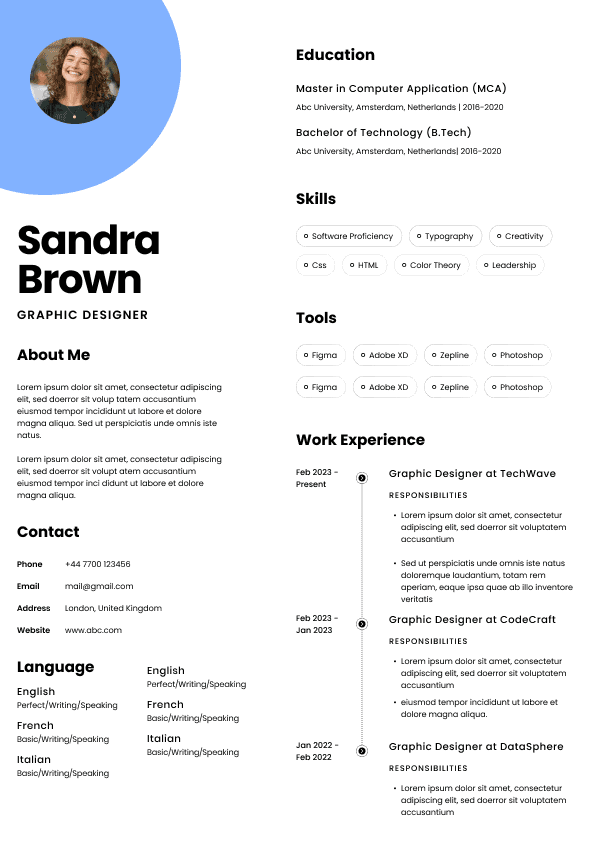
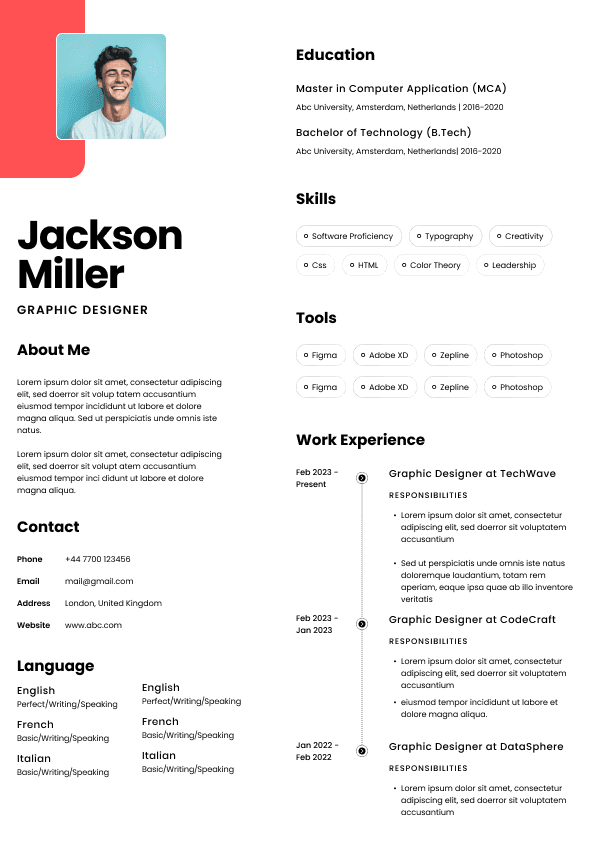
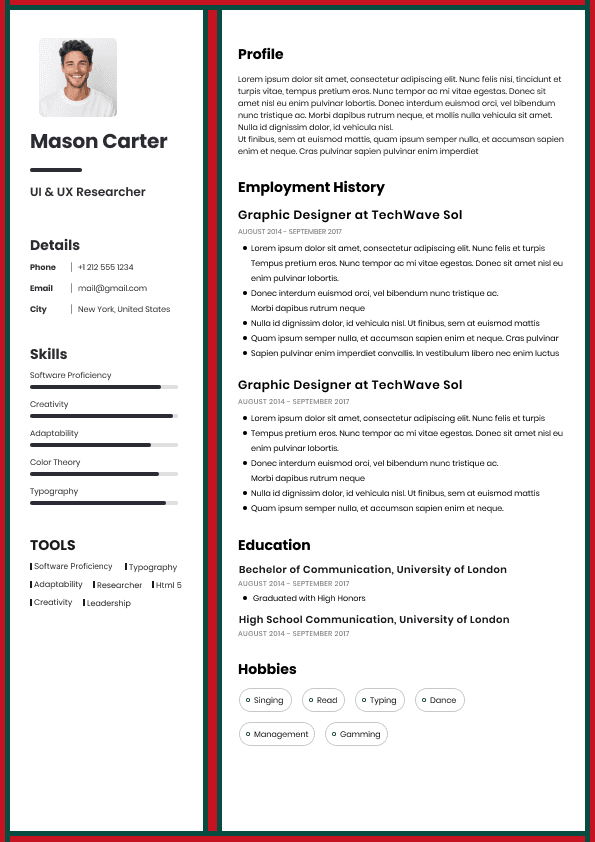
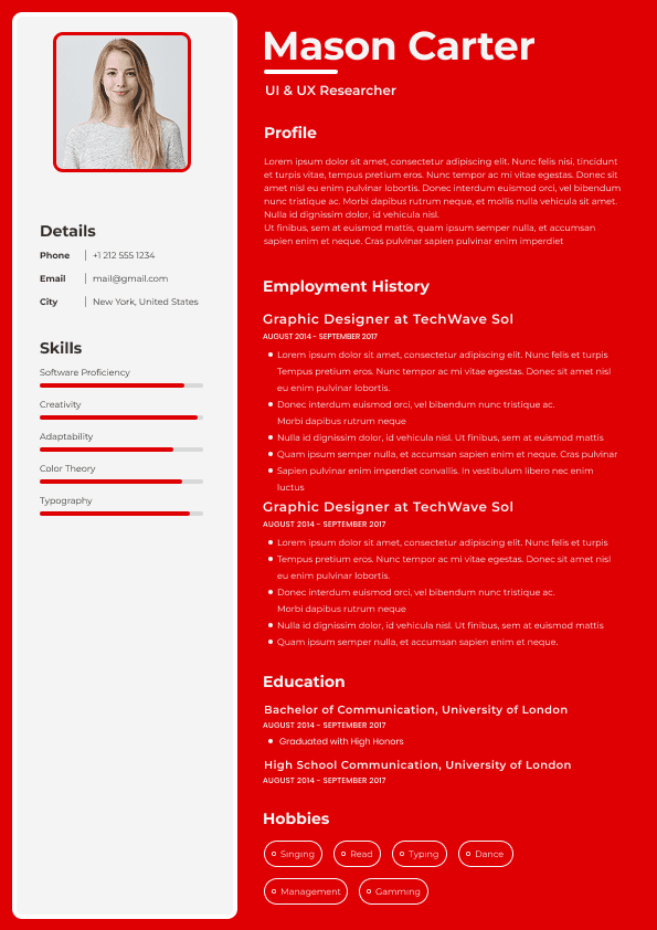
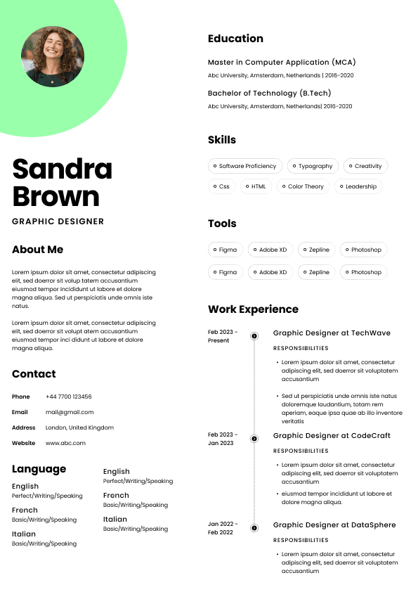
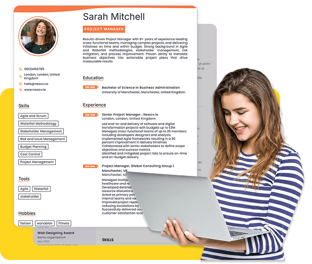
Two-column layouts are among the most common resume design mistakes.
They're visually attractive and often popular in design templates. But many create serious scanning problems.
Typical issues include:
•Work experience squeezed into narrow columns
• Skills hidden in sidebars
• Education placed in visually isolated sections
• ATS systems parsing content out of order
• Reading flow becoming unpredictable
Recruiters read vertically.
Human eyes naturally scan top to bottom.
When layouts force zig-zag reading patterns, comprehension slows.
Imagine a recruiter trying to evaluate:
Marketing Manager → 8 years experience → SaaS background → CRM expertise → measurable growth results
Instead of seeing this immediately, they must visually hunt through sidebars and split sections.
That costs time.
Time creates friction.
Friction reduces interview rates.
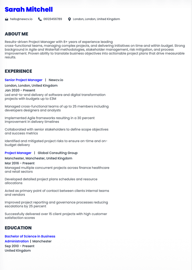
Use a single-column structure with clear hierarchy:
Header
Some resume templates resemble marketing brochures.
They include:
•Progress bars
• Timeline graphics
• Pie charts
• Visual rating systems
• Decorative icons
• Infographics
These create major problems.
Recruiters generally dislike visual indicators because they communicate almost nothing useful.
For example:
"Leadership: 90%"
What does that mean?
How was leadership measured?
Compared to whom?
Visual graphics often replace actual evidence.
Leadership: ██████████
Led a 12-person cross-functional product team and reduced launch timelines by 28%.
Recruiters trust outcomes.
Not visual decoration.
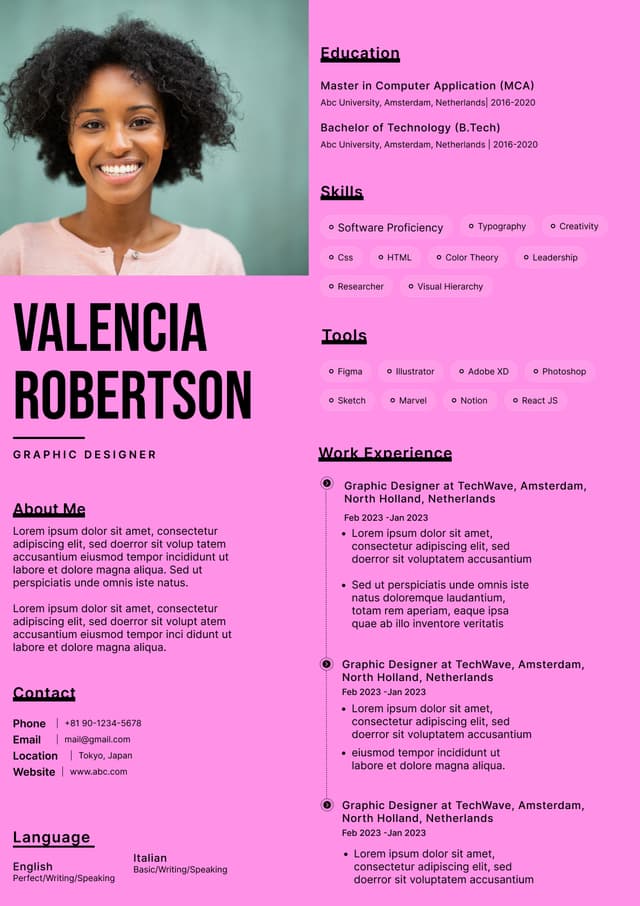
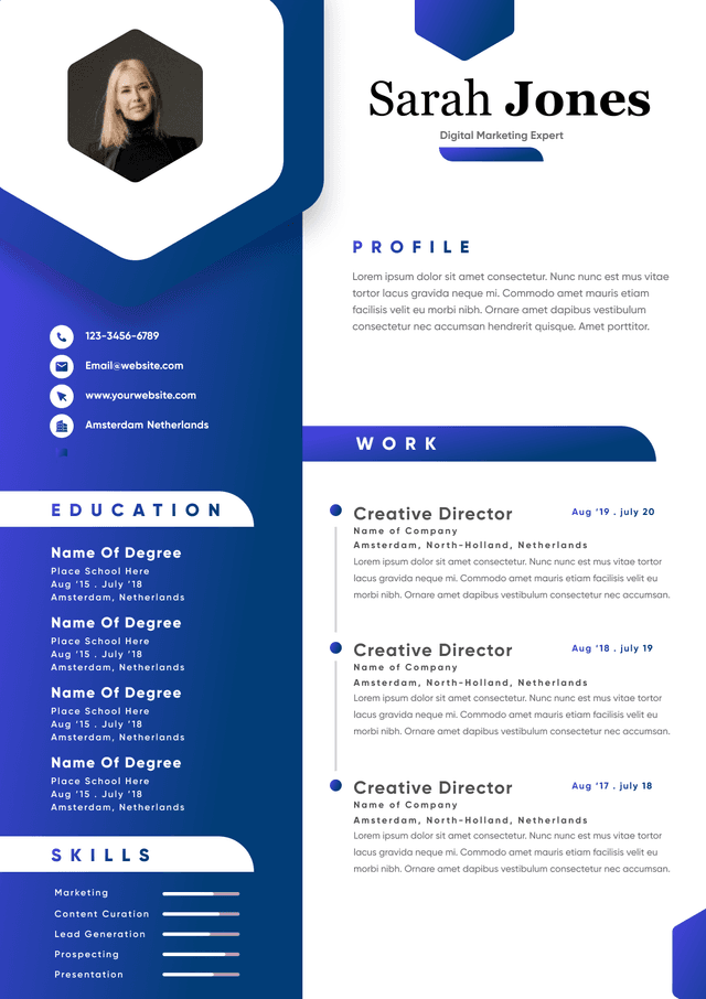
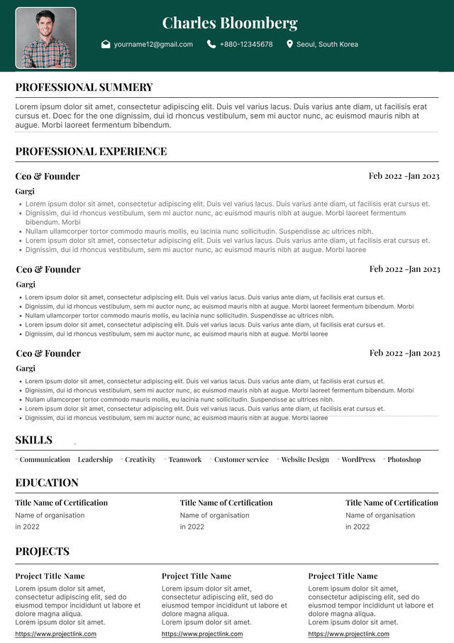
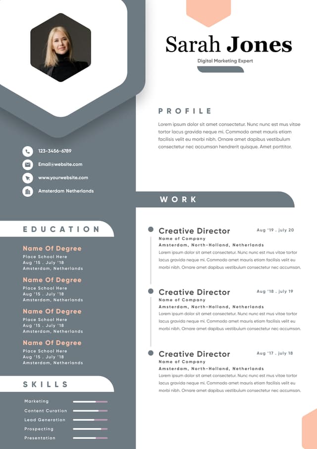
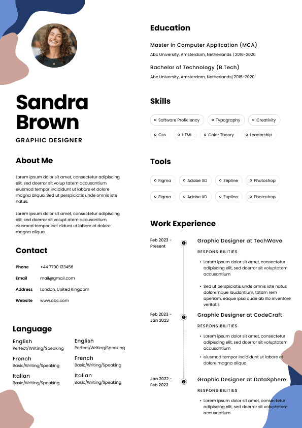
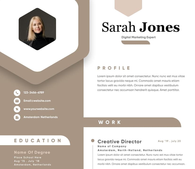
Some layouts use oversized branding sections:
Large photographs
Huge names
Multiple colors
Taglines
Social icons
Large empty spacing
The first third of the page becomes visual branding rather than qualification information.
This wastes valuable screen space.
Recruiters want immediate context.
The top of the resume should communicate:
•Target role
• Relevant expertise
• Years of experience
• Primary specialization
• Major strengths
The first screen matters enormously.
Large headers delay important information.
Minimalism can become a problem too.
Some resumes contain:
•Long paragraphs
• Dense summaries
• Massive job descriptions
• Minimal spacing
• Few visual breaks
Recruiters scan.
They do not read line by line initially.
Dense content creates visual fatigue.
Human attention naturally seeks patterns:
•Headings
• white space
• bullet structures
• hierarchy
Without these, resumes become difficult to process.
•Paragraphs longer than four lines
• Job descriptions replacing achievement bullets
• No visual separation
• Minimal whitespace
• Overcrowded pages
Readable formatting creates faster understanding.
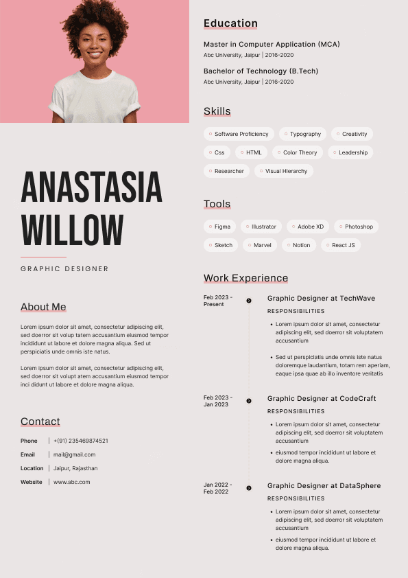
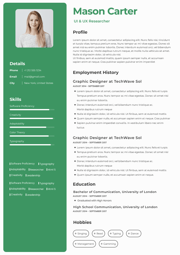
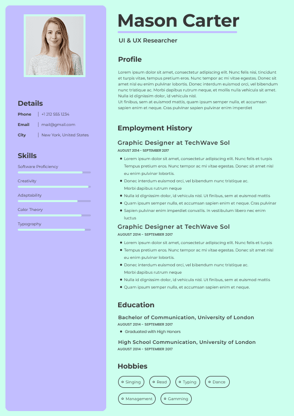
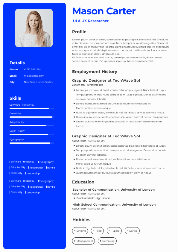
Skill bars remain surprisingly common.
Examples include:
Python: 85%
Excel: 70%
Communication: 95%
Recruiters dislike these because they create artificial precision.
Professional capability is not measurable that way.
Instead of communicating competence, they create ambiguity.
Recruiters ask:
85% compared with what?
What does 70% Excel mean?
Can this person build advanced models?
Automate workflows?
Create dashboards?
Percentages hide context.
Context creates trust.
Replace vague indicators with proof.
Project Management: 90%
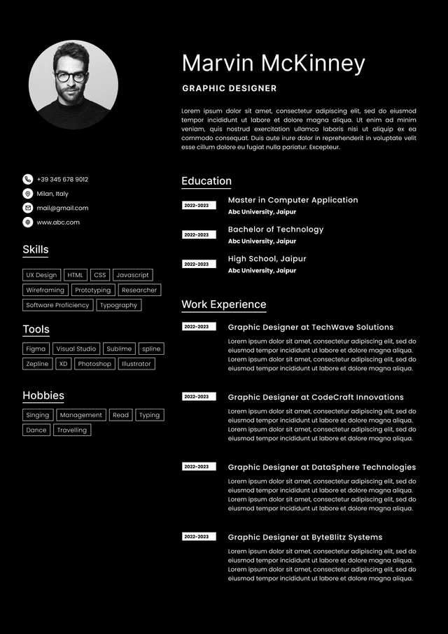
Design-heavy resumes can occasionally work for:
•Graphic designers
• visual creatives
• brand designers
• art directors
But outside these fields, they frequently hurt outcomes.
Roles like:
•Product manager
• software engineer
• sales manager
• analyst
• HR specialist
• operations manager
typically benefit from clarity over visual experimentation.
Recruiters often associate excessive design with poor judgment if the role itself prioritizes efficiency.
Context matters.
A beautiful design that conflicts with hiring expectations creates confusion.
Length itself isn't the issue.
Low-value information is.
Recruiters dislike resumes that expand because of:
•Objective statements
• irrelevant hobbies
• repetitive job descriptions
• unnecessary coursework
• old experience
• filler language
Long resumes fail when signal gets buried under noise.
•Responsible for
• Worked on
• Assisted with
• Helped with
• Participated in
These communicate activity.
Recruiters prioritize impact.
•Increased
• Reduced
• Built
• Led
• Implemented
• Automated
• Improved
Action plus measurable outcome creates stronger evaluation signals.
Competitor articles often stop at obvious design mistakes.
But real hiring workflows reveal subtler issues.
Candidates frequently emphasize low-priority information:
Large education sections
Tiny experience sections
Long summaries
Buried accomplishments
Recruiters evaluate according to relevance.
The most important information should appear first.
Not necessarily chronologically.
Excessive fonts create distraction.
Common issues include:
•multiple font families
• decorative text
• inconsistent sizing
• unusual spacing
Simple typography consistently wins.
Most successful resumes use:
•one font family
• predictable sizing
• clean hierarchy
Modern recruiting is screen-first.
Resumes are reviewed on:
•Applicant tracking systems
• recruiter dashboards
• laptops
• mobile devices
• hiring platforms
Templates optimized only for paper often fail digitally.
Narrow margins, tiny text, and compressed spacing become harder to scan on screens.
Digital readability now matters more.
Recruiter-friendly resumes share consistent characteristics.
They are:
•Easy to scan
• Predictable
• visually organized
• ATS compatible
• readable across devices
• achievement focused
Strong layouts generally include:
Name
Role
Phone
Portfolio if relevant
Short and targeted.
Relevant and prioritized.
Most valuable content.
Concise and structured.
Candidates often think they must choose:
ATS optimization or visual design.
That tradeoff increasingly creates unnecessary limitations.
Modern resume workflows work best when machine readability and human usability support each other.
Some resume builders still force users into extremes:
Either plain ATS templates
Or visually attractive designs that create parsing issues
That gap creates frustration.
Platforms like NewCV increasingly address this workflow problem by combining recruiter-friendly structure, ATS compatibility, modern presentation, and AI-assisted resume workflows without requiring users to sacrifice readability for appearance.
The practical value is workflow efficiency.
Candidates spend less time manually balancing formatting decisions and more time improving content quality.
Because content—not decorative design—usually determines interview outcomes.
Before choosing a resume layout, ask:
•Can someone identify my fit in under ten seconds?
• Is experience immediately visible?
• Does hierarchy feel obvious?
• Can ATS systems read the structure?
• Are achievements easier to notice than design elements?
• Does formatting support my target role?
If the answer is no, redesign the layout.
Not because recruiters dislike creativity.
Because they prioritize efficiency.
Recruiters do not hate resumes that look modern.
They dislike resumes that create friction.
The strongest resume layouts reduce effort. They surface qualifications quickly, support ATS parsing, and help hiring teams make faster decisions.
Many rejected resumes are not rejected because of weak candidates.
They're rejected because information becomes difficult to access.
The best resume design is often invisible.
It quietly removes obstacles between your experience and a hiring decision.
Choose from a wide range of NEWCV resume templates and customize your NEWCV design with a single click.

Use ATS-optimised Resume and resume templates that pass applicant tracking systems. Our Resume builder helps recruiters read, scan, and shortlist your Resume faster.
Use professional field-tested resume templates that follow the exact Resume rules employers look for.
Create Resume
Use professional field-tested resume templates that follow the exact Resume rules employers look for.
Create ResumeProfessional summary
Skills
Experience
Education
Optional sections
Simple structures outperform clever ones.
Managed 14 concurrent SaaS implementation projects with a 98% on-time delivery rate.
Certifications
Projects
Publications
Awards
The structure feels almost boring.
That is often a strength.
Hiring workflows reward clarity.