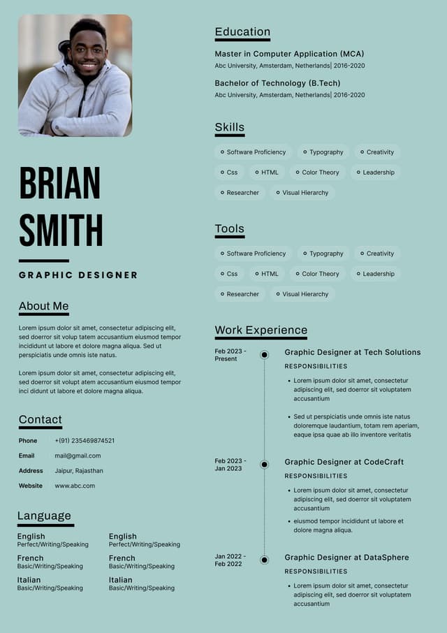
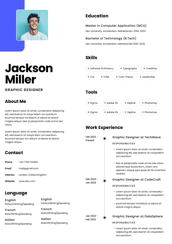
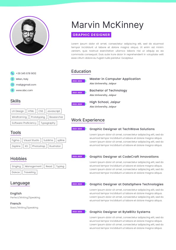
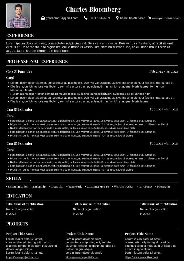
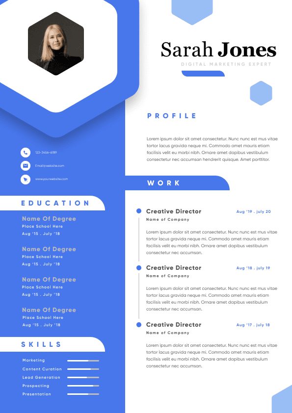
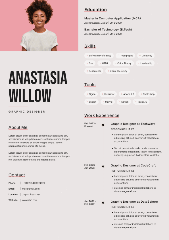
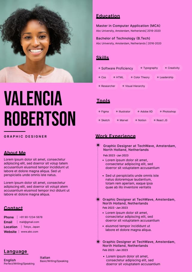
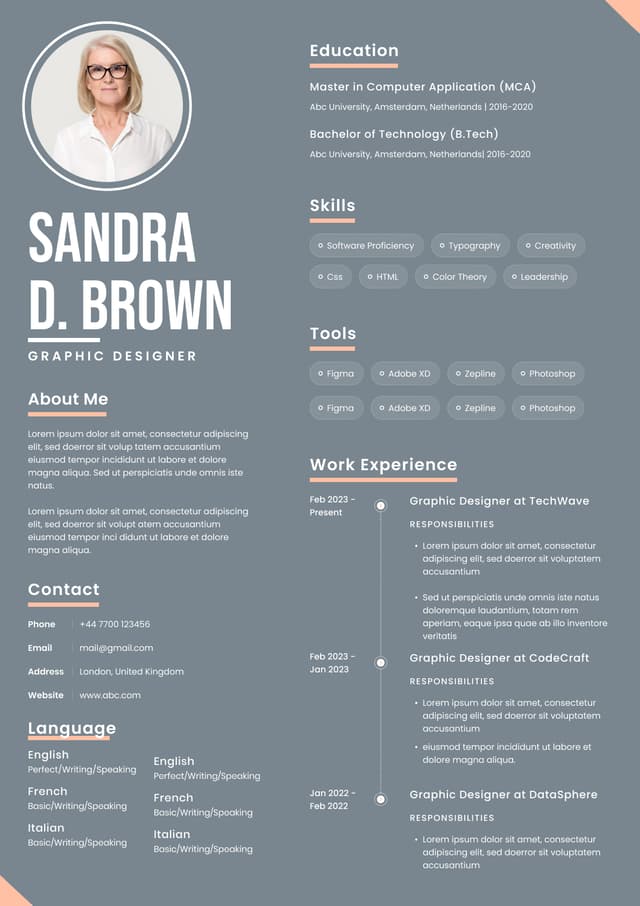
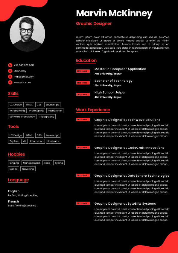
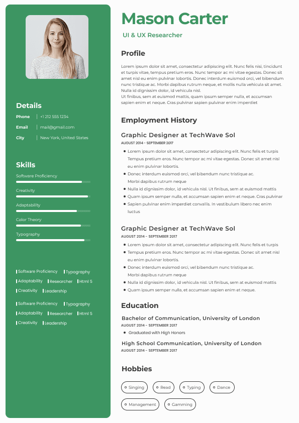
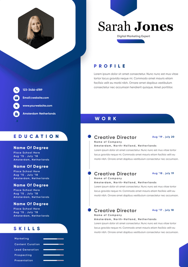
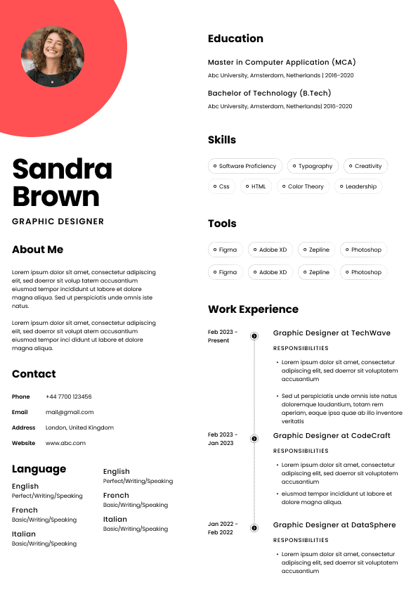
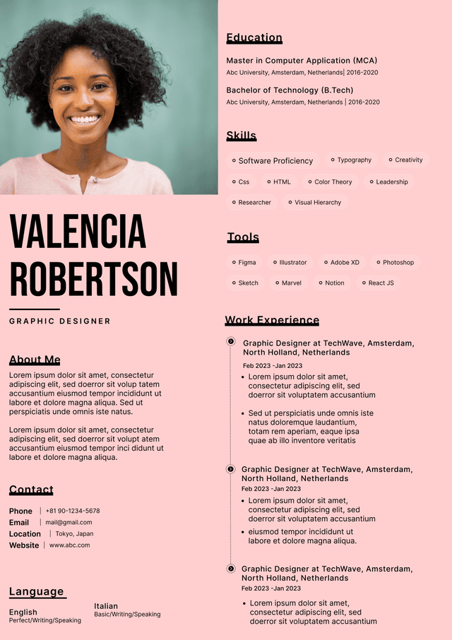
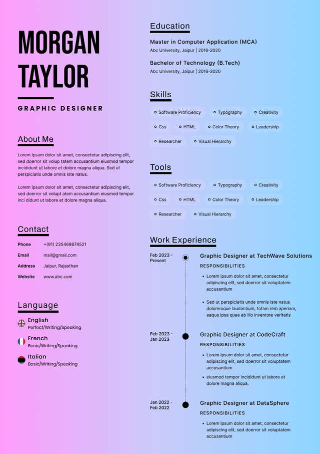
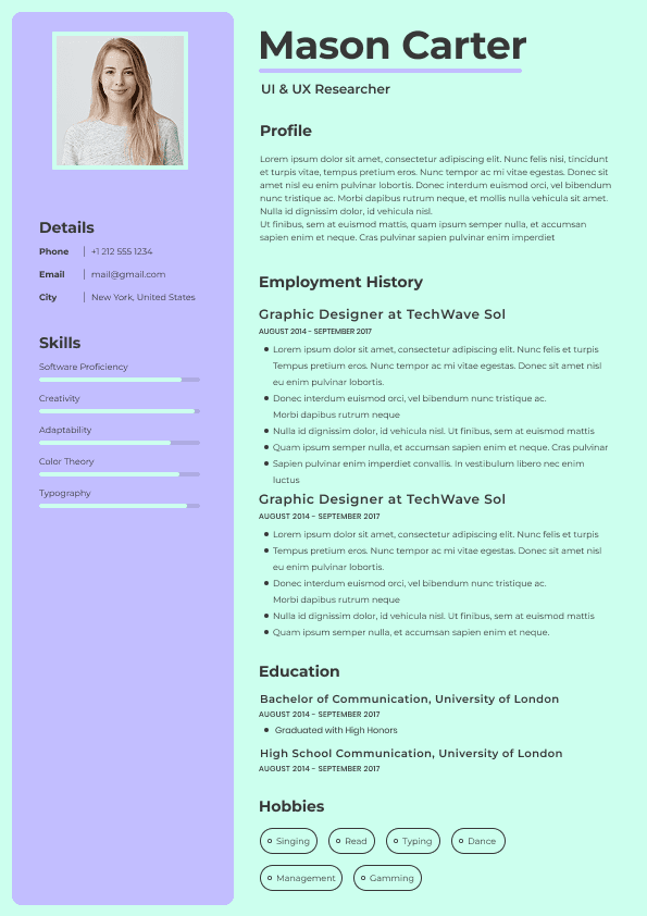
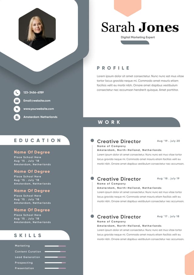
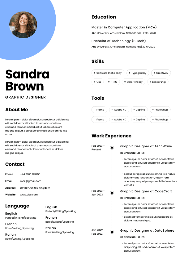
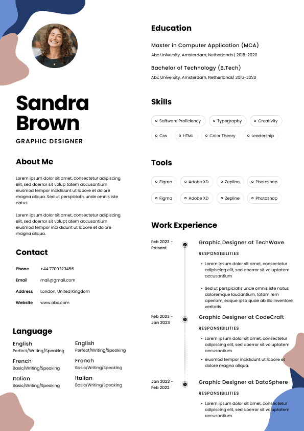
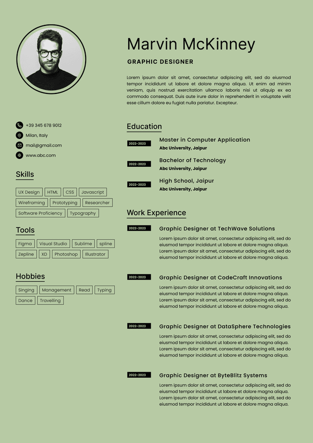
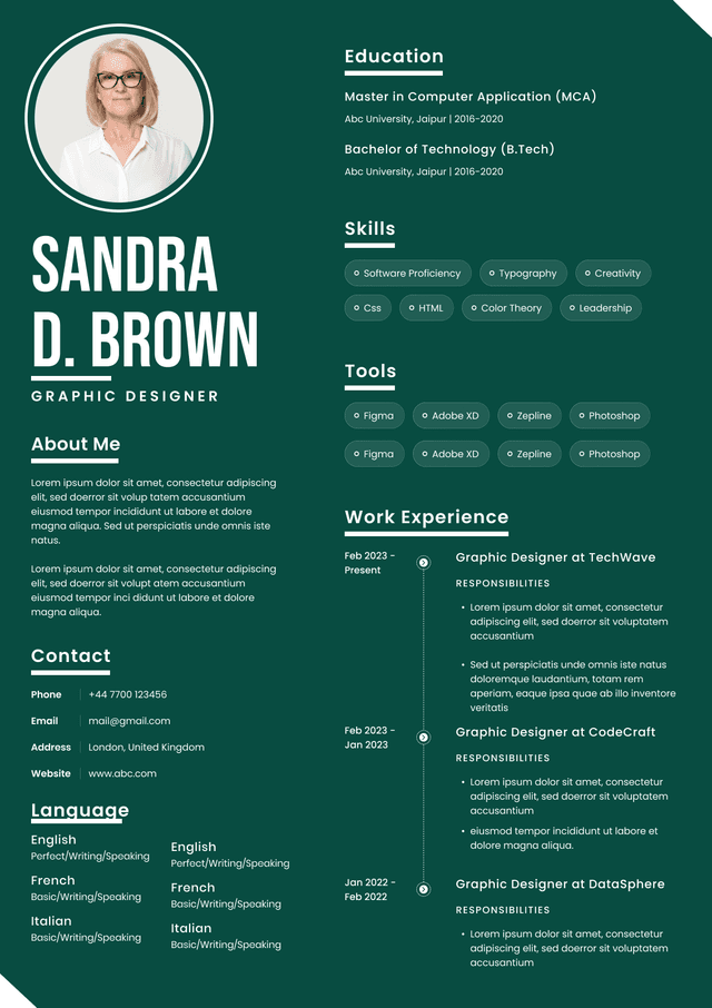
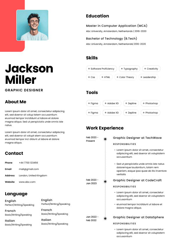
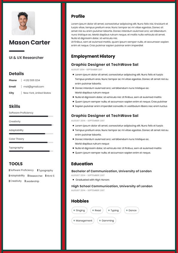
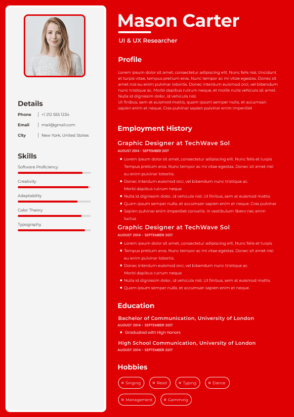
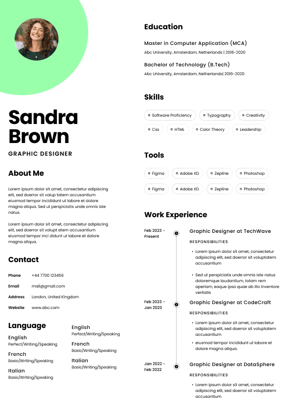
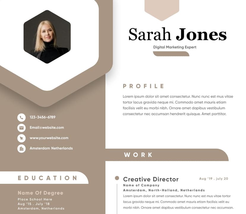
Choose from a wide range of NEWCV resume templates and customize your NEWCV design with a single click.

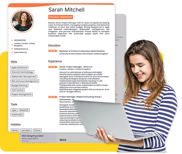

Use professional field-tested resume templates that follow the exact Resume rules employers look for.
Create ResumeResume spacing directly impacts whether recruiters actually read your resume. In real hiring environments, recruiters often spend only a few seconds on an initial screen. Dense blocks of text, crowded formatting, inconsistent spacing, and poor white space create friction. Even strong candidates get overlooked when resumes feel visually exhausting. Good resume spacing improves scanability, helps important information stand out, guides the eye naturally, and increases readability for both humans and applicant tracking systems.
The goal is not to make your resume look “pretty.” The goal is to reduce cognitive load so recruiters can instantly find what matters: your experience, achievements, skills, and qualifications. The best resume spacing creates a clean visual hierarchy that makes reading effortless.
Many job seekers focus heavily on wording and keywords but underestimate visual presentation.
Recruiters evaluate resumes under time pressure. During high volume hiring, a recruiter may review hundreds of applications in a single day.
What usually happens:
The recruiter opens a resume
Eyes scan top to bottom in a Z or F pattern
Key information must stand out instantly
Visual clutter creates friction
Friction causes skipping
Even excellent qualifications can get buried inside poor formatting.
A resume with smart spacing communicates:
Professionalism
Organization
Attention to detail
Strong communication skills
Easy readability under fast scanning conditions
A resume with poor spacing often creates a completely different impression:
Disorganized thinking
Lack of polish
Hard to review quickly
Weak presentation skills
Low effort formatting
Candidates rarely realize this because spacing feels cosmetic.
Recruiters do not see it that way.
There is no single mandatory spacing formula, but hiring teams consistently favor resumes with balanced white space and readable structure.
Recommended standards:
Margins: 0.5 to 1 inch on all sides
Line spacing: 1.0 to 1.15 for body text
Section spacing: 12 to 18 points before major sections
Space between roles: 10 to 15 points
Bullet spacing: consistent throughout
Font size: 10 to 12 for body text
Name/header font: 16 to 22
These guidelines create visual breathing room without wasting space.
The biggest mistake candidates make is trying to cram an extra half page into one page by shrinking margins and squeezing text together.
That usually hurts readability more than it helps.
Candidates often panic when they see unused space.
Recruiters usually do not.
White space is a design tool.
White space helps:
Separate ideas
Guide eye movement
Create visual structure
Prevent reader fatigue
Increase scanning speed
Think of white space as pauses in conversation.
Without pauses, everything blends together.
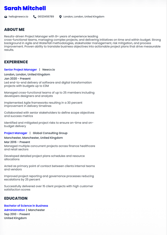
Professional Experience Senior Marketing Manager ABC Company New York Managed digital campaigns Led teams Increased revenue by 35% Developed strategies Created KPIs Managed budgets
This becomes a visual wall.
Professional Experience
Senior Marketing Manager
ABC Company | New York
Managed digital campaigns across multiple channels
Led cross functional teams of 12 employees
Increased annual revenue by 35%
Developed strategic growth initiatives
Managed budgeting and performance KPIs
The content barely changed.
The readability changed dramatically.
Recruiters do not read resumes line by line during first review.
They scan sections.
If sections blend together, important information disappears.
Major sections should clearly stand apart:
Professional Summary
Work Experience
Skills
Education
Certifications
Projects
Technical Skills
Space between sections creates navigation points.
When sections sit directly on top of each other with little separation, resumes feel compressed and chaotic.
A recruiter should instantly locate:
Current role
Years of experience
Industry background
Skills
Relevant qualifications
Spacing supports this process.
One of the most common resume failures happens when candidates desperately try to stay on one page.
This creates formatting problems like:
Tiny margins
Reduced font sizes
Dense paragraphs
Single spaced bullet lists
Minimal section spacing
Recruiters see this constantly.
Ironically, the attempt to save space often damages performance.
For experienced professionals, a clean two page resume frequently outperforms an overcrowded single page resume.
Hiring managers prefer readability over forced brevity.
If you have:
More than 8 to 10 years of experience
Multiple employers
Technical projects
Leadership achievements
You may not need to force everything into one page.
Good spacing beats artificial page limits.
Most candidates imagine recruiters carefully reading every line.
That rarely happens during initial screening.
Recruiter eye tracking studies repeatedly show scanning behavior.
Recruiters often focus on:
Name and title
Current company
Dates
Job progression
Key achievements
Relevant skills
Education
Spacing affects whether those elements stand out.
Large blocks of uninterrupted text slow processing.
When recruiters encounter friction, they subconsciously skip.
That means spacing impacts visibility.
Visibility impacts interview rates.
Bullet points create structure.
But spacing mistakes often ruin them.
Common problems:
Bullets stacked too tightly
Inconsistent spacing between bullets
Bullets containing huge paragraphs
Bullet lengths varying wildly
The ideal approach:
Keep bullets concise
Maintain equal spacing
Use visual consistency
Separate major accomplishments
Too dense.
Led a five person operations team supporting nationwide projects
Increased customer satisfaction scores by 18%
Reduced operating costs by $250,000 annually
The information becomes easier to absorb.
Recruiters process outcomes faster.
Margins influence how crowded a resume feels.
Recommended range:
0.5 inch minimum
1 inch preferred for many layouts
Extremely narrow margins create edge to edge text that feels compressed.
Extremely large margins waste valuable space.
Margins should create a frame around content.
Think balance rather than maximum space usage.
Hiring managers rarely think:
"This margin is perfect."
But they immediately feel when spacing is wrong.
Line spacing controls visual density.
Too tight:
Feels cluttered
Reduces readability
Increases fatigue
Too loose:
Creates disconnected content
Wastes page space
Best practice:
Body text: 1.0 to 1.15
Section headers: slightly more separation
Bullet groups: visually consistent
Tiny adjustments matter.
Increasing line spacing slightly can completely change readability.
Many candidates worry that spacing hurts applicant tracking systems.
Usually the opposite is true.
Modern ATS platforms struggle more with:
Tables
Graphic elements
Columns used poorly
Text boxes
Complex designs
Simple spacing does not create problems.
Good spacing actually supports ATS friendly formatting.
Recommended ATS safe structure:
Clear section headings
Consistent formatting
Standard bullets
Predictable layout hierarchy
White space without visual gimmicks
The safest resume often looks simpler than candidates expect.
Small formatting issues signal carelessness.
Common spacing mistakes include:
Different spacing between sections
Uneven bullet indentation
Random blank lines
Huge gaps between employers
Cramped contact information
Inconsistent margins
Mixed alignment patterns
Giant blocks of summary text
These issues may seem minor.
Collectively they create visual chaos.
Recruiters often cannot explain exactly why a resume feels weak.
They simply describe it as:
"Hard to read."
That reaction matters.
Before submitting your resume, perform a quick visual review.
Ask:
Can I identify every section in two seconds?
Does anything feel crowded?
Is spacing consistent?
Are bullets visually balanced?
Is white space distributed evenly?
Can achievements stand out quickly?
Does the page feel easy to scan?
Then perform one additional test.
Zoom out to roughly 60%.
Look at the page structure only.
Ignore wording.
If the page looks crowded from a distance, recruiters will probably feel the same.
This simple exercise catches problems candidates miss.
Clean section spacing
Balanced white space
Readable line spacing
Consistent formatting
Bullet organization
Natural visual flow
Text cramming
Tiny margins
Massive paragraphs
Uneven spacing
Inconsistent formatting
Artificial one page compression
Good resume spacing supports your qualifications.
Bad spacing competes against them.
Most resume advice treats spacing as a formatting issue.
Recruiters experience it differently.
Spacing changes how effort feels.
Two candidates with identical experience can create completely different reactions.
Resume A feels easy.
Resume B feels like work.
Humans naturally choose easier processing experiences.
That principle affects every stage of hiring.
Candidates often believe hiring is purely qualification driven.
In reality, reducing friction matters.
Resume spacing reduces friction.
That alone makes it more powerful than many people realize.
Use ATS-optimised Resume and resume templates that pass applicant tracking systems. Our Resume builder helps recruiters read, scan, and shortlist your Resume faster.
Use professional field-tested resume templates that follow the exact Resume rules employers look for.
Create Resume