
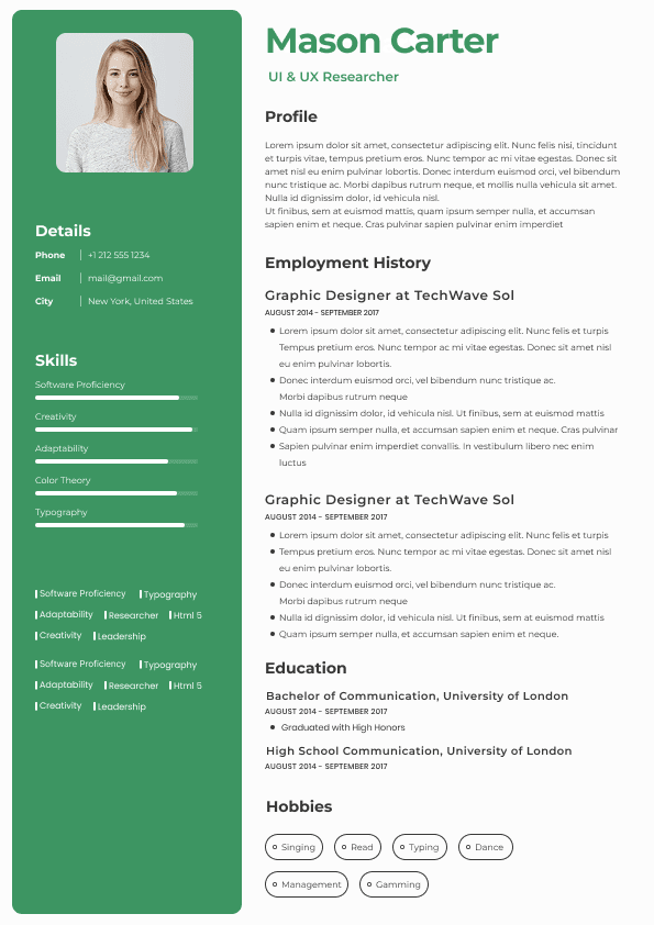
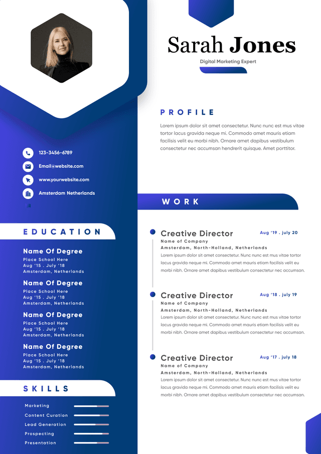
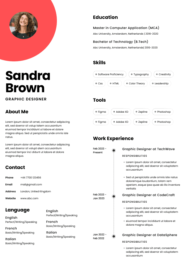
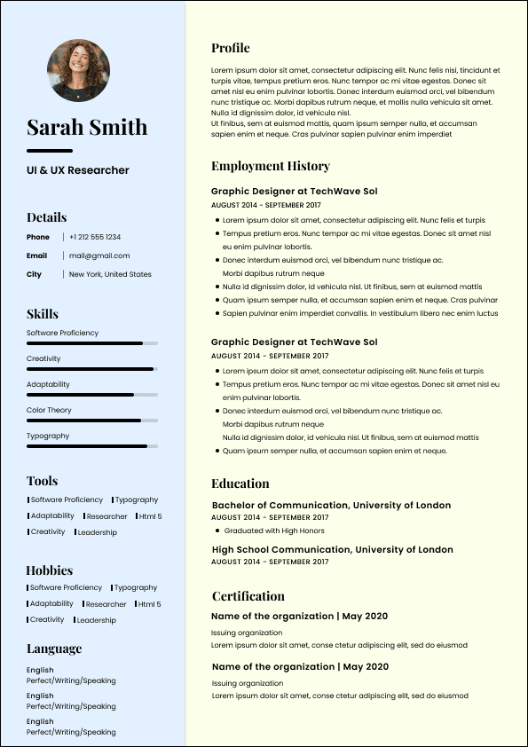
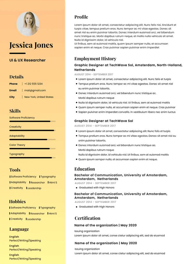
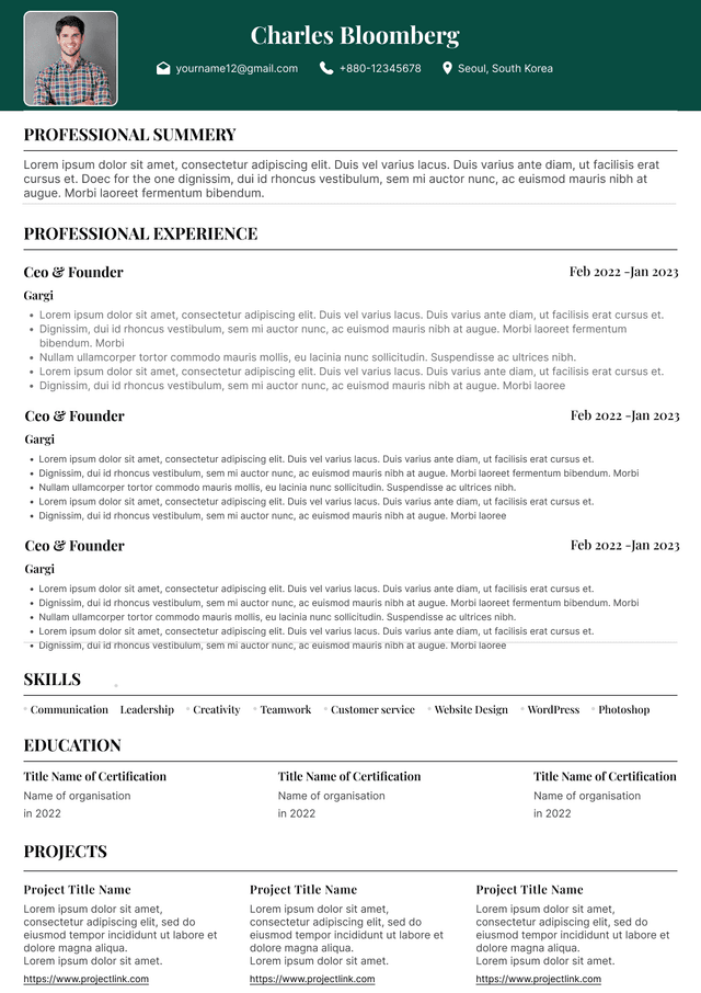
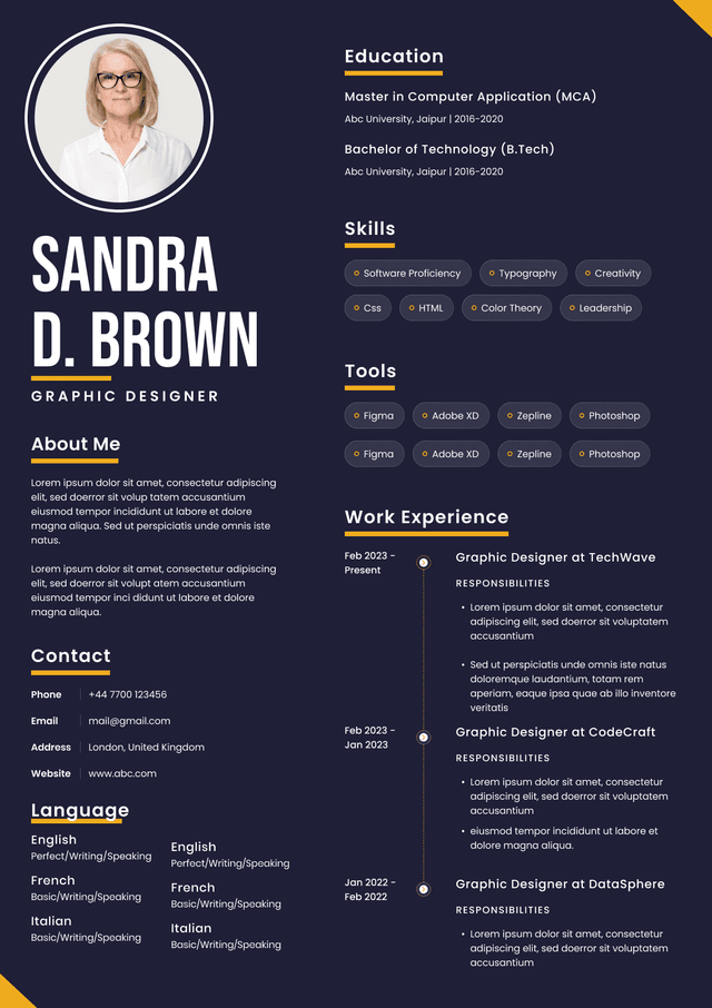
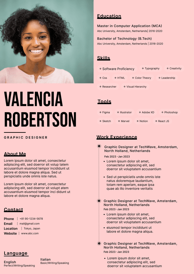
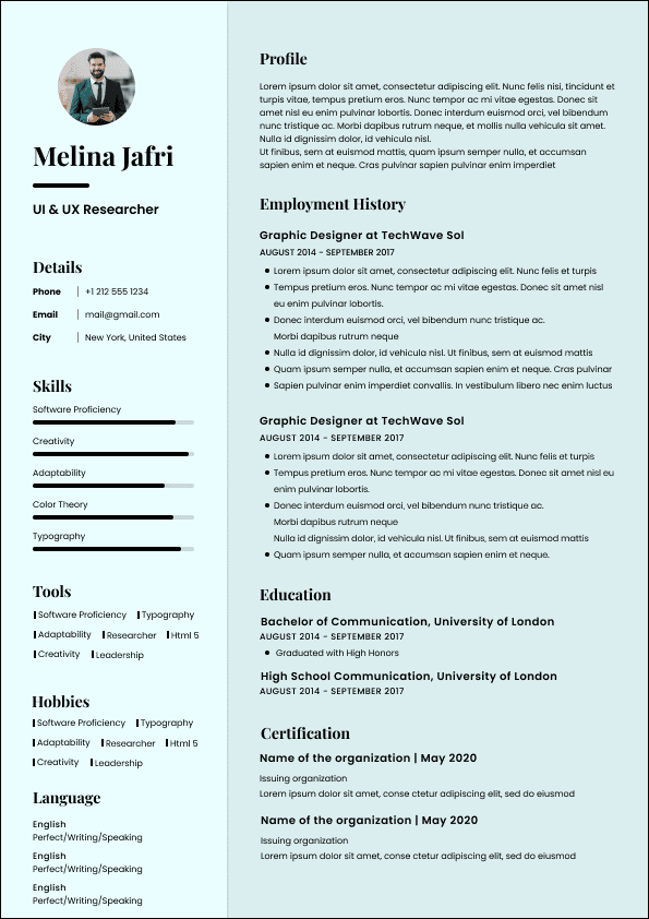
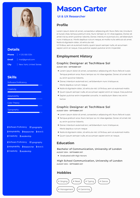
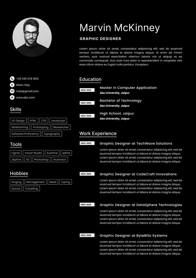
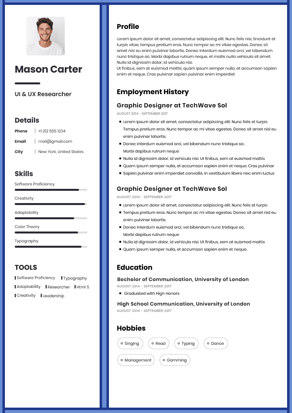
Choose from a wide range of NEWCV resume templates and customize your NEWCV design with a single click.
The best font for a resume in Australia is usually Calibri, Arial, Aptos, Helvetica, Cambria, or Garamond, depending on your role, industry, and document style. If you want the safest choice, use Calibri or Arial in 10.5 to 11 point size for the body text. They are clean, familiar, easy to scan, and unlikely to cause issues with applicant tracking systems. That matters more than most candidates realise.
A resume font will not get you hired by itself. No hiring manager is sitting there thinking, “Excellent use of Calibri, bring them in immediately.” But a poor font can absolutely make your resume harder to read, harder to trust, or easier to reject. In recruitment, clarity wins. Your font should make your experience easy to assess, not force the reader to work harder than necessary.
For most Australian job applications, the best resume font is Calibri, Arial, Aptos, Helvetica, Cambria, or Garamond. These fonts work because they are readable on screen, professional without being distracting, and safe for both recruiters and applicant tracking systems.
My practical recommendation is simple:
Best overall resume font: Calibri
Best safe modern font: Arial
Best Microsoft Word default style: Aptos
Best polished corporate font: Helvetica
Best traditional professional font: Cambria
Best executive or senior professional font: Garamond
If you are unsure, do not overthink it. Use Calibri or Arial. They may not feel exciting, but your resume is not meant to be exciting in the way a poster is exciting. It is meant to be clear, controlled, and easy to evaluate quickly.
Candidates often treat font choice like a design preference. Recruiters experience it as a readability issue.
Most resumes are not read slowly at first. They are scanned. That first scan may happen on a laptop, a second monitor, a recruitment database preview, a mobile screen, or inside an applicant tracking system. Sometimes the resume is opened properly. Sometimes it is previewed quickly while comparing ten candidates at once. Glamorous? No. Realistic? Very.
A strong resume font helps with three things:
Readability: The recruiter can scan your job titles, companies, dates, and achievements without squinting.
Professional impression: The document feels controlled, mature, and credible.
ATS compatibility: The text is less likely to parse incorrectly when uploaded into recruitment software.
The hiring reality is this: most candidates are not rejected because their font is “wrong”. They are rejected because their resume creates too much work. A cramped font, tiny text, inconsistent spacing, or decorative typeface makes the recruiter slow down for the wrong reason.
And when a recruiter has two hundred applications open, you do not want your resume to be the one that feels like admin punishment.
The safest resume fonts are the ones that are standard, readable, and widely supported across systems. These are the fonts I would trust for Australian job applications.
Calibri is still one of the safest choices for a resume. It is clean, familiar, compact, and readable. It works particularly well for corporate, administrative, finance, operations, HR, customer service, sales, and professional services roles.
Some candidates think Calibri is boring. That is not a problem. Boring and readable beats creative and annoying almost every time.
Use Calibri when you want your resume to feel practical, modern enough, and easy to process.
Arial is one of the safest resume fonts because it is simple, widely recognised, and easy to read across different systems. It works well for almost every industry.
Arial can look slightly plain, but that is also its advantage. It does not create visual drama. It lets the content carry the weight.
Use Arial if you want a clean, no nonsense resume that will not cause formatting concerns.
Aptos is the newer Microsoft default font and is becoming more common in modern documents. It has a cleaner, more current feel than Calibri while still being professional.
The only caution is that not every employer environment will display newer fonts exactly as expected if the resume is shared in editable Word format. If you save your resume correctly as a PDF where appropriate, this is usually less of an issue.
Use Aptos if you want a modern Word based resume that still feels safe and readable.
For most Australian resumes, use 10.5 to 11 point font for the body text. This is the safest range for readability and space management.
A good resume font size usually looks like this:
Name: 18 to 24 point
Contact details: 10 to 11 point
Professional summary: 10.5 to 11 point
Body text: 10.5 to 11 point
Section headings: 12 to 14 point
Job titles: 11 to 12 point
Dates and locations: 10 to 11 point
The biggest mistake I see is candidates reducing the font size to fit more content. That usually creates the opposite effect. Instead of making the resume stronger, it makes the reader work harder.
Recruiters are not usually judging font choice in isolation. They are judging the overall reading experience.
When I open a resume, I notice whether the document feels easy to move through. I notice whether the headings are obvious. I notice whether the dates are aligned. I notice whether the job titles stand out. I notice whether the achievements are readable or buried in dense paragraphs.
The font contributes to that impression, but it is part of a wider judgement.
A resume with a safe font can still fail if the formatting is messy. A resume with a slightly less common font can still work if the structure is clean and readable. The goal is not to find a magic font. The goal is to make your career evidence easy to assess.
Recruiters tend to notice these issues quickly:
The font is too small
The font changes throughout the document
The headings look inconsistent
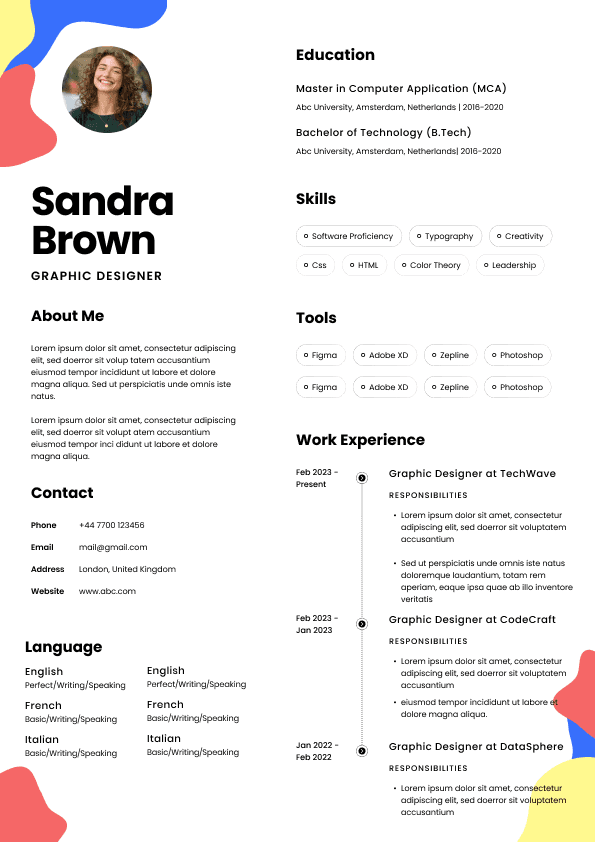
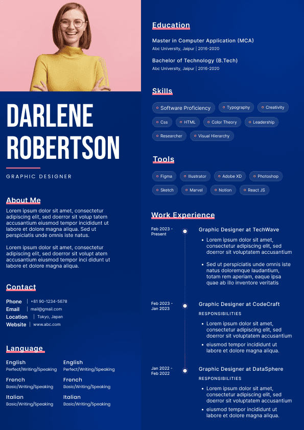
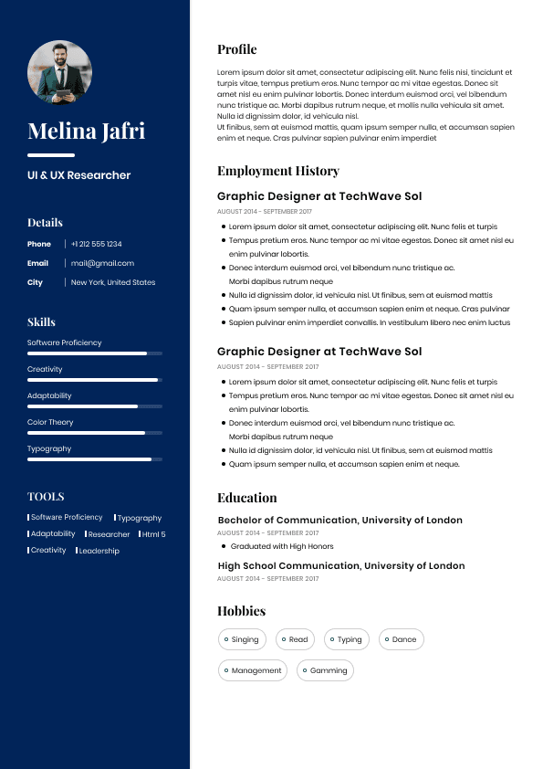
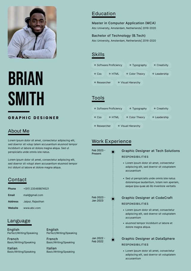
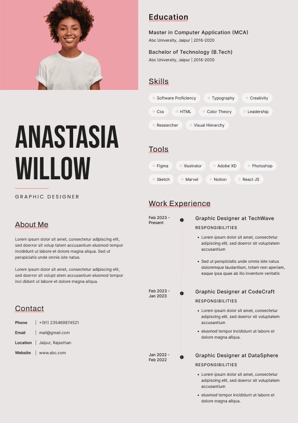
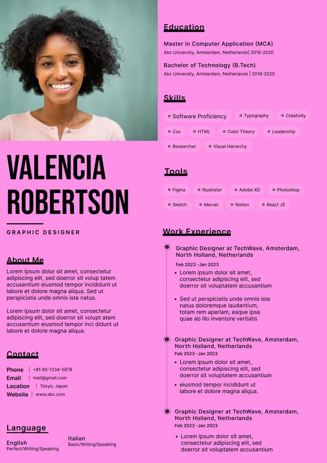
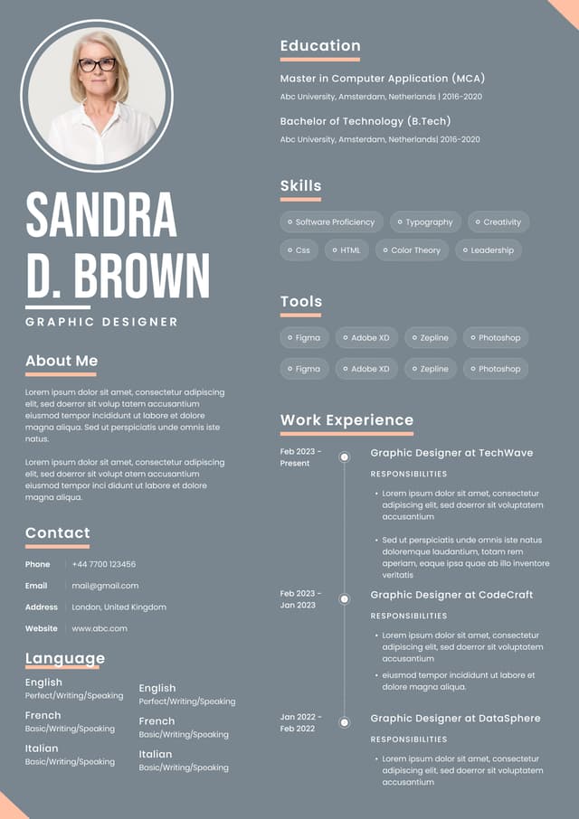
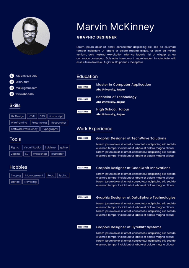
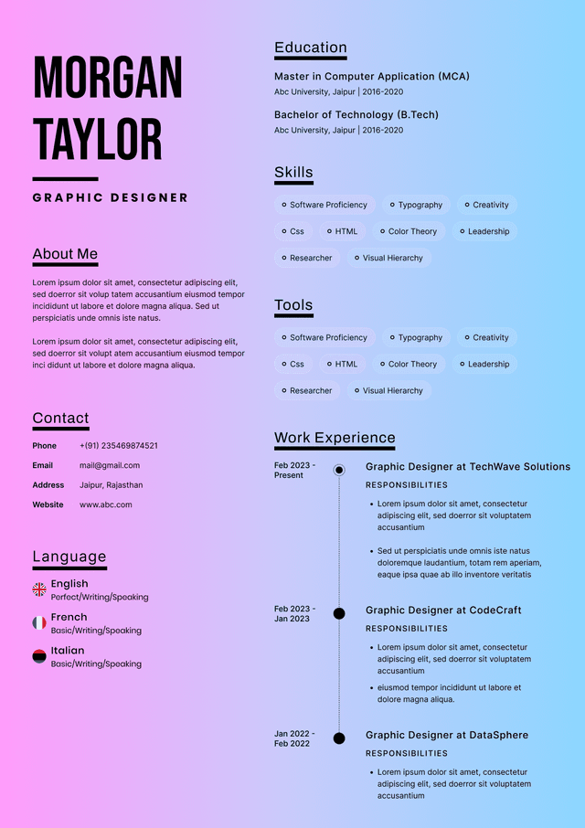
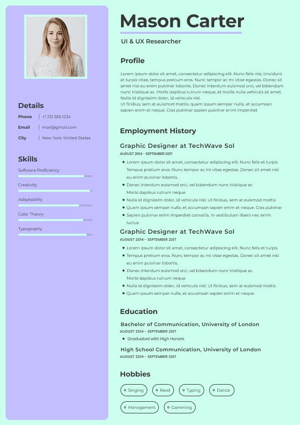
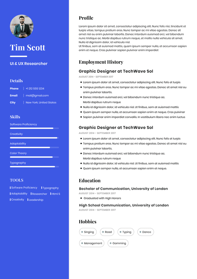
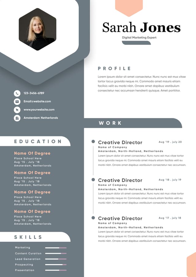
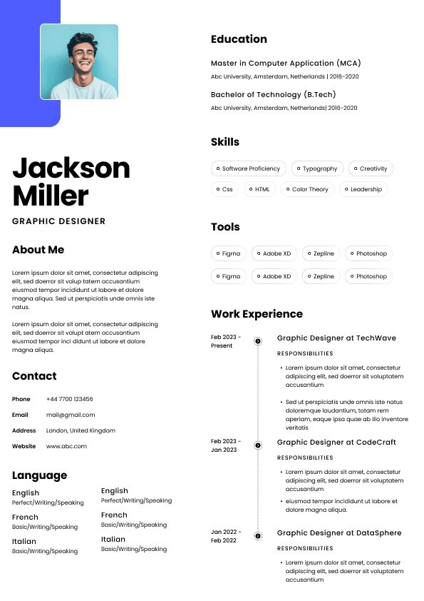
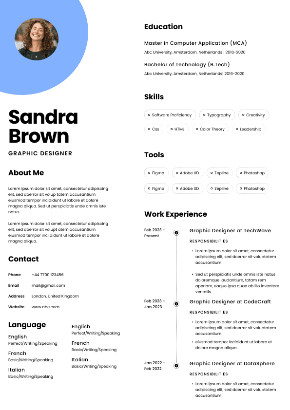
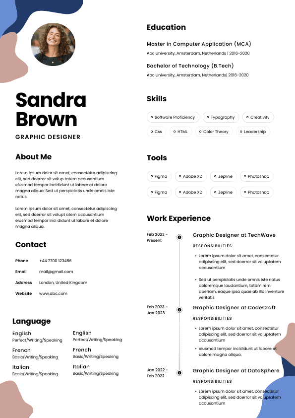
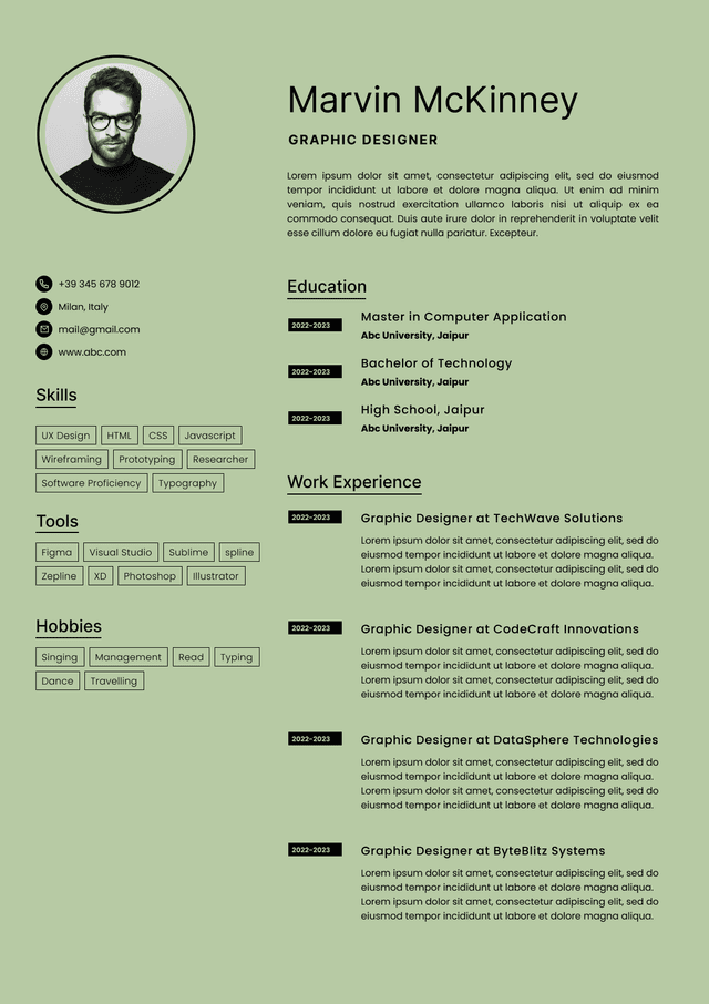
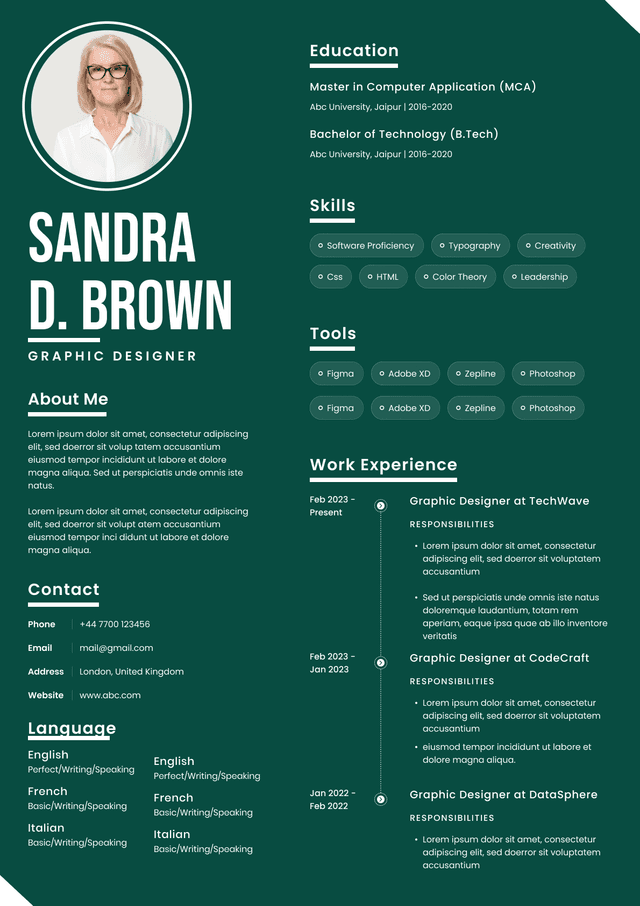
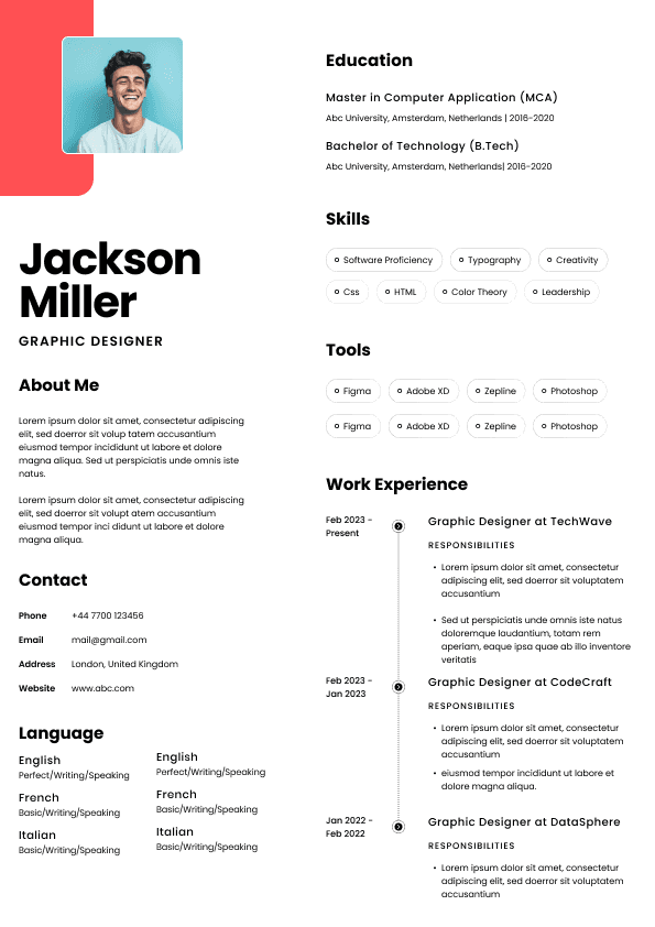
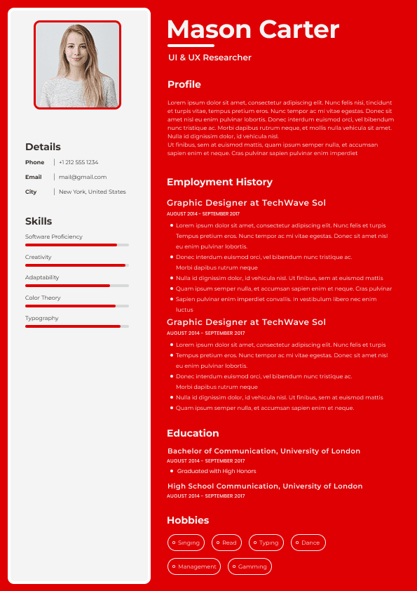
The resume looks like a template rather than a professional document
The line spacing is too tight
Some fonts create the wrong impression immediately. Others may cause readability or ATS issues. I would avoid these on a professional Australian resume.
Avoid fonts that look handwritten, artistic, playful, or overly stylised. They may look interesting on a wedding invitation. They do not belong on a resume.
Fonts like these make the document feel less serious and harder to scan. They also create unnecessary risk with parsing and compatibility.
No. Just no.
Comic Sans gives the wrong professional signal. Even if you are applying for a creative or child focused role, your resume still needs to show judgement.
Impact style fonts are too heavy for resume headings and can make the document feel aggressive. Your resume should be confident, not shouting from across the room.
Some modern fonts look beautiful in design software but weak in a resume. Thin fonts can become hard to read on screens, especially in PDF previews or applicant tracking systems.
This is a common issue with Canva style resumes. The design looks nice at 150 percent zoom, but in a recruiter preview pane it becomes a pale grey whisper.
If the font is not widely available or properly embedded, it can create display problems when opened on another system. That is not a risk worth taking for most job applications.
Both serif and sans serif fonts can work on an Australian resume. The better choice depends on your industry, seniority, and document style.
Sans serif fonts, such as Calibri, Arial, Aptos, and Helvetica, usually feel cleaner and more modern. They are often easier to read on screens and work well for most job applications.
Serif fonts, such as Cambria, Georgia, and Garamond, can feel more traditional, formal, or editorial. They can work well for senior professionals, legal roles, education, policy, government, research, and academic pathways.
Here is the practical recruiter view:
Use sans serif fonts if you want maximum readability and modern simplicity.
Use serif fonts if your field values formal written communication or you want a more established professional tone.
Avoid mixing too many fonts because it can make the resume look amateur.
If you combine fonts, use one font for headings and one for body text only.
Most candidates do not need to mix fonts at all. One clean font used consistently is usually stronger than a “designed” resume with three typefaces fighting for attention.
Most standard fonts are fine for applicant tracking systems. The bigger ATS problems usually come from layout, tables, graphics, icons, text boxes, columns, headers, footers, and unusual formatting.
That said, font choice still matters because ATS systems need to extract text cleanly. Standard fonts reduce the chance of weird parsing issues.
If you want an ATS safe resume, use fonts like:
Calibri
Arial
Aptos
Helvetica
Cambria
Georgia
Garamond
A font should match the level of professionalism expected in your field. It should not feel disconnected from the role you are applying for.
Use Calibri, Arial, Aptos, or Helvetica. These fonts feel clean, practical, and business appropriate.
For these roles, hiring managers usually want clarity, organisation, accuracy, and relevance. A simple font supports that impression.
Use Arial, Aptos, Calibri, or Helvetica. These fonts feel modern and readable.
For tech and project roles, the resume needs to be structured and easy to scan. Skills, tools, systems, project scope, and outcomes should be visible quickly. A clean sans serif font helps.
Use Cambria, Georgia, Garamond, or Arial. These fonts feel more formal and controlled.
For these roles, written communication matters. A slightly more traditional font can work well, provided it remains readable.
Use Helvetica, Aptos, Arial, or Calibri. If you are in a creative field, your resume can have more visual polish, but it still needs to function as a hiring document.
This is where candidates sometimes go too far. A creative resume is not an art project. It still has to be readable by a recruiter, hiring manager, and potentially an ATS.
A resume uses a decorative font for the name, narrow font for the body text, tiny 9 point text to fit more content, and several different heading styles. It looks designed, but the reader has to work hard to extract the actual career story.
Why it fails: The formatting is trying to impress visually, but it creates friction. The recruiter has to decode the document instead of assessing the candidate.
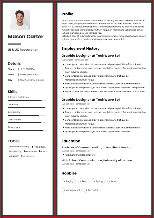
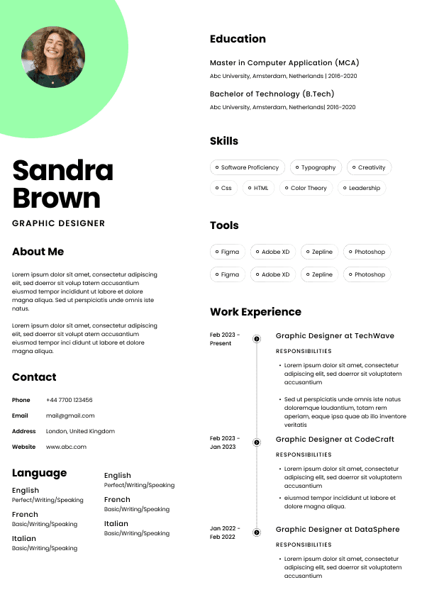
A resume uses Calibri at 11 point for the body text, clear section headings at 13 point, bold job titles, consistent spacing, and simple bullet points under each role.
Why it works: The format supports fast screening. The recruiter can quickly understand the candidate’s role, level, responsibilities, achievements, and relevance.
A candidate uses a very elegant thin font because it looks premium in a template. On screen, the resume looks faint and hard to read.
Why it fails: The resume was designed for appearance, not real recruitment conditions. Recruiters often read resumes quickly, across different devices and systems.
A candidate uses Garamond at a readable size with generous spacing and strong headings. The document feels polished without sacrificing clarity.
Why it works: The font supports the candidate’s seniority and gives the resume a calm, professional feel.
The font itself is rarely the whole problem. The mistake is usually how the font is used.
If you keep shrinking your font to fit your resume onto fewer pages, your resume probably needs editing, not smaller text.
Candidates often include too much detail because they are afraid of leaving something out. But hiring decisions are not made by volume. They are made by relevance. A clear two or three page resume with strong prioritisation is usually better than a cramped document pretending to be concise.
Your resume can show personality through your achievements, career choices, communication style, and positioning. It does not need a quirky font to prove you are interesting.
In hiring, unusual formatting often creates more suspicion than admiration. The reader may wonder why the presentation is doing so much work.
Two fonts can work if used carefully. Three or more usually looks messy.
If you are not confident with design, use one font throughout. Make your headings stronger with size and bolding, not by introducing another typeface every few sections.
Some resume templates look good until you upload them, convert them, or view them on another device. Always test your final resume before sending it.
Open the PDF. Zoom out. Check readability. Upload it into a job portal if possible. Copy and paste the text into a plain document to see whether the content remains logical. This is not glamorous, but it is practical.
If you want the safest option for an Australian resume, use this setup:
Font: Calibri or Arial
Body text: 10.5 to 11 point
Headings: 12 to 14 point
Name: 18 to 24 point
Line spacing: Comfortable, not cramped
Colour: Black or very dark grey for body text
File type: PDF unless the employer requests Word
Consistent headings, clear job titles, simple bullet points
Use this simple decision framework.
Choose Calibri or Arial if you want the safest professional option.
Choose Aptos if you want a modern Microsoft Word style and your final document will be saved cleanly.
Choose Helvetica if you want a polished, modern look and you are confident the final PDF displays correctly.
Choose Cambria or Georgia if you are applying for formal, academic, legal, policy, education, or government roles.
Choose Garamond if you are a senior professional and want a refined look, but only if the document remains easy to read.
Avoid anything decorative, playful, overly condensed, overly thin, or difficult to read in a preview pane.
The question is not “Which font looks nicest?” The better question is: “Which font helps a recruiter understand my relevance faster?”
That is the whole game.
The best font for a resume in Australia is one that makes your experience easy to read, easy to trust, and easy to assess. For most people, that means Calibri or Arial. For more formal or senior resumes, Cambria, Georgia, Helvetica, or Garamond can also work well.
Do not treat your font like a personal branding crisis. Treat it like a screening tool.
A good resume font will not compensate for vague achievements, weak role alignment, unexplained gaps, or poor positioning. But it can make a strong resume easier to read and easier to shortlist.
And that matters, because recruitment is full of small judgement moments. A hiring manager may not consciously think about your font, but they will feel whether your resume is clear, professional, and easy to deal with.
That is what good formatting does. It reduces doubt.
Written by Simar Malhi, a recruiter and headhunter with international recruitment experience. I write about CVs, job applications, hiring decisions, and the reality behind recruitment processes. My goal is to help candidates understand more honestly how employers, recruiters, and hiring managers actually select candidates.

Use ATS-optimised Resume and resume templates that pass applicant tracking systems. Our Resume builder helps recruiters read, scan, and shortlist your Resume faster.

Use professional field-tested resume templates that follow the exact Resume rules employers look for.
Create Resume
Use professional field-tested resume templates that follow the exact Resume rules employers look for.
Create ResumeThat is the part candidates often miss. The font is not there to express your personality. It is there to remove friction. When I look at a resume, I am trying to answer practical questions quickly: What does this person do? Are they relevant for the role? Have they done the work before? Are they senior enough? Are they too senior? Is the information easy to verify?
A good font stays out of the way of those questions. A bad font gets in the way.
Helvetica is polished, clean, and professional. It gives a resume a slightly more refined look without becoming decorative. It works well for corporate, marketing, communications, technology, consulting, and design adjacent roles where presentation matters but clarity still matters more.
The only issue is that Helvetica may not behave the same across all systems if the font is not installed. If using Helvetica, test the final PDF carefully.
Use Helvetica when you want your resume to look sharp but still professional.
Cambria is a strong serif font for resumes, especially if you want something slightly more traditional. It can work well for legal, academic, policy, government, education, research, and senior corporate roles.
It has more character than Arial or Calibri, but still feels professional. The key is not to make it too small, because serif fonts can become harder to read when compressed.
Use Cambria if your field values formal communication and structured presentation.
Garamond can look elegant and senior when used well. It is particularly useful when a resume needs to fit substantial experience into a clean document without looking crowded.
But there is a trap. Garamond can look too delicate if the font size is too small or the spacing is too tight. I see this often with senior candidates trying to squeeze twenty years of experience into two pages. The result is technically compact but visually exhausting.
Use Garamond for executive, professional, academic, or senior resumes, but give it enough breathing room.
If your resume only fits at 9 point font, the problem is probably not the font. The problem is that you have too much content, weak prioritisation, or too many low value details.
A hiring manager should not need determination and excellent eyesight to understand your career history.
The font looks decorative or childish
The resume has been designed for looks rather than screening
The content is hard to scan because everything has the same visual weight
This is where candidates sometimes misunderstand “standing out”. You do not stand out by using a quirky font. You stand out by making your value obvious faster than other applicants.
A resume should not depend on the employer having the same font library as you. They probably do not, and they are not going to troubleshoot it for you.
Times New Roman
But I want to be blunt here: candidates often obsess over ATS fonts because it feels like a controllable technical trick. In reality, the bigger issue is usually content relevance. The ATS can read your resume perfectly and you can still be rejected because your experience does not match the role closely enough.
So yes, choose an ATS friendly font. But do not use ATS anxiety as a distraction from the harder work: positioning your experience properly against the job.
Show taste through hierarchy, spacing, and content selection, not through a font that looks like it belongs on a boutique candle label.
Use Garamond, Cambria, Helvetica, or Arial. The font should feel mature, polished, and calm.
Senior resumes often fail because they try to include everything. A strong font can help, but the bigger priority is restraint. Senior candidates need a resume that communicates scope, leadership, commercial impact, and judgement without turning into a career autobiography.
A resume that looks too designed can sometimes create the wrong signal, especially in conservative industries. The hiring manager may wonder whether the candidate understands the professional environment.
Design should support trust. It should not distract from evidence.
This setup will not win design awards. Good. A resume is not trying to win a design award. It is trying to get you shortlisted.
The best resume formatting does not announce itself. It quietly makes the recruiter’s job easier.
That is the standard I would use: can someone understand your value in thirty seconds without fighting the document?




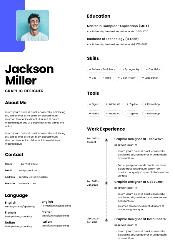
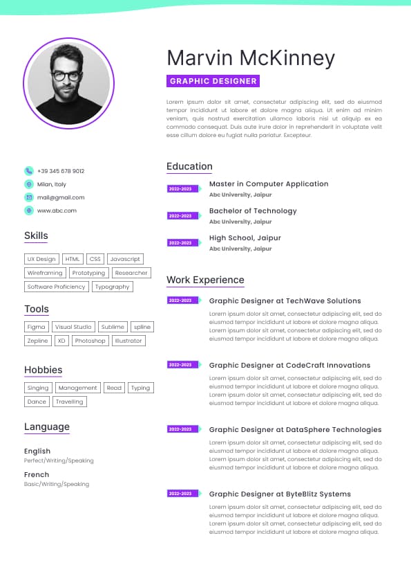
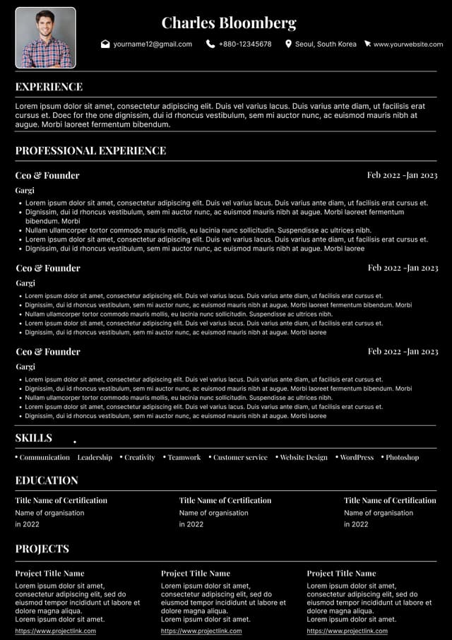
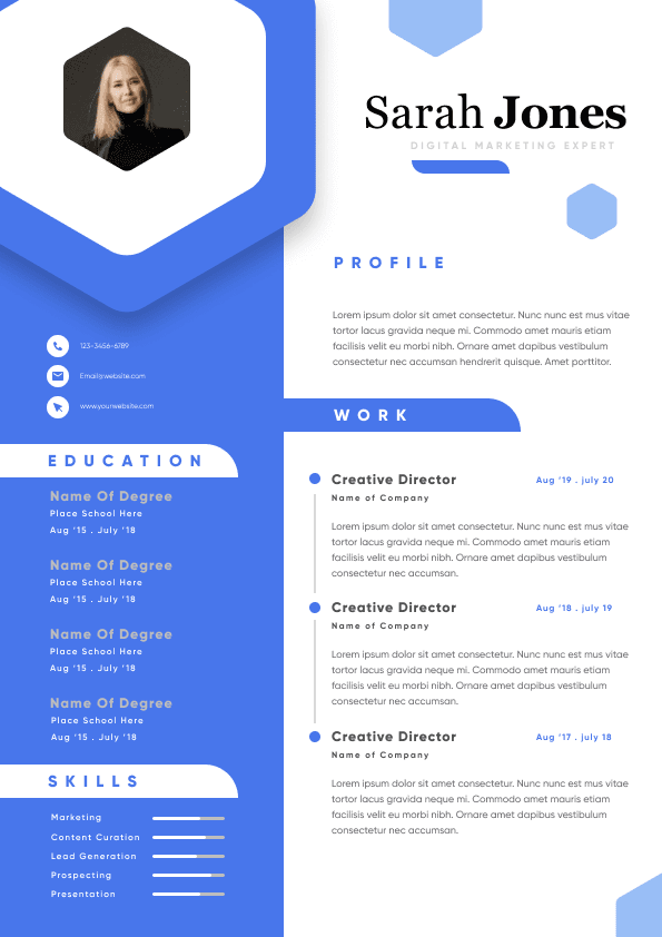
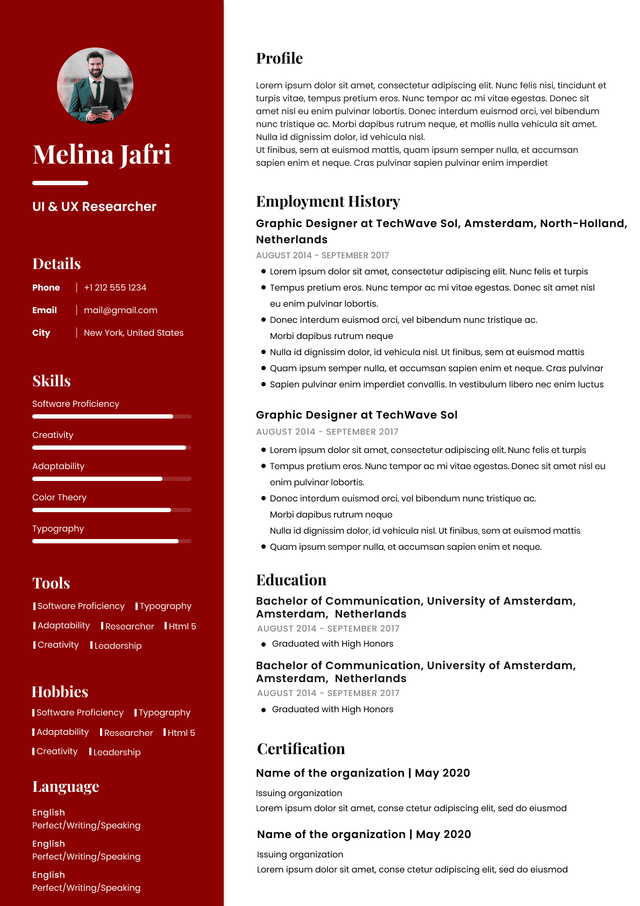
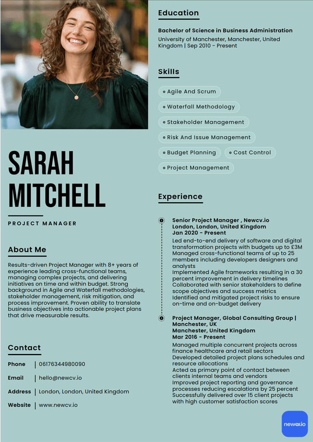
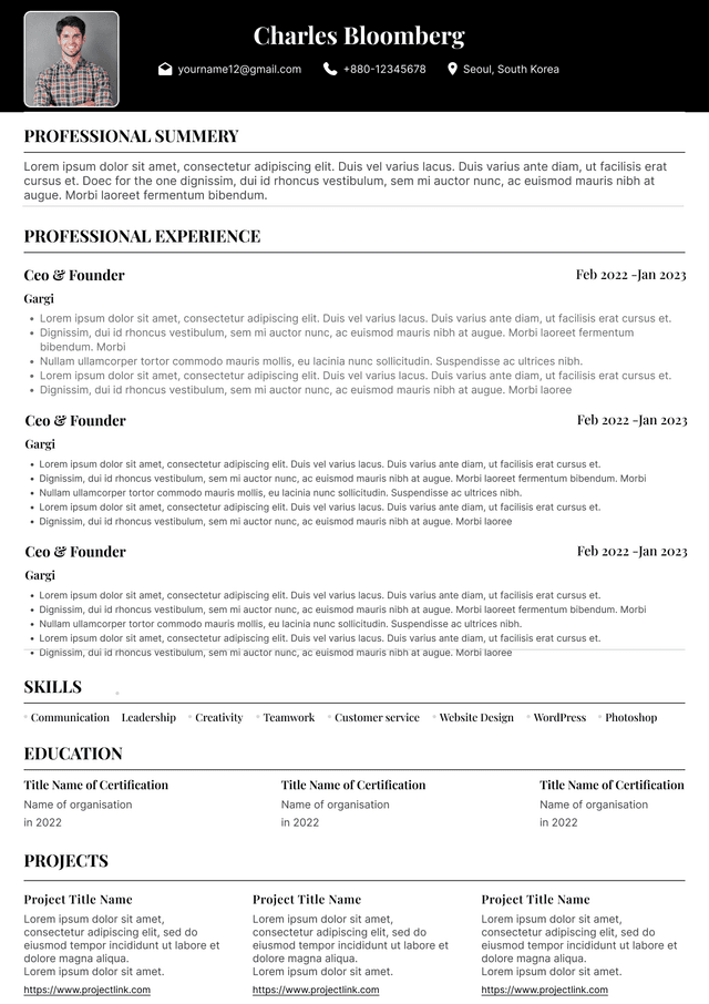
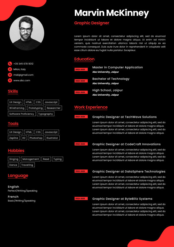
 Upload Resume
 Import from Linkedin