
Australian resume formatting is not about making your resume look fancy. It is about making the right information easy to find, easy to trust, and easy to compare against the role. Recruiters and hiring managers usually do not read resumes slowly from top to bottom at first. They scan for job titles, recent experience, relevant skills, career progression, achievements, gaps, location, work rights, and whether your background matches the job brief. Good formatting helps them reach the right conclusion faster. Bad formatting makes them work too hard, and when hiring teams are busy, that matters more than candidates realise. Your resume should be clean, ATS friendly, logically structured, and designed for human screening, not decoration.
A well formatted Australian resume has one main job: to help the reader understand your fit for the role quickly and accurately.
That sounds simple, but most resume formatting advice gets stuck on surface details like font size, margins, colours, and whether you should use a template. Those things matter, but only because they support the bigger goal. The real question is not “Does this resume look nice?” The better question is “Can a recruiter understand this candidate’s relevance within seconds?”
When I screen resumes, I am usually trying to answer a few practical questions very quickly:
What does this person do professionally?
What level are they operating at?
Have they done work similar to this role?
Are they moving in a logical career direction?
Are their achievements credible?
Is anything missing, confusing, or inconsistent?
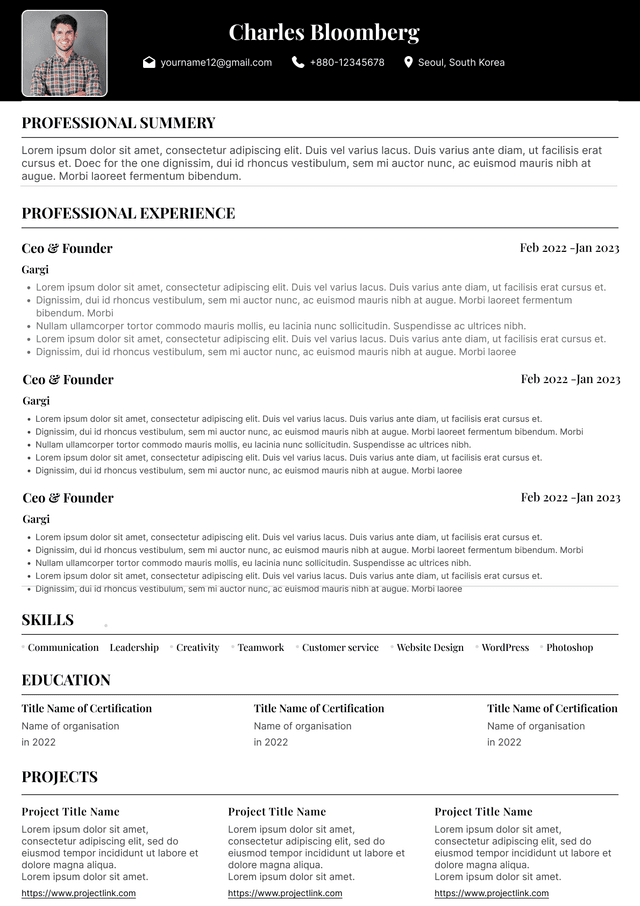
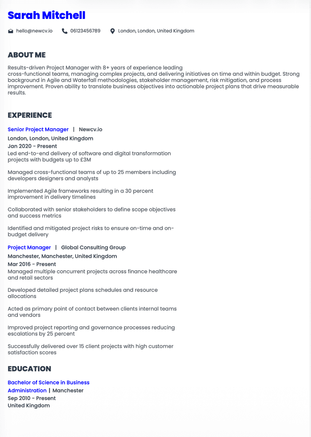
The best resume format in Australia is a clean reverse chronological format, with your most recent and relevant experience first. This is the format recruiters and hiring managers expect because it makes your career history easy to assess.
For most Australian job seekers, your resume should follow this structure:
Name and contact details
Professional headline or target role
Short professional summary
Key skills or areas of expertise
Professional experience in reverse chronological order
Education and qualifications
Certifications, licences, systems, or technical skills where relevant
One of the biggest resume formatting mistakes I see in Australia is candidates using design to compensate for unclear content. A visually attractive resume can still perform badly if it is difficult to scan, difficult for ATS systems to parse, or too focused on style instead of relevance.
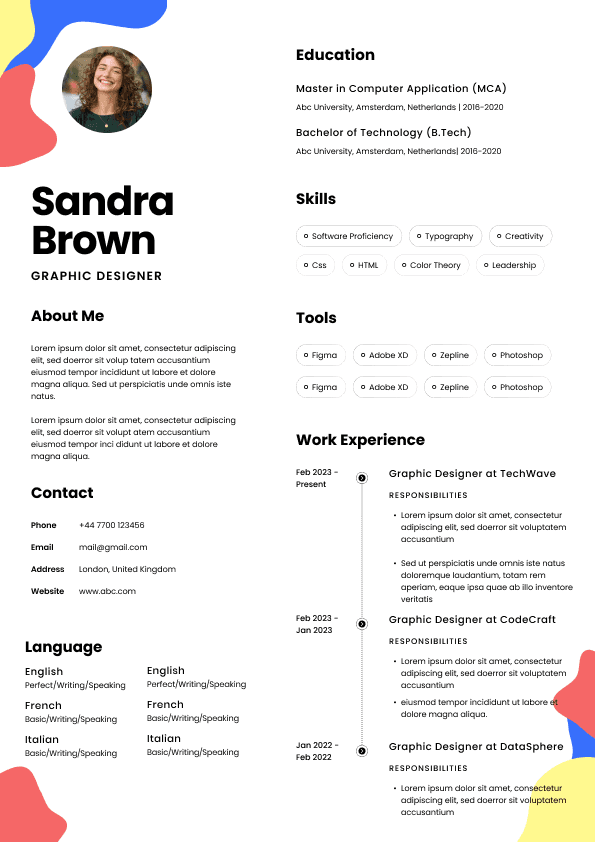
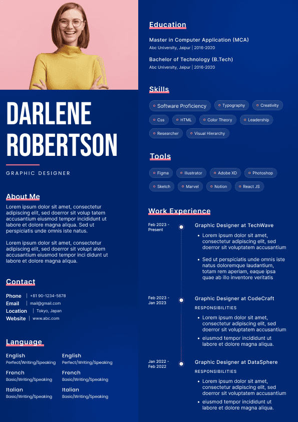
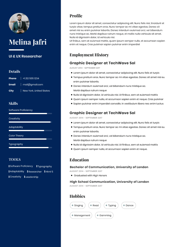
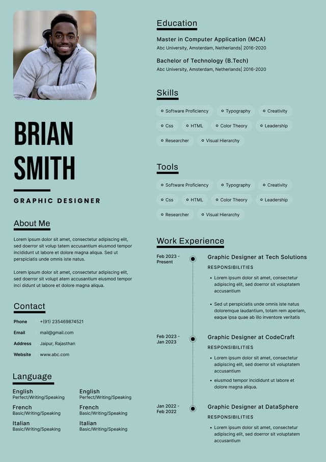
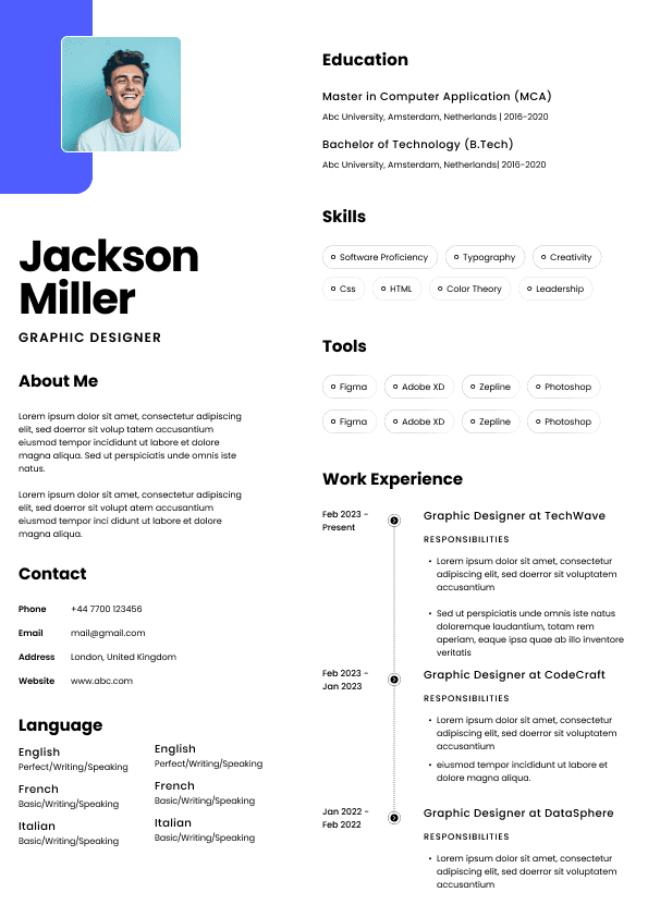
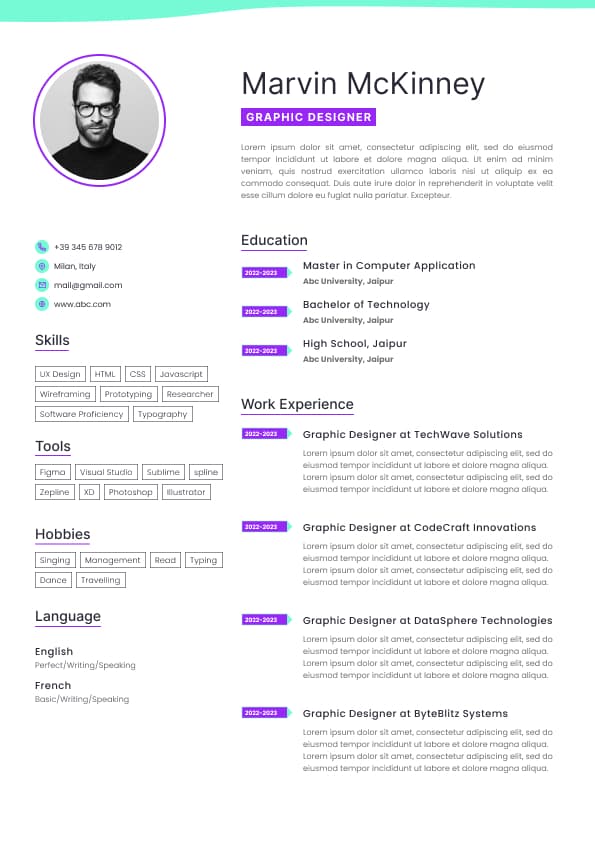
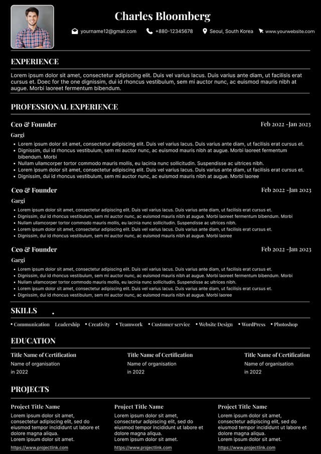
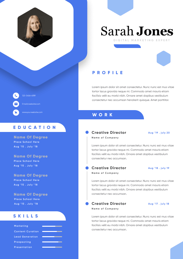
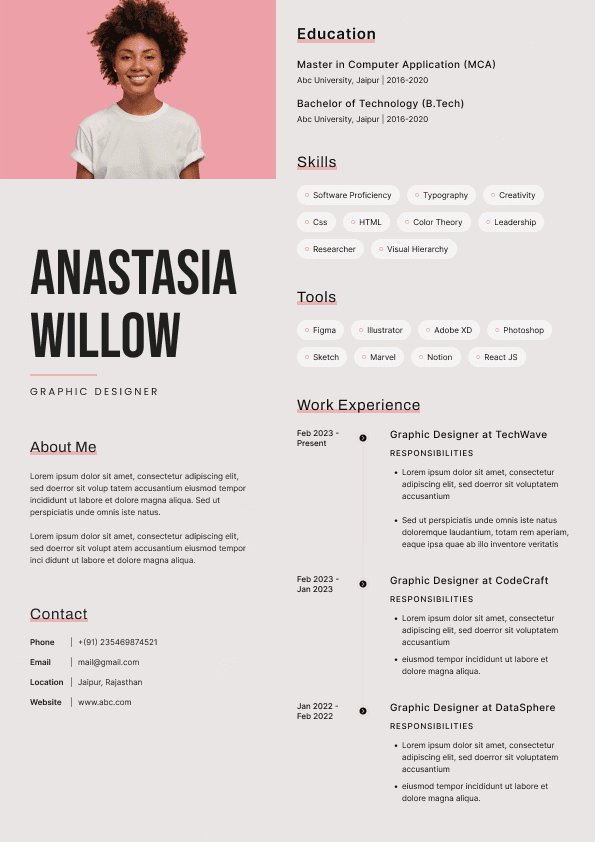
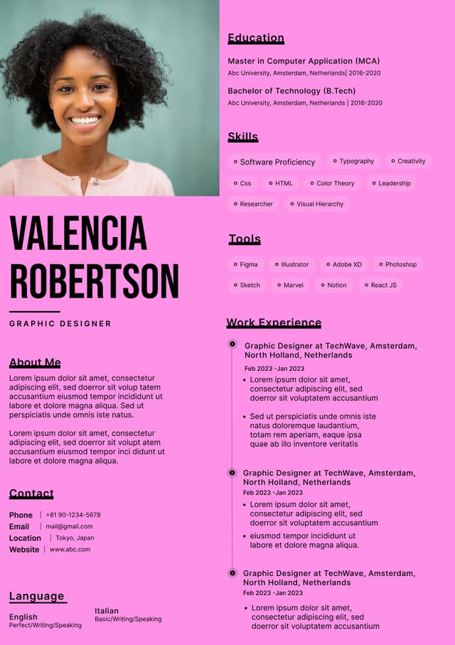
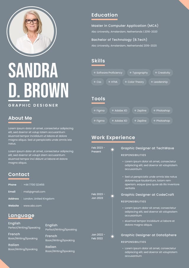
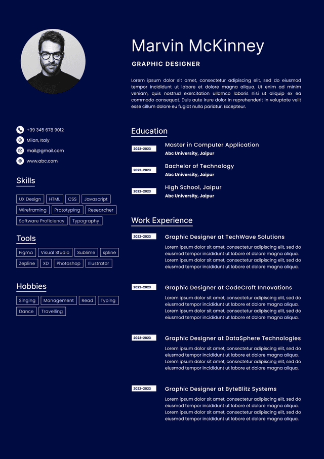
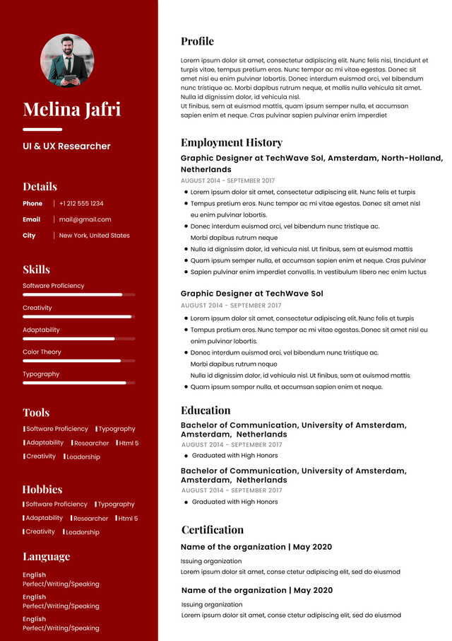
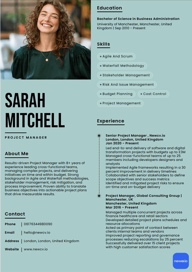
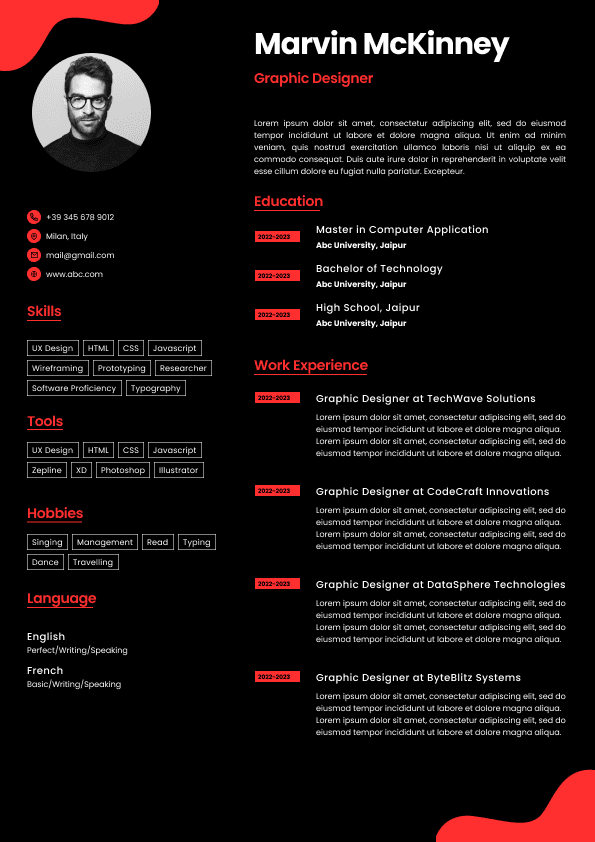
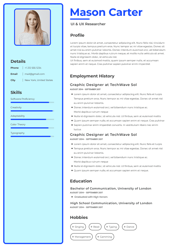
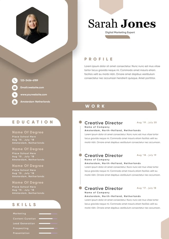
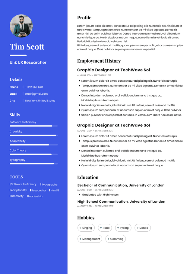
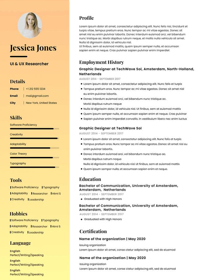
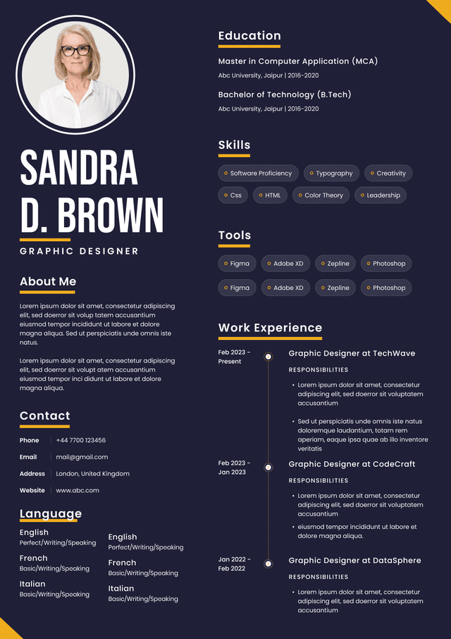
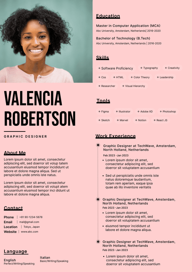
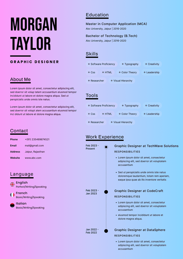
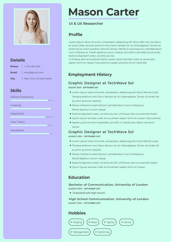
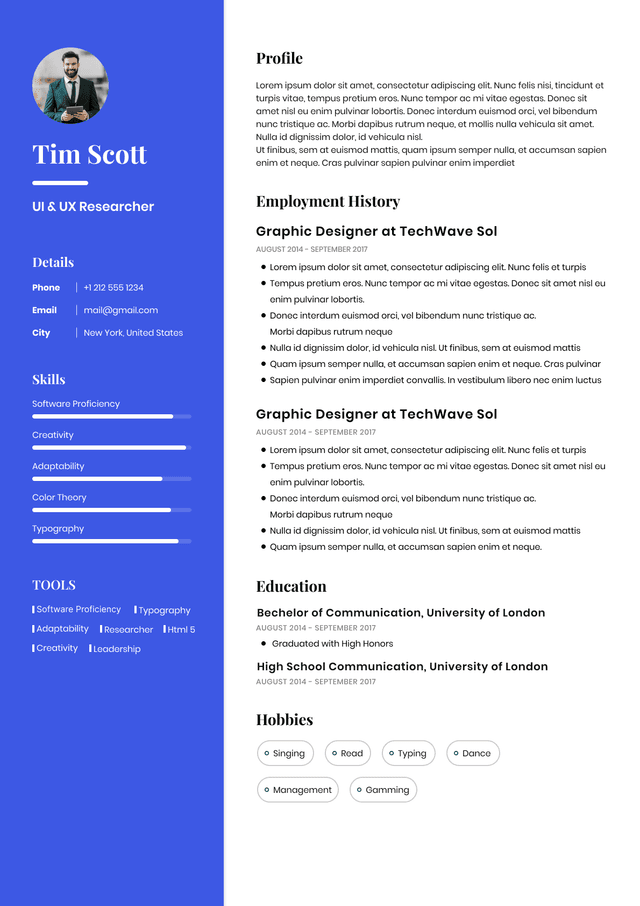
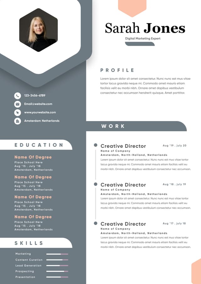
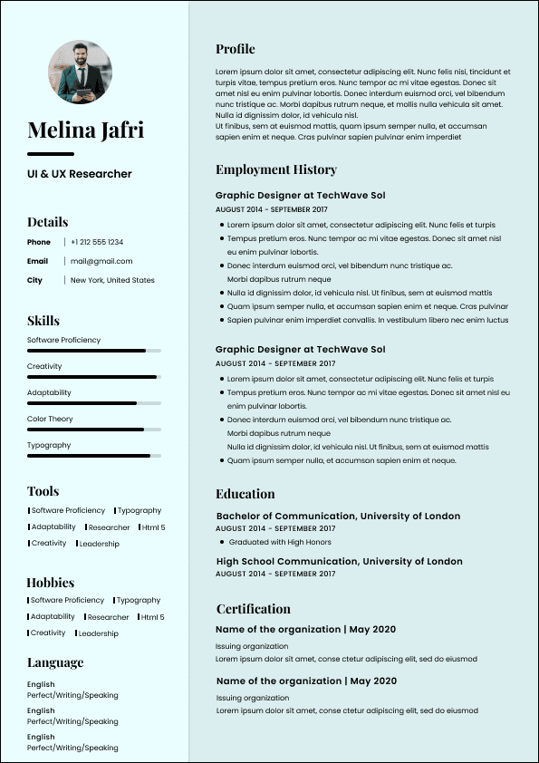
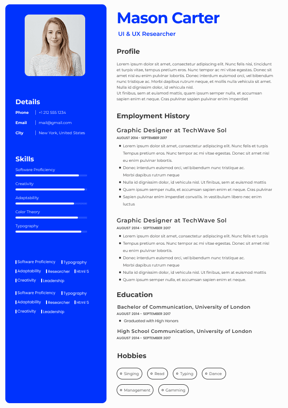
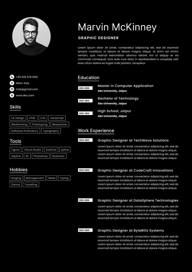
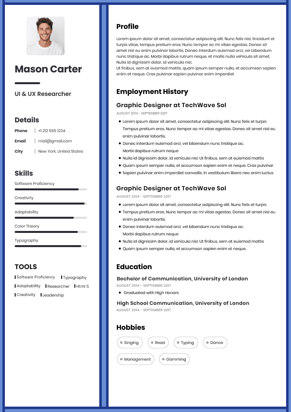
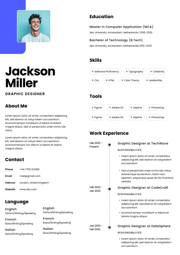
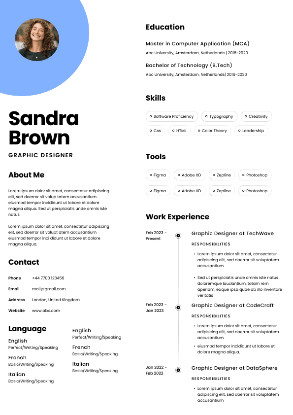
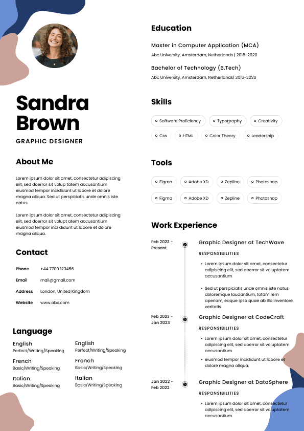
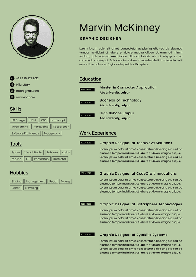
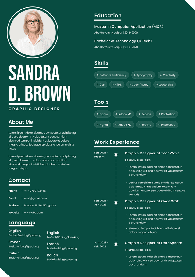
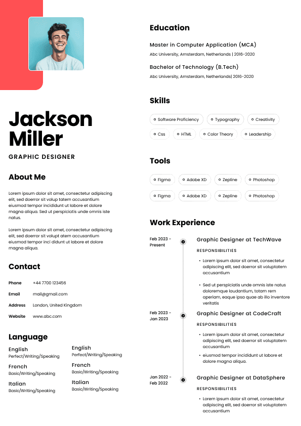
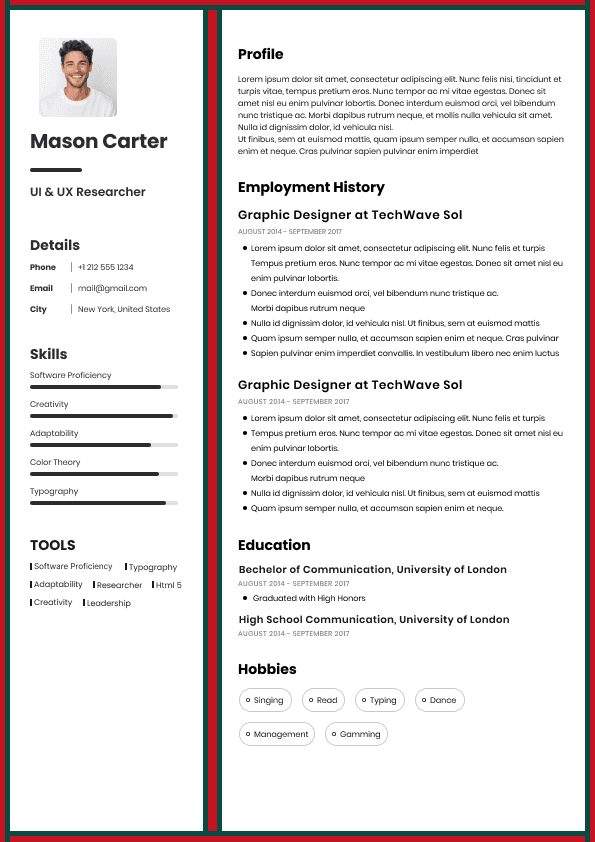
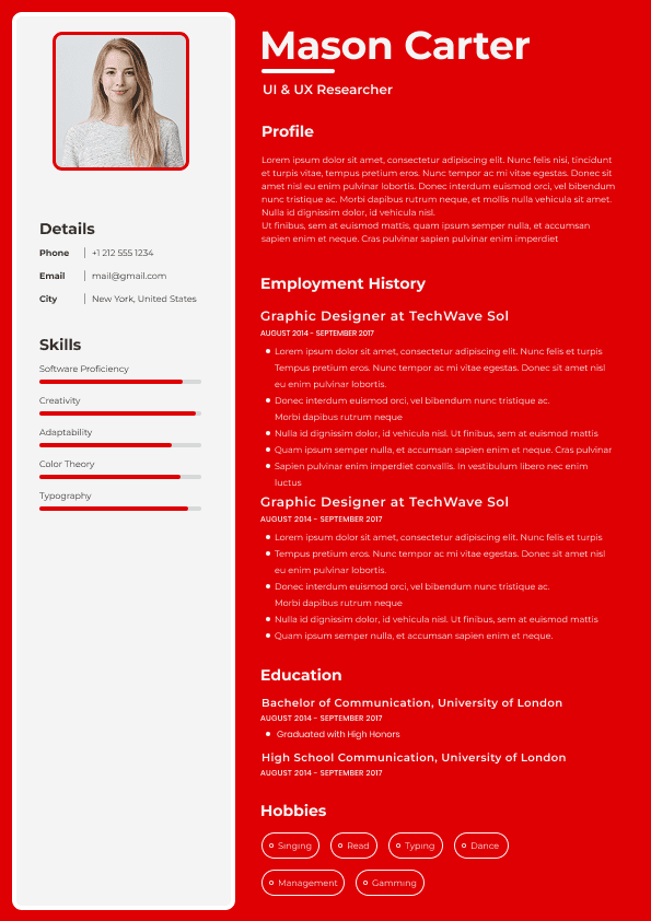
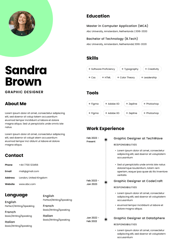
Recruiters are not impressed by complicated columns, icons, rating bars, profile photos, text boxes, heavy colour blocks, or infographic layouts if they make the resume harder to read. In some industries, a little design polish is fine. In most professional hiring, clarity beats creativity.
A clean resume design usually means:
Standard page layout
Clear section headings
Consistent spacing
Easy to read font
Strong contrast between text and background
No unnecessary graphics
Your resume header should be clean, professional, and easy to read. Put your name at the top, followed by your phone number, email address, location, LinkedIn profile, and any relevant portfolio link.
In Australia, you usually do not need to include your full residential address. Suburb and state are enough in most cases. For example, “Parramatta, NSW” or “Brisbane, QLD” gives employers enough location context without unnecessary personal detail.
Your header should include:
Full name
Mobile number
Professional email address
City or suburb and state
LinkedIn URL if your profile supports your application
Portfolio, GitHub, website, or professional profile if relevant
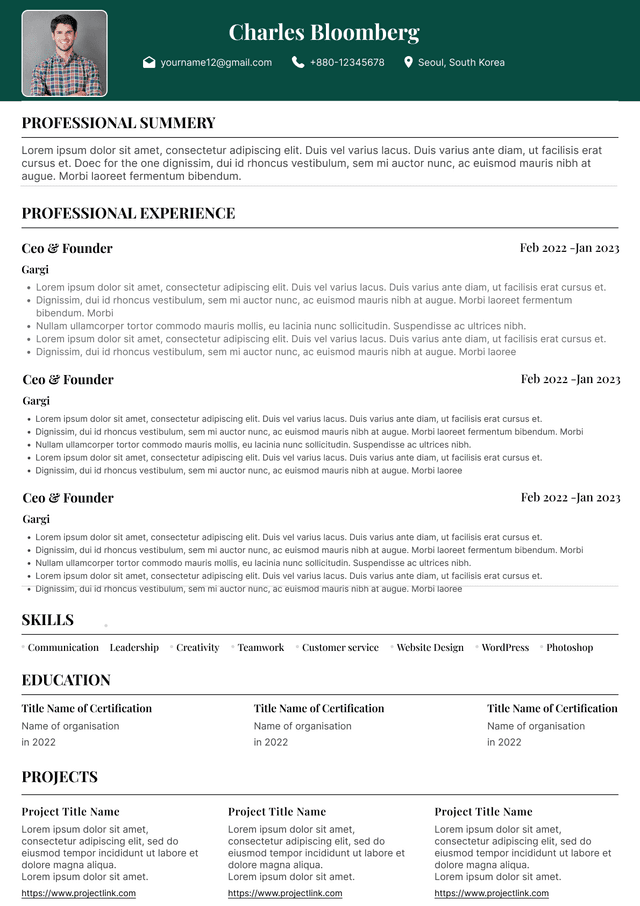
Avoid adding personal details that Australian employers do not need at screening stage, such as age, date of birth, marital status, religion, nationality, or a photo. A photo is not standard for most Australian resumes and can create unnecessary bias issues. Unless you are applying for a role where a portfolio or public profile is genuinely part of the assessment, leave the photo out.
A professional summary should not be a motivational speech. It should quickly position you for the job you want.
Most weak resume summaries sound like this:
Weak Example
“Hardworking and passionate professional with excellent communication skills and a strong work ethic. A team player who is motivated, reliable, and eager to contribute to a dynamic organisation.”
This tells me almost nothing. It could belong to an accountant, retail assistant, project coordinator, support worker, marketing manager, or someone applying to join a circus. Nice words, no positioning.
A stronger summary gives context, level, function, industry, and value.
Good Example
“Customer service professional with five years of experience across high volume retail and contact centre environments. Strong background in complaint handling, order support, CRM systems, and customer retention. Known for resolving complex enquiries calmly while maintaining service targets and customer satisfaction.”
This works because it helps the recruiter immediately understand where the candidate fits. It also gives the hiring manager language they can connect to the job.
For Australian resumes, keep your summary to three to five lines. You do not need a long personal profile. You need a practical snapshot.
A good summary usually answers:
What type of professional are you?
Your professional experience section is usually the most important part of your resume. This is where recruiters spend the most time once your resume passes the first scan.
Each role should include:
Job title
Company name
Location
Employment dates
Short company or role context if useful
Bullet points showing responsibilities, achievements, scope, systems, and outcomes
Use a consistent format for every role. Do not make the reader hunt for dates in one role, job titles in another, and company names somewhere else entirely. Consistency builds trust because it makes your career history easier to follow.
A strong role entry might look like this:
Bullet points are useful when they make information easier to scan. They are not useful when they become a dumping ground for every task you have ever touched.
Good resume bullet points should be specific, role relevant, and easy to understand. They should show what you did, where you did it, how you did it, and what changed where possible.
Weak bullet points usually sound like this:
Weak Example
Responsible for customer service
Helped with admin
Worked in a team
Used computer systems
Handled enquiries
These are technically fine, but they are too broad. They do not show level, volume, complexity, tools, industry, or impact.
Stronger bullet points sound like this:
Good Example
Applicant tracking systems are part of modern Australian recruitment, especially in corporate, government, university, healthcare, banking, retail head office, and large employer hiring. But candidates often misunderstand how ATS works.
An ATS is not usually some magical robot rejecting you because you used the wrong synonym once. In many hiring processes, it is a database that stores, parses, ranks, filters, and helps recruiters search applications. The bigger risk is not that the ATS “hates” your resume. The bigger risk is that your formatting makes your information difficult to parse or search.
To keep your resume ATS friendly:
Use standard headings such as Professional Experience, Education, Skills, Certifications, and Contact Details
Avoid placing critical information in headers, footers, images, tables, or text boxes
Use simple fonts such as Arial, Calibri, Aptos, Helvetica, or Times New Roman
Save as a Word document or PDF depending on the employer’s instructions
Include relevant keywords naturally from the job ad
For most Australian professionals, two to four pages is normal. One page can work for students, graduates, early career candidates, or people with limited experience. Senior professionals, specialists, managers, healthcare workers, government candidates, academics, and technical professionals may need more space.
The problem is not length by itself. The problem is poor judgement.
A two page resume can be too long if it is full of fluff. A four page resume can be appropriate if it contains relevant, well structured evidence. Recruiters do not reject resumes because they reach page three. They reject resumes when page three gives them nothing useful.
Use resume length based on relevance:
One page for students, school leavers, and some entry level candidates
Two pages for early to mid career professionals with focused experience
Three pages for experienced professionals with multiple relevant roles, achievements, systems, and projects
Four pages or more only when the role genuinely requires detailed evidence, such as senior leadership, government, academia, technical, medical, research, or project heavy backgrounds
Do not cut strong evidence just to obey a one page rule you read online. That advice often comes from markets or contexts that do not match Australian hiring. At the same time, do not include every casual job from fifteen years ago if it adds no value to your current target role.
Recruiters scan resumes in patterns. We do not give every line equal attention at the first stage.
The highest attention areas are usually:
Top third of page one
Current or most recent job title
Current or most recent employer
Employment dates
Key skills section
First few bullet points under recent roles
Qualifications or licences if mandatory
Keywords matter because recruiters and ATS systems often search for specific skills, systems, licences, job titles, methodologies, and industry terms. But keyword stuffing makes a resume sound unnatural and desperate.
The right way to use keywords is to mirror the genuine language of the role where it matches your experience.
Look at the job ad and identify:
Required technical skills
Systems and software
Industry terminology
Qualifications or licences
Core responsibilities
Compliance requirements
Methodologies or frameworks
Employment dates are one of the first things recruiters check. Not because we are trying to catch candidates out, but because dates help us understand continuity, recency, stability, progression, and context.
Use a clear and consistent date format, such as:
March 2022 to Present
January 2020 to February 2022
2018 to 2020
Month and year is usually best for professional roles. Year only can be acceptable in some situations, but it can also create questions if the timeline is already unclear.
Do not use vague formatting like:
Recently
Current role
Two years
A skills section can help your resume perform well, but only when it is specific and targeted. Many candidates create skills sections that are too broad to be useful.
A weak skills section looks like this:
Weak Example
Communication
Teamwork
Problem solving
Leadership
Microsoft Office
Time management
These skills are not wrong, but they are too generic. They do not help the recruiter understand your professional value.
A stronger skills section groups relevant capabilities by function.
Good Example
Some formatting choices do more harm than candidates realise. They may look harmless, but they create friction during screening.
Avoid these formatting mistakes:
Adding a photo for standard professional roles
Using coloured backgrounds that reduce readability
Putting key information inside graphics or icons
Using tiny font to squeeze in more content
Using large blocks of dense text
Mixing too many fonts or heading styles
Including personal details that are not needed
You do not need to redesign your resume for every job application. But you should adjust the emphasis.
Tailoring is not just about changing words. It is about changing what the reader sees first.
For each application, ask:
What are the top three things this employer needs to see quickly?
Is my most relevant experience visible on page one?
Does my summary match the target role?
Are the right skills and systems easy to find?
Do my bullet points reflect the job ad priorities?
Have I removed or reduced irrelevant detail?
For example, if you are applying for a people leadership role, your formatting should make leadership scope easy to see. Team size, performance management, coaching, rostering, hiring involvement, stakeholder management, and operational outcomes should not be buried.
Before you apply, review your resume with a recruiter’s eyes. Do not just ask, “Does this look good?” Ask, “Can someone quickly understand why I fit this role?”
Use this checklist:
Is my resume in reverse chronological order?
Are my name and contact details clear at the top?
Have I included suburb or city and state instead of a full street address?
Is my professional summary specific to the type of role I want?
Are my key skills relevant to the job ad?
Is my most recent experience easy to understand?
Are job titles, employers, locations, and dates formatted consistently?
Here is the honest part. Formatting matters, but it is not magic.
A beautifully formatted resume with vague content will still struggle. A plain resume with strong, relevant evidence can still perform well. The best result comes from both: clean formatting and sharp positioning.
When a resume is not working, candidates often blame the template first. Sometimes the template is the issue. But often the deeper problem is that the resume does not clearly connect the candidate’s background to the job they want.
Recruiters are not just looking at whether your resume is neat. We are looking for evidence. We are comparing your background against the role brief, the hiring manager’s preferences, the market, the salary range, the team structure, and the likely candidate pool.
Good formatting helps your evidence land. It cannot replace the evidence.
So before you spend hours choosing between resume templates, get the basics right:
Make your target role clear
Put relevant experience early
Use specific language
Show scope and outcomes
Written by Simar Malhi, a recruiter and headhunter with international recruitment experience. I write about CVs, job applications, hiring decisions, and the reality behind recruitment processes. My goal is to help candidates understand more honestly how employers, recruiters, and hiring managers actually select candidates.
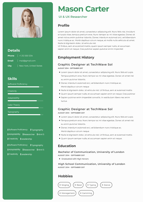
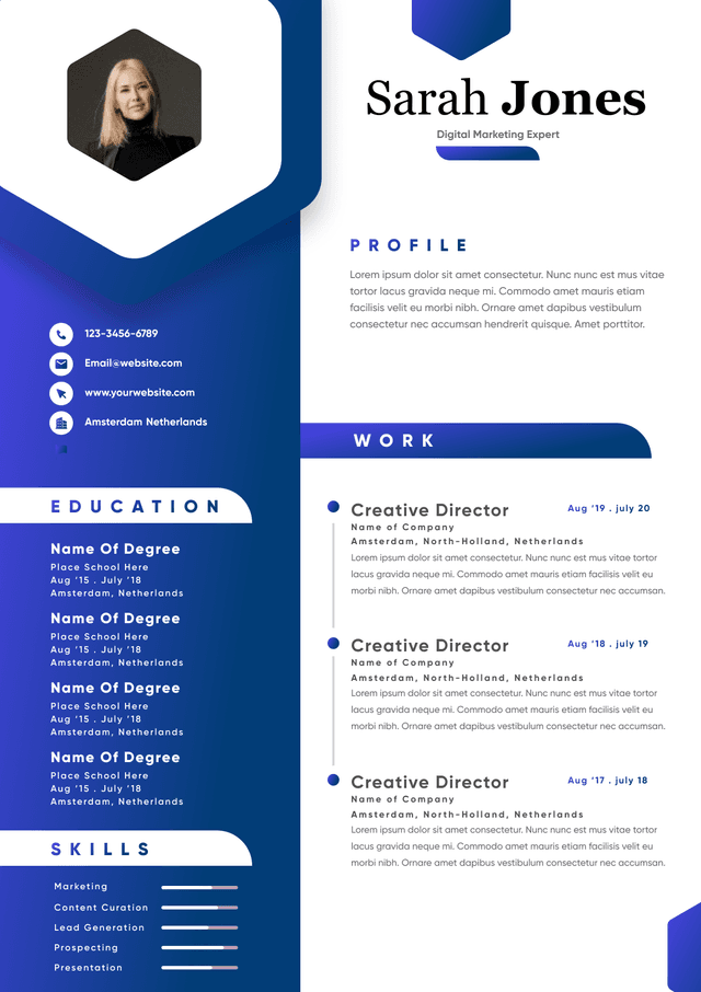
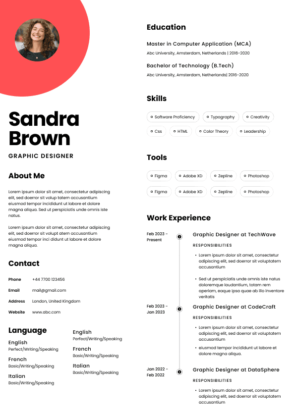
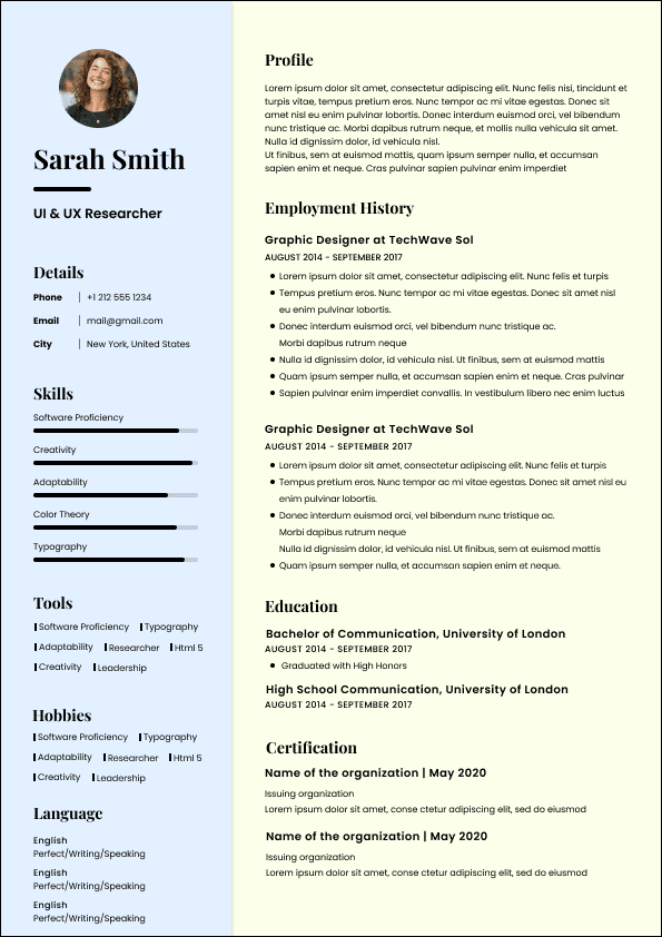
Choose from a wide range of NEWCV resume templates and customize your NEWCV design with a single click.

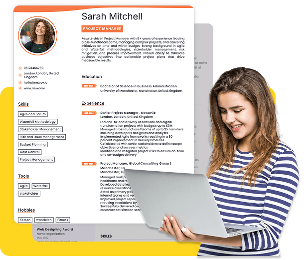
Use ATS-optimised Resume and resume templates that pass applicant tracking systems. Our Resume builder helps recruiters read, scan, and shortlist your Resume faster.

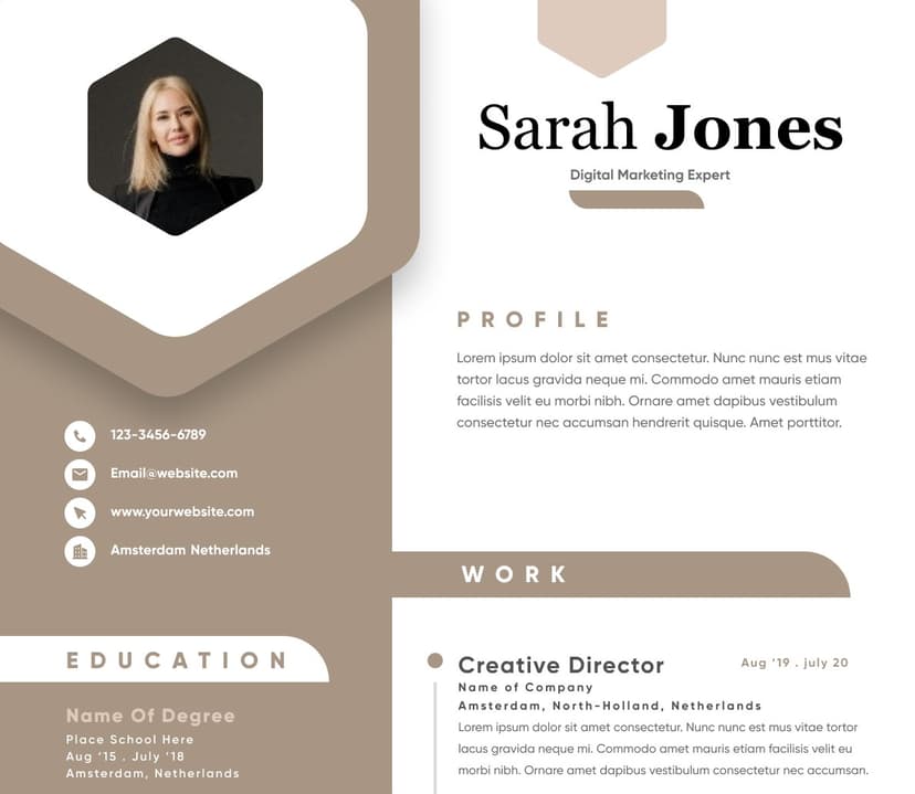
Use professional field-tested resume templates that follow the exact Resume rules employers look for.
Create Resume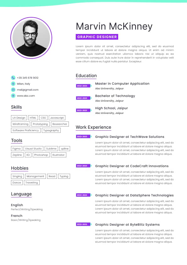
Use professional field-tested resume templates that follow the exact Resume rules employers look for.
Create ResumeWould a hiring manager understand their value without me having to explain it?
This is where formatting becomes more than presentation. It becomes positioning. A strong resume format guides the reader’s eyes towards the evidence that matters most. A weak format hides good experience under clutter, vague headings, oversized summaries, long paragraphs, decorative templates, and inconsistent spacing.
The frustrating part is that many candidates are not rejected because they lack value. They are skipped because their value is too difficult to extract. That is avoidable.
Optional extras such as volunteer work, professional memberships, projects, or awards
Reverse chronological formatting works because hiring teams care heavily about recency. Your most recent role usually tells us the most about your current capability, salary level, responsibilities, industry exposure, and likely fit.
Functional resumes, where skills are separated from work history and job dates are minimised, are usually less effective in Australia. Candidates often use them to hide gaps, career changes, or limited direct experience. Recruiters know this. Hiring managers know this too. That does not mean a functional resume is always wrong, but it often creates more suspicion than confidence.
A better approach is to keep the reverse chronological structure and use your summary, skills section, and bullet points to reposition your experience.
For example, if you are changing careers, do not hide your work history. Make the transferable parts obvious. If you have a career gap, do not build a confusing format around it. Use clean dates and explain the gap briefly where needed. Good formatting should clarify. It should not look like it is trying to distract the reader.
No excessive colours
No cramped margins
No tiny text
No complicated tables or columns
If your resume looks like a brochure, a flyer, or a Canva experiment that got too confident, pull it back.
The best resume formatting usually feels almost boring at first glance. That is not a weakness. Boring can be powerful when the content is sharp. Recruiters do not need your resume to entertain us. We need it to answer the role brief.
One small detail candidates overlook: make sure your LinkedIn profile and resume do not contradict each other. Recruiters often cross check. If your resume says one job title and LinkedIn says another, it may not be a disaster, but it creates friction. Friction slows trust.
How much relevant experience do you have?
Which industries, functions, or environments are you familiar with?
What problems do you solve?
What makes your background relevant to this role?
The trick is to avoid writing a summary about your personality unless your personality traits are backed by role relevant evidence. “Reliable” is not positioning. “Experienced in rostering, stock control, and leading weekend trading teams across high volume stores” is positioning.
ABC Retail Group, Melbourne, VIC
March 2021 to Present
Led a team of customer service consultants across a busy retail support environment, managing escalations, service quality, rostering support, and daily workflow coordination.
Supervised a team of twelve consultants handling phone, email, and online order enquiries
Reduced escalated complaints by improving call coaching, knowledge base usage, and handover quality
Monitored service levels, customer satisfaction, and response times during peak trading periods
Trained new starters on CRM processes, refund policies, and complaint handling standards
Notice the format. The role is easy to scan. The context is clear. The bullet points do not just list tasks. They show scope, action, and impact.
The mistake many candidates make is formatting every bullet as a job duty. That makes the resume read like a position description. Hiring managers do not need a copy of your job description. They need to understand how you performed the job, what level you operated at, and what evidence supports your suitability.
Managed up to eighty customer enquiries per day across phone, email, and live chat while maintaining response time targets
Processed refunds, exchanges, and order amendments using Zendesk, Shopify, and internal CRM systems
Resolved escalated delivery issues by coordinating with warehouse, courier, and store teams
Supported new team members with call scripts, system navigation, and complaint handling processes
This gives the recruiter something to work with. I can now understand environment, tools, pace, responsibility, and relevance.
A practical rule: if your bullet point could be copied into thousands of other resumes without changing anything, it is too generic.
Avoid graphics, icons, skill bars, and decorative columns
Use clear job titles and dates
ATS friendly does not mean ugly. It means readable by software and humans. The best resumes satisfy both.
One thing I often see: candidates use skill rating bars, like “Excel 90 percent” or “Leadership 5 stars”. These look neat but say very little. A hiring manager does not know what “Excel 90 percent” means. Advanced formulas? Pivot tables? Power Query? Reporting dashboards? Data cleaning? Budget modelling? Replace rating bars with actual capability.
For example:
Weak Example
Good Example
That is more searchable, more credible, and more useful.
Good formatting means the most relevant information appears early, not that everything is squeezed into the smallest possible space.
Location and work rights where relevant
This is why your first page matters so much. If the top half of your resume is filled with a long generic profile, oversized contact details, decorative design, or vague soft skills, you are wasting premium space.
The top third of your resume should help the reader quickly understand your fit. It should not force them to scroll or search for basic relevance.
For example, if you are applying for an accounts payable role, your first page should quickly show accounts payable experience, invoice processing, reconciliations, ERP systems, vendor management, payment runs, and relevant finance exposure. Do not bury those details on page two under a job from 2018.
If you are applying for a project coordinator role, make sure project coordination, stakeholder support, scheduling, documentation, reporting, budgets, risks, and systems are visible early.
This sounds obvious, but many candidates format their resume around chronology only, without thinking about visibility. Chronology matters, but relevance must be easy to see.
Customer groups or stakeholder types
Then include the relevant terms naturally in your summary, skills section, and work experience.
For example, if a job ad mentions stakeholder management, reporting, governance, risk registers, project documentation, and Microsoft Project, do not just dump those words into a skills list. Show them in context.
Weak Example
Good Example
The good version is stronger because it proves usage. Hiring teams are not just checking whether a word appears. They are checking whether your experience makes sense.
A recruiter can usually tell when a resume has been artificially stuffed with keywords. It reads like the job ad has been blended into a smoothie and poured into the skills section. Do not do that. Use the language of the role, but keep it honest.
Various contracts
Previous employment
These create more questions than they answer.
If you have contract roles, label them clearly. Contract work is common in Australia, especially in project, government, technology, administration, finance, construction, and healthcare environments. It is not automatically a problem. The problem is when contract work looks like unexplained job hopping.
For example:
Project Administrator
XYZ Infrastructure, Sydney, NSW
Six month contract, April 2023 to September 2023
That gives context immediately. No drama. No mystery.
If you have a career gap, formatting alone will not solve it. But clean formatting helps prevent the gap from looking worse than it is. You can explain a gap briefly if needed, especially if it involved study, caregiving, relocation, redundancy, health recovery, travel, or a career break. Keep it factual. You do not need to over confess. This is a resume, not a courtroom statement.
Customer Operations: complaint resolution, order support, escalation handling, service recovery, customer retention
Systems: Salesforce, Zendesk, Shopify, Microsoft Excel, Microsoft Teams
Team Support: onboarding, coaching, workflow coordination, call quality feedback
Reporting: service level tracking, customer satisfaction trends, daily activity reports
This format gives the reader a much clearer view of what the candidate can actually do.
For technical, trades, healthcare, finance, IT, marketing, engineering, and project roles, skills sections are especially important because hiring teams often screen for specific systems, tools, licences, or methodologies.
But do not let the skills section replace evidence. Listing “stakeholder management” is not enough. Your work experience needs to show where and how you managed stakeholders.
Hiding dates or using inconsistent date formats
Using tables that break when uploaded
Making the resume look like a design portfolio when the job is not design related
Listing references on the resume unless requested
Adding “References available upon request”, which is usually unnecessary
The issue is not that recruiters are fussy about design for fun. The issue is that every formatting choice either reduces or increases confidence.
A resume with inconsistent formatting can make the candidate look careless, even when the actual experience is strong. That may sound harsh, but hiring is often comparative. If two candidates have similar experience and one resume is clear while the other is messy, the clear resume has an advantage.
Formatting sends signals. It tells the reader how you organise information, how much judgement you use, and whether you understand professional expectations.
If you are applying for an analyst role, your formatting should bring data tools, reporting, dashboards, insights, process improvement, and commercial outcomes forward.
If you are applying for an administration role, your formatting should highlight systems, documentation, scheduling, customer service, records management, compliance, and office coordination.
Same candidate. Same career history. Different emphasis.
This is where many candidates go wrong. They think tailoring means rewriting the whole resume from scratch. Usually, it means improving the first page, reordering skills, sharpening the summary, and adjusting the most relevant bullet points.
Do my bullet points show scope, tools, responsibilities, and outcomes?
Have I avoided photos, icons, graphics, rating bars, and unnecessary design elements?
Is the resume easy to read on both desktop and mobile?
Have I used standard section headings?
Are important keywords included naturally?
Is the document ATS friendly?
Have I removed outdated or irrelevant information?
Would a hiring manager understand my value without extra explanation?
A strong resume format does not make an unqualified candidate qualified. But it can make a qualified candidate much easier to recognise. That is the point.
Keep formatting clean
Remove anything that distracts from fit
Make the hiring decision easier
That last point is the one candidates underestimate. A strong resume reduces effort for the person screening it. It answers questions before they become doubts. It gives the recruiter confidence to shortlist you and the hiring manager enough context to say, “Yes, I want to speak with this person.”
That is what good resume formatting does in the real Australian job market.




 Upload Resume
 Import from Linkedin