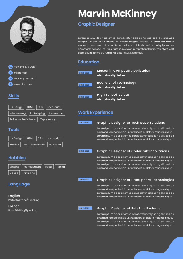
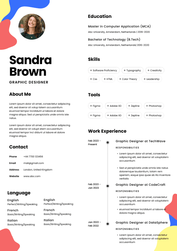
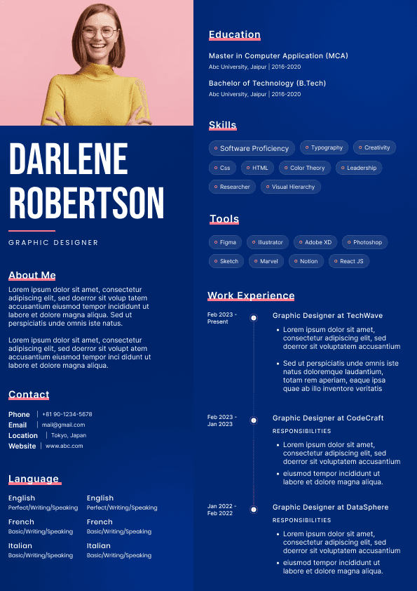
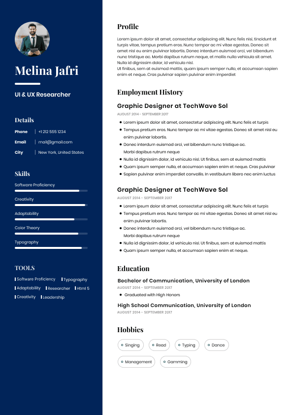
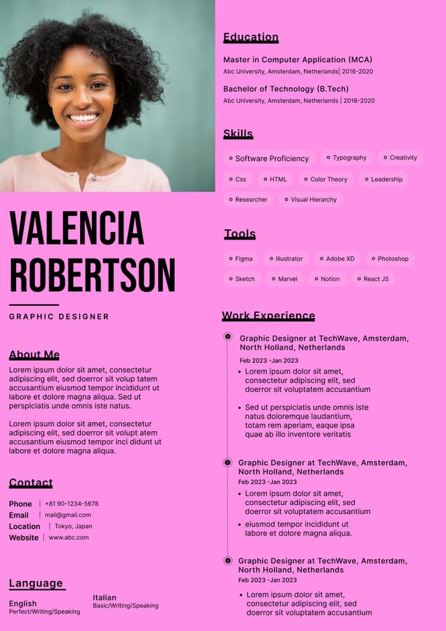
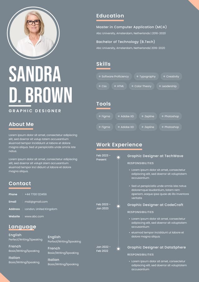
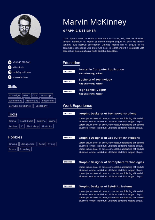
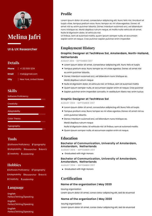
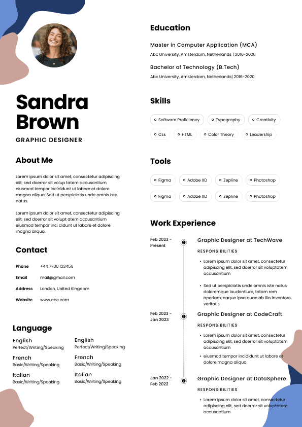
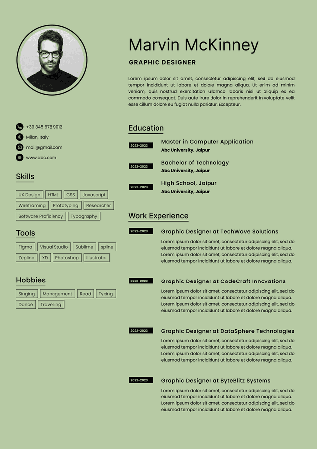
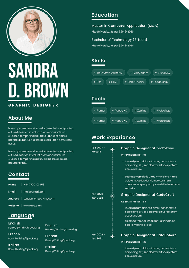
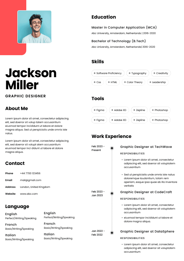
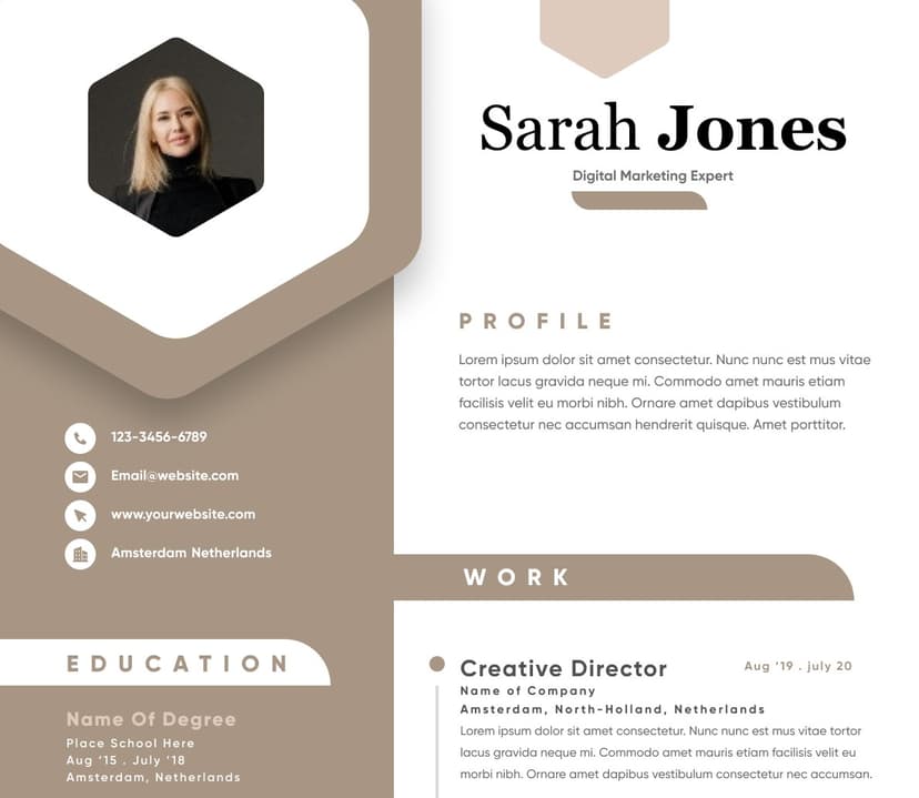
Choose from a wide range of NEWCV resume templates and customize your NEWCV design with a single click.
The best resume margins are usually 0.75 to 1 inch on all sides. For most Canadian job applications, I recommend starting with 1 inch margins because they create a clean, professional layout that is easy for recruiters, hiring managers, and applicant tracking systems to read. If your resume is slightly too long, you can reduce the margins to 0.75 inches, but I would be careful going smaller than that. Very narrow margins often make a resume look cramped, desperate, or poorly formatted, even when the content itself is strong. Resume margins seem like a small detail, but they affect the first impression immediately. Before I read a word, I can usually tell whether a candidate has tried to force too much information onto the page.
The safest resume margin size is 1 inch on the top, bottom, left, and right sides. That is the standard I would recommend for most job seekers in Canada because it gives your resume enough white space without wasting valuable room.
A resume is not just a document with your work history. It is a screening tool. Recruiters are not reading it slowly with a cup of coffee and a soft emotional investment in your career journey. We are scanning it quickly to decide whether your background makes sense for the role.
Good margins help that scan happen smoothly.
For most resumes, use this margin range:
Ideal margin size: 1 inch on all sides
Acceptable margin size: 0.75 inches on all sides
Minimum margin size: 0.5 inches only when absolutely necessary
Margins to avoid: Anything below 0.5 inches
I know people often shrink margins because they are trying to fit everything onto one or two pages. I understand the instinct. But when a resume looks packed edge to edge, the message is not “I have so much valuable experience.” The message is usually “I could not prioritize.”
That is not a small issue. Prioritization is one of the hidden things employers are judging when they read your resume.
Margins affect readability, visual balance, ATS parsing, and the overall professionalism of your resume. They also influence how much patience the reader has with your content.
This is the part many candidates miss. Formatting does not get you hired on its own, but poor formatting can absolutely weaken a strong profile. A hiring manager may not consciously think, “These margins are too narrow.” What they will think is, “This resume feels hard to read.”
That feeling matters.
In Canadian hiring, especially for corporate, professional, administrative, technical, finance, healthcare, operations, sales, and management roles, resumes are expected to be clean and easy to navigate. You do not need a fancy design. In fact, fancy design often creates more problems than it solves. But your resume does need to look controlled.
Margins contribute to that control.
When margins are too narrow, several things happen:
The page feels crowded before the recruiter reads the content
Bullet points look heavier than they are
Section headings lose visual separation
The resume becomes harder to skim
For Canadian resumes, 1 inch margins are the best default. They work across industries, seniority levels, and resume formats. They also keep your resume looking familiar, which is useful because recruiters and hiring managers are used to reviewing resumes quickly.
Use 1 inch margins when:
Your resume fits naturally on one or two pages
You are applying for professional, corporate, government, nonprofit, healthcare, education, finance, technology, or administrative roles
You want the safest formatting choice
Your resume will be uploaded through an applicant tracking system
You are sending your resume as a PDF
Use 0.75 inch margins when:
Your resume is slightly too long
Both 1 inch and 0.75 inch margins can work well. The difference is mostly about space and readability.
One inch margins create the cleanest, most traditional resume layout. They are ideal when your content already fits properly. They also make the resume feel more polished because the page has enough white space.
0.75 inch margins are useful when your resume is close to fitting, but not quite. I use this adjustment often when helping candidates tighten a resume without damaging readability.
The mistake is thinking margin size alone will save a resume that is too long.
If your resume needs 0.75 inch margins because you have one or two lines spilling onto another page, that is fine. If your resume needs 0.5 inch margins, 9 point font, no spacing, and six bullet points under every job, the margins are not the real issue.
Here is the recruiter reality: hiring teams do not reward you for squeezing in more information. They reward you for making the right information easy to find.
A resume with slightly less content but stronger relevance will usually perform better than a resume that includes every task, tool, project, committee, training session, and workplace side quest. This is not a storage unit. It is a positioning document.
For a one page resume, I usually recommend 0.75 to 1 inch margins. If you are early in your career, a recent graduate, changing careers, or applying for roles where a concise resume is expected, one page can work well.
But do not make the page look artificially full.
Some candidates use wide margins, huge headings, large spacing, and oversized fonts to make a thin resume look complete. Recruiters notice that too. Empty space is not automatically a problem, but exaggerated formatting can make the resume feel light.
For a one page resume, your goal is balance. The page should look complete, but not padded.
A good one page resume usually has:
Clear name and contact details at the top
A short, targeted professional summary if useful
Core skills or areas of expertise
Work experience with relevant bullet points
Education, certifications, or training
For a two page resume, I strongly prefer 1 inch margins or close to it. A two page resume already gives you more room, so there is usually no reason to make the margins extremely narrow.
A two page resume should feel intentional. It should not feel like a one page resume that gave up.
For most Canadian professionals with several years of experience, two pages is normal and often appropriate. The question is not whether two pages is allowed. The question is whether both pages earn their place.
Good margins help make a two page resume easier to read because the recruiter can move through the sections without feeling overloaded.
For two page resumes, watch for these issues:
Page one should contain the strongest and most relevant information
Page two should not become a dumping ground for old responsibilities
Margins should be consistent across both pages
Section spacing should feel clean and controlled
The second page should not have only a few lines of content
Resume margins can affect ATS compatibility, especially when candidates use unusual layouts, text boxes, columns, graphics, or extremely narrow spacing.
Most modern applicant tracking systems can read standard resumes reasonably well, but that does not mean you should test their patience. ATS friendly formatting is not about making your resume ugly. It is about keeping the structure predictable enough that both software and humans can understand it.
For ATS friendly resume margins, use:
0.75 to 1 inch margins
Standard page size used in Canada, usually letter size
Clear section headings
Simple formatting
No important text hidden in headers, footers, images, or text boxes
Consistent spacing between sections
When margins are too narrow, I rarely think about the margins in isolation. I think about what the formatting suggests.
A resume with tiny margins often tells me one of five things:
The candidate is trying to include too much
The candidate does not know what is most relevant
The resume has not been tailored
The candidate is relying on volume instead of positioning
The document may be difficult for the hiring manager to read
That may sound harsh, but this is how screening works. Recruiters are constantly making small judgments from incomplete information. Your resume needs to reduce friction, not create it.
The biggest issue with narrow margins is that they make everything feel equally important. When every section is packed tightly, nothing stands out. Your strongest achievements compete with basic duties. Your recent experience competes with outdated details. Your skills section competes with your education. The reader has to work harder.
And when the reader has to work harder, weaker candidates with clearer resumes sometimes get more attention than stronger candidates with messy ones.
Margins that are too wide create a different problem. They can make the resume look thin, underdeveloped, or padded.
This is common with early career resumes, career change resumes, and resumes made from templates with overly decorative spacing. The candidate may have decent experience, but the layout makes the page look empty.
Wide margins are not always wrong. A clean, spacious resume can look professional. But when margins are too wide, the content area becomes narrow, bullet points wrap awkwardly, and the resume may appear less substantial than it is.
Recruiters may wonder:
Does this person have enough relevant experience?
Is the resume hiding a lack of depth?
Why does the formatting feel larger than the content?
Is this template doing too much?
This is where design can quietly sabotage the candidate. Some resume templates are built to look attractive in a portfolio, not to perform in a real hiring process. They use large margins, big icons, sidebars, columns, and decorative elements that reduce the amount of usable space.
The resume may look nice at first glance, but it does not help the recruiter understand the candidate faster.
Most candidates create resumes in Microsoft Word or Google Docs, then save them as PDFs. That is fine. Just make sure the margins stay consistent after exporting.
In Microsoft Word, go to Layout, then Margins, then choose Normal for 1 inch margins. You can also choose Custom Margins if you want to set all sides to 0.75 inches.
In Google Docs, go to File, then Page setup, then adjust the top, bottom, left, and right margins. Set them to 1 inch or 0.75 inches depending on your layout.
After setting your margins, check the resume in three ways:
View it at full page size
Export it as a PDF and review the PDF
Open the PDF on a different screen if possible
This matters because resumes can shift slightly between programs, devices, and file formats. A resume that looks fine in Google Docs may look different as a PDF if spacing, fonts, or page breaks change.
Also check whether your resume is using Canadian standard letter size. In Canada, most resumes are created on letter size, not A4. This is a small detail, but it can affect page breaks and formatting if you are using a template from another country.
As someone with international recruitment experience, I see this often. A resume template created for one market gets reused in another market without adjusting page size, terminology, or expectations. The result is not always terrible, but it can feel slightly off. Canadian hiring teams may not reject you for page size alone, obviously, but your resume should feel familiar and easy to handle in the market where you are applying.
Margins do not work alone. They interact with font size, line spacing, section spacing, bullet length, and page length.
This is why copying a margin rule without looking at the whole resume can backfire. A resume with 0.75 inch margins can look excellent if the font is readable and the bullet points are well edited. The same margins can look terrible if the font is tiny and the content is dense.
For most resumes, use:
Font size between 10 and 12 points
Section headings slightly larger than body text
Enough spacing between job entries
Short, focused bullet points
Consistent alignment
No dense paragraphs under work experience
The biggest formatting mistake I see is not the wrong margin size. It is trying to solve every space issue by reducing everything at once. Smaller margins. Smaller font. Smaller spacing. Longer bullets. Less white space. Suddenly the resume looks like it was written during a panic spiral at 1:13 a.m.
Resume margin mistakes usually happen when candidates are trying to make the resume fit a rule they have heard somewhere. One page only. Two pages maximum. No white space. More keywords. More details. More proof.
The problem is that resume advice often gets repeated without context.
Here are the margin mistakes I would watch for.
This is the classic mistake. The candidate has enough experience for two pages but forces everything onto one page with tiny margins and cramped spacing.
The result may technically be one page, but it is not stronger. It is just harder to read.
A one page resume is only better when it improves clarity. If it reduces clarity, it is not doing its job.
Some templates have a narrow content area, a wide sidebar, or decorative blocks that throw off the visual balance. This can make your resume look designed but not necessarily professional.
Recruiters are not impressed by complicated formatting when it slows down screening.
Many candidates focus on left and right margins but ignore the bottom of the page. If your final line sits too close to the bottom edge, the resume looks squeezed. It can also print poorly.
Leave enough bottom space so the page feels finished, not jammed.
Examples help because margin problems are often visual, but the logic behind them is easy to understand once you know what to look for.
Weak Example
A candidate uses 0.4 inch margins, 9 point font, no spacing between roles, and seven bullet points under each job. The resume fits on one page, but it looks crowded and stressful to read.
What is wrong: The candidate has prioritized page count over readability. The resume may include good experience, but the formatting makes the recruiter work too hard to find it.
Good Example
A candidate uses 0.75 inch margins, 10.5 or 11 point font, clear section headings, and four focused bullet points under each recent role. The resume is two pages, but it is easy to scan and the most relevant experience appears early.
What works: The formatting supports the content. The candidate looks organized, selective, and aware of what the hiring team needs to see.
Weak Example
A candidate uses 1.5 inch margins and a decorative template with a large sidebar. The resume looks modern, but the actual work experience is squeezed into a narrow column, making each bullet wrap across several lines.
What is wrong: The design reduces readability. The resume may look polished at a glance, but it becomes annoying to read in detail.
Good Example
A candidate uses 1 inch margins with a simple single column layout. The sections are clearly labelled, the spacing is consistent, and the content fills the page naturally without looking crowded.
What works: The resume looks professional without distracting from the candidate’s qualifications.
The right resume margins depend on your content, seniority, industry, and target role. But the decision should always support readability first.
Use this practical framework.
Choose 1 inch margins if your resume already fits well and you want the safest professional layout.
Choose 0.75 inch margins if your resume needs slightly more space but still looks clean.
Choose 0.5 inch margins only if you have already edited the content and need a small final adjustment.
Avoid margins below 0.5 inches because they usually make the resume look cramped and poorly controlled.
If you are applying for conservative industries in Canada, such as banking, insurance, government, legal support, accounting, healthcare administration, or education, I would stay closer to 1 inch where possible. These environments usually respond better to clean, traditional formatting.
If you are applying for technology, marketing, product, design adjacent roles, sales, operations, or startups, 0.75 inch margins can still be completely acceptable as long as the layout remains clean.
But do not confuse creative with cluttered. A resume can show personality through strong content, sharp positioning, and relevant achievements. It does not need chaotic formatting to prove you are interesting.
This is the part I wish more candidates understood: resume margins are not just a formatting detail. They expose how well you understand relevance.
When a candidate cannot fit their resume properly, the issue is often not space. It is decision making.
They are trying to include everything because they are afraid of leaving something out. That fear is understandable, especially in a competitive Canadian job market where candidates feel pressure to prove themselves quickly. But more information does not always create more confidence.
Sometimes it creates more doubt.
Recruiters and hiring managers are looking for alignment. They want to see whether your background matches the role, whether your recent experience is relevant, whether your achievements show the right level of impact, and whether your resume makes the decision easier.
A resume with good margins says: “I know what matters here.”
A resume with chaotic margins says: “I am hoping something on this page works.”
That is a very different message.
Your resume does not need to tell your entire career story. It needs to make a strong case for this specific opportunity. Margins help frame that case, but they cannot replace strategy.
For most Canadian job seekers, use 1 inch margins as your starting point. If you need more room, reduce them to 0.75 inches. Only use 0.5 inch margins when necessary and only if the resume still looks clean, readable, and professional.
Do not shrink margins to avoid editing. Do not use oversized margins to hide thin content. Do not rely on templates that make your resume look attractive but harder to read.
The best resume margins create enough white space for the reader to move through your experience easily. They support the content instead of competing with it.
That is the real goal. Not perfect formatting for its own sake. Not squeezing your career into an arbitrary page rule. Not impressing a recruiter with design gymnastics. Just a clear, professional resume that makes your value easy to understand.
In hiring, easy to understand is underrated. It should not be.
Written by Simar Malhi, a recruiter and headhunter with international recruitment experience. I write about CVs, job applications, hiring decisions, and the reality behind recruitment processes. My goal is to help candidates understand more honestly how employers, recruiters, and hiring managers actually select candidates.

Use ATS-optimised Resume and resume templates that pass applicant tracking systems. Our Resume builder helps recruiters read, scan, and shortlist your Resume faster.

Use professional field-tested resume templates that follow the exact Resume rules employers look for.
Create Resume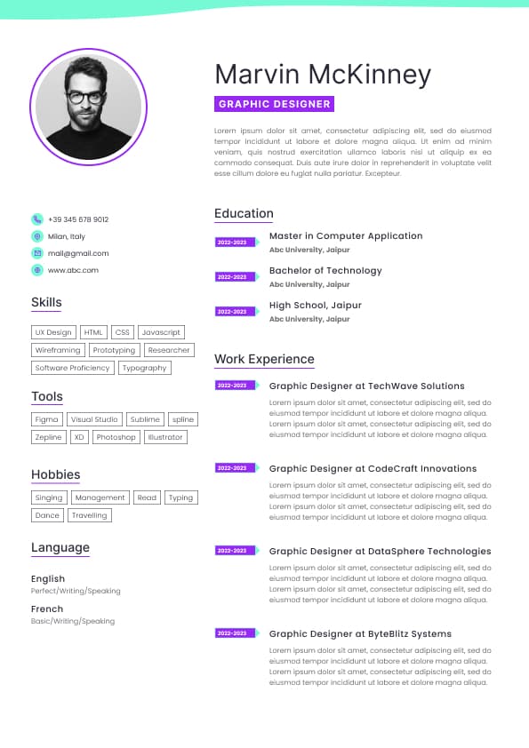
Use professional field-tested resume templates that follow the exact Resume rules employers look for.
Create ResumeImportant achievements get buried
The document may print poorly
ATS systems may struggle with unusual layouts
The candidate can appear unfocused or overly detailed
That last point matters more than people realize. When I see a resume with tiny margins, tiny font, dense paragraphs, and no breathing room, I often assume the candidate has not edited their content properly. That may or may not be fair, but hiring decisions are full of quick impressions. Your resume has to survive them.
You need a little more space without making the page look crowded
Your resume still has enough white space between sections
Your font size remains readable
Use 0.5 inch margins only when:
You are making a very small adjustment
The resume still looks balanced
You are not using dense paragraphs
You are not reducing the font below a readable size
I would not use margins smaller than 0.5 inches. At that point, you are usually solving the wrong problem. The issue is probably not the margins. The issue is that the resume has too much content, weak editing, repeated responsibilities, or details that are not relevant to the target role.
That is where candidates often go wrong. They try to fix a strategy problem with a formatting trick.
Enough white space to make the document easy to scan
If you need to reduce margins to fit your resume on one page, do it carefully. A clean two page resume is often better than a one page resume that looks like it has been emotionally compressed.
In the Canadian job market, one page is not always the gold standard. Many mid level and senior professionals need two pages, and that is completely normal. The old advice that every resume must be one page is too simplistic. It depends on your experience, industry, and the level of the role.
That last one is a common formatting problem. If your second page has only a small amount of text, do not immediately shrink the margins to force everything onto one page. First, edit the content. Remove repeated bullets. Cut old experience that no longer supports your target role. Tighten your summary. Combine short sections where appropriate.
A resume that is slightly shorter because it is better edited will almost always beat a resume that is shorter because the margins were attacked.
Readable font size
Margins are not usually the main ATS problem. The bigger problems are columns, tables, icons, graphics, unusual templates, and overly designed layouts. But margins still matter because extreme formatting can create parsing issues or make the resume harder to review after it enters the system.
Here is what candidates often misunderstand about ATS systems. The ATS is not the hiring decision maker. It is part database, part workflow system, part filter, and part storage cabinet with opinions depending on how the employer uses it. A recruiter or hiring manager usually still reviews the resume, especially when the application is relevant.
So your resume has to work for both.
A resume that is technically ATS readable but visually exhausting is not a win. A resume that looks beautiful but does not parse properly is also not a win. You need the boring middle ground: clean, readable, structured, and targeted.
That is where good margins help.
That is frustrating, but it is real.
Hiring is not an academic exercise where every resume is carefully studied with equal focus. It is a practical decision process happening under time pressure. Your formatting should respect that reality.
Good resume formatting should make the content stronger. It should not become the main character.
That is not the energy we want.
A better approach is to edit in this order:
Remove outdated or low value information
Reduce repeated responsibilities
Combine similar bullet points
Focus on achievements and scope
Shorten long lines
Adjust spacing slightly
Then adjust margins if still needed
Margins should be one of the final formatting adjustments, not the first rescue mission.
Your margins should be consistent across the resume. If page one has different margins from page two, the document can look patched together.
Consistency signals care. Inconsistency creates doubt.
Wide margins, oversized headings, and large spacing can make a resume look fuller than it is. But if the experience is thin, the better solution is not visual padding. The better solution is stronger positioning.
That may mean highlighting transferable skills, relevant projects, measurable contributions, certifications, internships, volunteer work, or practical training. The content still has to carry the resume.