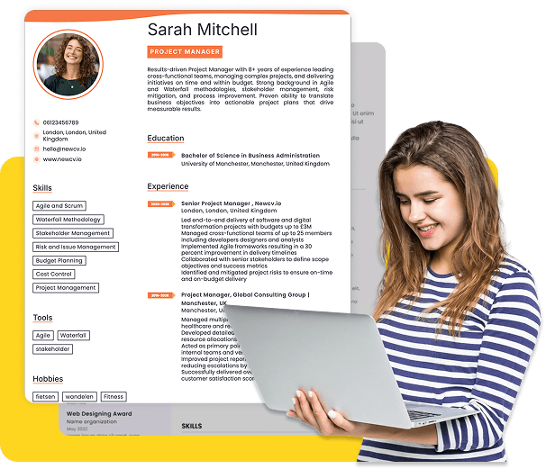
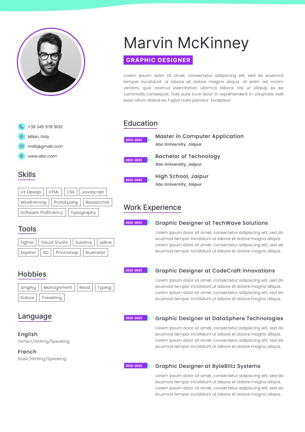
Choose from a wide range of NEWCV resume templates and customize your NEWCV design with a single click.
Use ATS-optimised Resume and resume templates that pass applicant tracking systems. Our Resume builder helps recruiters read, scan, and shortlist your Resume faster.

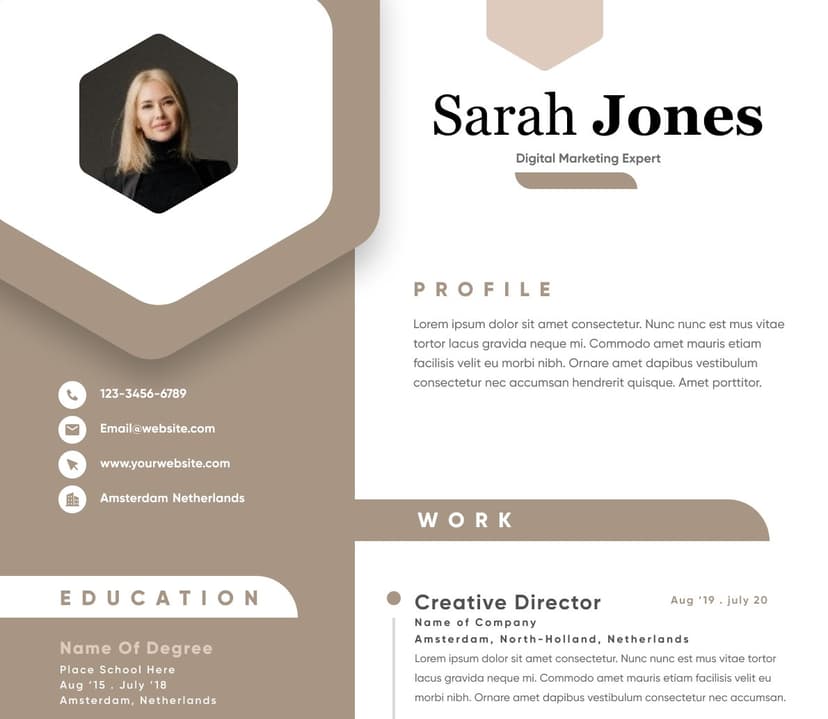
Use professional field-tested resume templates that follow the exact Resume rules employers look for.
Create Resume
Use professional field-tested resume templates that follow the exact Resume rules employers look for.
Create ResumeIf you’re searching for new CV design ideas, what you really want is a resume that stands out visually while still passing Applicant Tracking Systems (ATS) and impressing recruiters. The best CV designs today combine clean structure, modern layout, and strategic formatting to highlight your value instantly. This guide shows exactly how to design a CV that gets attention and leads to interviews.
A modern CV design is not about being flashy. It’s about clarity, hierarchy, and strategic visual flow.
In today’s hiring process, recruiters scan your CV in 6–10 seconds. Your design must help them instantly find:
Who you are
What you do
Why you’re qualified
A modern CV design achieves this through:
Clean formatting with clear sections
Strong visual hierarchy (headings, spacing, alignment)
Minimal clutter and no unnecessary graphics
Strategic use of white space
Many candidates make a critical mistake: designing for aesthetics only.
Here’s the truth:
ATS systems read structure and keywords
Recruiters read layout and clarity
Your CV must satisfy both.
Standard section headings (Experience, Skills, Education)
Simple fonts (no decorative or script fonts)
Logical structure
Clear alignment
This is the most effective and safest design.
Why it works:
Easy for ATS to read
Simple for recruiters to scan
Keeps focus on content
Structure:
Header (Name + Contact Info)
Professional Summary
Experience
Skills
ATS-friendly structure
The goal is simple: make your value easy to scan and impossible to miss.
Over-designed templates with columns ATS can’t parse
Excessive icons or graphics
Text embedded in images
Unreadable font styles
The best new CV design ideas are simple, structured, and strategic.
Education
Best for:
Corporate roles
Tech jobs
Finance
Entry-level to senior positions
This layout splits content visually but must remain ATS-friendly.
Left side:
Skills
Certifications
Tools
Right side:
Experience
Summary
Works if:
Designed cleanly
No tables or text boxes
Risk:
Use only if:
This design focuses on a strong first impression.
Features:
Larger name font
Job title directly under name
Clean contact section
Example:
John Smith
Senior Marketing Manager
This immediately tells recruiters who you are.
Your font choice can make or break your CV.
Arial
Calibri
Helvetica
Open Sans
Name: 16–20 pt
Headings: 12–14 pt
Body text: 10–11 pt
Using multiple fonts
Using decorative fonts
Text that is too small or too dense
Good typography improves readability instantly.
White space is not empty space. It’s a design tool.
It helps:
Improve readability
Reduce overwhelm
Guide the reader’s eye
Add space between sections
Avoid cramming too much text
Keep margins consistent
Recruiter insight:
A CV that feels “easy to read” gets read longer.
Your CV should visually guide the recruiter through your story.
Use:
Bold headings
Consistent formatting
Bullet points for achievements
Weak Example:
Worked on marketing campaigns and improved performance.
Good Example:
The second example stands out visually and delivers impact.
Instead of listing responsibilities, design your CV around results.
Each role should show:
What you did
What impact you created
This transforms your CV from generic to powerful.
Modern recruiters look for skills fast.
Place a skills section right after your summary:
Project Management
Data Analysis
CRM Tools
This increases keyword visibility for ATS.
Use color carefully:
Section headings (subtle color)
Divider lines
Avoid:
Bright colors
Background colors
Overuse
Keep it professional.
Follow this proven structure:
Name
Job Title
Contact Info
A 3–4 line value statement
Projects
Certifications
Portfolio
This structure aligns with how recruiters scan CVs.
Too many elements = confusion
ATS cannot read them
Messy layout signals lack of attention to detail
Different fonts, spacing, or styles reduce professionalism
Dense paragraphs reduce readability
Keep it clean, consistent, and focused.
From a recruiter’s perspective:
They look at:
Job title alignment
Recent experience
Achievements
Skills match
Your design should highlight these instantly.
If they can’t find this in seconds, they move on.
Knowing design principles is not enough. Execution matters.
This is where many candidates struggle.
Instead of manually building a CV, using a structured system ensures:
Correct formatting
ATS compatibility
Professional design
Keyword optimization
Creating a new resume or new CV using a smart system like NewCV allows you to apply all these design principles instantly.
With NewCV, you get:
ATS-friendly resume templates
Clean, recruiter-approved layouts
Modern CV designs that stand out
AI-powered content optimization
Built-in personal branding features
This eliminates guesswork and ensures your CV meets today’s hiring standards.
Clean layout
Clear sections
Strong achievements
Minimal design elements
Fancy templates
Graphics-heavy resumes
Overly creative formats
Poor readability
Your goal is not to impress visually.
Your goal is to get shortlisted.
There are exceptions.
Creative CV designs may work for:
Graphic designers
UI/UX designers
Creative roles
Even then:
Keep a clean version for ATS
Avoid sacrificing readability
For most roles, simple wins.
Before sending your CV, check:
Is it easy to scan in 10 seconds?
Are key achievements visible?
Is the layout clean and consistent?
Does it pass ATS readability?
Does it highlight your value clearly?
If the answer is yes, your design is working.