Choose from a wide range of NEWCV resume templates and customize your NEWCV design with a single click.

Use professional field-tested resume templates that follow the exact Resume rules employers look for.
Create ResumeOn-page resume design is not about visual creativity alone.
It is about structuring content for optimal readability, ATS parsing, and recruiter scanning efficiency.
In 2026, recruiters spend less than 30 seconds on the first pass, and ATS systems extract content algorithmically.
Every design choice impacts how your resume communicates value.
This guide explains the practical elements of on-page resume design and how they influence hiring outcomes.
Effective on-page design prioritizes:
•Content hierarchy
• Readability
• Keyword visibility
• Metrics prominence
• Progression clarity
Poor design can obscure impact and reduce interview probability, regardless of achievements.
•Preferred for ATS and recruiter scanning
• Clear flow from top to bottom
• Reduces parsing errors
•Professional Summary / Positioning
• Skills or Core Competencies
• Professional Experience
• Education & Certifications
Spacing and alignment should guide the reader naturally through content.
•Use clean, professional sans-serif fonts (Arial, Calibri, Helvetica, Inter)
• Maintain consistent font sizing:
• Name: 18–20pt
• Section headers: 12–14pt bold
• Body text: 10–11pt
• Avoid mixing multiple font styles
Consistency signals professionalism and aids rapid scanning.
•Use margins between 0.5–1 inch
• Leave space between sections
• Separate bullets clearly
White space directs attention to high-value areas like achievements, metrics, and roles.
Overcrowding reduces cognitive processing speed for recruiters.
•Use bold for job titles, companies, or key metrics
• Bullets should start with strong action verbs
• Place measurable outcomes early in the bullet
Example:
•Led a team of 5 to streamline inventory processes, reducing errors by 34% and cutting processing time by 2 weeks
Metrics and outcomes must be visible without reading the entire paragraph.
•Skills should be listed in a concise section
• Prioritize job-relevant skills and technologies
• Cross-reference skills in achievement bullets
Avoid overloading the skills section with soft skills or irrelevant tools; ATS and recruiters value context-linked competencies.
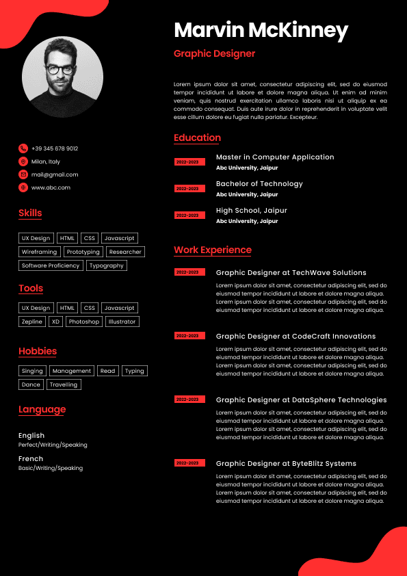
•Minimalist accents can be used for section headers
• Safe colors: dark navy, gray, charcoal
• Avoid bright or multiple colors
• Refrain from graphics that interfere with ATS parsing
Design must support content clarity, not distract.
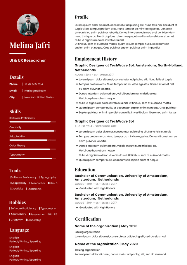
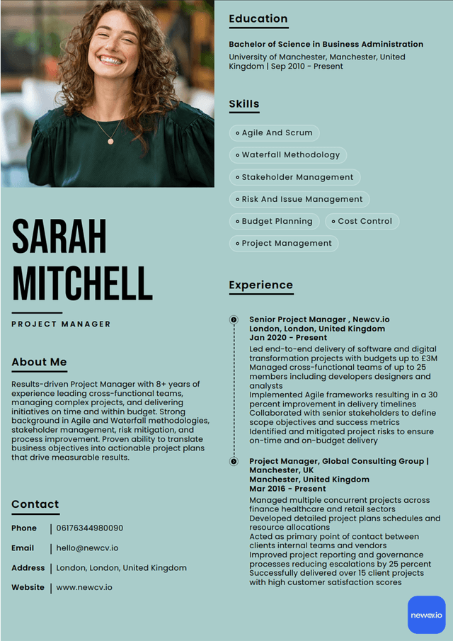
•Avoid multi-column layouts
• Don’t embed text inside images
• Use standard bullets (•)
• Keep contact info and dates in plain text
ATS extracts content linearly. Complex design can break parsing and reduce keyword recognition.
•Ensure text scales correctly on smaller screens
• Maintain clear headers and bullet spacing
• Avoid narrow columns or tightly spaced sections
Recruiters increasingly review resumes on tablets or smartphones; design must remain legible.
•Overusing graphics or icons
• Multi-column layouts
• Excessive skill bars or rating visuals
• Decorative fonts that reduce legibility
• Poor alignment of dates and titles
Every visual element must have a functional purpose.
Use ATS-optimised Resume and resume templates that pass applicant tracking systems. Our Resume builder helps recruiters read, scan, and shortlist your Resume faster.

Use professional field-tested resume templates that follow the exact Resume rules employers look for.
Create Resume