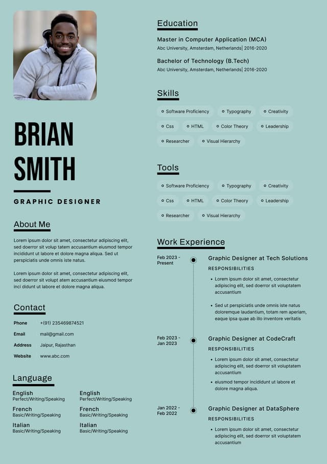
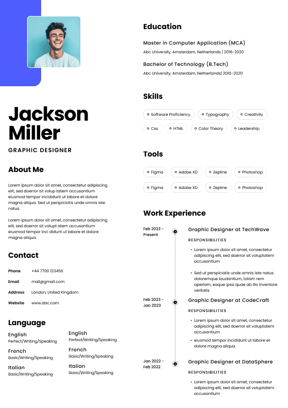
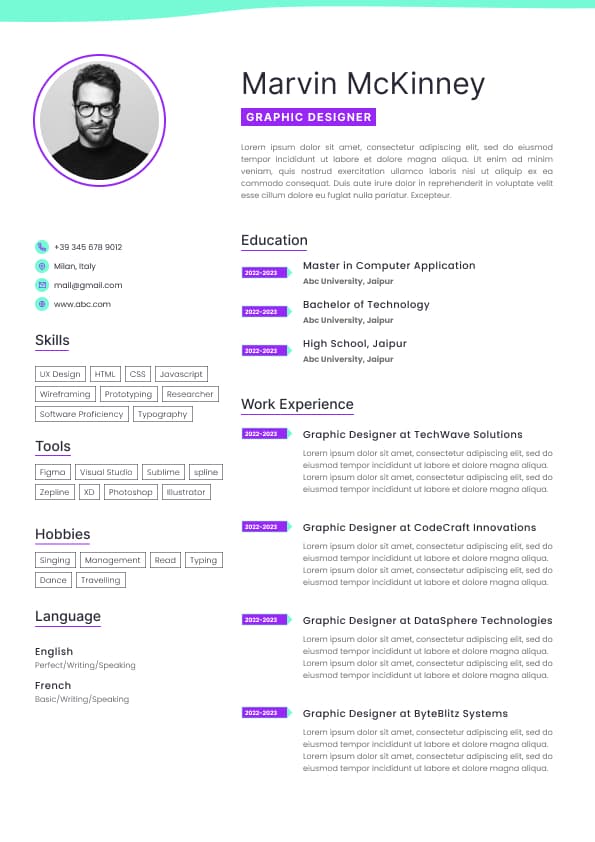
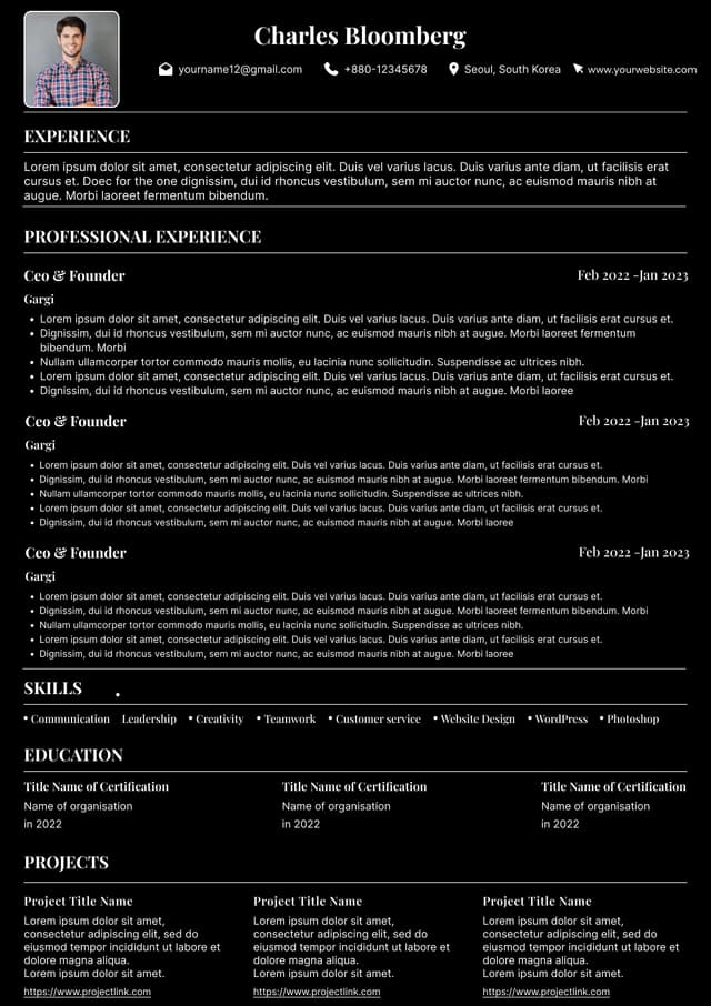
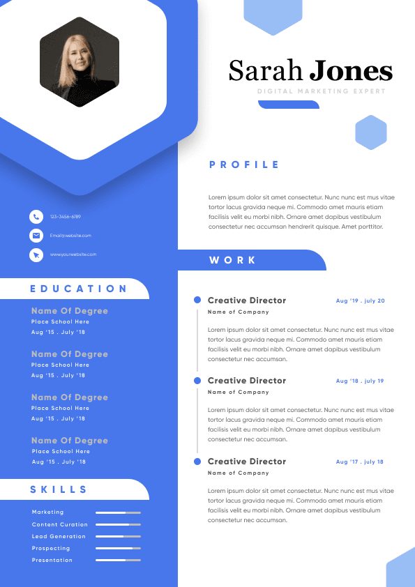
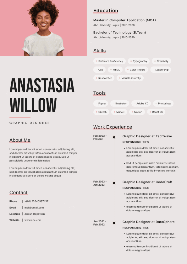
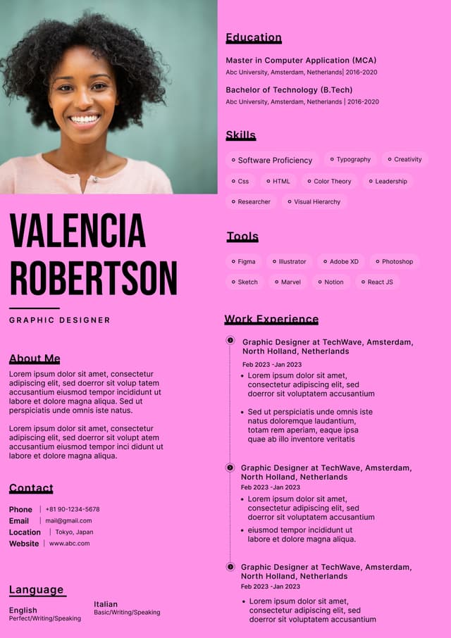
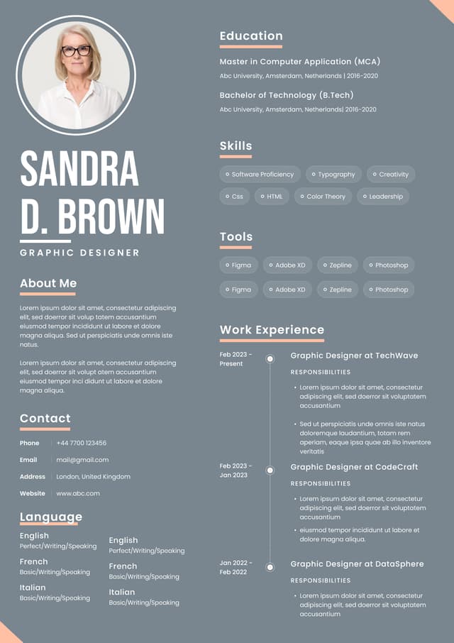
Choose from a wide range of NEWCV resume templates and customize your NEWCV design with a single click.

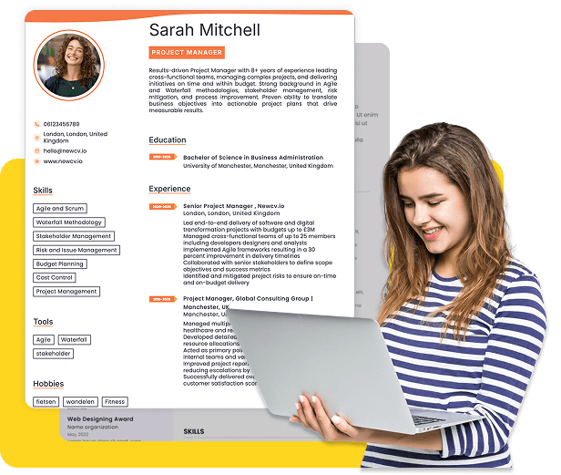

Use professional field-tested resume templates that follow the exact Resume rules employers look for.
Create ResumeYour resume design affects far more than appearance. In many hiring processes, design influences whether your resume gets scanned correctly, read quickly, or ignored entirely. Recruiters routinely review dozens to hundreds of applications for a single opening. Most resumes receive an initial review measured in seconds, not minutes.
If your layout creates friction, forces unnecessary effort, or confuses the reader, strong experience may never get seen.
Candidates often assume content alone determines outcomes. In reality, resume design influences usability. Hiring teams are not judging artistic talent. They are evaluating speed, clarity, readability, and information hierarchy.
A resume can fail even when the experience is excellent.
Poor formatting, overdesigned templates, visual clutter, and design decisions that look impressive on social media often create real hiring disadvantages. Modern resume design should help recruiters process information quickly, support ATS compatibility, and reinforce your professional positioning.
The candidates getting interviews are not necessarily the most qualified. They are often the easiest to evaluate.
Most candidates imagine recruiters carefully reviewing every section.
That rarely happens.
The first pass is usually a rapid scan designed to answer a few practical questions:
What role does this person want?
Are they qualified enough to continue?
Does their experience match the position?
Is there evidence of progression or impact?
Is anything immediately concerning?
Design directly affects how quickly those answers appear.
Recruiters naturally follow visual patterns. Eyes typically scan:
Name and title
Current company and role
Dates
Keywords matching job requirements
Recent accomplishments
Education if relevant
When design interrupts that process, screening slows down.
Slow equals risk.
Risk often becomes rejection.
Candidates frequently optimize for appearance instead of usability.
Those are different goals.
Many resumes are designed to impress the candidate rather than help the recruiter.
Examples include:
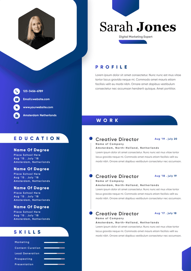
Large visual headers
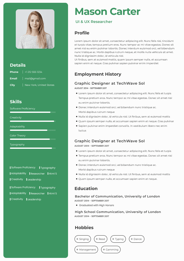
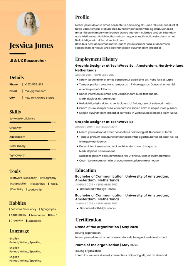
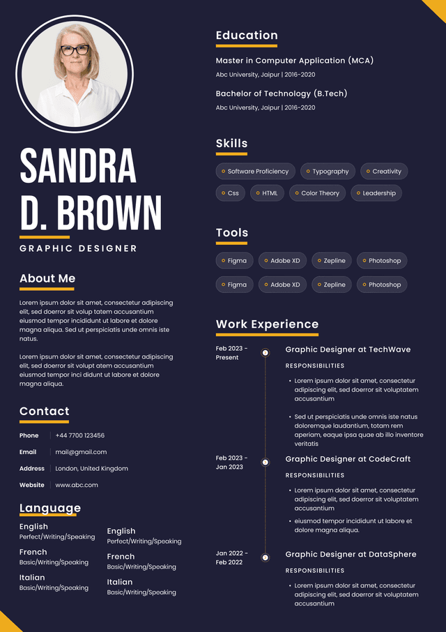
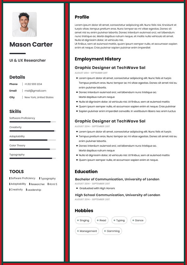
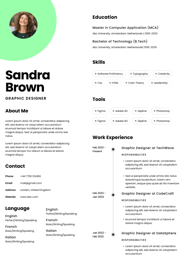
Sidebars packed with skills
Multiple columns
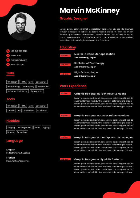
Graphic rating bars
Infographics
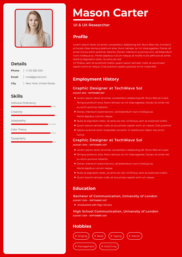
Heavy colors
Decorative icons
Excessive whitespace
Portfolio-style layouts
These designs may perform well on social media because they look visually polished.
But hiring systems and recruiters evaluate functionality.
An attractive resume that creates friction loses to a plain resume that creates clarity.
Many candidates hear "Applicant Tracking System" and assume ATS software either accepts or rejects resumes automatically.
That oversimplifies reality.
Modern systems vary significantly.
The real issue is not whether ATS "likes" your resume.
The issue is whether formatting prevents your information from being interpreted correctly.
Design elements that commonly create ATS issues include:
Text boxes
Multi-column layouts
Icons replacing labels
Header information inside graphics
Skill bars
Tables
Embedded visuals
Unusual fonts
Graphic timelines
A recruiter may receive a parsed version showing:
John Smith
No email found
No work history detected
Skills unavailable
Now your resume enters human review already damaged.
You never know this happened.
You only see silence.
Certain mistakes repeatedly appear across unsuccessful applications.
Candidates often assume visual sophistication communicates professionalism.
Sometimes it signals the opposite.
Overdesigned templates can create:
Visual distraction
Reading fatigue
Missing hierarchy
Reduced ATS compatibility
Unclear priorities
Recruiters do not reward complexity.
They reward efficiency.
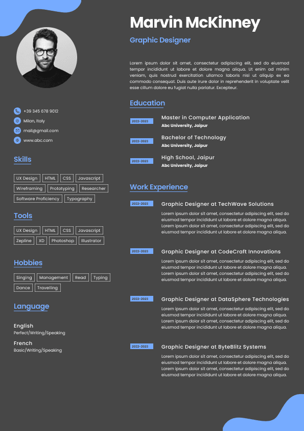
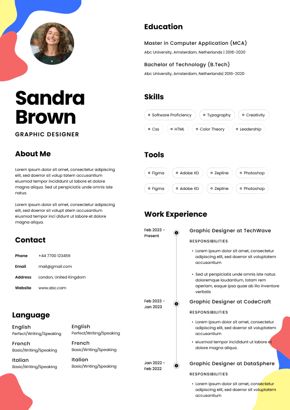
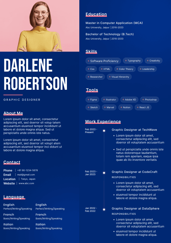
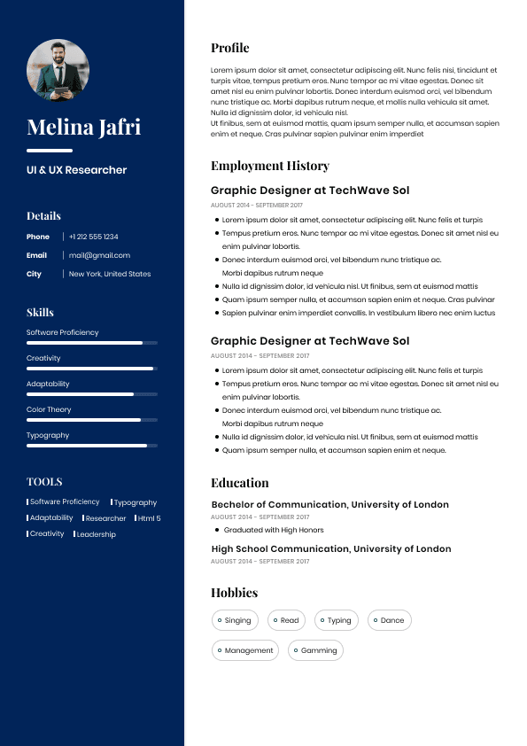
Two-column designs continue appearing across online resume builders.
The problem is predictable reading flow.
Many ATS systems process information left to right.
Columns can scramble:
Dates
Skills
Job descriptions
Contact information
Content may become distorted before recruiters ever see it.
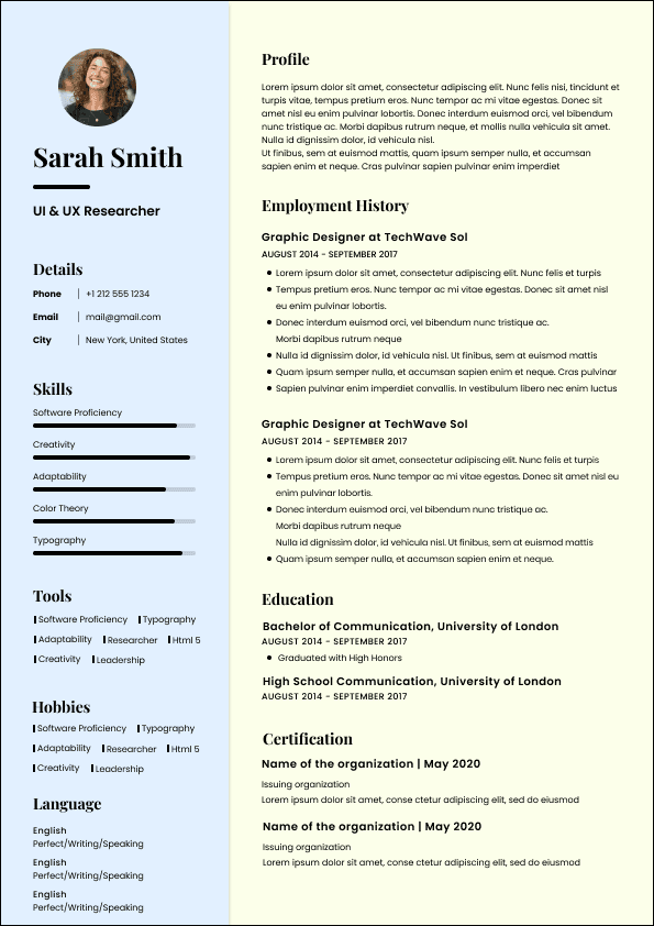
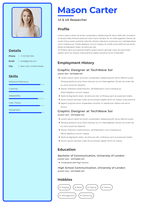
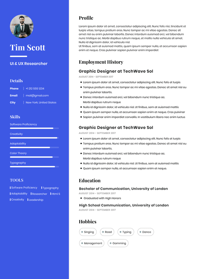
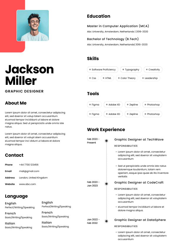
Five-star scales and progress bars create multiple problems.
They lack context.
What does four out of five in leadership mean?
Who determined it?
Compared to whom?
Recruiters trust evidence over self-assessments.
Weak Example:
Leadership: █████
Good Example:
Led a 12-person cross-functional team that reduced onboarding time by 30%.
Specific achievements outperform visual ratings every time.
Design should support readability.
When color dominates, attention scatters.
Recruiters want contrast and structure.
They do not want visual puzzles.
Most advice warns against crowded resumes.
Less discussed:
Too much empty space can also damage performance.
Many candidates use templates containing:
Huge section gaps
Oversized headings
Excessive margins
Large icons
Decorative spacing
Result:
One page contains surprisingly little information.
Recruiters may interpret this as weak experience depth rather than poor formatting decisions.
Design should create breathing room, not waste valuable real estate.
Strong resume design rarely attracts attention.
That sounds counterintuitive.
But effective design removes effort.
Recruiters should never consciously notice formatting.
Instead they should think:
"This candidate makes sense."
High-performing resume designs usually include:
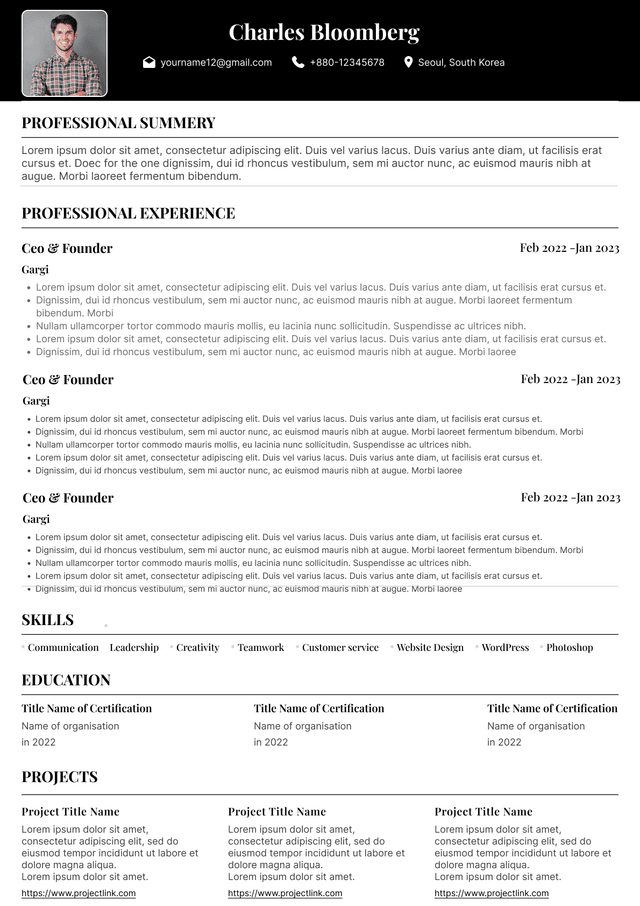
Single-column structure
Clear section hierarchy
Standard headings
Easy-to-read fonts
Strong spacing consistency
Minimal visual distractions
Clear role progression
Predictable layout flow
Good design supports information.
It never competes with it.
Fonts communicate subtle signals.
Some fonts create unnecessary friction.
Common problems include:
Decorative fonts
Condensed fonts
Tiny font sizes
Overly modern stylized typography
Inconsistent formatting choices
Safe options include:
Calibri
Arial
Helvetica
Aptos
Georgia
Garamond
Typical body text ranges:
10–12 point
Headings slightly larger
Consistent spacing throughout
Recruiters care less about style preference and more about effortless reading.
Resume builders simplified resume creation.
They also created design sameness.
Recruiters increasingly recognize identical templates.
The issue is not template usage itself.
The issue is when templates prioritize aesthetics over communication.
Many candidates inherit structural flaws they never evaluate.
Before using any template, ask:
Does this make information easier to scan?
Would ATS parse this correctly?
Are accomplishments easy to find?
Does hierarchy feel obvious?
Is design helping or distracting?
Templates should serve strategy.
Not replace it.
Recruiters screen broadly.
Hiring managers review more deeply.
Their evaluation differs.
Hiring managers often notice:
Career progression
Scope of work
Business impact
relevance to team needs
Problem-solving evidence
Leadership indicators
Design influences whether those patterns become obvious.
Strong formatting highlights trajectory.
Weak formatting hides it.
Candidates often underestimate how many hiring decisions involve reducing uncertainty.
Confusing resumes create uncertainty.
Clear resumes reduce it.
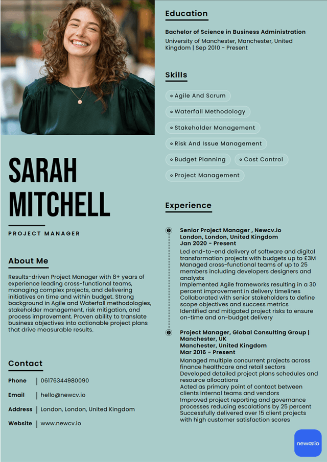
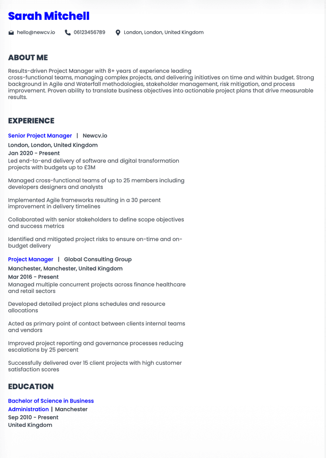
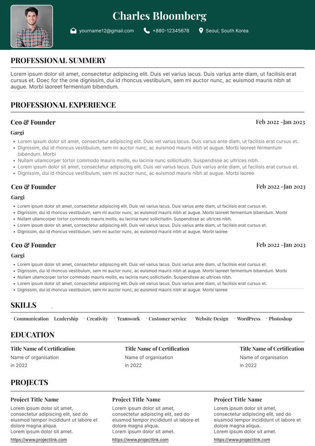
Clean single-column layouts
Consistent formatting
Standard section labels
Achievement-focused bullets
Clear job chronology
Strategic use of whitespace
Readable typography
Visual simplicity
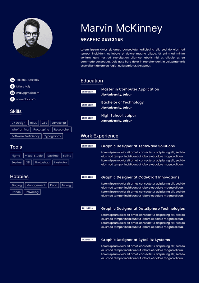
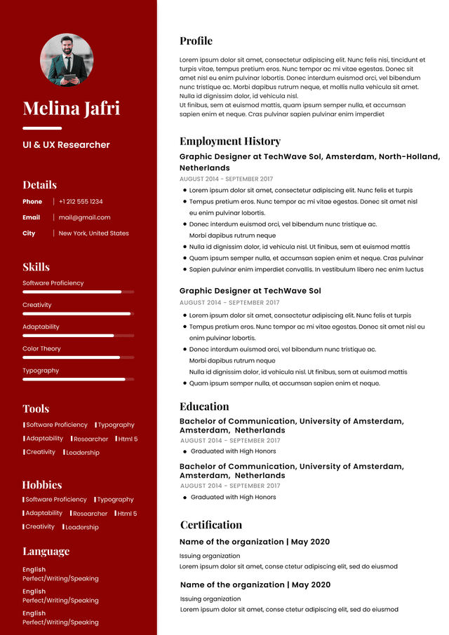
Graphic-heavy templates
Decorative elements without purpose
Multiple columns
Skill charts
Excessive colors
Tiny text
Unclear hierarchy
Portfolio-style layouts for noncreative roles
Candidates assume rejection means lack of qualifications.
Sometimes the issue is presentation.
I've seen candidates with:
Strong promotions
Excellent metrics
Relevant industry experience
Leadership background
Still struggle because design buried their strengths.
The problem was never capability.
The problem was discoverability.
Resumes succeed when they reduce cognitive effort.
Hiring teams are busy.
The easier you make evaluation, the more likely you move forward.
Your resume is not an art project.
It is a decision-making tool.
Design should make hiring managers confident in saying yes.
Use ATS-optimised Resume and resume templates that pass applicant tracking systems. Our Resume builder helps recruiters read, scan, and shortlist your Resume faster.
Use professional field-tested resume templates that follow the exact Resume rules employers look for.
Create Resume