The best UK CV layout is simple, clear, reverse chronological, and built for fast recruiter screening. Your CV should show your contact details, professional profile, key skills, work experience, education, and relevant extras in a logical order. The goal is not to look clever. The goal is to help a recruiter or hiring manager understand, within seconds, what you do, where you have done it, what level you operate at, and whether you match the role.
This is where many candidates go wrong. They treat CV layout like a design project. In real hiring, layout is a decision tool. A good UK CV layout reduces doubt. A weak layout creates friction, even when the candidate is strong. And yes, recruiters notice friction very quickly.
A strong UK CV layout has one job: make your suitability obvious without making the reader work for it.
That sounds simple, but most CVs fail because they are organised around the candidate’s personal history rather than the employer’s decision process. Candidates often think, “This is my full career story.” Recruiters think, “Does this person match the vacancy, salary level, industry, responsibilities, and required experience?”
Those are not the same thing.
A good CV layout helps answer the questions that sit in a recruiter’s mind during screening:
What role is this person targeting?
Are they operating at the right level?
Have they done similar work before?
Are their skills relevant to this specific job?
Is their experience recent enough?
Is there evidence of responsibility, impact, progression, or stability?
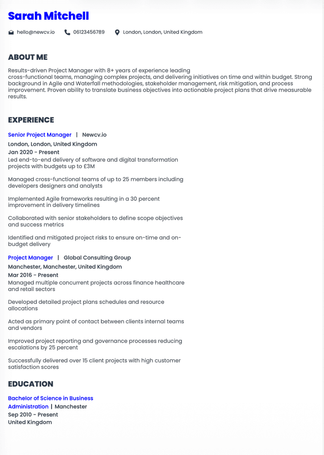
For most UK job applications, the strongest CV layout follows a reverse chronological structure. That means your most recent role appears first, followed by earlier roles in order.
This works because recruiters usually care most about your recent experience. What you did ten years ago may still matter, but it rarely carries the same weight as what you are doing now or what you have done in your last few roles.
A strong UK CV layout usually follows this order:
Contact details
Professional profile
Key skills or core competencies
Professional experience
Education and qualifications
Certifications, technical skills, languages, or additional relevant sections
Most candidates imagine their CV being read slowly, line by line, with thoughtful appreciation of every sentence. Lovely idea. Not how screening usually works.
In reality, the first scan is fast. Very fast.
A recruiter is usually looking for relevance signals. They are not reading your CV like a biography. They are checking whether your profile fits the vacancy well enough to deserve deeper attention.
During the first scan, the eye usually goes to:
Current or most recent job title
Current or most recent employer
Industry or sector background
Length of time in recent roles
Key skills near the top
Location or working arrangement, where relevant
A good UK CV layout is not just about section order. Each section has to earn its place. If a section does not help the reader understand your suitability, it is either too weak, too long, or unnecessary.
Your contact details should sit at the top of the CV. Keep them simple.
Include:
Full name
Phone number
Professional email address
Town or city, not full home address
LinkedIn profile, if it supports your application
Portfolio, GitHub, personal website, or online work samples where relevant
Do not include your date of birth, marital status, national insurance number, full address, photo, or unnecessary personal details. In the UK job market, these details do not help your application and can make the CV feel outdated.
CV formatting should make the document easier to read. That is the whole point.
I see candidates spend huge amounts of time on colours, columns, icons, graphics, and complicated templates. Then the actual hiring evidence is weak, buried, or difficult to scan. That is backwards.
For a UK CV, the safest and strongest formatting choices are:
Use a clean font such as Calibri, Arial, Aptos, Helvetica, or similar
Keep font size readable, usually around 10.5 to 12 for body text
Use clear section headings
Keep margins balanced
Use consistent spacing
Use bullet points for experience, not dense paragraphs
For most UK professionals, a two page CV is completely acceptable. In many cases, it is expected.
The one page CV rule is often repeated as if it applies to everyone. It does not. A graduate, early career candidate, or someone applying for a very focused role may only need one page. A mid level or senior professional usually needs two pages to show relevant experience properly.
The real rule is not “one page” or “two pages.” The real rule is: use the space needed to make a strong, relevant case without padding.
A one page CV can fail if it cuts out important evidence. A two page CV can fail if it is bloated with irrelevant detail. A three page CV may be acceptable in some academic, medical, technical, or senior contexts, but for most corporate roles, three pages is where recruiters start asking whether the candidate can prioritise.
Use one page if:
You are a student or recent graduate
You have limited work experience
You are applying for part time or entry level roles
Your background is simple and focused
Use two pages if:
Sometimes the easiest way to understand CV layout is to compare what creates friction with what creates clarity.
Weak Example
Name at the top, followed by a long personal statement, then education, then hobbies, then work experience halfway down the page. Work experience appears in paragraphs with unclear dates, inconsistent job titles, and no measurable achievements.
Why this layout fails: The most important evidence is buried. A recruiter has to work too hard to understand the candidate’s recent experience. The layout is built around the candidate’s personal order of importance, not the employer’s decision process.
Good Example
Name and contact details at the top, followed by a targeted profile, relevant key skills, reverse chronological experience, education, certifications, and additional skills. Each role has clear dates, job titles, employer names, concise responsibilities, and evidence of contribution.
Why this layout works: The reader can quickly understand what the candidate does, what they have done recently, and why they may fit the role. It supports fast screening without sacrificing substance.
A good layout does not guarantee an interview. But a poor layout can absolutely stop a strong candidate from being properly understood.
That is the frustrating part. Some candidates are not rejected because they lack ability. They are rejected because their CV does not make their ability easy enough to see.
Most CV layout problems are not dramatic. They are small decisions that add up to confusion.
A vague personal statement wastes the most valuable space on the CV. The top third of page one should help the reader understand your fit quickly.
Avoid statements that focus on personality without professional substance. “I am a motivated individual seeking a new challenge” tells the employer nothing useful.
Use that space to position yourself clearly.
If you have strong work experience, lead with it. If you are a graduate, your education may deserve more prominence. If you are changing careers, you may need a stronger profile and skills section before experience.
The best CV layout depends on what evidence you need the reader to see first.
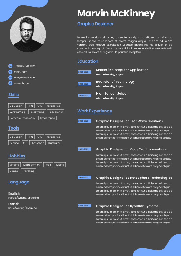
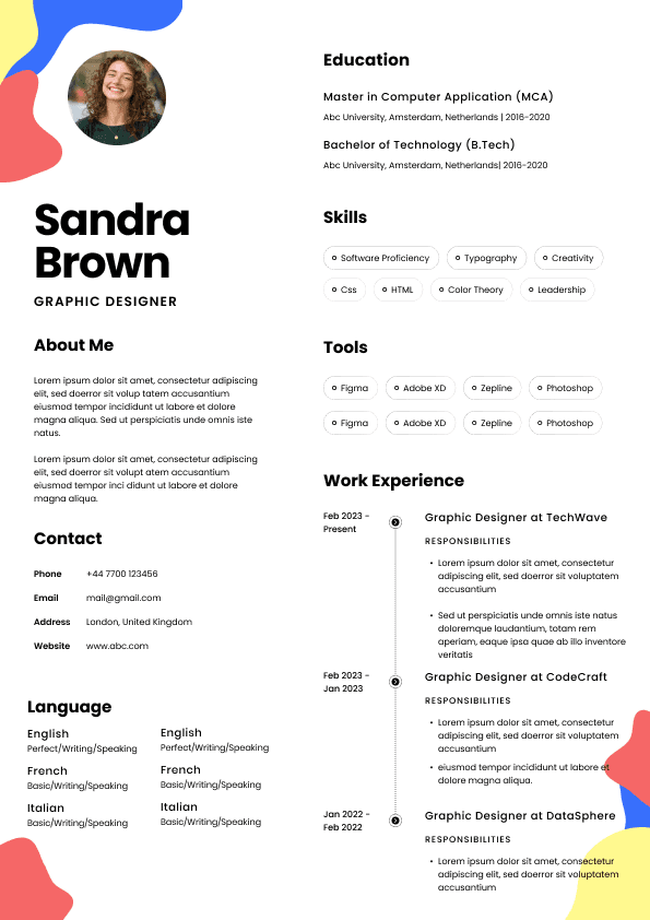
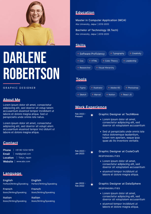
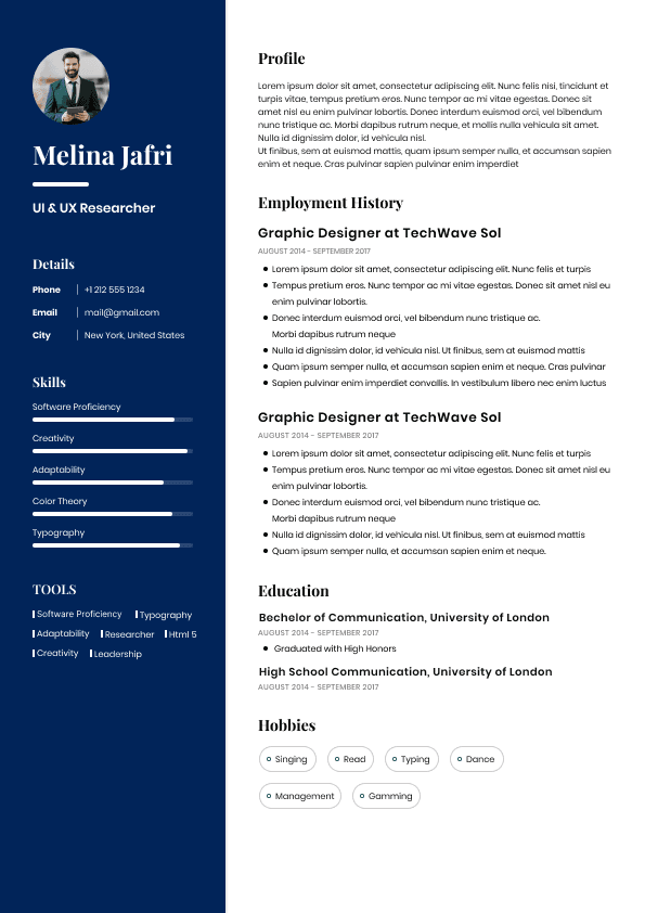
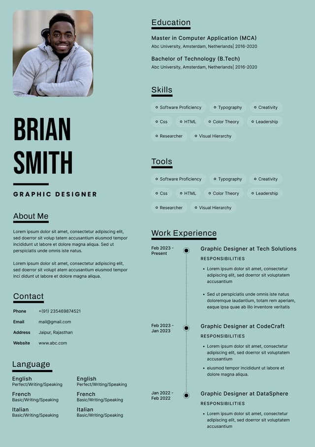
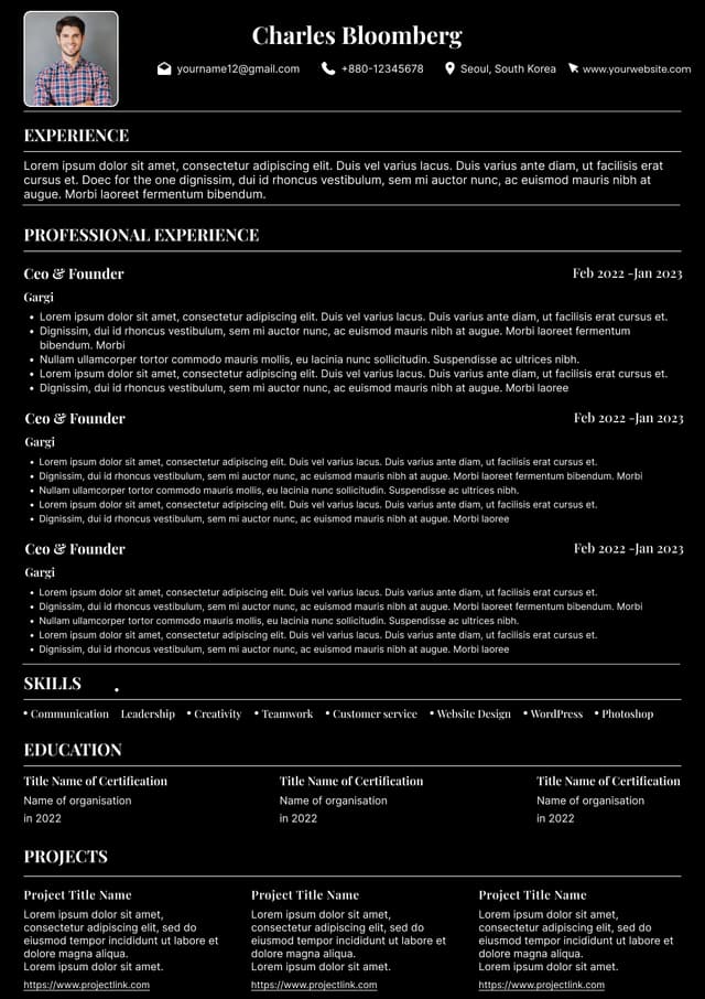
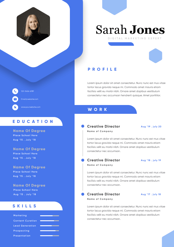
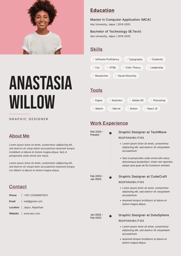
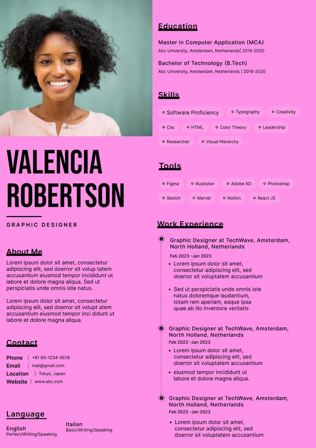
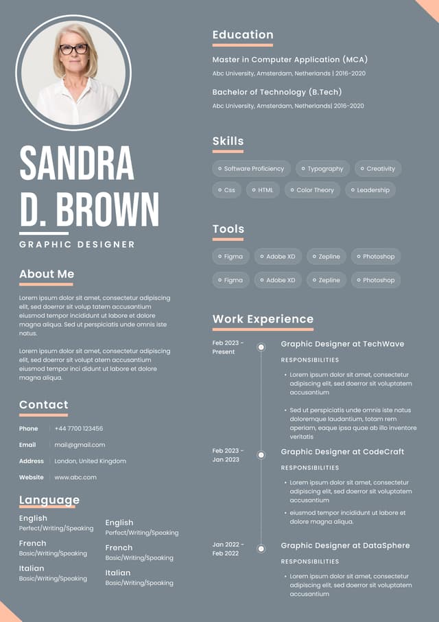
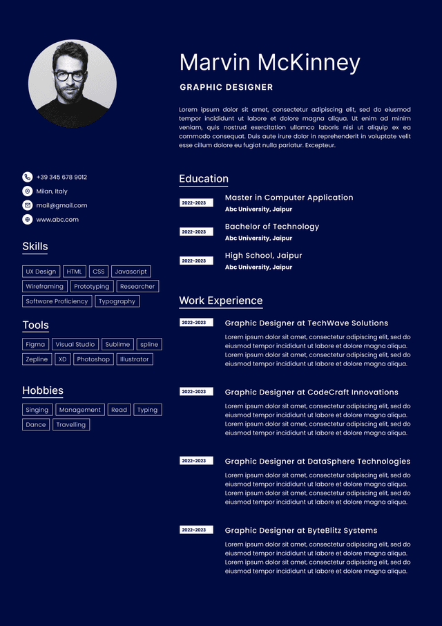
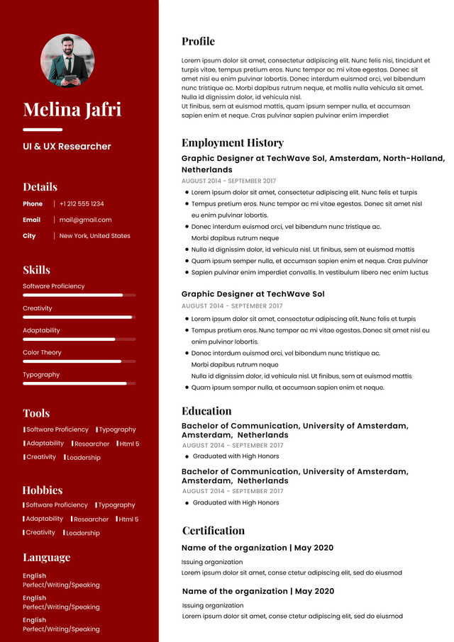
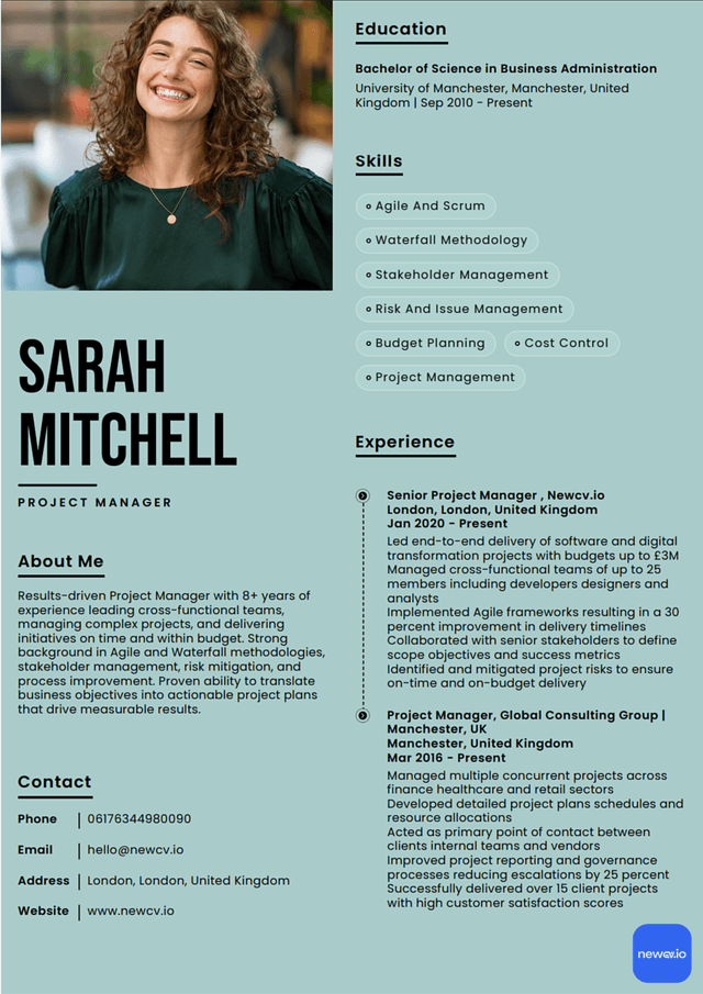
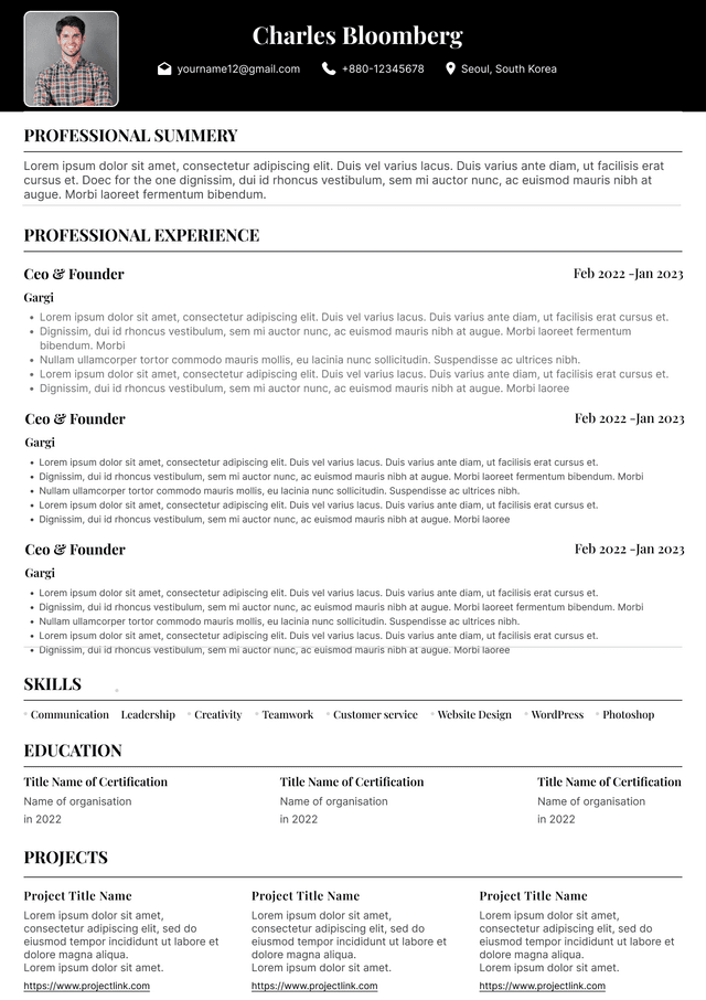
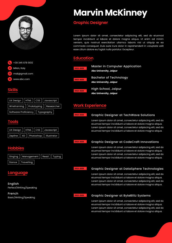
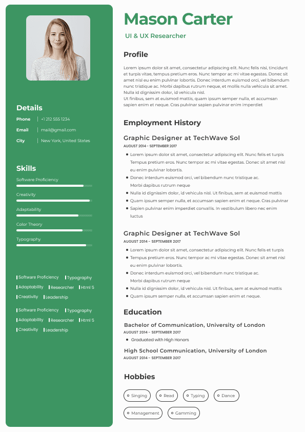
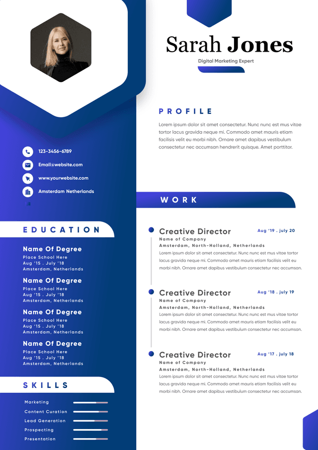
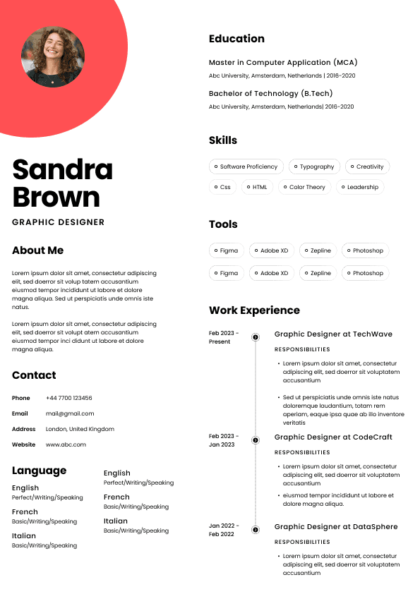
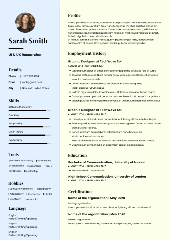
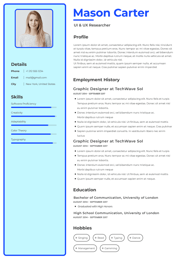
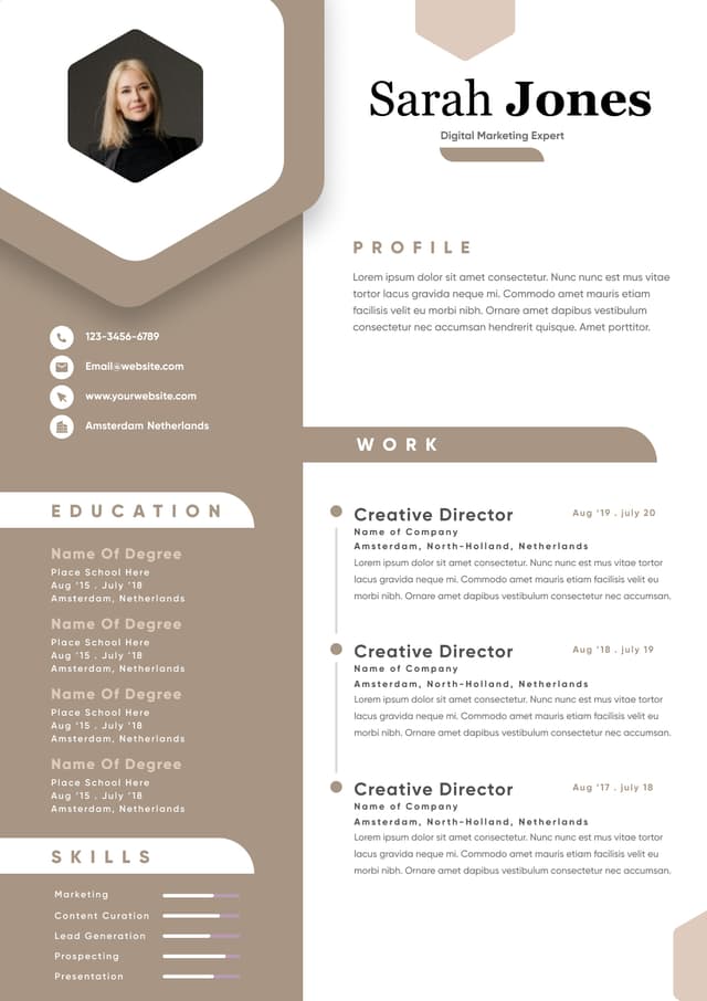
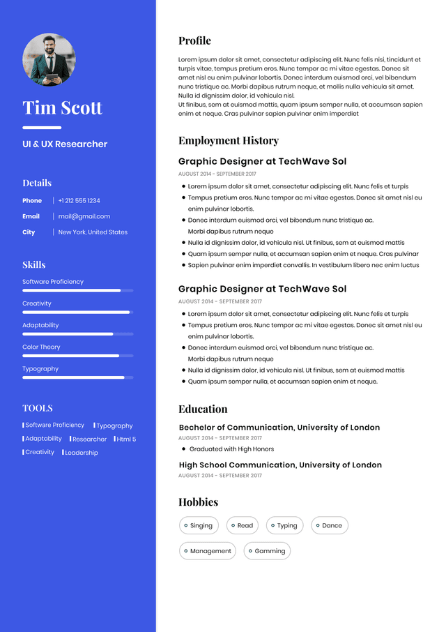
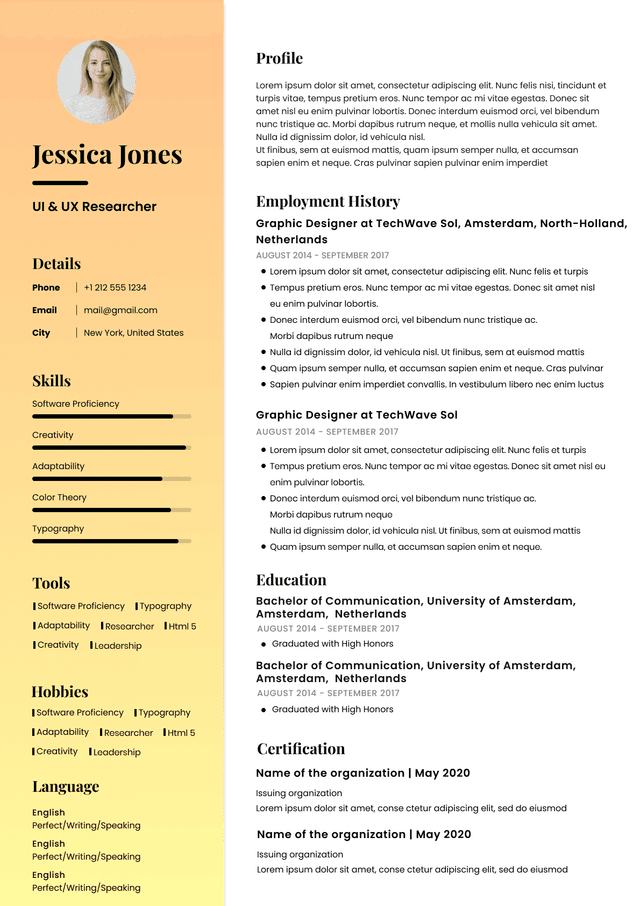
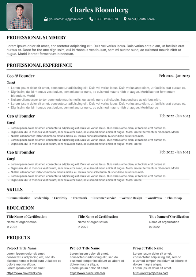
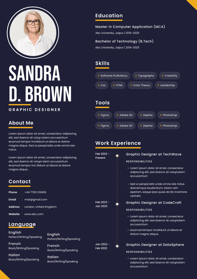
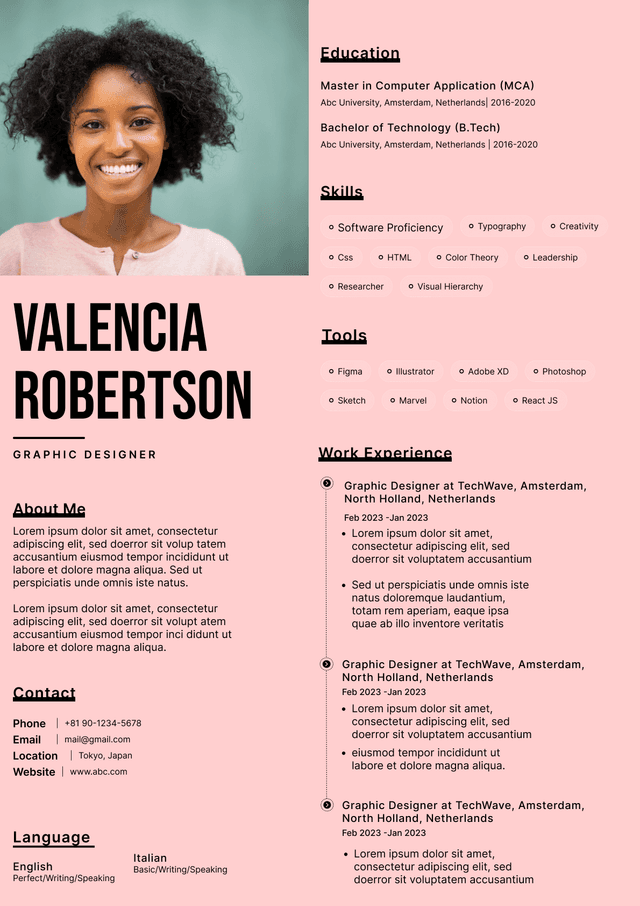
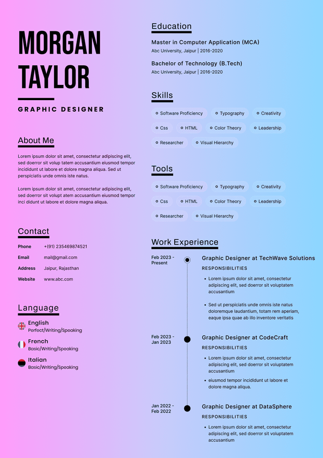
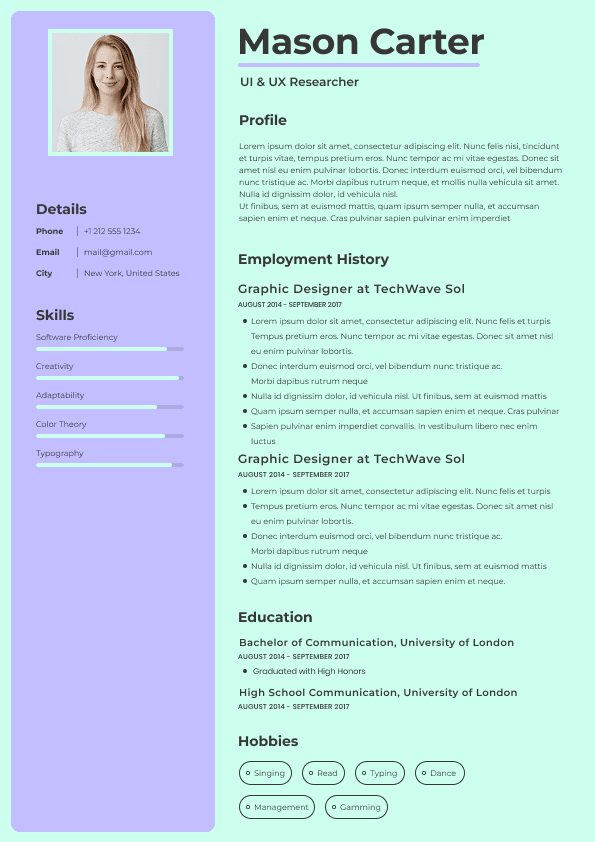
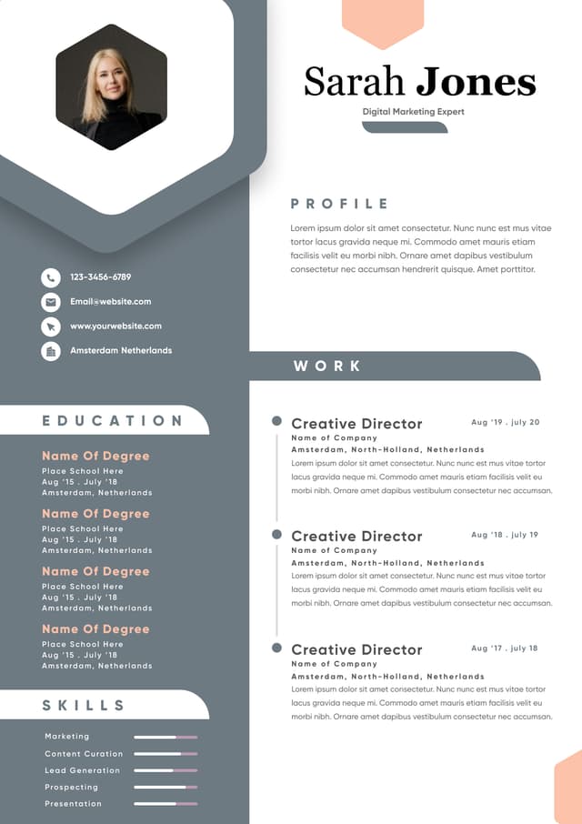
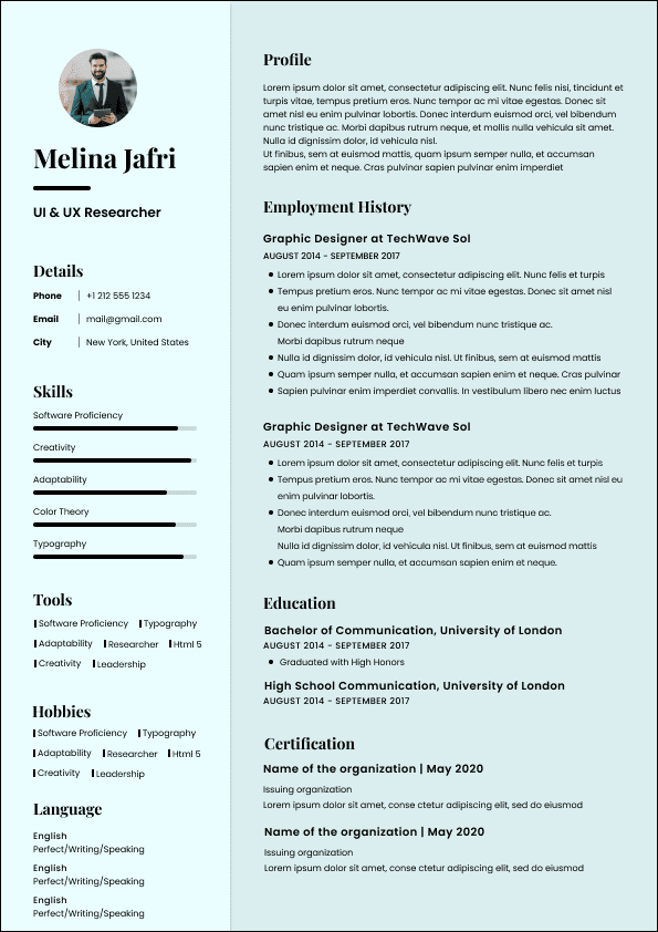
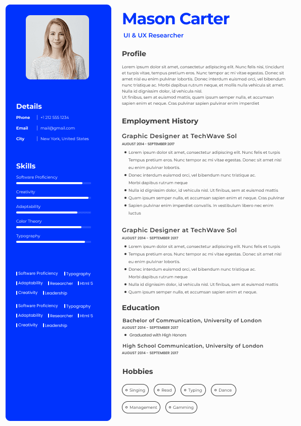
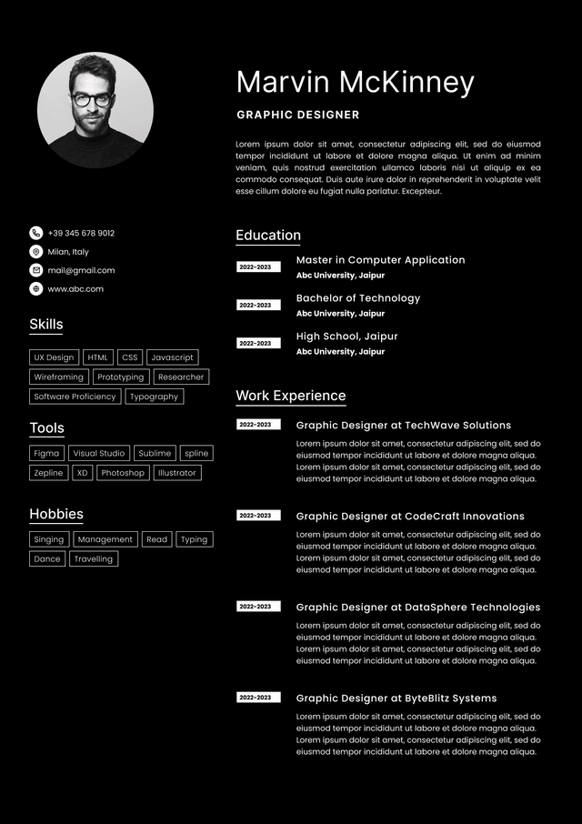
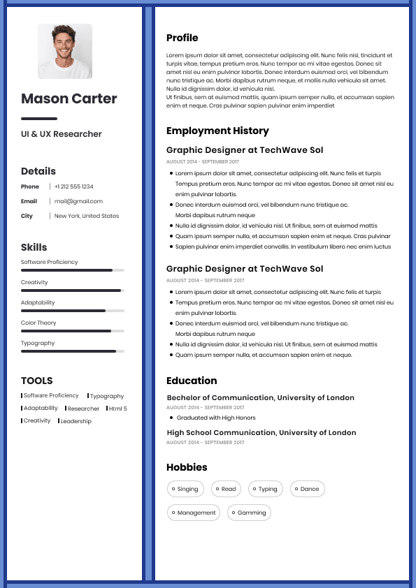
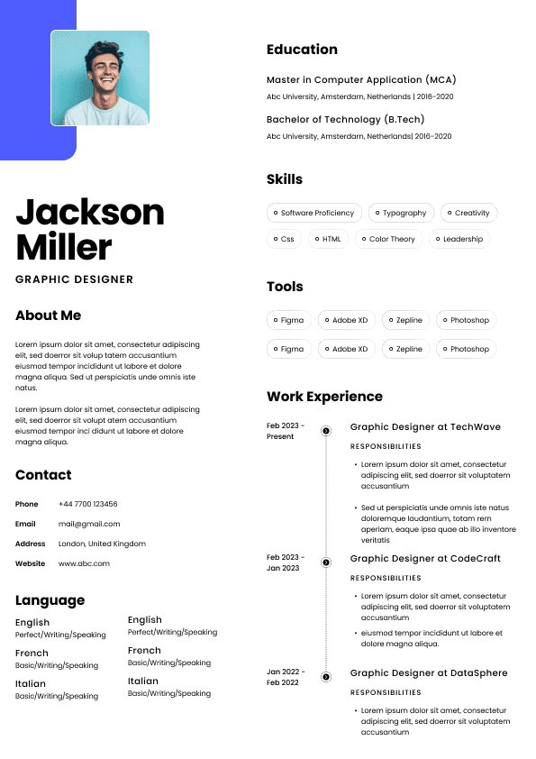
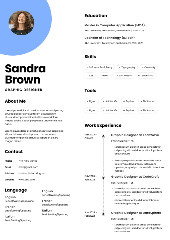
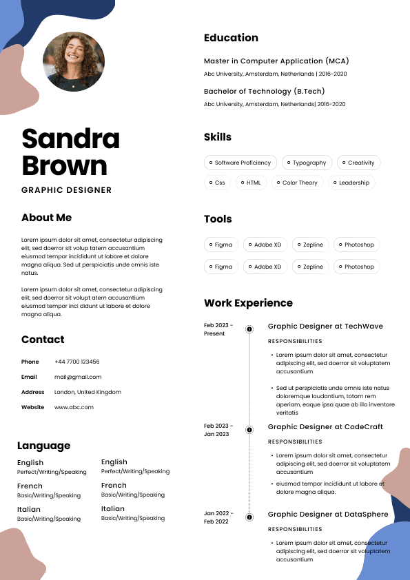
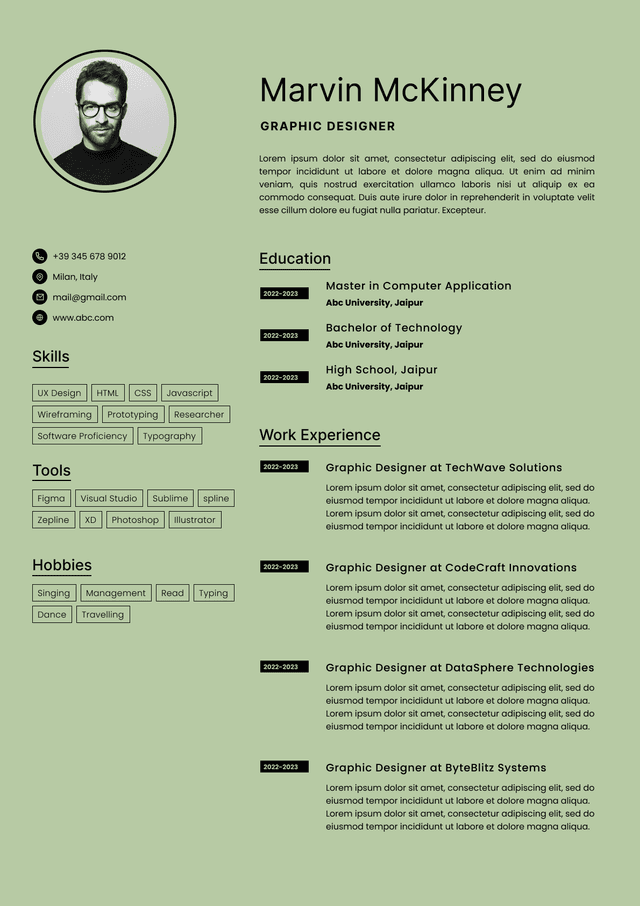
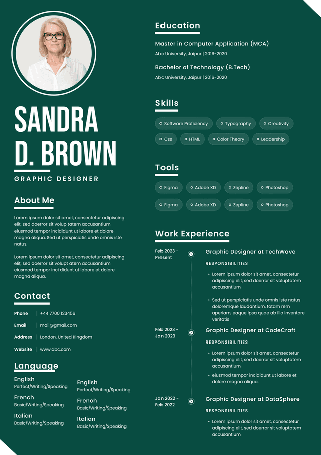
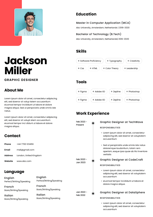
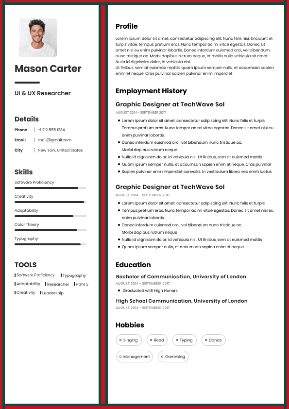
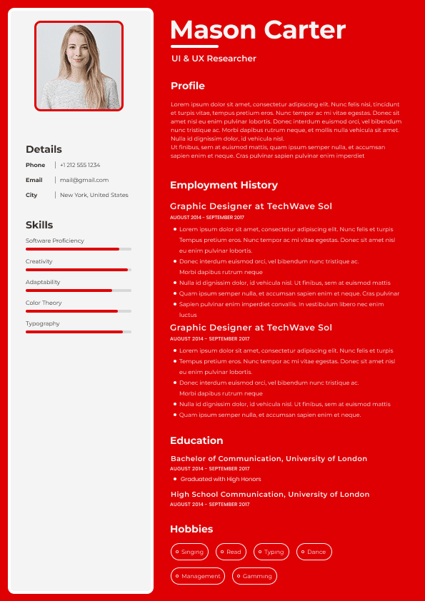
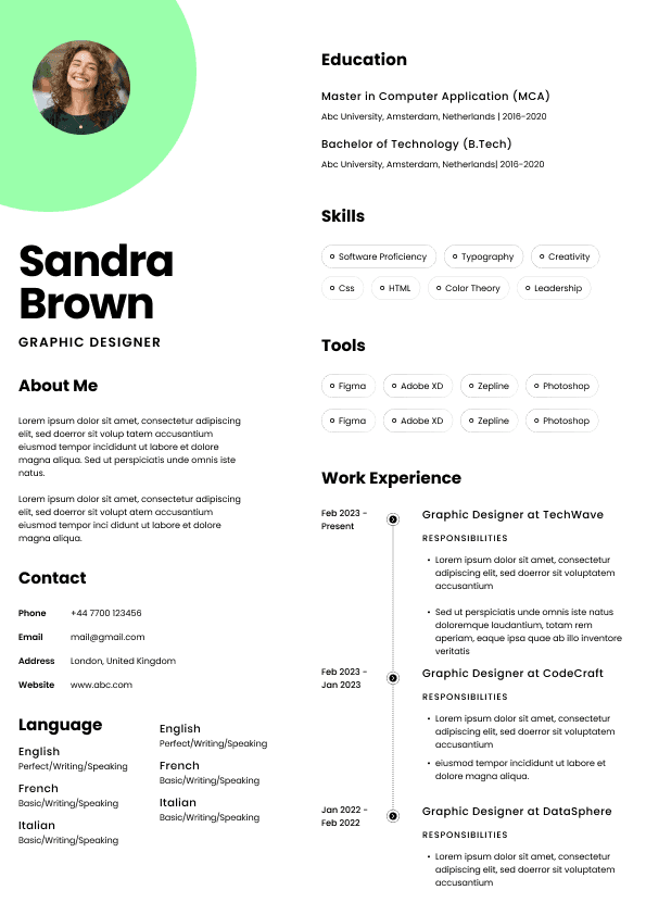
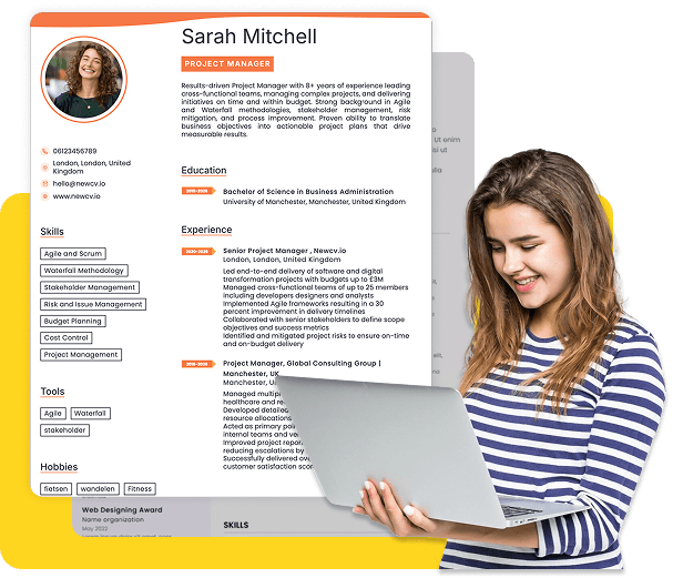
Creative templates can look attractive, but many create problems. Columns can disrupt scanning. Icons may not parse properly. Graphics take up space without adding evidence.
Unless you are applying for a design role and your layout choices genuinely demonstrate relevant skill, keep the CV clean.
A recruiter is not shortlisting your Canva template. They are shortlisting your fit for the job.
Some candidates hide dates because they are worried about gaps, short roles, or age. I understand the instinct, but hiding dates often creates more suspicion.
There is no single perfect CV layout for every candidate. The structure should change slightly depending on what you need to prove.
For a graduate CV, education can appear near the top, especially if your degree, modules, dissertation, placements, or academic projects are relevant.
A good graduate CV layout may include:
Contact details
Short profile
Education
Relevant projects or placements
Work experience
Skills
Before sending your CV, check it like a recruiter would.
Ask yourself:
Can the reader understand my target role within ten seconds?
Is my most relevant experience easy to find?
Does my profile say something specific, or could anyone use it?
Are my job titles, employers, and dates clear?
Is my recent experience stronger and more detailed than older roles?
Have I shown outcomes, not just duties?
Is the CV easy to scan on a screen?
Written by Simar Malhi, a recruiter and headhunter with international recruitment experience. I write about CVs, job applications, hiring decisions, and the reality behind recruitment processes. My goal is to help candidates understand more honestly how employers, recruiters, and hiring managers actually select candidates.
Choose from a wide range of NEWCV resume templates and customize your NEWCV design with a single click.

Use ATS-optimised Resume and resume templates that pass applicant tracking systems. Our Resume builder helps recruiters read, scan, and shortlist your Resume faster.

Use professional field-tested resume templates that follow the exact Resume rules employers look for.
Create Resume
Use professional field-tested resume templates that follow the exact Resume rules employers look for.
Create ResumeAre there any obvious gaps, inconsistencies, or unclear job moves?
Can I confidently send this CV to the hiring manager?
That final question matters more than candidates realise. Recruiters are not just reading your CV privately and forming a personal opinion. They are often deciding whether your CV is strong enough to put in front of someone else. If the layout makes your experience difficult to explain, you are making that decision harder.
A strong UK CV layout should therefore be:
Easy to scan
Clear in section order
Focused on relevant experience
Consistent in formatting
Suitable for applicant tracking systems
Professional without being overdesigned
Honest about dates, job titles, employers, and career movement
Specific enough to show value, not just responsibilities
The best CVs are not the prettiest ones. They are the ones that make the hiring decision feel less risky.
Volunteering, interests, or achievements only where useful
This layout works because it mirrors how recruiters naturally assess candidates. First, they identify who you are and what you do. Then they check whether your skills match the role. Then they look for evidence in your work history. Then they check qualifications, sector requirements, and any extra details that support the application.
What I would avoid is placing education above experience if you already have substantial work history, unless you are applying for graduate roles, academic roles, technical roles where qualifications are essential, or a profession where specific credentials are non negotiable.
Candidates sometimes put education first because it feels important to them personally. Hiring managers usually care about what proves you can do the job now.
Salary level clues, if visible from role scope
Qualifications, if the role requires them
Evidence of measurable impact
Career gaps or unclear transitions
This is why CV layout matters so much. If the information is hidden, scattered, overdesigned, or buried in dense paragraphs, the recruiter may not find the evidence quickly enough.
That does not always mean instant rejection. Sometimes it means something worse: uncertainty. And uncertainty quietly damages applications.
A hiring manager rarely says, “The CV layout was bad.” They say things like:
“I’m not clear what they actually did.”
“Do they have enough experience?”
“This feels a bit vague.”
“I can’t see the relevance.”
“Maybe not for this one.”
That is what poor layout creates. Not always rejection with drama. Just doubt. And doubt is enough.
A small but important point: make sure your email address looks professional. Recruiters do notice. Nobody wants to be the person forwarding a CV with an email address from 2009 that sounds like a nightclub username.
Your professional profile should be a short, targeted summary of who you are professionally and what you bring to the role.
This is not a personality paragraph. It is not a place to say you are passionate, hardworking, dynamic, motivated, and able to work independently or as part of a team. Those phrases have been used so often that they barely register.
A strong profile should answer:
What is your professional identity?
What level are you operating at?
What industries, functions, or environments do you know?
What strengths are most relevant to the job?
What type of role are you positioning yourself for?
Weak Example
“Hardworking and enthusiastic professional with excellent communication skills, looking for a challenging role where I can develop and contribute to a successful company.”
Why this is weak: It could belong to almost anyone. It gives no role focus, no seniority, no evidence, and no useful hiring signal.
Good Example
“Commercially focused account manager with experience managing B2B client portfolios across professional services and technology environments. Strong background in client retention, revenue growth, stakeholder management, and cross functional delivery, with a practical approach to building long term client relationships.”
Why this works: It tells the reader what the candidate does, where they have done it, and what they are likely to be useful for.
The profile should usually be around three to five lines. If it is longer than that, it often becomes a soft cover letter sitting on top of the CV. Recruiters do not need that. They need clarity.
A key skills section can work very well in a UK CV, especially when the role has clear technical, functional, or specialist requirements.
But this section should not become a dumping ground for generic traits. “Communication,” “teamwork,” and “problem solving” are not useless, but they are weak unless they are connected to the role.
Better skills are specific and searchable:
Financial reporting
Stakeholder management
Contract negotiation
CRM systems
Data analysis
Project coordination
Payroll processing
Candidate sourcing
Account management
Risk assessment
Business development
Supply chain planning
Applicant tracking systems may pick up keywords from this section, but do not write for software only. Write for the human who has to decide whether those skills are credible. If your skills section says “leadership” but your experience section shows no leadership responsibility, the CV starts to feel padded.
Good CV layout creates alignment between your skills section and your work experience. The skills at the top should be proved later.
Your work experience section is usually the most important part of a UK CV. This is where recruiters look for proof.
For each role, include:
Job title
Company name
Location, if useful
Dates of employment
Short company context, if the employer is not widely known
Main responsibilities
Achievements, outcomes, or measurable contributions
The strongest layout is usually:
Job Title, Company, Location
Month Year to Month Year
Short context line if needed.
Bullets covering responsibilities and achievements.
A common mistake is writing every role as a list of duties. Duties tell me what you were supposed to do. Achievements tell me what actually happened because you were there.
That does not mean every bullet needs a number. Not every job produces neat metrics, despite what some career advice suggests. But every role should show scope, complexity, judgement, ownership, or contribution.
Weak Example
“Responsible for admin tasks, answering emails, supporting the team, and helping with reports.”
Why this is weak: It is too vague. It tells the reader almost nothing about the level, environment, tools, volume, stakeholders, or value of the work.
Good Example
“Coordinated weekly reporting for a regional operations team, consolidating data from multiple sites and improving visibility of outstanding actions, deadlines, and service issues.”
Why this works: It gives context, purpose, and value. It shows what the task supported, not just the task itself.
For recent roles, include more detail. For older roles, reduce the detail unless they are highly relevant. Your current and most recent roles should normally carry the most weight.
The education section should be clear and proportionate.
Include:
Degree or qualification name
Institution
Year completed, where useful
Relevant modules, only for graduates or career changers
Professional qualifications required for the role
If you are an experienced professional, your education section does not need to dominate the CV unless the qualification is central to the role.
For graduates, education can sit higher on the CV, especially if work experience is limited. For experienced candidates, education usually sits after professional experience.
A recruiter will not thank you for making them scroll through every GCSE subject if you have ten years of relevant work experience. Give the right level of detail for your career stage.
Additional sections can strengthen your CV if they support the application. They can also clutter it if they do not.
Useful additional sections may include:
Technical skills
Systems and software
Professional certifications
Languages
Publications
Projects
Volunteering
Awards
Professional memberships
Security clearance, where relevant
Be selective. A CV is not a storage unit for everything you have ever done. It is a relevance document.
Interests are optional. They can help if they show something meaningful, unusual, or relevant. They do not help if they say “socialising, reading, travelling.” That line appears so often it may as well be printed by default.
Keep formatting simple enough for applicant tracking systems
Avoid text boxes, excessive columns, graphics, charts, and icons
Save and send the CV as a PDF unless the employer requests Word format
Use a clear file name with your name and the role type
The file name is a small detail, but it matters. “CV final final updated new version 3” does not scream calm professional judgement. Use something like “Simar Malhi CV Talent Acquisition” or “Aisha Khan CV Finance Manager.”
A good CV layout should feel invisible. The reader should not be thinking about the formatting. They should be understanding your experience.
You have several years of relevant experience
You need to show progression across multiple roles
Your work involves technical skills, projects, clients, systems, or measurable outcomes
You are applying for professional, managerial, or specialist roles
The best two page CVs are not longer for the sake of it. They are structured. Page one carries the strongest current evidence. Page two supports the story without becoming a career archive.
Recruiters are used to seeing career gaps, redundancies, contract work, caring responsibilities, study breaks, relocation, and career changes. What creates concern is not always the gap itself. It is the lack of clarity.
Clear dates are better than mystery.
Responsibilities matter, but they are not enough. If every bullet starts with “responsible for,” the CV can feel passive.
Show what you managed, improved, delivered, coordinated, reduced, supported, increased, resolved, built, processed, led, or influenced.
Your CV should not give the same amount of space to every job. Recent and relevant roles deserve more detail. Older or less relevant roles can be shortened.
This is where judgement matters. A CV layout should guide attention, not distribute it equally like a school timetable.
Inconsistent formatting makes a CV feel careless even when the content is good.
Watch for:
Different date formats
Random bolding
Mixed fonts
Inconsistent spacing
Uneven bullet styles
Job titles formatted differently
Employer names missing in some roles
Recruiters may not consciously reject you for inconsistent formatting, but it affects the impression. It suggests a lack of care. That may be unfair, but hiring decisions are often made through accumulated signals.
Volunteering or extracurricular achievements
Graduate CVs often fail when candidates underestimate part time work. Retail, hospitality, tutoring, volunteering, and society roles can show communication, responsibility, resilience, customer service, teamwork, and leadership. The trick is to translate them into workplace value without exaggerating.
For a career change CV, the layout needs to bridge the gap between where you have been and where you are going.
A useful structure may include:
Contact details
Targeted profile explaining the transition
Transferable skills
Relevant projects, training, or certifications
Work experience
Education
The mistake career changers make is hoping the employer will connect the dots. They usually will not. You need to make the transferable logic visible.
Do not pretend your previous career is irrelevant. Reframe it. Employers may value your previous experience if you show how it transfers into the new role.
For senior candidates, the CV should show leadership scope, commercial impact, strategic responsibility, and stakeholder influence.
A strong senior CV layout may include:
Contact details
Executive profile
Key leadership strengths
Career highlights
Professional experience
Board, advisory, or transformation experience where relevant
Education and professional credentials
Senior CVs often become too long because candidates include everything. The higher you go, the more important prioritisation becomes. Hiring managers want evidence of judgement. A cluttered senior CV can quietly undermine that.
For contractors and consultants, clarity around assignments is essential. Recruiters need to understand whether short roles are intentional contract work or unexplained job hopping.
Make contract status clear in the role title or context line.
For example:
Project Manager, ABC Financial Services, London
Contract Assignment, March 2024 to December 2024
Then explain the project scope, deliverables, stakeholders, systems, and outcomes.
Contractor CVs should focus less on loyalty and more on delivery. What were you brought in to fix, build, manage, stabilise, or improve?
For technical roles, skills and systems matter more than in many other CVs. A technical skills section can sit near the top, but it must be organised clearly.
Group technical skills by category if needed:
Programming languages
Cloud platforms
Data tools
Frameworks
Systems
Certifications
Methodologies
Avoid listing every tool you have ever touched. Hiring teams can usually tell when a technical CV has been stuffed with keywords. The strongest technical CVs show both tools and application. What did you actually build, migrate, automate, analyse, secure, or optimise?
Have I avoided unnecessary graphics, columns, and design clutter?
Is the formatting consistent from top to bottom?
Does every section help my application?
Have I removed outdated or irrelevant personal details?
Would a recruiter feel confident sending this to a hiring manager?
That last question is the real test. Your CV is not just a document about you. It is a document someone else may need to defend, discuss, compare, and shortlist.
The easier you make that, the stronger your application becomes.