The best font for an Irish CV is a clean, professional, easy to read font such as Calibri, Arial, Aptos, Helvetica, Garamond, Cambria, or Georgia. For most candidates applying in Ireland, I would choose Calibri, Arial, Aptos, or Helvetica because they are simple, ATS friendly, and easy for recruiters and hiring managers to scan quickly.
That last part matters more than people realise. Your CV font is not there to show personality. It is there to remove friction. When a recruiter opens your CV at speed, the font should make the information feel clear, structured, and trustworthy. If the font gets noticed for the wrong reason, it has already done too much.
For most Irish CVs, the safest and strongest font choices are:
Calibri
Arial
Aptos
Helvetica
Cambria
Georgia
Garamond
My practical recruiter recommendation is simple: if you are unsure, use Calibri, Arial, or Aptos. They are clean, modern enough, widely supported, and unlikely to cause formatting issues when your CV is opened by a recruiter, hiring manager, employer, or applicant tracking system.
I know font advice can sound ridiculously small compared with work experience, achievements, salary expectations, notice period, and interview performance. But CV screening is often a fast judgement process. Recruiters are not sitting there lovingly admiring your formatting with a cup of tea and a candle lit. They are scanning for role fit, evidence, progression, keywords, responsibilities, location, salary alignment, and whether the CV makes their job easier or harder.
Recruiters rarely think, “What a beautiful font.” That is not how CV screening works.
What we notice is whether the CV is easy to process. Font affects that immediately. A recruiter opening a CV usually forms a quick impression before reading the details properly. The questions running in the background are more practical than aesthetic:
Can I read this quickly?
Does the CV look professional?
Is the layout clean?
Can I find the job titles, employers, dates, and achievements?
Does this CV feel modern and credible?
Will a hiring manager take this seriously?
Has the candidate made sensible presentation choices?
Calibri is still one of the safest CV fonts. It is clean, familiar, easy to read, and works well across most systems. Some people think Calibri is too common, but that is not a real hiring problem. Recruiters do not reject strong candidates because the font is common. They reject or ignore CVs when the content is unclear, badly structured, or hard to assess.
Calibri works especially well for:
Office based roles
Administration
Finance
Customer service
Sales
HR
Operations
For most CVs in Ireland, use:
10.5 to 11.5 pt for the main body text
12 to 14 pt for section headings
14 to 18 pt for your name
This is not about following a perfect rule. It is about readability. A recruiter should not have to zoom in to read your CV. If I need to zoom, squint, or fight through tiny text, I immediately know the candidate has prioritised page count over communication.
That is usually a mistake.
Candidates often ask whether an Irish CV should be one page or two pages. The real answer is that the CV should be as long as it needs to be and as short as it can be. For many professionals in Ireland, two pages is completely normal. Trying to force ten years of experience onto one page by using tiny font is not efficient. It just makes the CV harder to read.
A clear two page CV is usually stronger than a cramped one page CV.
For most Irish job applications, I recommend a sans serif font such as Calibri, Arial, Aptos, or Helvetica.
Sans serif fonts tend to look cleaner on screens. That matters because most recruiters and hiring managers read CVs digitally first. Your CV may be opened on a laptop, desktop monitor, phone, applicant tracking system, or recruitment agency database. It needs to survive all of those without looking awkward.
Serif fonts such as Cambria, Georgia, and Garamond can still work, especially for legal, academic, policy, education, editorial, and senior roles. But they need more care. If your CV already has long paragraphs, dense experience sections, and minimal white space, a serif font can make it feel heavier.
My honest view is this: if you are applying for mainstream professional roles in Ireland and you do not have a strong design reason to choose a serif font, use a clean sans serif font. It keeps the focus where it belongs, on your experience.
Some fonts create the wrong impression immediately. They may not automatically ruin your application, but they make the CV feel less professional than it should.
Avoid:
Comic Sans
Papyrus
Courier New
Brush Script
Impact
Times New Roman if the layout already looks dated
Overly decorative fonts
A CV font creates a first impression before the recruiter has processed a single achievement.
A clean font says:
This candidate understands professional presentation
This CV will probably be easy to review
The information is likely to be organised
The candidate has made sensible choices
A difficult font says:
This may take effort to read
The candidate may not understand professional norms
The formatting may cause issues
An applicant tracking system, usually called an ATS, is software used by employers and recruitment teams to store, search, filter, and manage job applications. Not every Irish employer uses the same system, and not every ATS reads CVs in exactly the same way. That is why simple formatting is safer.
ATS friendly fonts include:
Calibri
Arial
Aptos
Helvetica
Cambria
Georgia
Garamond
The biggest CV font mistake is not choosing the “wrong” professional font. It is using font to compensate for poor structure.
I see this constantly. A candidate has too much text, unclear achievements, repeated responsibilities, and no clear hierarchy. Instead of editing the content, they reduce the font size, tighten the margins, remove spacing, and hope the CV now looks complete.
It does not look complete. It looks crowded.
A crowded CV tells me the candidate has not made decisions about what matters. That becomes a recruiter problem because now I have to work harder to find the relevant evidence.
A strong CV is not just a document with all your experience thrown onto the page. It is a selected argument for why you match the role. The font can make that argument easier to read, but it cannot make weak positioning strong.
For a graduate CV in Ireland, use Calibri, Arial, Aptos, or Helvetica. Keep it clean and simple. Graduate recruiters are usually scanning for education, internships, part time work, projects, skills, and motivation. Do not distract from that with overly creative formatting.
A graduate CV should feel organised, not overdesigned. You are trying to show potential, reliability, and relevance.
For most professional CVs, Calibri, Arial, Aptos, or Helvetica will work well. These fonts are safe for roles in finance, HR, operations, sales, administration, customer service, supply chain, and business support.
The priority is clarity. A recruiter should quickly understand your current role, employer, responsibilities, achievements, systems, sector exposure, and career progression.
For senior and executive CVs, Aptos, Helvetica, Cambria, Georgia, or Garamond can work well. The font should support authority without making the CV look old fashioned.
At senior level, the issue is often density. Executives sometimes want to include everything because everything feels important. It is not. The CV needs strategic selection. Font, spacing, and structure should make leadership impact easy to see.
For creative roles, you can use a more design aware font, but do not sacrifice readability. Helvetica, Aptos, Georgia, or a clean modern font can work well if exported properly to PDF.
Here is the hiring reality: even for creative roles, your CV still needs to be read by recruiters, HR teams, and hiring managers. Your portfolio can show more personality. Your CV still needs to communicate clearly.
You can use two fonts on a CV, but most candidates do not need to.
A simple approach is:
One font for the whole CV
Slightly larger or bold text for headings
Consistent spacing between sections
Clear formatting for job titles, employers, and dates
Using one font is usually the safest option. It keeps the CV clean and reduces formatting risk.
If you do use two fonts, use them intentionally. For example, you might use a clean sans serif font for headings and a readable serif font for body text. But do not mix fonts randomly. Random formatting makes a CV feel patched together.
Recruiters notice consistency. Not in a dramatic way, but in the same way you notice when a room feels tidy. You may not analyse every detail, but the overall impression lands.
Font choice only works if the layout supports it.
A strong Irish CV layout usually has:
Your name clearly visible at the top
Contact details easy to find
A focused professional profile if it adds value
Clear job titles
Employer names and locations
Dates in a consistent format
Bullet points used for readability
Achievements separated from routine duties where possible
For most Irish job applications, send your CV as a PDF unless the employer, recruiter, or application system specifically asks for a Word document.
PDF protects your formatting. That matters if you are using a font that may not appear the same on every device. It also helps preserve spacing, headings, margins, and page breaks.
Word can be useful when:
A recruiter asks for an editable version
An agency needs to format your CV for submission
The employer’s ATS specifically requests a Word file
The application portal does not accept PDF
If you send a Word document, use a very safe font such as Calibri, Arial, Aptos, Cambria, or Georgia. Avoid unusual fonts because they may be replaced automatically on the recipient’s system.
One practical note from recruitment: if a recruiter asks for Word, it is often because they need to add a cover sheet, remove contact details for agency submission, or adjust formatting for the client. That does not mean your PDF was wrong. It means their process requires an editable file.
Hiring managers care about whether your CV helps them answer practical hiring questions.
They want to know:
Can this person do the job?
Have they worked in a similar environment?
What level of responsibility have they handled?
Are their achievements relevant?
Do they understand the tools, systems, clients, products, or regulations involved?
Are they likely to fit the salary range?
Is their notice period workable?
Weak Example
A candidate uses a decorative font, reduces the body text to 9 pt, removes most spacing, and includes long paragraphs under each role.
The problem is not just that it looks unattractive. The real problem is that it slows the reader down. The recruiter has to work harder to identify role scope, achievements, systems used, and relevance to the vacancy. In a competitive Irish job market, that is a poor trade.
Good Example
A candidate uses Calibri 11 pt, clear section headings, consistent dates, strong spacing, and concise bullet points under each role.
This works because the font supports fast screening. The recruiter can quickly see the candidate’s job title, employer, responsibilities, achievements, and fit for the role. The CV feels controlled and professional without trying too hard.
That is what good CV formatting should do. It should make the candidate easier to understand.
If you want the safest answer, use Calibri, Arial, or Aptos in 10.5 to 11.5 pt.
If you want a slightly more polished modern feel, use Aptos or Helvetica and save the CV as a PDF.
If you are applying for legal, academic, policy, editorial, or senior roles, Cambria, Georgia, or Garamond can work well if the layout is spacious and professional.
Do not overthink this to the point of avoiding the harder work. The best CV font will not fix vague responsibilities, weak achievements, unclear dates, or poor role targeting. But it will make a strong CV easier to read, and that is the whole point.
A recruiter should not notice your font before they notice your fit.
Before sending your CV, check:
Is the font easy to read on screen?
Does it look professional in both PDF and Word?
Is the main text at least 10.5 pt?
Are headings clearly larger or bold?
Is the spacing comfortable?
Does the CV look current without looking gimmicky?
Can a recruiter scan job titles, employers, dates, and achievements quickly?
Is the font consistent throughout the document?
Written by Simar Malhi, a recruiter and headhunter with international recruitment experience. I write about CVs, job applications, hiring decisions, and the reality behind recruitment processes. My goal is to help candidates understand more honestly how employers, recruiters, and hiring managers actually select candidates.
Choose from a wide range of NEWCV resume templates and customize your NEWCV design with a single click.

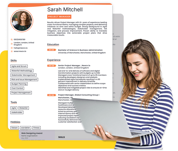
Use ATS-optimised Resume and resume templates that pass applicant tracking systems. Our Resume builder helps recruiters read, scan, and shortlist your Resume faster.

Use professional field-tested resume templates that follow the exact Resume rules employers look for.
Create Resume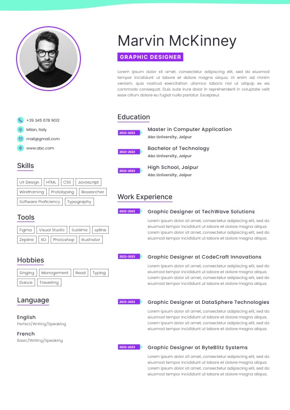
Use professional field-tested resume templates that follow the exact Resume rules employers look for.
Create ResumeA good CV font does not get you hired on its own. But a poor font can make a strong candidate look careless, outdated, difficult to read, or badly positioned. That is the bit candidates underestimate.
A good font supports all of that quietly. A bad font creates resistance. And when your CV creates resistance, recruiters may still read it, but you have made the process harder than it needed to be.
In the Irish job market, where employers may be comparing applicants from Ireland, the UK, Europe, and beyond, your CV needs to feel clear, familiar, and easy to assess. That does not mean boring. It means commercially sensible.
Graduate CVs
General professional CVs
Use Calibri when you want the CV to feel straightforward, readable, and safe. It is not flashy, but your CV is not meant to be a poster.
Arial is another strong option for an Irish CV. It is slightly more neutral and plain than Calibri, but that can be a strength. It works well when your CV has a lot of information and you need the page to stay readable.
Arial is especially useful for:
Technical CVs
Engineering roles
IT and software roles
Project management
Operations
Compliance
Logistics
Public sector applications
The main risk with Arial is that it can look a little dense if the font size is too small or the spacing is too tight. If you use Arial, do not squash everything onto the page like you are trying to win a formatting endurance test. Recruiters can tell when a CV has been squeezed.
Aptos is a modern Microsoft font and is a good choice for candidates who want a clean, current look without being overly designed. It feels a little fresher than Calibri while still being professional and readable.
Aptos works well for:
Business roles
Marketing
Technology
Product
Finance
HR
Management
Professional services
It is a good option if you want your CV to feel modern but still safe for the Irish job market. The only caution is to check how it appears when exported to PDF. Always send the final CV as a PDF unless the employer specifically requests Word.
Helvetica is clean, polished, and professional. It is often a strong choice for candidates in more design aware or modern industries, but it still works for corporate CVs when used properly.
Helvetica works well for:
Marketing
Communications
Product roles
UX and design adjacent roles
Startups
Tech companies
Senior professional CVs
The issue is availability. Helvetica may not display the same way on every system if the recipient does not have the font installed. If you use it, save your CV as a PDF so the formatting stays intact.
Cambria is a professional serif font. Serif fonts have small strokes at the ends of letters, which can make a document feel more traditional. Cambria can work well for candidates who want a slightly more formal CV without looking outdated.
Cambria works well for:
Legal roles
Academic CVs
Policy roles
Public sector roles
Senior leadership CVs
Professional services
It gives a more serious tone, but use it carefully. If the CV is text heavy, Cambria can start to feel dense. It needs good spacing.
Georgia is another readable serif font. It is warmer and more modern than some traditional serif fonts. It can work well when you want your CV to feel professional but not cold.
Georgia works well for:
Communications
Content roles
Education
Policy
Nonprofit roles
Senior CVs
It is not my first choice for every Irish CV, but it can be effective when the layout is clean and the candidate’s writing is strong.
Garamond is elegant and compact. It can help fit more text onto a page while still looking polished. But this is where candidates need to be careful. The goal is not to use Garamond as a trick to cram in twice as much information.
Garamond works well for:
Academic CVs
Legal roles
Editorial roles
Senior professional CVs
Traditional industries
It can look excellent when used with restraint. It can also look old fashioned if paired with heavy paragraphs and poor spacing.
Thin or compressed fonts that become difficult to read
Unusual downloaded fonts that may not display correctly
The issue is not that recruiters are font snobs. The issue is judgement. Your CV is a professional document. If the font looks playful, theatrical, overly stylised, or difficult to read, it raises a small but unnecessary question about your professional judgement.
And yes, small questions matter. Hiring is full of small judgements. Candidates often imagine hiring decisions are based on one dramatic yes or no moment. In reality, recruiters and hiring managers build an impression through lots of signals. Font is one of the quiet signals.
The CV may be style over substance
That may sound harsh, but recruitment is partly about reducing uncertainty. When a hiring manager is comparing five strong candidates, presentation will not replace experience, but it can influence confidence. A CV that is easy to read feels easier to trust.
This is especially relevant in Ireland for competitive roles where employers may receive a high volume of applications. If your CV looks clear, current, and well structured, you give yourself a better chance of being properly assessed.
Verdana
The best ATS font is one that is widely recognised and easy to parse. But font is only one part of ATS compatibility. I see candidates obsess over ATS tricks while ignoring the basics that matter more.
A CV is more ATS friendly when it has:
Clear section headings
Standard job titles where possible
Consistent dates
Simple formatting
No text hidden inside images
No important details trapped in graphics
Keywords used naturally in context
A clean PDF or Word document depending on the employer’s request
The ATS is not sitting there admiring your font. It is trying to read and categorise your information. The recruiter is then trying to understand whether that information matches the role. Your font should support both.
For technical roles in Ireland, especially IT, software, engineering, data, cybersecurity, and infrastructure, use Arial, Calibri, Aptos, or Helvetica.
Technical hiring teams care about skills, tools, environments, projects, scale, impact, and problem solving. Do not make them dig through awkward formatting. A clean font and structured layout will help your technical evidence land faster.
Skills grouped logically
Education and qualifications placed according to relevance
The font should make this structure easier to scan. If your sections are unclear, your headings are inconsistent, or your bullet points are too long, changing the font will not solve the real issue.
This is where I see a lot of candidates focus on the wrong problem. They ask, “What font should I use?” when the bigger issue is, “Can a recruiter understand my value in thirty seconds?”
The font helps. The structure decides whether the font can do its job.
Does their career path make sense?
Are there gaps or changes that need discussion?
The font will not answer those questions. But it determines how easily those answers can be found.
That is the real role of font. It is not decoration. It is access. A good font gives the recruiter and hiring manager faster access to the evidence.
Have you avoided decorative or unusual fonts?
Does the layout still look clean when opened on another device?
If the answer is yes, the font is probably doing its job.
And that is the honest recruiter answer. The best font for an Irish CV is not the one that looks the most impressive in isolation. It is the one that makes your experience easiest to assess, easiest to trust, and easiest to move forward in the hiring process.


