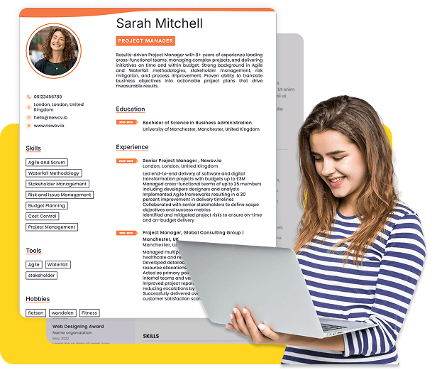
Choose from a wide range of NEWCV resume templates and customize your NEWCV design with a single click.
iOS accessibility is the practice of building iPhone and iPad apps that work for people using VoiceOver, Dynamic Type, Switch Control, keyboard navigation, reduced motion, larger text, and other assistive settings. For iOS developers, accessibility is not just a compliance requirement. It is a product quality skill that affects usability, App Store readiness, enterprise adoption, customer trust, and hiring value. Strong iOS accessibility means screens are understandable without sight, controls are usable without precise touch, text scales without breaking layouts, and important actions are available to every user. The best iOS accessibility developers know how to build inclusive mobile experiences, test real user flows, fix accessibility defects, and explain accessibility outcomes in terms product teams and hiring managers value.
iOS accessibility means making native mobile apps usable for people with visual, motor, hearing, cognitive, and neurological disabilities. In real product work, it means the app must remain clear, usable, and predictable even when a user does not interact with it visually or physically in the same way the design team originally imagined.
A truly accessible iOS app supports:
VoiceOver screen reader navigation
Dynamic Type and larger accessibility text sizes
Clear accessibility labels, hints, values, and traits
Logical focus order
Strong color contrast
Reduced motion preferences
Large and forgiving tap targets
Accessibility matters because it affects real users, business risk, product quality, and career growth.
For users, accessibility can determine whether they can log in, make a payment, book an appointment, complete a medical form, read an alert, submit a claim, or manage an account independently.
For companies, poor accessibility can lead to:
Failed enterprise accessibility reviews
Legal and compliance risk
Lower app ratings
Customer complaints
Increased support tickets
Blocked government or healthcare adoption
Failed procurement requirements
A strong iOS accessibility developer understands both technical implementation and user experience. Basic knowledge is not enough. Many developers know how to add labels, but fewer understand whether a VoiceOver user can complete the actual task efficiently.
Core iOS accessibility skills include:
Writing meaningful accessibility labels
Using accessibility hints only when they add value
Setting correct accessibility traits
Supporting Dynamic Type at larger text sizes
Creating logical VoiceOver focus order
Grouping related content semantically
Managing focus after modals, alerts, and screen changes
VoiceOver is Apple’s screen reader. It allows users to navigate an app through spoken feedback and gestures. For developers, VoiceOver support is one of the clearest tests of whether an app’s interface is semantically meaningful.
Good VoiceOver support requires more than making elements readable. It requires making the user journey understandable.
A strong VoiceOver experience should answer these questions:
What screen am I on?
What action is available?
What will happen if I activate this element?
What information is important here?
What changed after I took an action?
Where should my focus go next?
Dynamic Type allows users to increase or decrease text size across iOS. Larger text support is one of the most important accessibility requirements because many users rely on it to read comfortably.
It is also one of the most common failure points in iOS apps.
Many apps look polished at default text size but break when users enable larger accessibility sizes. This often happens because the design uses rigid spacing, fixed height cards, dense layouts, or text containers that cannot expand.
Common Dynamic Type failures include:
Clipped text
Overlapping buttons
Hidden primary actions
Form labels pushed off screen
Navigation titles that truncate badly
Cards that cannot expand
SwiftUI provides helpful accessibility defaults, but defaults do not guarantee a high quality accessible app. Many SwiftUI accessibility problems happen when developers build custom views, icon based controls, gesture driven interactions, or complex visual layouts without enough semantic structure.
Strong SwiftUI accessibility requires developers to think about what each element means, not only how it looks.
Important SwiftUI accessibility priorities include:
Clear labels for meaningful controls
Helpful hints for actions with unclear outcomes
Accurate values for sliders, progress indicators, and adjustable controls
Correct traits for buttons, toggles, links, images, and selected states
Semantic grouping for related content
Dynamic Type support across all screen states
UIKit remains important in enterprise, healthcare, banking, insurance, and large legacy iOS applications. Many senior iOS roles still require UIKit experience because mature apps often contain years of UIKit architecture.
UIKit accessibility gives developers detailed control, but it also requires discipline.
Key UIKit accessibility concepts include:
Accessibility labels
Accessibility hints
Accessibility values
Accessibility traits
Accessibility elements
Custom accessibility actions
Table and collection view accessibility
WCAG is often associated with websites, but its principles are widely used in mobile accessibility reviews, especially in enterprise, government, healthcare, education, finance, and insurance environments.
For iOS apps, the most relevant WCAG principles are:
Content must be perceivable
Interfaces must be operable
Navigation must be understandable
UI behavior must be robust across assistive technologies
In practical terms, this means an iOS app should not rely only on color, visual position, animation, precise gestures, or small touch targets.
WCAG aligned iOS accessibility often includes:
Sufficient color contrast
Text that resizes without losing meaning
Accessibility testing should combine tools, manual review, and real task completion. Automated testing helps, but it cannot prove that an app is actually usable.
A strong iOS accessibility testing workflow includes:
Accessibility Inspector review
VoiceOver testing on a physical device
Dynamic Type testing at larger accessibility sizes
Color contrast review
Reduced Motion testing
Switch Control awareness
Keyboard navigation testing on iPad
Inclusive mobile UX improves accessibility and overall app quality at the same time. A screen that is clear for VoiceOver users is often clearer for everyone. A form that supports larger text is usually more resilient. A button with a better label is easier to understand for all users.
Accessibility improves:
Navigation clarity
Form completion
Error recovery
Readability
Tap accuracy
Onboarding success
User confidence
Accessibility matters across all apps, but it carries extra weight in certain industries.
In healthcare, accessibility can affect whether patients can schedule appointments, access records, manage medications, complete forms, or communicate with providers.
In banking and fintech, accessibility affects account access, payments, transfers, fraud alerts, card controls, and financial confidence.
In government and public sector apps, accessibility is often tied to service access, legal requirements, and public trust.
In education, accessibility affects learning access, assignments, assessments, communication, and student independence.
In enterprise apps, accessibility supports workforce productivity, procurement requirements, internal compliance, and broader employee inclusion.
In insurance, accessibility can affect claims submission, policy management, document review, and customer support.
For iOS developers, this industry context matters because accessibility is not valued equally in every hiring conversation. It becomes especially powerful when connected to regulated, high trust, high usage, or enterprise scale products.
Recruiters and hiring managers do not usually evaluate iOS accessibility by checking whether a candidate knows every accessibility term. They look for evidence of practical ownership.
Strong candidate signals include:
Built accessible SwiftUI and UIKit components
Improved VoiceOver navigation flows
Increased Dynamic Type compatibility
Reduced accessibility defects
Supported WCAG aligned reviews
Used Accessibility Inspector and manual testing
Worked with UX designers on inclusive mobile patterns
Most iOS accessibility failures happen because teams treat accessibility as a checklist instead of a product standard.
A screen can have labels and still be unusable. If focus order is wrong, hints are confusing, actions are hidden, or state changes are not announced, the user experience still fails.
Dynamic Type is not a minor visual preference. For many users, it determines whether they can read and use the app comfortably.
Swipe, drag, long press, and custom gestures need accessible alternatives. If an important action only works through a gesture, many users may not be able to access it.
Error states, warnings, selected states, required fields, and status indicators should not depend only on color. Use text, icons, labels, and semantic state where appropriate.
Hints should add clarity. They should not repeat obvious behavior or make every interaction longer.
Custom components are one of the biggest accessibility risks. The more custom the interface, the more intentional the accessibility implementation must be.
A strong accessibility workflow should be part of every feature cycle.
Use this practical framework:
Define the core user task before designing the screen
Choose native iOS controls whenever possible
Design layouts that support larger text from the beginning
Write labels that make sense without visual context
Use hints only when the result of an action is not obvious
Set correct traits for buttons, links, toggles, images, and selected states
Group related content in a way that improves screen reader efficiency
Accessibility work becomes more valuable when it is measured. Strong teams track accessibility outcomes, not just accessibility tasks.
Useful KPIs include:
Improved accessibility audit score
Reduced accessibility defects
Increased Dynamic Type compatibility
Improved VoiceOver task completion
Reduced UI usability complaints
Lower support ticket volume
Improved app rating after accessibility fixes

Use ATS-optimised Resume and resume templates that pass applicant tracking systems. Our Resume builder helps recruiters read, scan, and shortlist your Resume faster.
Use professional field-tested resume templates that follow the exact Resume rules employers look for.
Create Resume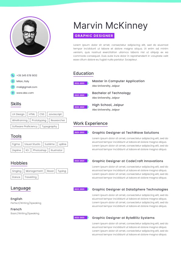
Use professional field-tested resume templates that follow the exact Resume rules employers look for.
Create ResumeKeyboard navigation on iPad
Switch Control awareness
Accessible custom components
Clear form errors and status messages
Predictable navigation and modal behavior
The goal is not to add accessibility after the app is finished. The goal is to build accessibility into the design, development, testing, and release process from the start.
This matters because accessibility problems usually reveal deeper product quality problems. If a screen is confusing for VoiceOver users, it is often confusing visually too. If a layout breaks with larger text, the app may also struggle with localization, longer content, smaller screens, or real world edge cases.
Lost trust with users
For developers, accessibility is a strong signal of engineering maturity. Hiring managers increasingly value iOS developers who understand accessibility because it shows they can think beyond visual implementation. They can build for real users, prevent defects, collaborate with UX designers, support regulated industries, and ship mobile experiences that hold up under quality review.
This is especially important for apps in:
Healthcare
Banking and fintech
Insurance
Government
Education
Enterprise software
Public sector platforms
Consumer apps with large user bases
In these industries, accessibility is often tied to product approval, procurement, QA signoff, compliance review, and long term customer adoption.
Making custom controls discoverable
Supporting reduced motion settings
Testing on real devices
Understanding WCAG principles for mobile apps
Using Accessibility Inspector and manual testing workflows
The strongest developers also connect accessibility work to business and product outcomes. They can explain how a fix improved task completion, reduced defects, increased audit readiness, improved usability, or supported enterprise adoption.
That is what separates real accessibility experience from surface level accessibility claims.
Can I complete the task without guessing?
Common VoiceOver failures include:
Buttons with vague names
Icons that have no meaningful description
Controls read in the wrong order
Duplicate or repetitive announcements
Important content skipped by focus
Modal screens that do not receive focus
Error messages that are not announced
Custom controls that do not expose their purpose
Swipe order that does not match task order
A good accessibility label should describe the purpose of an element in context. A button labeled “Submit” may be acceptable on a simple form, but “Submit insurance claim” or “Submit payment request” is usually clearer in a complex app.
The best VoiceOver experiences reduce uncertainty. They do not force users to memorize the visual layout or guess what a control does.
Error messages that become unreadable
Layouts that do not scroll when content grows
Strong Dynamic Type support requires flexible layout thinking. Developers and designers should assume text will expand, content will wrap, and screens may need to scroll.
A Dynamic Type friendly app should:
Allow text to wrap naturally
Avoid fixed height containers for content heavy areas
Keep primary actions reachable
Support accessibility text sizes, not only standard sizes
Test forms, cards, alerts, navigation, and empty states
Consider long localized strings
Maintain readable spacing at larger sizes
Hiring managers value this skill because Dynamic Type failures often become real production defects. They affect low vision users, older users, users with reading preferences, and anyone who increases text size for comfort.
Accessible navigation for custom views
Reduced reliance on gesture only interactions
A common mistake is describing an icon literally instead of describing its action. For example, a trash icon should not simply be announced as “trash” if the real action is deleting a saved payment method, removing a document, or clearing a search.
Another common issue is over grouping or under grouping content. If every small text element is read separately, the experience becomes slow and noisy. If too much content is grouped together, the user loses control and detail. Good semantic grouping makes information efficient without hiding important meaning.
SwiftUI developers should pay special attention to:
Custom cards
Custom tab bars
Icon only buttons
Expandable sections
Financial transaction rows
Medical records screens
Checkout flows
Form validation states
Progress and loading states
SwiftUI accessibility is strongest when developers use native patterns where possible and add custom accessibility behavior only where the user experience requires it.
Modal focus management
Screen change announcements
UIKit developers must be especially careful with custom components. A custom view that looks like a button must behave like a button for assistive technologies. A custom slider must communicate its current value. A custom card with actions must expose those actions clearly.
Table views and collection views also require careful accessibility work. A transaction list, appointment list, claims list, or message inbox should not read as disconnected fragments. Each row should communicate the right amount of information in a logical order.
For example, a banking transaction row should help the user understand the merchant, amount, date, and status together. A healthcare appointment row should make the provider, date, time, location, and next action clear.
Modal focus management is another major UIKit issue. When a modal, alert, confirmation screen, or error state appears, VoiceOver focus should move to the correct place. If focus remains behind the modal or lands somewhere unexpected, users may become disoriented.
This is one area where experienced UIKit developers stand out because they understand not only how screens appear, but how focus behaves after state changes.
Forms with clear labels and errors
Controls that work without gesture only interaction
Navigation that behaves predictably
Meaningful screen reader descriptions
Visible and understandable status changes
Reduced motion support
Clear focus behavior
Consistent component patterns
An iOS developer does not need to sound like a legal compliance specialist. But they should understand how WCAG principles translate into native mobile product decisions.
That practical understanding is especially valuable in companies preparing for accessibility audits, enterprise sales, public sector procurement, or regulated product reviews.
Form error and validation testing
Modal and alert focus testing
Manual completion of key user flows
Accessibility Inspector helps identify missing labels, incorrect traits, focus issues, hierarchy problems, hit target concerns, and contrast warnings. It is useful, but it is not enough.
VoiceOver testing on real devices is essential because it reveals practical usability issues such as confusing swipe order, inefficient announcements, focus jumps, poor modal behavior, and unclear actions.
Dynamic Type testing should include real screens, not only isolated components. Developers should test onboarding, checkout, settings, profile pages, forms, dashboards, empty states, error states, and confirmation screens.
The most important accessibility testing question is simple: Can a user complete this task independently using assistive technology?
If the answer is unclear, the app is not ready.
Support efficiency
App review sentiment
Product trust
Accessibility also improves team decision making. It forces designers, developers, QA analysts, product managers, and content teams to define what matters on each screen.
If an action cannot be described clearly, the product flow may be unclear. If content cannot scale, the layout may be too fragile. If navigation only works visually, the information architecture may need improvement.
This is why accessibility should be treated as app quality, not just compliance.
Improved accessibility audit scores
Built reusable accessibility standards for a design system
Improved App Store quality through accessibility fixes
Weak candidate signals include:
Worked on accessibility
Added labels
Followed accessibility guidelines
Helped make the app accessible
These claims are too vague. They do not show scope, judgment, or impact.
A stronger resume style statement would be:
This works because it connects technical work to user experience and measurable quality improvement.
Hiring managers respond well to accessibility experience when it shows:
Ownership
Product judgment
User empathy
Technical depth
Collaboration
Measurable outcomes
Accessibility can help an iOS developer stand out because it shows they build for real users, not just visual demos.
Simulators and automated tools are useful, but they do not replace testing on actual iPhones and iPads with VoiceOver and larger text settings enabled.
Test VoiceOver order during development
Validate Dynamic Type at larger accessibility sizes
Check forms, errors, alerts, modals, and confirmation states
Review color contrast and reduced motion behavior
Test important flows on real devices
Add automated checks where they help prevent regressions
Include accessibility acceptance criteria before release
The best teams do not ask, “Can we make this accessible later?” They ask, “What accessibility requirements must this feature meet before we consider it done?”
That mindset prevents expensive rework and improves the quality of the entire app.
Faster QA approval for accessibility reviewed releases
Increased accessible component coverage
Reduced regression issues in key user flows
For developers, these KPIs also improve career positioning. A hiring manager will value “reduced accessibility defects by 40%” much more than “worked on accessibility.”
Measurable accessibility impact shows that the developer understands quality, users, and business outcomes.


 Upload Resume
 Import from Linkedin