
Choose from a wide range of NEWCV resume templates and customize your NEWCV design with a single click.

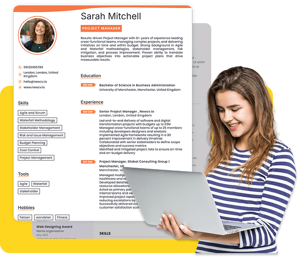
Use ATS-optimised Resume and resume templates that pass applicant tracking systems. Our Resume builder helps recruiters read, scan, and shortlist your Resume faster.

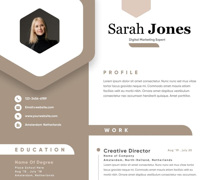
Use professional field-tested resume templates that follow the exact Resume rules employers look for.
Create Resume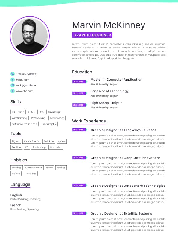
Use professional field-tested resume templates that follow the exact Resume rules employers look for.
Create ResumeYour resume font absolutely affects whether recruiters keep reading or move on.
In the Australian job market, hiring managers typically spend seconds scanning a resume before deciding whether it looks credible, professional, and easy to review. Font choice influences all of that immediately. A clean, readable font improves scan speed, ATS compatibility, and overall candidate perception. A poor font creates friction, makes resumes look outdated, or signals poor judgement.
The best resume fonts in Australia are modern, highly readable, ATS-friendly, and professional without looking overly designed. For most industries, the safest and strongest choices are:
Calibri
Arial
Aptos
Helvetica
Cambria
Georgia
These fonts consistently perform well because recruiters can read them quickly across screens, PDFs, laptops, and applicant tracking systems. The wrong font, meanwhile, can make even strong experience feel harder to process.
Most candidates overthink aesthetics and underthink readability.
Recruiters are not assessing whether your font is “creative”. They are assessing whether your resume is easy to scan under time pressure.
In Australian recruitment environments, resumes are commonly reviewed:
On laptops during bulk screening
Inside ATS platforms with compressed layouts
On dual monitors while comparing applicants
On mobile devices during shortlisting
In PDF preview windows with reduced zoom
That means your font must remain readable in multiple formats and sizes.
From a recruiter perspective, the ideal resume font does three things:
Reduces visual fatigue
Makes key information easy to locate
Creates a modern professional impression
If a recruiter has to work harder to read your resume, your chances drop immediately, especially in competitive roles where there are dozens or hundreds of applicants.
Calibri remains one of the safest resume fonts in Australia.
It became the default Microsoft Office font for years, which means recruiters are extremely familiar with reading it. It is clean, modern, compact, and highly ATS-compatible.
Best for:
Corporate roles
Government applications
Graduate resumes
Sales and operations roles
Most professional industries
Calibri works especially well when candidates need to fit strong experience into two pages without making the resume feel crowded.
Aptos is replacing Calibri as Microsoft’s newer default font and is becoming increasingly common in professional resumes.
It feels slightly more modern and cleaner while maintaining excellent readability.
Best for:
Modern corporate resumes
Technology roles
Consulting applications
Mid-level and senior professionals
Using Aptos can subtly modernise your resume without appearing unconventional.
Arial is highly readable and ATS-safe.
Some candidates think Arial feels too basic, but recruiters rarely care about that. What matters is readability and structure.
Arial performs particularly well in:
High-volume recruitment
Blue-collar industries
Healthcare
Logistics
Trades
Administrative roles
If your resume is content-heavy, Arial often improves clarity.
Helvetica creates a more polished and premium feel compared to Arial, while maintaining strong readability.
It is commonly used by:
Marketing professionals
Designers with conservative resumes
Executives
Consultants
Professionals applying to global firms
However, Helvetica is not installed on every Windows device, so exporting to PDF is essential.
Cambria is one of the best serif fonts for resumes.
Serif fonts can work well when used correctly because they create a more formal and established appearance.
Cambria suits:
Legal professionals
Academic roles
Finance professionals
Executive resumes
Senior government applications
It also performs very well in printed resumes.
Georgia is another strong serif option that remains highly readable on screens.
Compared to Times New Roman, Georgia feels significantly more modern and easier to scan.
Best for:
Professional services
Education
Policy and public sector roles
Communications positions
Most Australian resumes should use:
10 to 12 pt for body text
14 to 18 pt for headings
1.0 to 1.2 line spacing
The ideal size depends on the font itself.
For example:
Calibri often looks best at 10.5 or 11 pt
Arial typically works best at 10 or 10.5 pt
Cambria usually needs 11 or 12 pt
One of the biggest resume mistakes recruiters see is candidates shrinking fonts excessively to fit more content.
This usually backfires because:
Recruiters stop reading
Important achievements become harder to find
The resume feels dense and overwhelming
Mobile readability suffers badly
If you cannot fit your resume within two to three pages using readable font sizes, the issue is usually content quality, not spacing.
The strongest Australian resumes typically follow this structure:
Font: Calibri, Aptos, Arial, or Helvetica
Body text: 10.5 to 11 pt
Headings: 14 to 16 pt
Bold section headings
Consistent spacing throughout
Clear margins
Adequate white space
This combination improves scan speed dramatically.
Recruiters often make decisions based on how quickly they can identify:
Job titles
Employers
Dates
Achievements
Industry relevance
Seniority level
Good formatting helps all of that happen faster.
Some fonts create immediate negative impressions because they reduce readability or appear unprofessional.
Avoid these fonts on Australian resumes:
Times New Roman
Comic Sans
Papyrus
Courier New
Brush Script
Impact
Decorative script fonts
Times New Roman is not automatically disqualifying, but it increasingly makes resumes look outdated.
Recruiters commonly associate it with:
Old resume templates
Poor modern formatting
Minimal resume optimisation
Generic applications
In highly competitive professional roles, presentation influences perceived candidate quality more than many applicants realise.
Creative fonts usually fail for one reason:
They prioritise style over readability.
Recruiters do not want resumes to feel “designed”. They want resumes to feel effortless to scan.
Even in creative industries, overly stylised fonts often reduce professionalism.
Applicant Tracking Systems can struggle with:
Non-standard fonts
Decorative typography
Embedded text formatting
Poor PDF exports
Text boxes with unusual styling
The safest ATS fonts are:
Calibri
Arial
Aptos
Helvetica
Cambria
Georgia
To maximise ATS compatibility:
Use standard fonts only
Avoid graphics-heavy resumes
Export to PDF unless the application specifies Word format
Avoid columns in highly ATS-sensitive applications
Keep formatting simple and consistent
Sans serif fonts are the dominant standard in Australian resumes.
Examples include:
Calibri
Arial
Helvetica
Aptos
They feel:
Cleaner
More modern
Easier to scan digitally
Better for ATS readability
Most recruiters prefer sans serif fonts for modern professional resumes.
Serif fonts include:
Cambria
Georgia
Garamond
They can work well for:
Traditional professions
Academic sectors
Senior leadership roles
Legal and policy positions
However, serif fonts require stronger formatting discipline to avoid making resumes feel text-heavy.
Best choices:
Calibri
Aptos
Helvetica
These fonts align with modern corporate presentation standards.
Best choices:
Calibri
Arial
Cambria
Government resumes often contain more detailed information, so readability becomes critical.
Best choices:
Aptos
Calibri
Helvetica
Tech recruiters usually prefer clean, modern layouts with minimal visual clutter.
Best choices:
Arial
Calibri
Georgia
Healthcare resumes are frequently screened quickly, especially in high-volume recruitment environments.
Best choices:
Arial
Calibri
Simplicity and readability matter far more than design sophistication.
Best choices:
Helvetica
Aptos
Clean customised sans serif fonts
Even in creative sectors, readability still wins. Most hiring managers reject resumes that feel visually chaotic.
Candidates underestimate how much fonts influence perception.
Recruiters unconsciously associate typography with:
Professional judgement
Communication ability
Attention to detail
Seniority
Modernity
Commercial awareness
A cluttered or outdated font subtly lowers perceived candidate quality before recruiters even assess experience.
A clean modern font creates the opposite effect:
The candidate feels more organised, credible, and easier to work with.
This matters particularly in competitive white-collar hiring where multiple applicants have similar qualifications.
Generally, no.
The strongest resumes usually use:
One font family only
Bold for emphasis
Consistent heading hierarchy
Minimal stylistic variation
Mixing fonts often creates visual inconsistency and reduces professionalism.
The only acceptable variation is occasionally pairing:
A sans serif body font
With a subtle serif heading font
But even then, most recruiters prefer simplicity.
Always check how your resume renders after export.
One of the most common resume problems in Australia is font corruption caused by poor PDF conversion or incompatible fonts.
Before submitting:
Open the PDF on desktop and mobile
Check spacing consistency
Ensure headings align properly
Confirm no font substitution occurred
Verify ATS readability if possible
A strong resume can look broken simply because the formatting was not tested properly.
Within seconds, recruiters usually assess:
Is this easy to read?
Does it feel modern?
Can I find the important information quickly?
Does the candidate understand professional presentation?
Is the resume visually exhausting?
Font choice directly impacts all five.
Candidates often obsess over wording while ignoring readability, but poor presentation regularly causes strong applicants to be overlooked.
If you want the safest possible setup for Australian hiring processes, use:
Font: Calibri or Aptos
Body text: 11 pt
Headings: 15 pt bold
Black text only
Standard margins
PDF format
This combination works across nearly every industry and ATS environment.
It is not flashy, but that is exactly why it performs well.
This immediately reduces readability and often signals poor editing discipline.
Highly designed resumes frequently perform worse in ATS systems and recruiter screening.
Fonts like Times New Roman can age a resume unnecessarily.
Changing font sizes randomly creates visual friction and weakens professionalism.
Low-contrast text looks modern to candidates but becomes difficult to read during screening.
For most Australian job seekers, the best resume fonts are:
Calibri
Aptos
Arial
Helvetica
These fonts consistently deliver the best balance of:
ATS compatibility
Recruiter readability
Modern presentation
Professional appearance
Cross-device performance
If you work in a more traditional profession, Cambria or Georgia can also work extremely well.
Ultimately, the best resume font is the one that helps recruiters absorb your value faster. That is what gets interviews.


 Upload Resume
 Import from Linkedin